
|
Brief
For this project we were put into groups, acting as a design consultancy for a city bidding to be the City of Culture in 2025. We had to produce a brand identity for the city of Sheffield, to be used as a key element in their bid strategy across a range of media. Research We had to find out about the history, industry, commerce, geography, population, famous inhabitants, culture etc of our city too inform the concepts to develop for the brand. After delegating topics, we got to work; I researched culture and commerce; what I found can be seen in the file here. 
We then collated all of our research together into a powerpoint for presenting our findings to the rest of the class.
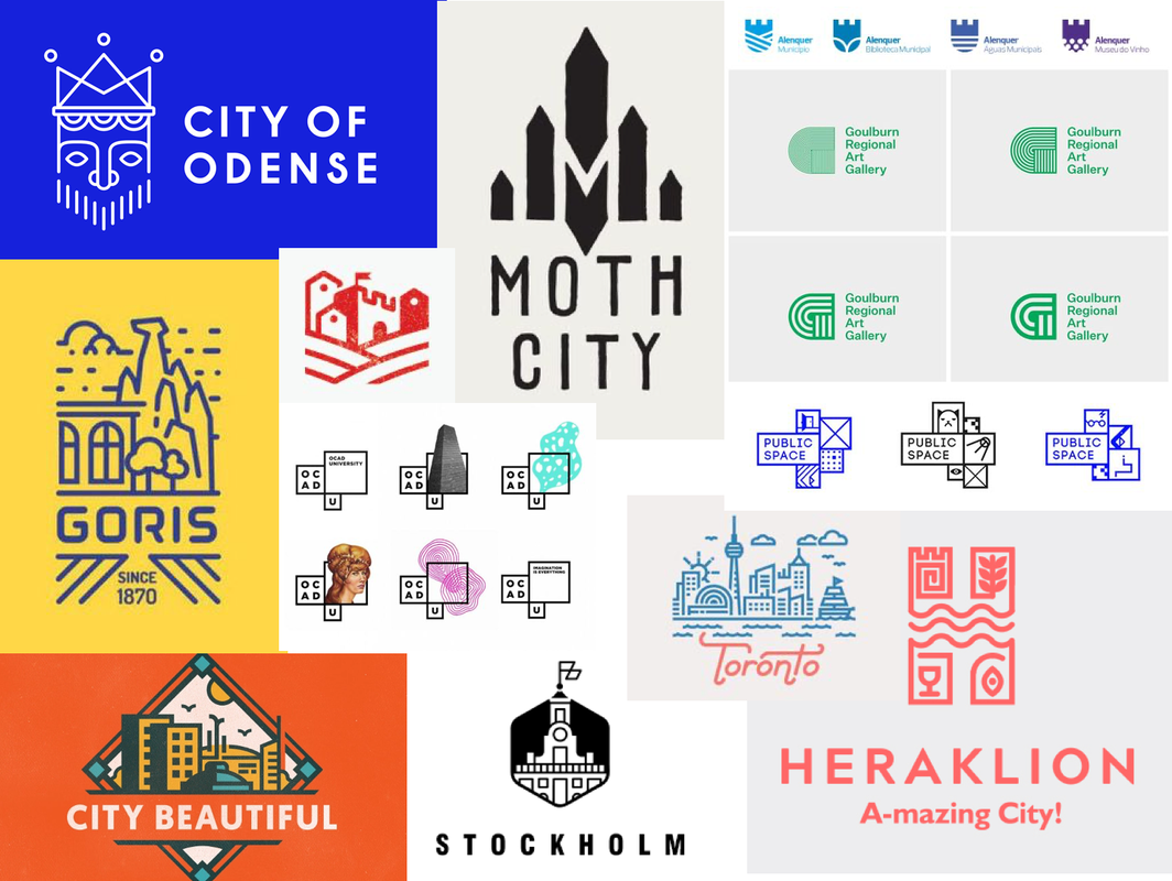
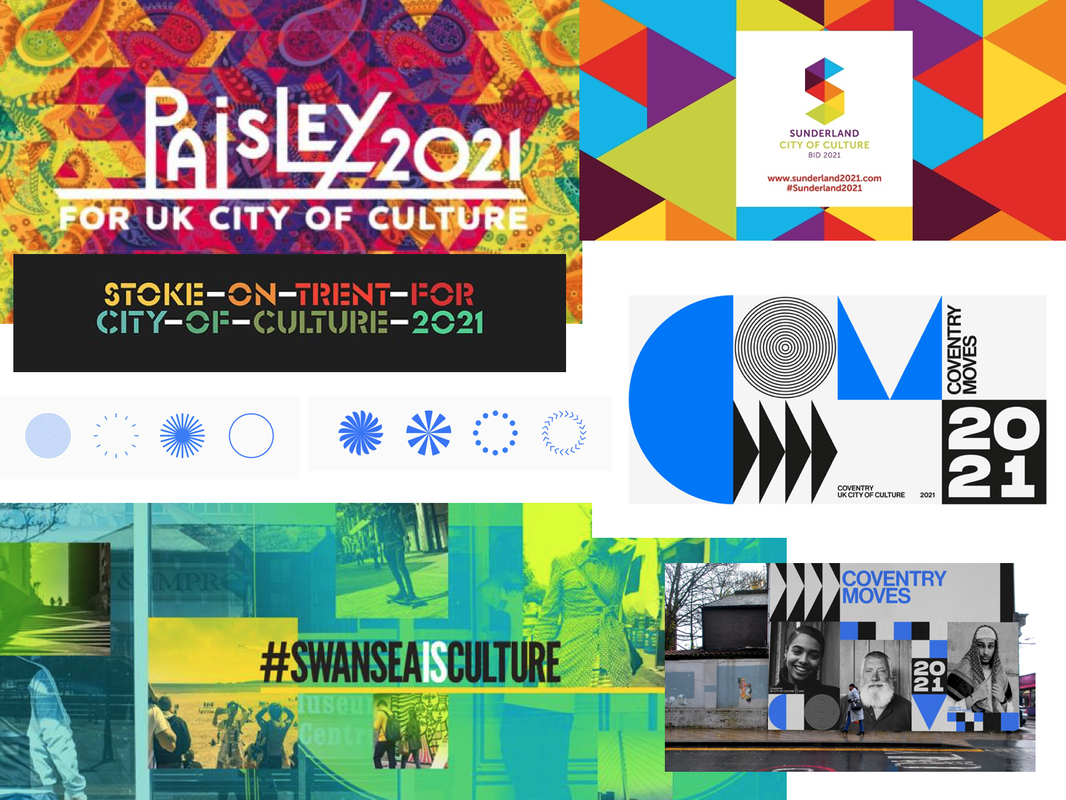
I then decided to do some research into other branding designs, specifically at past City of Culture designs to get some more inspiration, as well as at some logo designs that I liked. I was particularly drawn towards minimalistic, simple lines and shapes that could be easily used in a range of ways/colours.
Logo Sketches
Next, we decided to do some idea generation and do some initial thumbnail sketches. We figured the steel aspect was something we definitely needed to look into but my worry was that the logo could end up looking too much like a steel company logo rather than represent the city as a whole, especially seen as the steel industry in Sheffield isn't even as prominent as it used to be. Therefore, I tried to include other themes such as landscape and music.
After discussing our ideas with each other, we decided to take forward one of Olivers ideas, using the shape of an 'S'. I did some sketches based of his original drawings of how we could possibly incorporate symbols of the steel industry and music etc into the shape.
Logo Development
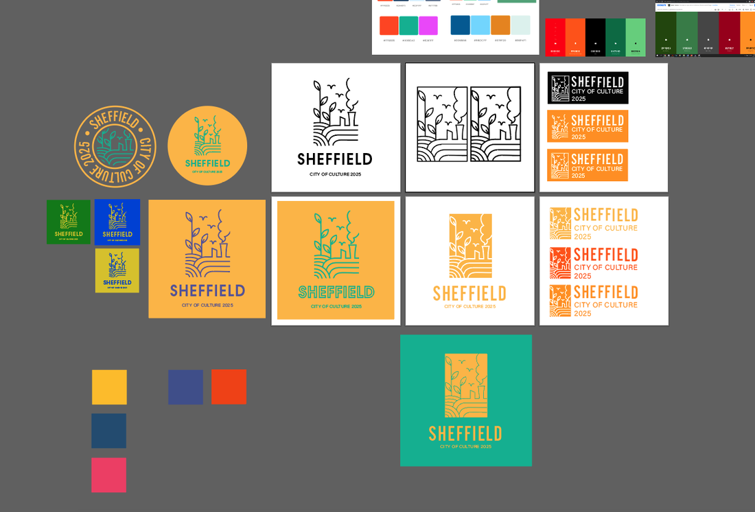
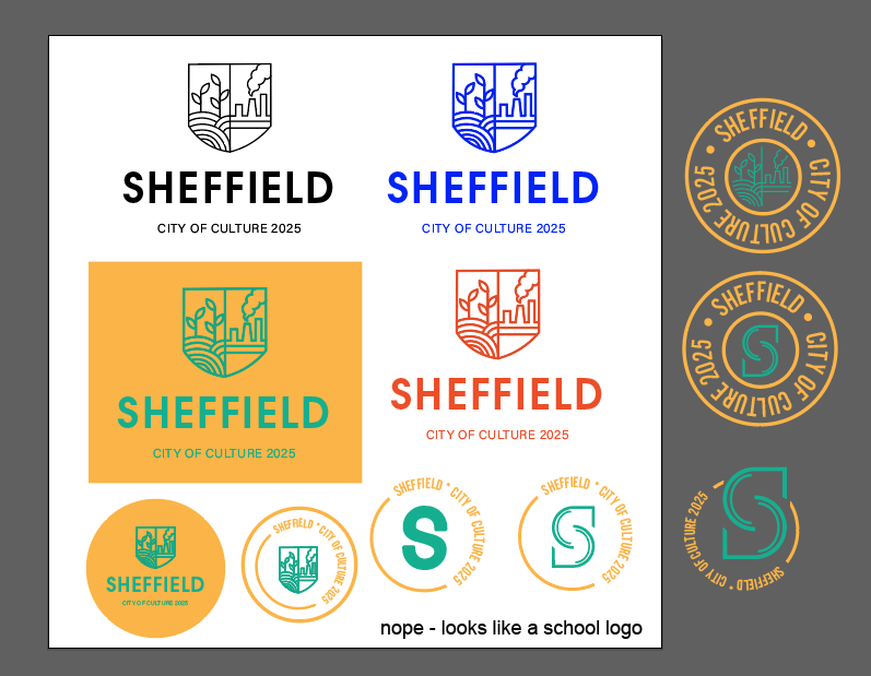
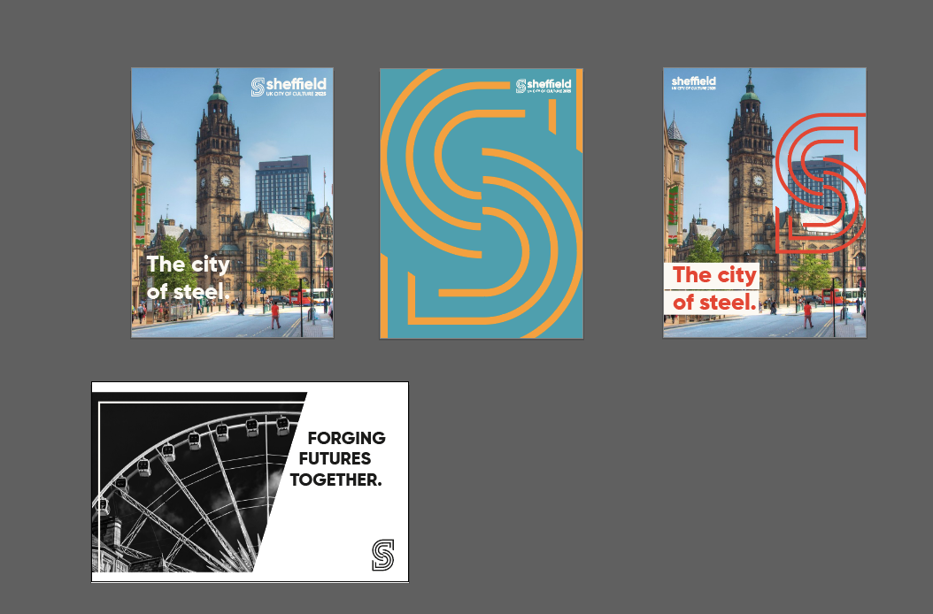
I then decided it was time to start experimenting with some of the ideas on Illustrator; I started with my original concepts to see if they could be worth pursuing as well as vectorising the symbols, then continued trying to refine the 'S' logo idea. It became apparent that incorporating any illustrations into the shape wasn't going to work well as it would be too small to be legible at smaller sizes and frankly just didn't flow well as whole. So I came up with a more simple design that used the original shape with extra lines all at the same thickness. We found this actually worked well to represent the steel industry as it gave the impression of the flow of molten metal through a mould. 
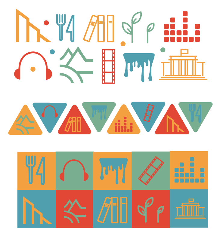
We then began thinking about colours. I wanted the colour palette to represent the city's industry using mainly oranges and yellows, combined with at least one contrasting colour.
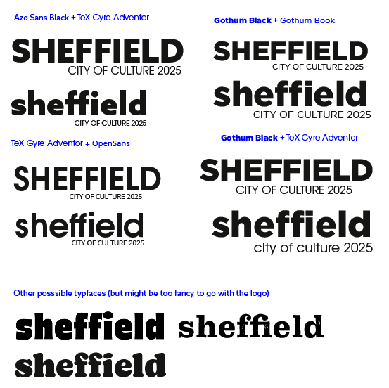
When thinking about typefaces, I thought we needed something like a thick, modern sans-serif, so I put forward what I found to the group along with some possible typeface pairings. I much preferred the way the word looked as completely lowercase and it just looked more friendly that way.
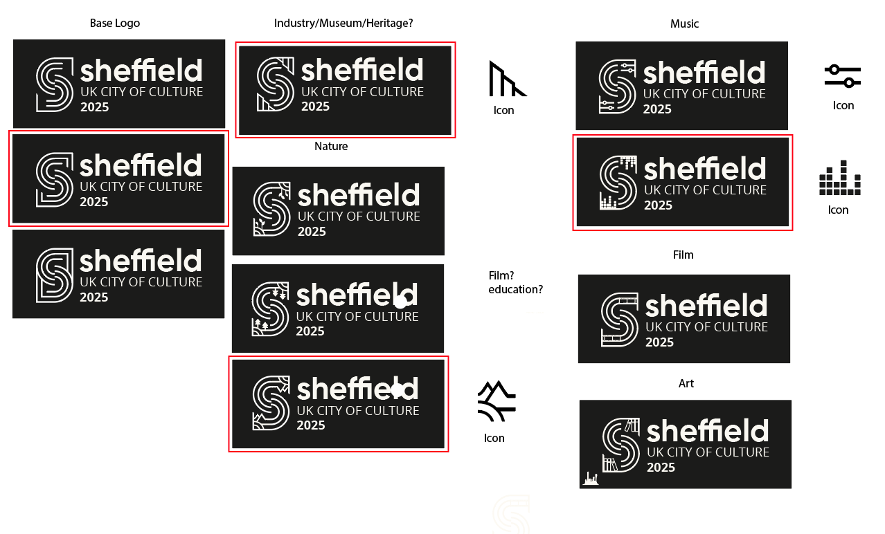
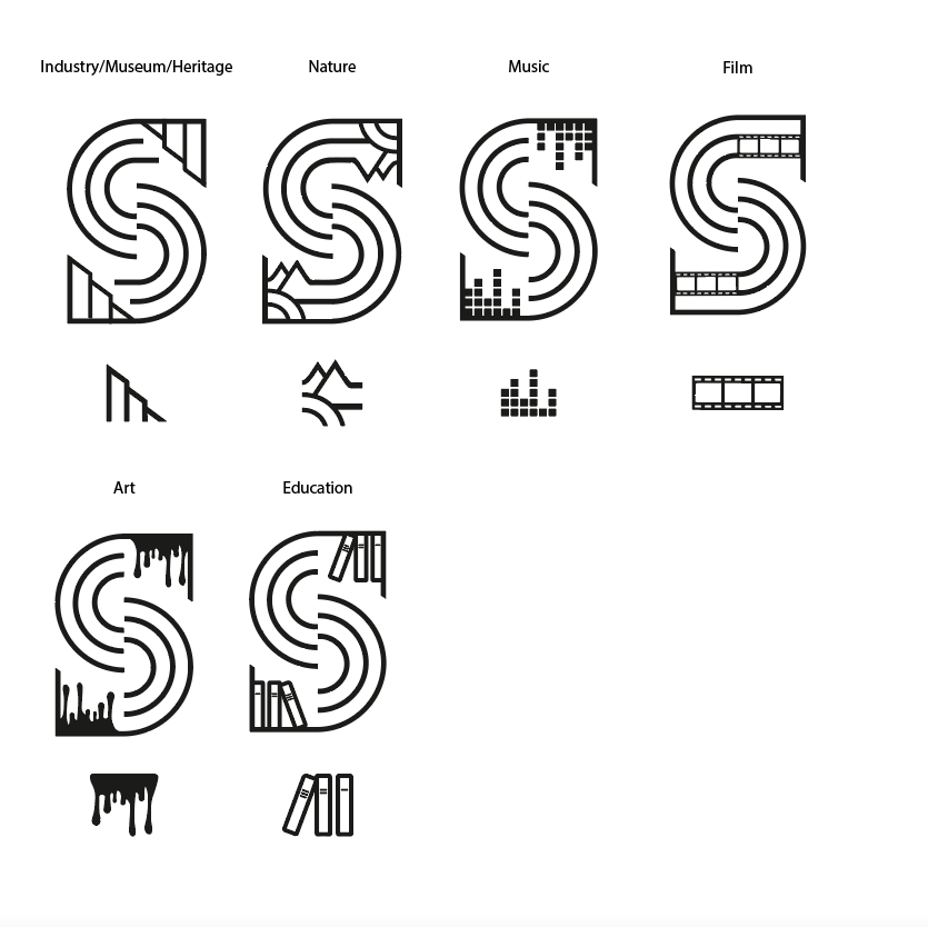
I then started trying to combine the colours and font ideas with the logo to see how it may look. I tried combining the factory shape into the logo to make it more obvious its symbolising the steel industry, however I felt it was too restricting because it didn't represent any of the other factors that make up Sheffields culture. As a result, we decided we would create a modular logo, containing of a base logo and other variations of it combining the symbols I created earlier. The idea was that each symbol would be used for different thing, for example, the music themed logo would be used for any music related brand implementation.
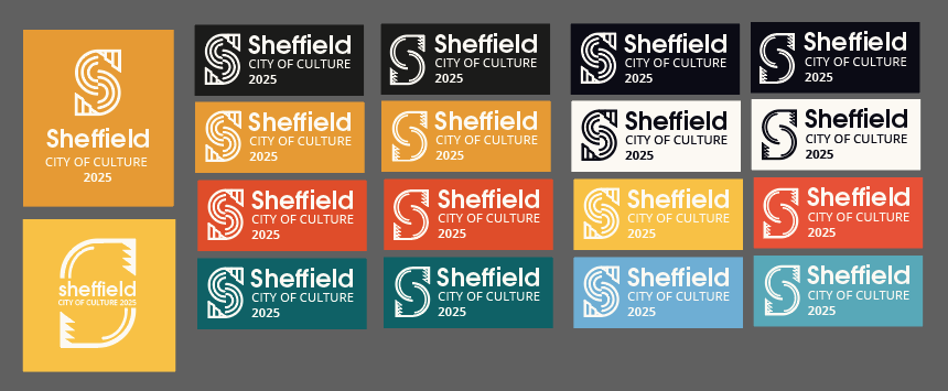
The most difficult part of designing these logos was trying to make the added symbols flow into the 'S' and be more seamless as I didnt want it to end up looking like the base logo with a symbol just stuck in the corner.
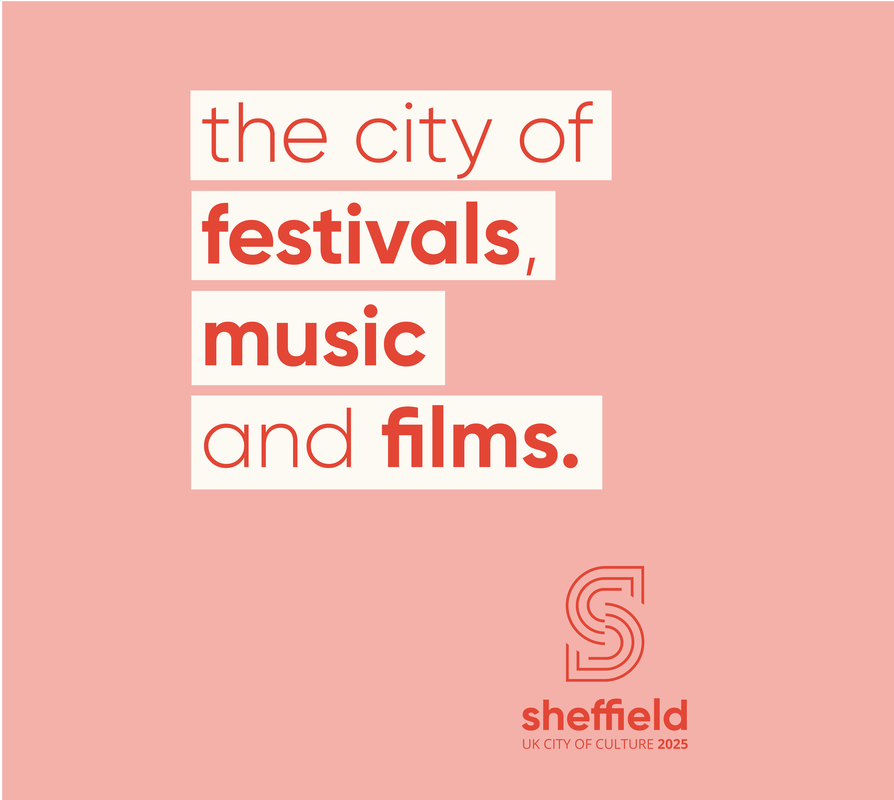
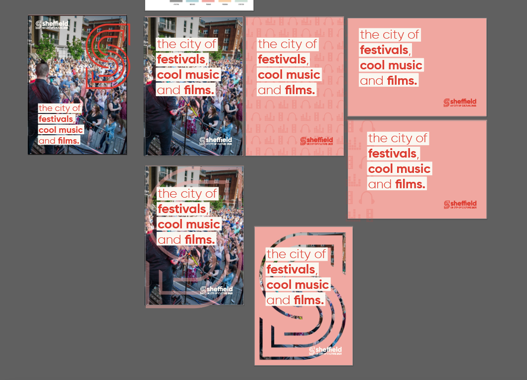
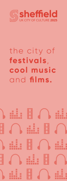
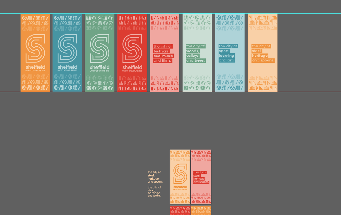
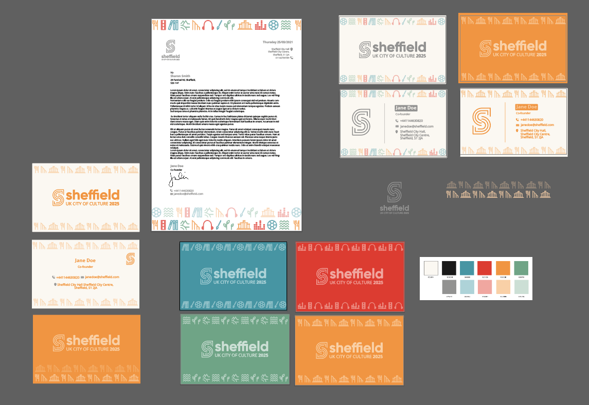
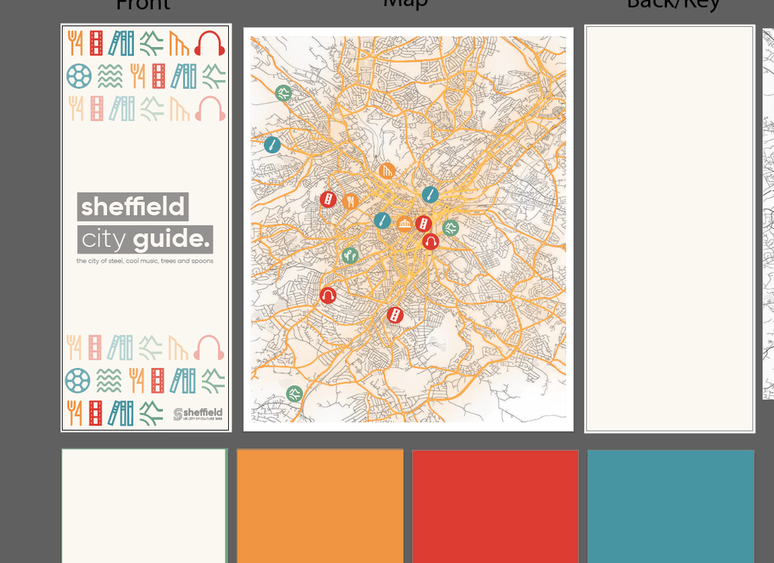
Final Assets Here is the final base logo and the other individual logos from the rest of the modular design incorporating each of the themes into the 'S', along with the accompanying symbols. I also put together some possible patterns and tag-lines (inspired by the original 'City of Steel' tagline), for use when implementing the brand.
Basic Brand Guidelines
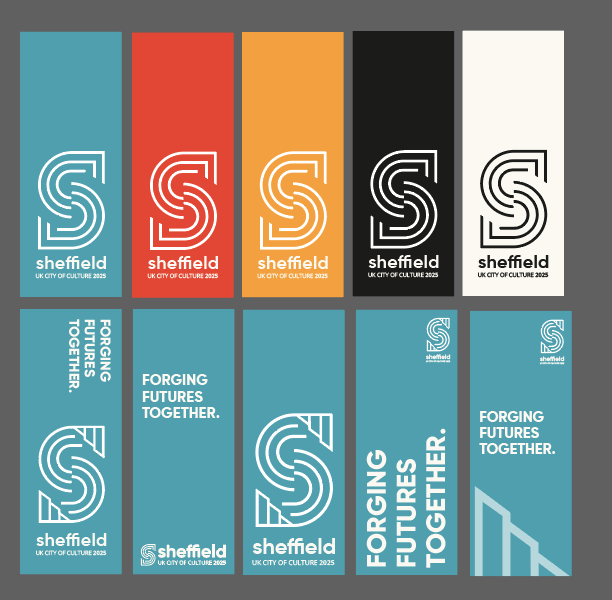
We finally settled on our base guidelines, choosing a bold sans-serif typeface for display and an easy to read body copy font. Our final colours consist of a colour for each theme of the modular design as well as a soft black and white and complimenting pastel shades of each colour. The symbols matching tag-lines further help to establish the language of the brand. 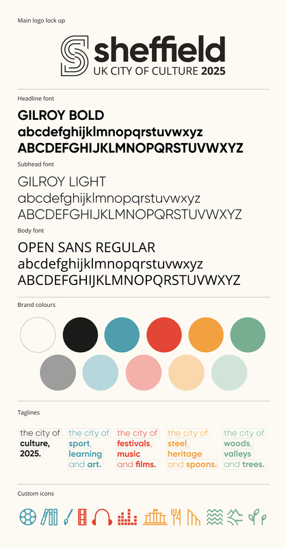
Implementation
After settling on our basic brand guidelines, we started to implement the design onto a range of publicity materials, including posters/signage, online presence, stationery and various merchandise. Below are some of my experiments applying the brand guidelines to posters, flags, a city guide, stationery, as well as merchandise such as mugs, t-shirts and bags. Posters:
Pole Flags/Banners:
Stationery:
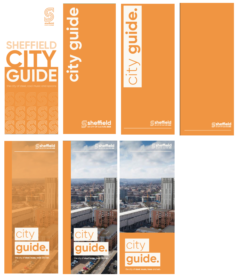
City Guide:
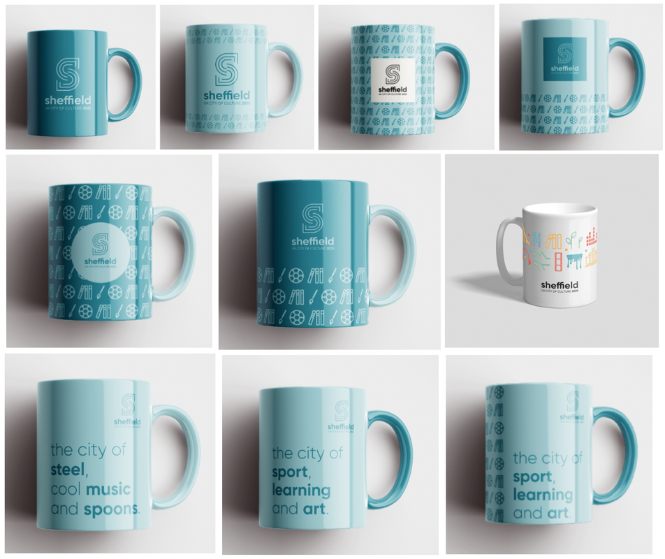
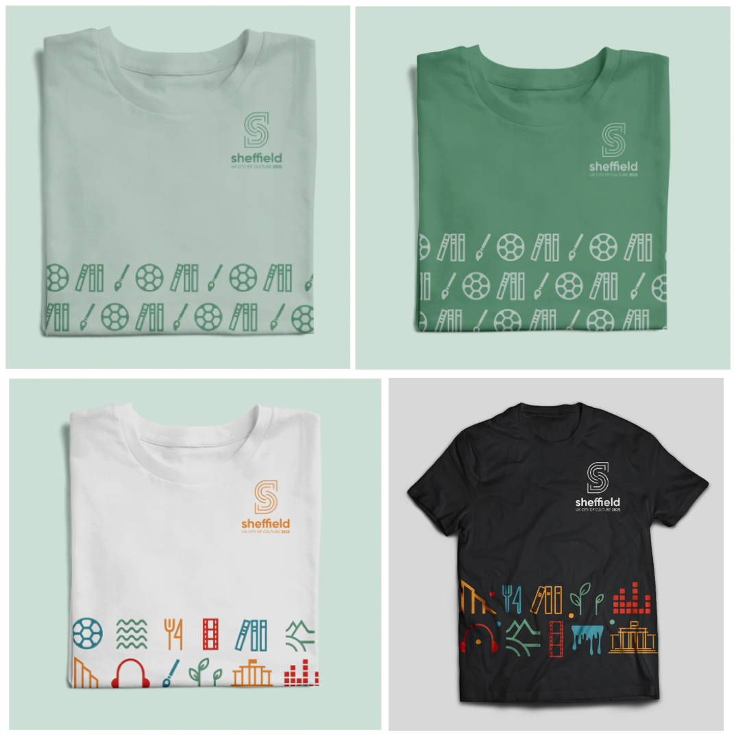
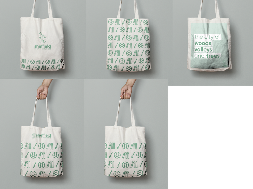
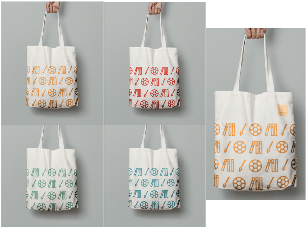
Merchandise:
Final Designs and Presentation
At the end of the project we had to present all of our work to the class as a group, showcasing the detailed brand guidelines and all the matching implementation.
0 Comments
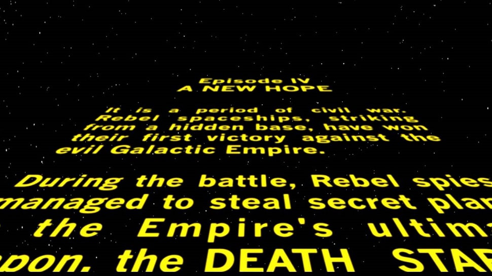
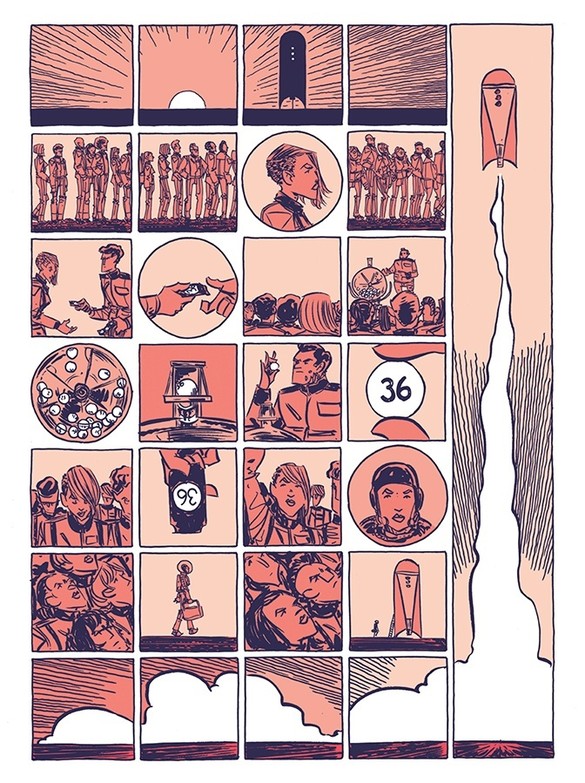
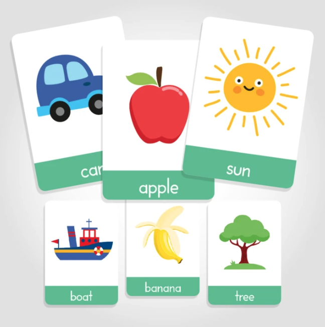
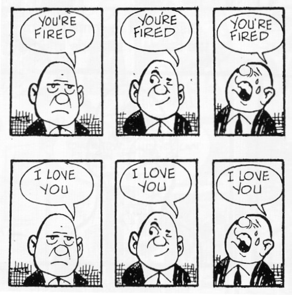
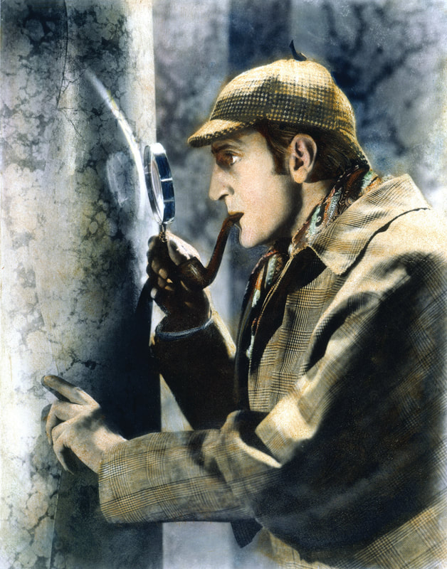
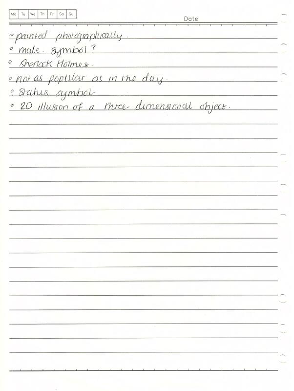
Planes of Expression and Abstraction Words are arbitrary signifiers; they don't resemble what they describe and they require the knowledge of language, linguistic forms, rules and culturally learnt definitions. How something is said, written or designed affects the 'reading of meaning' and this is called the 'plane of expression', (e.g. fonts used). Images are iconic signifiers because they resemble what they describe and they are usually learnt/viewed/experienced before words, (e.g. memories are experienced before we use language to frame them). The 'plane of abstraction' refers to how the way an image is captured and rendered visually affects the 'reading of meaning', (e.g.photographs, drawings, icons). Types of Anchorage Barthes stated that anchorage is used to describe the 'relay' between words and visuals and they are rarely not placed together, such as on webpages, illustrated books, packaging and advertising. In the book 'Understanding Comics', Scott McCloud listed the different types: Word specific - words (text or verbal) that provide all or most of the information needed to decode a message, for example the 'Star Wars' crawl text'. Image specific - images that provide all or most of the information needed to decode a message, for example in Jesse Lonergan's comic 'Hedra'. Dual message - words and images that communicate the same message, for example in children's early learning books/flashcards. Interdependent/convergent - words and images that work together whilst contributing information separately, to convey an idea they couldn't do alone, for example, in comic books. Parallel/divergent - words and images that follow different paths or communicate ideas that don't intersect, for example also in comic books. Denotation and Connotation Denotation is the the primary meaning; the non-coded, most immediate reading of a sign. Connotation is the secondary reading, for example the reader may pick up on style, production or materials which triggers off associated readings or link to other concepts. Barthes stated that coded interpretation (myth) is relayed at the level of connotation and argues that signs are polysemous and open to many interpretations. For example: 'DOG' Denotation - domesticated four legged carnivore Connotation - loyalty, obedience, sense of smell, breed, Pavlov, cultural perspective, Beatles song lyrics (intertextuality - echos other cultural texts) signifier + signified = denotative sign and connotative signifier Connotative signifier + connotative signified = connotative sign + connotative signifier The Treachery of Images The 'Treachery of Images' is a painting by surrealist painter René Magritte (1929) that shows an a pipe with the French translation for 'this is not a pipe' below it.  The literal reading of the text has denotations of 'this is not a pipe' and the signature, handwritten in the French language as a statement of fact. This links to connotations of personal expression and of the creation being of value, as well as the work 'pipe' signifying associations of its own. The image denotes a realistic oil painting of a pipe (an iconic signifier). This links to many connotations, such as smoking, bad health, being old-fashioned, male symbols, status symbols. The plane of abstraction signifies the artist is skilled as the painting is almost as realistic as a photograph. It also has intertextual connotations such as Sherlock Holmes and Peaky Blinders. However, these connotations are dependant of the time and place it is being viewed. The anchorage used here is 'interdependent/converging'; the text and image work together whilst contributing information separately. At first glance they convey contradictory messages but it is a 2D illusion of a 3D object; the painting itself is not a pipe; it is an image of a pipe. Sources:
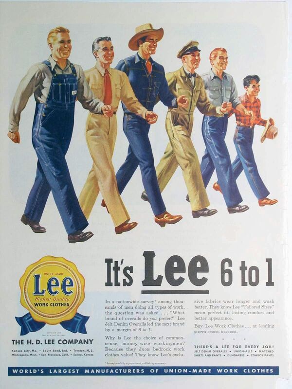
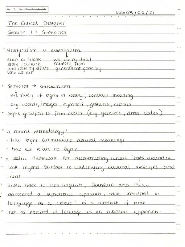
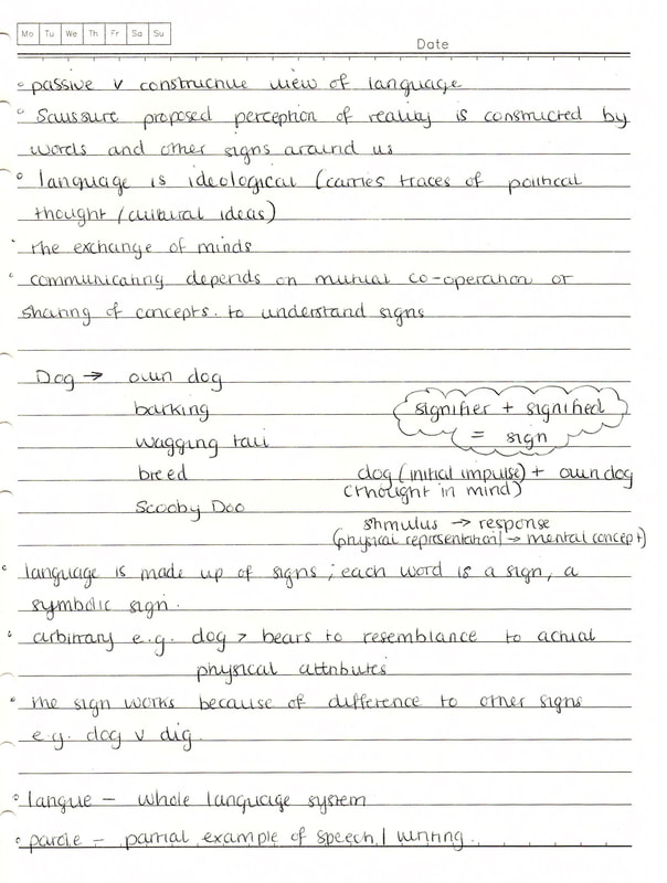
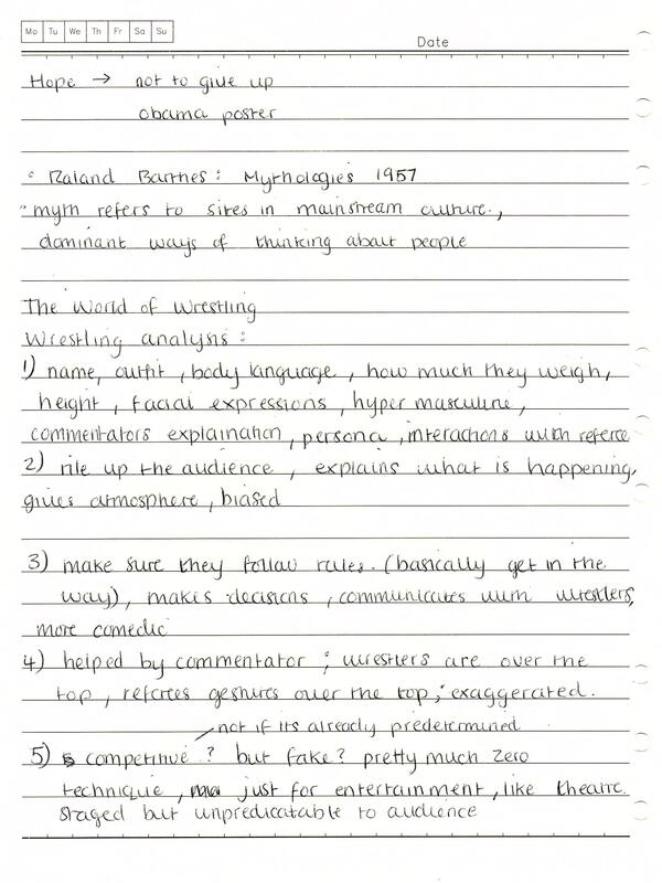
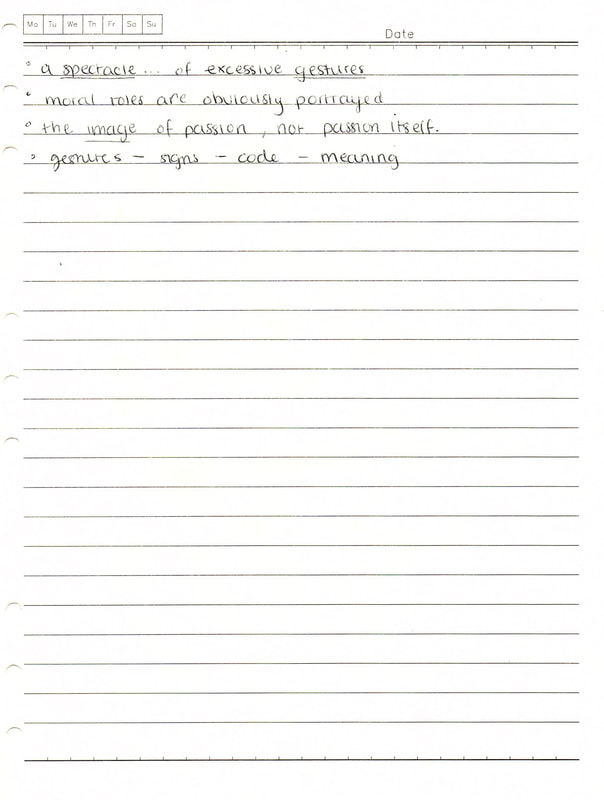
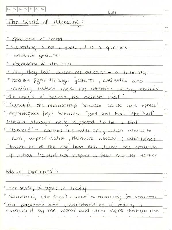
Notes: Structuralism and Semiotics 'Structuralism' refers to the theory that the way we communicate starts as a blank slate and that the culture and society that surrounds us effects who we are. The counter argument to this is the idea of 'essentialism'; we carry it in our DNA and through memories from past generations. Semiotics follows the same concept as structuralism. Semiotics is the study of signs and sign systems in society; anything that conveys meaning is a sign such as words, images, symbols, gestures, clothes etc. Our perception and understanding of reality is constructed by the words and other signs that we use. For example, the word 'children' makes us think of very young people as a group different to adults. However, different social groups around the world at different points in time may have a different distinction between the two, such as age, religion etc. Culture and society decide what the sign means rather than from nature/biology. Therefore, our own sense of identity is dependant on existing signs in society and are only meaningful if they are accepted in a social context. For example, denim jeans used to be considered as work attire, whereas today they are a sign of casual style. A lot of signs are grouped together to form codes, for example certain pieces of clothing can form a dress code (e.g. top hat and tail jacket for formal weddings). Semiotics is a critical methodology, in that it refers to how signs communicate and how we relate to them. It's a useful framework for deconstructing visual texts beyond the surface for underlying cultural messages/ideas. Saussure's' Key Ideas Literary theorist, Roland Barthes, stated that a cultural sign system has 'strong communicative value and is used on a daily basis to negotiate meaning and interact on the basis of that meaning'. This idea can be traced back to two linguists: Ferdinand Saussure and Charles Pierce, both who advocated a synchronic approach to language. Saussure's key ideas related to a passive versus constructive view of language. He proposed that our perception of reality is constructed by words and other signs around us. As a result, language is ideological and carries traces of political thought and cultural ideas. He believed that communication through language is about the exchange of minds and the understanding of signs depended on sharing particular concepts. Language is made up of signs; each word, written or spoken, is a symbolic sign. Signs are arbitrary in that they bear no resemblance to an actual physical appearance or attribute, and they work because of their differences to other signs (e.g. dog versus dig, cat). Every sign has two sides illustrated by the equation: sign = signifier + signified The signifier refers to the physical representation/stimulus and the signified refers to the mental concept/response. For example, d-o-g (initial impulse) + four legged creature (thought in mind) = the sign.  Semiotics Terminology The term langue refers to the whole language system such as the system of rules in chess and the term parole is a partial example of speech or writing, such as the particular moves made in a game. For a comment to be meaningful it has to conform to the system of rules (langue) in the English language. A syntagm refers to a complete, ordered sequence of signs (e.g. a sentence, such as 'the dog bites the man). Each sign could also be replaced by another that is related to it and this is called a paradigm; a point of substitution in a sentence (group of signs) which allows for an exchange of a similar sign without changing the overall structure (e.g. my dog smells/pongs/hums etc). Pierce's Key Ideas Visual signs, such as gestures, traffic signs, advertising images etc, can be approached in similar way to linguistic signs. In a photograph of a cat, the signifier is the colour and shape in the picture, and the signified is the concept of a cat. An iconic sign refers to when the signifier resembles the referent (e.g. a photograph of a specific cat); the signifier, signified and referent can be merged together. When a cat meows to gain attention, the sound points to its presence and this is called an indexical sign. We use signs to describe and interpret the world; they label things but also have 'connotations'. For instance, a photograph of Buckingham Place signifies the building itself but also has connotations with royalty, wealth and power, and this comes from our social experiences. This concept is used in TV, advertising, news etc to trigger a range of connotations to a sign that shapes a particular message; a 'myth'. An example of this can be seen in an advert for shoes that includes an image of Buckingham Palace which attaches connotations of wealth. Myth uses existing signs and makes a new sign system out of them through the use of metaphors and metonymy so they play a particular social role. 'The World of Wrestling' From Mythologies In Roland Barthes' 'The World of Wrestling from Mythologies', myth refers to sites in mainstream culture which reflect dominant ways of thinking about people, products or places (cultural norms). They are structured to send messages on cultural stereotypes, and may be ideological. Barthes' refers to wrestling as a 'spectacle... of excessive gestures'. This idea can be illustrated in the above video of a wrestling match. The role of each wrestler/character is defined and communicated to the audience through their name, appearance and the exaggerated gestures they make, and the obviousness of their roles determines the outcome to the audience - a basic sign. For example, it is a mythological fight between Good and Evil; the 'bad' wrestler being the one in the darker, scruffier attire. The roles are also influenced by the commentators introduction and their interactions with the referee so moral roles are clearly portrayed. The role of the commentator is also to rile up the audience and give atmosphere as well as explain what is happening, usually in a biased way that favours one competitor over the other. The role of the referee is to make sure the wrestlers are following the rules; the 'bastard' accepts the rules 'only when useful to him', giving further signs to the audience to how the fight will play out. Based on these observations, it makes it hard to classify wrestling as a sport as the show is more like theatre; most of the events taking place have been predetermined, even though its unpredictable for the audience. As Barthes put it: 'wrestling is not a sport, it is a spectacle'. Semiotics in Graphic Design Semiotics is used in graphic design all the time, through the creation of visual signs. Designers manipulate visual elements in their work to trigger a response in the viewer. For example, the logo shown was created as a part of a corporate identity for an auto-servicing business. The logo was rejected because it reminded them of the 'deadly sin of gambling'. This represents how his own life experiences influenced his impression of the visual sign. Sources:
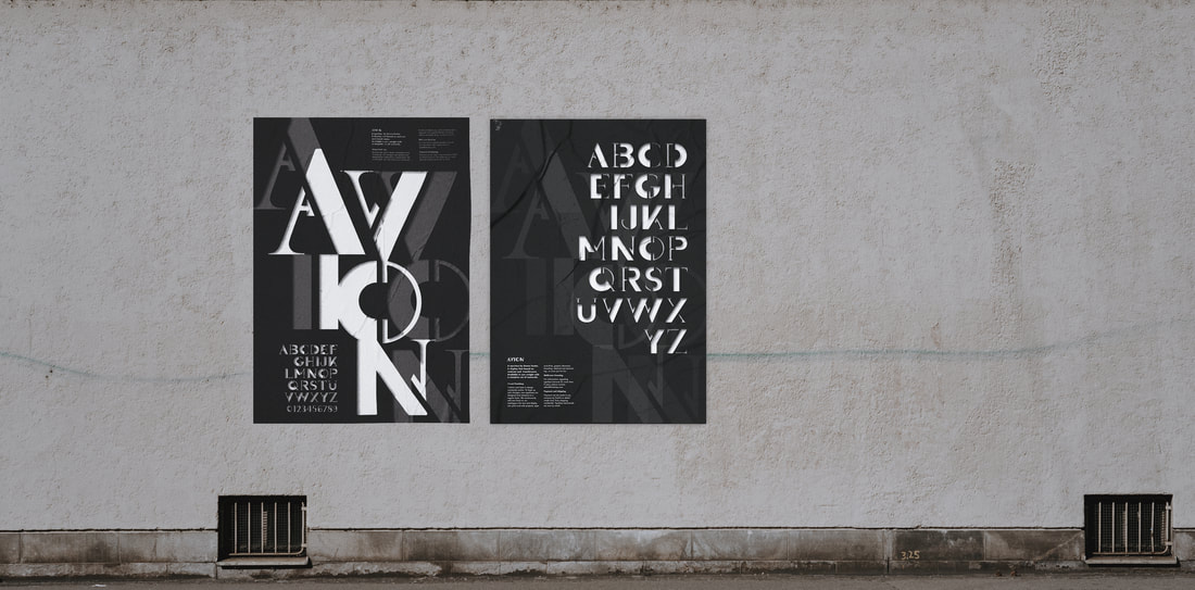
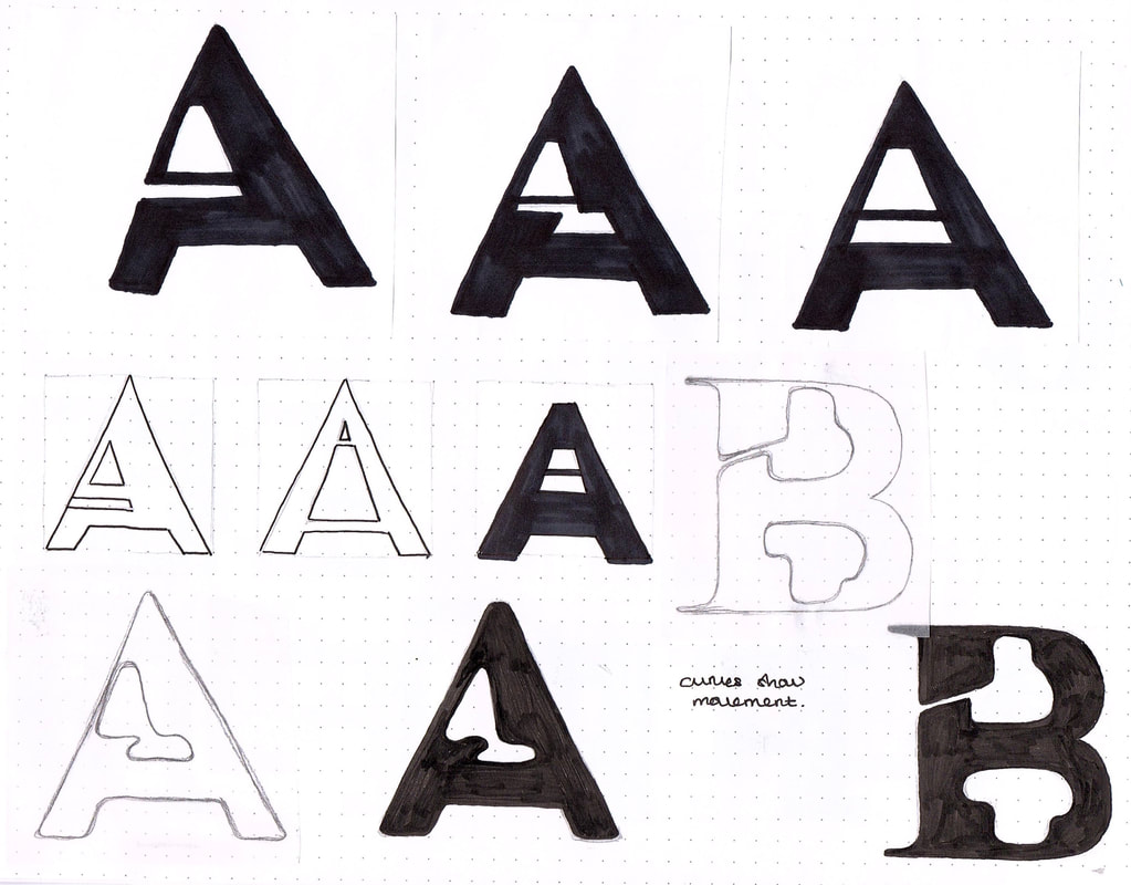
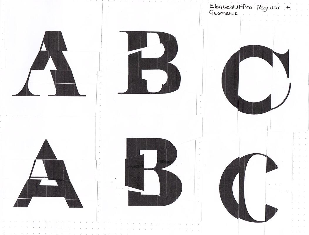
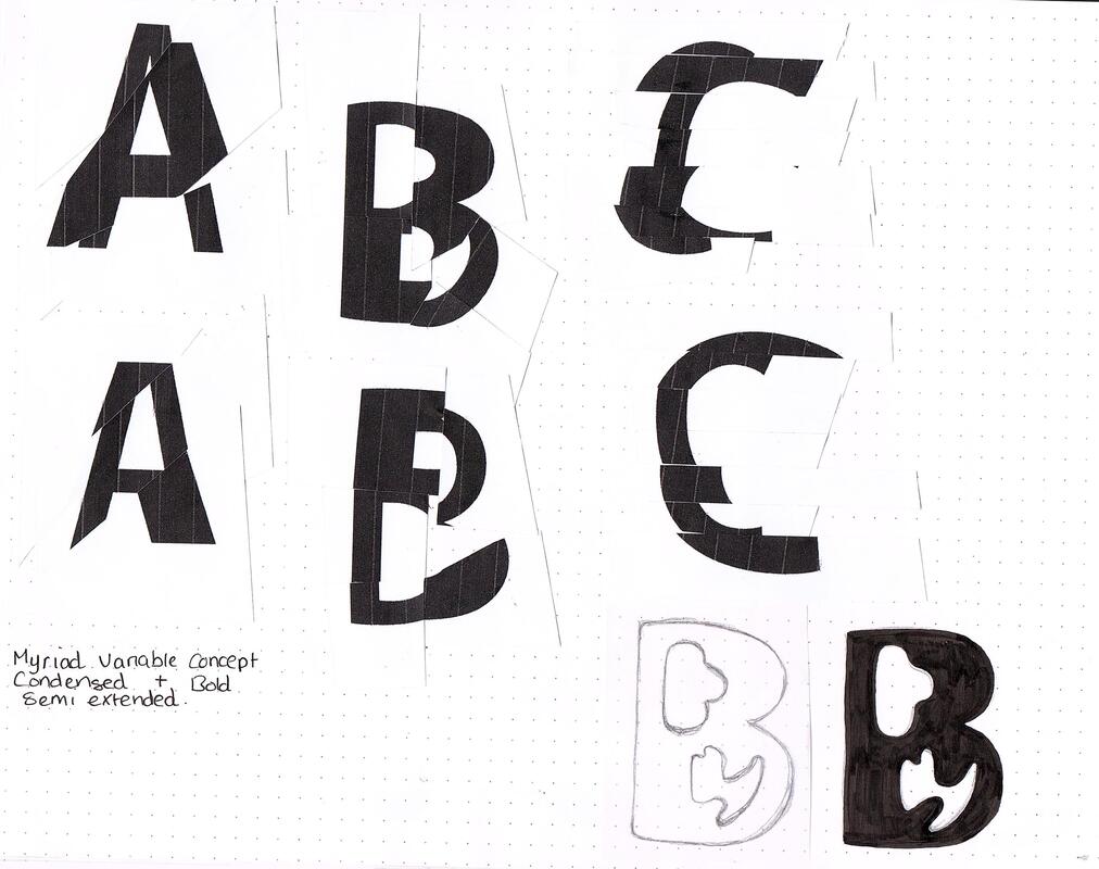
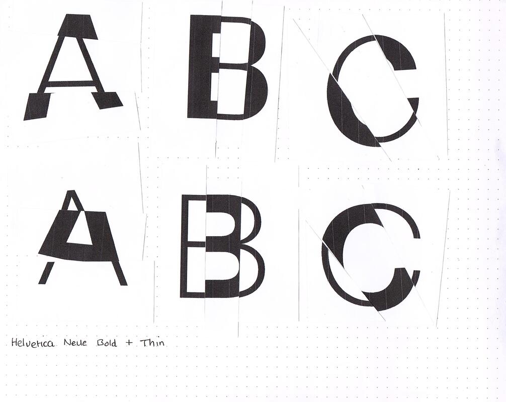
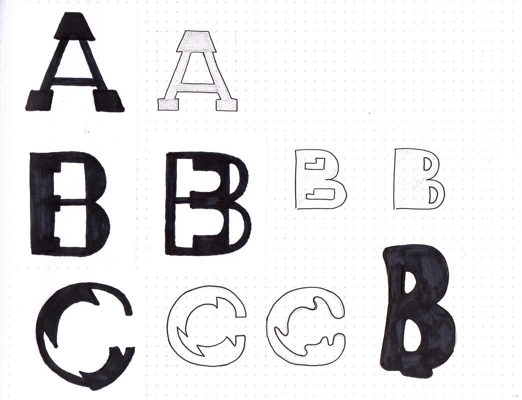
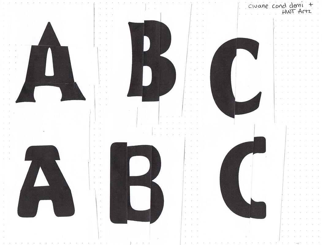
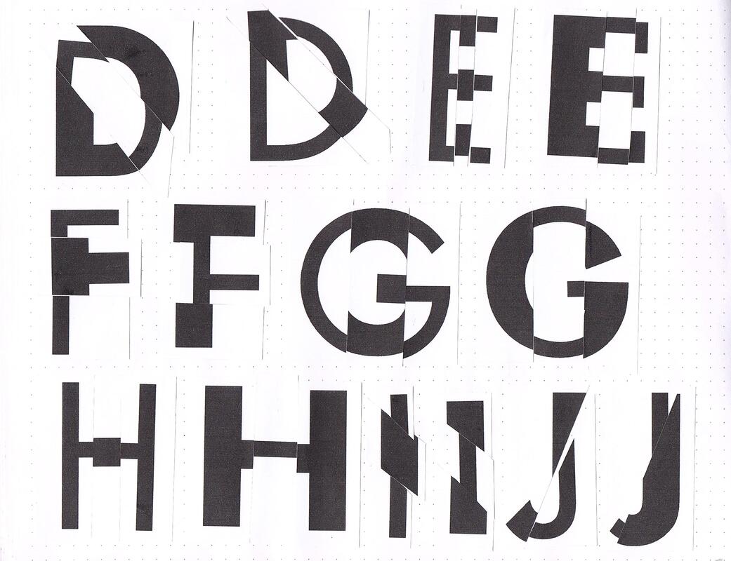
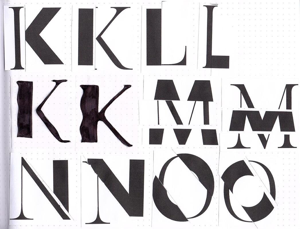
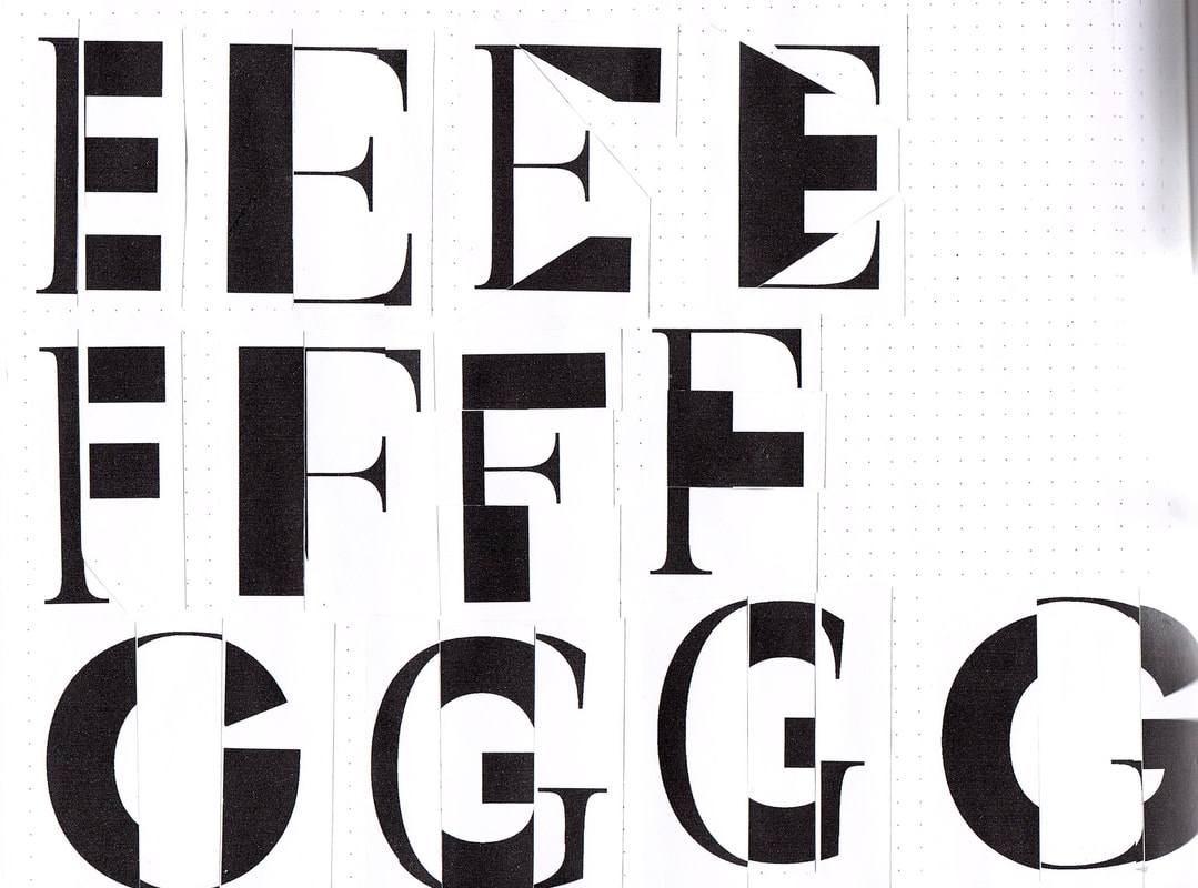
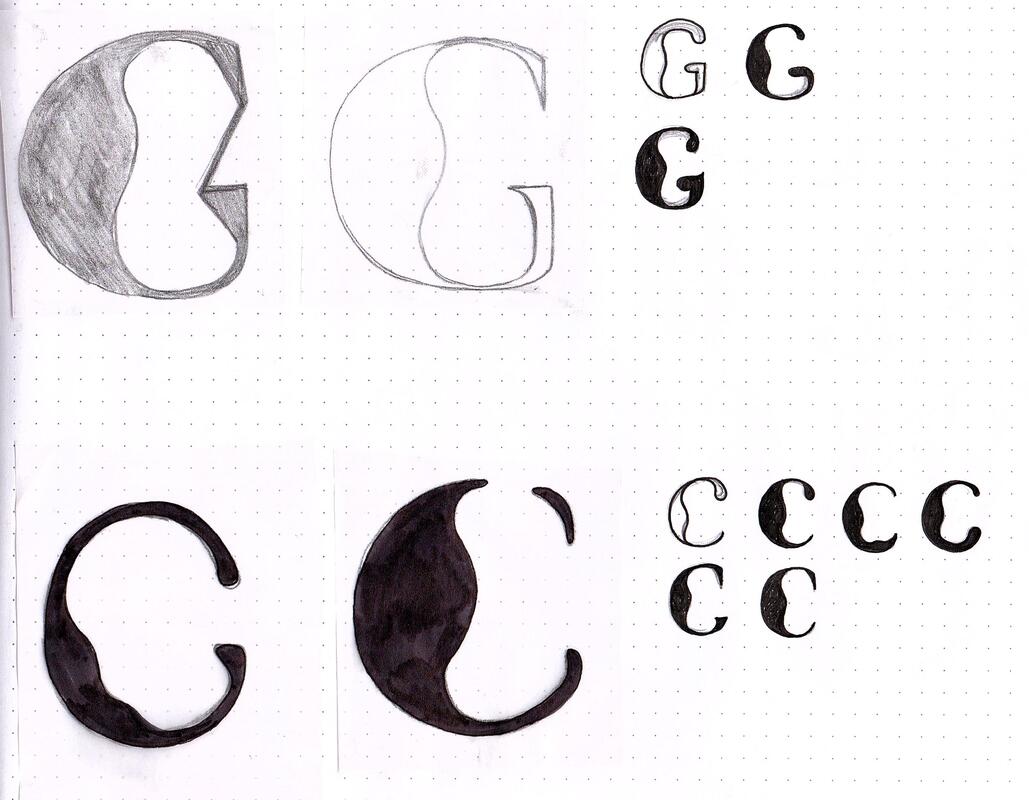
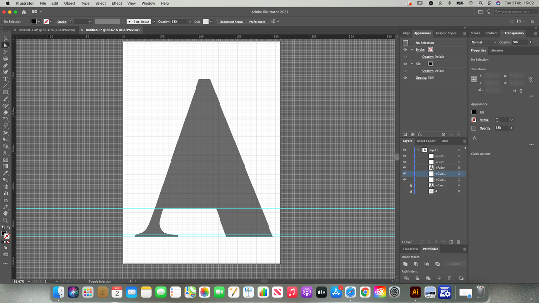
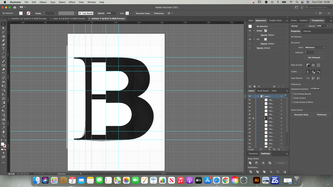
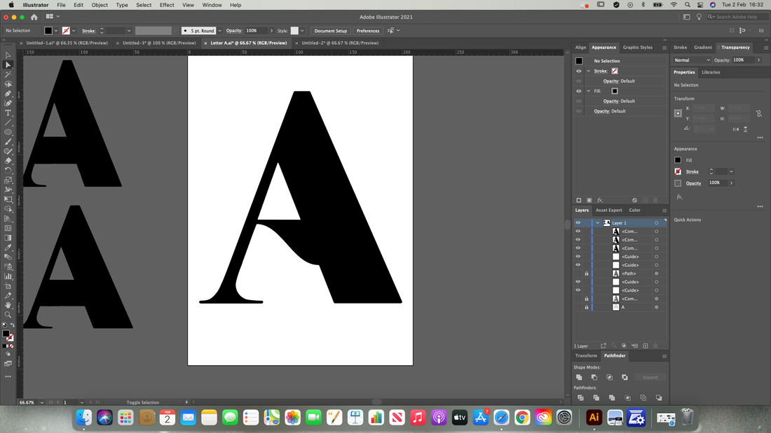
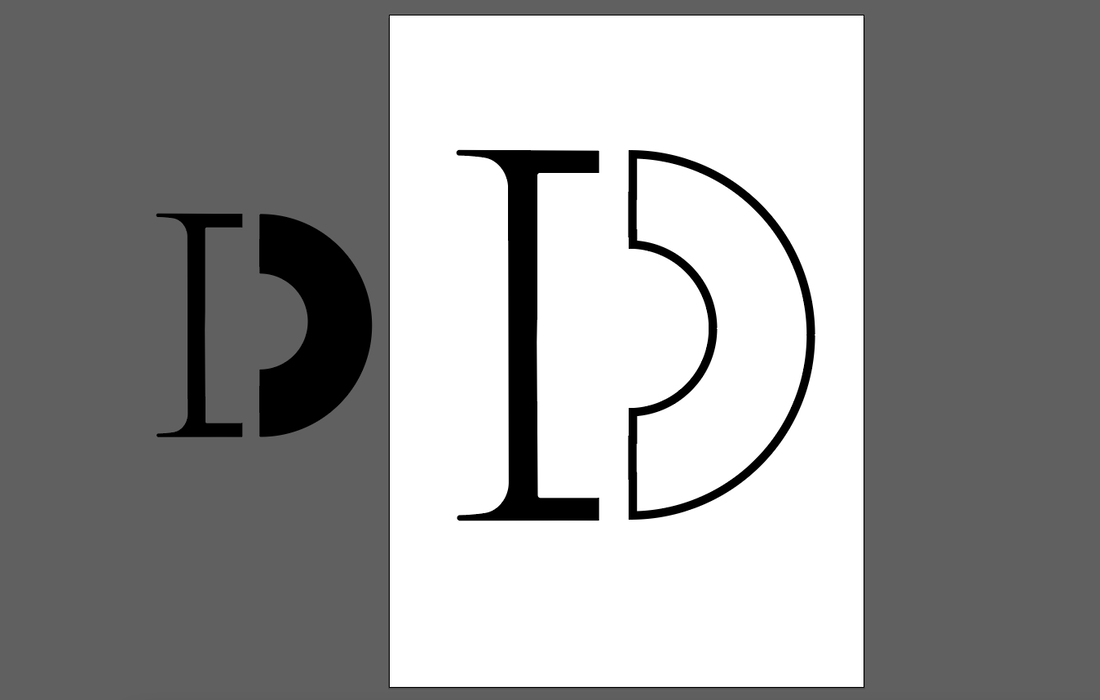
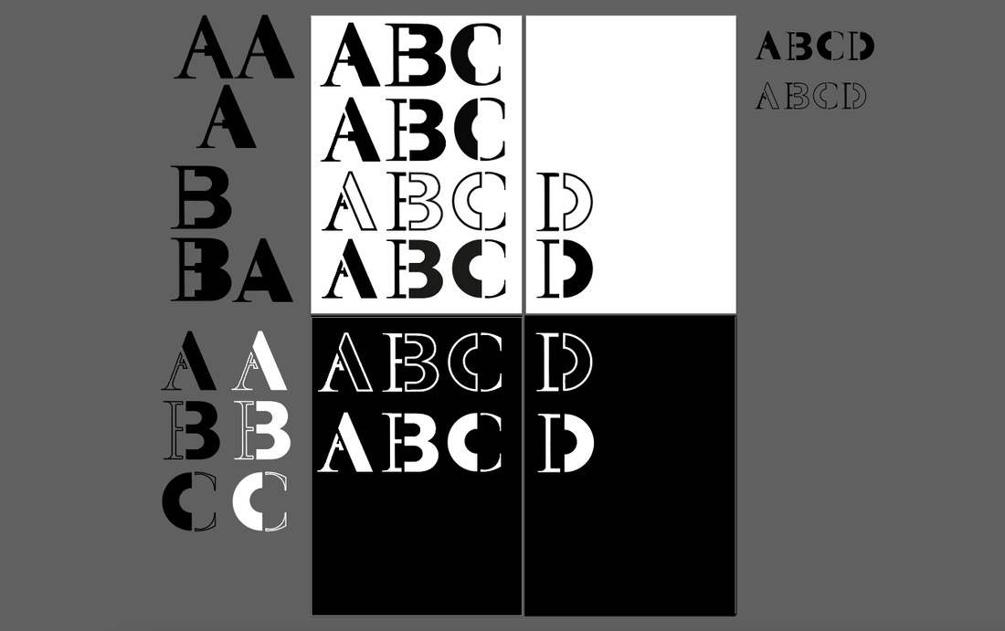
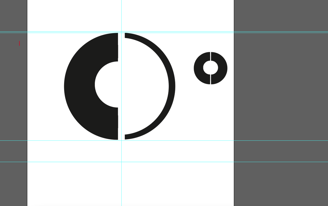
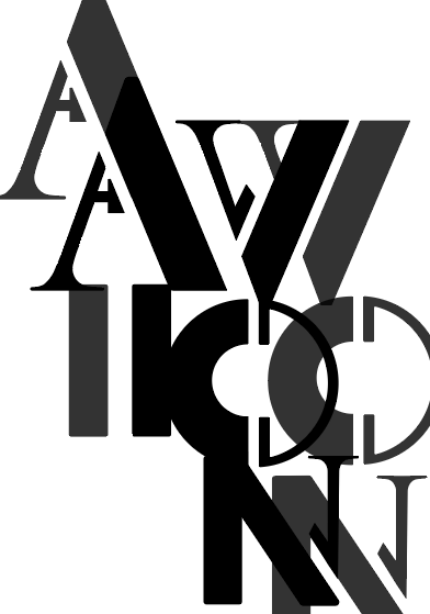
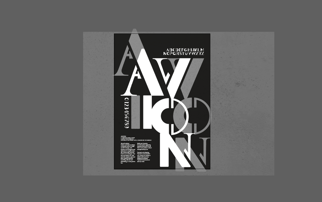
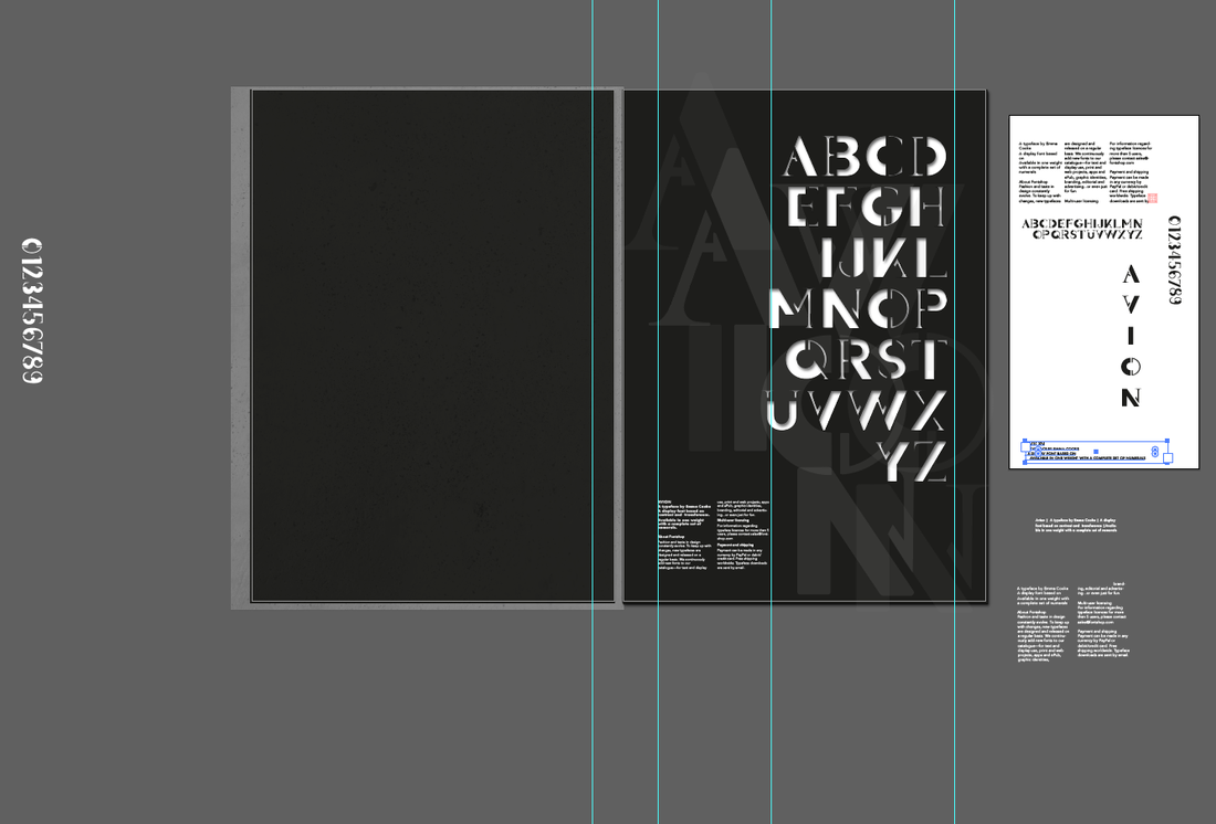
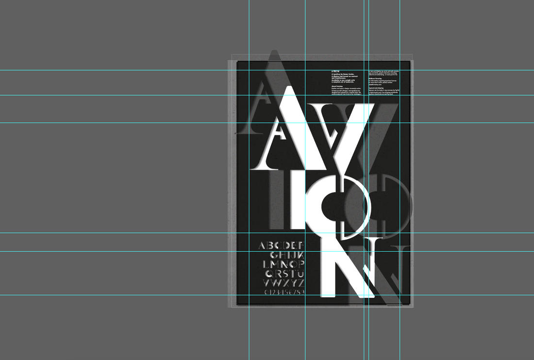
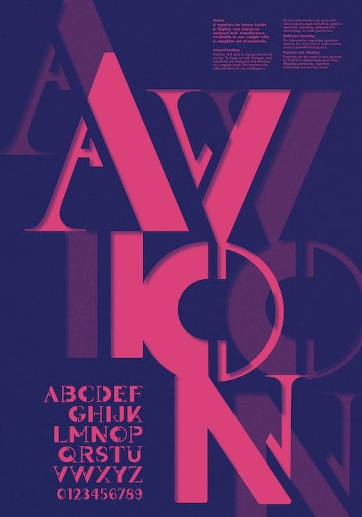
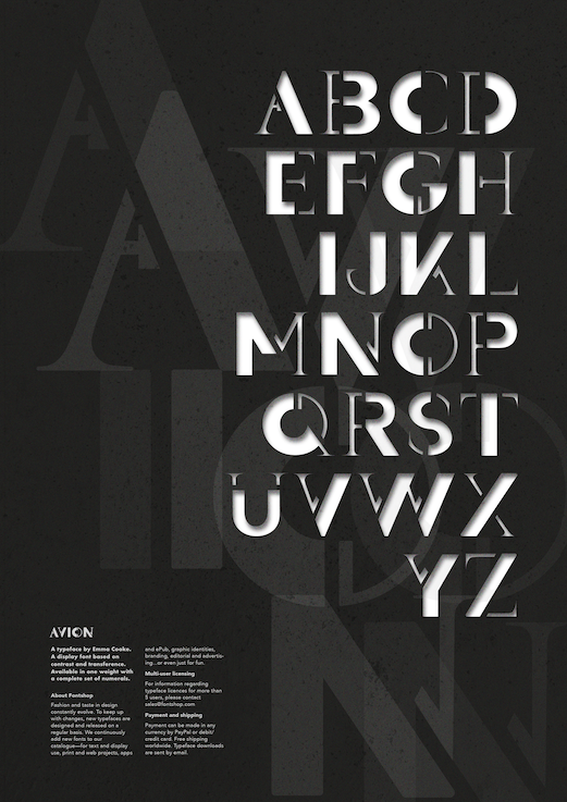
Notes: Brief For this project we had to design a display font with a complete set of characters from 'A' to 'Z', either uppercase or lowercase, plus a set of numerals. In addition, we then had create a poster to showcase and promote our typeface. Typeface Research We were given the word 'migration' as a starting point to base our font on, so I began by investigating its different meanings and interpretations. Migration can have multiple meanings such as referring to a group of people or animals migrating together, movement of people to a new area or country in order to find work or better living conditions, or in chemistry the shifting of one or more atoms from one position in the molecule to another. Below are some images I found inspiring. I liked the images that used shapes because they could be arranged in an interesting way in order to indicate movement, which was initially the path I wanted to take.  I also did some research on some already created typefaces inspired by movement. I love the way they some of them flow and look almost like liquid. I was trying to think of ways movement could be suggested such as showing speed, slight blurriness, and having a sort of shaking effect. I also like how some of these styles look quite retro and show a lot of character. 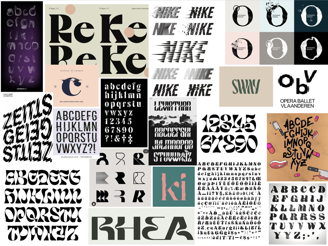 Initial Sketches and Ideas We were given two different approaches to try in order to get us started. Using dotted paper we had to use a 9x9 square grid to work with to form the basis of each character. I began by starting off with the 'control characters' first, which represent the basic square and round letterforms.    The second approach involved taking two already existing typefaces that are very different from each other, slicing and reassembling them to create new versions of the letters. The idea was the experiment as such as possible but still keep the typeface we design balanced. Throughout these sketches are also drew out new versions inspired by them; I really liked the suggested movement in the form of curvy shapes. I experimented combining the same typeface at different stroke weights (Futura Bold and Medium) and also a serif with a sans-serif (Futura Bold and Butler), combining them at different angles. Experimentation and Development I was inspired by some images I found on the internet in which I liked the shapes and wondered if I could create letters using similar shapes. Previous creations with the above techniques inspired me to combine the inspirations and experiment a bit more with some of the letters I made as well as use some other materials such as inks to create more a more flowy and organic effect. I then kept drawing further from the shapes I created from the cut and stick exercise, trying to incorporate my previous ideas of having the letters look flowy. After some feedback, I realised that trying to make the letters look flowy actually took away the interest in the letters that was created from the original cut and stick creations. So I went back to those, using tracing paper to draw over them and making subtle changes to transform them. After I had a good idea of the design, I created some quick sketches applying the same approach to the rest of the letterforms and numbers, ready to vectorise. 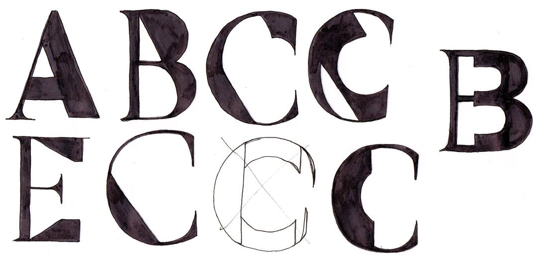 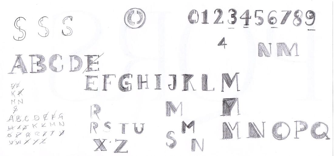 Next, I took my drawings into Illustrator to vectorise and develop them into a working typeface using my sketches and collages as a guide. I really liked idea of leaving gaps between the thick and thin parts to make it look a little like a stencil. Here is the finished typeface, shown with a few variations. It's interesting how far from my original ideas this turned out, as its more geometric than organic but I'm happy with it.  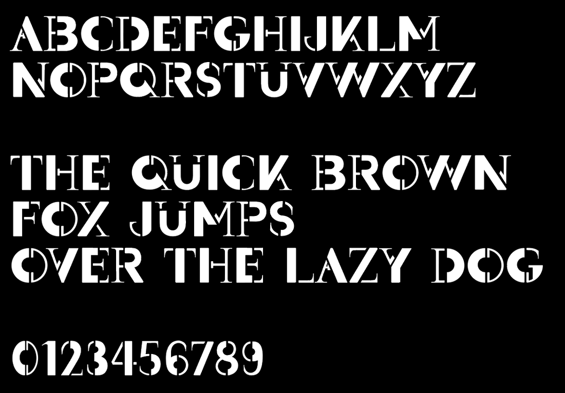  Promotion Poster Research After putting the final touches to my typeface design, I then moved on to researching ideas for the promotional poster. Looking online, I made a mood-board of some posters that I was most drawn to. I especially liked the idea of incorporating and experimenting with more colour into the design. I created another mood-board of some inspirations I found looking through the books I had at home. ('Playful Type' and 'The History of Graphic Design Vol 2') Thumbnail Sketches I then did some thumbnail sketches to figure out layout ideas for the poster. I was undecided on whether I wanted the poster to feature the name of the typeface, a quote, or focus more on just the alphabet itself. I also tried to think about how I could incorporate colour. 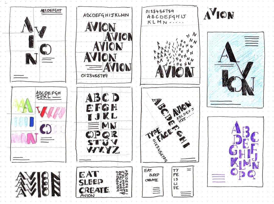 Development I then went into Illustrator to try and make the poster digitally, using my thumbnails as a guide. I started out keeping the designs black and white then eventually experiment with some colour to make the typeface pop more. Final Design Here are my final designs, as well as the typeface file below. I actually ended up sticking with the original black and white as I liked it better. I also did a mock up of them in action.
Brief
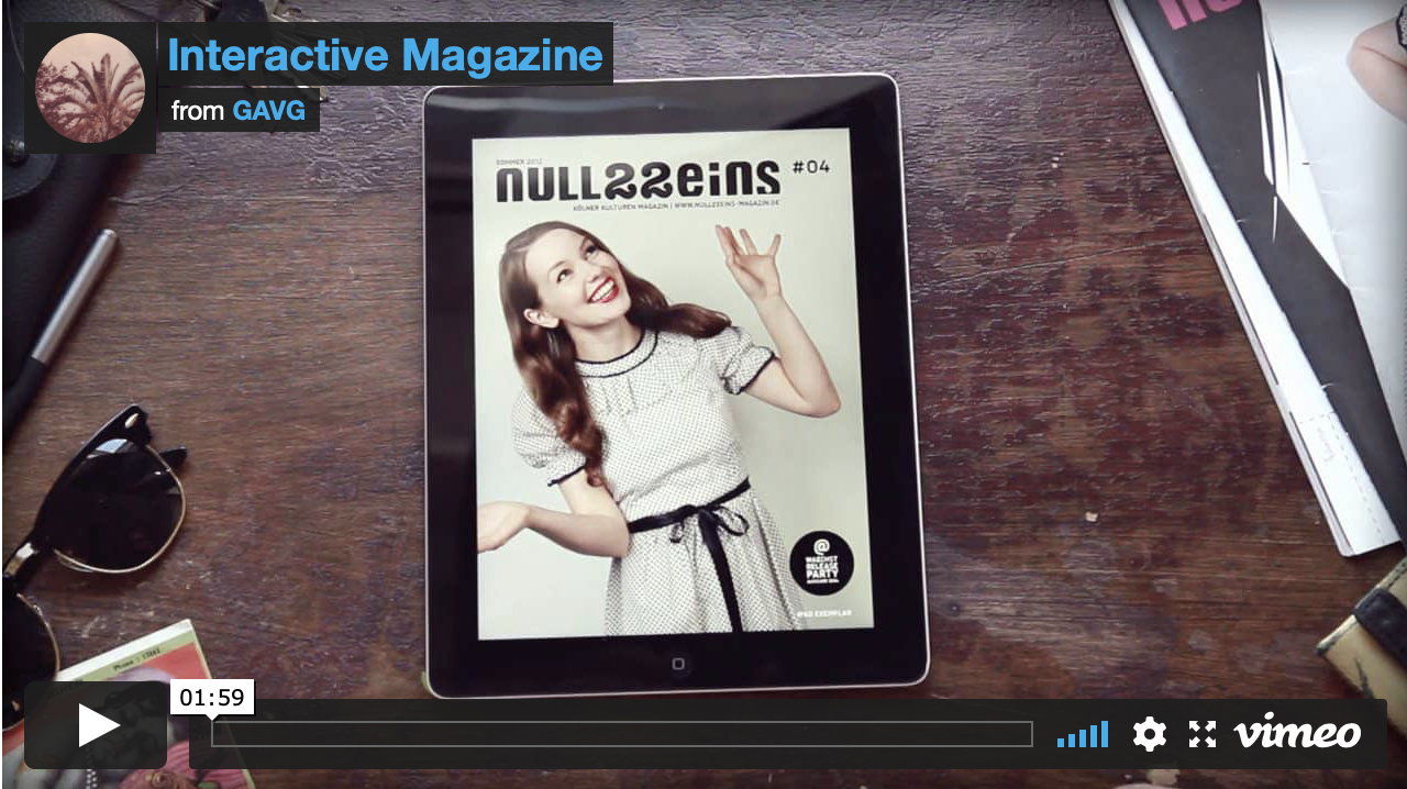
Following on from our existing print-based editorial work, we had to create a proposal for a digital version of our stories for a web-based version of the magazine. Research To begin I started by researching some examples of interactive, digital magazines to use as inspiration and give me ideas for what additional content I wanted to include such as videos, sound, and other interactive elements. I found a few that I liked on Behance and Youtube and they inspired me by how the little animations for swiping and viewing extra content enhanced the users experience. 


Addition Content
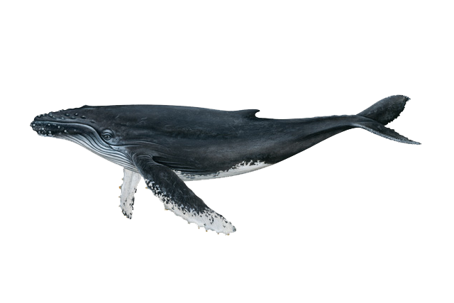
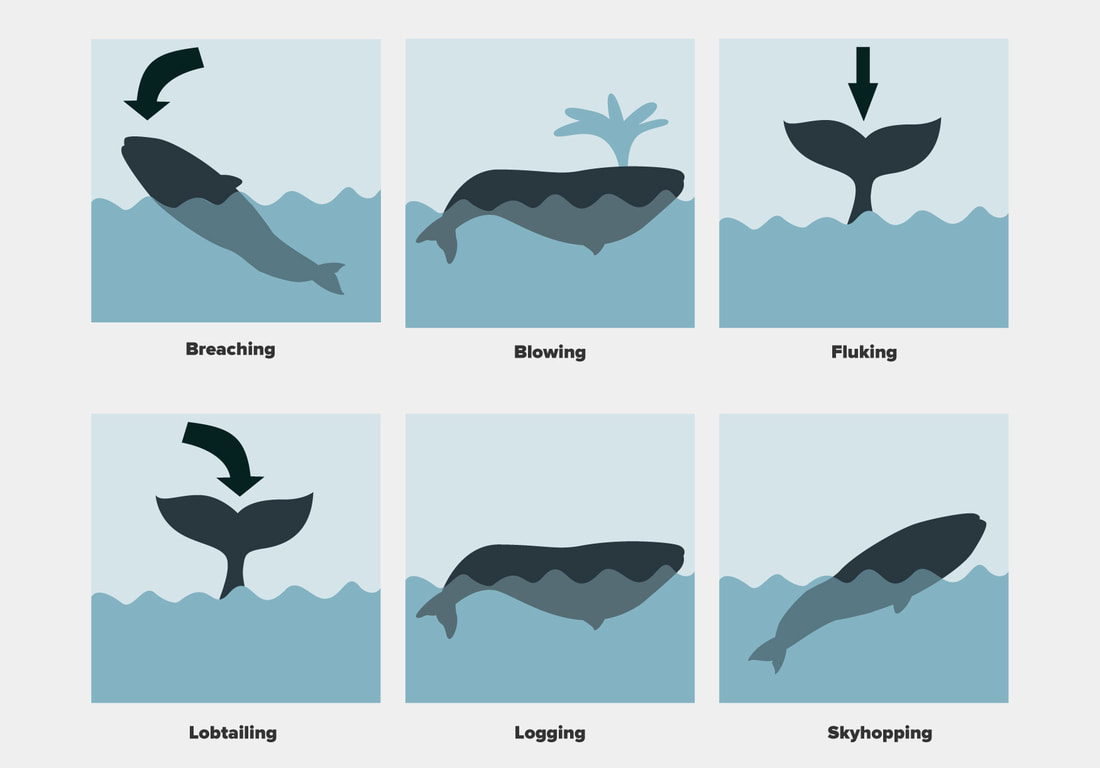
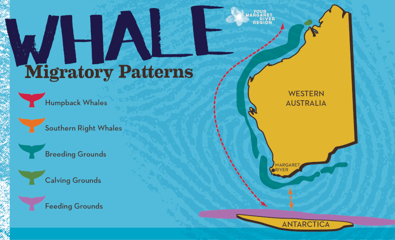
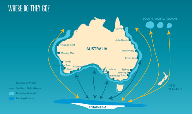
Due to this digital magazine having more pages, I needed to look for more content to include to bulk it out. I began by researching online for ideas for more relevant information. I knew I wanted to include a 3D whale image to add content around so I looked for more quick and short facts, maps to add animated elements onto, extra images for slideshows, videos, sounds, as well as general body text. Videos:
Imagery:
Information:
Initial Flat Plan of Sequence of Pages
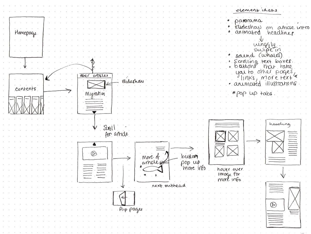
After curating some additional content, I began thinking about the order of pages, and tried to get an idea on what was going on each page, as well as where the interactive elements could go.
Thumbnails
I then went ahead and drew some thumbnail sketches for layout ideas for my pages, trying to take into account that some areas would be interactive or have some sort of effect added. I also tried to think about layouts for both portrait and landscape and how the article could look if it was a page you scrolled down to see more of it rather than each being an individual page. 
Mood Board
I decided to do a quick mood board of how I wanted the style of the magazine to differ from my previous one. I wanted it to be mainly the same but include more fun, handwritten/hand drawn elements that could be subtly animated and add a bit more visual interest. 
Initial Concept
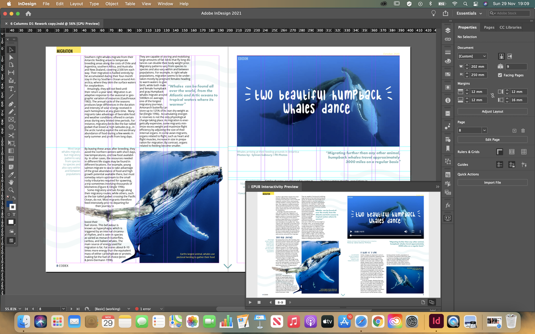
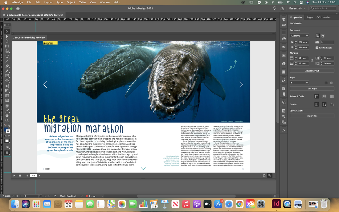
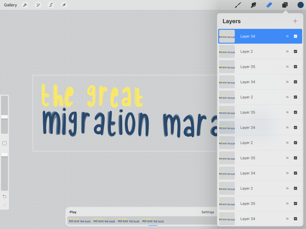
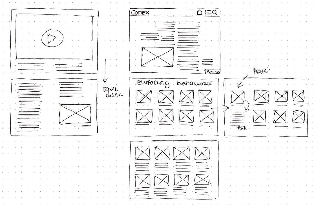
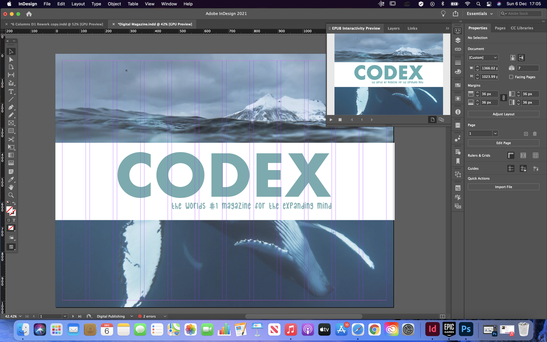
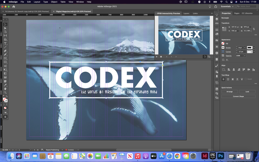
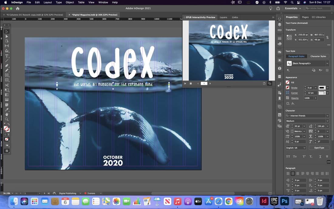
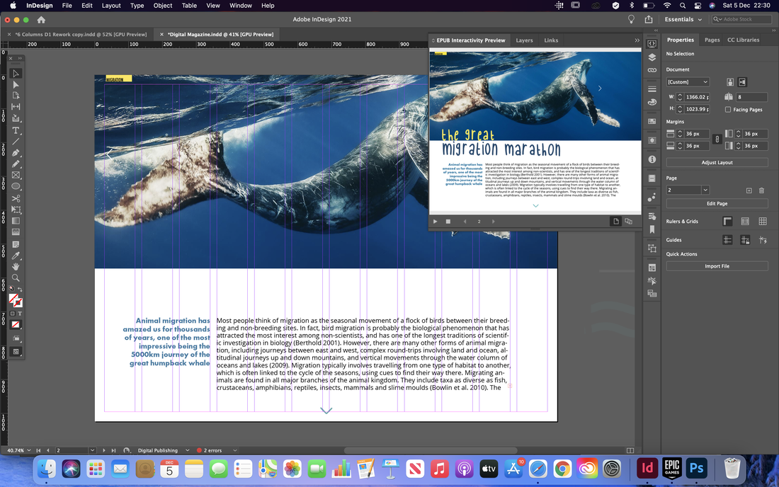
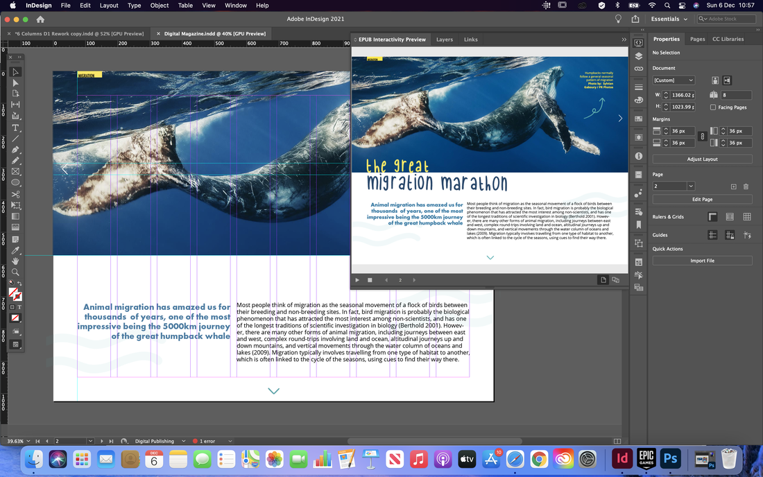
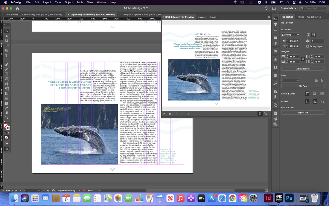
After planning out my ideas, I began to implement them on screen. I took my original spreads and edited some of the fonts and layout to fit the new style and incorporated a bunch of new interactive elements. I included animation, roll-over buttons and made gifs using Procreate to use for animated titles and sub-titles. I also included a clickable slide show of images on the articles splash page and edited a video from online to make it fit in more with my theme. 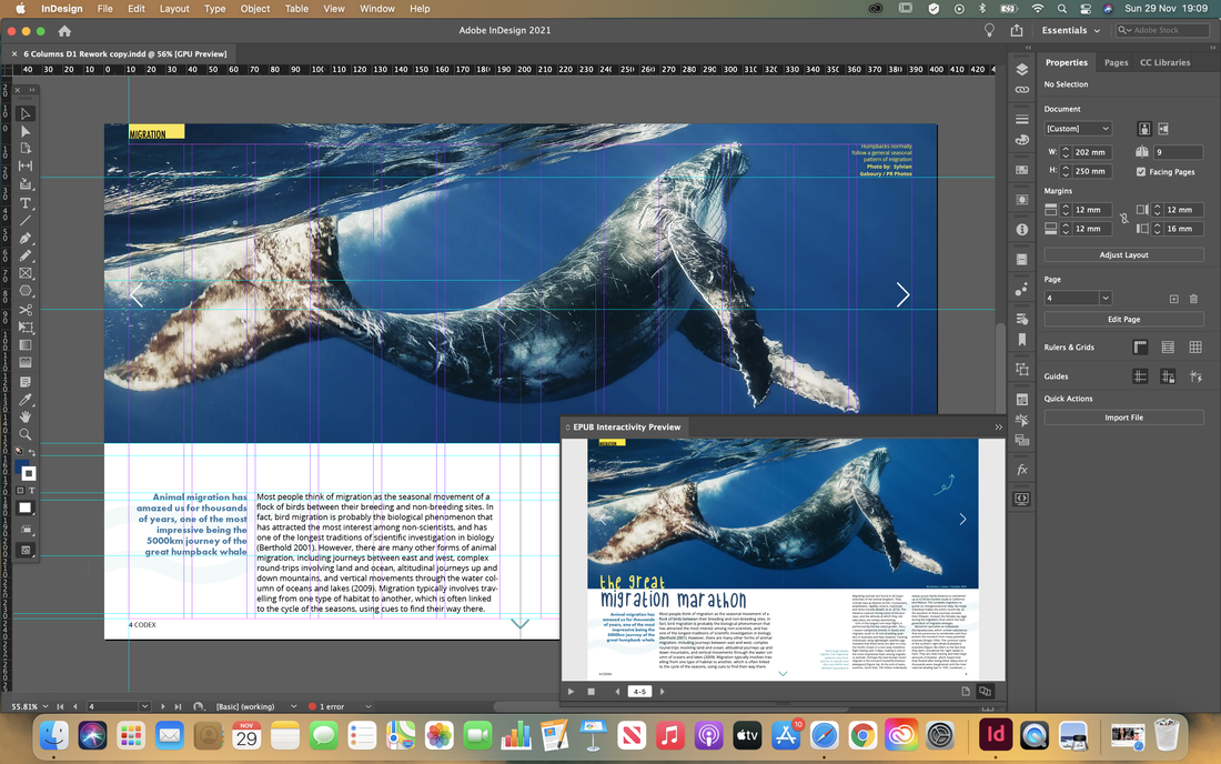


After receiving feedback on what I had done so far, I began reworking my layouts so it looked more like it was intended to be digital, rather than a printed magazine with interactive elements added to it.
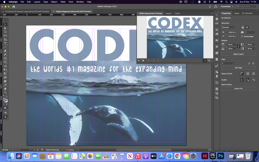
I started with the cover page, removing the featured articles so it was just an image and there name of the magazine, as the articles would be clickable on the contents page anyway so didn't need to be on both pages.
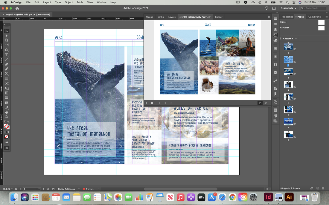
Next I started trying to design the contents page. I initially was struggling with the layout of this page but eventually settled for the hover over tiles with a bigger tile on the left with the featured articles as a clickable slideshow.
I then moved onto the article pages, rearranging the layouts to fit what a digital publication might look like. I also experimented here with landscape and portrait layouts to see how the pages might look depending on which way the reader is viewing the magazine.
I continues further making the pages using the same theme and style, rearranging the layouts till they looked visually appealing. I also decided to design a menu bar at the top to give it a more website style look and to add extra navigation.
Final Design
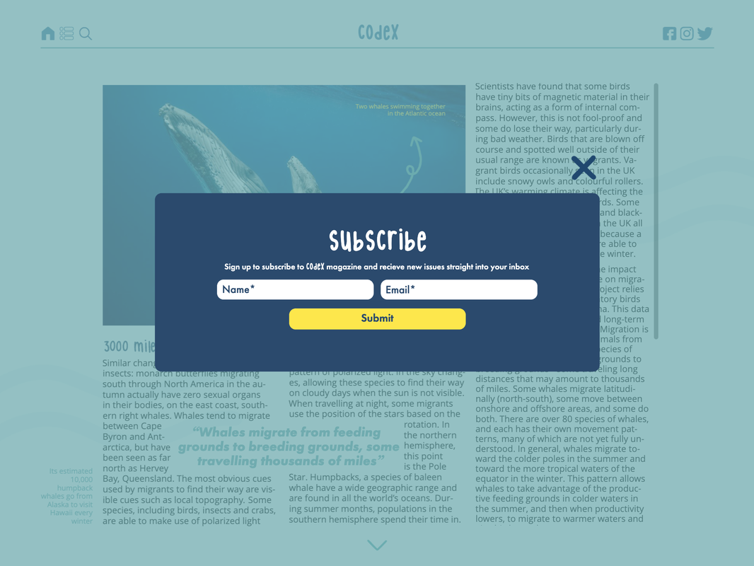
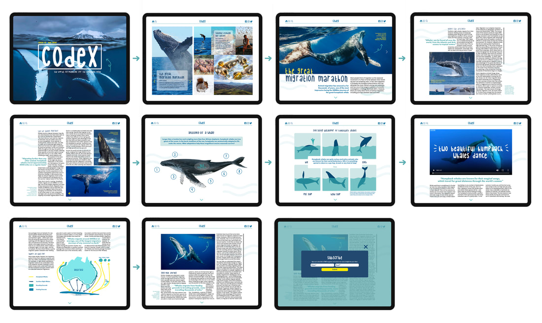
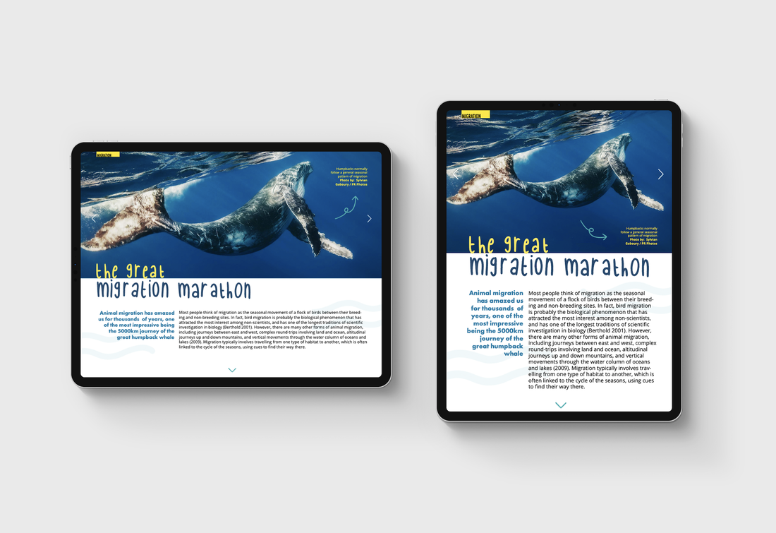
Below are screenshots of the final pages along with the interactive digital publication. I also included a storyboard with mock ups of the screens to show what it looks like on a iPad device. 


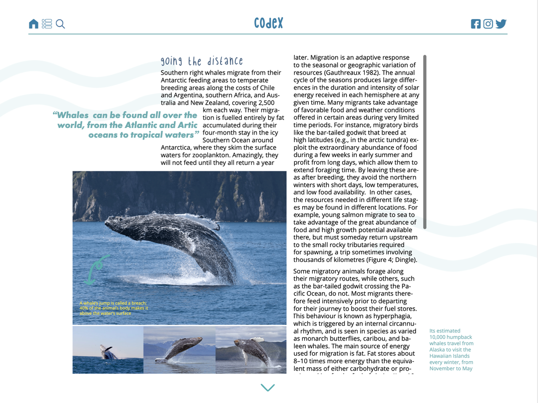

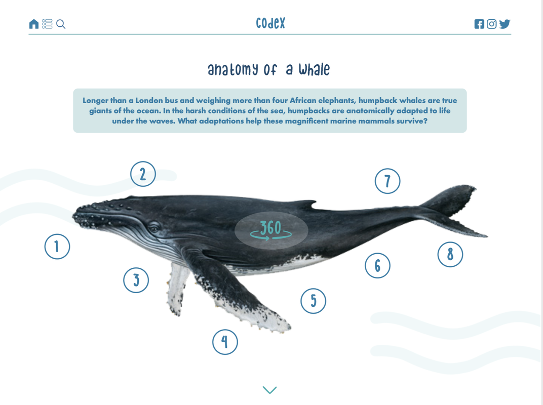
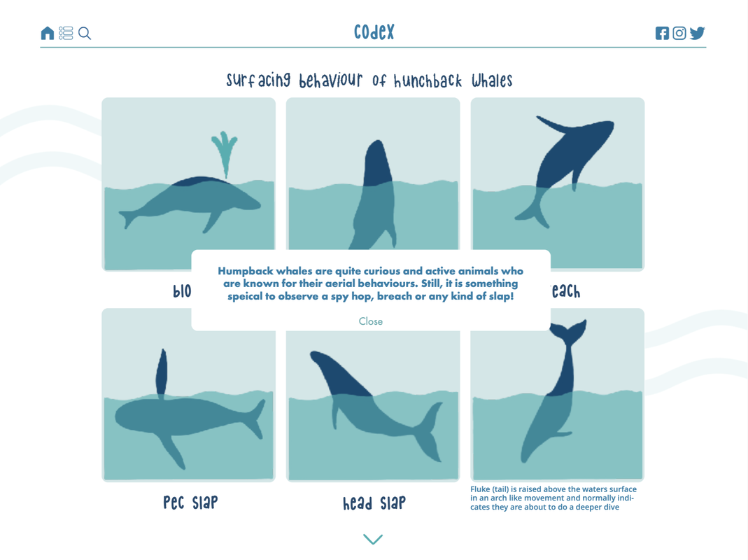


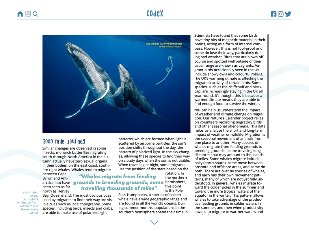
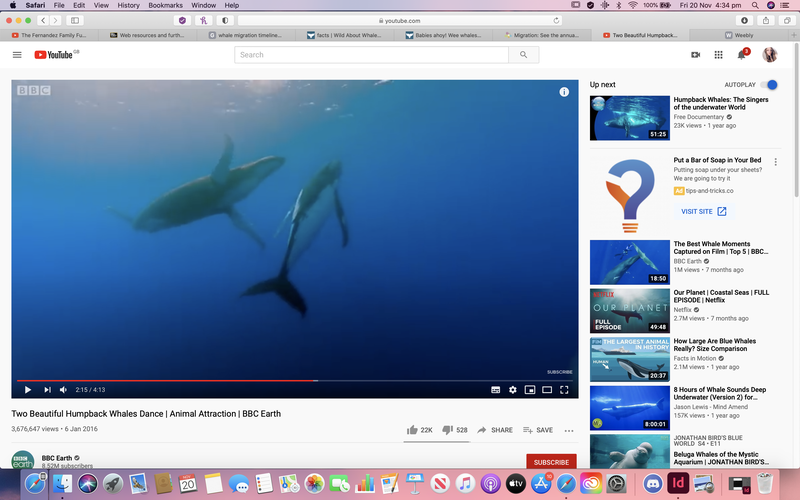
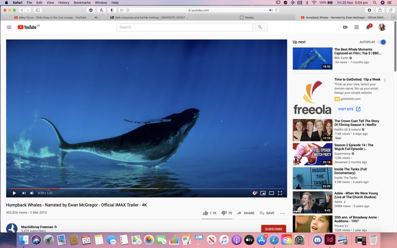
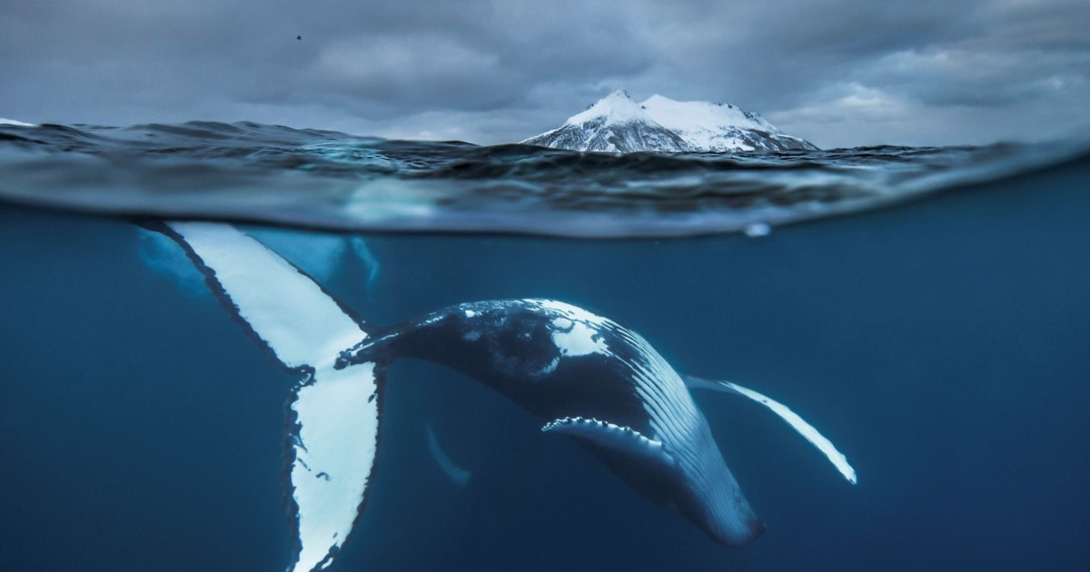
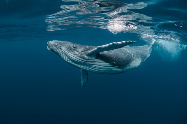
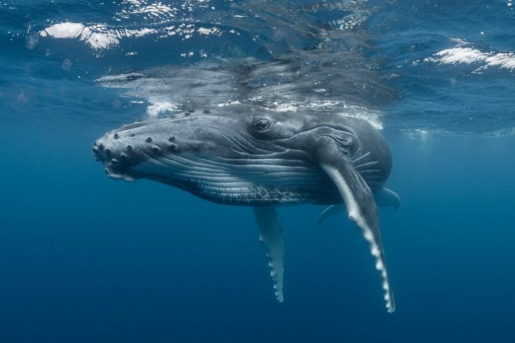
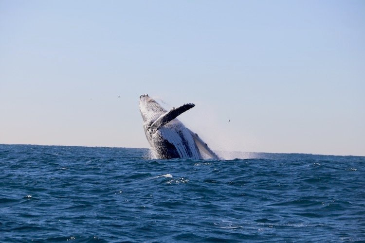
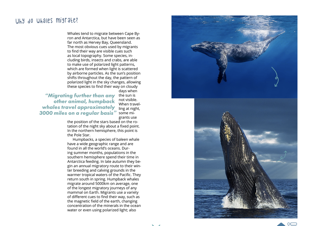
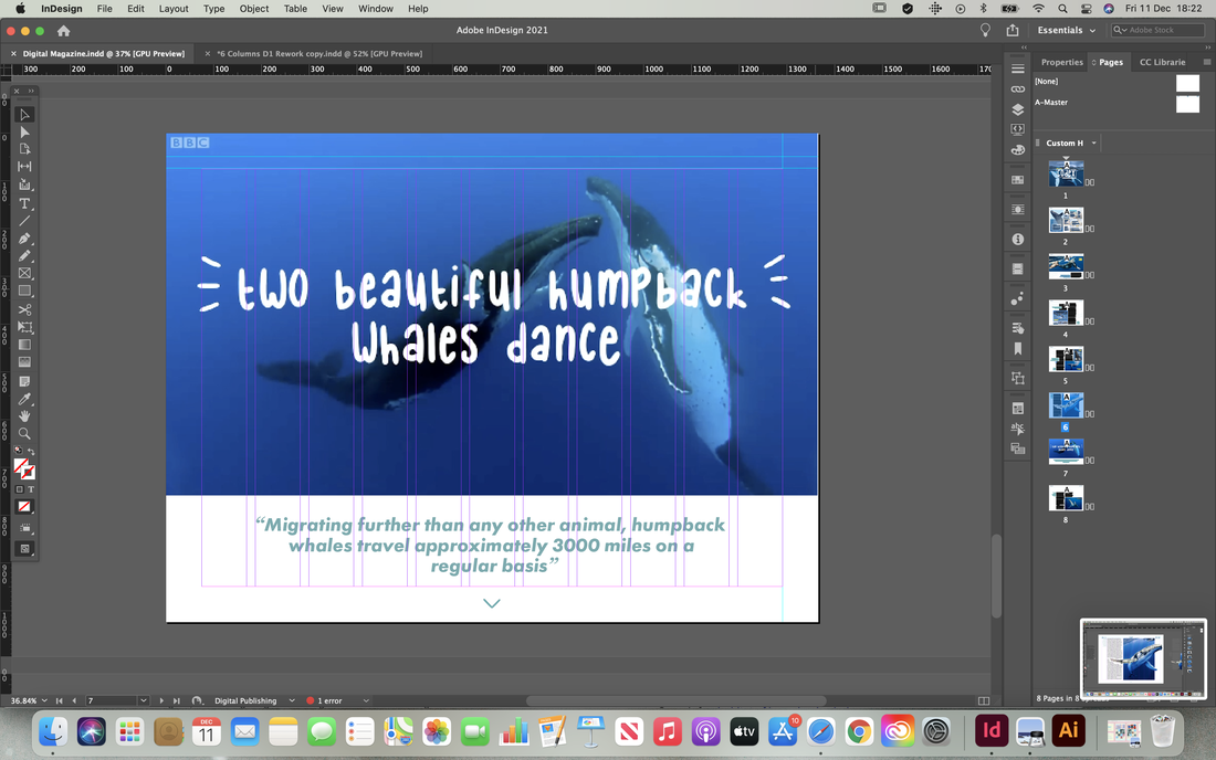
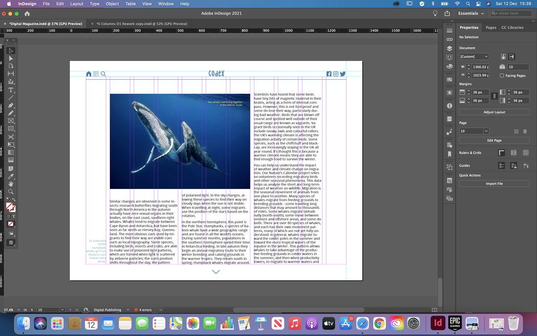
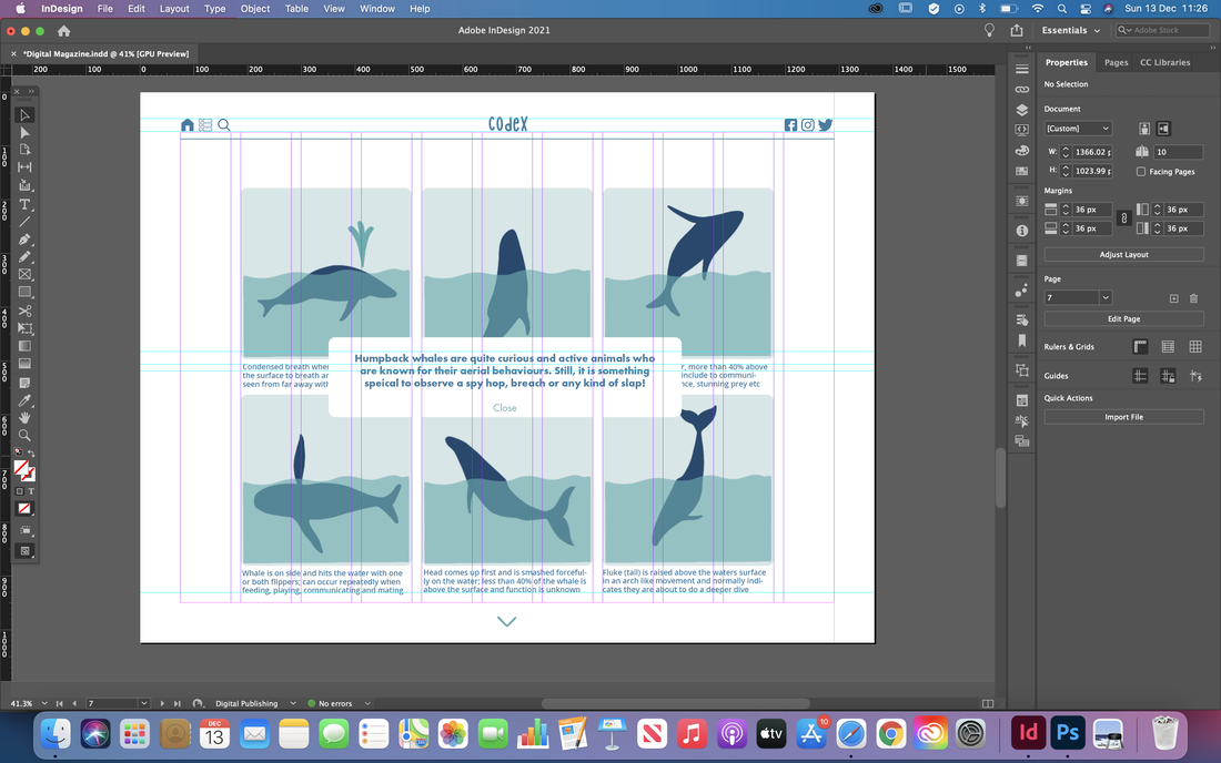
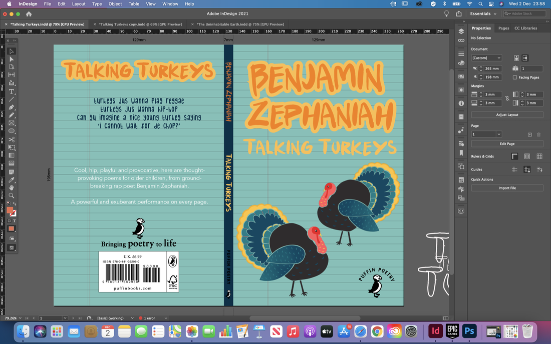
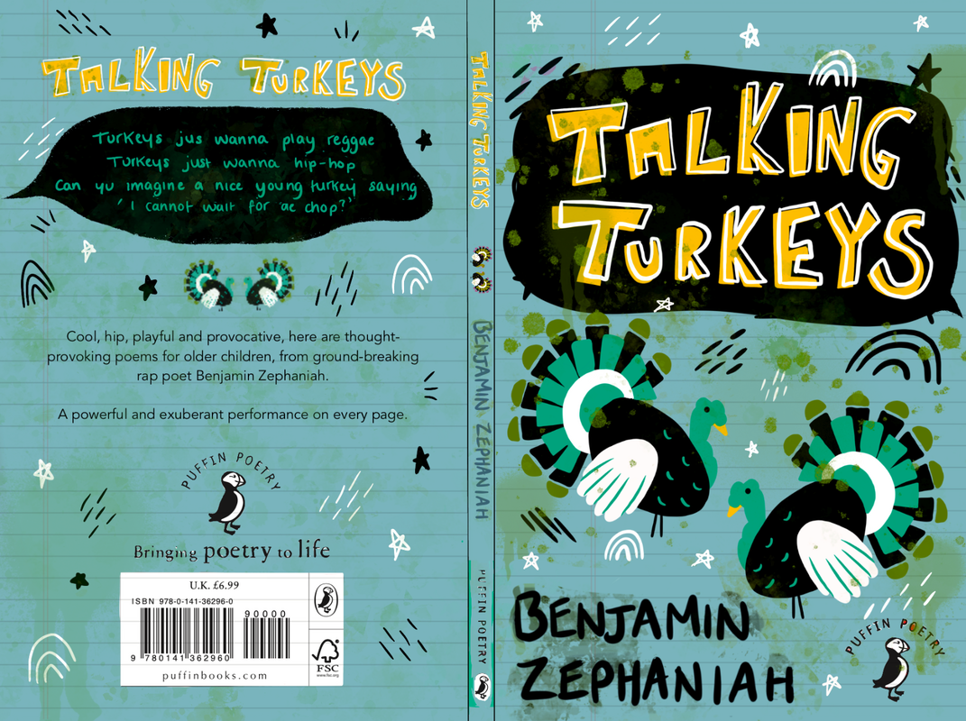
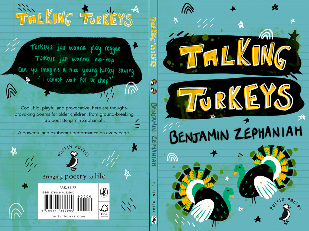
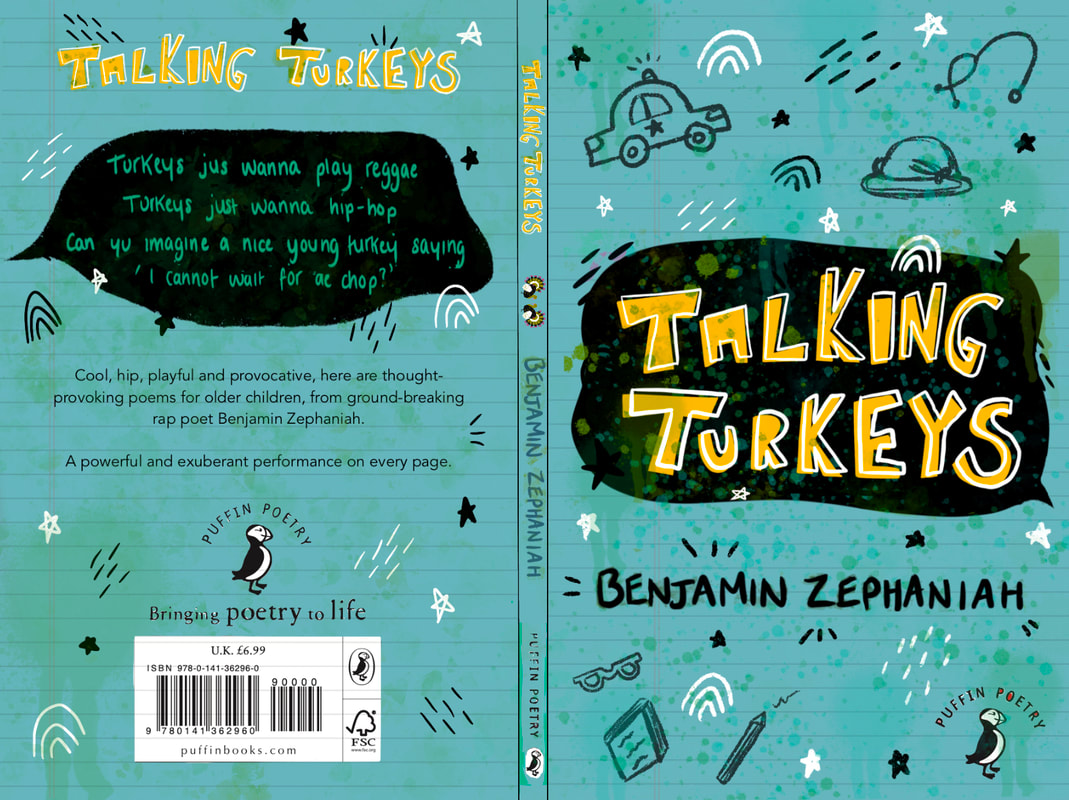
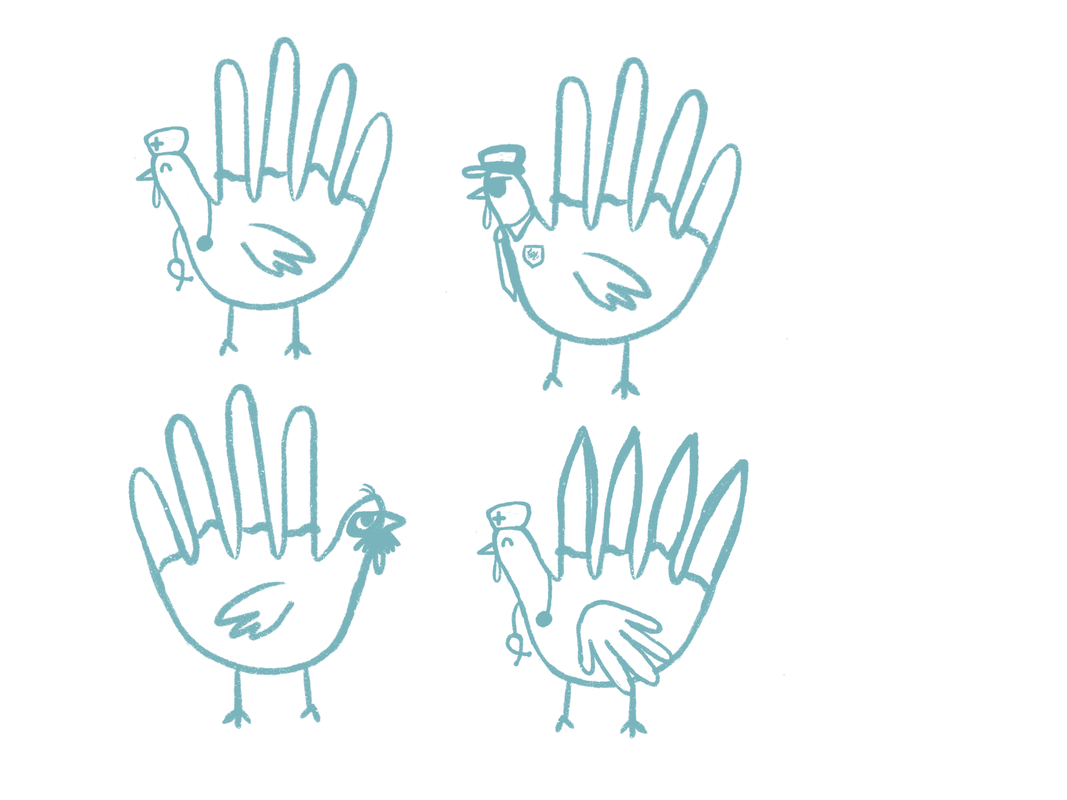
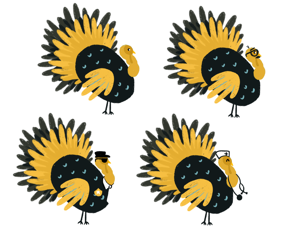
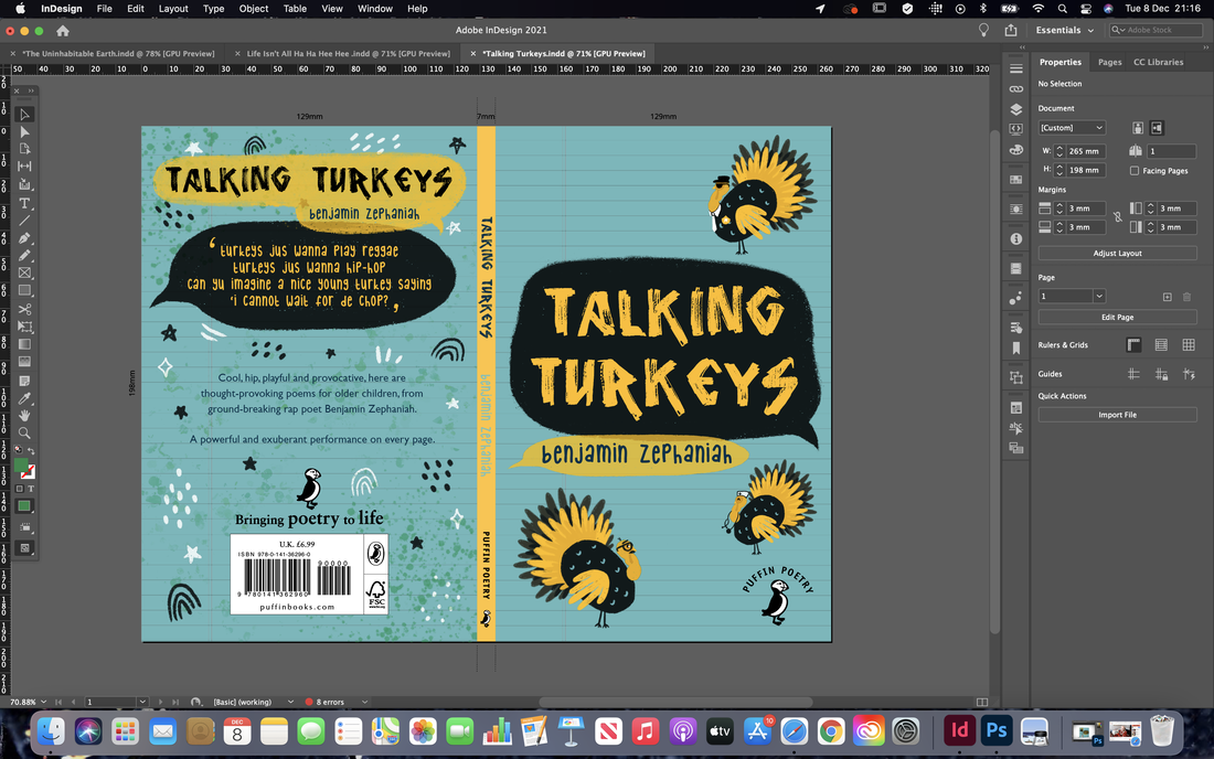
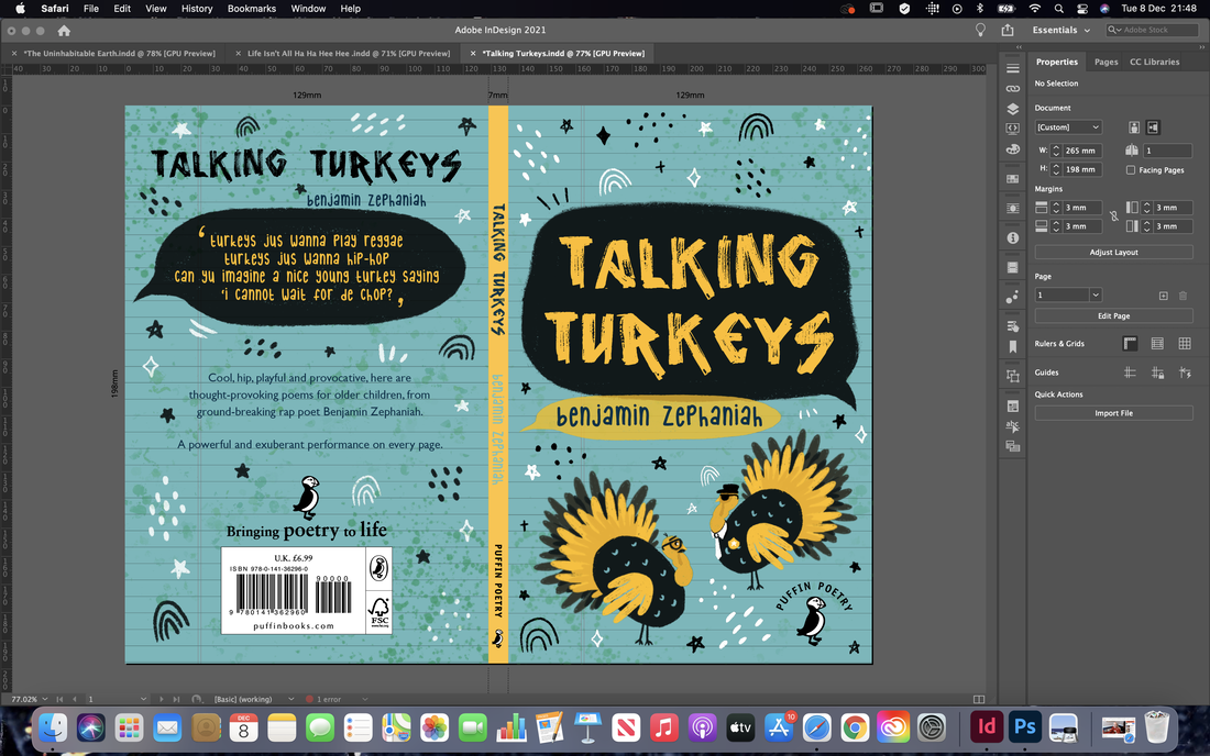
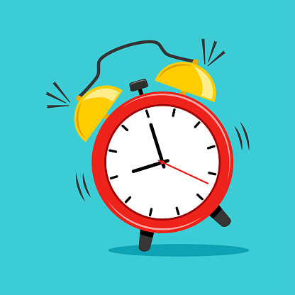
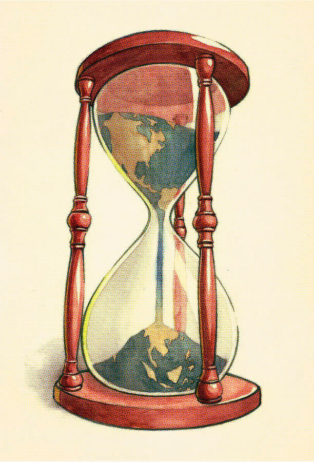
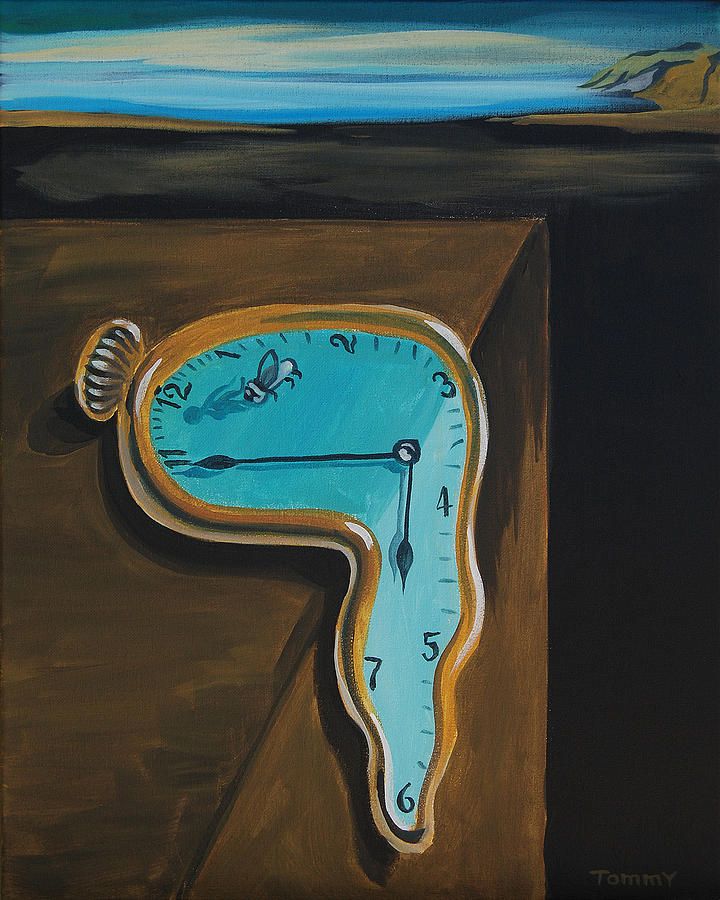
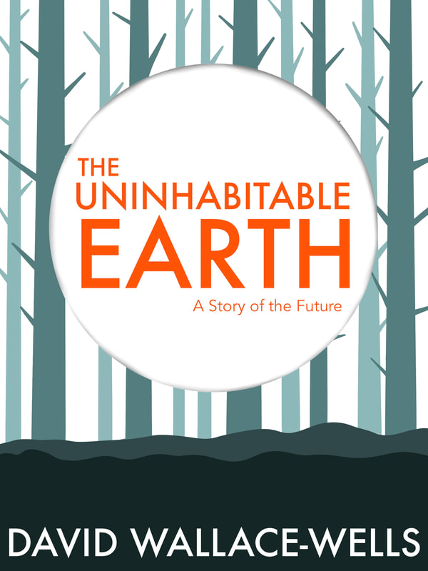
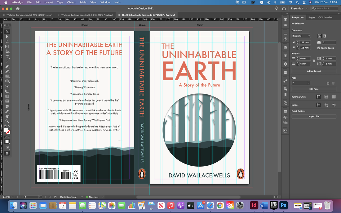
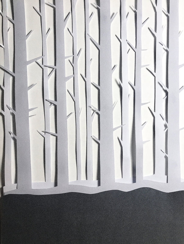
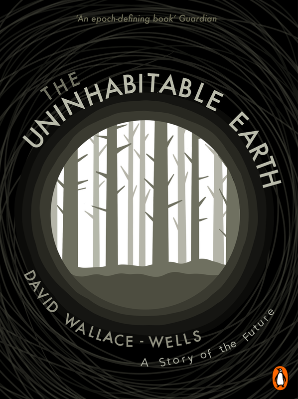
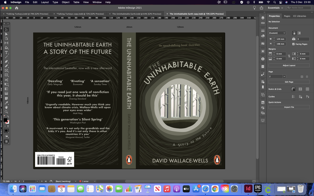
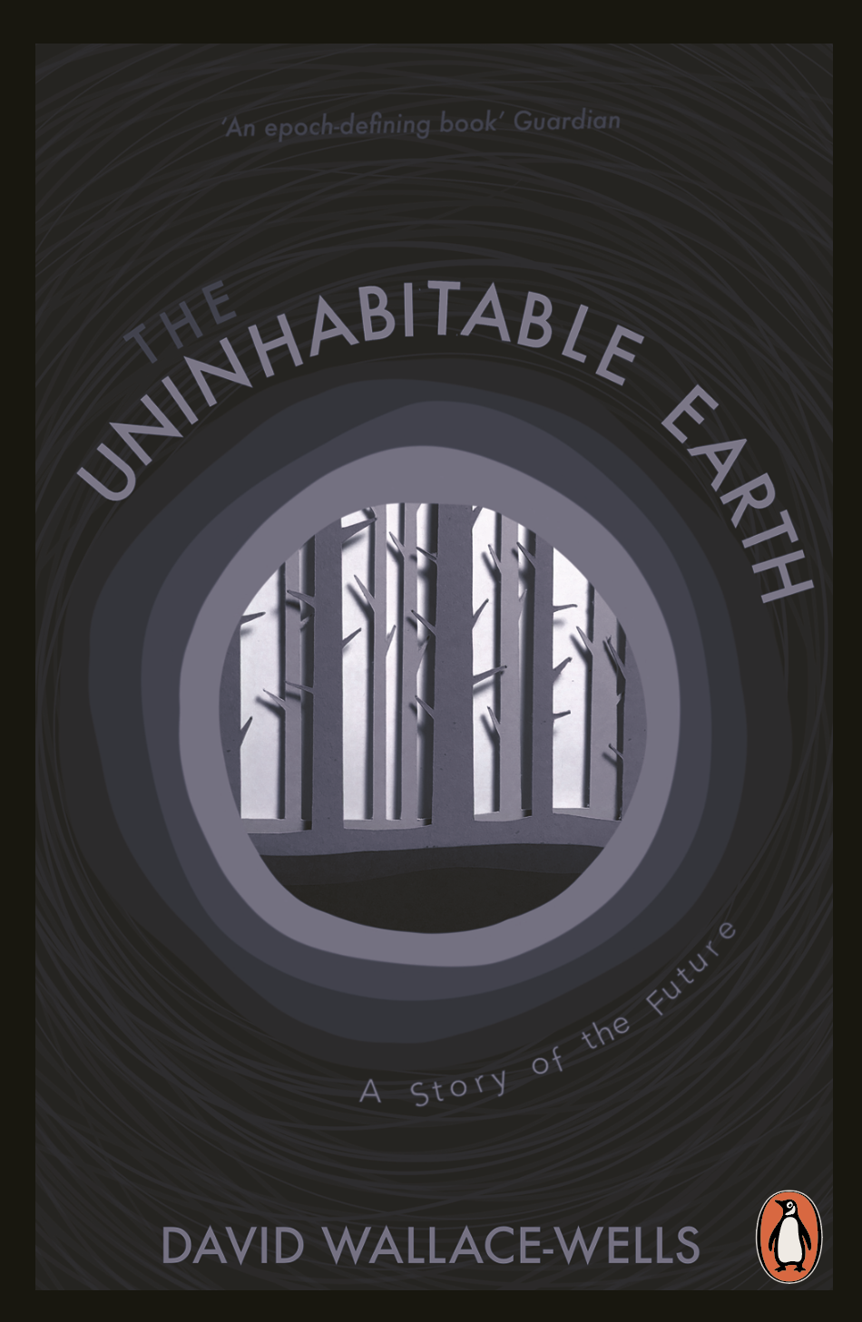
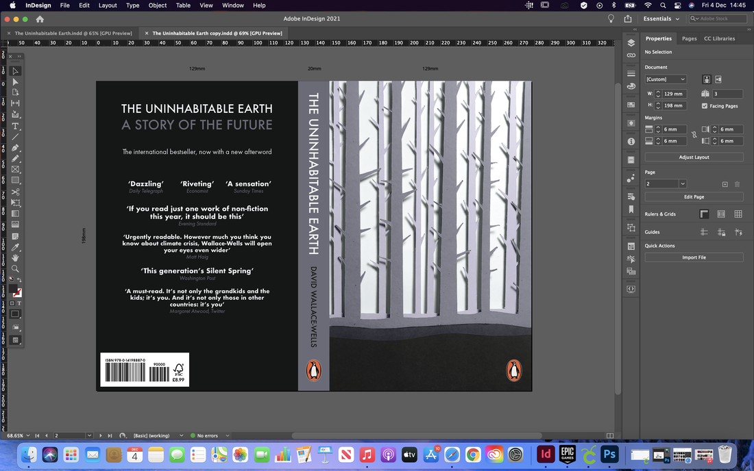
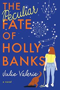
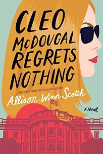
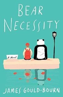
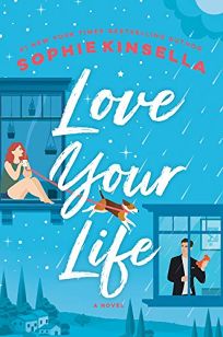
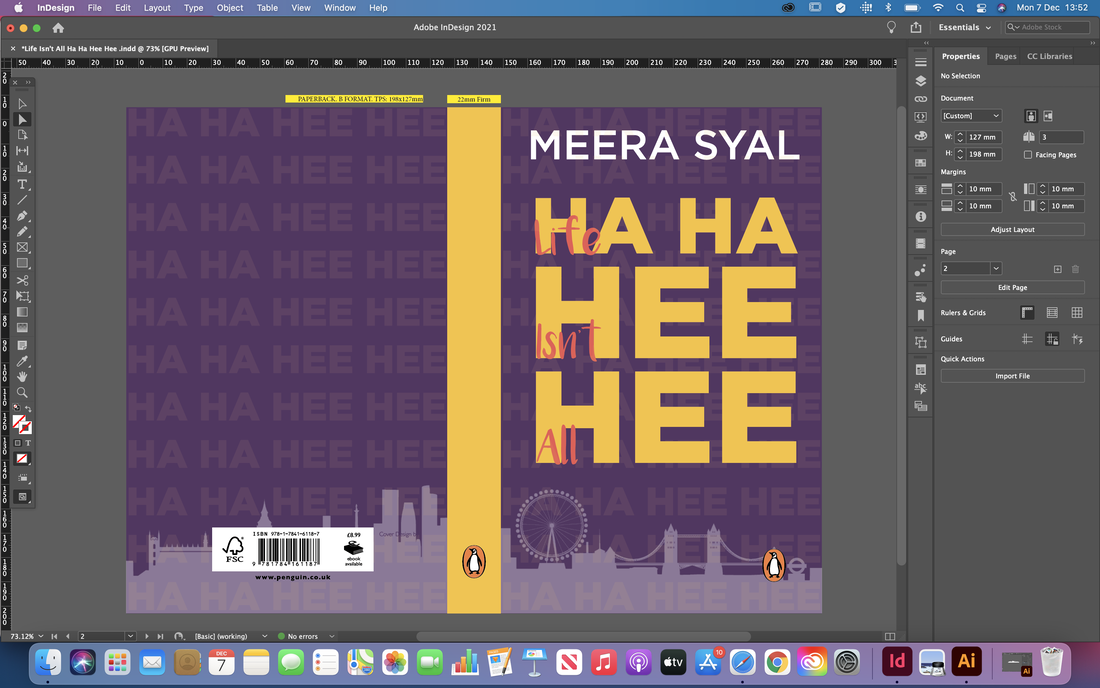
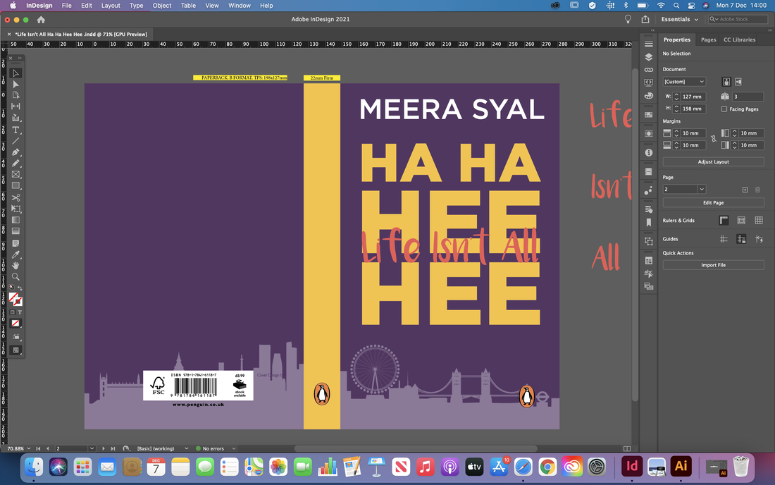
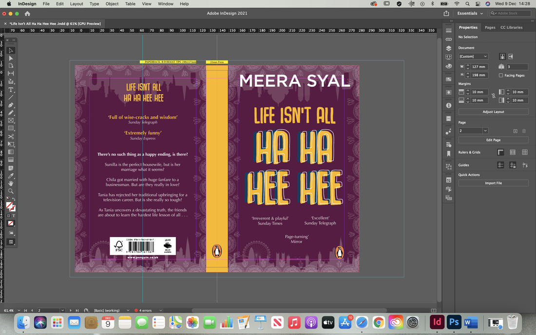
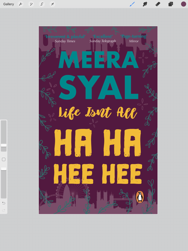
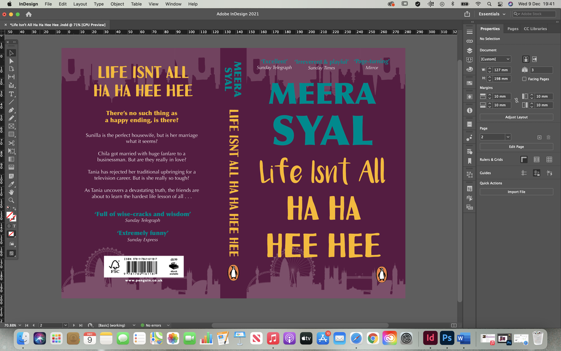
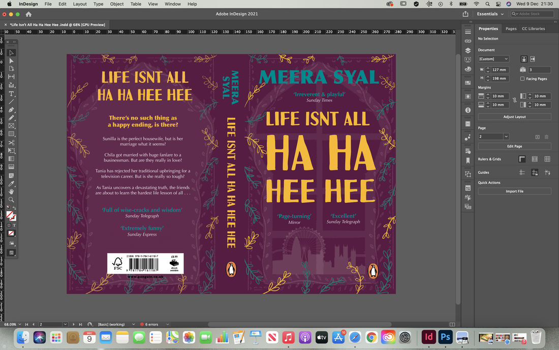
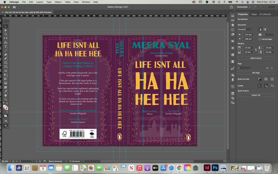
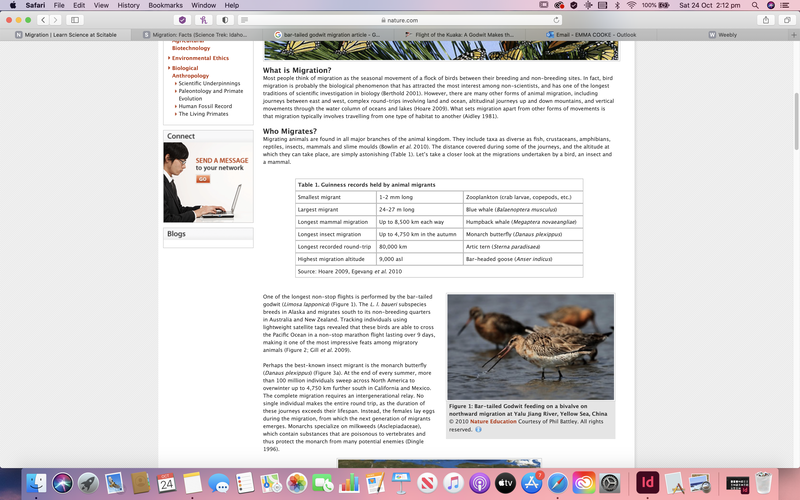
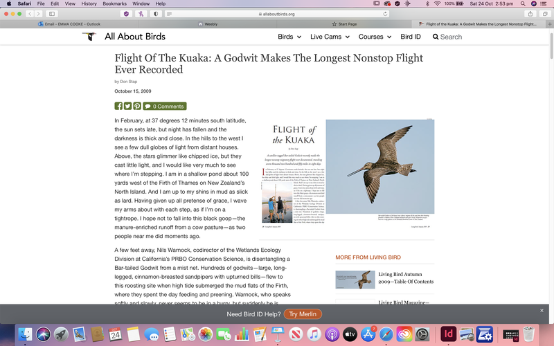
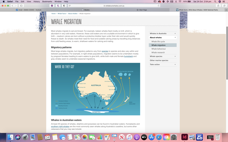
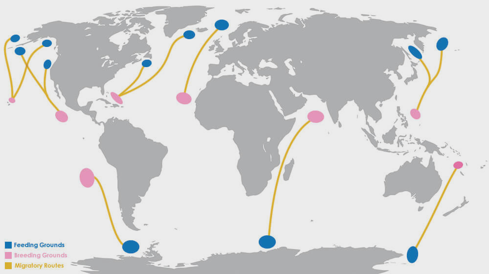
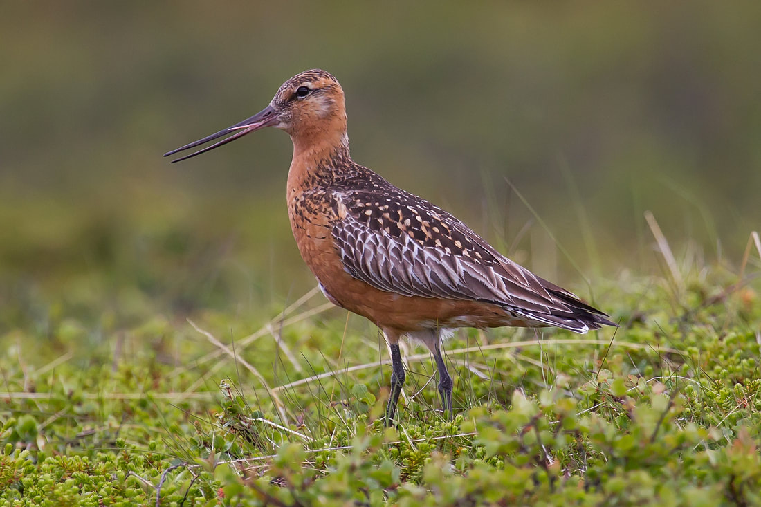
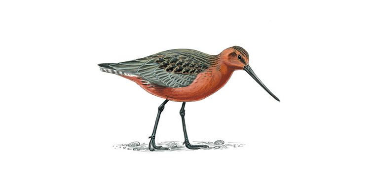
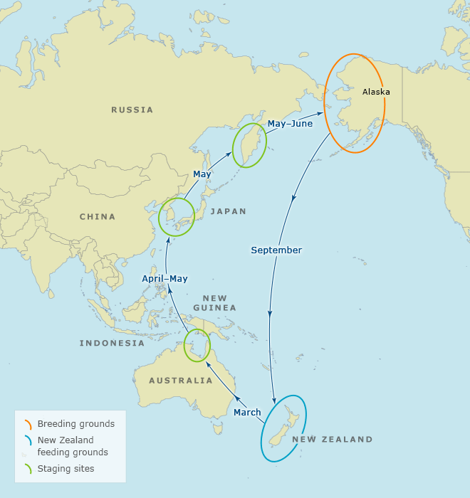
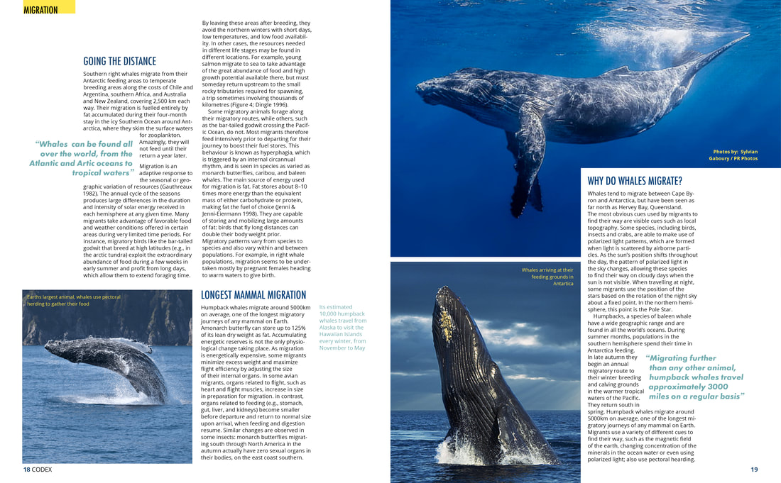
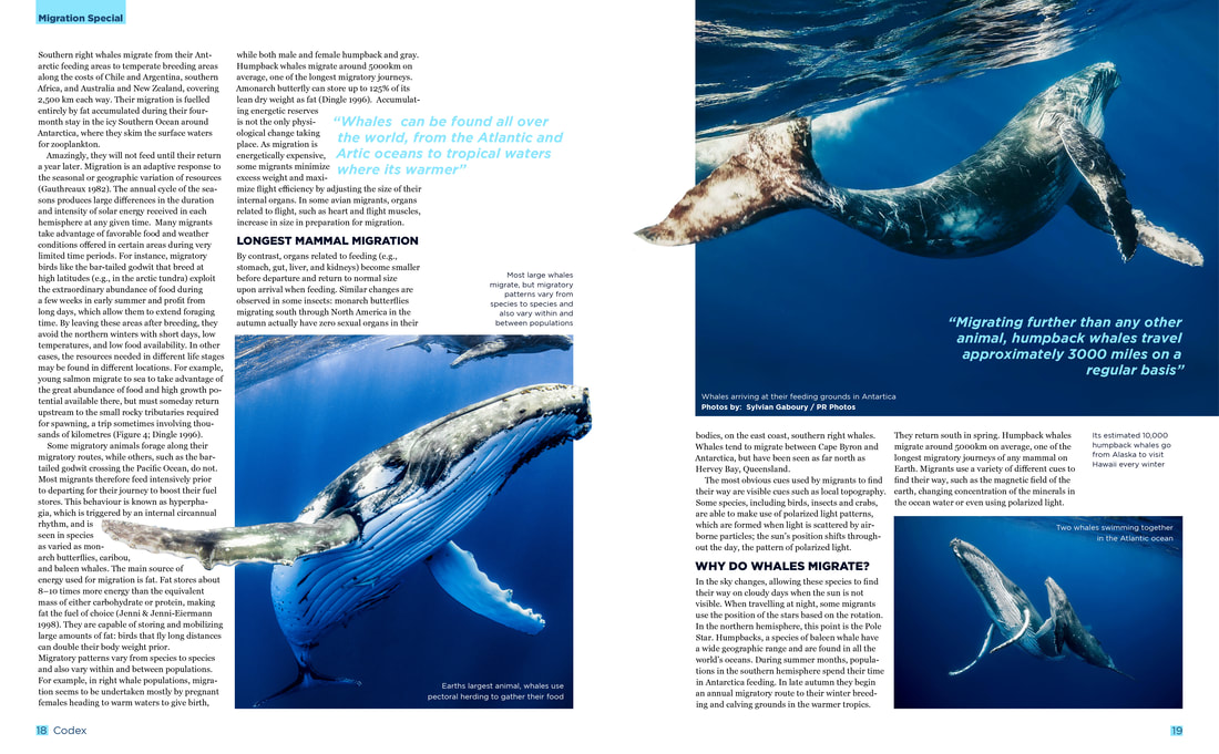
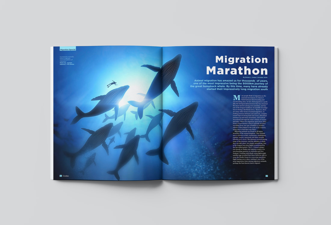
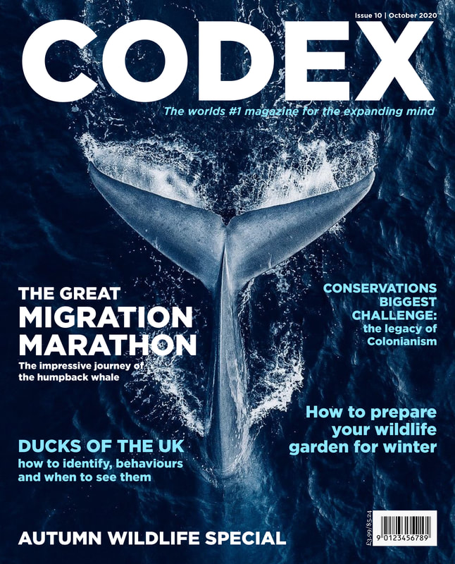
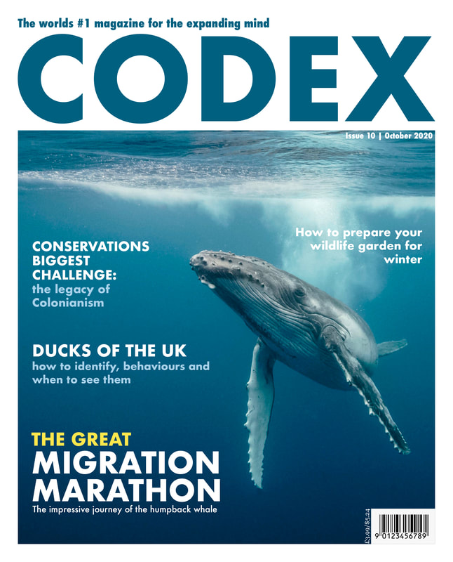
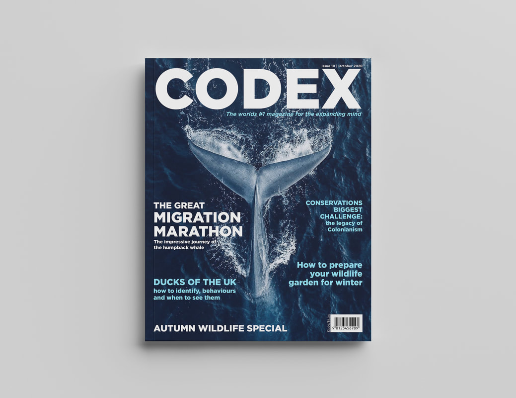
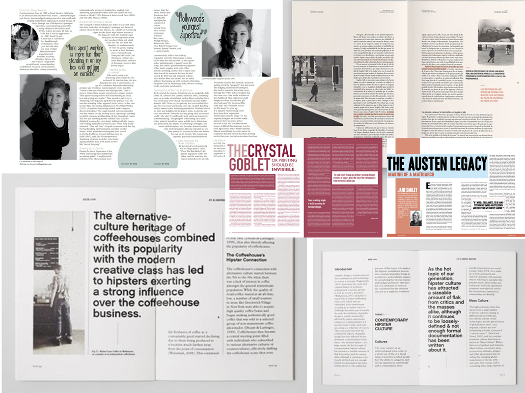
Brief For this project we had to explore the three levers of design (message, tone-of-voice and artefact) to create book cover designs that directly target predefined audiences. The designs had to be for a children's book cover: Talking Turkeys by Benjamin Zephaniah, an adult non-fiction cover: The Uninhabitable Earth: A Story of the Future by David Wallace-Wells, and finally an adult fiction cover: Life Isn’t All Ha Ha Hee Hee by Meera Syal. Research To begin this project we were asked to do a little bit of research and find some creative book cover designs for the categories 'typographic', 'photographic' and 'illustrative'. We had to select covers that we thought successfully communicated to their intended audience, as well as be eye-catching and engaging.    Mind Map and Initial Thoughts We then had to read the synopsis’ of the books and simplify each book to a single sentence/statement. I also did some more research for each of the different books and their audiences, trying to find examples of where I wanted to take my own ideas and made some mood-boards for inspiration. Below is a mind map of some initial ideas; trying to think of less obvious ways to represent the meanings of the books. 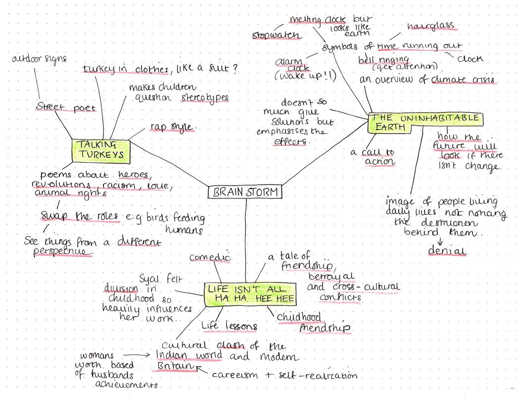    Initial Thumbnail Sketches Next I started to draw up some really quick, rough sketches of my initial ideas. I knew I wanted the children's book to be super playful with handwritten typography. The adult non-fiction I thought could be a lot more photographic and dramatic looking, and finally the adult fiction I wanted to be super modern and I liked the idea of the illustrations being minimal and more silhouette-like. 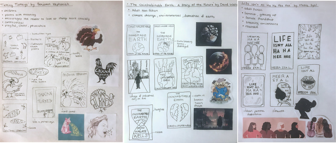 'Talking Turkeys' by Benjamin ZephaniahOne of my ideas for this book cover was inspired by the titular poem, about animal rights and encouraging people to not eating turkeys at Christmas. Due to the books unconventional style, this reminded me of some illustrations I once saw that swapped the roles of humans and animals around to highlight the injustice and makes you see the situation from a new perspective. Some of them wouldn't be suitable for kids but there are some more appropriate ones (the illustrations are linked here). I decided to sketch out a few more ideas down on paper, thinking about how I could add the humour and make the imagery relate to the poems. I also thought about the authors culture, adding in elements related to the street with a graffiti style.  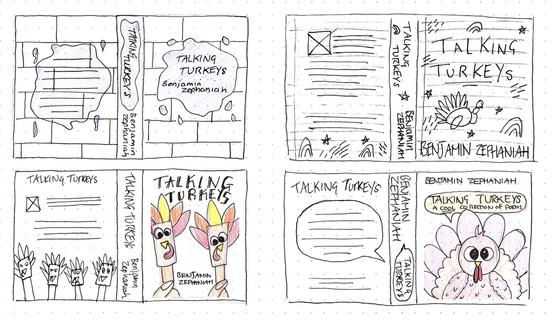 I then found couple of colour schemes I found inspiring that could work with attracting kids attentions and relate to the street art style; bold, bright colours.     I was feeling a little stuck with how to move forward so below is a rough mock up of one of my ideas. I wanted it to look super hand drawn and child-like with the messy typography, simple shapes and decorative elements, including the paint splatter to represent the graffiti side and the lined paper effect underneath. 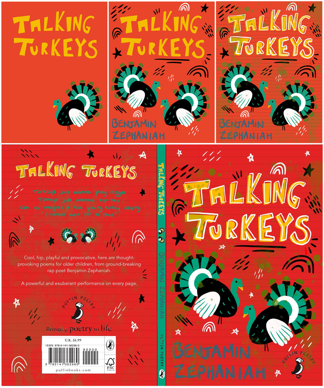 After receiving some feedback I began to develop my design, experimenting mainly with colour and graffiti-style type to begin with. I also tried to redesign the turkey illustration to be more detailed, but then realised I much preferred the more simple one I did previously. I then began taking my idea into InDesign and experimented slightly with the layouts. I also redid the turkey illustrations so they included my idea of having the turkeys wearing disguises and referencing the poems themselves. These were also made using hand shapes to mimic the craft children do using drawn out shapes of their hands to create the feathers. Here is my first final design for 'Talking Turkeys' as well as a mock up below:  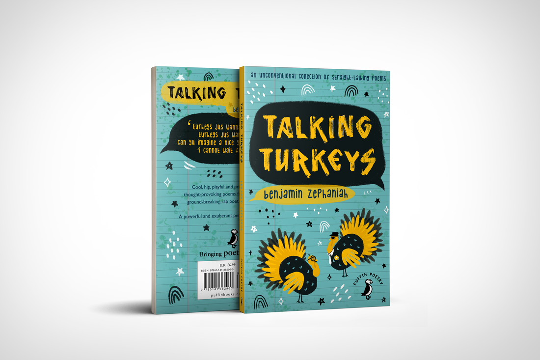 'The Uninhabitable Earth' by David Wallace-WellsMy initial idea for this book cover was to have an illustration of the Earth in the centre but I soon realised this was way too obvious so I became brainstorming symbols to represent climate change and more importantly the message that 'time is running out'. My ideas included having illustrations of an hourglass, melting clocks, stopwatches, alarm clocks and bells ringing to infer people to wake up and pay attention to the issues the author is presenting. Another idea was to have an illustration of a post apocalyptic Earth (i.e burning buildings, destroyed forests...) and in the foreground have people getting on with their daily lives oblivious to the destruction behind them. I then went ahead and drew out some more thumbnail sketches, firstly of some visual concepts for the imagery rather than the book as a whole. I wanted to try convey the aspect of the Earth in a less obvious way. I then did some thumbnails of how the entire book cover could look as a whole including the back and the spine.  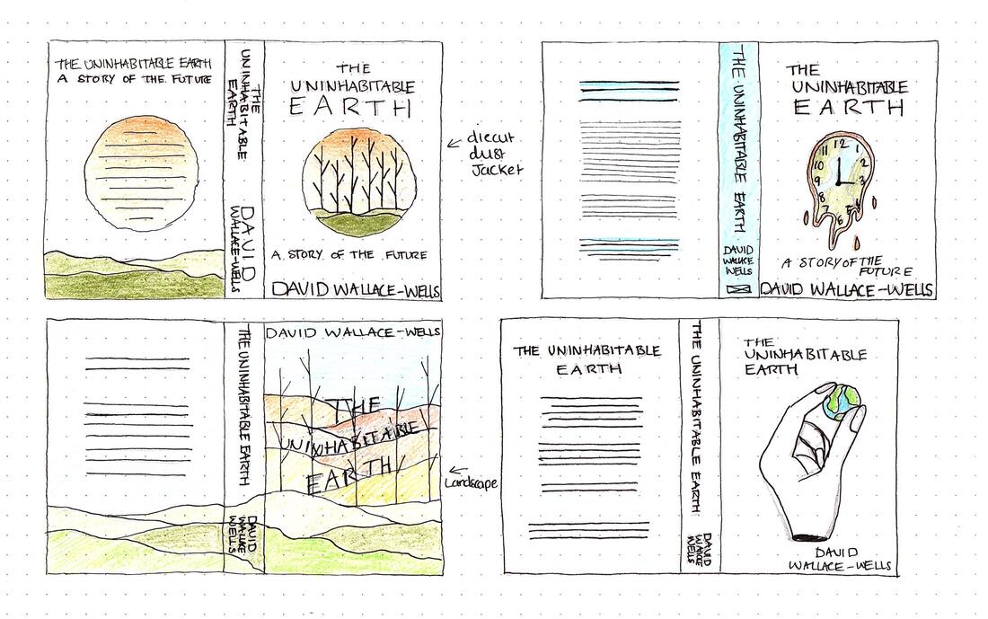 I wanted the colour scheme for this cover to convey a more serious tone with the grey and reflect the topic of nature using greens and blues. I also liked the idea of added pops of red and yellow to grab the readers attention and convey alarm.    I then started to try and create some on my design digitally, experimenting with layout as much as possible and thinking about how the design could translate onto the backs covers. 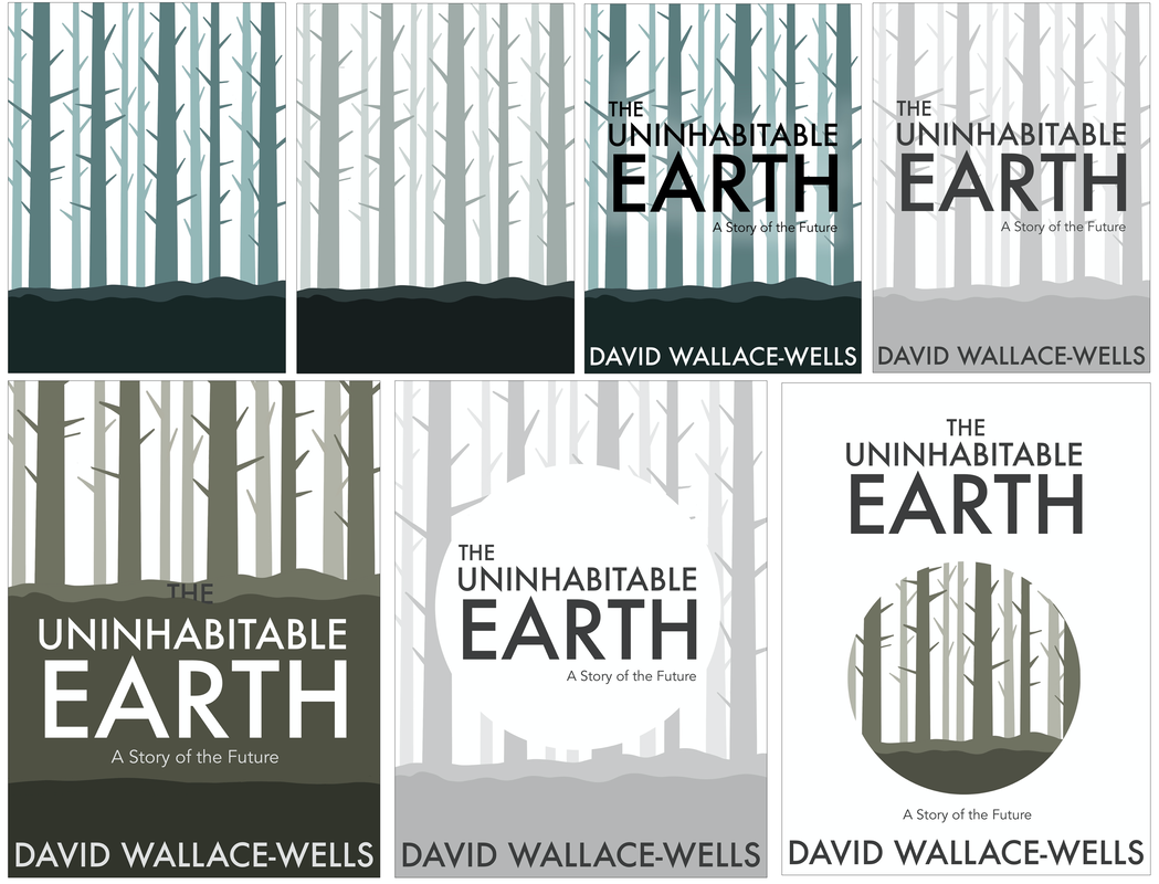      I then was inspired by these paper illustrations and thought it could be implemented into one of my designs to make it more interesting. I did a mock up digitally below of how it could look, realising it gave a sort of black hole effect to the design which I think fits in quite nicely with the theme of the book. I then came up with another design inspired by this blackhole idea, and actually found it made the book look more like a novel. I decided to create both designs are final pieces to show the different interpretations. Here I physically created the design; my first attempt printing out and cutting by hand and the next using colour card and using my Cricut machine to get an accurate and clean cut. The second attempt came out much better as the card was easier to create the differing layers. I then took the image and re-colourised it to make it match the colour scheme I already chose.  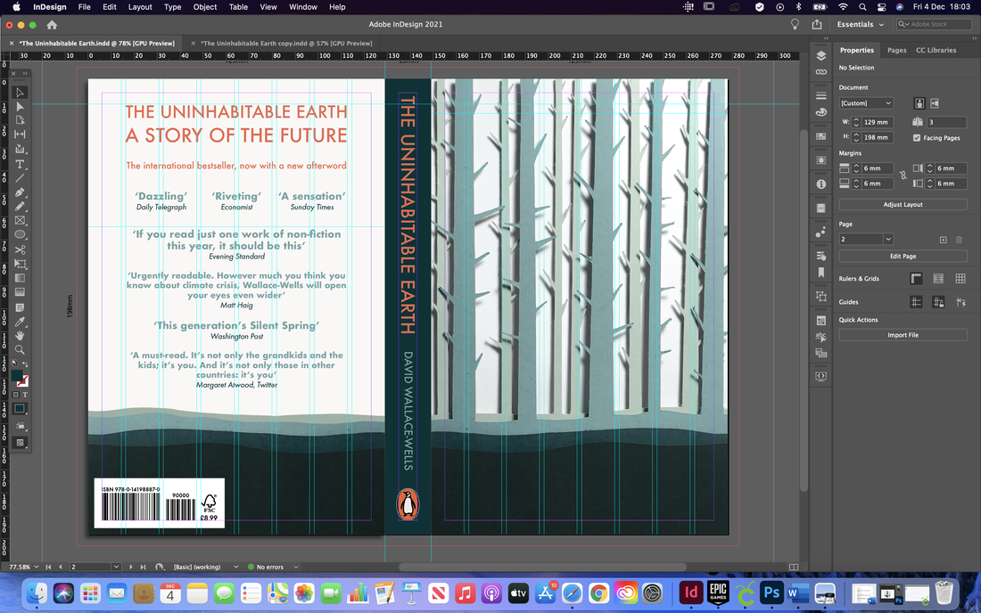 I then developed my second idea, using the same imagery but in a different style. Here is my first final design for 'The Uninhabitable Earth' as well as mock ups below: 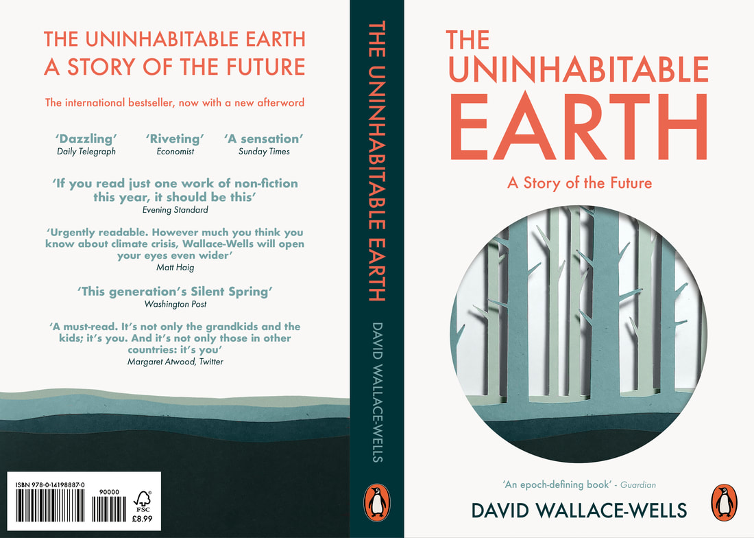   Here is my second design with mockups below:   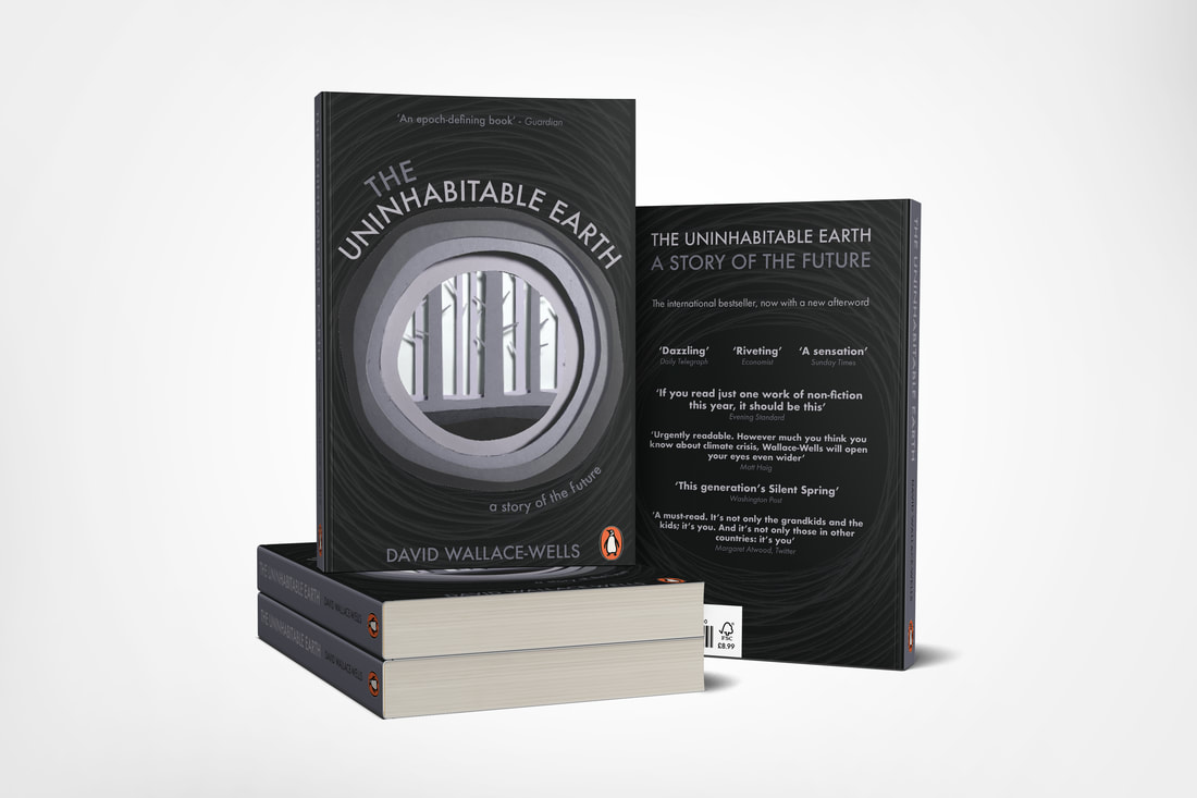 'Life Isn't All Ha Ha Hee Hee' by Meera SyalThis book cover I was finding the hardest to think of interesting ideas for. I wanted to come up with a symbolic way of representing the cultural clash of the Indian world, where a woman's worth is based largely on her husbands achievements, and modern Britain, built a lot of careerism and self-realisation. Below found some more book covers for inspiration in terms of style and tone. After some further research I went ahead and did some more detailed thumbnail sketches of the book cover. I liked the idea of illustrating the switch between urban London life and her Indian heritage, reflecting both landscapes across from each other. I also liked the idea of doing a more decorative cover and one that was more minimalist. 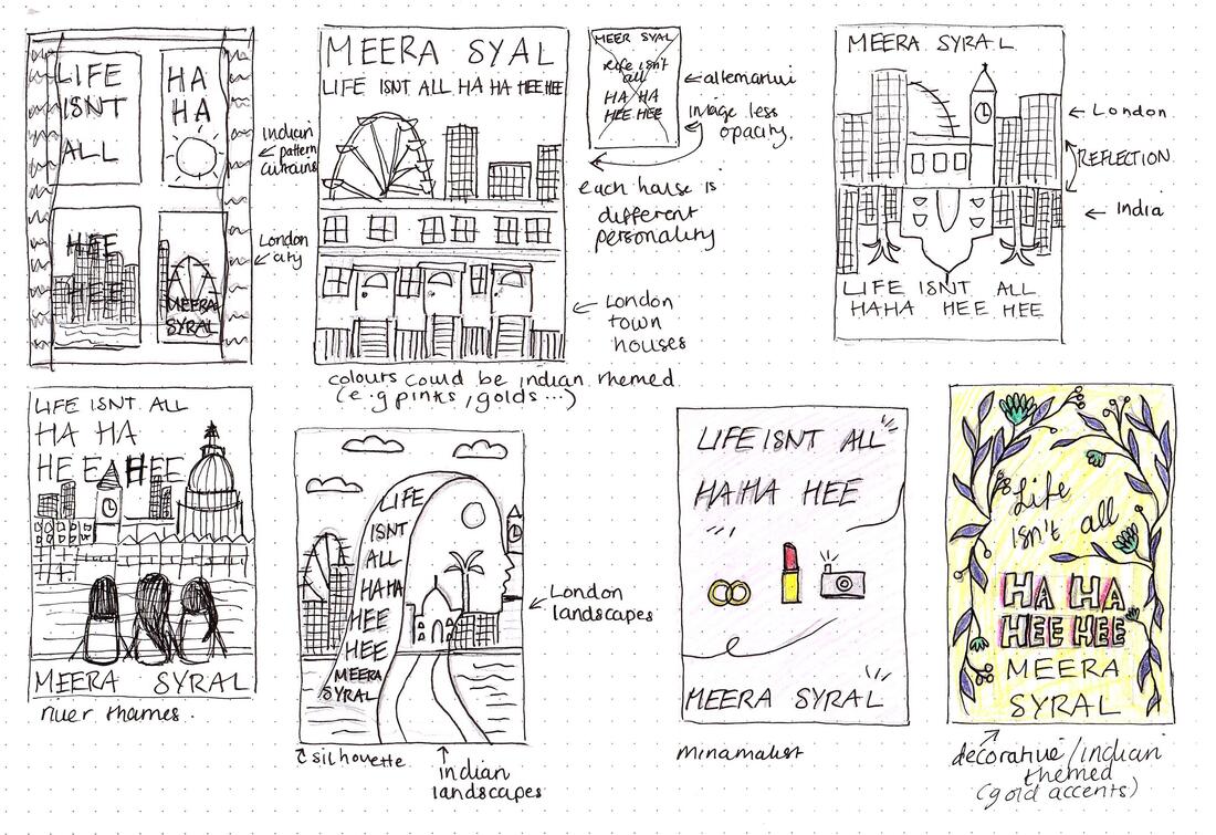 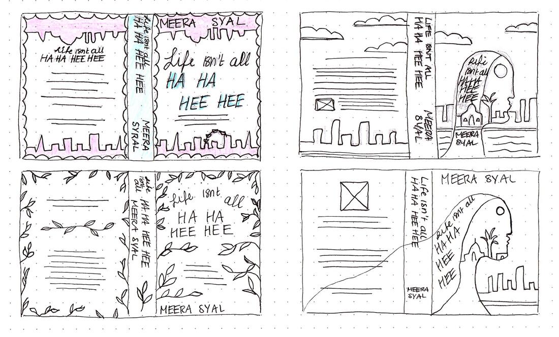 I also found a few colour schemes that I could use, mainly focusing on Indian culture; warm colours, reds, pinks, golds and greens.     I decided to do a quick mock up of one of my design ideas, using bright colours and fun typography, as well as illustrations of the three women. I also made it more decorative with the patterns and landscape silhouettes.  After receiving my feedback I began to develop this design; I decided that it looked too much like a teen novel rather than adult so I began experimenting with different colour schemes to make it appeal more to a more grown up audience. I also wasn't too keen on the illustrations of the girls and wasn't sure they were necessary so I removed these and made the design more typography based. I also decided to incorporate my window idea as I felt it looked too plain with out any illustration at all. This changed my design quite drastically. Here is my first final design for 'Life Isn't All Ha Ha Hee Hee' as well as a mock up below: 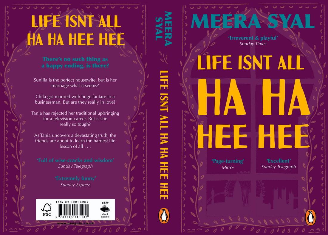  Brief Our third brief required us to develop a concept for a new independent magazine, including a feature article on the theme of 'migration'. We had to create two alternative sets of double page spreads (a 'splash' and 'turn'), as well as a masthead cover. Research I started out by doing some research to find some good examples of editorial design for inspiration. I was looking particularly for interesting layouts and use of alignment and negative space.  I also did some research on what I wanted my article to be about. I decided to base mine on animal migration so I began researching online about interesting facts to see if I could find anything interesting enough to base an entire 2 double page spread on. I drew up a mind map of the research I found with some facts to base my article on, as well as brainstormed some possible headlines. 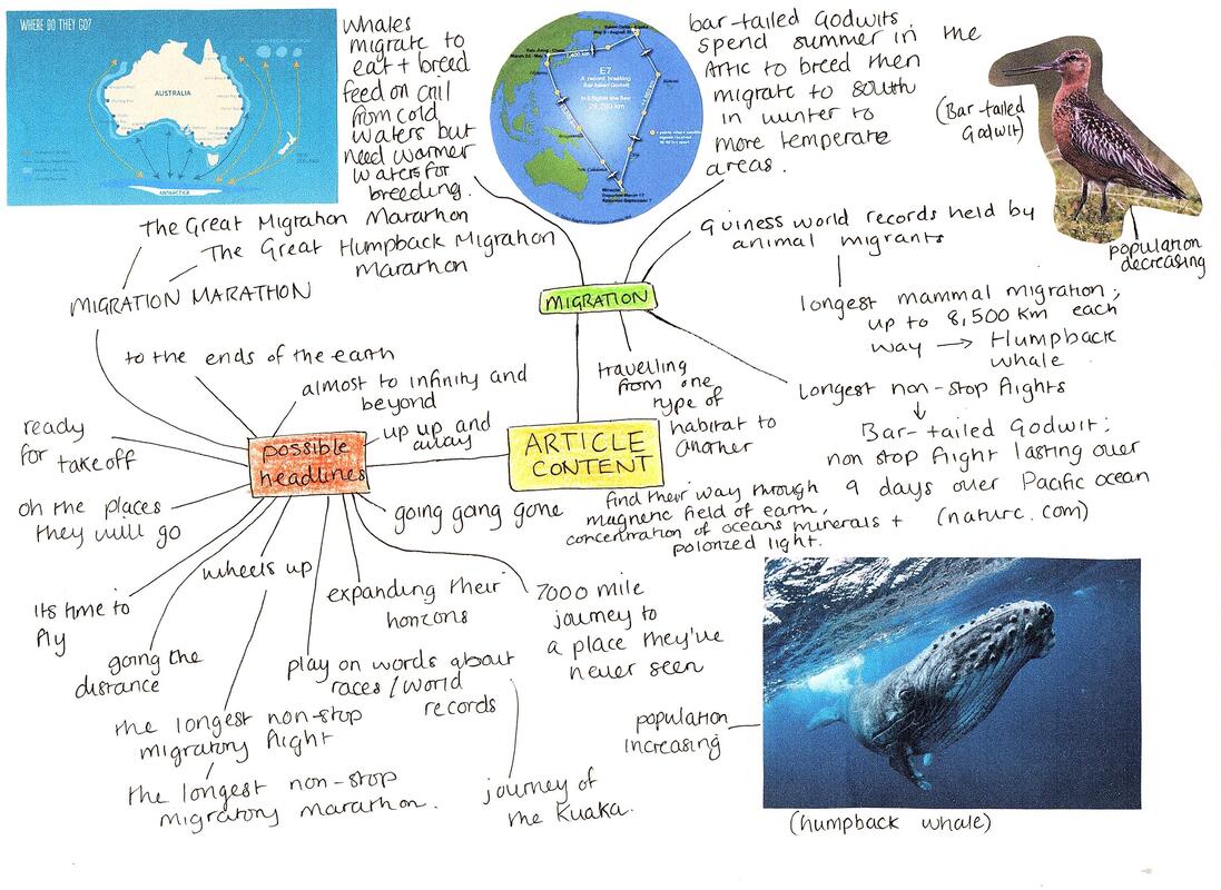 Potential Imagery Here are a view potential images I could include in my magazine spreads. I tried to find good high quality photographs as well as a few illustrations and diagrams. I must prefer the images I found on humpback whales as I love the colours and would like to use these as inspiration for the design of the rest of the pages. Thumbnail Sketches Here are my thumbnail sketches for each type of column number. I included splash and turn page layouts throughout, varying them as much as I could and using the editorial images I collected earlier for inspiration. 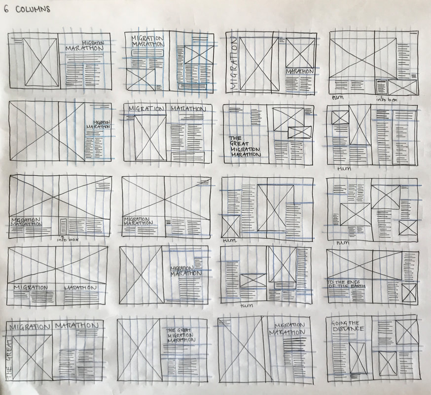   Setting Up the Grids We had to set up the documents using InDesign; 250x202mm trimmed pages, one spread with 6 columns and the other with 11 columns. 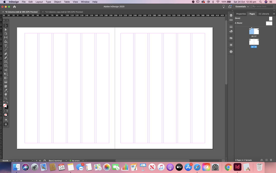  Initial Mock Ups and Developments I then started trying to recreate some of my layouts from my thumbnails using the software. Below you can see some of my process and changes I made as I went. Here is my first mock up for the splash and turn 6 column spreads. I tried out a contrasting colour scheme and a view variations of the layout. I think I prefer the first variation for the turn page more as there's more of a balance of negative space so I will probably revert back to that if I decide to take this design forward. 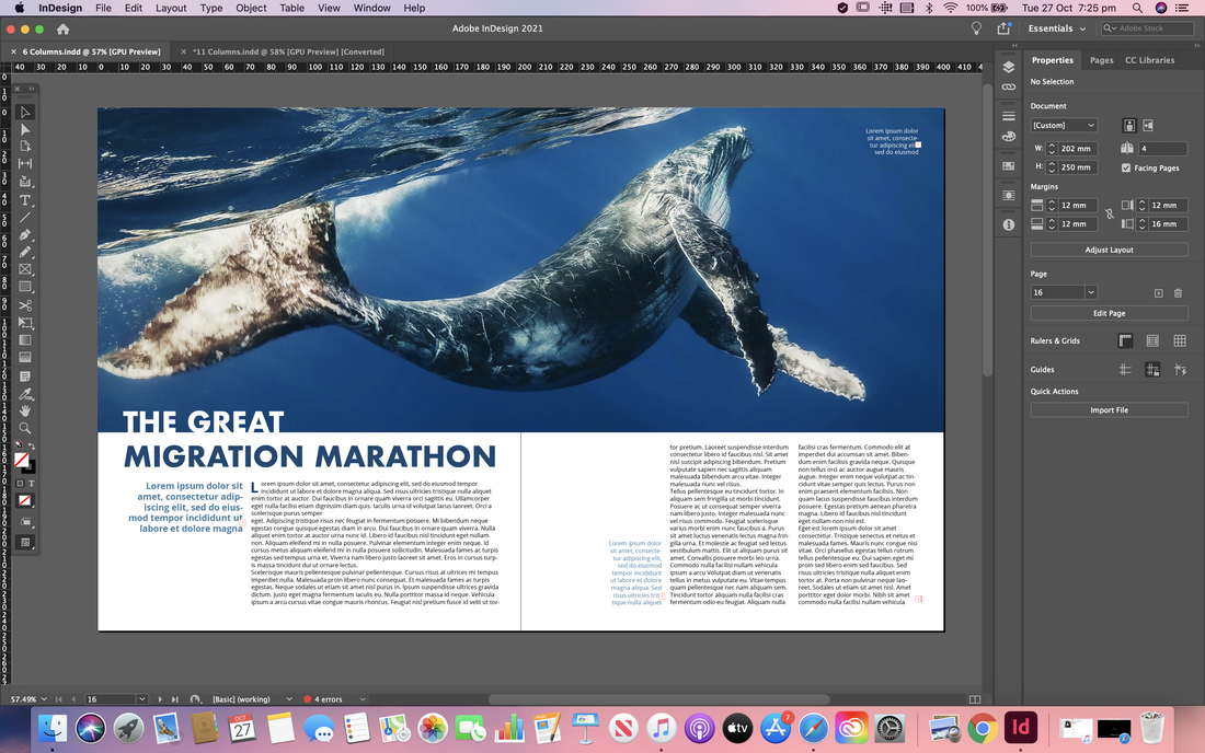    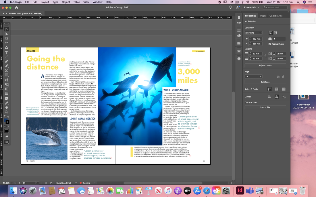 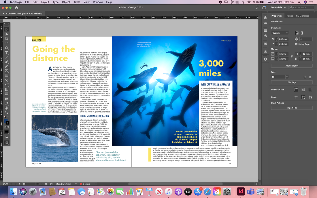 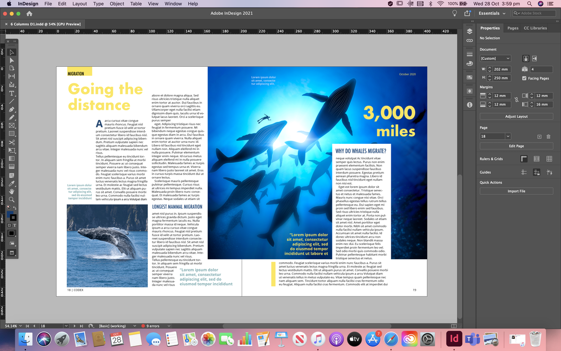  Here is my first mock up of the splash and turn for the 11 column spreads. So far I am happy with how this is going, and I especially love the more complementary colour scheme and the faded words in the background of the spread. However I think the layout of the body copy could do with a rework as I'm not sure I like it at the moment.       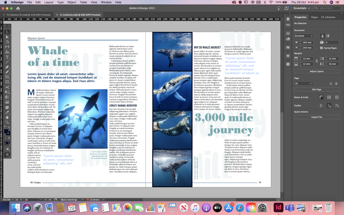 Here I tried out another layout for the 11 column grid spread, using a full bleed image for the splash page. Im not as happy with the turn page; I think there perhaps isn't enough body copy and the images are too large.  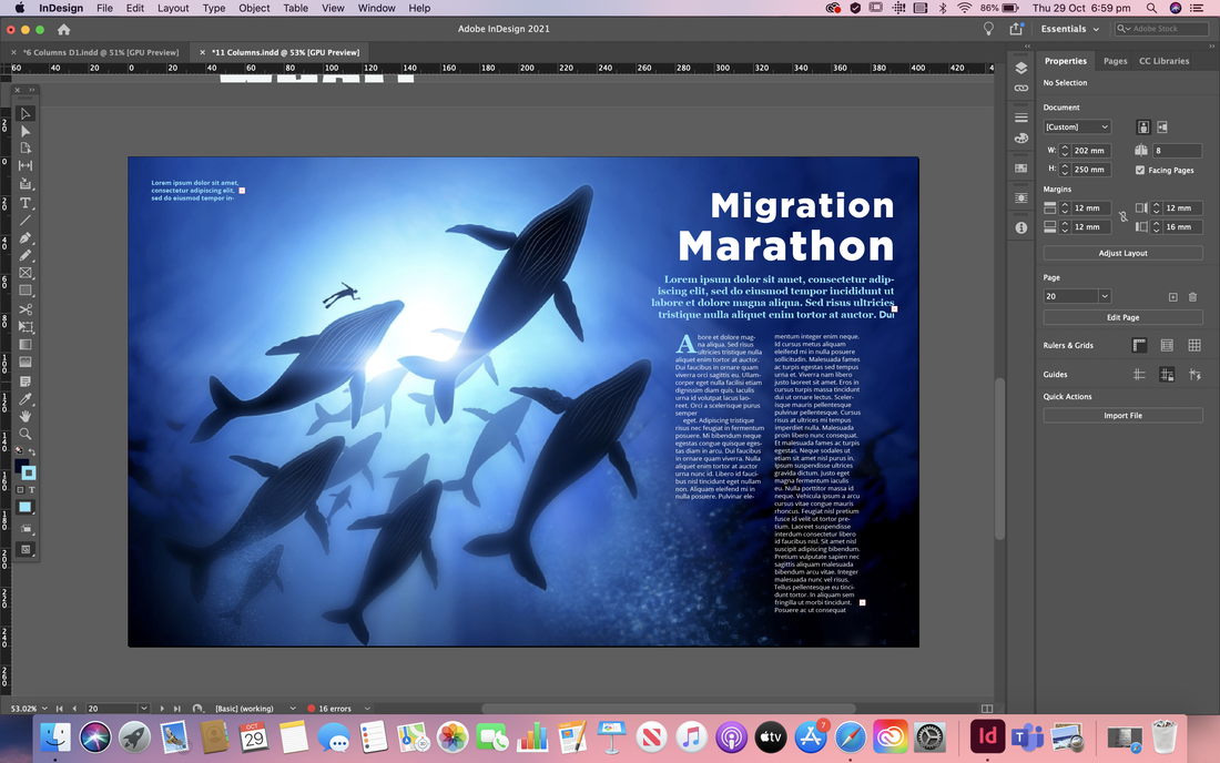  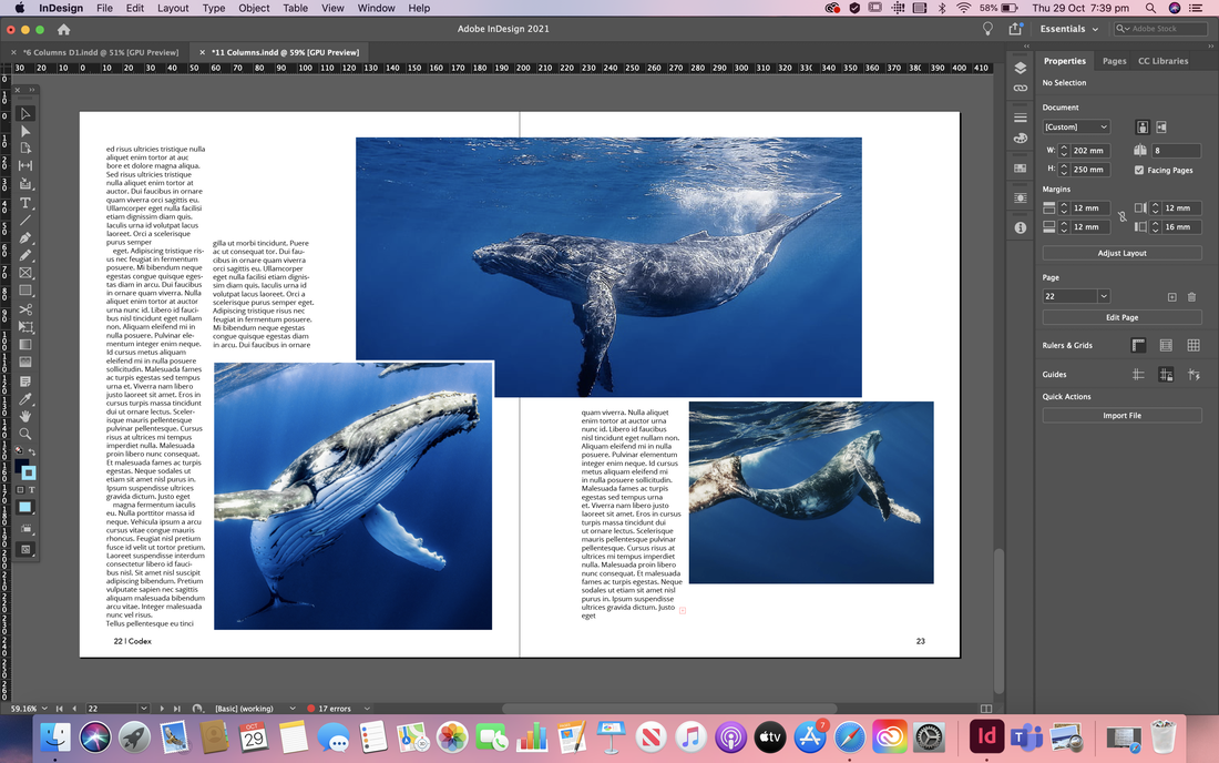  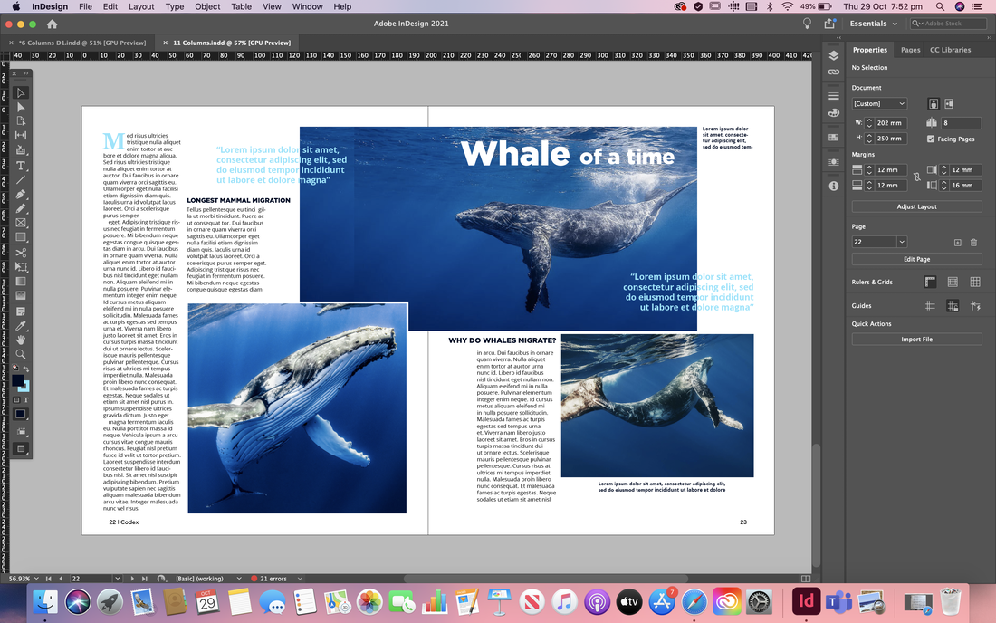 Developments After Feedback After receiving some feedback on how to improve my initial spreads I went ahead and made some changes. I was told my spreads look more like two splash pages, so for the first set I removed the big titles from the turn spread, tweaked the layout of the body copy, changed some of the images so there were smaller and then switched out all the place holder text to an actual article. I also wrote out the pull quotes, headers, sub headers, and captions etc. The second set I did mostly the same thing but I quite drastically changed the layout as I felt the images were too large and that there wasn't enough body copy. I also edited the images to that I could use text wrap.  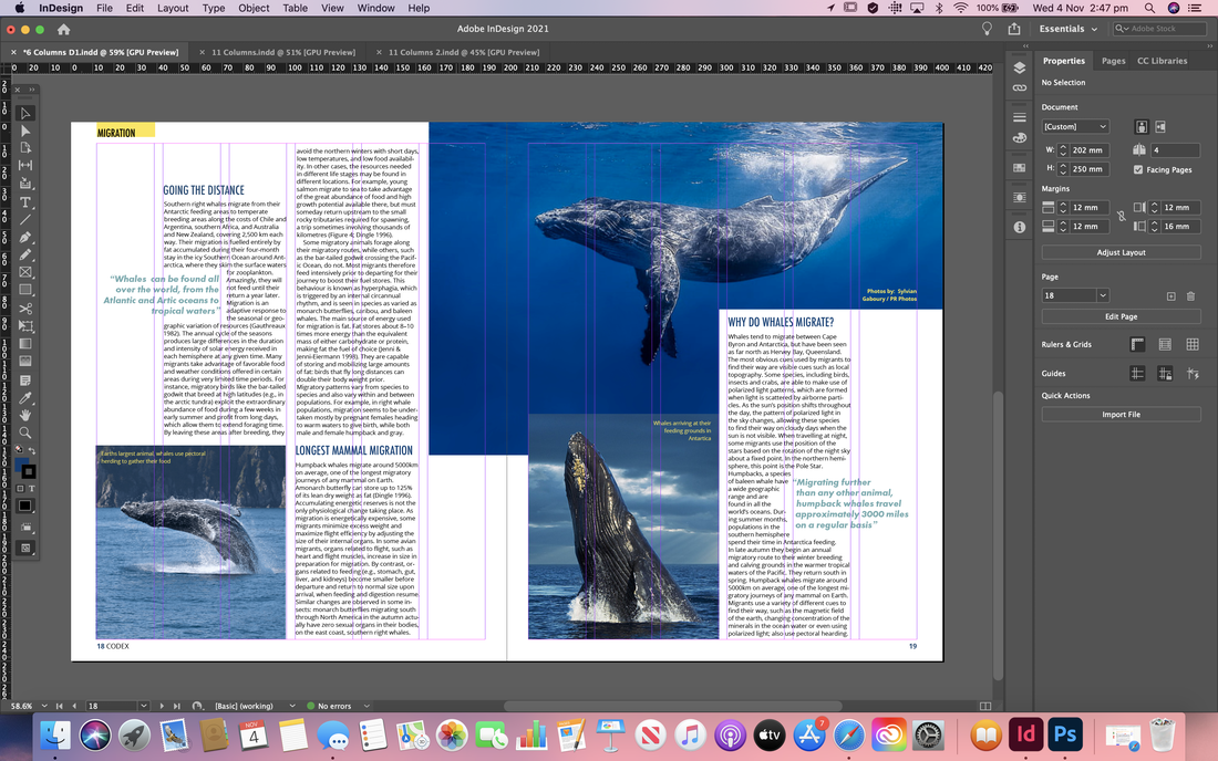    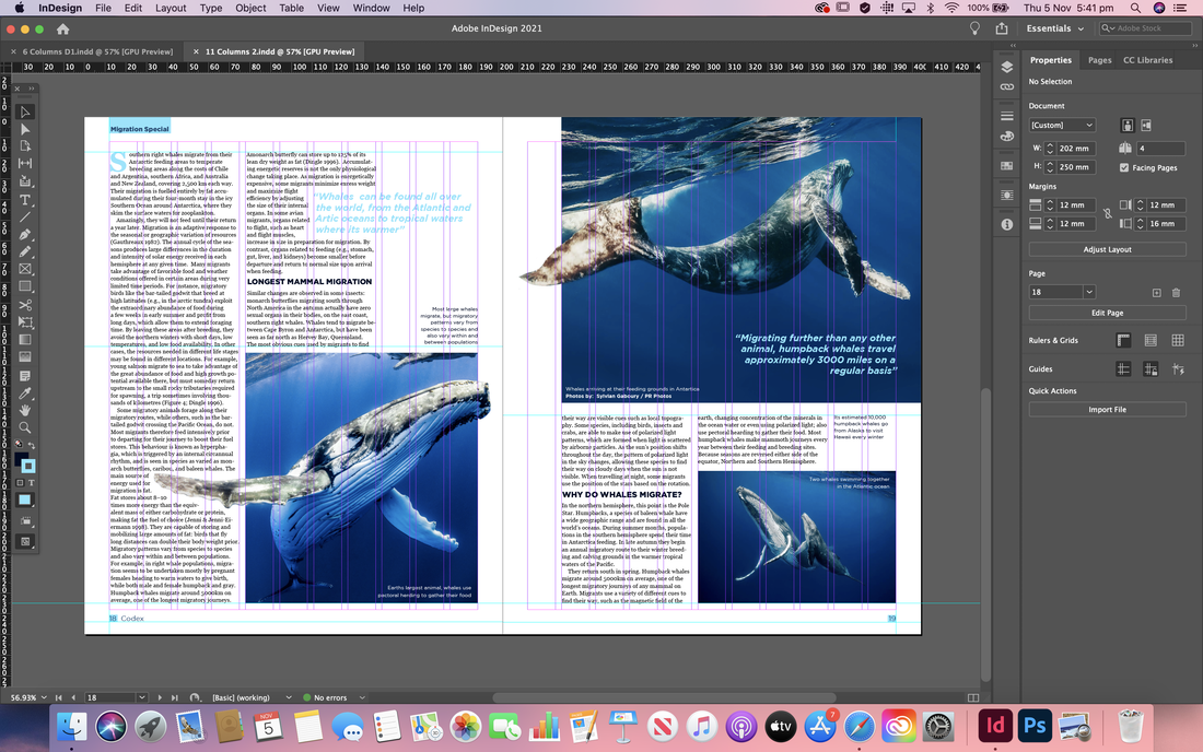 Magazine Cover For the cover I began by researching online to get some initial inspiration. I tried to find ones that were a little different from each other; some being more busy and others more minimal, focusing more on promoting the main featured article.  I then draw up a few quick thumbnail sketches, thinking about how I wanted to layout the elements on the cover. I knew I definitely wanted the mast head to be at the top so that it would be most visible on a shelf and then include a large, high quality image of a whale. I mainly just experimented with the placement of the featured article name and if I was going to include other articles or not. 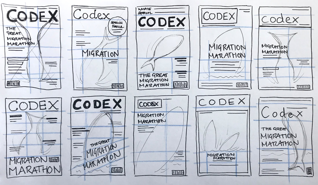 I then began transferring some of my thumbnail sketches into design in Adobe InDesign, experimenting with a colours and typefaces that would match my article spreads and create a harmonising set of work. I ended up designing two covers; one for a more affordable magazine and the other more minimal and high-end.  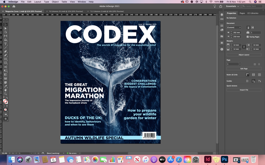  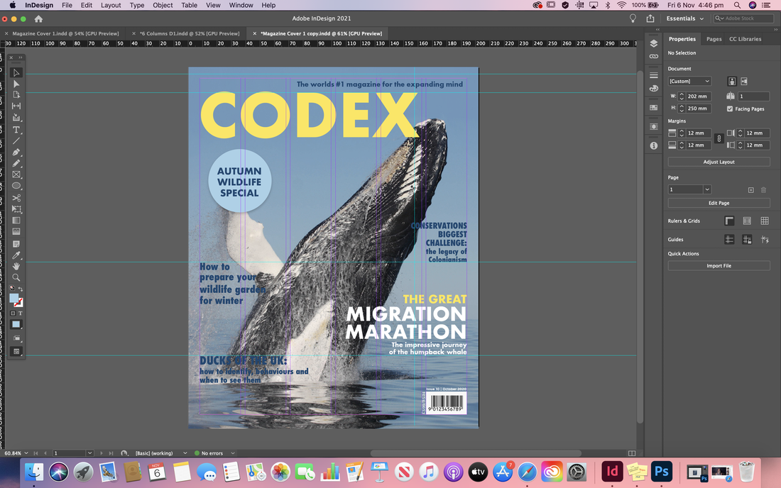 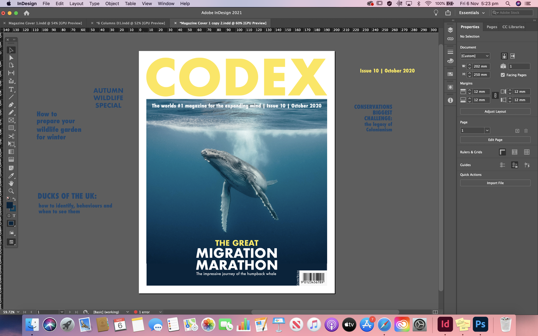 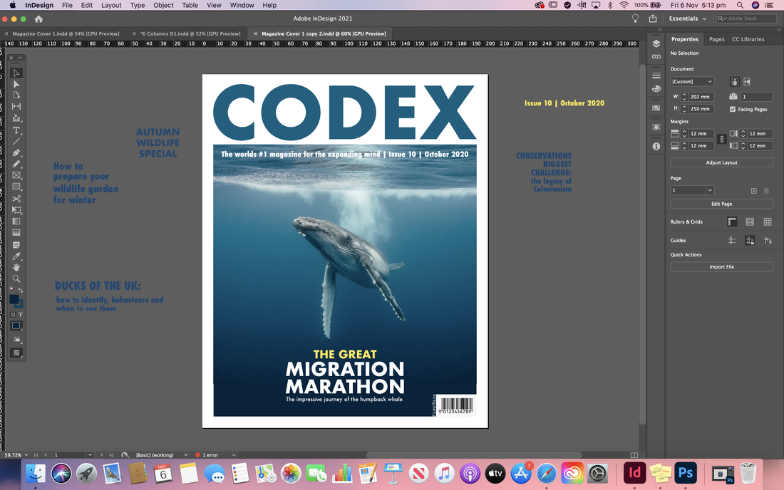 Final Designs
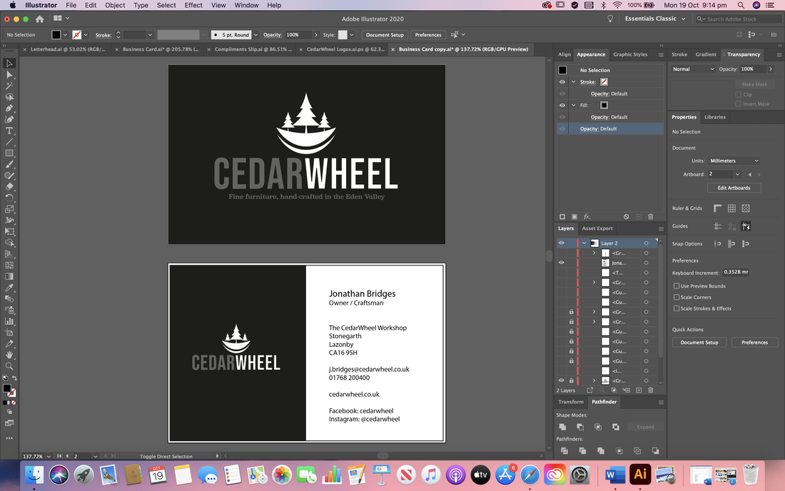
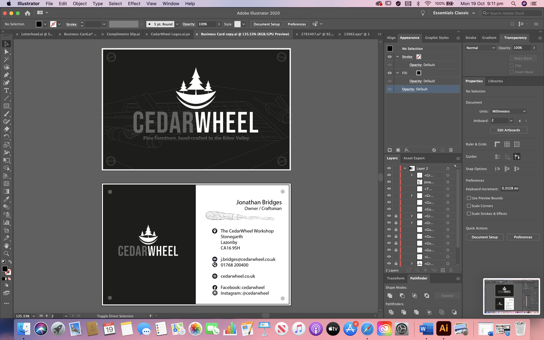
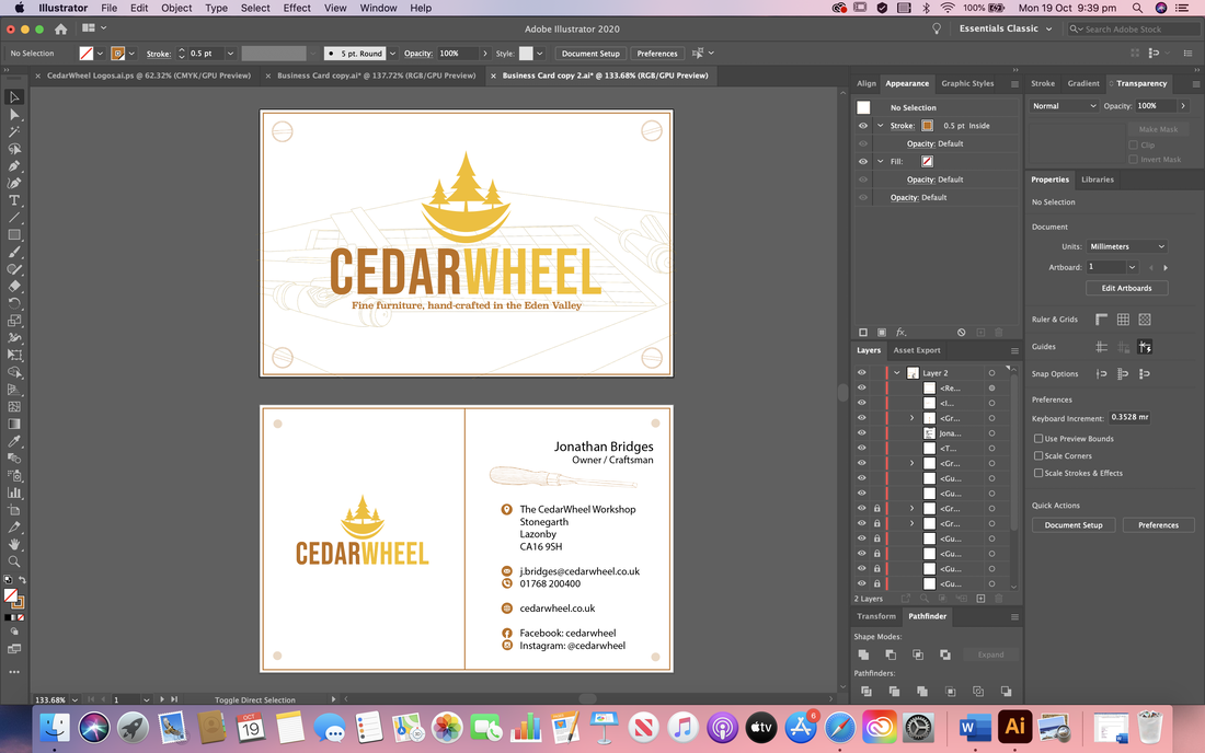
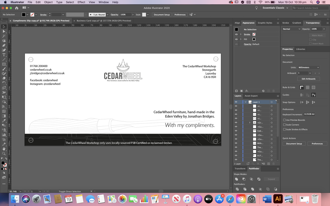
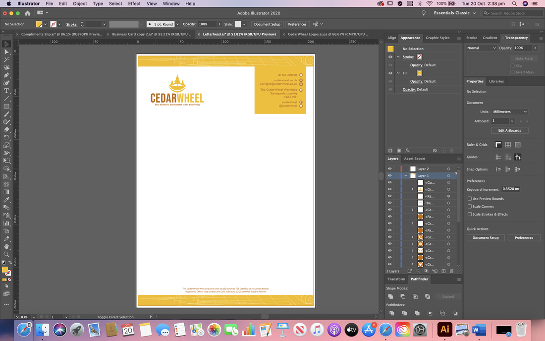
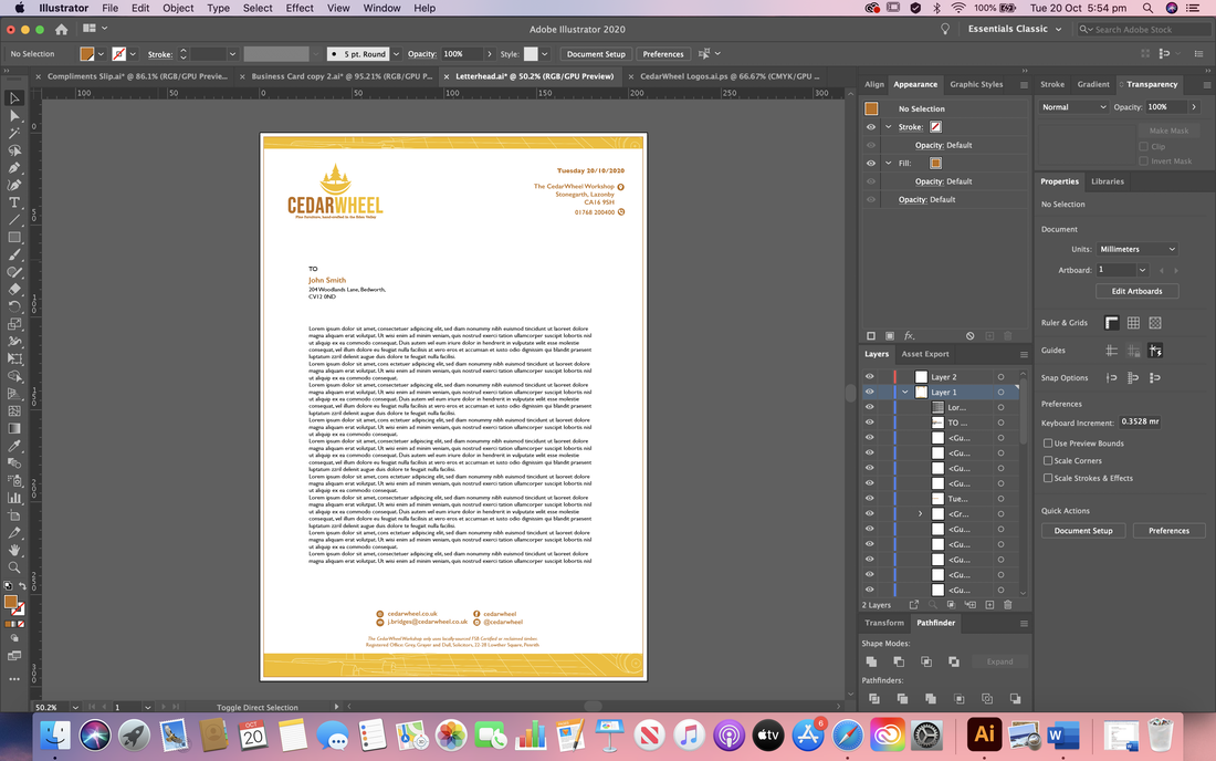
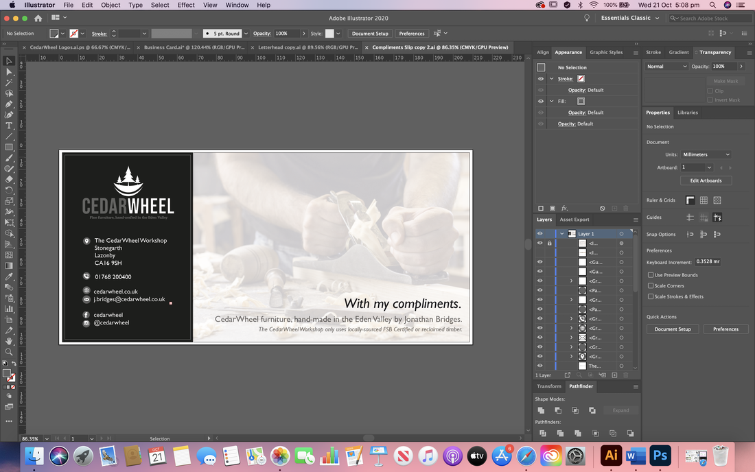
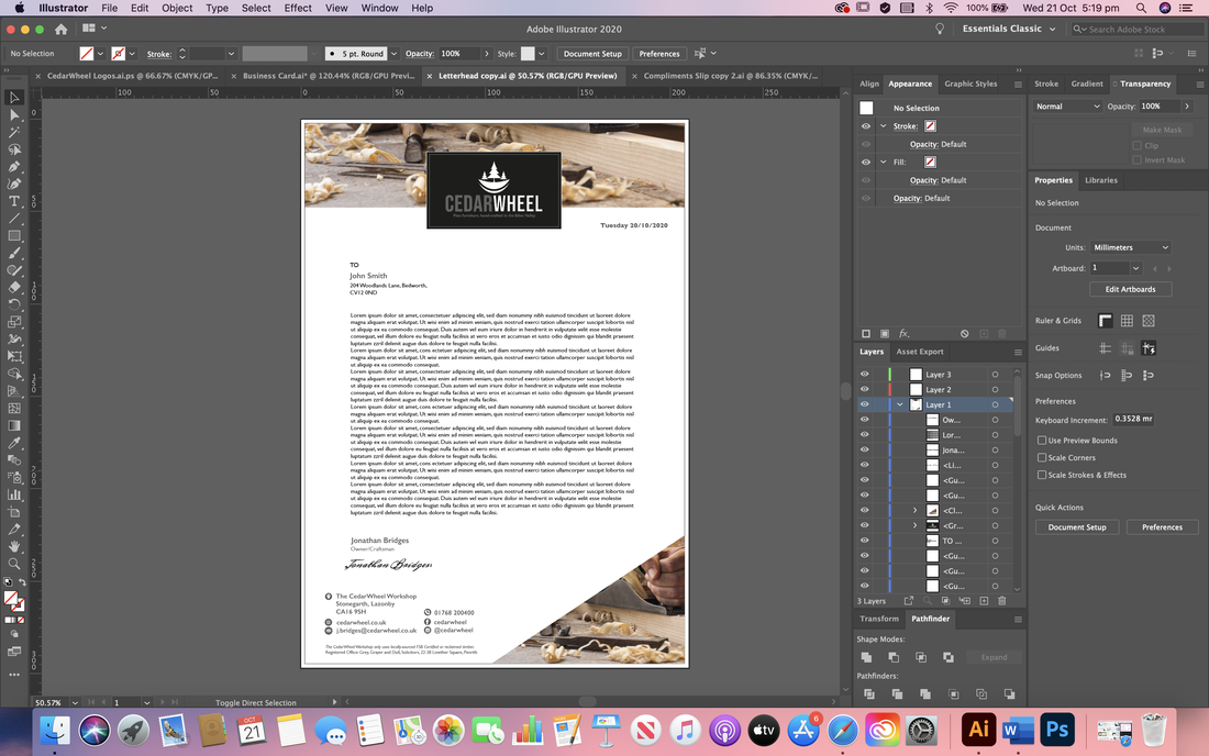
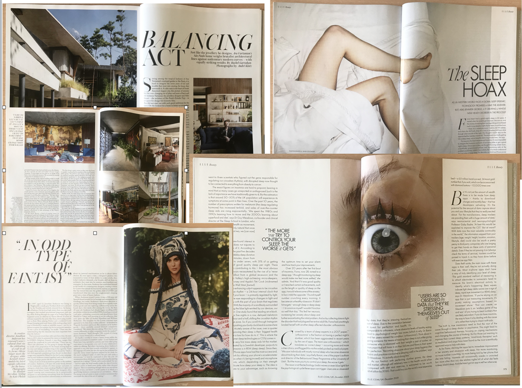
Here are my final designs for each of the different column grids and the cover after receiving all of my feedback. I also included mocked up versions so you can see them in action and how they might actually look in a magazine. Proximity and RepetitionFor this project we had to design a visual identity for a furniture workshop called CedarWheel using the assets provided and showing use of the concepts of proximity and repetition to create balanced and consistent designs. I began by researching various stationary designs to gain some inspiration, looking closely at their layouts and how they manage to create pieces that seem to go together as a whole.  As with all the other projects so far, I then went ahead and started drawing up some thumbnail ideas for the layouts of the stationary. I began first with the business card at it seemed the least intimidating with it being a smaller space, then took those ideas onto the other formats. 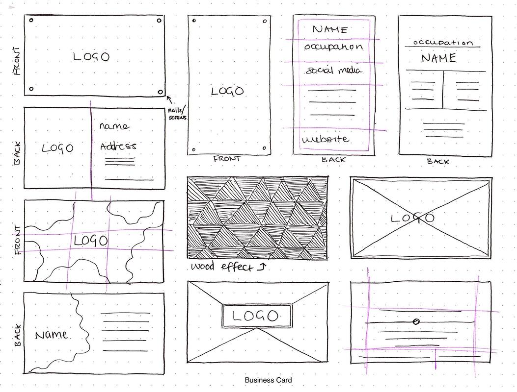 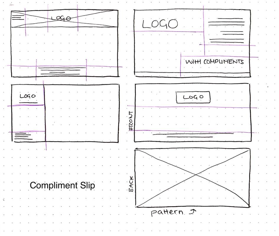  I then went into Illustrator and started putting together some layouts; starting simple before adding more details. I wanted to make the design more interesting but wasn't too keen on the way the images we were given looked so I drew up a line drawing of one of the images to use in the background instead as it looked more subtly stylised and minimal. Below is the black and white design I did first, as well as the colour version: I then tried to create a compliment slip and letterhead using the same styles I used for the business card to show consistency in the brand design. I still had to explore the fonts used for these designs as I wasn't happy with those yet. I also preferred the colour version of the design as it looked more interesting so I stuck with that. After some feedback, I decided to not only slightly rework my initial design but create a new one too in different style, experimenting best I could with different proximities while keeping everything consistent. Final Designs Here are my final stationary sets, each showing slightly different ways of proximity whilst repeating certain elements on each format to keep the brand looking consistent and like it's all a part of the same set.  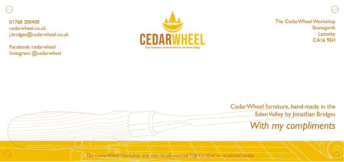  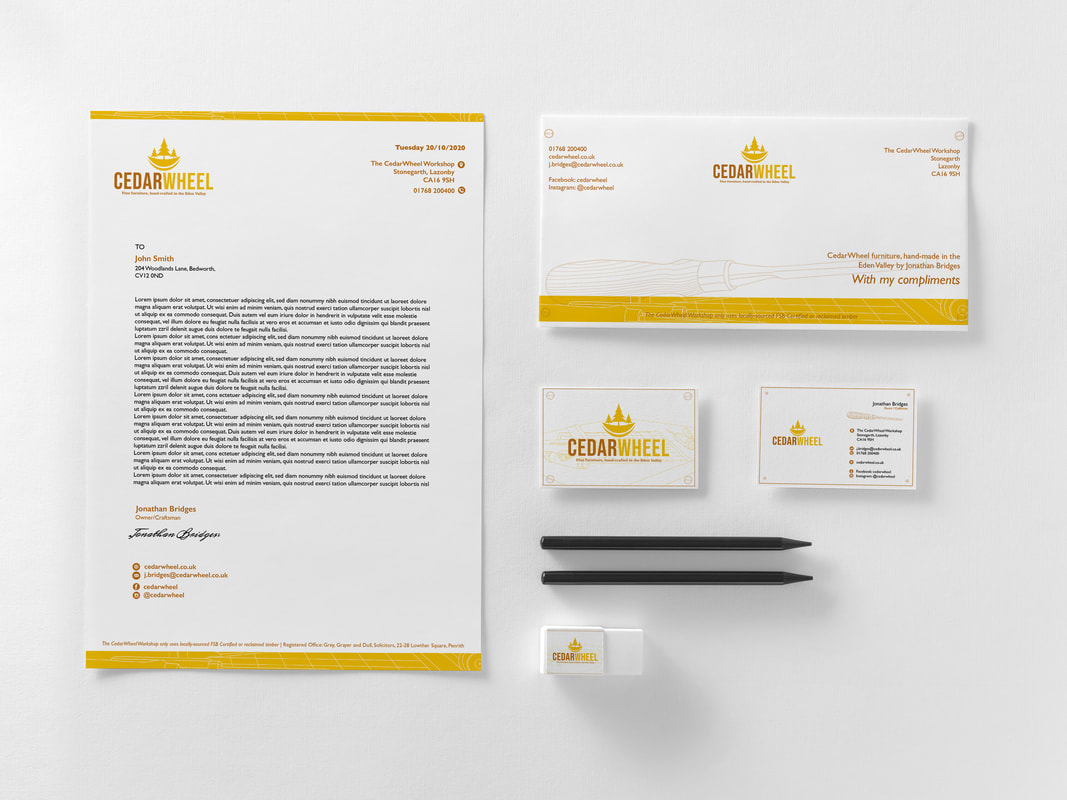 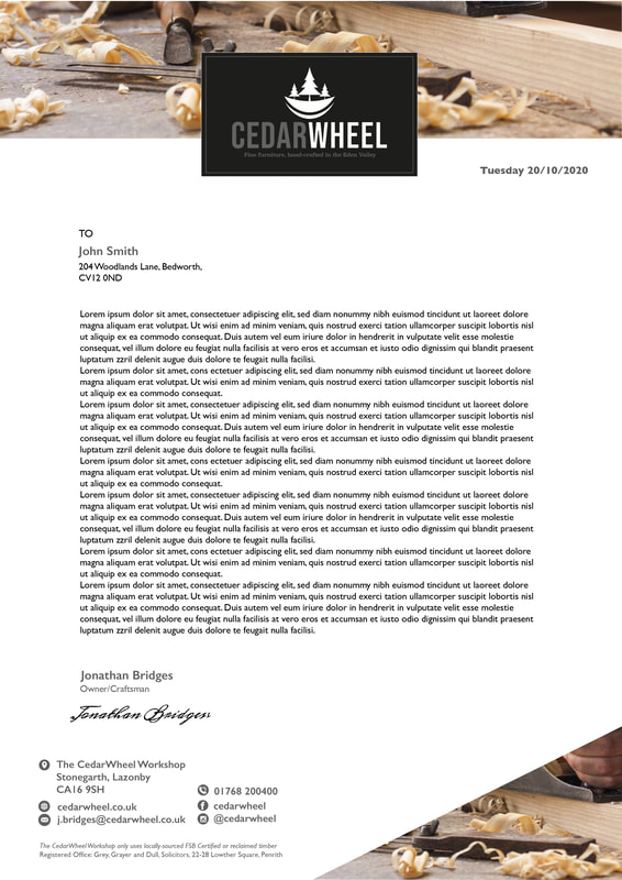 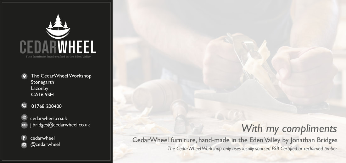 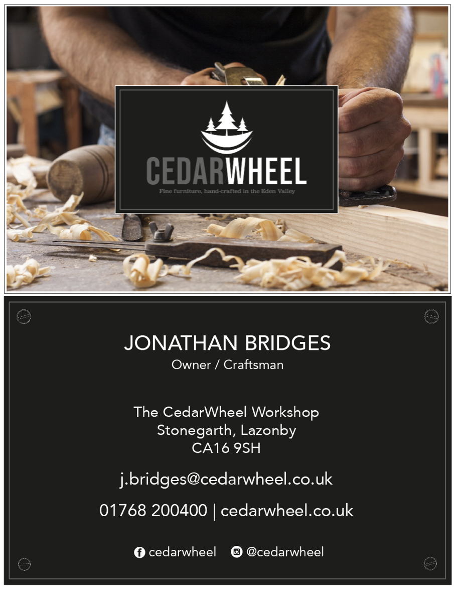  Balance and ColourFor our third exercise we had to create designs for an iPad resident app using the principles of balance and colour. The designs had to include a landing page and a product page, one set using symmetrical balance, the other asymmetrical as well each of those using complimentary colours and contrasting colours. I began by doing a bit of research into app design, as it was something completely new to me. I wanted to make the layout simple so I could focus more on experimenting with the colours.  I then sketched out some thumbnails to give me an idea of the layout of the two app pages before I went into Photoshop, taking inspiration from the above mood board and trying to think about how I could implement symmetry and asymmetry. I then decided to do a little research on complimenting colour combinations I could try out.  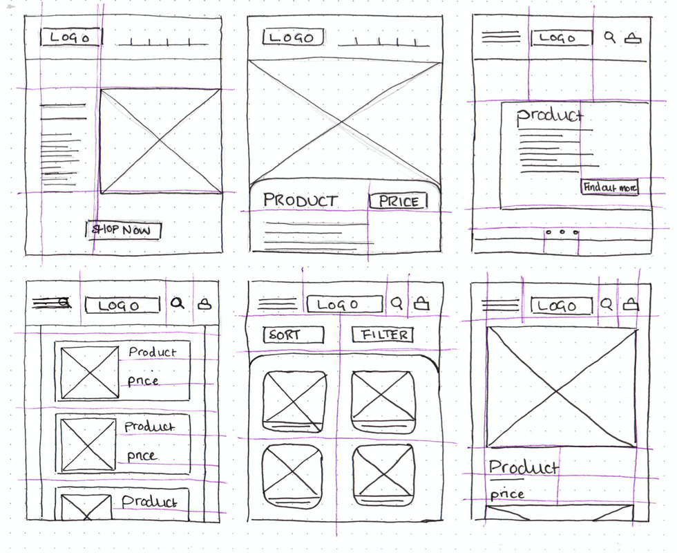 I then found an online wire framing tool (MockFlow) that I thought would be helpful to further figure out some of my layouts. 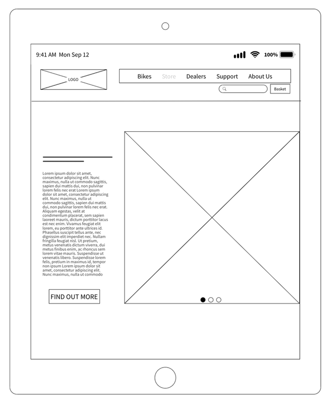 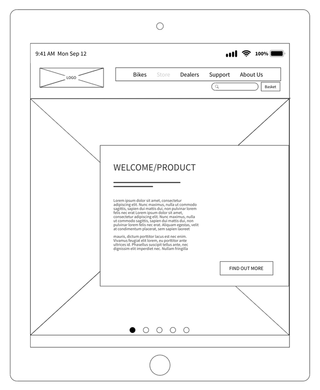   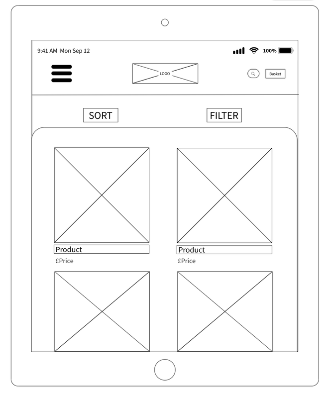 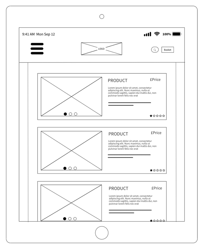  I also began looking into possible contrasting and complementary colour schemes before I started creating my designs on Photoshop. I used the websites ColourSpace, Coolors and Adobe Colour. I was leaning more towards using a palette that was still eye-catching but had mainly earthy tones to match the theme of bikes and being outdoors. 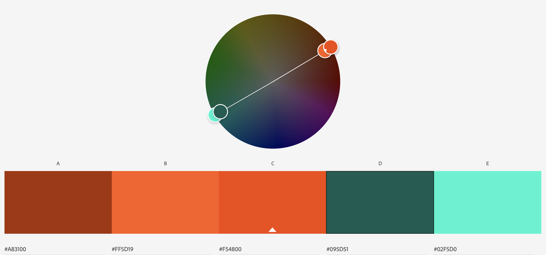        Symmetrical/Contrasting Colour Moving into Photoshop, I began creating my final designs, experimenting with the colour schemes as I went. I initially was going to use earthy colours such as greens and browns but actually preferred the way the navy and orange looked more for this contrasting, symmetrical design. 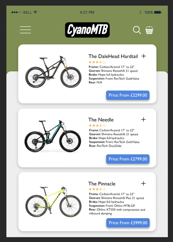 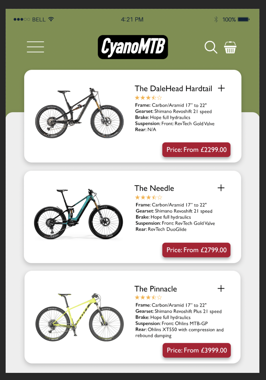 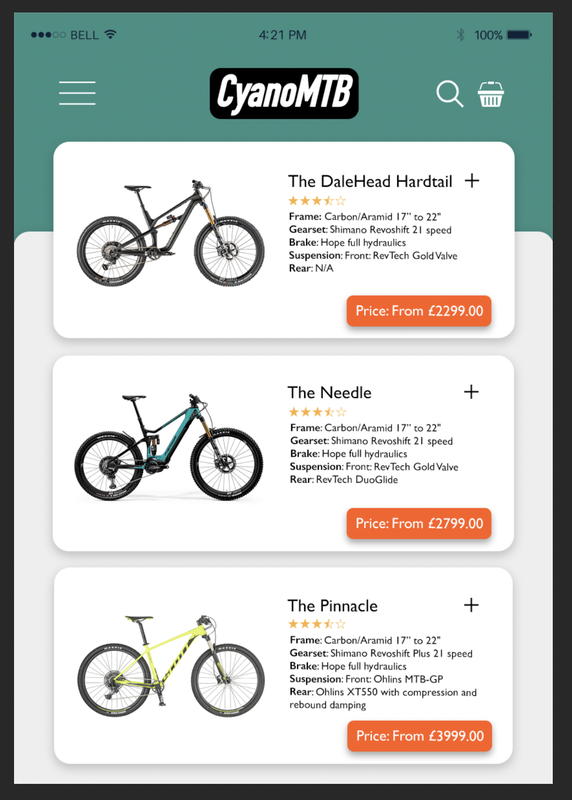  Here as some brief progress shots of my designs; I rearranged some elements and made subtle changes as I went to make the symmetry more obvious. 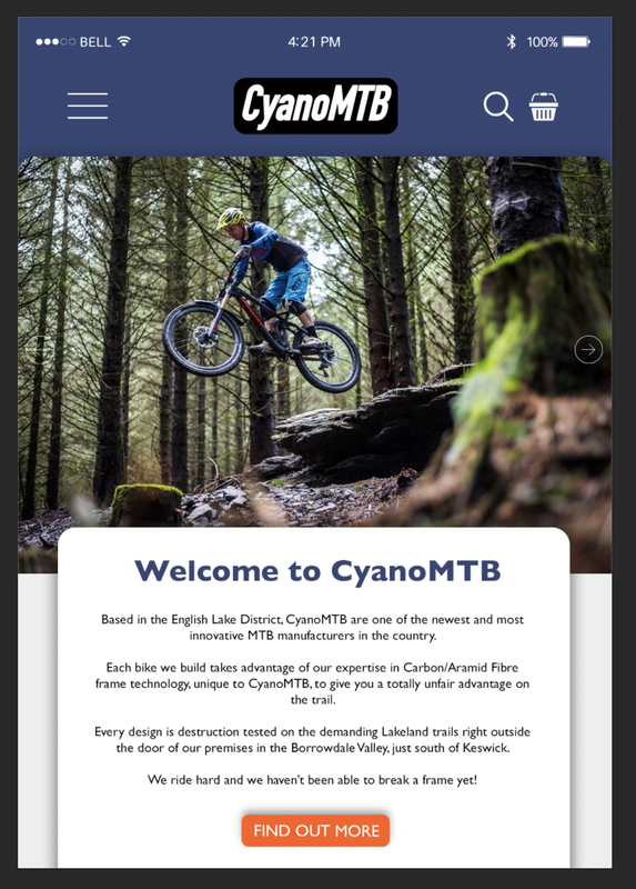 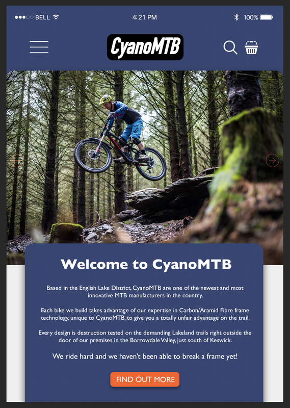 Here are some screenshots of the Photoshop documents showing the grids I used to show the layout and alignment:  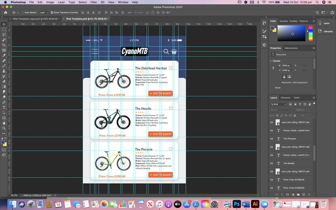 Final designs for symmetrical balance and contrasting colour scheme:  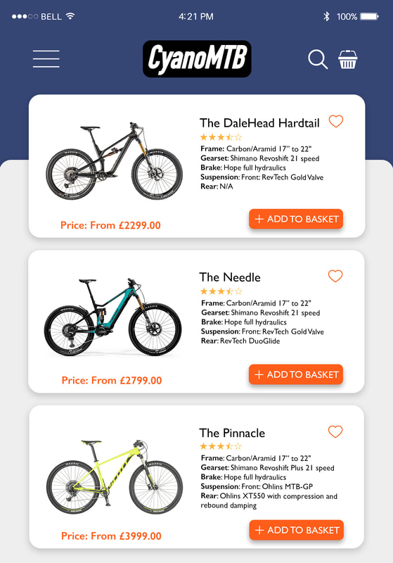 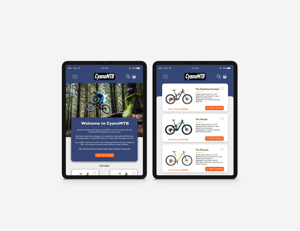 Asymmetrical/Complimentary Colour I then began designing my second set which would be asymmetrical with a complementary colour scheme. I experimented briefly with a couple different colour options until I settled on the green and yellow; a classic representation of adventure and the outdoors.   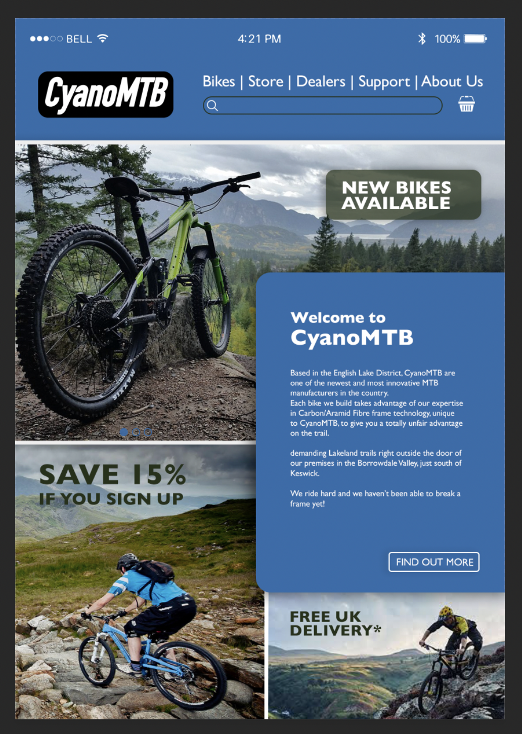  Here are some screenshots of the Photoshop documents showing the grids I used to show the layout and alignment:   Final designs for asymmetrical balance and complimentary colour scheme:   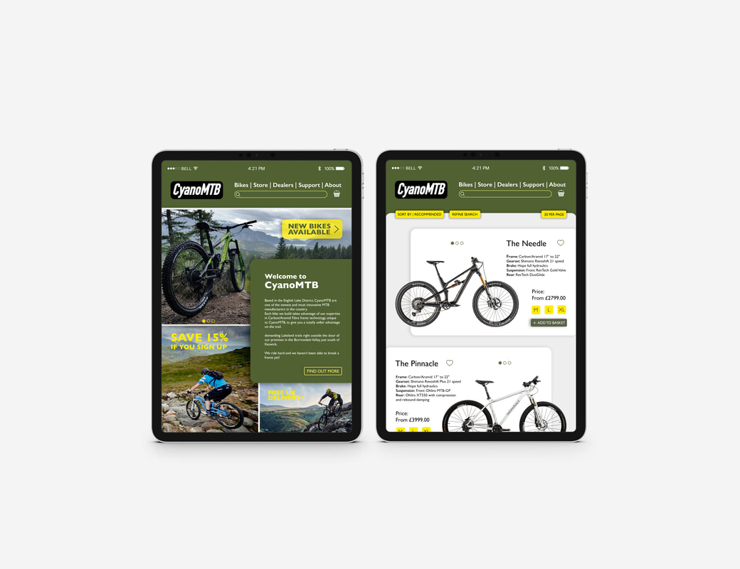 Contrast and Negative SpaceOur second task involved exploiting the principles of contrast and negative space to create two double-page spread layouts (a 'splash' page and 'turn' page) for a magazine, using the assets we were given. We also had to employ the principles we learnt last week on alignment and hierarchy. I started by doing a little research online for inspiring magazine layouts. I then also went straight to the source and looked in some of my old magazines I had at home, paying close attention to how they used negative space to enhance the other areas of the design as well as how they incorporated the images. After this I went ahead a quickly laid out a few thumbnails to use as a reference for when I jumped onto the computer, thinking about how I could attract attention with splash pages and contain more content on the turn pages whilst considering white space. 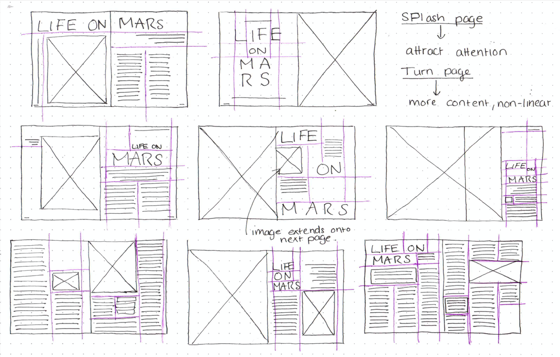  I then began recreating some of my thumbnails onto a document in Indesign, using the grids we learnt to use in the previous task. To begin with I focused more on layout and alignment. After getting some feedback I then reworked this design, changing the colours so there weren't as harsh, changing some alignments, as well as adding pull quotes and a drop cap to make it more interesting.  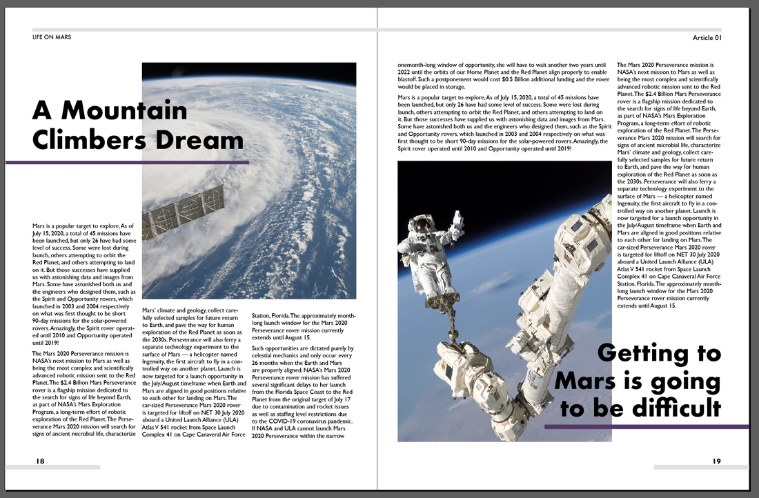 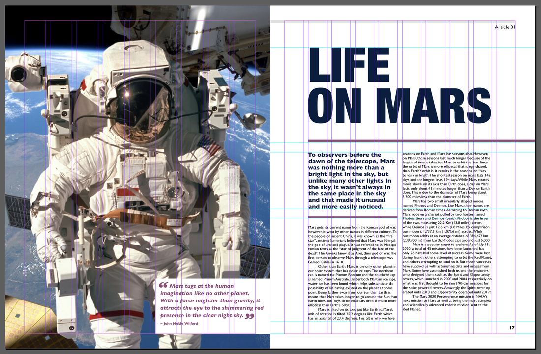 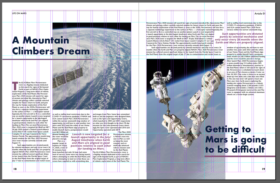     For my second design I find a few of my own images so that I could make the colour scheme more consistent. For the splash page I took it a step further making the image the most prominent element on the page, and tried to be a little more dynamic with the layout of body copy. For the turn page I regularly used the text wrap feature so that I could make the page flow more and be a little more interesting then just straight up and down columns.       |
AuthorHi, I'm Emma. I'm currently studying Graphic Design at the University of Cumbria. Modules
All
Archives
May 2021
|
||||


 RSS Feed