
|
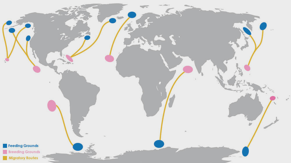
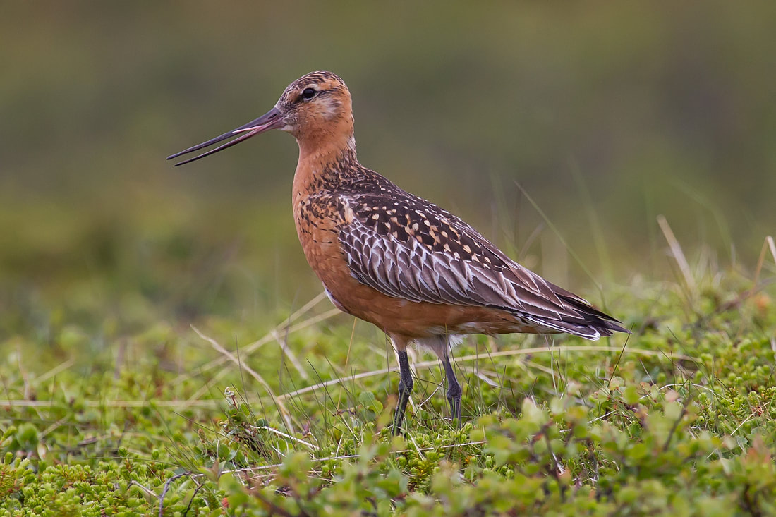
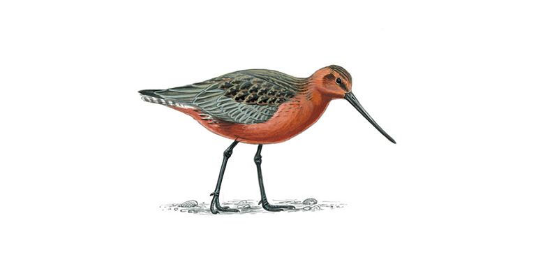
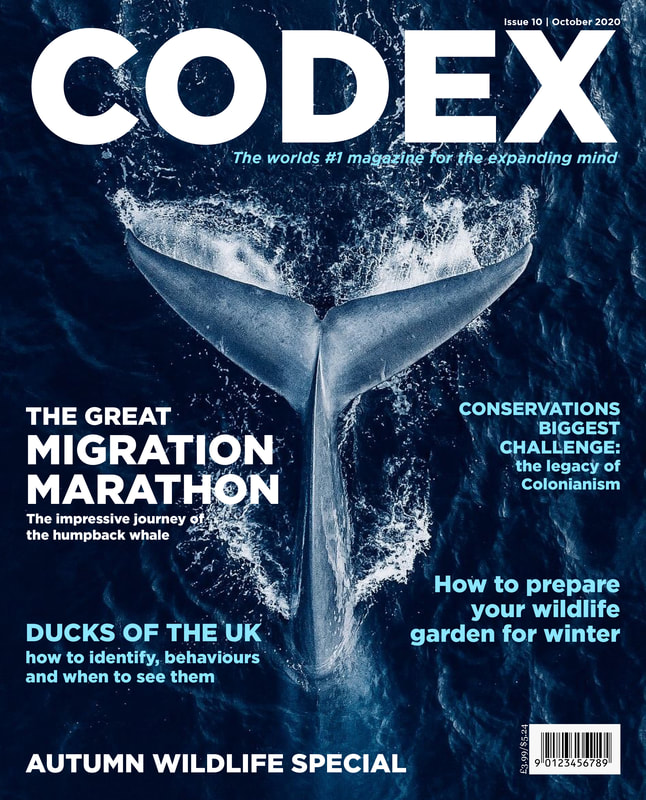
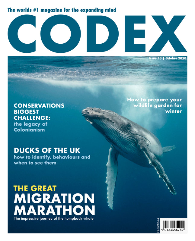
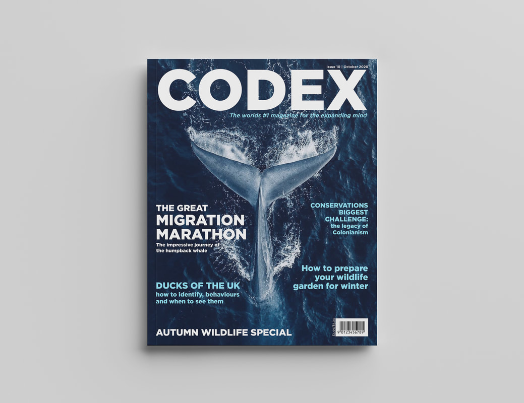
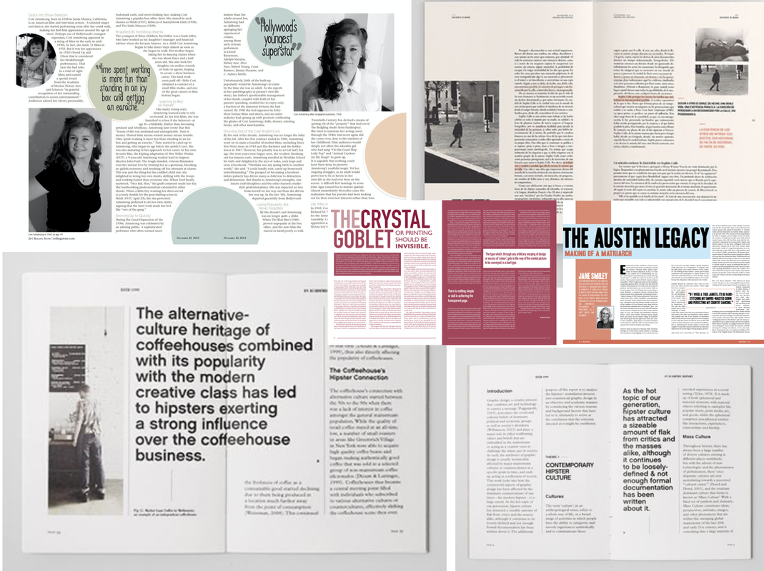
Brief Our third brief required us to develop a concept for a new independent magazine, including a feature article on the theme of 'migration'. We had to create two alternative sets of double page spreads (a 'splash' and 'turn'), as well as a masthead cover. Research I started out by doing some research to find some good examples of editorial design for inspiration. I was looking particularly for interesting layouts and use of alignment and negative space.  I also did some research on what I wanted my article to be about. I decided to base mine on animal migration so I began researching online about interesting facts to see if I could find anything interesting enough to base an entire 2 double page spread on. I drew up a mind map of the research I found with some facts to base my article on, as well as brainstormed some possible headlines. 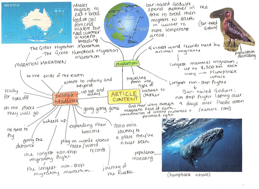 Potential Imagery Here are a view potential images I could include in my magazine spreads. I tried to find good high quality photographs as well as a few illustrations and diagrams. I must prefer the images I found on humpback whales as I love the colours and would like to use these as inspiration for the design of the rest of the pages. Thumbnail Sketches Here are my thumbnail sketches for each type of column number. I included splash and turn page layouts throughout, varying them as much as I could and using the editorial images I collected earlier for inspiration. 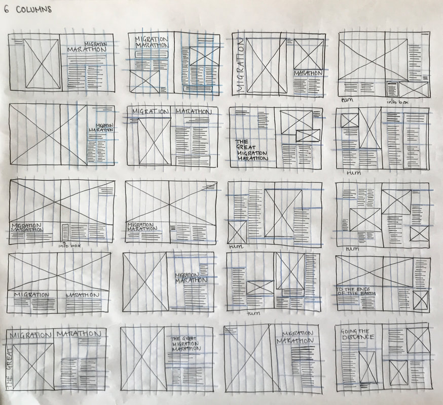   Setting Up the Grids We had to set up the documents using InDesign; 250x202mm trimmed pages, one spread with 6 columns and the other with 11 columns. 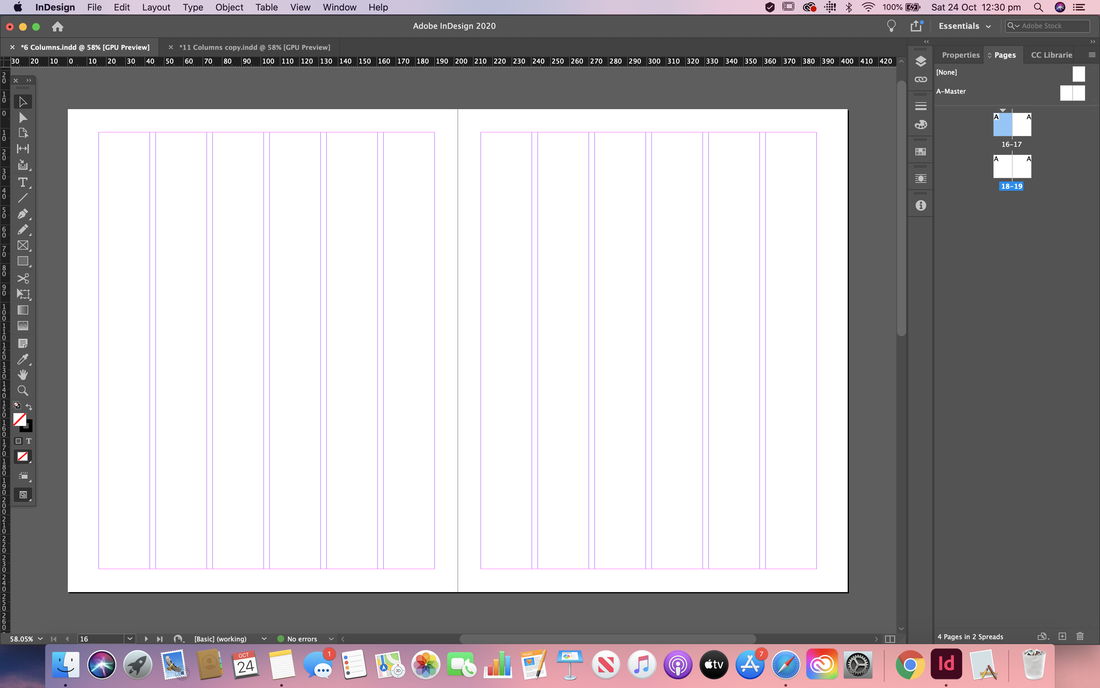  Initial Mock Ups and Developments I then started trying to recreate some of my layouts from my thumbnails using the software. Below you can see some of my process and changes I made as I went. Here is my first mock up for the splash and turn 6 column spreads. I tried out a contrasting colour scheme and a view variations of the layout. I think I prefer the first variation for the turn page more as there's more of a balance of negative space so I will probably revert back to that if I decide to take this design forward. 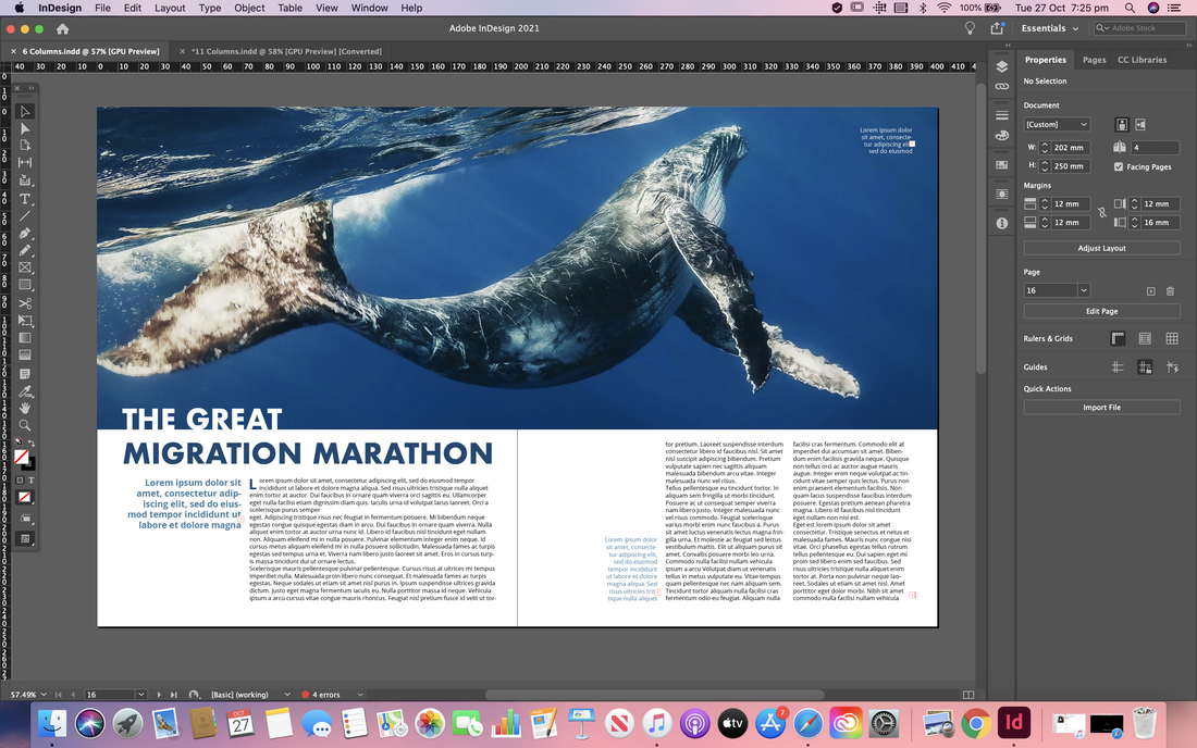    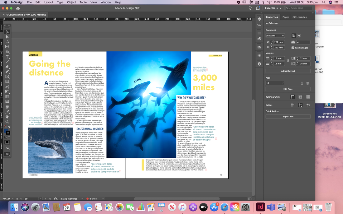 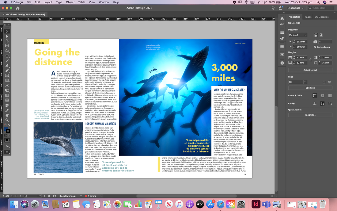 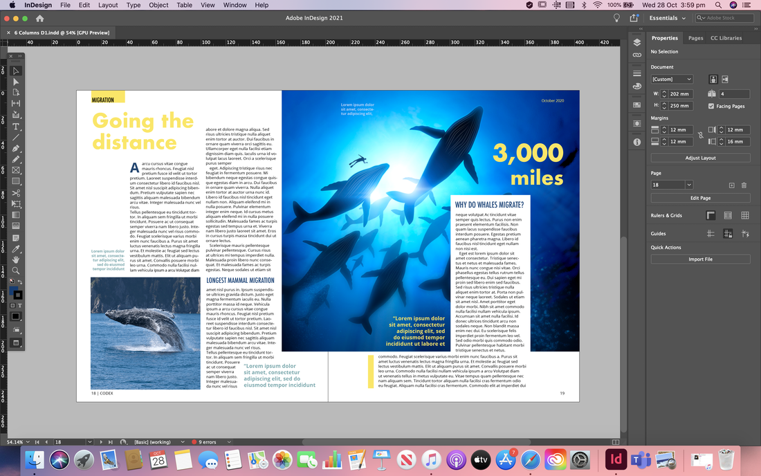  Here is my first mock up of the splash and turn for the 11 column spreads. So far I am happy with how this is going, and I especially love the more complementary colour scheme and the faded words in the background of the spread. However I think the layout of the body copy could do with a rework as I'm not sure I like it at the moment.       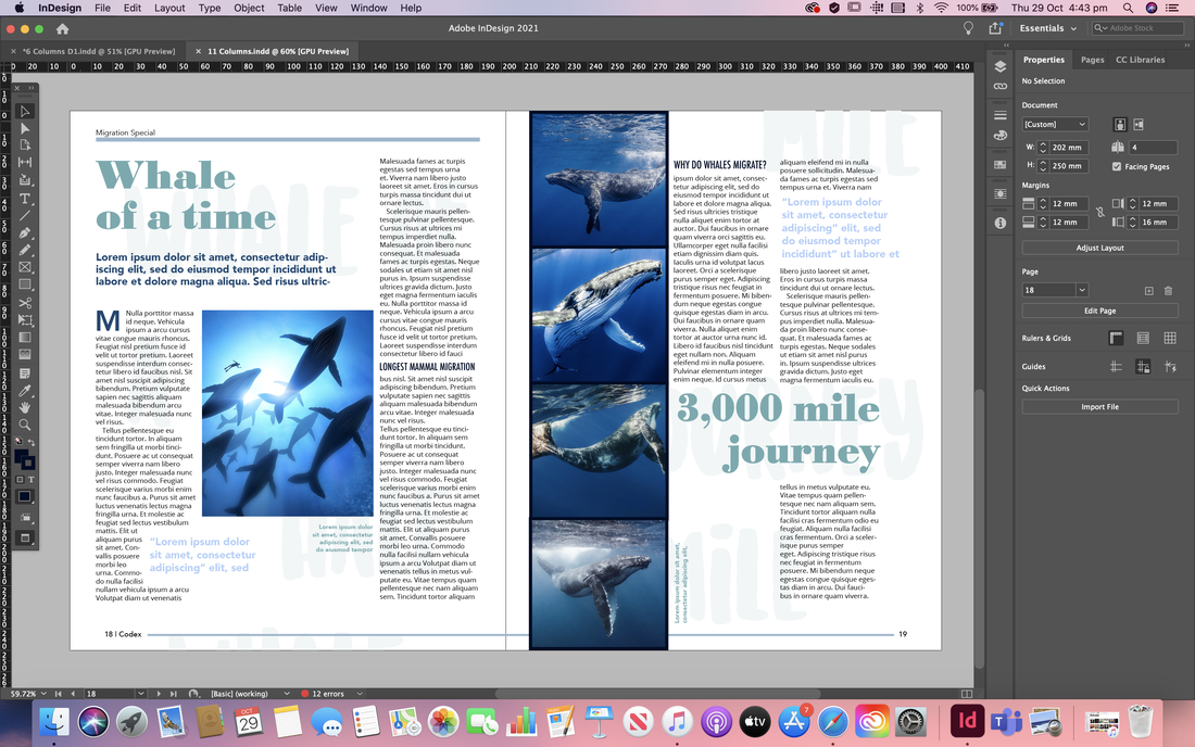 Here I tried out another layout for the 11 column grid spread, using a full bleed image for the splash page. Im not as happy with the turn page; I think there perhaps isn't enough body copy and the images are too large.  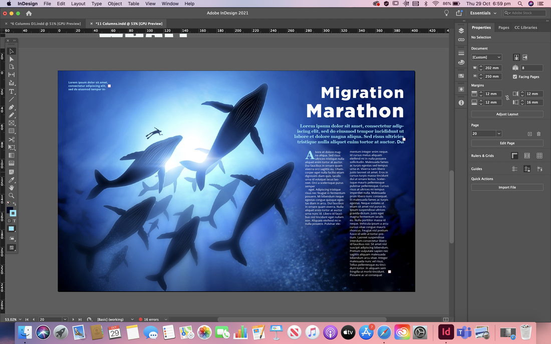  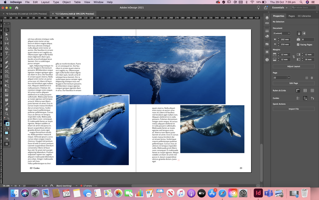  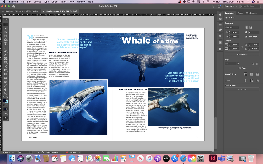 Developments After Feedback After receiving some feedback on how to improve my initial spreads I went ahead and made some changes. I was told my spreads look more like two splash pages, so for the first set I removed the big titles from the turn spread, tweaked the layout of the body copy, changed some of the images so there were smaller and then switched out all the place holder text to an actual article. I also wrote out the pull quotes, headers, sub headers, and captions etc. The second set I did mostly the same thing but I quite drastically changed the layout as I felt the images were too large and that there wasn't enough body copy. I also edited the images to that I could use text wrap.  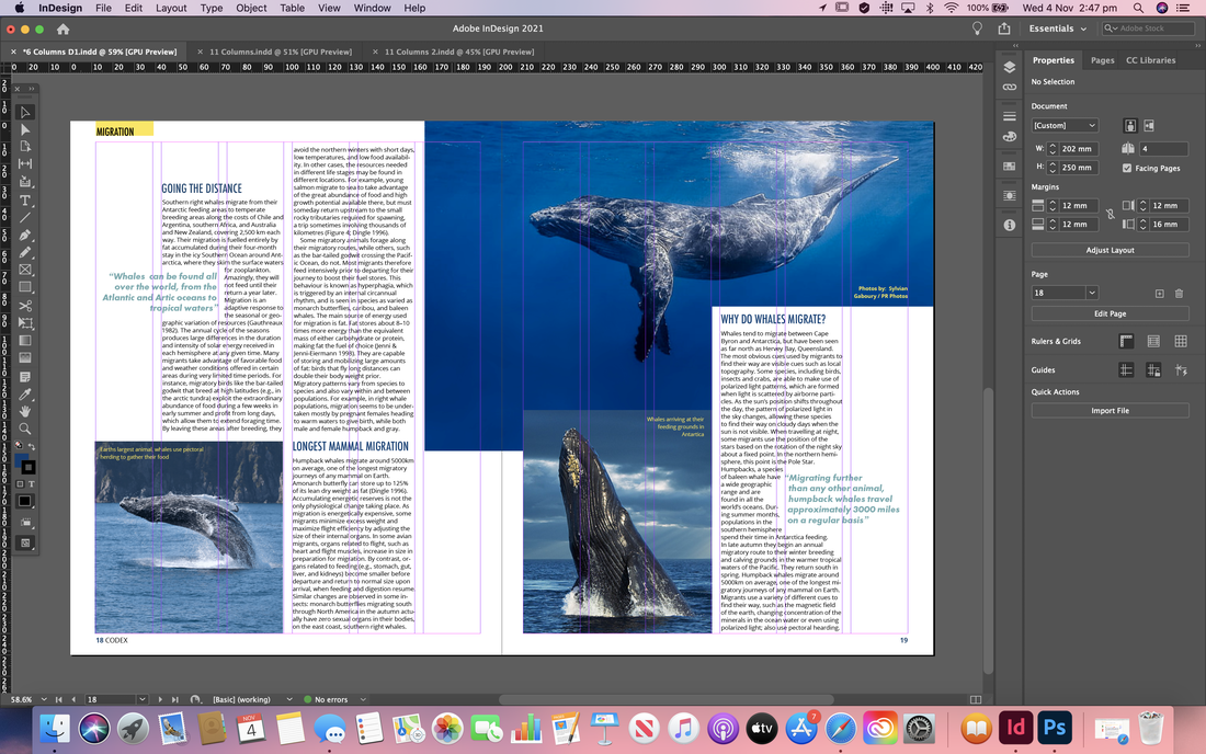    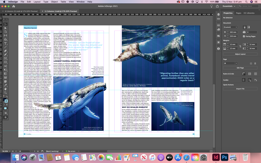 Magazine Cover For the cover I began by researching online to get some initial inspiration. I tried to find ones that were a little different from each other; some being more busy and others more minimal, focusing more on promoting the main featured article. 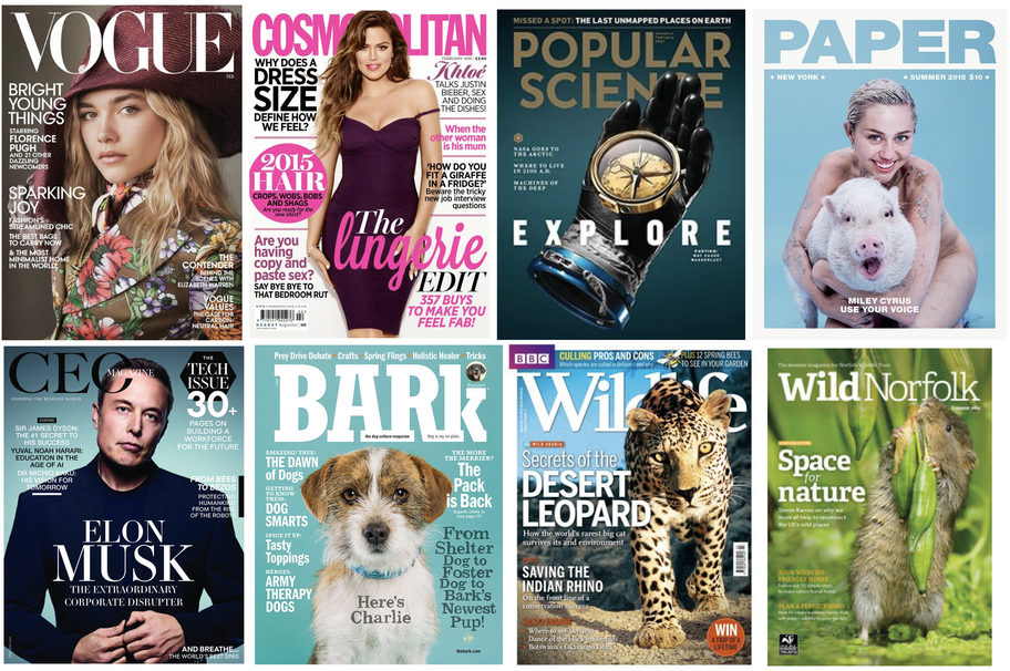 I then draw up a few quick thumbnail sketches, thinking about how I wanted to layout the elements on the cover. I knew I definitely wanted the mast head to be at the top so that it would be most visible on a shelf and then include a large, high quality image of a whale. I mainly just experimented with the placement of the featured article name and if I was going to include other articles or not. 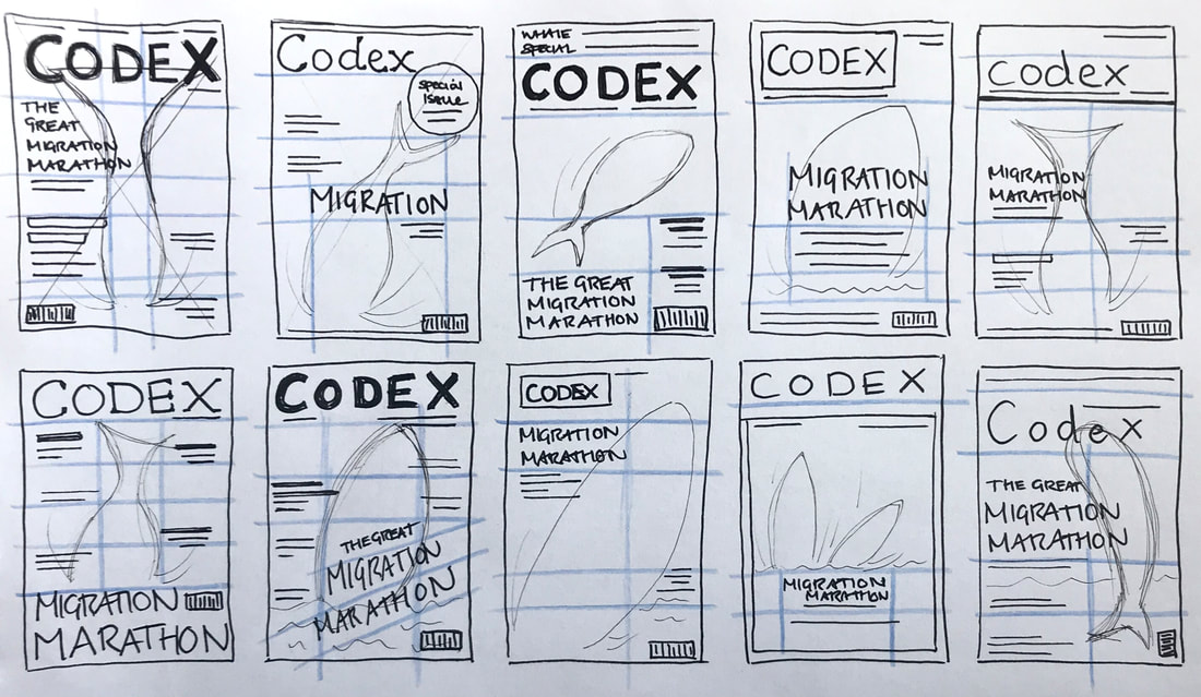 I then began transferring some of my thumbnail sketches into design in Adobe InDesign, experimenting with a colours and typefaces that would match my article spreads and create a harmonising set of work. I ended up designing two covers; one for a more affordable magazine and the other more minimal and high-end.  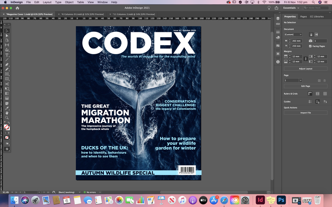  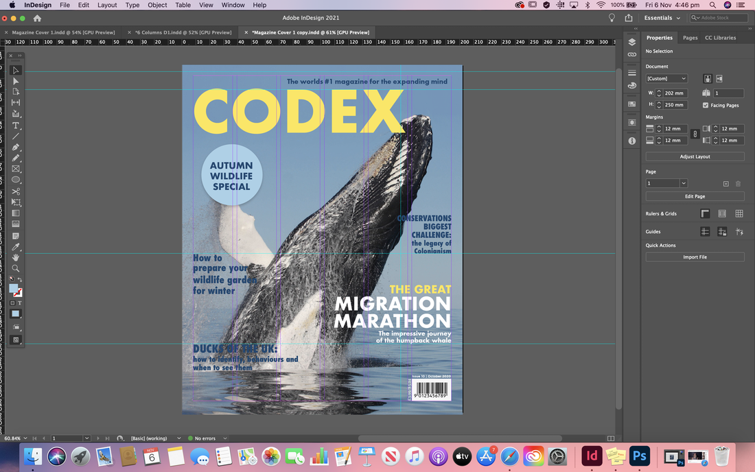 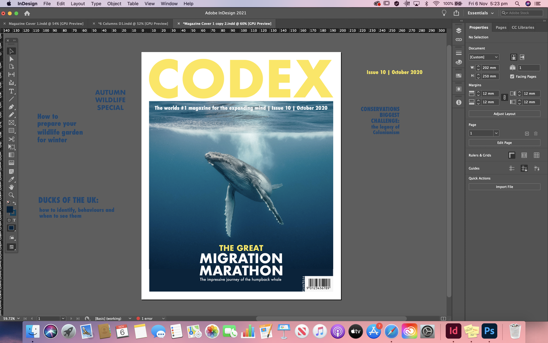 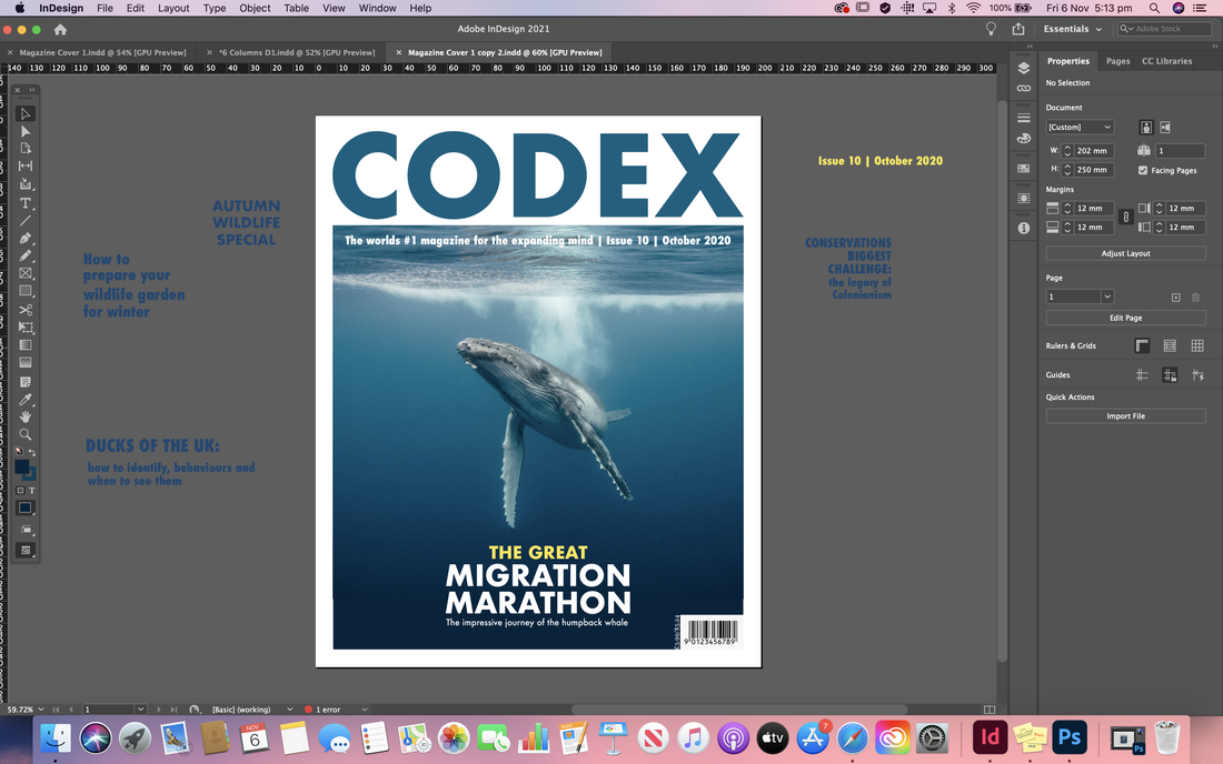 Final Designs
Here are my final designs for each of the different column grids and the cover after receiving all of my feedback. I also included mocked up versions so you can see them in action and how they might actually look in a magazine.
0 Comments
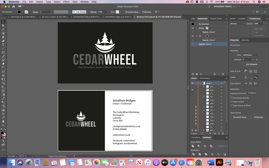
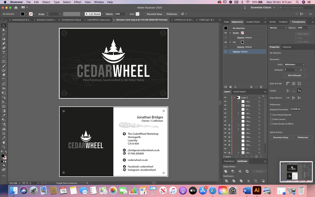
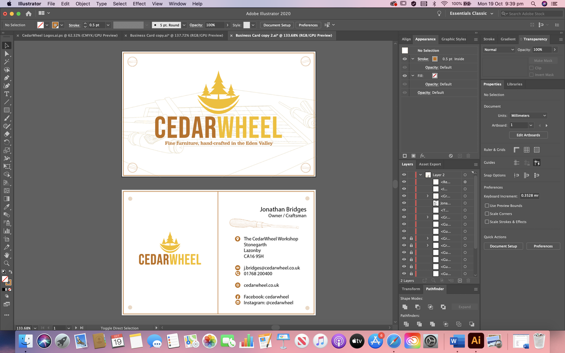
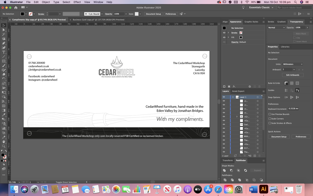
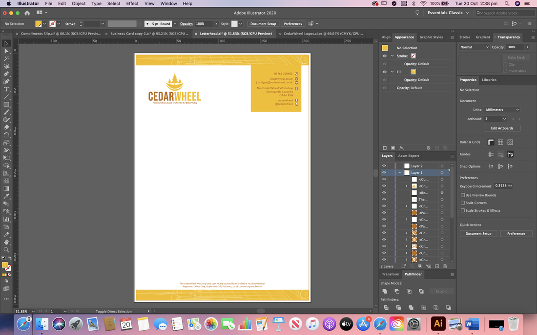
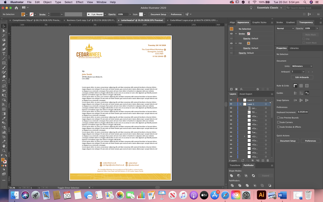
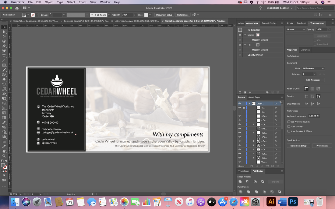
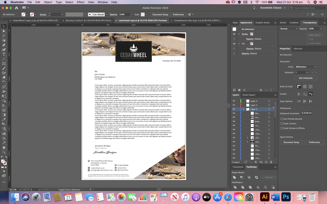
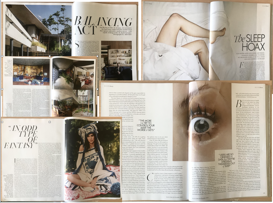
Proximity and RepetitionFor this project we had to design a visual identity for a furniture workshop called CedarWheel using the assets provided and showing use of the concepts of proximity and repetition to create balanced and consistent designs. I began by researching various stationary designs to gain some inspiration, looking closely at their layouts and how they manage to create pieces that seem to go together as a whole.  As with all the other projects so far, I then went ahead and started drawing up some thumbnail ideas for the layouts of the stationary. I began first with the business card at it seemed the least intimidating with it being a smaller space, then took those ideas onto the other formats. 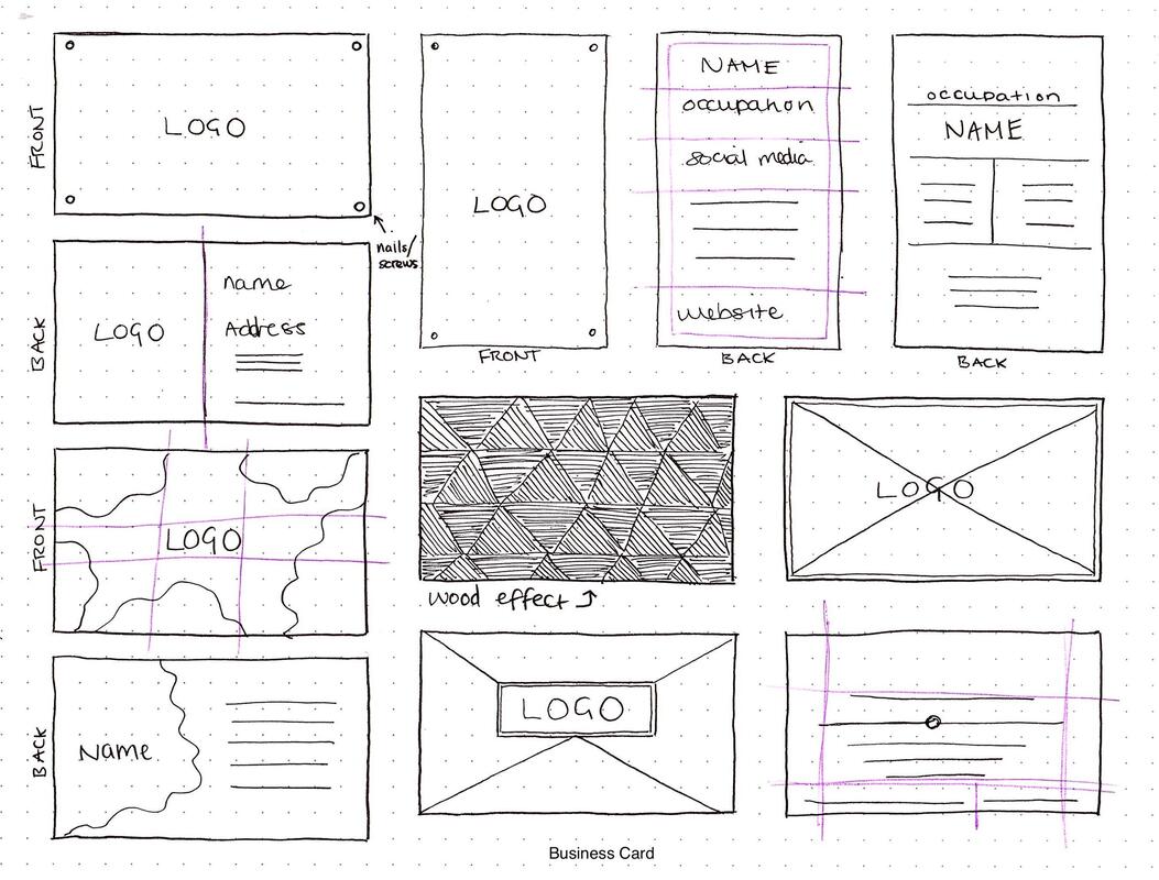 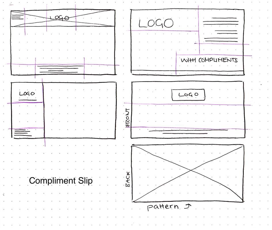  I then went into Illustrator and started putting together some layouts; starting simple before adding more details. I wanted to make the design more interesting but wasn't too keen on the way the images we were given looked so I drew up a line drawing of one of the images to use in the background instead as it looked more subtly stylised and minimal. Below is the black and white design I did first, as well as the colour version: I then tried to create a compliment slip and letterhead using the same styles I used for the business card to show consistency in the brand design. I still had to explore the fonts used for these designs as I wasn't happy with those yet. I also preferred the colour version of the design as it looked more interesting so I stuck with that. After some feedback, I decided to not only slightly rework my initial design but create a new one too in different style, experimenting best I could with different proximities while keeping everything consistent. Final Designs Here are my final stationary sets, each showing slightly different ways of proximity whilst repeating certain elements on each format to keep the brand looking consistent and like it's all a part of the same set.  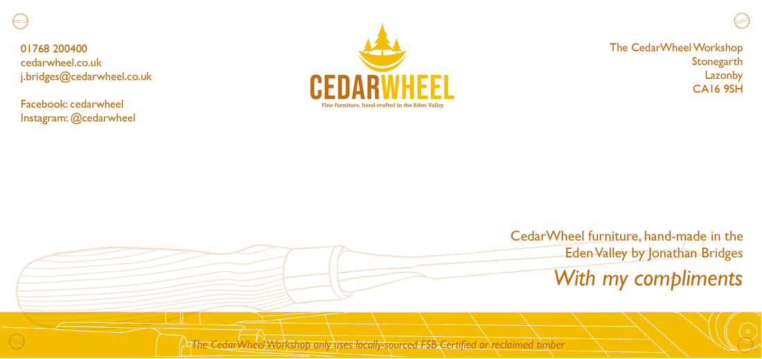  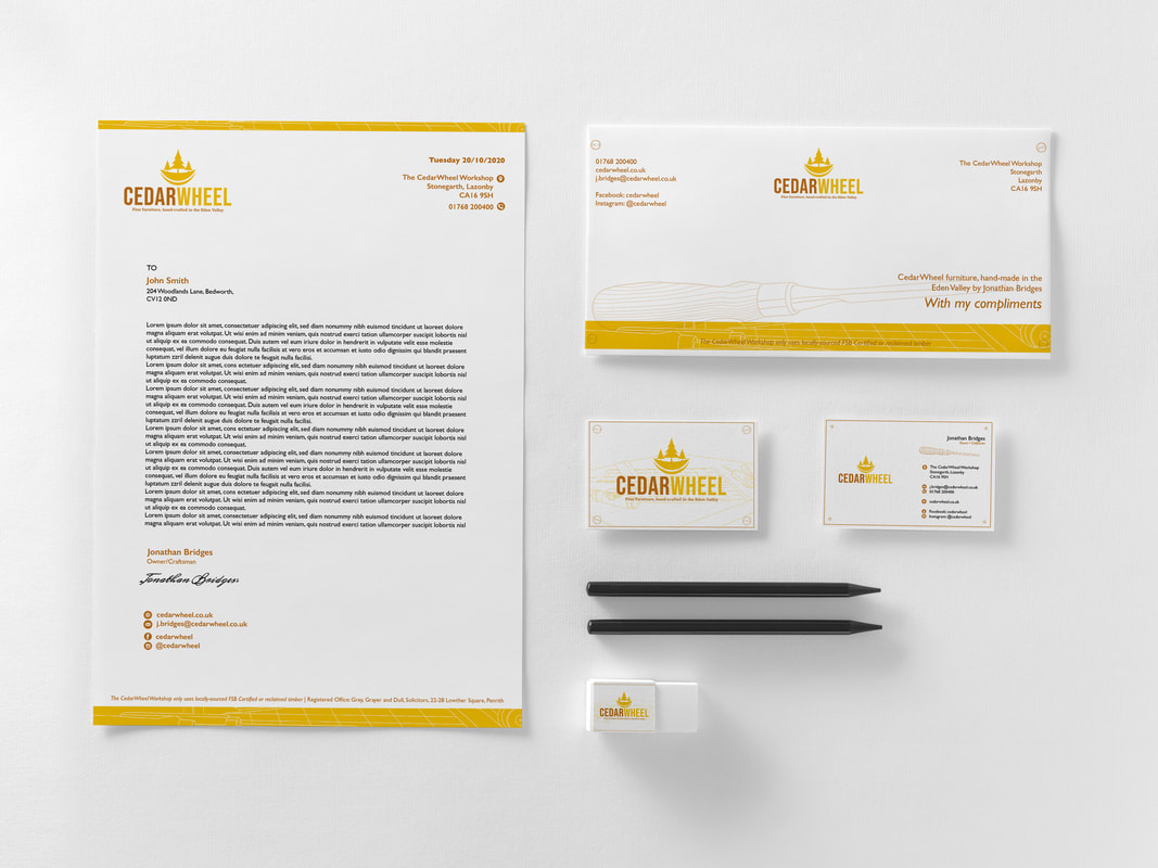 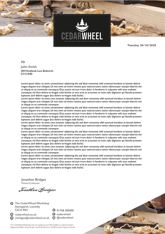 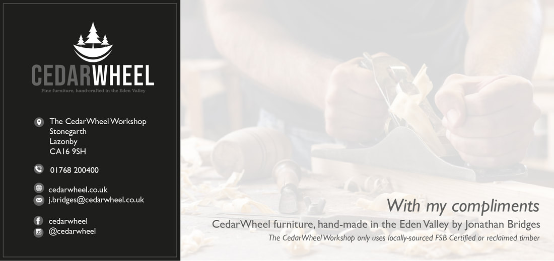   Balance and ColourFor our third exercise we had to create designs for an iPad resident app using the principles of balance and colour. The designs had to include a landing page and a product page, one set using symmetrical balance, the other asymmetrical as well each of those using complimentary colours and contrasting colours. I began by doing a bit of research into app design, as it was something completely new to me. I wanted to make the layout simple so I could focus more on experimenting with the colours. 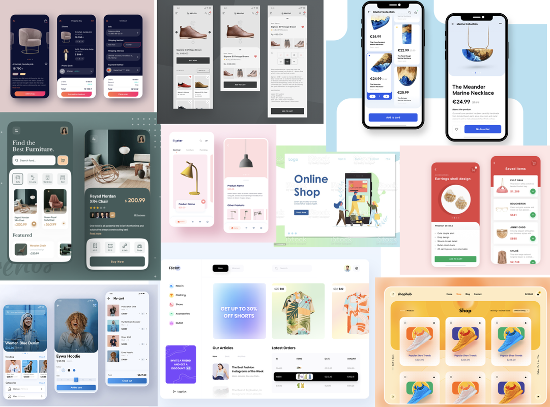 I then sketched out some thumbnails to give me an idea of the layout of the two app pages before I went into Photoshop, taking inspiration from the above mood board and trying to think about how I could implement symmetry and asymmetry. I then decided to do a little research on complimenting colour combinations I could try out.  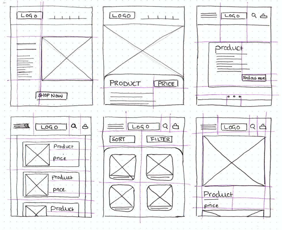 I then found an online wire framing tool (MockFlow) that I thought would be helpful to further figure out some of my layouts. 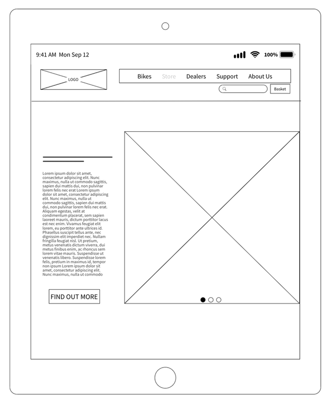 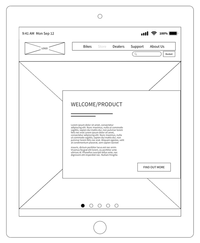   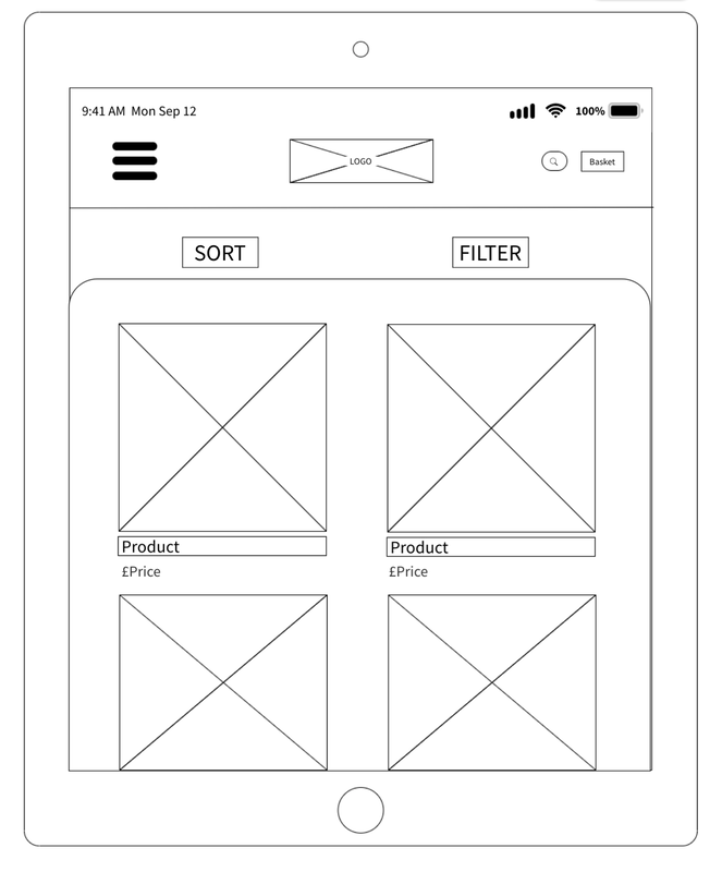 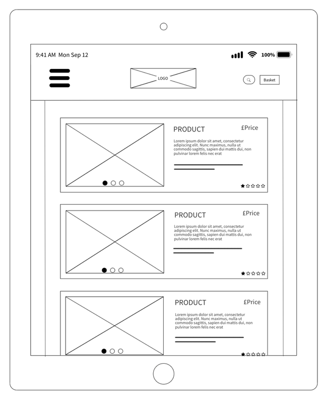  I also began looking into possible contrasting and complementary colour schemes before I started creating my designs on Photoshop. I used the websites ColourSpace, Coolors and Adobe Colour. I was leaning more towards using a palette that was still eye-catching but had mainly earthy tones to match the theme of bikes and being outdoors. 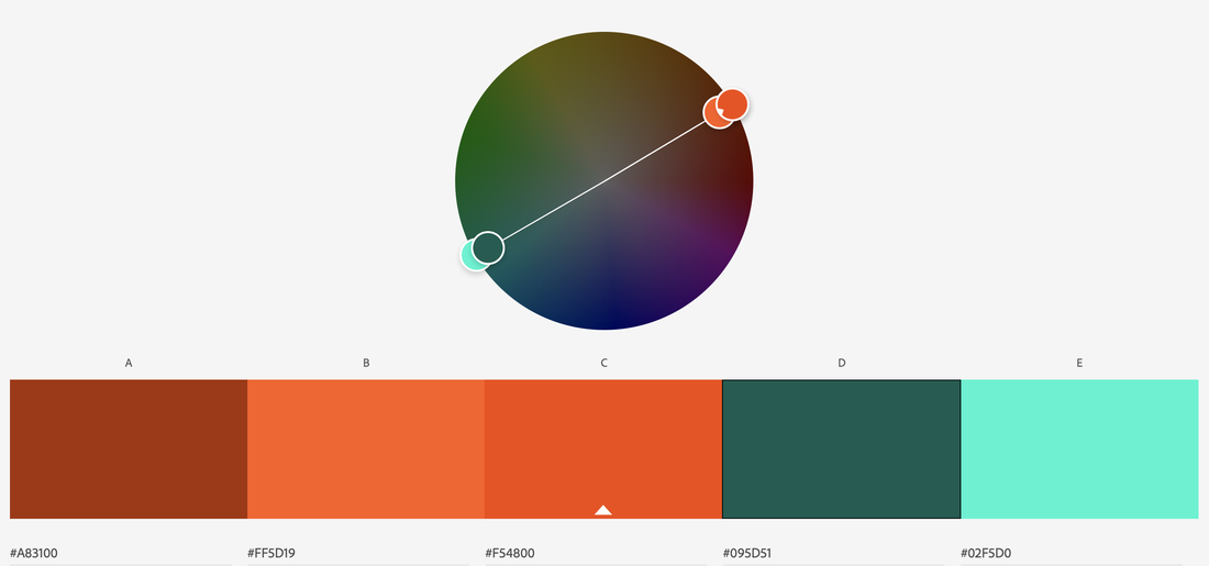     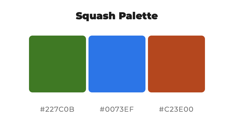   Symmetrical/Contrasting Colour Moving into Photoshop, I began creating my final designs, experimenting with the colour schemes as I went. I initially was going to use earthy colours such as greens and browns but actually preferred the way the navy and orange looked more for this contrasting, symmetrical design. 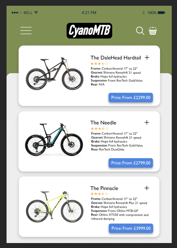 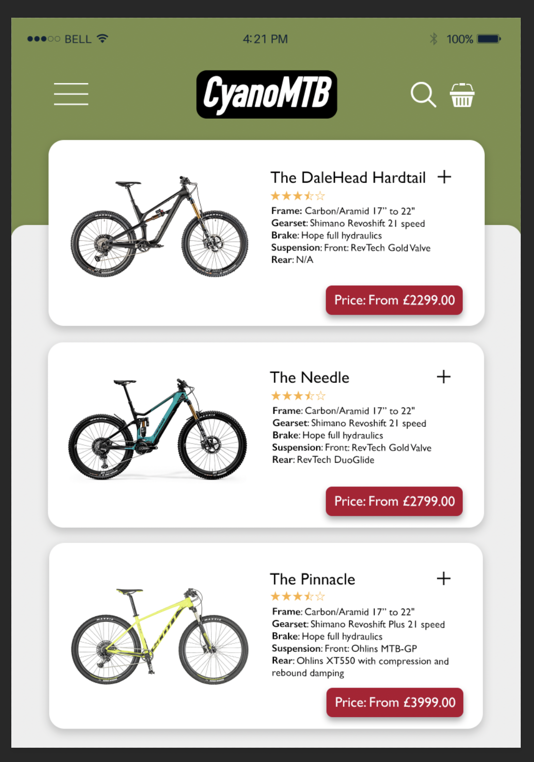 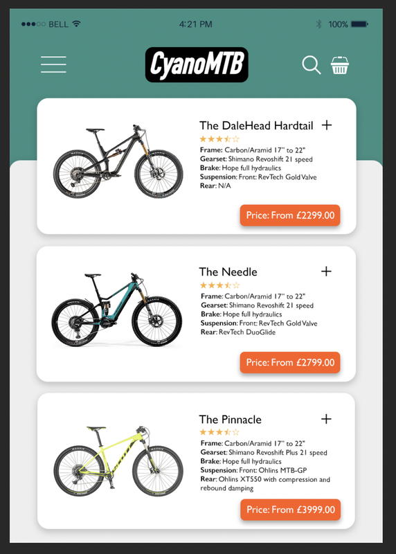  Here as some brief progress shots of my designs; I rearranged some elements and made subtle changes as I went to make the symmetry more obvious. 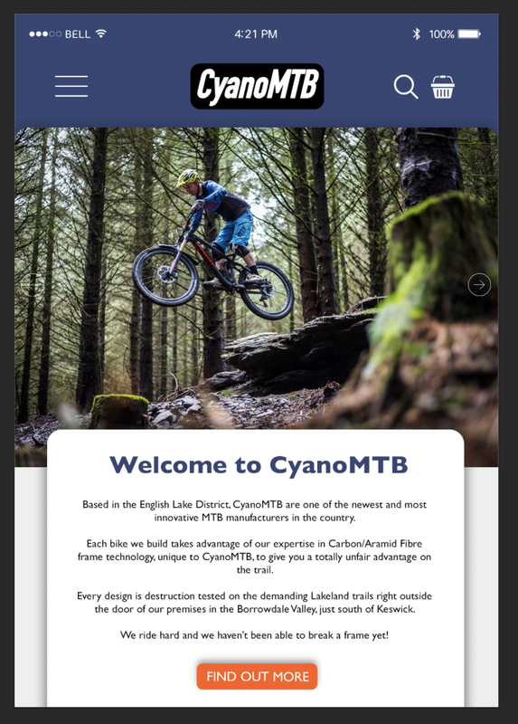  Here are some screenshots of the Photoshop documents showing the grids I used to show the layout and alignment:  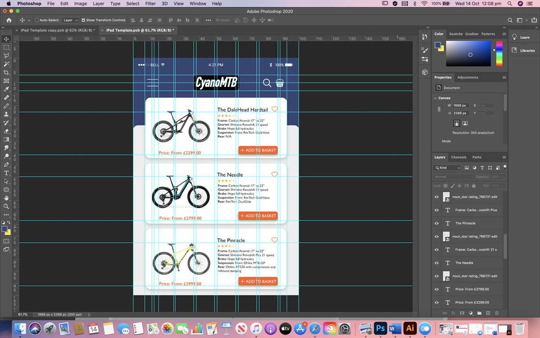 Final designs for symmetrical balance and contrasting colour scheme:  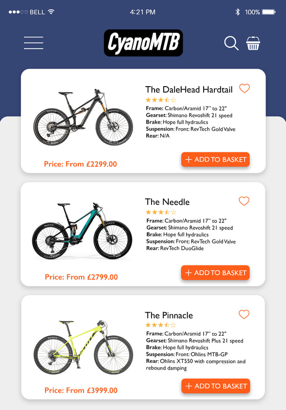 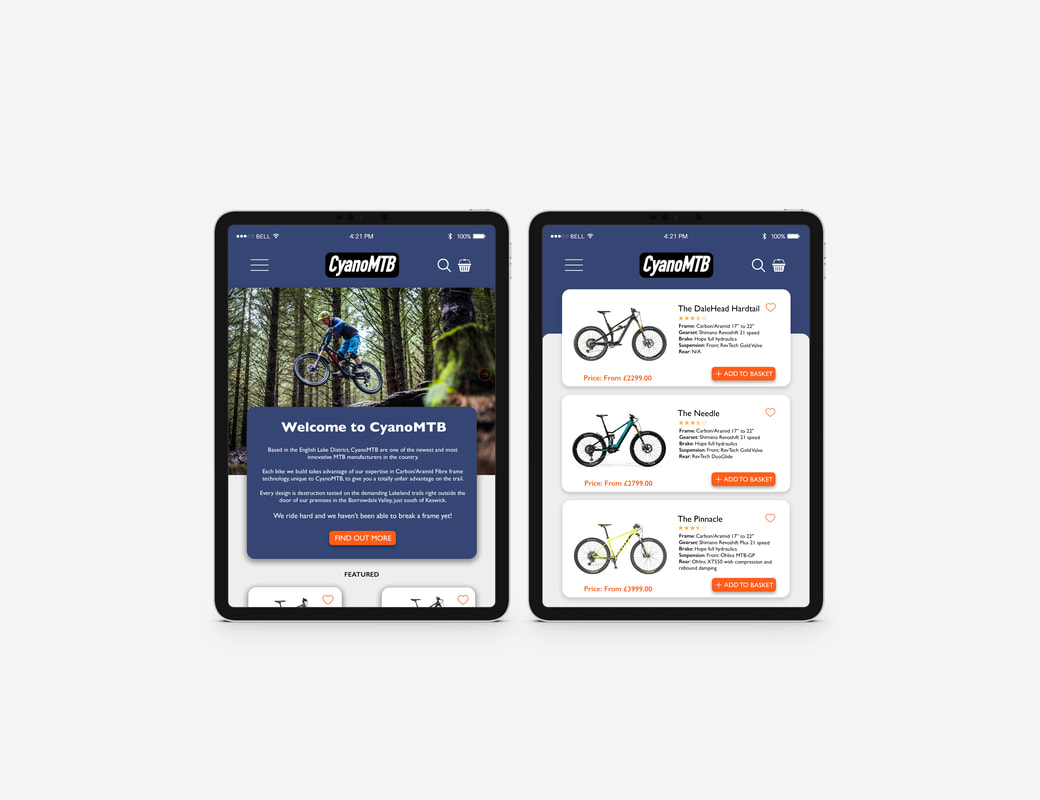 Asymmetrical/Complimentary Colour I then began designing my second set which would be asymmetrical with a complementary colour scheme. I experimented briefly with a couple different colour options until I settled on the green and yellow; a classic representation of adventure and the outdoors.   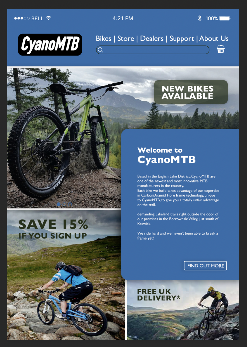  Here are some screenshots of the Photoshop documents showing the grids I used to show the layout and alignment: 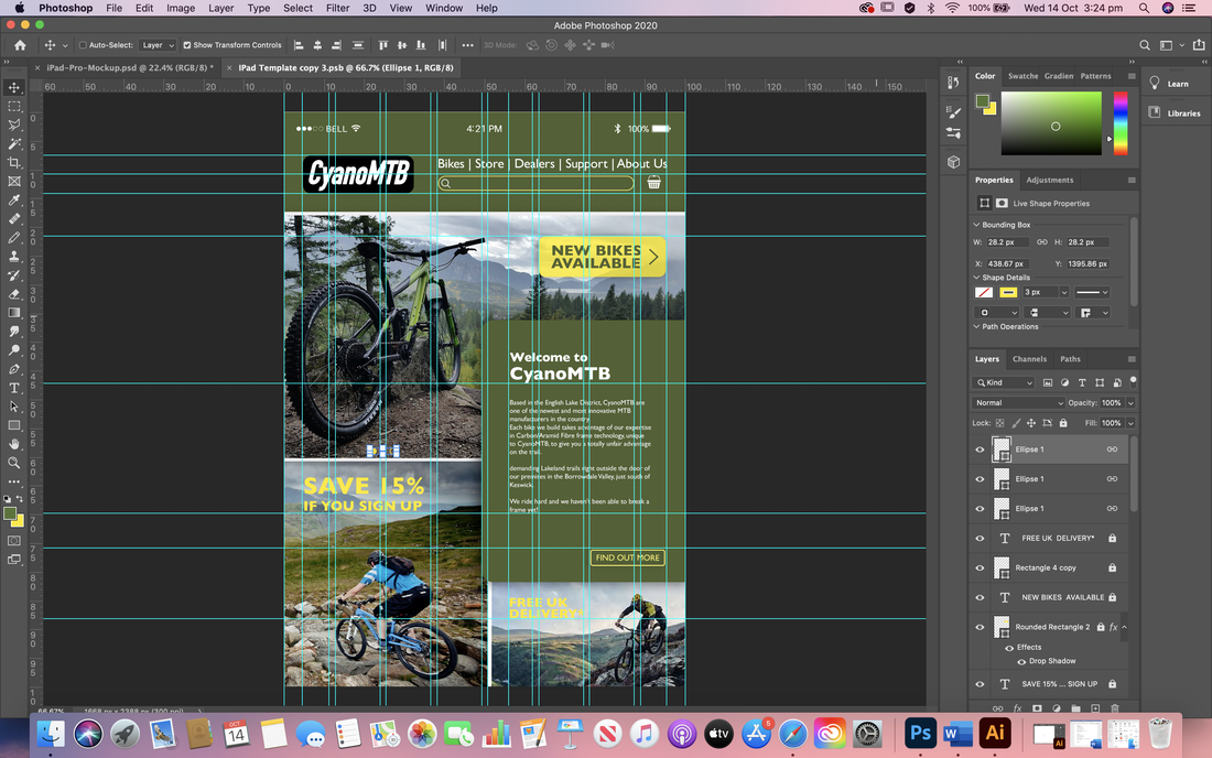  Final designs for asymmetrical balance and complimentary colour scheme:   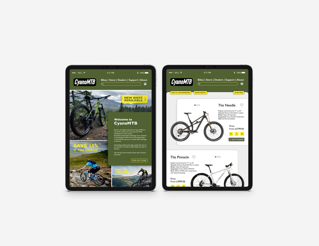 Contrast and Negative SpaceOur second task involved exploiting the principles of contrast and negative space to create two double-page spread layouts (a 'splash' page and 'turn' page) for a magazine, using the assets we were given. We also had to employ the principles we learnt last week on alignment and hierarchy. I started by doing a little research online for inspiring magazine layouts. I then also went straight to the source and looked in some of my old magazines I had at home, paying close attention to how they used negative space to enhance the other areas of the design as well as how they incorporated the images. After this I went ahead a quickly laid out a few thumbnails to use as a reference for when I jumped onto the computer, thinking about how I could attract attention with splash pages and contain more content on the turn pages whilst considering white space. 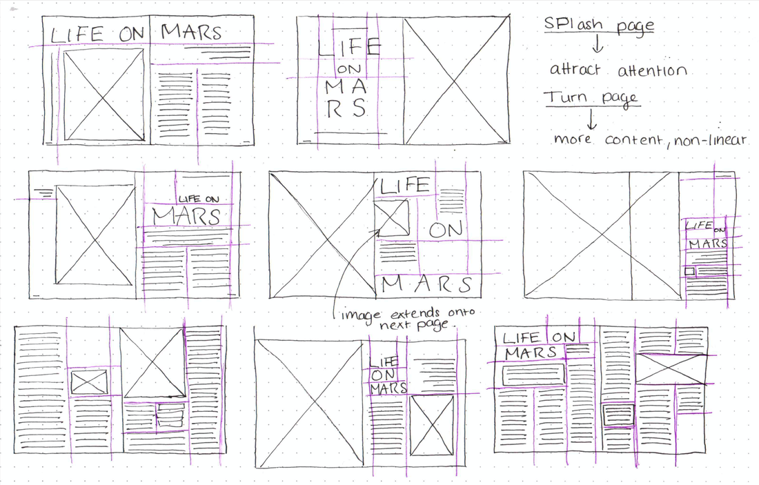  I then began recreating some of my thumbnails onto a document in Indesign, using the grids we learnt to use in the previous task. To begin with I focused more on layout and alignment. After getting some feedback I then reworked this design, changing the colours so there weren't as harsh, changing some alignments, as well as adding pull quotes and a drop cap to make it more interesting.  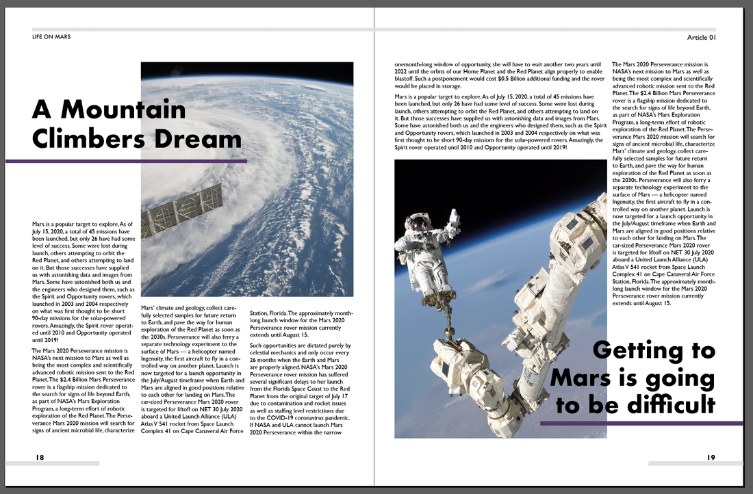 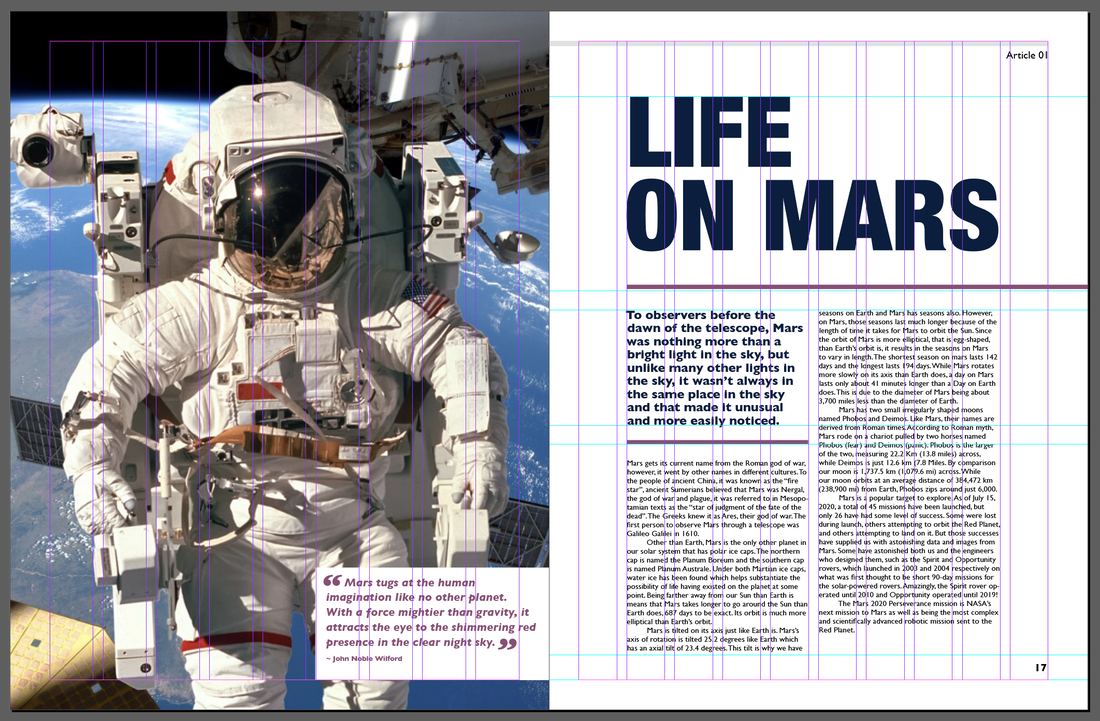 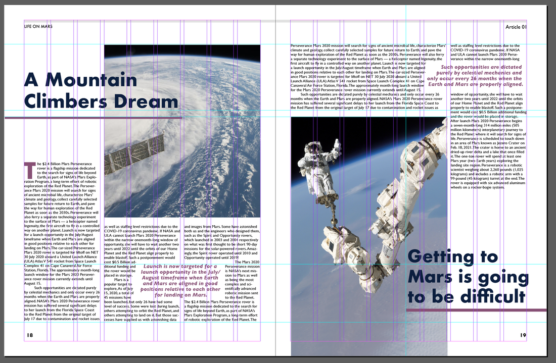  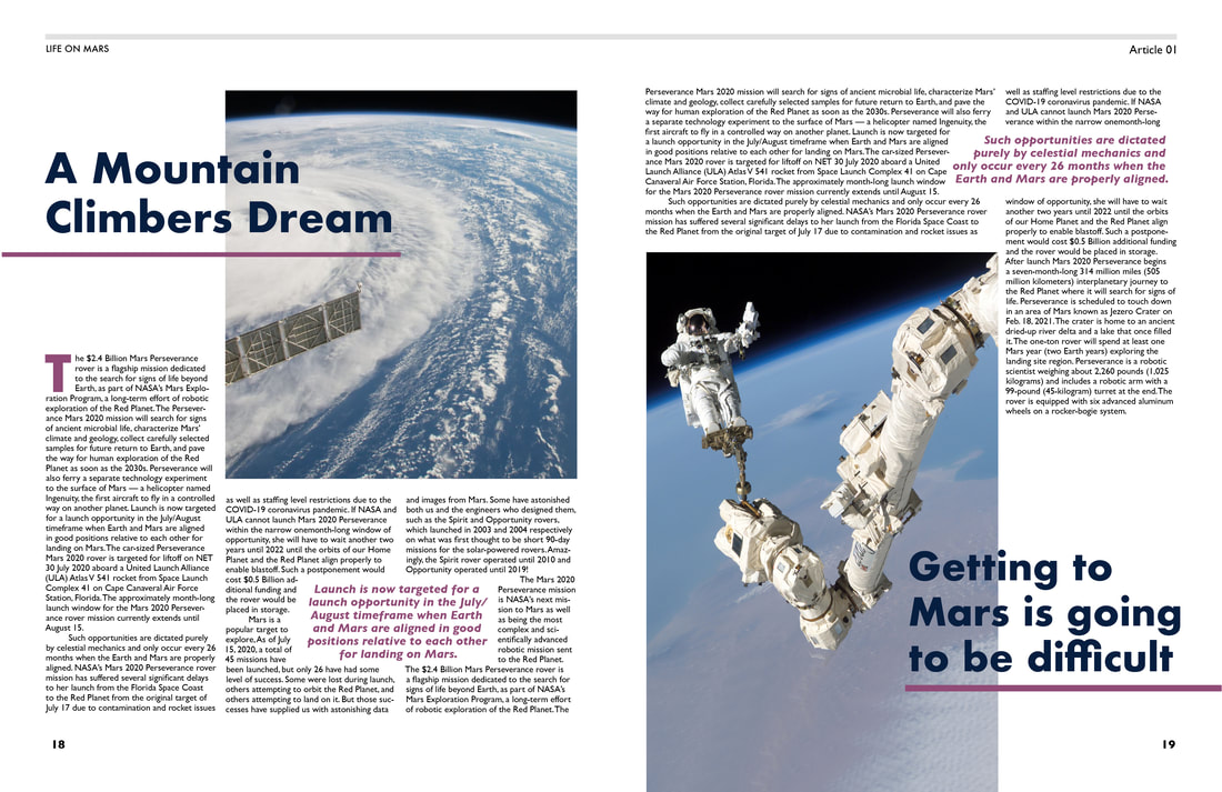 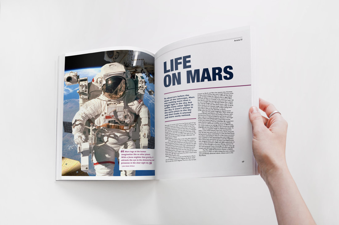  For my second design I find a few of my own images so that I could make the colour scheme more consistent. For the splash page I took it a step further making the image the most prominent element on the page, and tried to be a little more dynamic with the layout of body copy. For the turn page I regularly used the text wrap feature so that I could make the page flow more and be a little more interesting then just straight up and down columns.  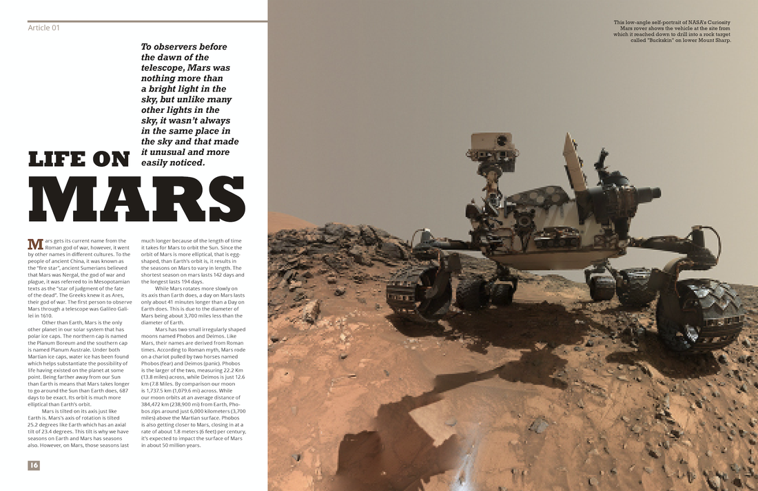 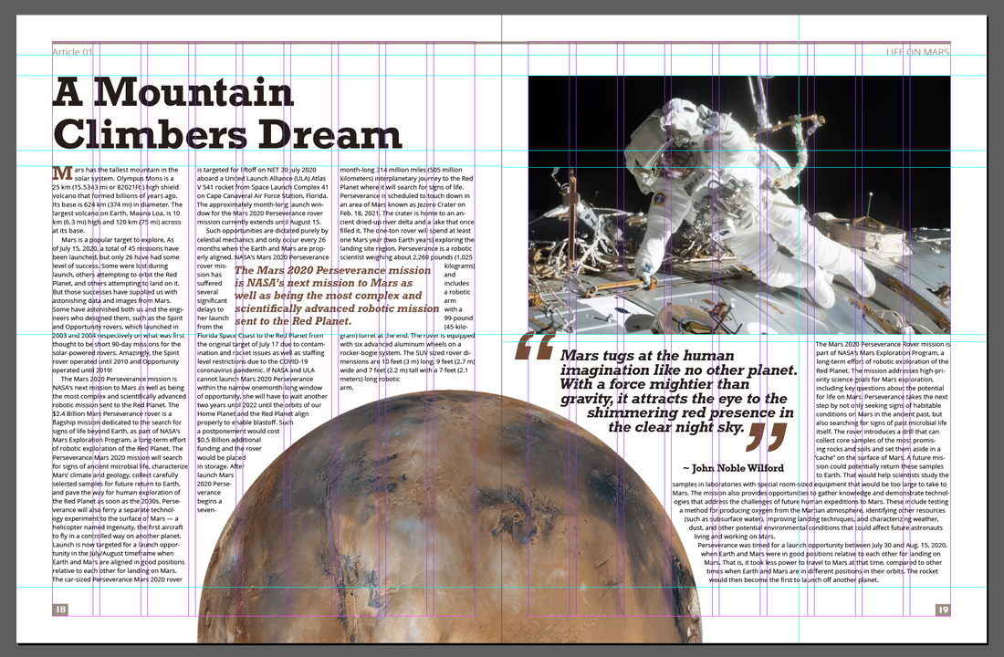   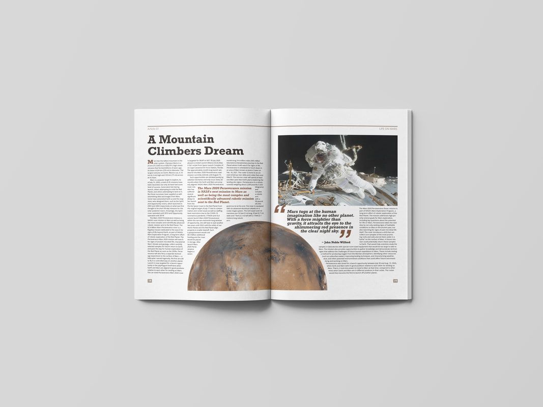 |
AuthorHi, I'm Emma. I'm currently studying Graphic Design at the University of Cumbria. Modules
All
Archives
May 2021
|


 RSS Feed