
|
Brief
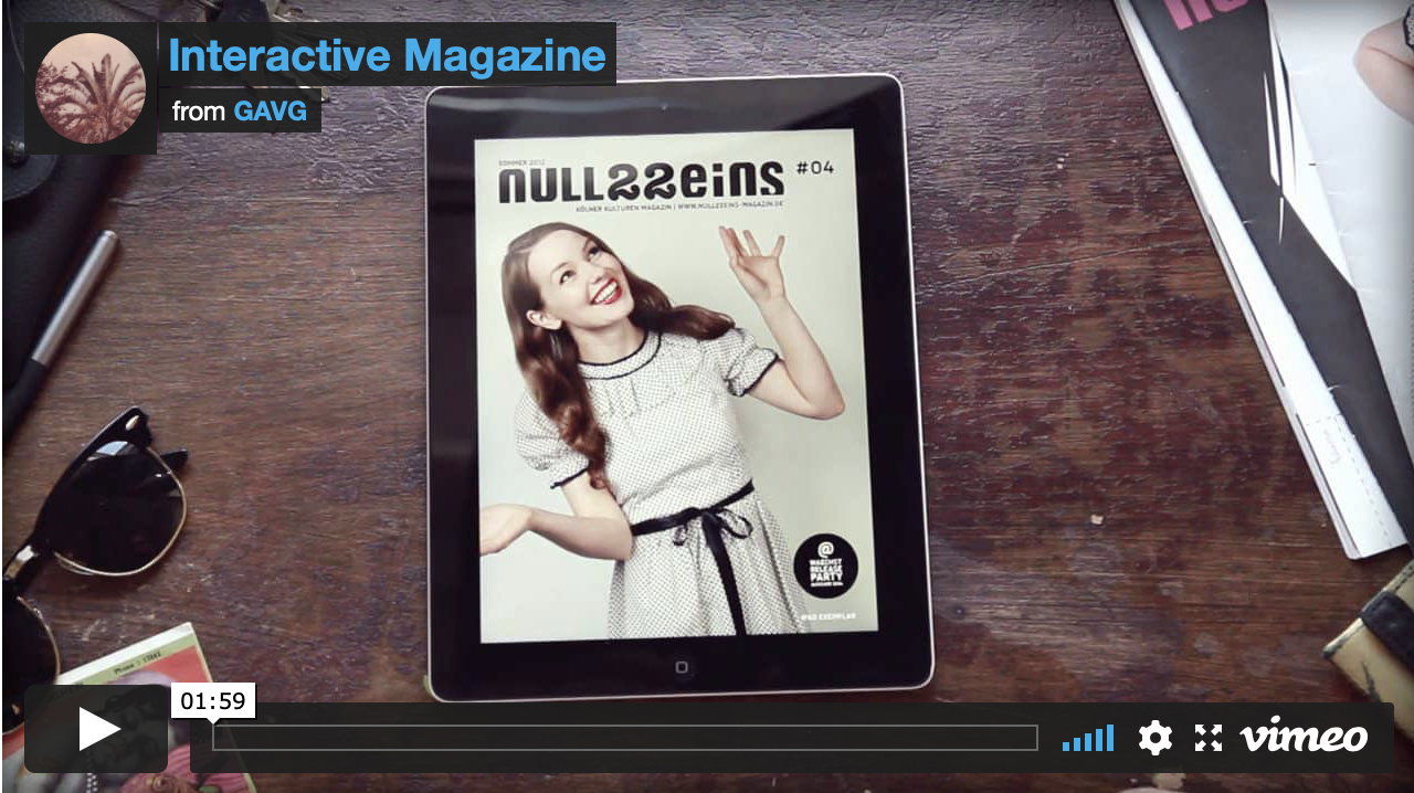
Following on from our existing print-based editorial work, we had to create a proposal for a digital version of our stories for a web-based version of the magazine. Research To begin I started by researching some examples of interactive, digital magazines to use as inspiration and give me ideas for what additional content I wanted to include such as videos, sound, and other interactive elements. I found a few that I liked on Behance and Youtube and they inspired me by how the little animations for swiping and viewing extra content enhanced the users experience. 


Addition Content
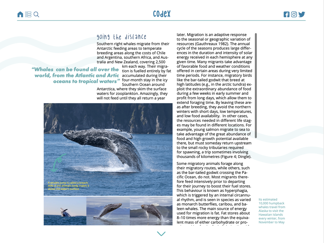
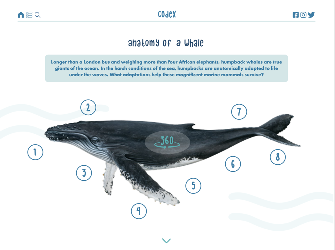
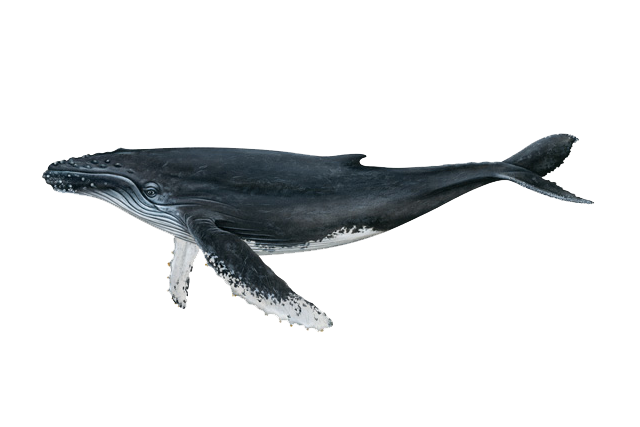
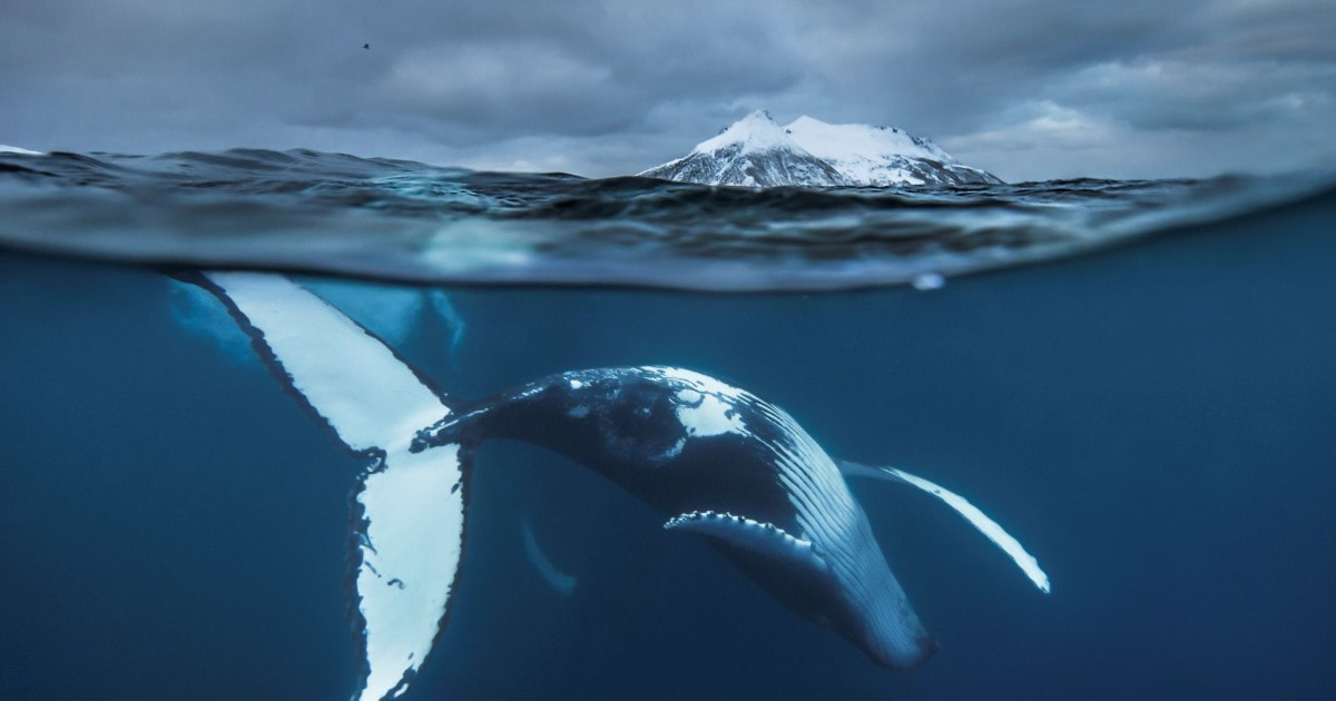
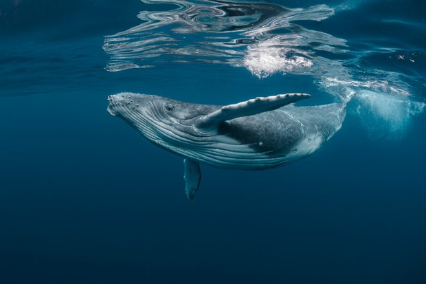
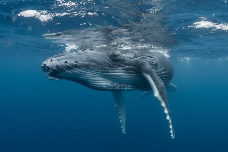
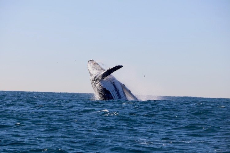
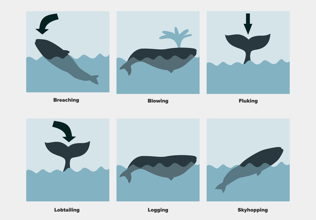
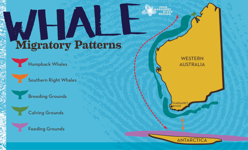
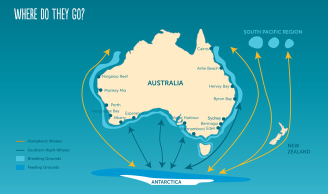
Due to this digital magazine having more pages, I needed to look for more content to include to bulk it out. I began by researching online for ideas for more relevant information. I knew I wanted to include a 3D whale image to add content around so I looked for more quick and short facts, maps to add animated elements onto, extra images for slideshows, videos, sounds, as well as general body text. Videos:
Imagery:
Information:
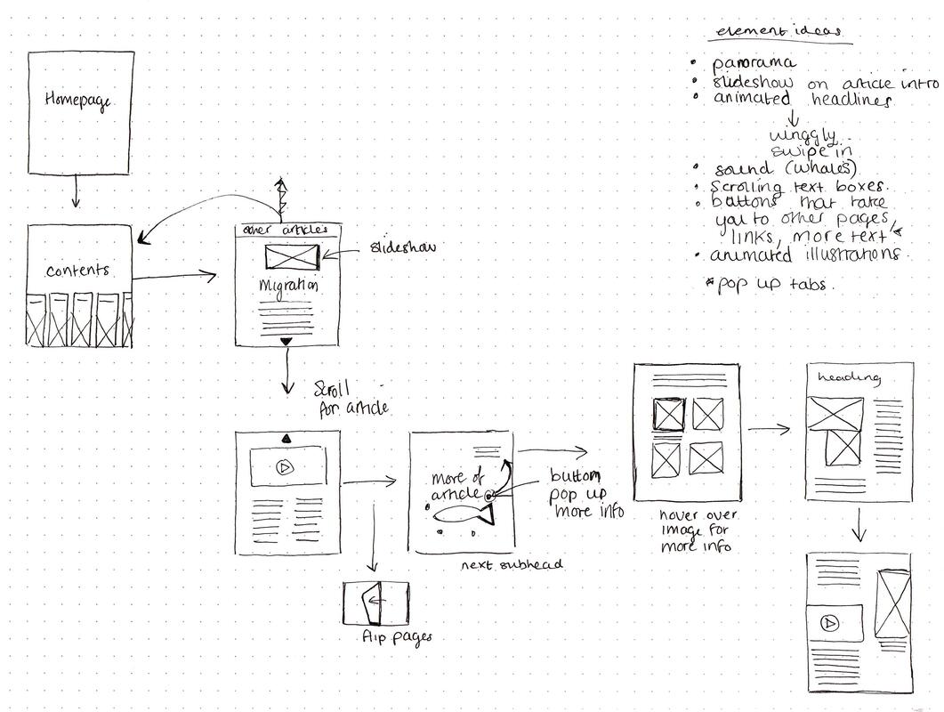
Initial Flat Plan of Sequence of Pages
After curating some additional content, I began thinking about the order of pages, and tried to get an idea on what was going on each page, as well as where the interactive elements could go.
Thumbnails
I then went ahead and drew some thumbnail sketches for layout ideas for my pages, trying to take into account that some areas would be interactive or have some sort of effect added. I also tried to think about layouts for both portrait and landscape and how the article could look if it was a page you scrolled down to see more of it rather than each being an individual page. 
Mood Board
I decided to do a quick mood board of how I wanted the style of the magazine to differ from my previous one. I wanted it to be mainly the same but include more fun, handwritten/hand drawn elements that could be subtly animated and add a bit more visual interest. 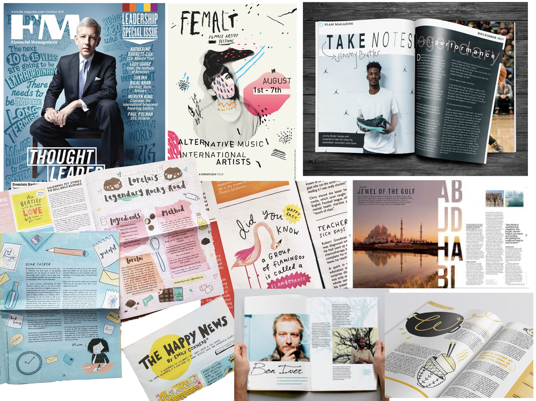
Initial Concept
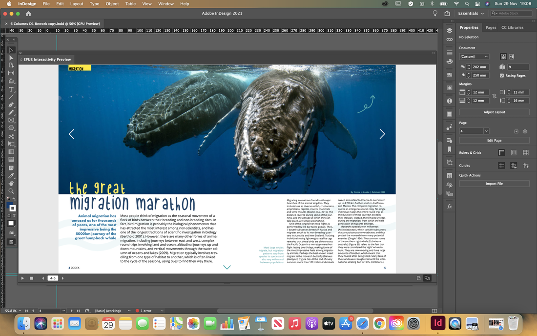
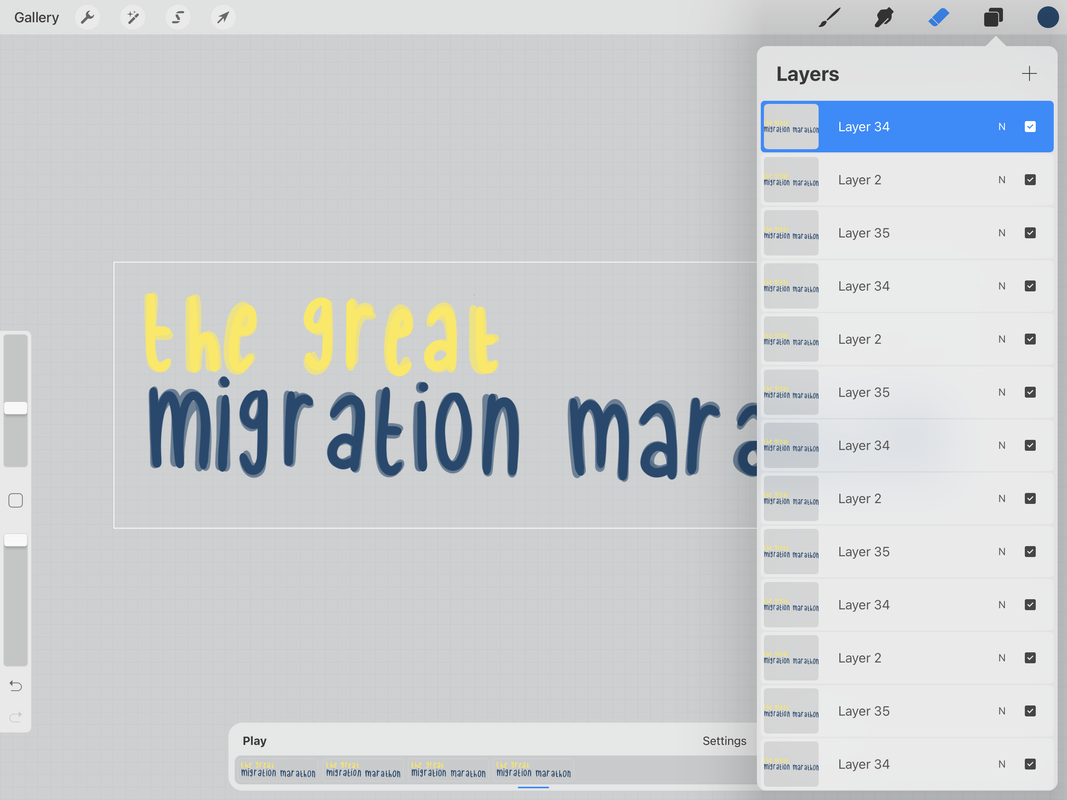
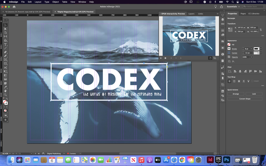
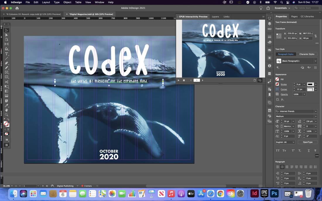
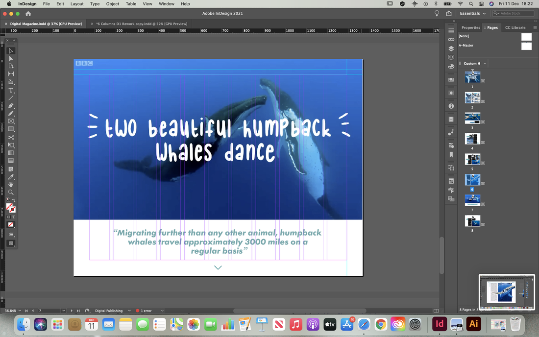
After planning out my ideas, I began to implement them on screen. I took my original spreads and edited some of the fonts and layout to fit the new style and incorporated a bunch of new interactive elements. I included animation, roll-over buttons and made gifs using Procreate to use for animated titles and sub-titles. I also included a clickable slide show of images on the articles splash page and edited a video from online to make it fit in more with my theme. 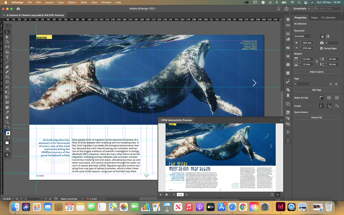

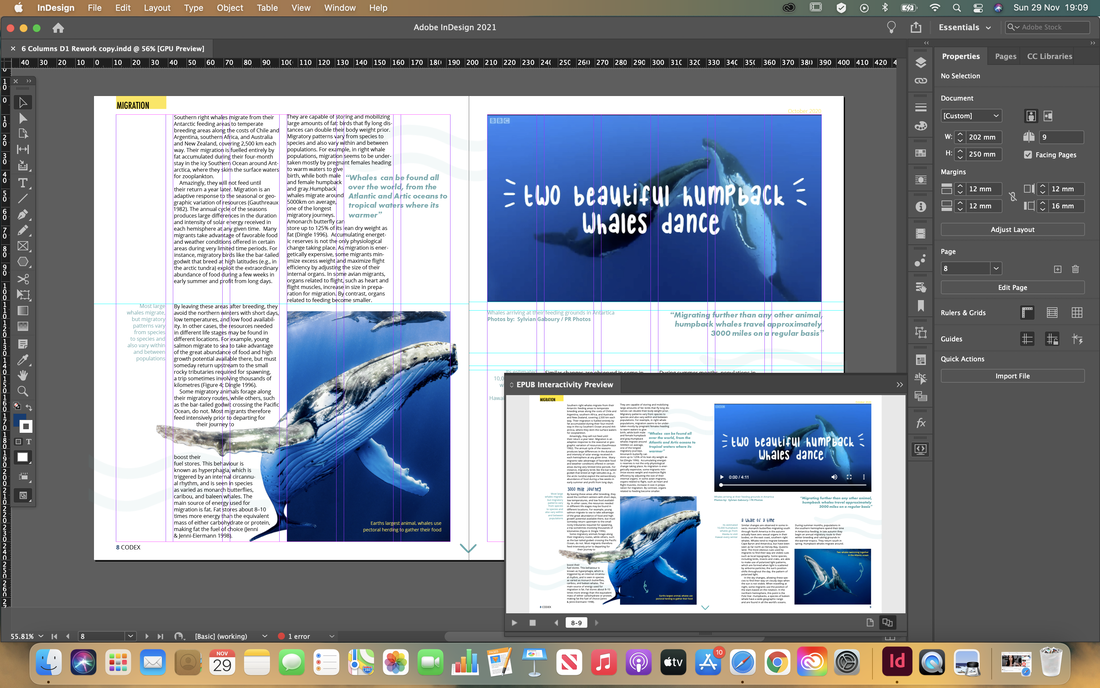


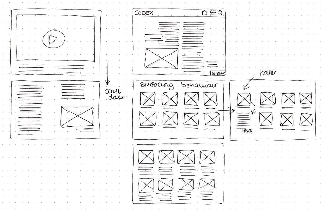
After receiving feedback on what I had done so far, I began reworking my layouts so it looked more like it was intended to be digital, rather than a printed magazine with interactive elements added to it.
I started with the cover page, removing the featured articles so it was just an image and there name of the magazine, as the articles would be clickable on the contents page anyway so didn't need to be on both pages.
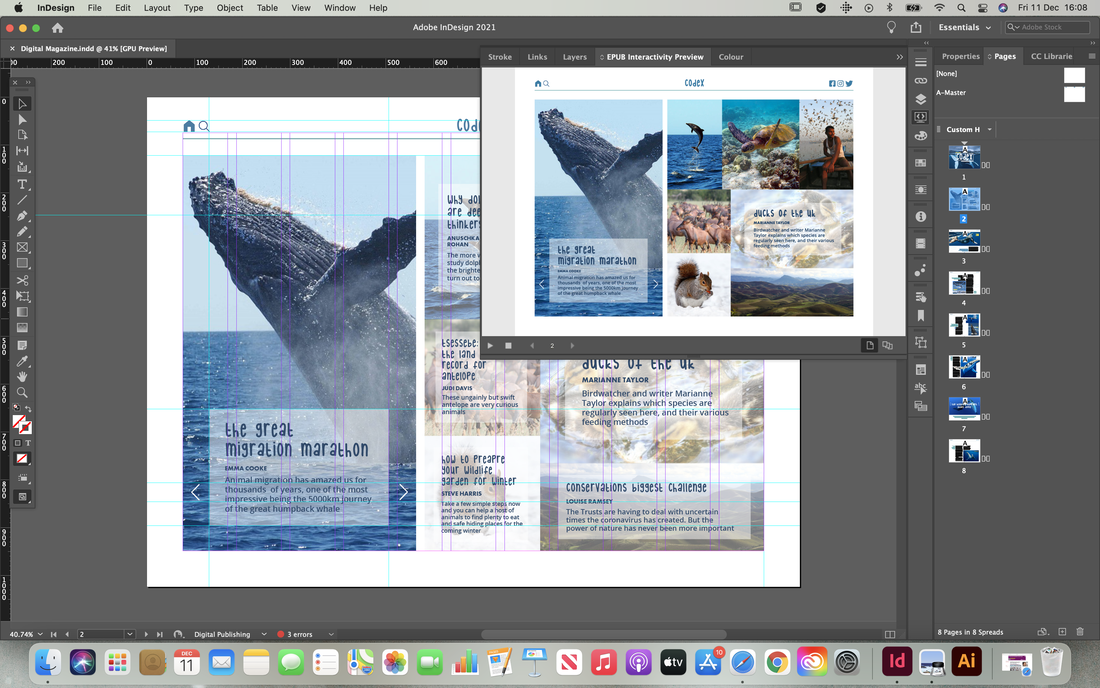
Next I started trying to design the contents page. I initially was struggling with the layout of this page but eventually settled for the hover over tiles with a bigger tile on the left with the featured articles as a clickable slideshow.
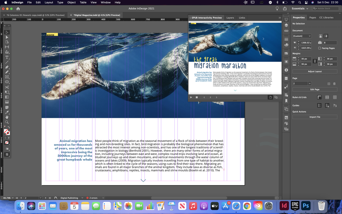
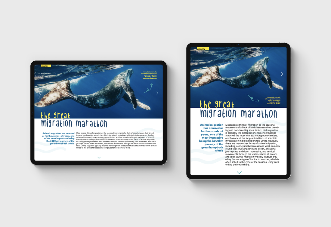
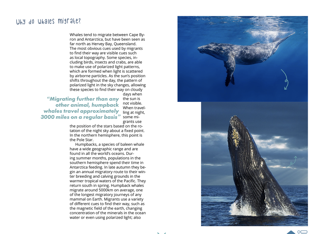
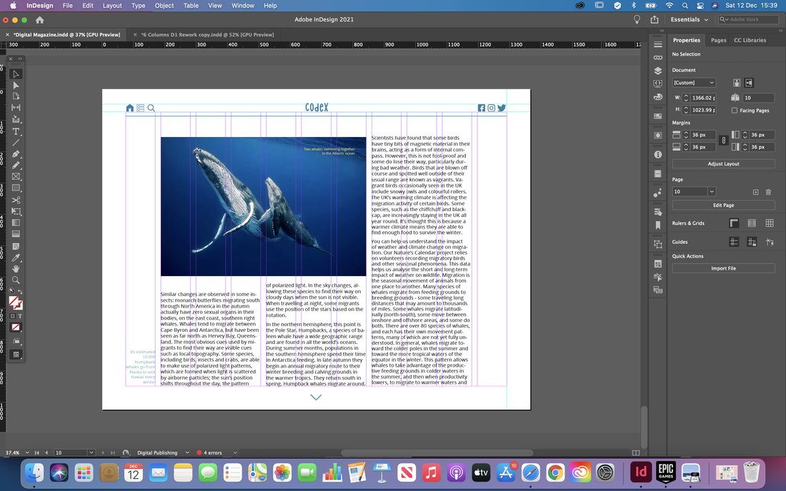
I then moved onto the article pages, rearranging the layouts to fit what a digital publication might look like. I also experimented here with landscape and portrait layouts to see how the pages might look depending on which way the reader is viewing the magazine.
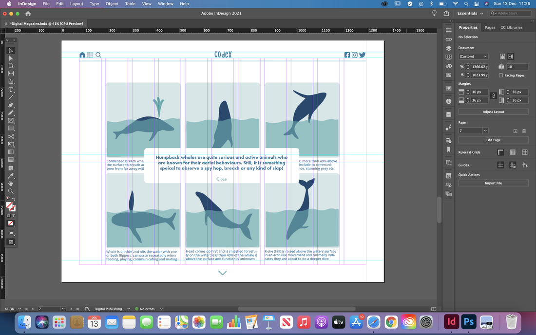
I continues further making the pages using the same theme and style, rearranging the layouts till they looked visually appealing. I also decided to design a menu bar at the top to give it a more website style look and to add extra navigation.
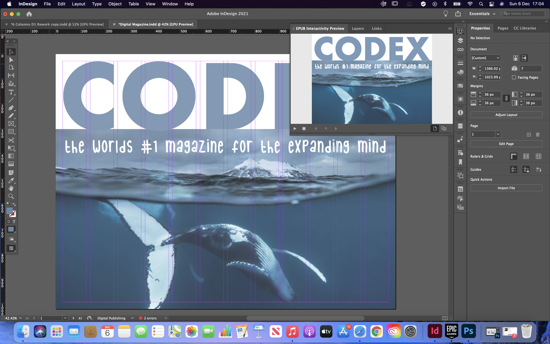
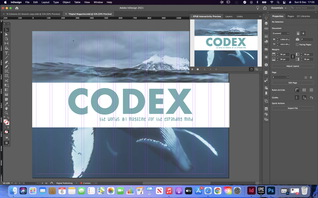
Final Design
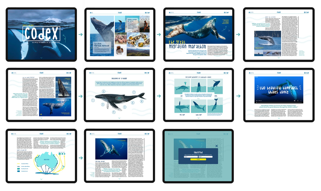
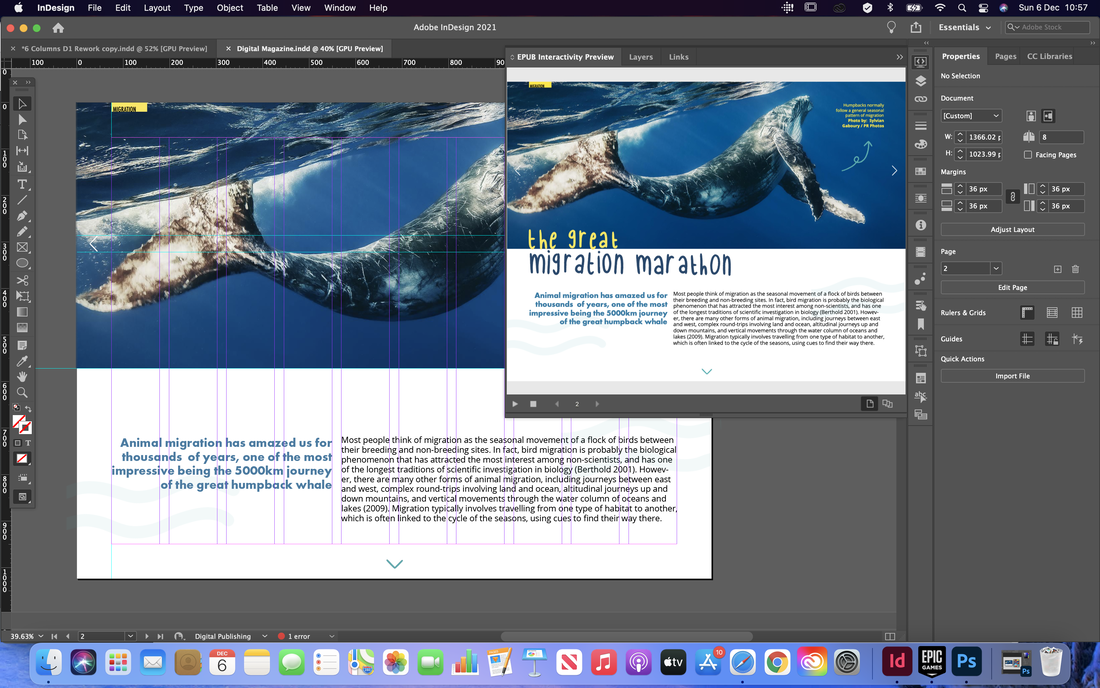
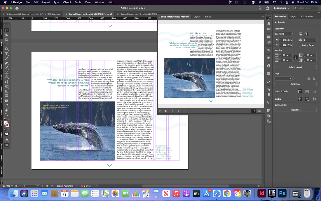
Below are screenshots of the final pages along with the interactive digital publication. I also included a storyboard with mock ups of the screens to show what it looks like on a iPad device. 


0 Comments
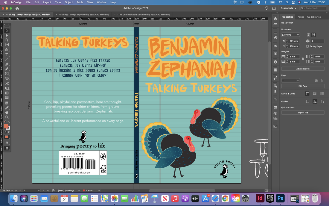
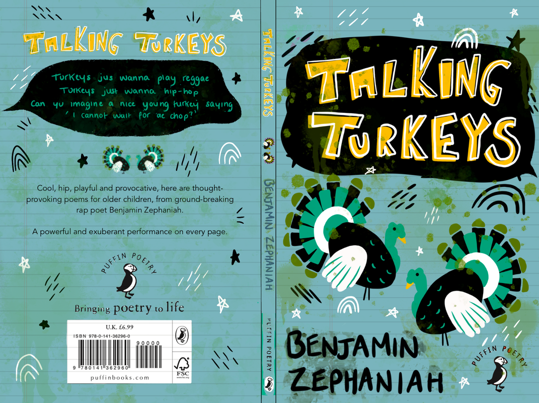
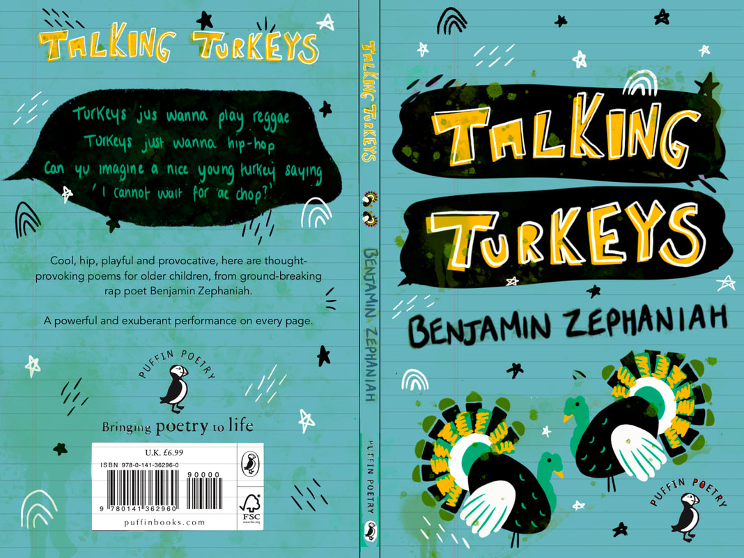
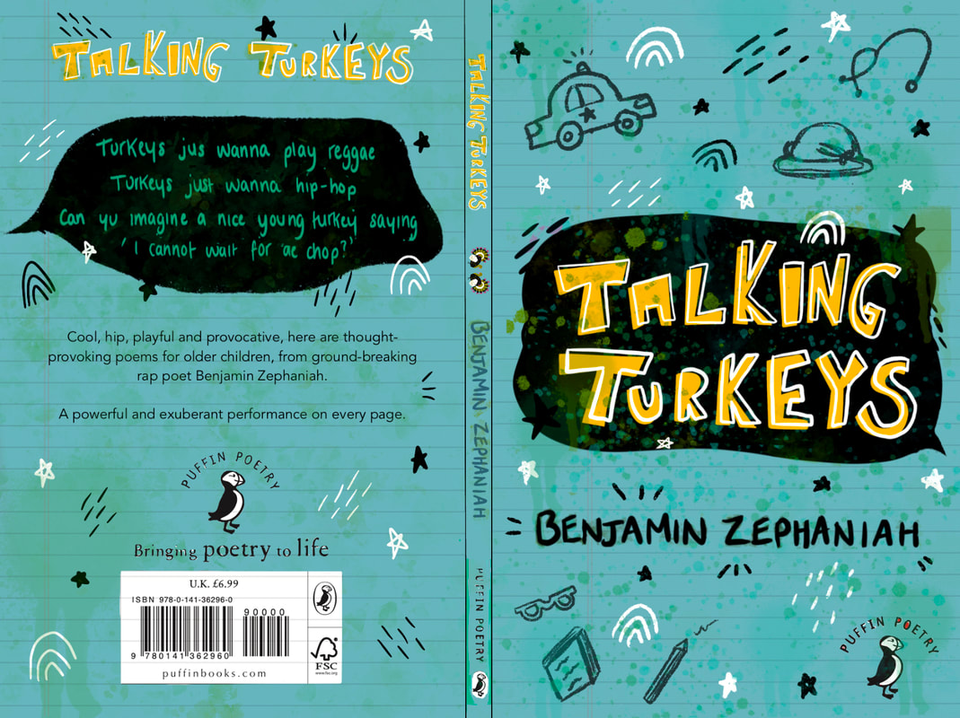
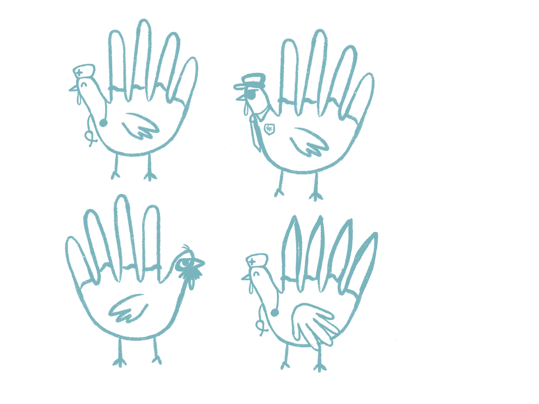
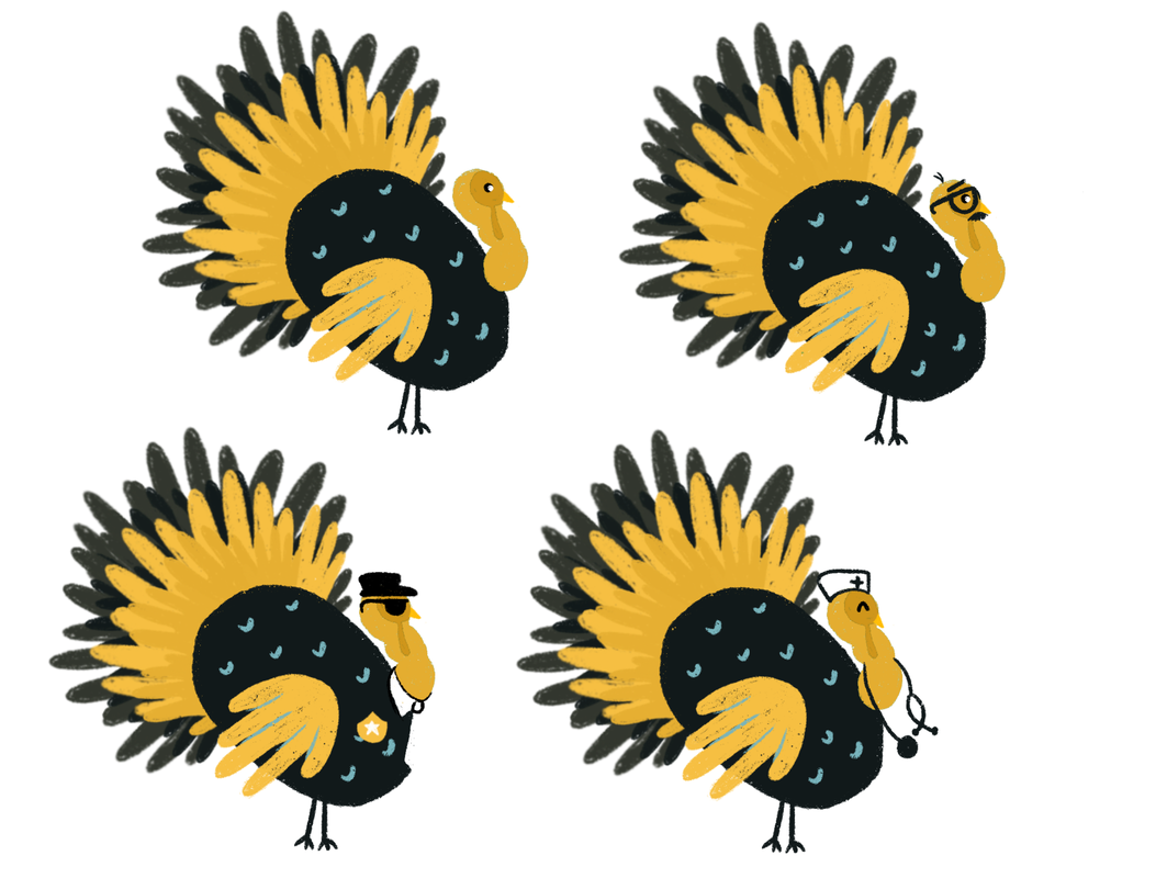
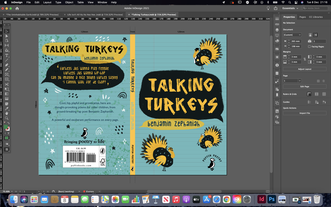
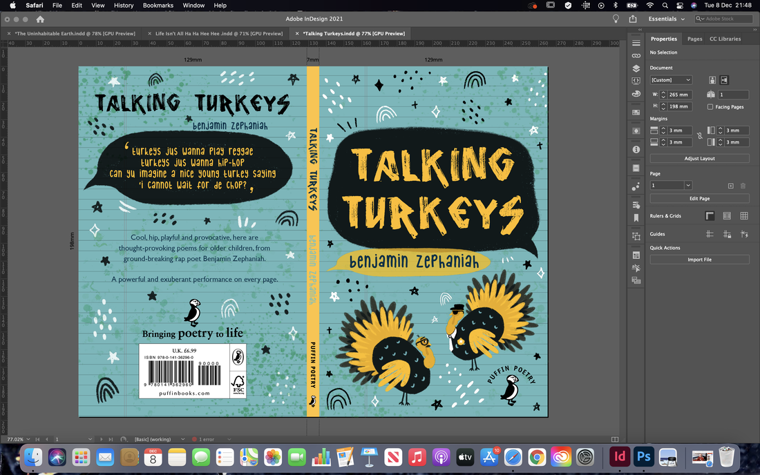
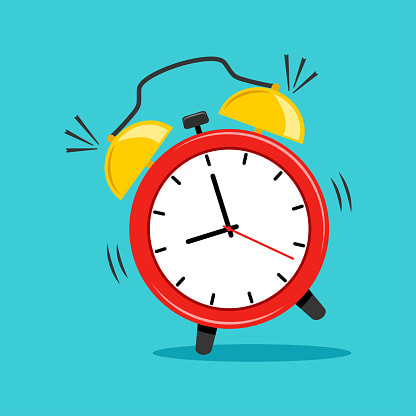
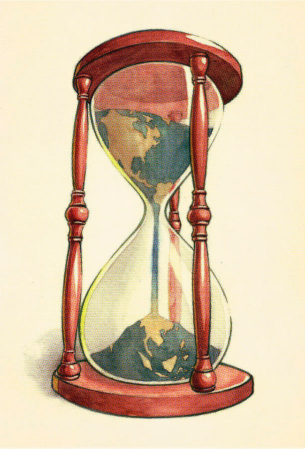
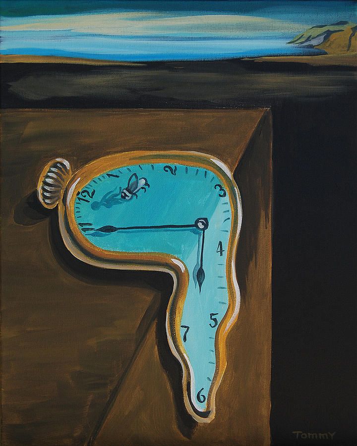
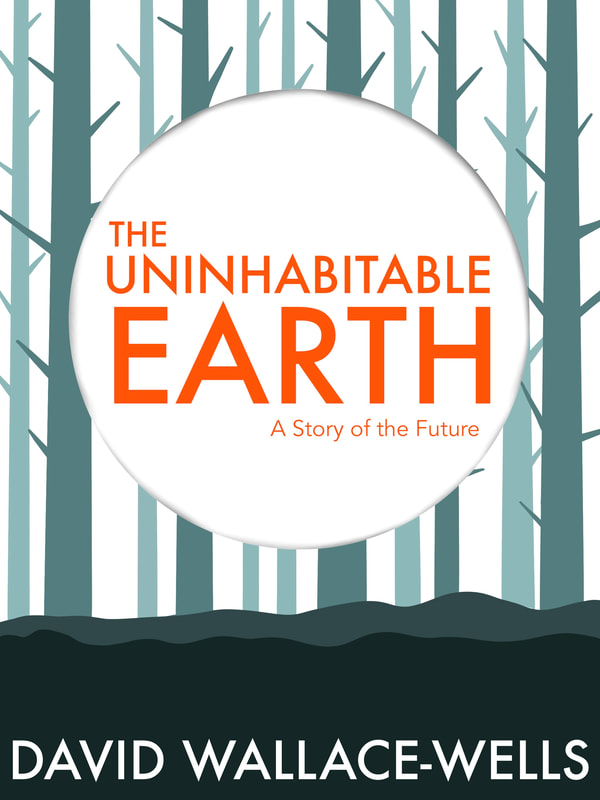
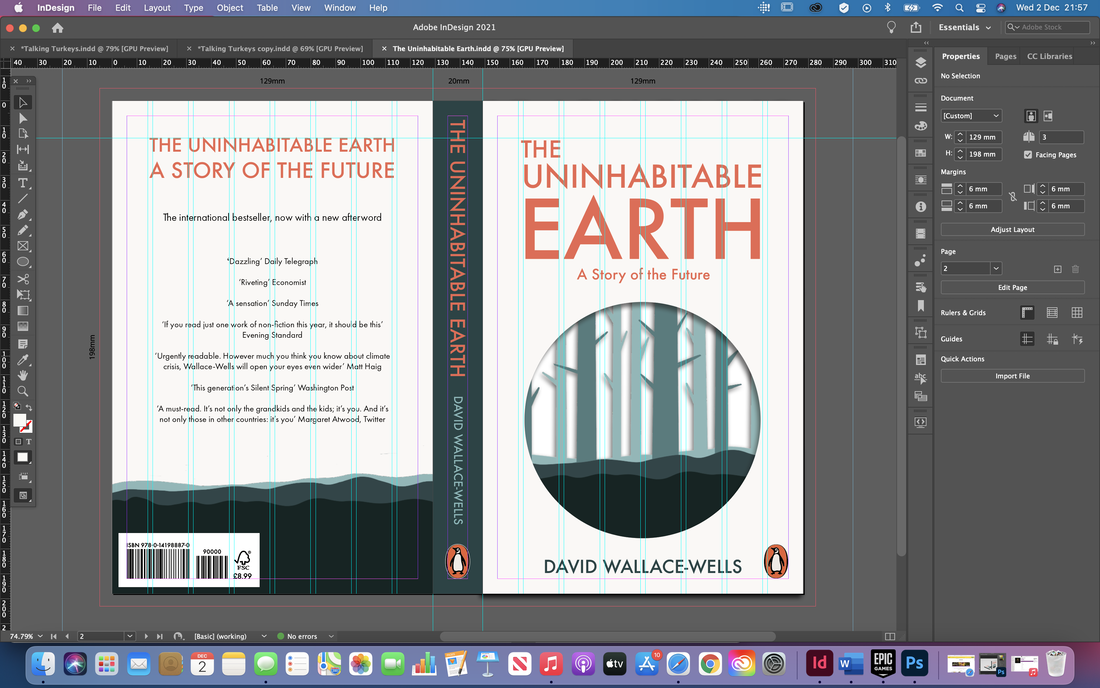
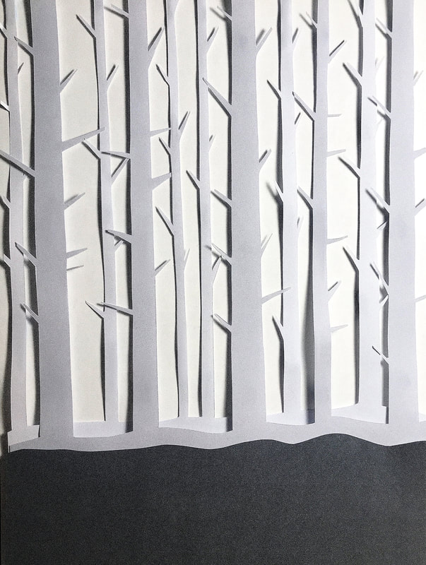
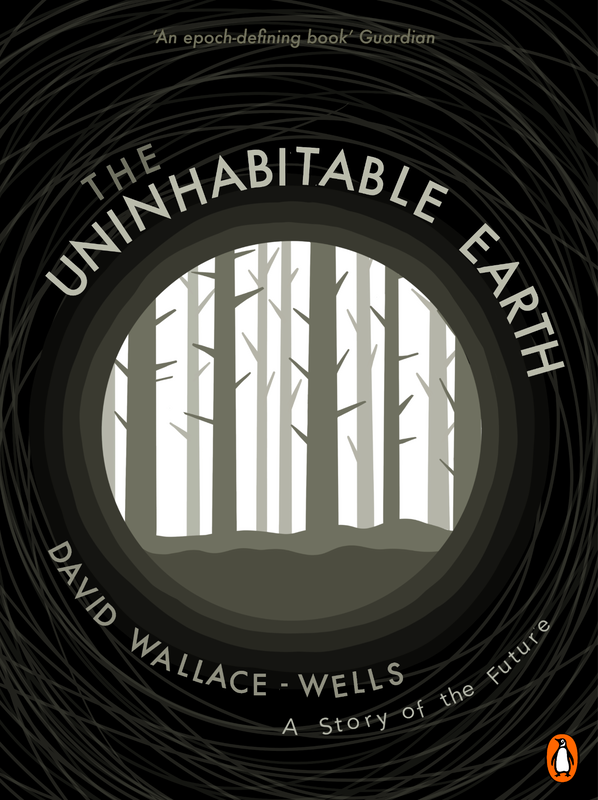
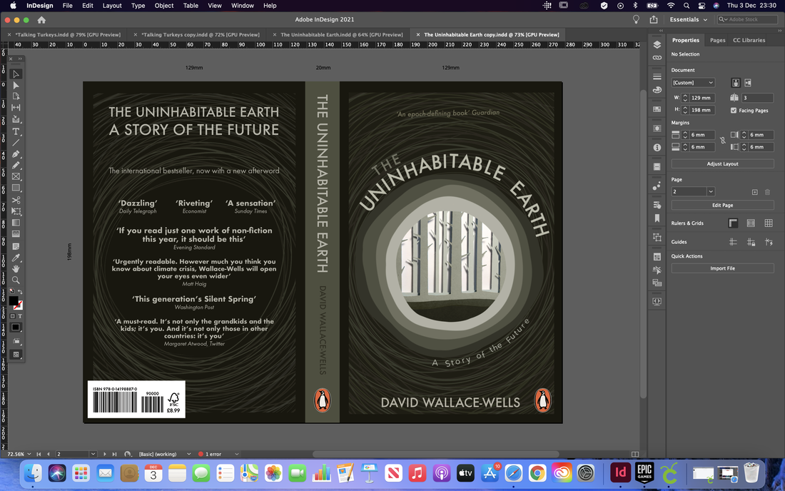
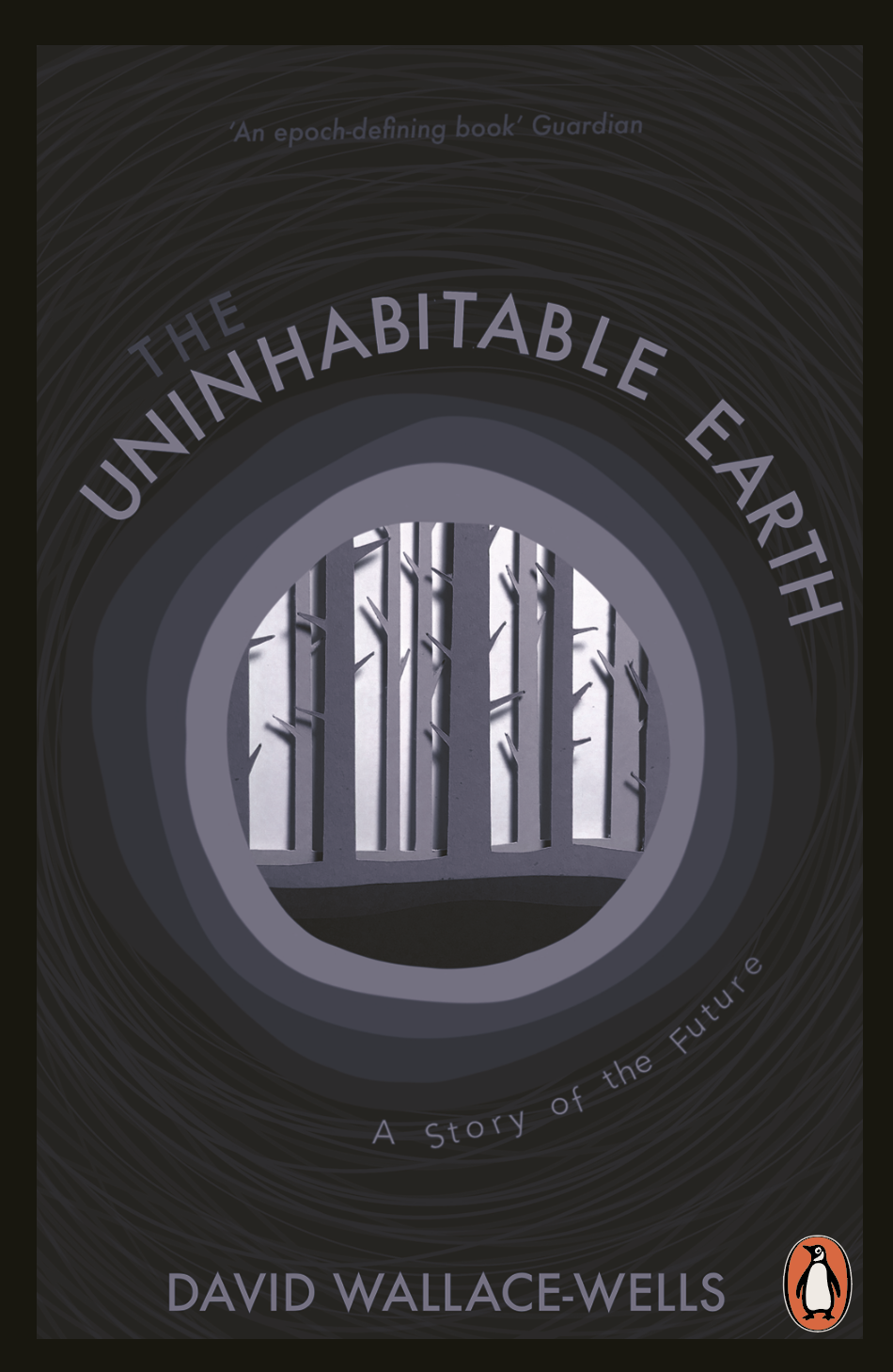
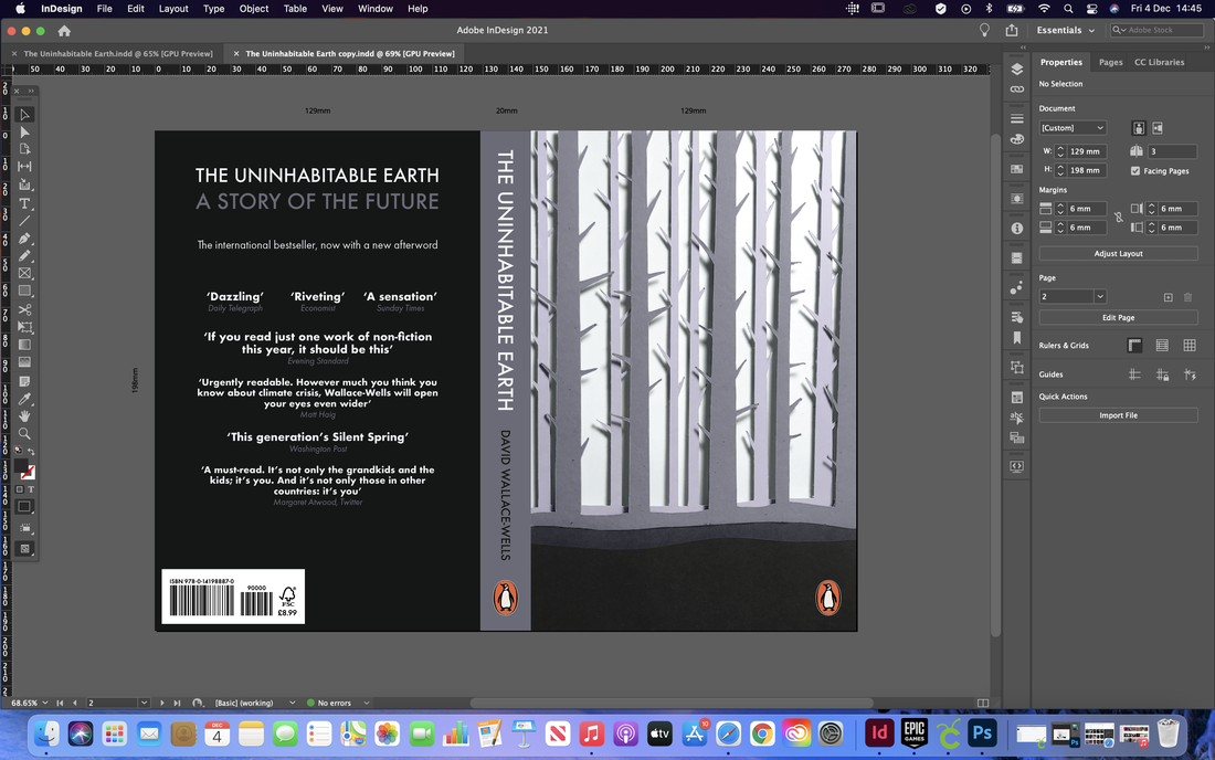
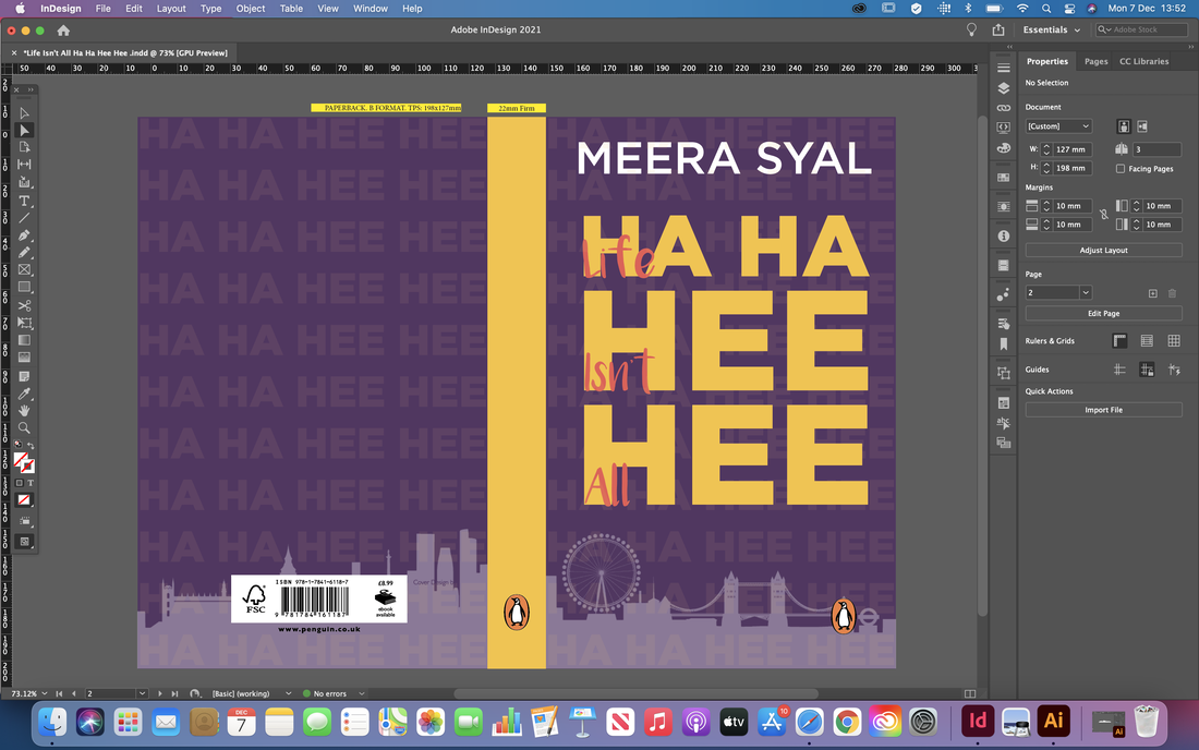
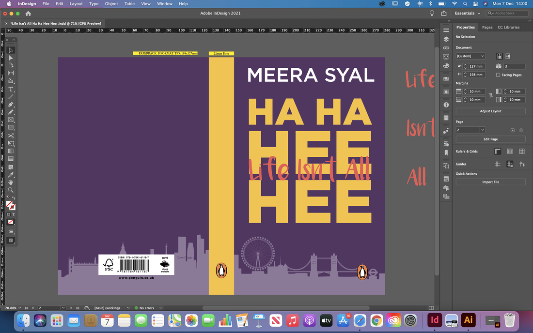
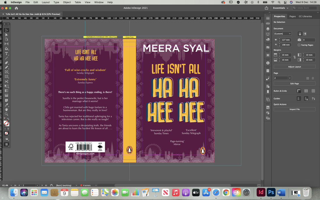
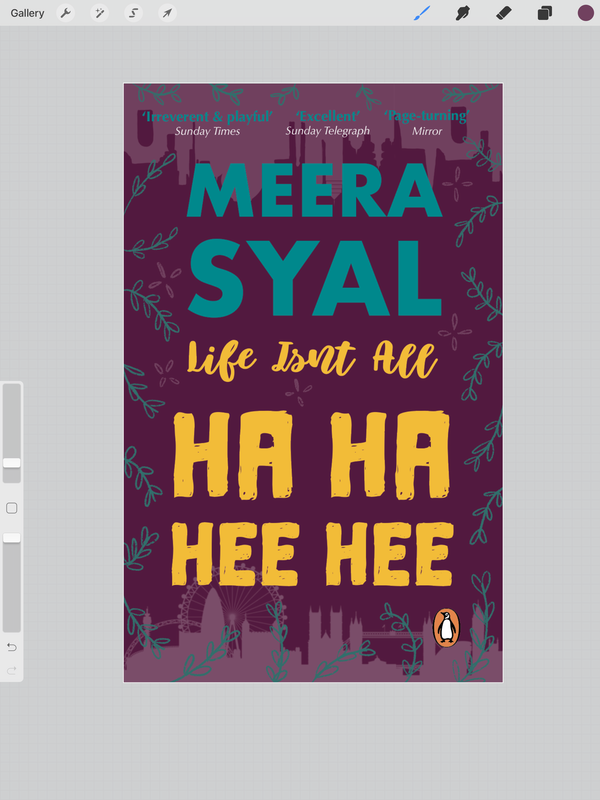
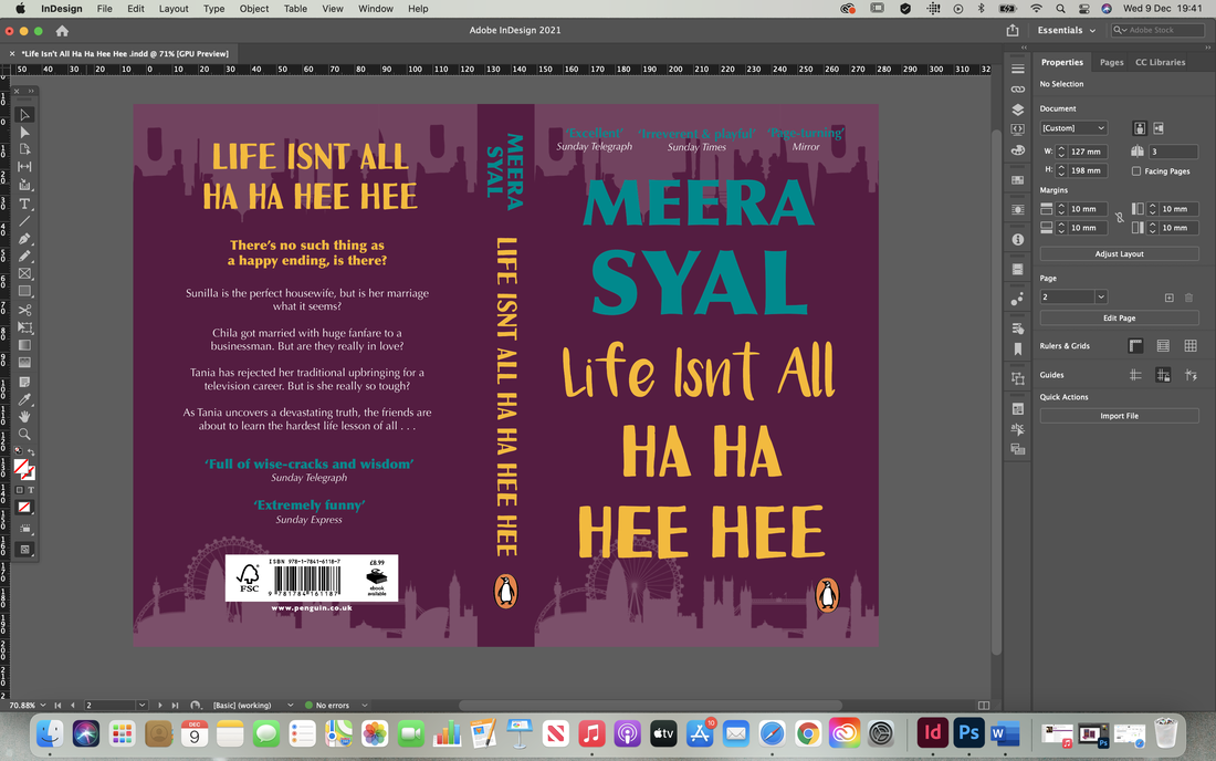
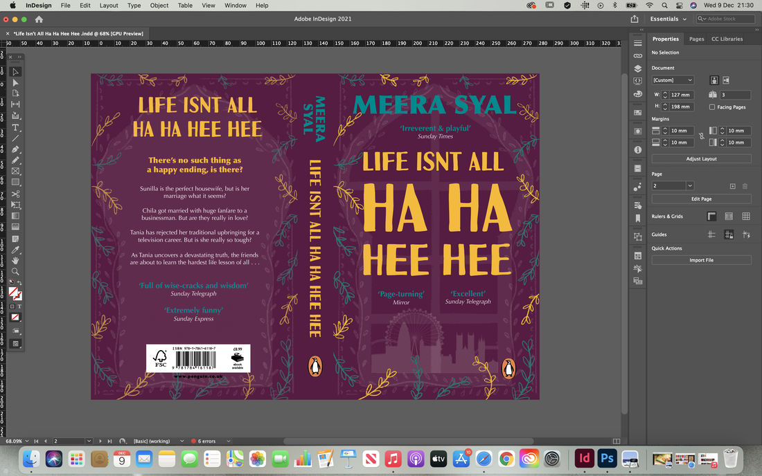
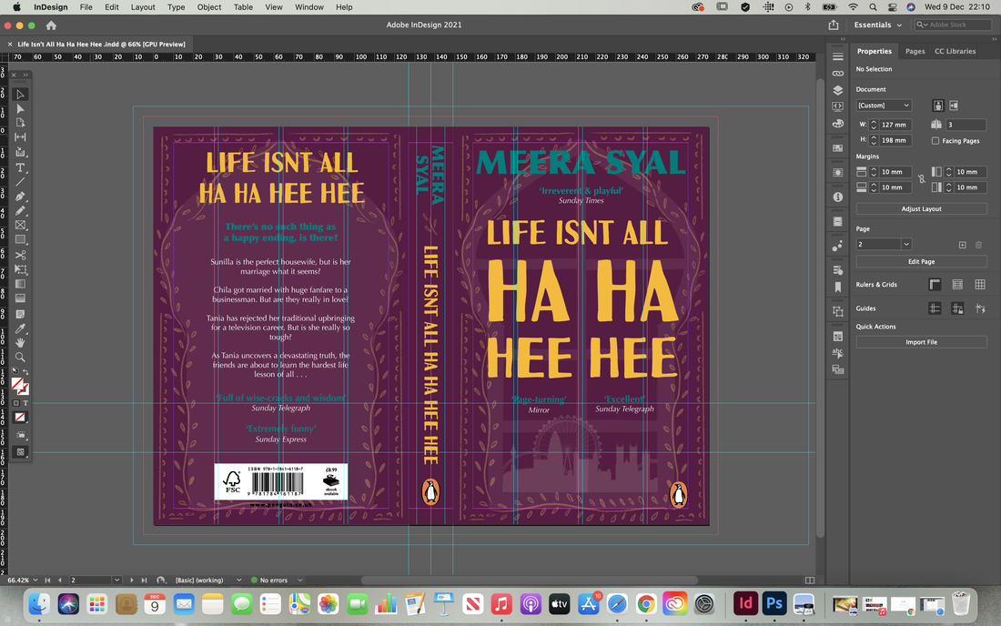
Brief For this project we had to explore the three levers of design (message, tone-of-voice and artefact) to create book cover designs that directly target predefined audiences. The designs had to be for a children's book cover: Talking Turkeys by Benjamin Zephaniah, an adult non-fiction cover: The Uninhabitable Earth: A Story of the Future by David Wallace-Wells, and finally an adult fiction cover: Life Isn’t All Ha Ha Hee Hee by Meera Syal. Research To begin this project we were asked to do a little bit of research and find some creative book cover designs for the categories 'typographic', 'photographic' and 'illustrative'. We had to select covers that we thought successfully communicated to their intended audience, as well as be eye-catching and engaging.    Mind Map and Initial Thoughts We then had to read the synopsis’ of the books and simplify each book to a single sentence/statement. I also did some more research for each of the different books and their audiences, trying to find examples of where I wanted to take my own ideas and made some mood-boards for inspiration. Below is a mind map of some initial ideas; trying to think of less obvious ways to represent the meanings of the books. 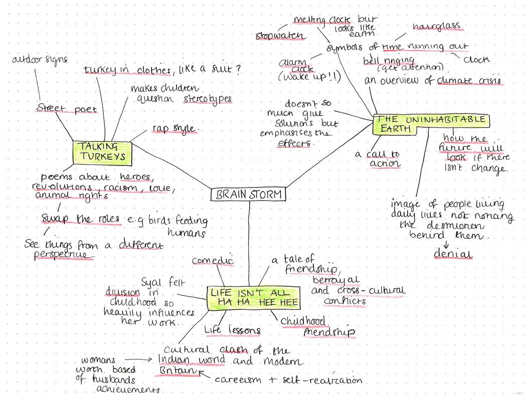    Initial Thumbnail Sketches Next I started to draw up some really quick, rough sketches of my initial ideas. I knew I wanted the children's book to be super playful with handwritten typography. The adult non-fiction I thought could be a lot more photographic and dramatic looking, and finally the adult fiction I wanted to be super modern and I liked the idea of the illustrations being minimal and more silhouette-like. 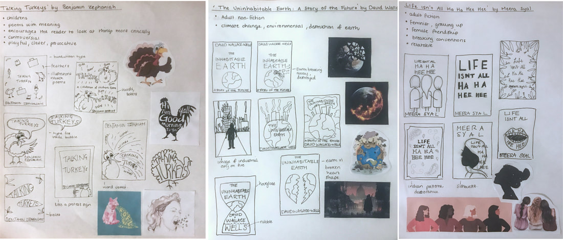 'Talking Turkeys' by Benjamin ZephaniahOne of my ideas for this book cover was inspired by the titular poem, about animal rights and encouraging people to not eating turkeys at Christmas. Due to the books unconventional style, this reminded me of some illustrations I once saw that swapped the roles of humans and animals around to highlight the injustice and makes you see the situation from a new perspective. Some of them wouldn't be suitable for kids but there are some more appropriate ones (the illustrations are linked here). I decided to sketch out a few more ideas down on paper, thinking about how I could add the humour and make the imagery relate to the poems. I also thought about the authors culture, adding in elements related to the street with a graffiti style.  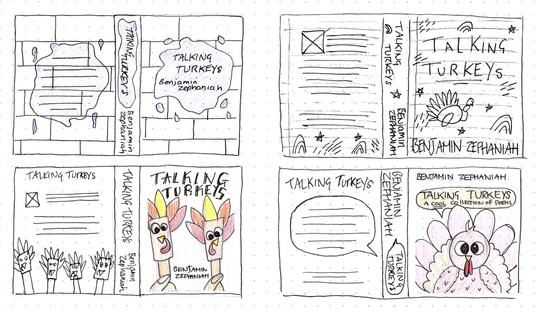 I then found couple of colour schemes I found inspiring that could work with attracting kids attentions and relate to the street art style; bold, bright colours.     I was feeling a little stuck with how to move forward so below is a rough mock up of one of my ideas. I wanted it to look super hand drawn and child-like with the messy typography, simple shapes and decorative elements, including the paint splatter to represent the graffiti side and the lined paper effect underneath. 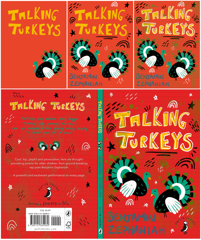 After receiving some feedback I began to develop my design, experimenting mainly with colour and graffiti-style type to begin with. I also tried to redesign the turkey illustration to be more detailed, but then realised I much preferred the more simple one I did previously. I then began taking my idea into InDesign and experimented slightly with the layouts. I also redid the turkey illustrations so they included my idea of having the turkeys wearing disguises and referencing the poems themselves. These were also made using hand shapes to mimic the craft children do using drawn out shapes of their hands to create the feathers. Here is my first final design for 'Talking Turkeys' as well as a mock up below:  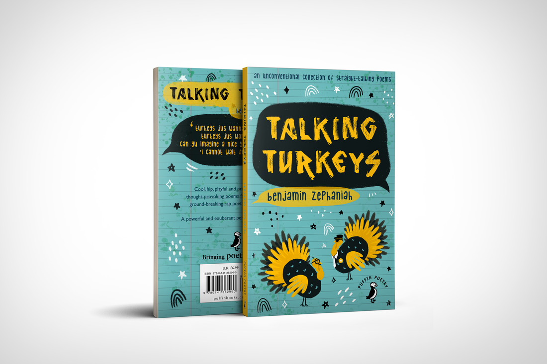 'The Uninhabitable Earth' by David Wallace-WellsMy initial idea for this book cover was to have an illustration of the Earth in the centre but I soon realised this was way too obvious so I became brainstorming symbols to represent climate change and more importantly the message that 'time is running out'. My ideas included having illustrations of an hourglass, melting clocks, stopwatches, alarm clocks and bells ringing to infer people to wake up and pay attention to the issues the author is presenting. Another idea was to have an illustration of a post apocalyptic Earth (i.e burning buildings, destroyed forests...) and in the foreground have people getting on with their daily lives oblivious to the destruction behind them. I then went ahead and drew out some more thumbnail sketches, firstly of some visual concepts for the imagery rather than the book as a whole. I wanted to try convey the aspect of the Earth in a less obvious way. I then did some thumbnails of how the entire book cover could look as a whole including the back and the spine.  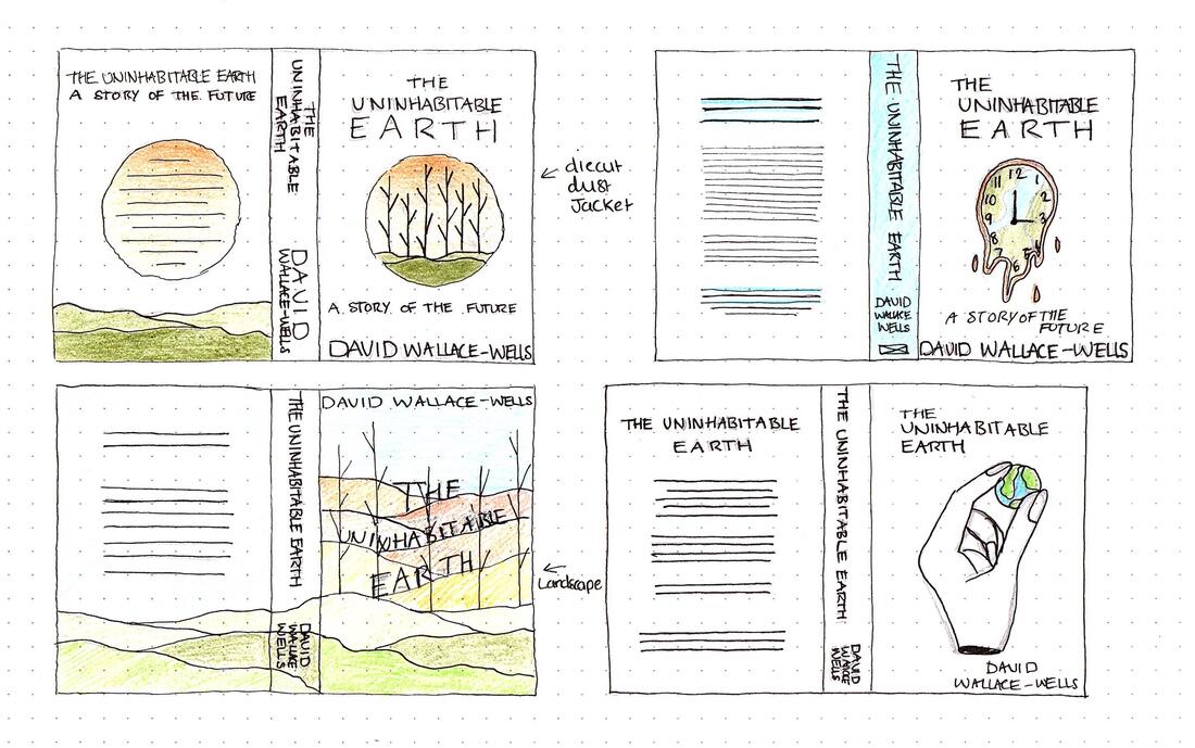 I wanted the colour scheme for this cover to convey a more serious tone with the grey and reflect the topic of nature using greens and blues. I also liked the idea of added pops of red and yellow to grab the readers attention and convey alarm.    I then started to try and create some on my design digitally, experimenting with layout as much as possible and thinking about how the design could translate onto the backs covers. 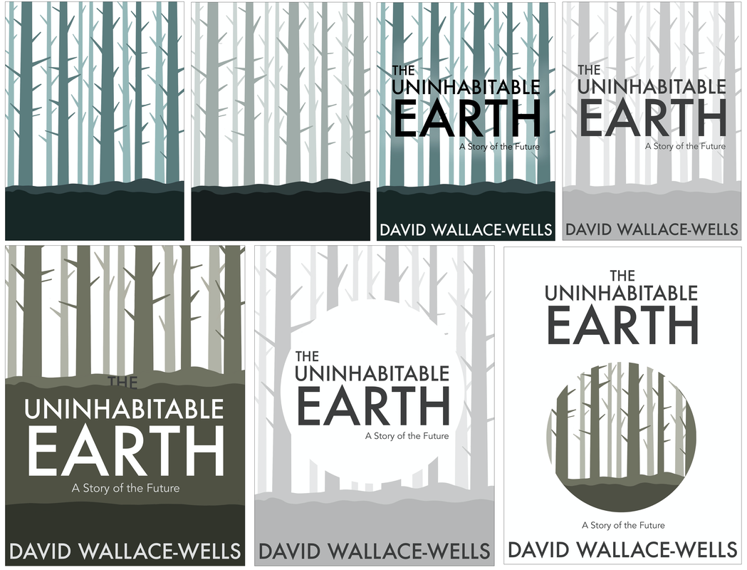      I then was inspired by these paper illustrations and thought it could be implemented into one of my designs to make it more interesting. I did a mock up digitally below of how it could look, realising it gave a sort of black hole effect to the design which I think fits in quite nicely with the theme of the book. I then came up with another design inspired by this blackhole idea, and actually found it made the book look more like a novel. I decided to create both designs are final pieces to show the different interpretations. Here I physically created the design; my first attempt printing out and cutting by hand and the next using colour card and using my Cricut machine to get an accurate and clean cut. The second attempt came out much better as the card was easier to create the differing layers. I then took the image and re-colourised it to make it match the colour scheme I already chose.  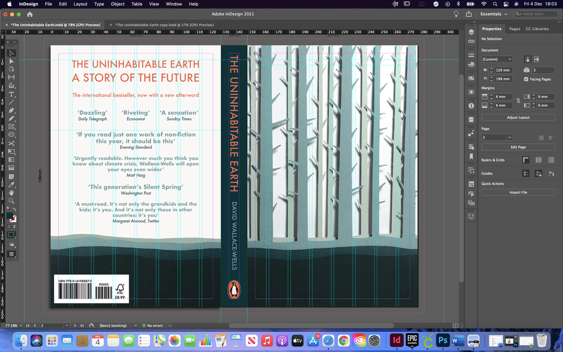 I then developed my second idea, using the same imagery but in a different style. Here is my first final design for 'The Uninhabitable Earth' as well as mock ups below: 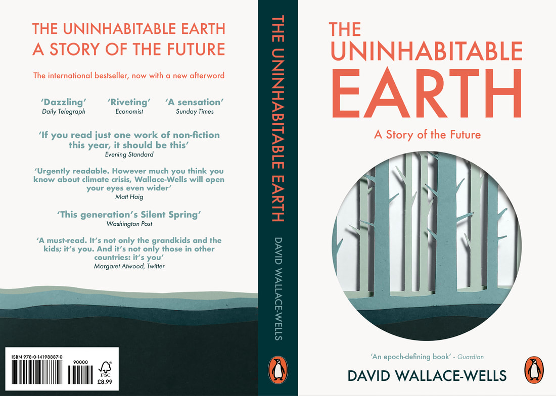   Here is my second design with mockups below:   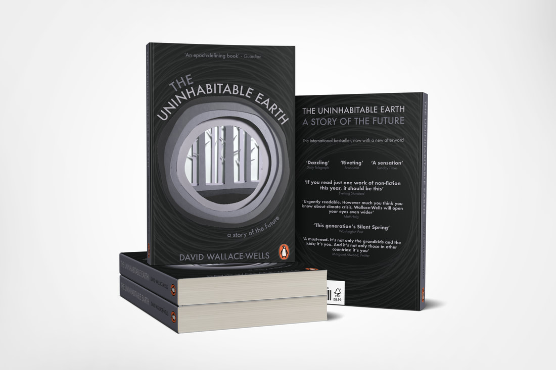 'Life Isn't All Ha Ha Hee Hee' by Meera SyalThis book cover I was finding the hardest to think of interesting ideas for. I wanted to come up with a symbolic way of representing the cultural clash of the Indian world, where a woman's worth is based largely on her husbands achievements, and modern Britain, built a lot of careerism and self-realisation. Below found some more book covers for inspiration in terms of style and tone. After some further research I went ahead and did some more detailed thumbnail sketches of the book cover. I liked the idea of illustrating the switch between urban London life and her Indian heritage, reflecting both landscapes across from each other. I also liked the idea of doing a more decorative cover and one that was more minimalist. 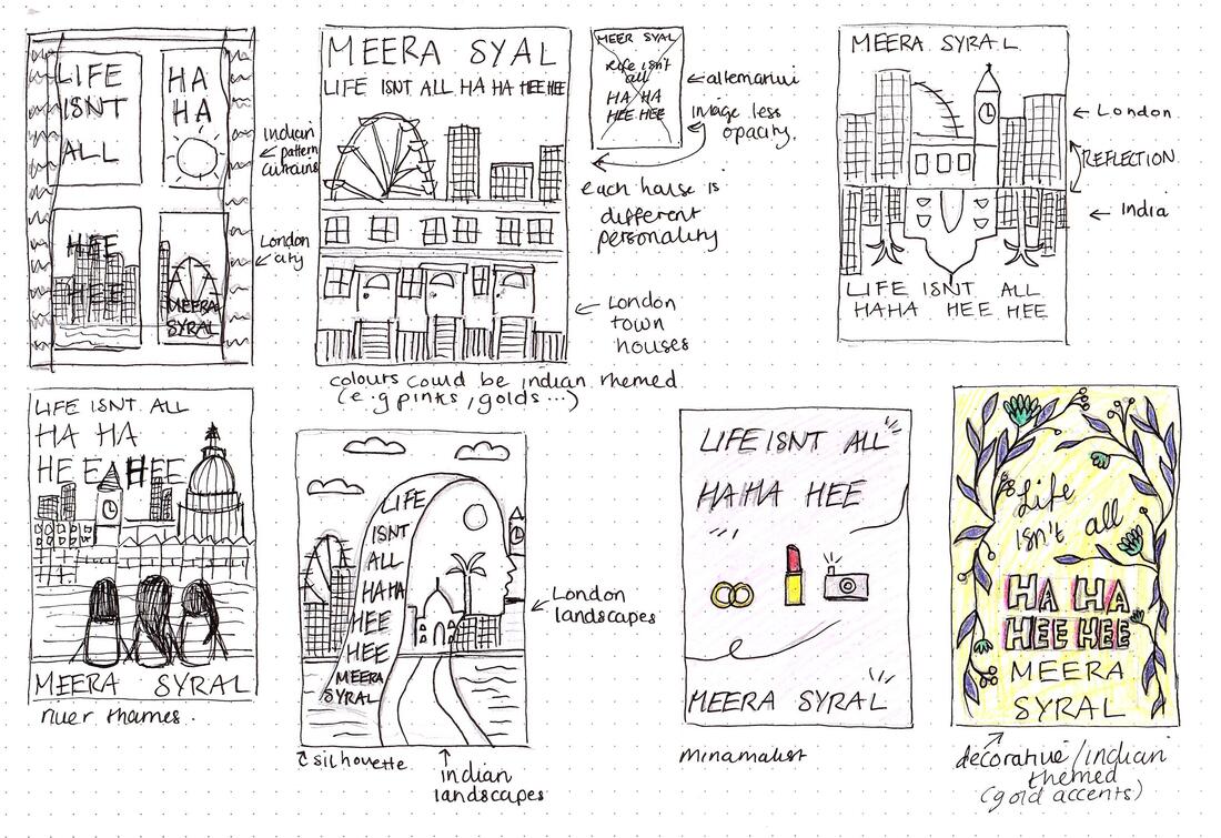 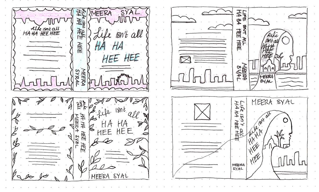 I also found a few colour schemes that I could use, mainly focusing on Indian culture; warm colours, reds, pinks, golds and greens.     I decided to do a quick mock up of one of my design ideas, using bright colours and fun typography, as well as illustrations of the three women. I also made it more decorative with the patterns and landscape silhouettes.  After receiving my feedback I began to develop this design; I decided that it looked too much like a teen novel rather than adult so I began experimenting with different colour schemes to make it appeal more to a more grown up audience. I also wasn't too keen on the illustrations of the girls and wasn't sure they were necessary so I removed these and made the design more typography based. I also decided to incorporate my window idea as I felt it looked too plain with out any illustration at all. This changed my design quite drastically. Here is my first final design for 'Life Isn't All Ha Ha Hee Hee' as well as a mock up below: 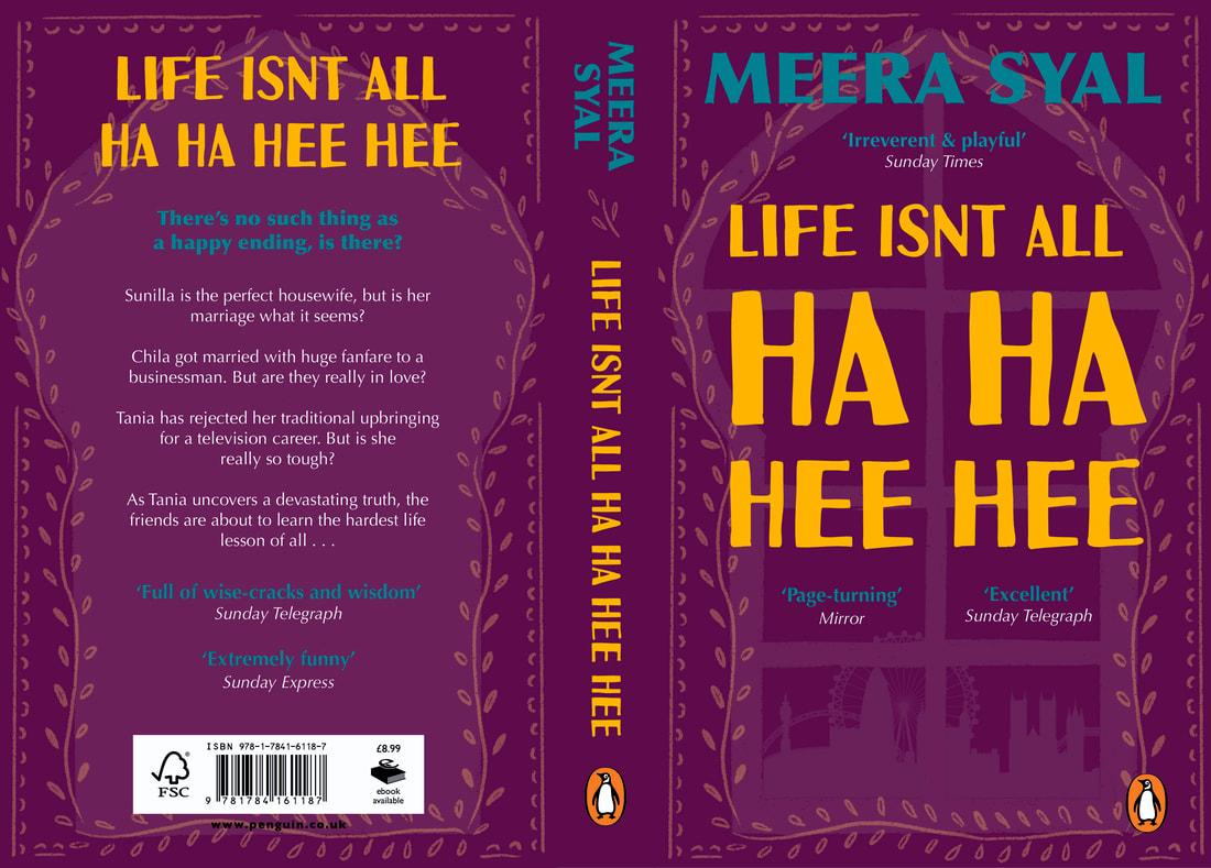  |
AuthorHi, I'm Emma. I'm currently studying Graphic Design at the University of Cumbria. Modules
All
Archives
May 2021
|


 RSS Feed