
|
Brief For our final project of the year, we had to design an infographic on a subject of our choice, by assembling data and presenting it in an engaging and informative way. Research I began by doing some general research on some examples of existing infographics to inspire me. I particularly liked the designs with bright colours, vector style illustrations and ones in a long portrait format so more information can be included. I also watched the LinkedIn course we were linked to on Blackboard to understand more about the process. I then began thinking about topics I was interested in and that would have good statistics t include in my infographic. Some of my interests I thought could work include, veganism, animal testing, space, 'Zelda', plants, Harry Potter, and mental health. I eventually decided on researching about animal agriculture, a topic I'm passionate about. I have been following a vegan diet myself for the last five years after discovering many shocking facts about what really goes on in the world of mass animal farming; how cruel it is, and how it effects your health and the environment. Animal Agriculture Research
Effects of animal agriculture on the environment:
Initial Ideas After doing some research, I began sketching some initial ideas to visually show the data I found; using related objects and cutting them up to show percentages and numbers, using illustrations to represent statistics, etc.  I then tried to sketch out some possible layouts/wireframes to explore how the data could be arranged. My idea is to have a section for each sub-topic; animals killed/percentage of meat eaters vs non meat-eaters, water usage, pollution, land usage and possibly also a section on fishing, so its easier to digest. I thought a long portrait format would help organise the sub-topics in an order but I also thought a landscape poster would work well, possibly as a double-page spread in a vegan lifestyle magazine to give it more context. For example, it could have a main illustration (maybe a map) in the centre, then little graphics and graphs surrounding, or the sections in blocks of colour.  I then looked for some inspiration, specifically for the styling of the infographics illustrations. I wanted it to be digitally drawn with a vectorised feel but look slightly more organic with more texture. I was inspired by how some of the images below were just simply hand-drawn style line art, and even the more detailed illustrations being still very minimal.   I then thought about colour combinations that I could experiment with; lots of green, blue and orange to represent the environmental theme. I also looked into typefaces. I really like the more handwritten, organic style shown in some of the above posters, but also thought a more simple, serif font would pair nicely with the illustrations and be more eligible. I wanted the whole design to look friendly so that the theme of the infographic didn't make the viewer feel like they were being made to feel bad or being shouted at for contributing to the issues. Development Here I started to experiment a little with the styling, using my original sketches and recreating them digitally, first in a simple flat vector style, then trying to add some texture and shading.   I then began experimenting a little with pairing the initial illustrations with the typography to see how it could be laid out. I thought the more sketchy typeface went pretty well with the more vectorised, flat visuals but I also wanted to flip this around and do the opposite; going back to my original pen and paper sketches and pair those with a simple, sans serif font. I then began trying to develop the whole layout of the magazine spread. Many of the illustrations I tweaked or drew from scratch as I was going so that they would fit perfectly into the spaces and make the whole page flow properly. After a lot of experimenting with type choice, I settled on 'DIN' and 'Palatino', which both had a good range of different weights for variation. I liked how the styling developed into a sort of newspaper style. 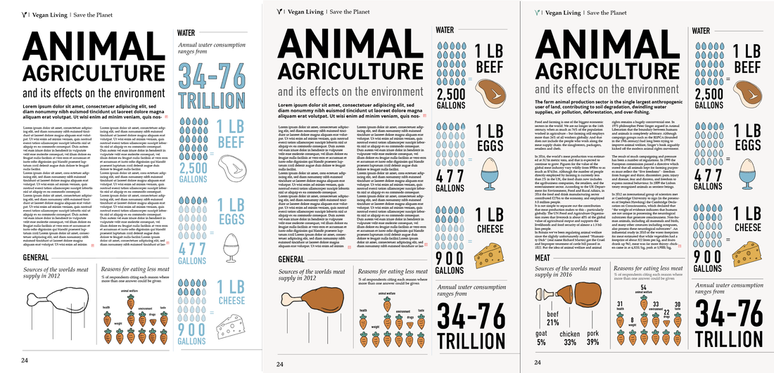  Here are the final illustrations for my infographic data visuals. I tried to keep the hand drawn feel, using a textured digital brush on Procreate and used a friendly looking colour palette. 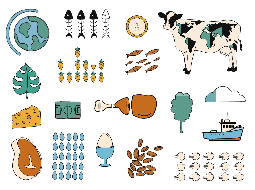 Final Piece Here is my final design, all mocked up as well as some close ups. Im actually quite happy with how it turned out; I think I managed to keep the charm of my original sketches with the hand drawn, contemporary vibe, even though its a lot different to how I originally envisioned. I did consider changing the bold type to a colour other than black to make it pop more but I felt like there would either be too many colours or the balance would be off so I kept it black.   Sources: https://www.vegansociety.com/news/media/statistics https://www.cowspiracy.com/facts https://www.bbc.co.uk/news/business-44488051 https://ourworldindata.org/land-use https://www.theguardian.com/news/2018/may/07/true-cost-of-eating-meat-environment-health-animal-welfare Image References:
0 Comments
Brief
For this project we were put into groups, acting as a design consultancy for a city bidding to be the City of Culture in 2025. We had to produce a brand identity for the city of Sheffield, to be used as a key element in their bid strategy across a range of media. Research We had to find out about the history, industry, commerce, geography, population, famous inhabitants, culture etc of our city too inform the concepts to develop for the brand. After delegating topics, we got to work; I researched culture and commerce; what I found can be seen in the file here. 
We then collated all of our research together into a powerpoint for presenting our findings to the rest of the class.
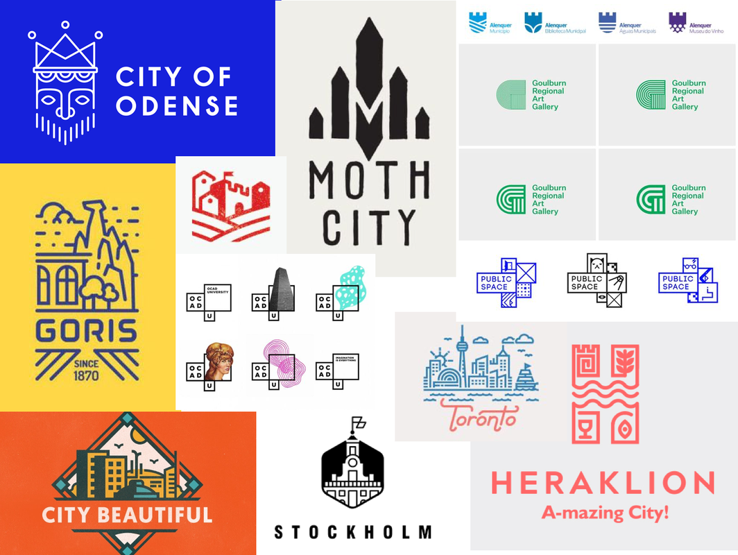
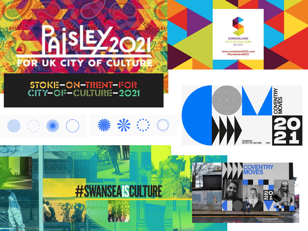
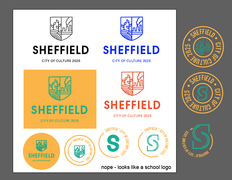
I then decided to do some research into other branding designs, specifically at past City of Culture designs to get some more inspiration, as well as at some logo designs that I liked. I was particularly drawn towards minimalistic, simple lines and shapes that could be easily used in a range of ways/colours.
Logo Sketches
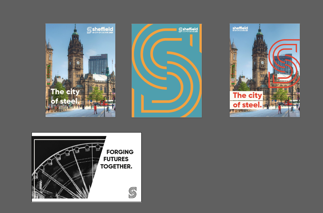
Next, we decided to do some idea generation and do some initial thumbnail sketches. We figured the steel aspect was something we definitely needed to look into but my worry was that the logo could end up looking too much like a steel company logo rather than represent the city as a whole, especially seen as the steel industry in Sheffield isn't even as prominent as it used to be. Therefore, I tried to include other themes such as landscape and music.
After discussing our ideas with each other, we decided to take forward one of Olivers ideas, using the shape of an 'S'. I did some sketches based of his original drawings of how we could possibly incorporate symbols of the steel industry and music etc into the shape.
Logo Development
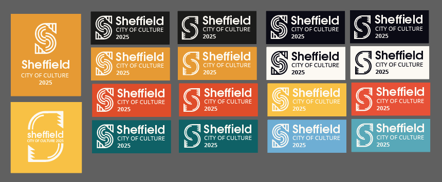
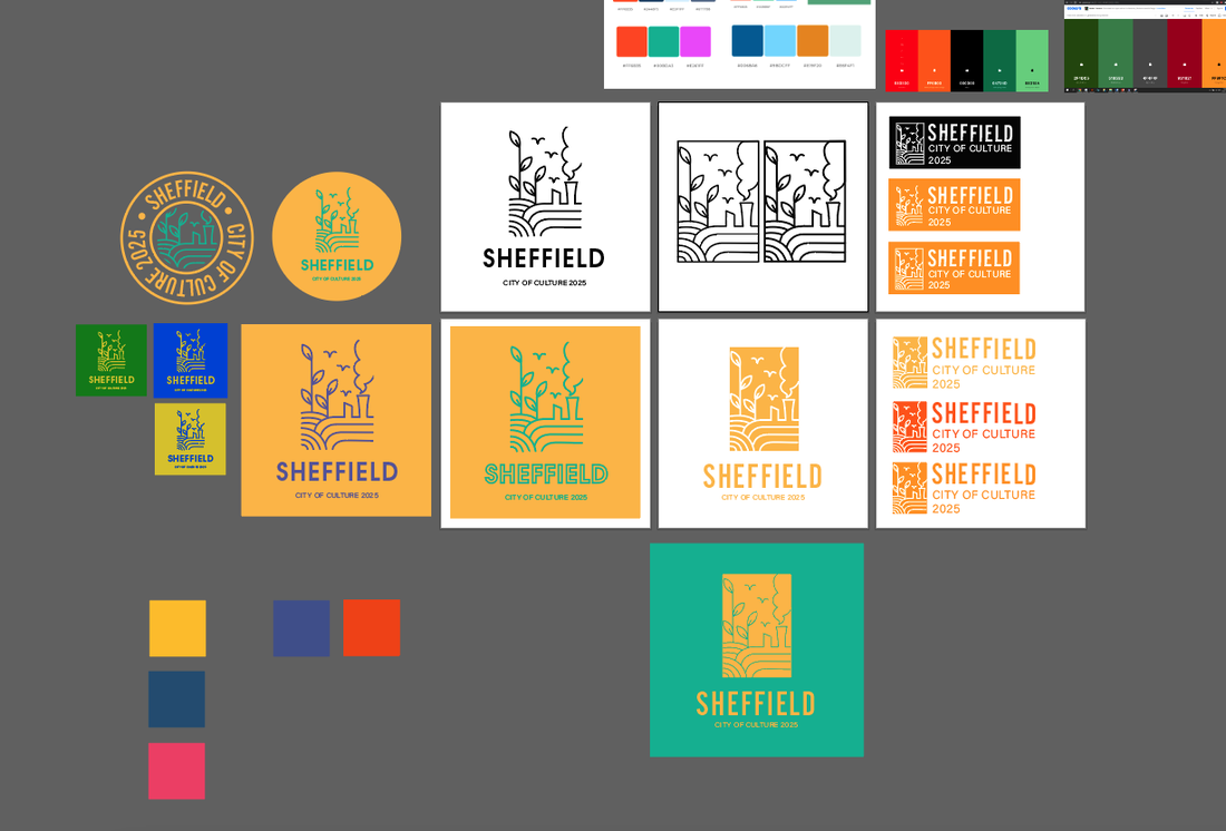
I then decided it was time to start experimenting with some of the ideas on Illustrator; I started with my original concepts to see if they could be worth pursuing as well as vectorising the symbols, then continued trying to refine the 'S' logo idea. It became apparent that incorporating any illustrations into the shape wasn't going to work well as it would be too small to be legible at smaller sizes and frankly just didn't flow well as whole. So I came up with a more simple design that used the original shape with extra lines all at the same thickness. We found this actually worked well to represent the steel industry as it gave the impression of the flow of molten metal through a mould. 
We then began thinking about colours. I wanted the colour palette to represent the city's industry using mainly oranges and yellows, combined with at least one contrasting colour.
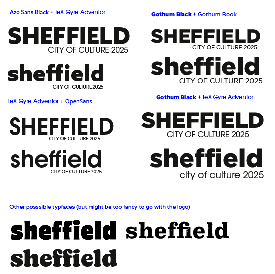
When thinking about typefaces, I thought we needed something like a thick, modern sans-serif, so I put forward what I found to the group along with some possible typeface pairings. I much preferred the way the word looked as completely lowercase and it just looked more friendly that way.
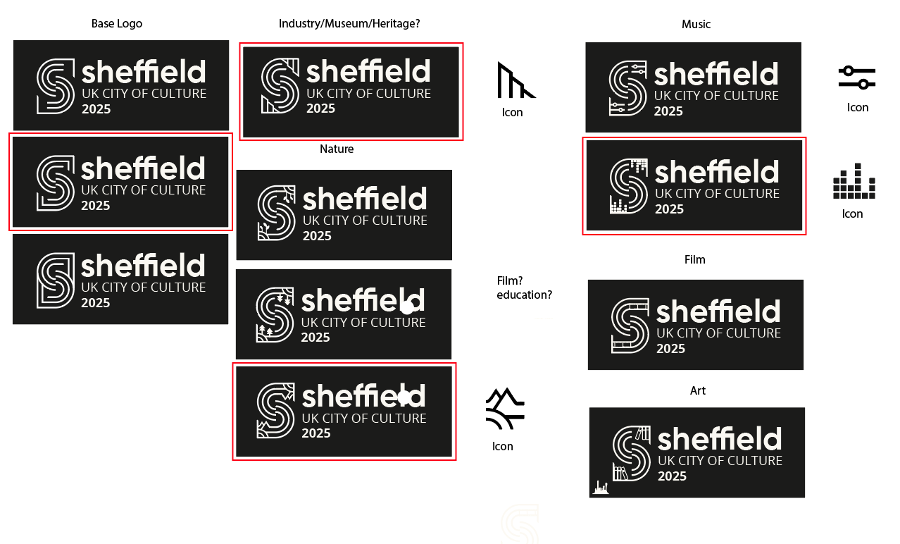
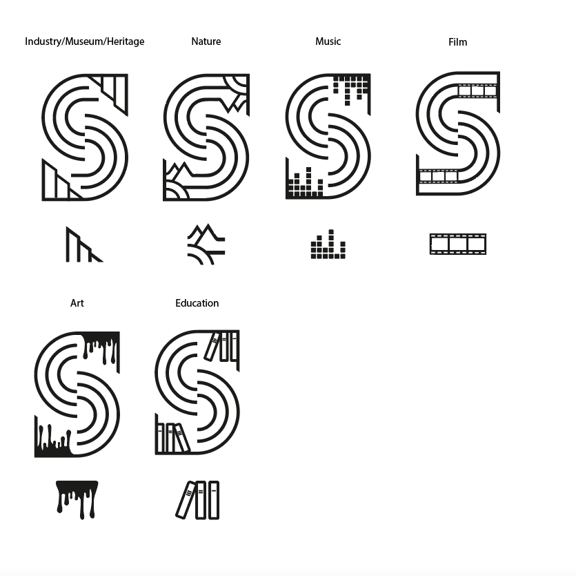
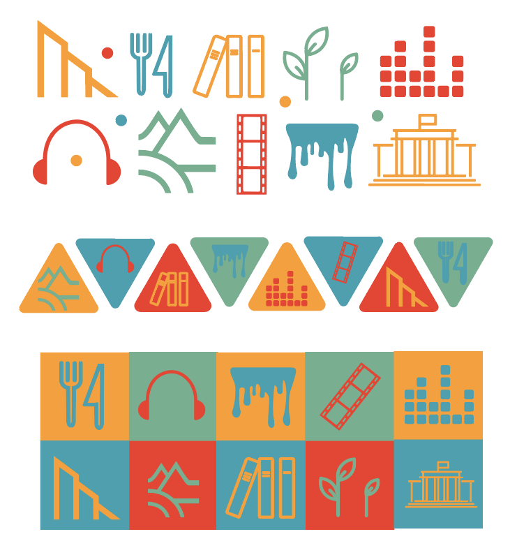
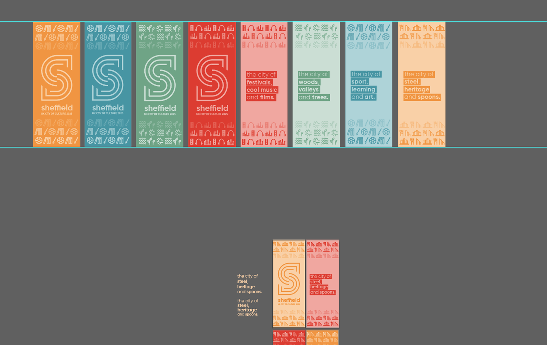
I then started trying to combine the colours and font ideas with the logo to see how it may look. I tried combining the factory shape into the logo to make it more obvious its symbolising the steel industry, however I felt it was too restricting because it didn't represent any of the other factors that make up Sheffields culture. As a result, we decided we would create a modular logo, containing of a base logo and other variations of it combining the symbols I created earlier. The idea was that each symbol would be used for different thing, for example, the music themed logo would be used for any music related brand implementation.
The most difficult part of designing these logos was trying to make the added symbols flow into the 'S' and be more seamless as I didnt want it to end up looking like the base logo with a symbol just stuck in the corner.
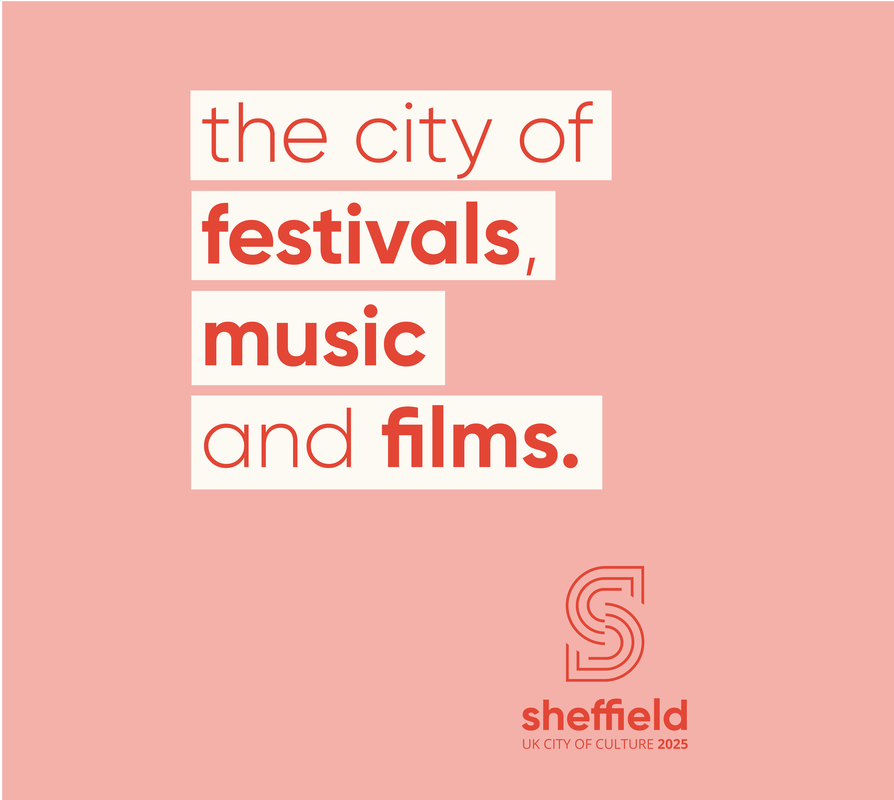
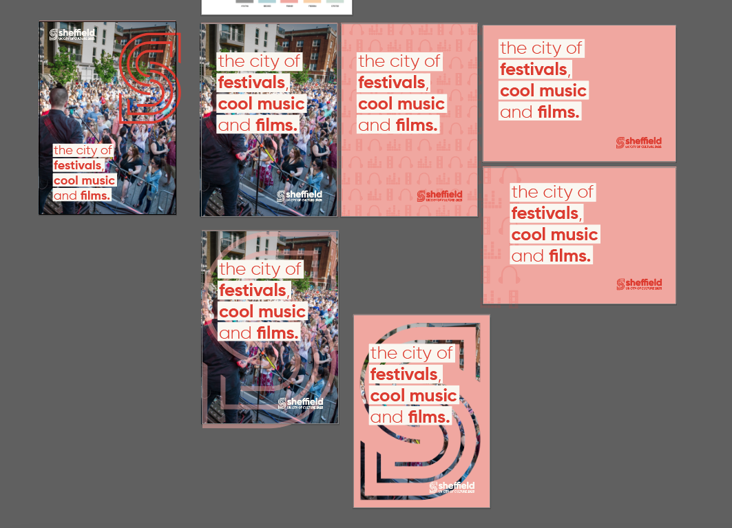
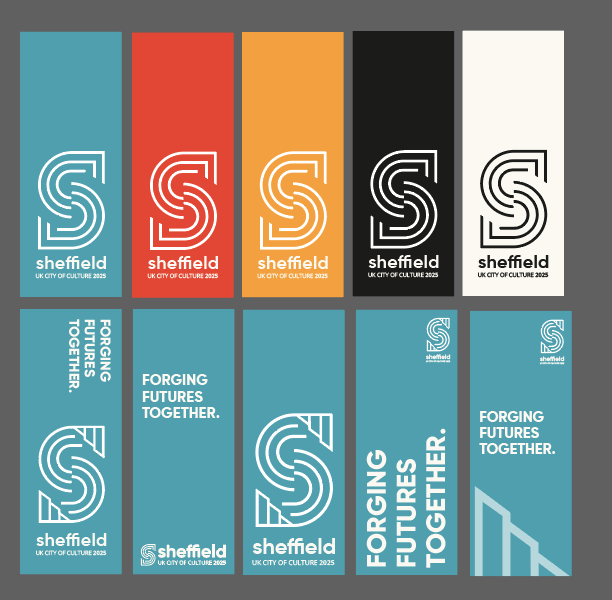
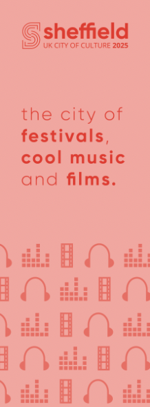
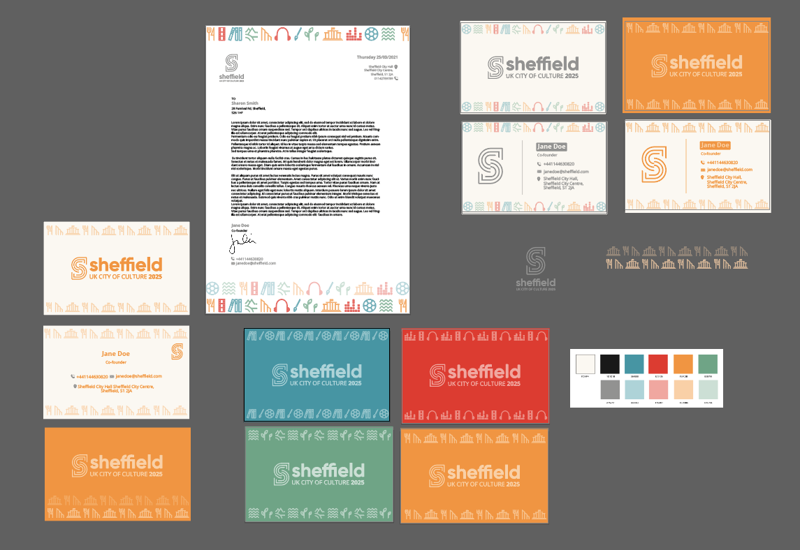
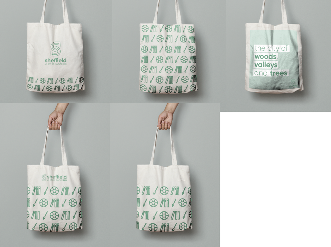
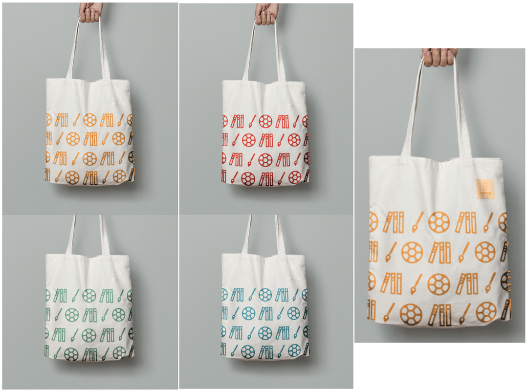
Final Assets Here is the final base logo and the other individual logos from the rest of the modular design incorporating each of the themes into the 'S', along with the accompanying symbols. I also put together some possible patterns and tag-lines (inspired by the original 'City of Steel' tagline), for use when implementing the brand.
Basic Brand Guidelines
We finally settled on our base guidelines, choosing a bold sans-serif typeface for display and an easy to read body copy font. Our final colours consist of a colour for each theme of the modular design as well as a soft black and white and complimenting pastel shades of each colour. The symbols matching tag-lines further help to establish the language of the brand. 
Implementation
After settling on our basic brand guidelines, we started to implement the design onto a range of publicity materials, including posters/signage, online presence, stationery and various merchandise. Below are some of my experiments applying the brand guidelines to posters, flags, a city guide, stationery, as well as merchandise such as mugs, t-shirts and bags. Posters:
Pole Flags/Banners:
Stationery:
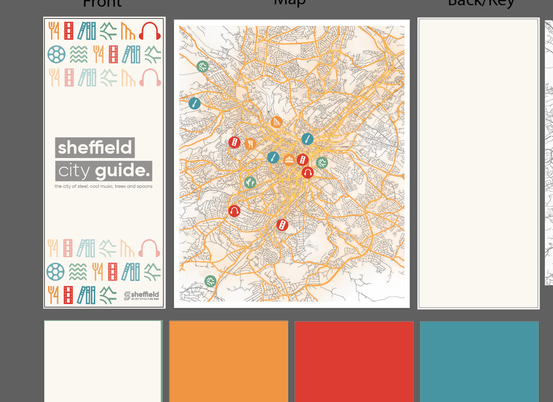
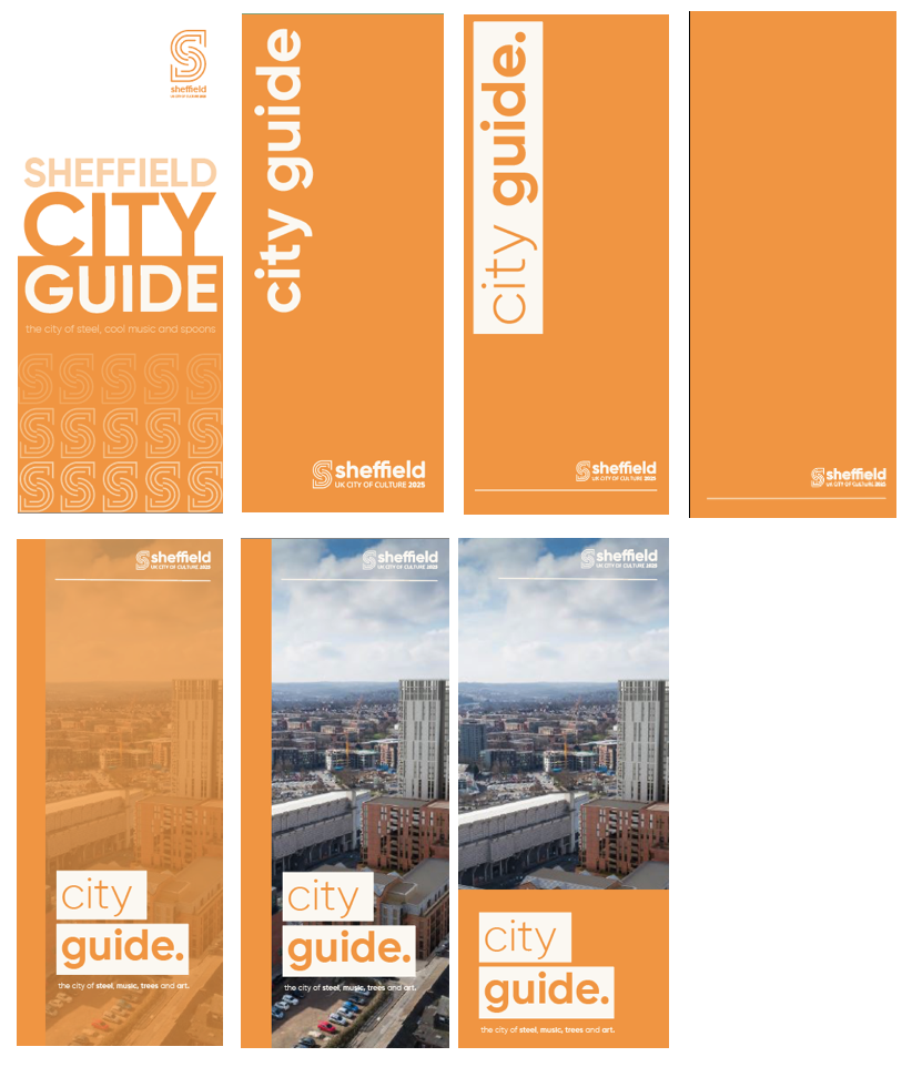
City Guide:
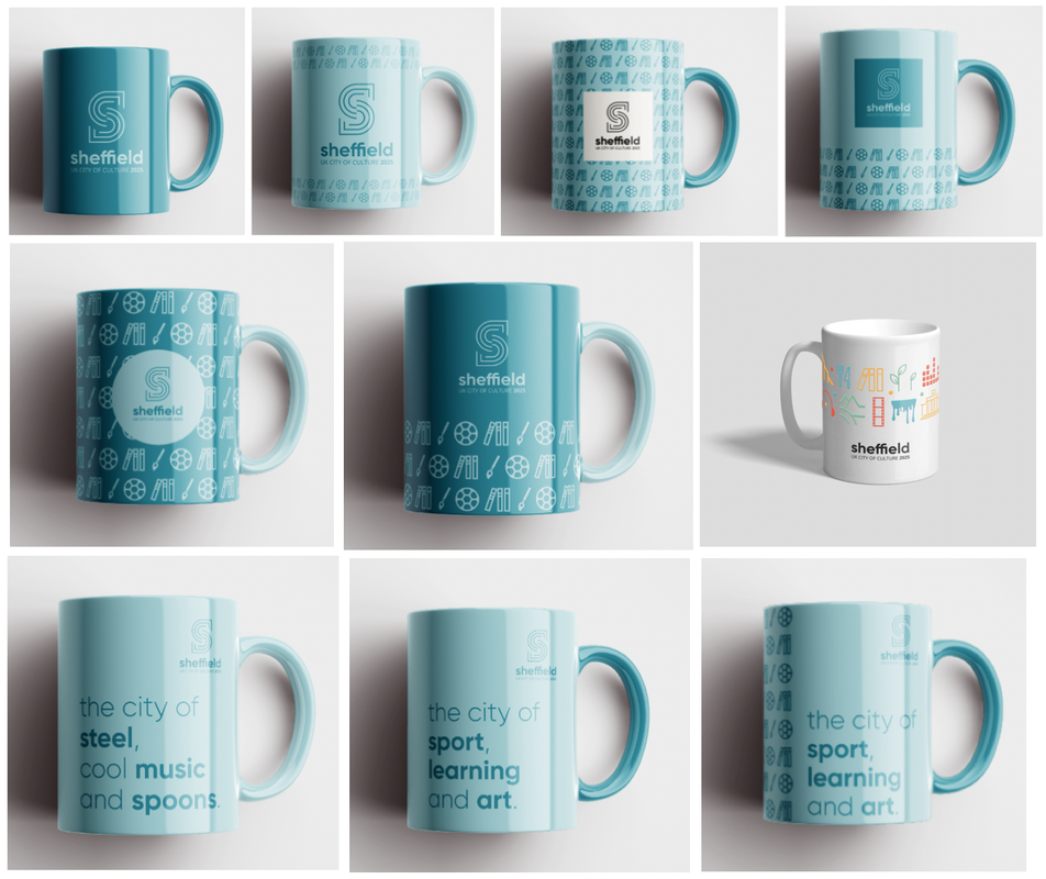
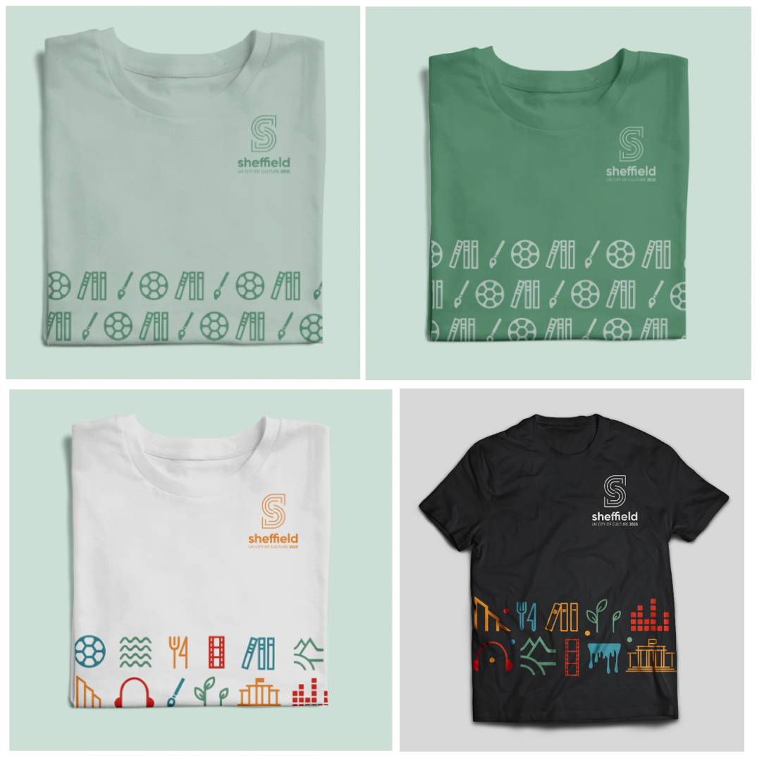
Merchandise:
Final Designs and Presentation
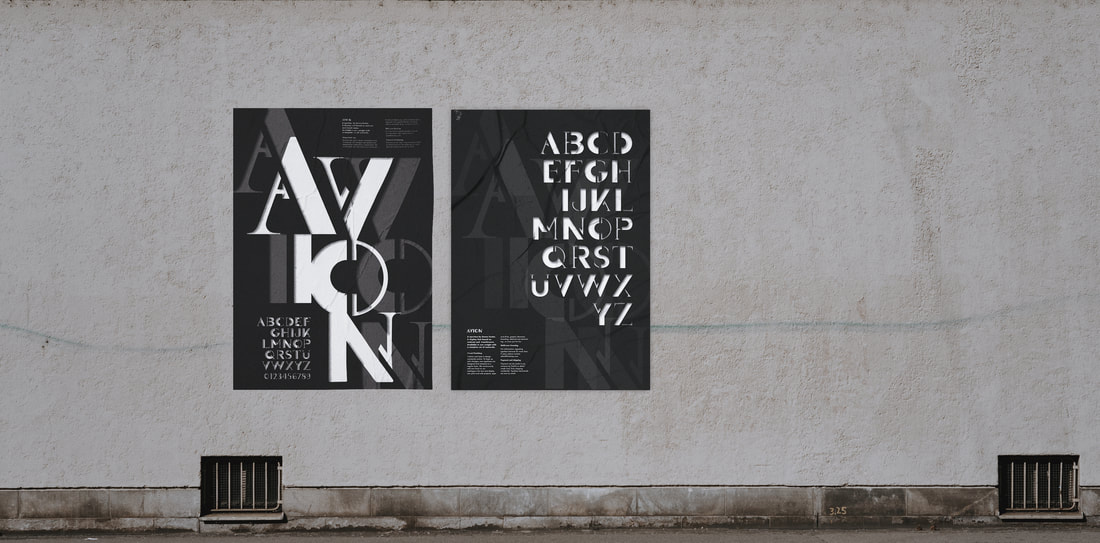
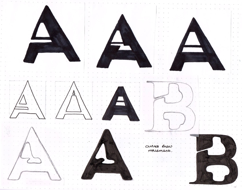
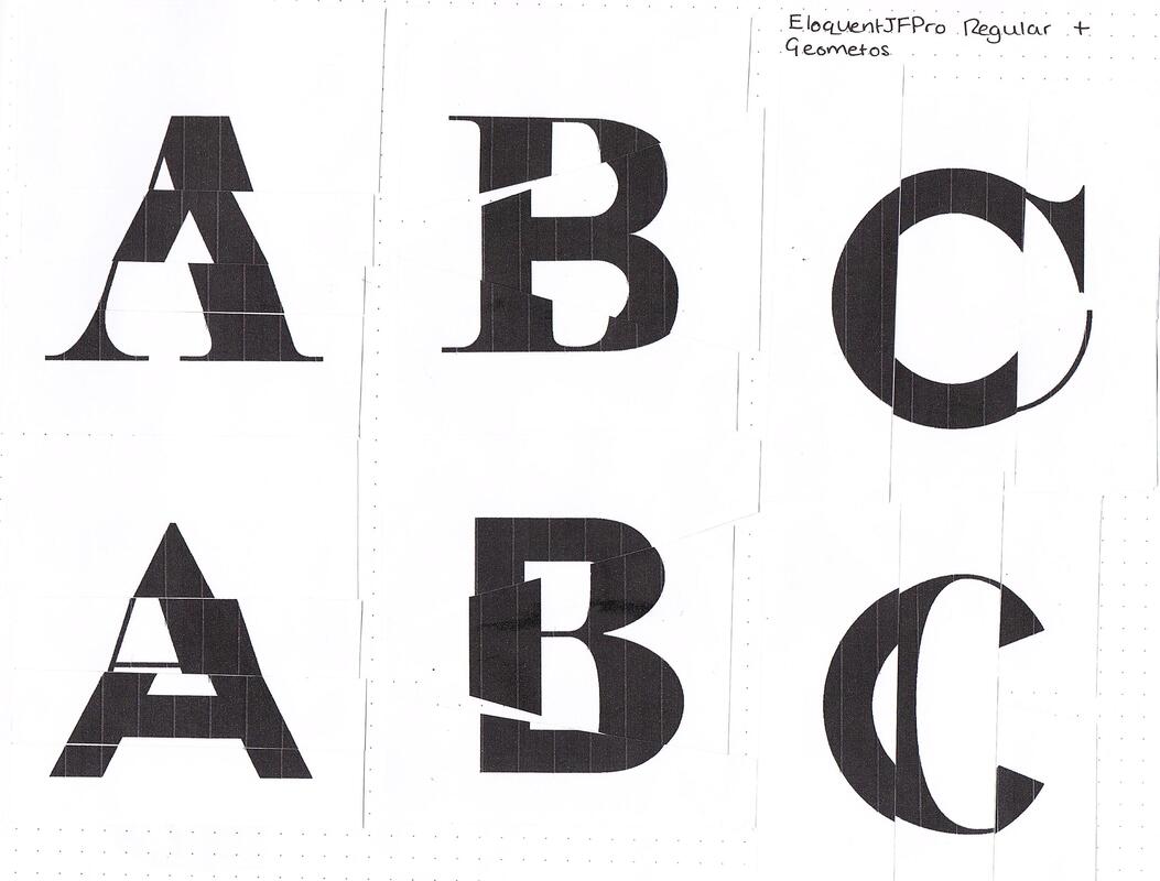
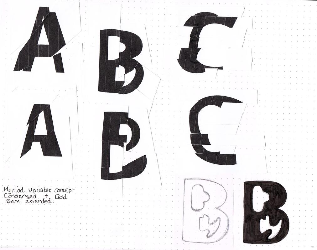
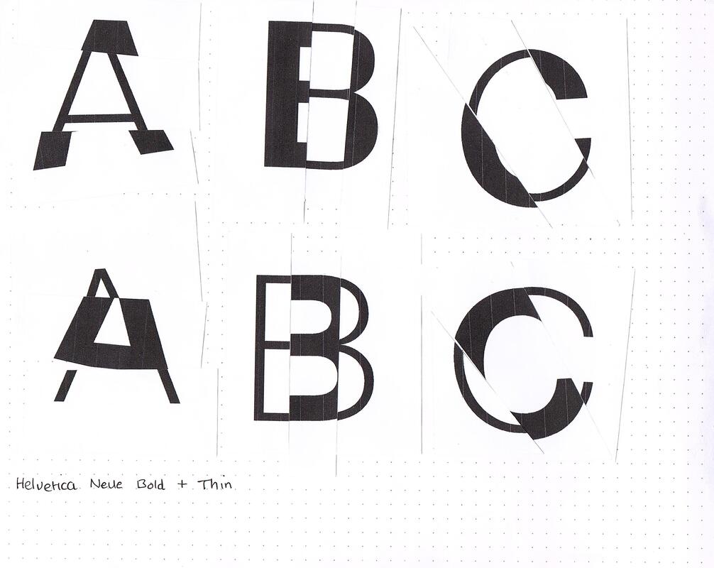
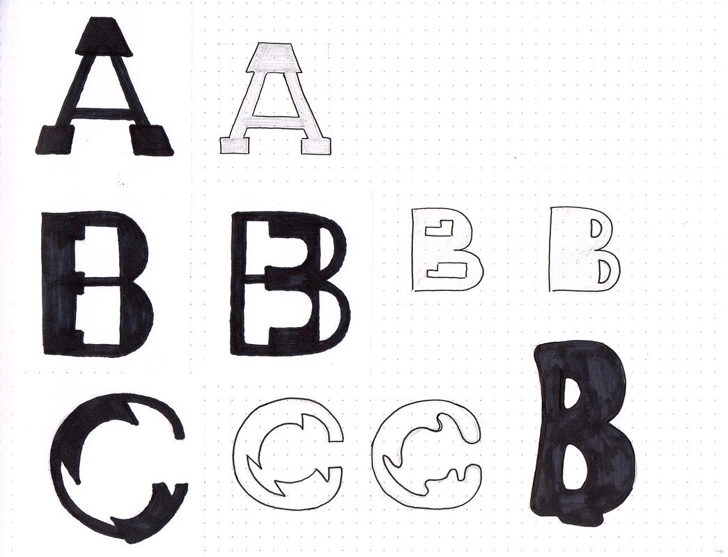
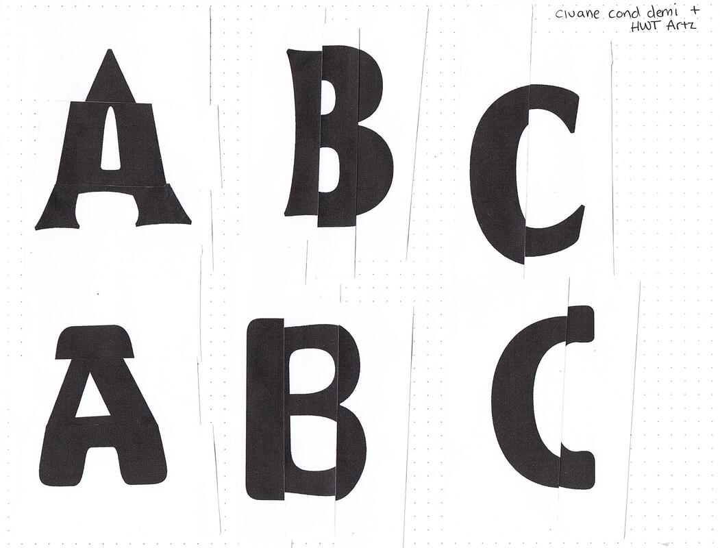
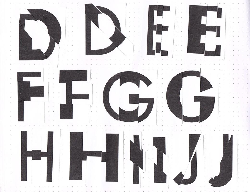
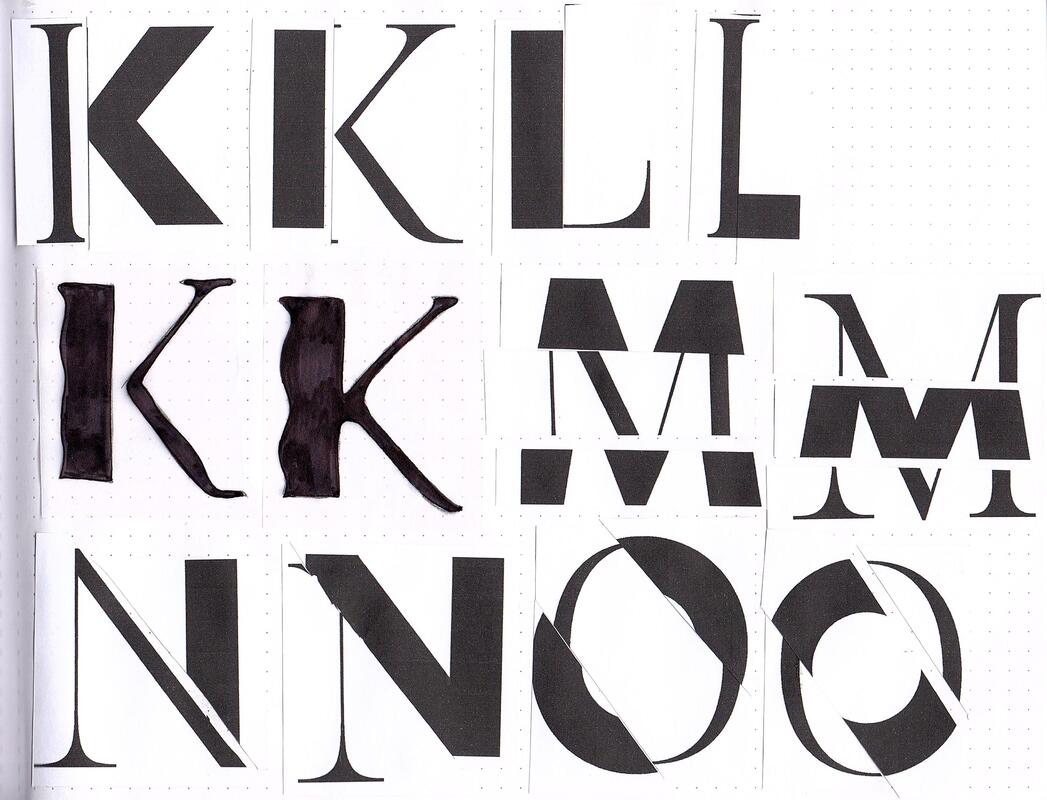
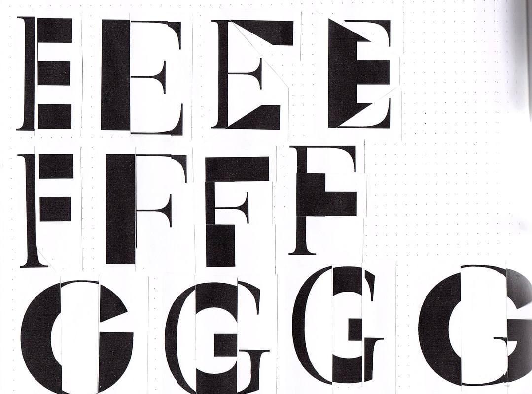
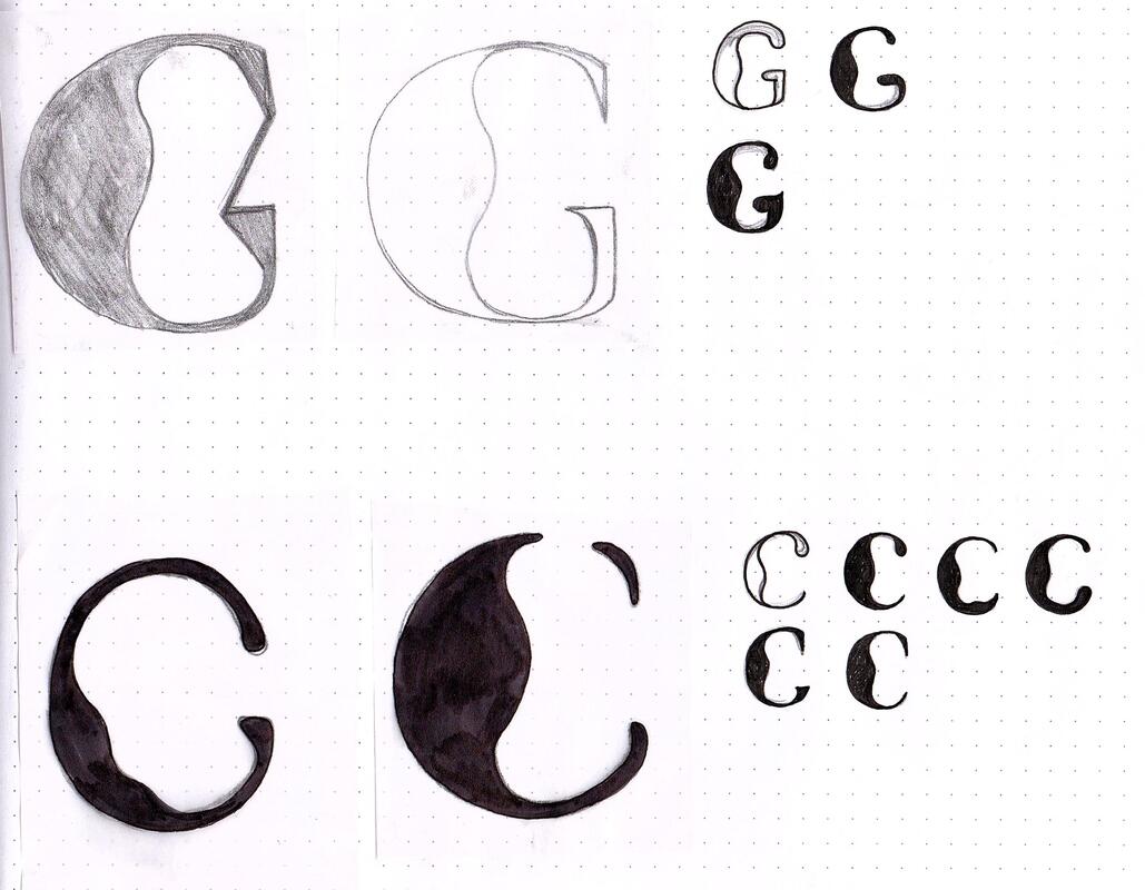
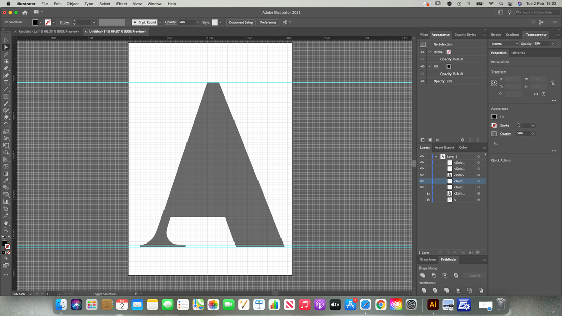
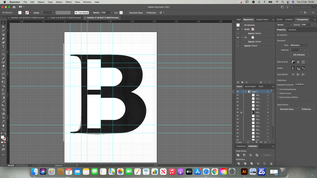
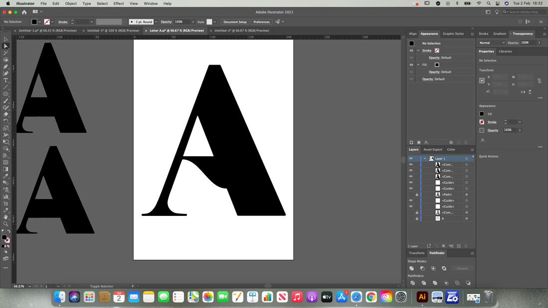
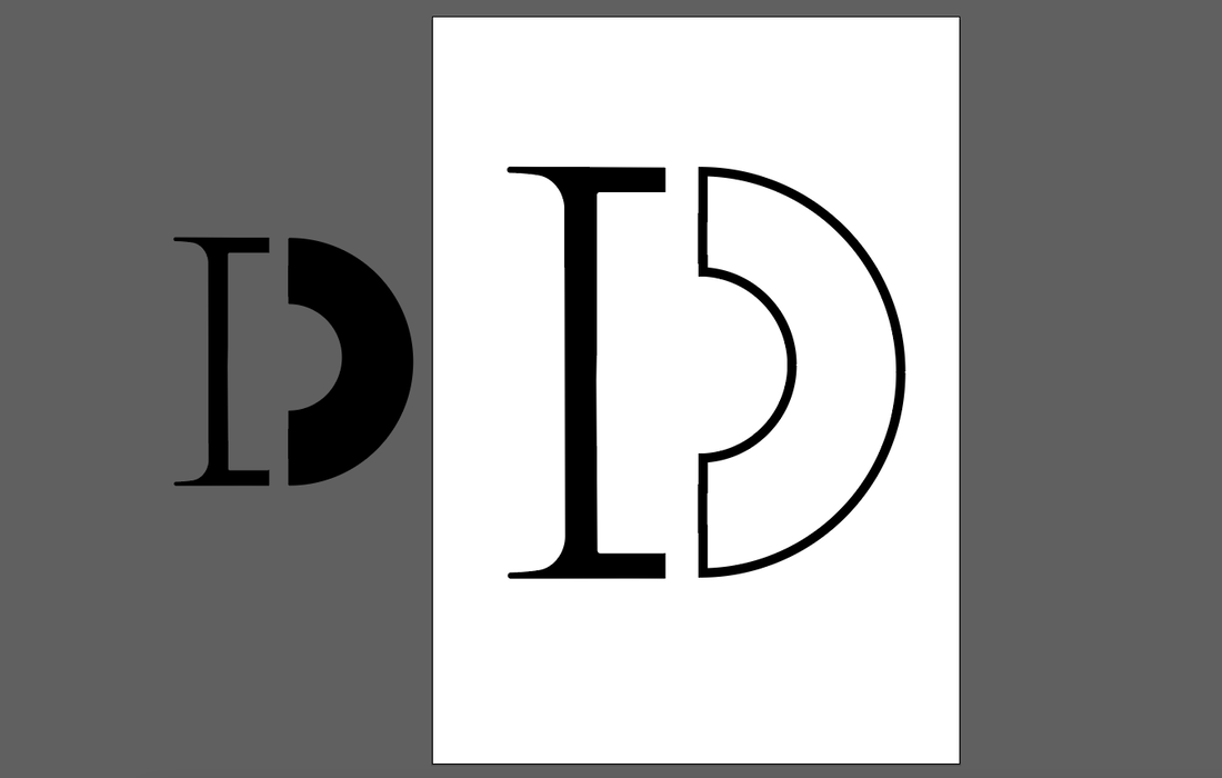
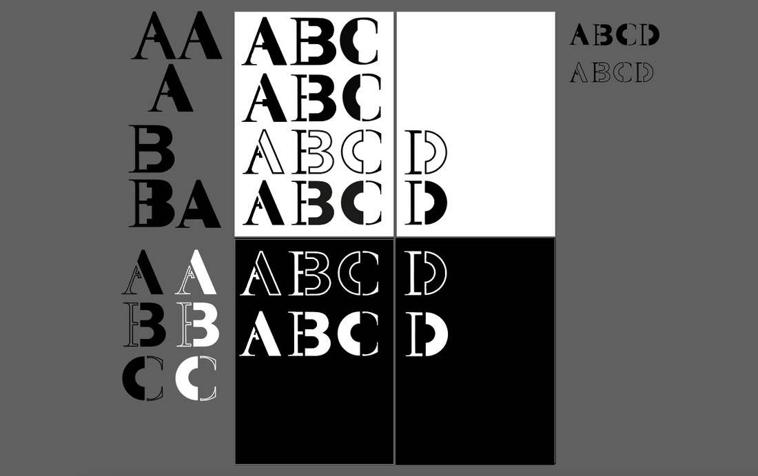
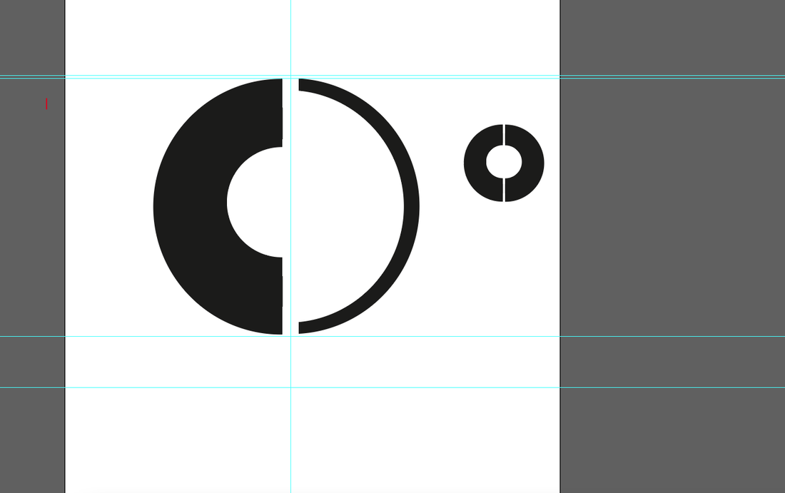
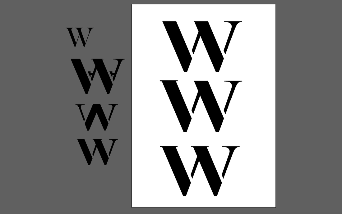
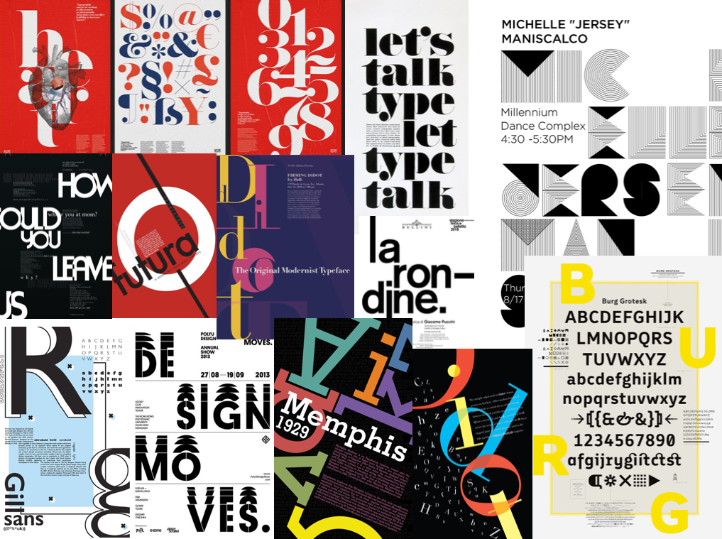
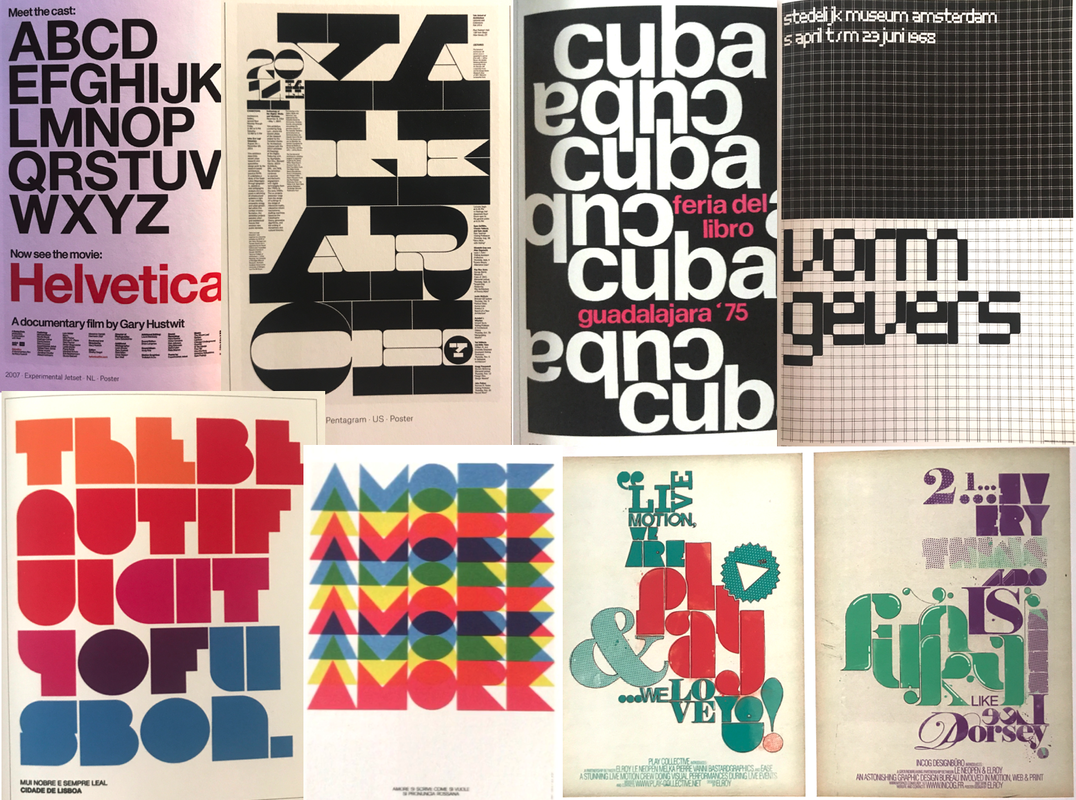
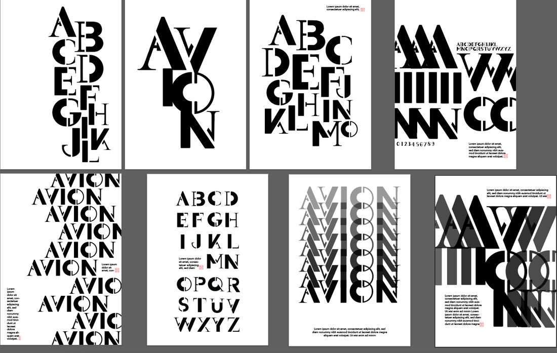
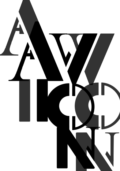
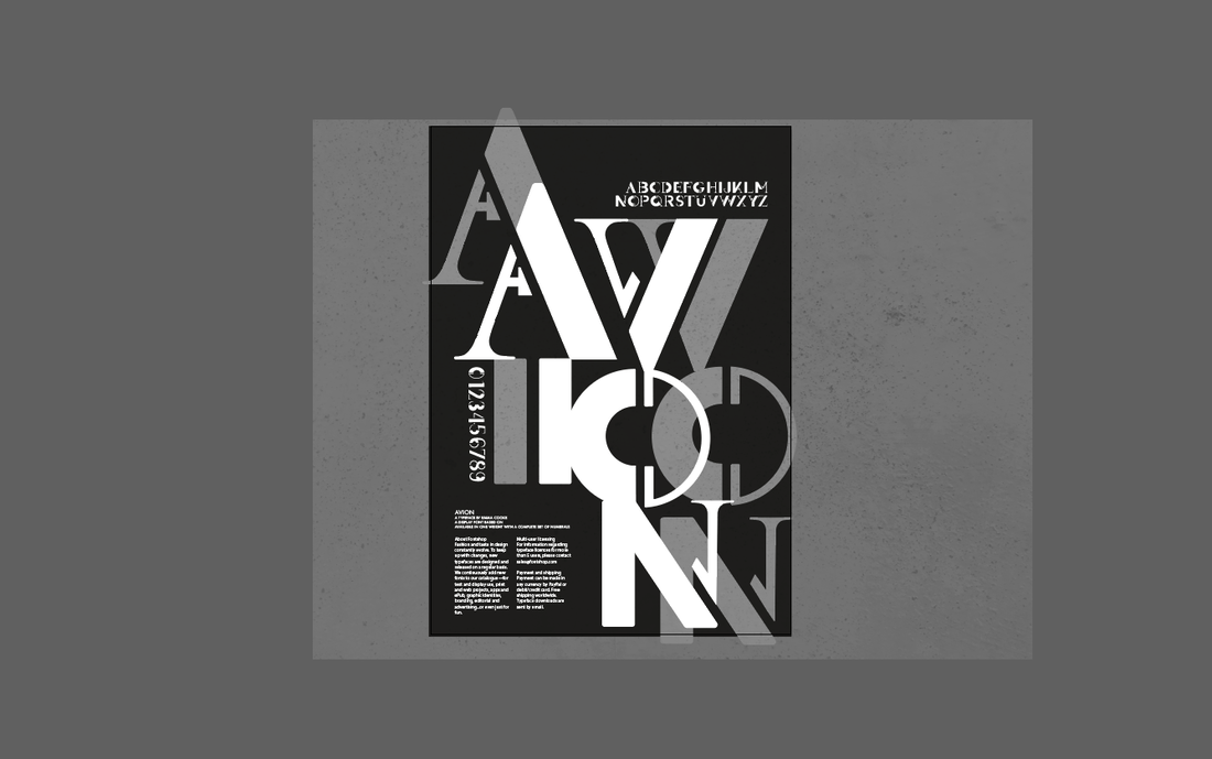
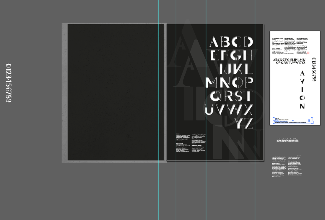
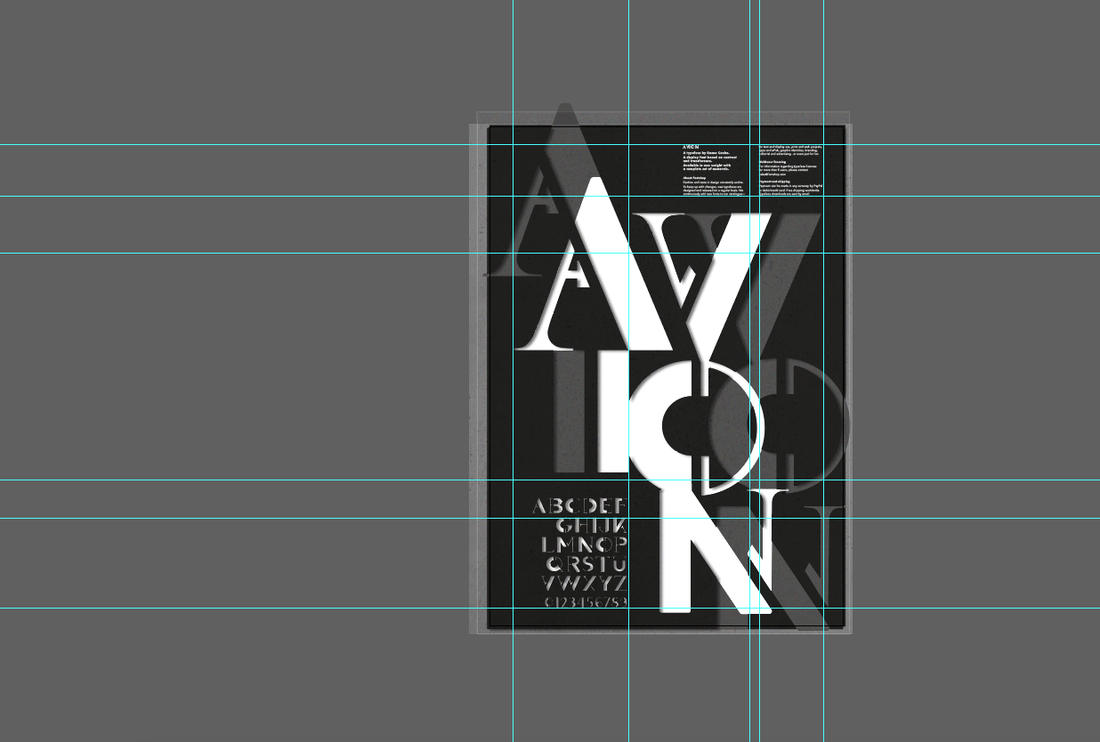
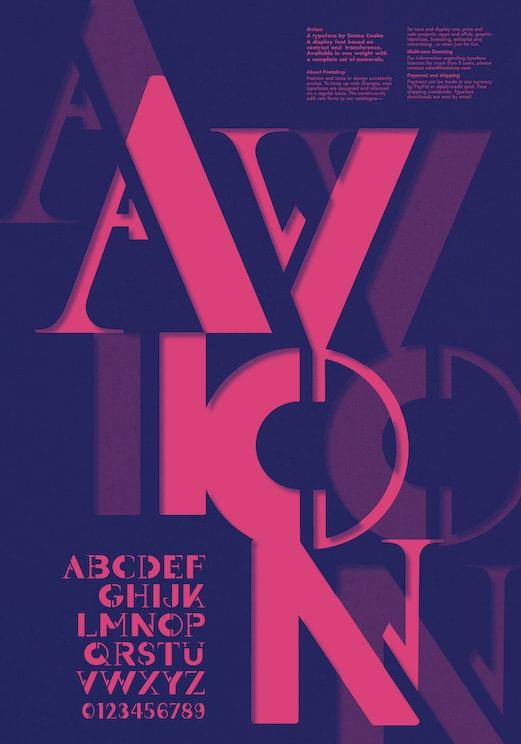
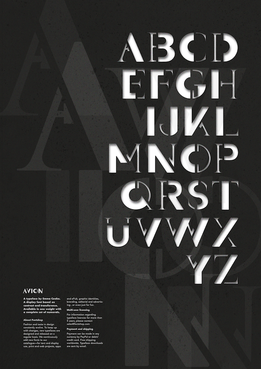
At the end of the project we had to present all of our work to the class as a group, showcasing the detailed brand guidelines and all the matching implementation. Brief For this project we had to design a display font with a complete set of characters from 'A' to 'Z', either uppercase or lowercase, plus a set of numerals. In addition, we then had create a poster to showcase and promote our typeface. Typeface Research We were given the word 'migration' as a starting point to base our font on, so I began by investigating its different meanings and interpretations. Migration can have multiple meanings such as referring to a group of people or animals migrating together, movement of people to a new area or country in order to find work or better living conditions, or in chemistry the shifting of one or more atoms from one position in the molecule to another. Below are some images I found inspiring. I liked the images that used shapes because they could be arranged in an interesting way in order to indicate movement, which was initially the path I wanted to take. 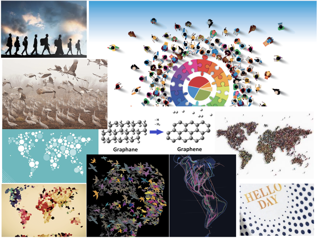 I also did some research on some already created typefaces inspired by movement. I love the way they some of them flow and look almost like liquid. I was trying to think of ways movement could be suggested such as showing speed, slight blurriness, and having a sort of shaking effect. I also like how some of these styles look quite retro and show a lot of character. 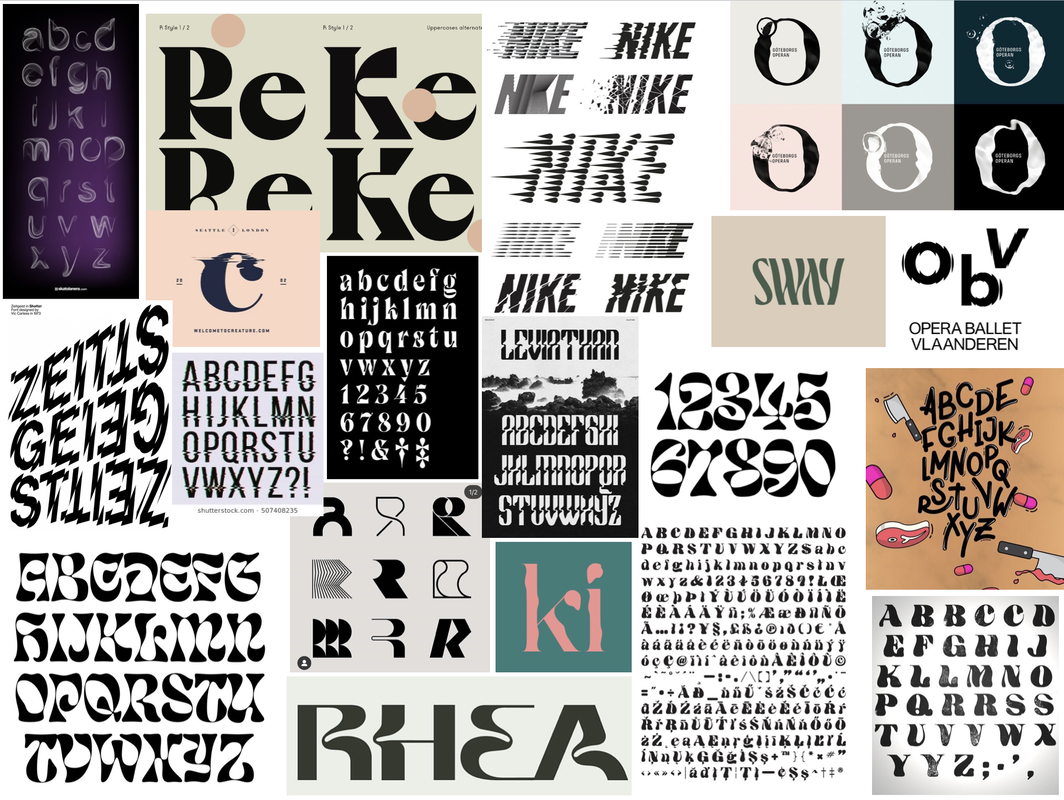 Initial Sketches and Ideas We were given two different approaches to try in order to get us started. Using dotted paper we had to use a 9x9 square grid to work with to form the basis of each character. I began by starting off with the 'control characters' first, which represent the basic square and round letterforms.    The second approach involved taking two already existing typefaces that are very different from each other, slicing and reassembling them to create new versions of the letters. The idea was the experiment as such as possible but still keep the typeface we design balanced. Throughout these sketches are also drew out new versions inspired by them; I really liked the suggested movement in the form of curvy shapes. I experimented combining the same typeface at different stroke weights (Futura Bold and Medium) and also a serif with a sans-serif (Futura Bold and Butler), combining them at different angles. Experimentation and Development I was inspired by some images I found on the internet in which I liked the shapes and wondered if I could create letters using similar shapes. Previous creations with the above techniques inspired me to combine the inspirations and experiment a bit more with some of the letters I made as well as use some other materials such as inks to create more a more flowy and organic effect. I then kept drawing further from the shapes I created from the cut and stick exercise, trying to incorporate my previous ideas of having the letters look flowy. After some feedback, I realised that trying to make the letters look flowy actually took away the interest in the letters that was created from the original cut and stick creations. So I went back to those, using tracing paper to draw over them and making subtle changes to transform them. After I had a good idea of the design, I created some quick sketches applying the same approach to the rest of the letterforms and numbers, ready to vectorise. 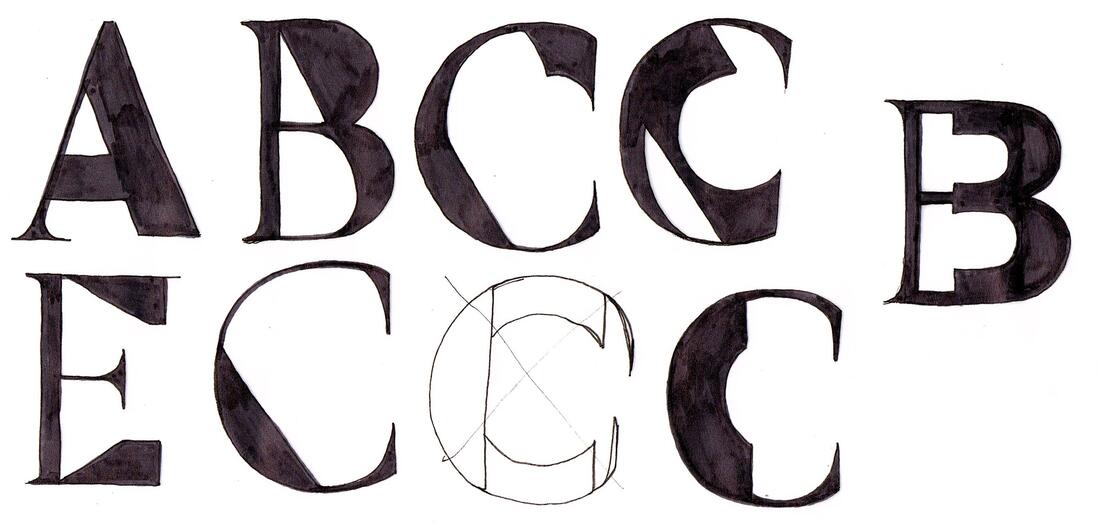 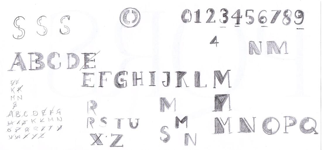 Next, I took my drawings into Illustrator to vectorise and develop them into a working typeface using my sketches and collages as a guide. I really liked idea of leaving gaps between the thick and thin parts to make it look a little like a stencil. Here is the finished typeface, shown with a few variations. It's interesting how far from my original ideas this turned out, as its more geometric than organic but I'm happy with it.  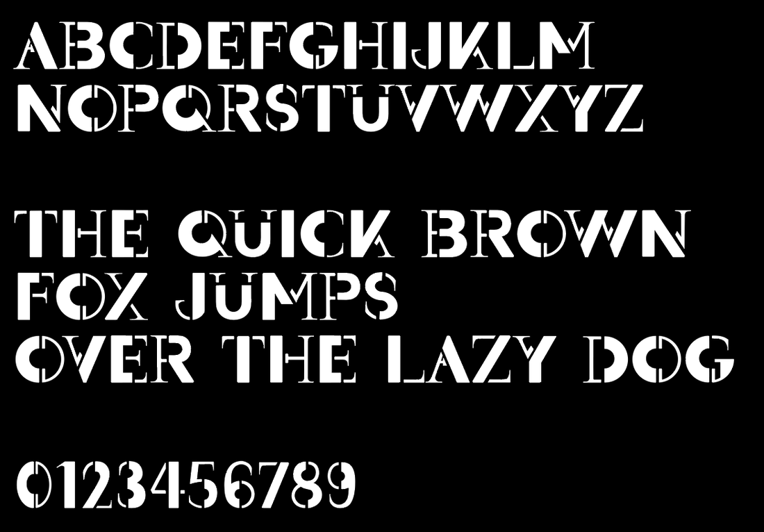  Promotion Poster Research After putting the final touches to my typeface design, I then moved on to researching ideas for the promotional poster. Looking online, I made a mood-board of some posters that I was most drawn to. I especially liked the idea of incorporating and experimenting with more colour into the design. I created another mood-board of some inspirations I found looking through the books I had at home. ('Playful Type' and 'The History of Graphic Design Vol 2') Thumbnail Sketches I then did some thumbnail sketches to figure out layout ideas for the poster. I was undecided on whether I wanted the poster to feature the name of the typeface, a quote, or focus more on just the alphabet itself. I also tried to think about how I could incorporate colour. 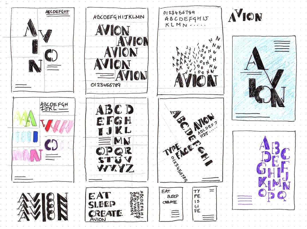 Development I then went into Illustrator to try and make the poster digitally, using my thumbnails as a guide. I started out keeping the designs black and white then eventually experiment with some colour to make the typeface pop more. Final Design Here are my final designs, as well as the typeface file below. I actually ended up sticking with the original black and white as I liked it better. I also did a mock up of them in action.
|
AuthorHi, I'm Emma. I'm currently studying Graphic Design at the University of Cumbria. Modules
All
Archives
May 2021
|
||||


 RSS Feed