
|
Brief
For this project we were put into groups, acting as a design consultancy for a city bidding to be the City of Culture in 2025. We had to produce a brand identity for the city of Sheffield, to be used as a key element in their bid strategy across a range of media. Research We had to find out about the history, industry, commerce, geography, population, famous inhabitants, culture etc of our city too inform the concepts to develop for the brand. After delegating topics, we got to work; I researched culture and commerce; what I found can be seen in the file here. 
We then collated all of our research together into a powerpoint for presenting our findings to the rest of the class.
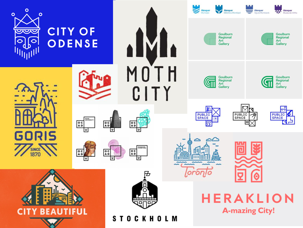
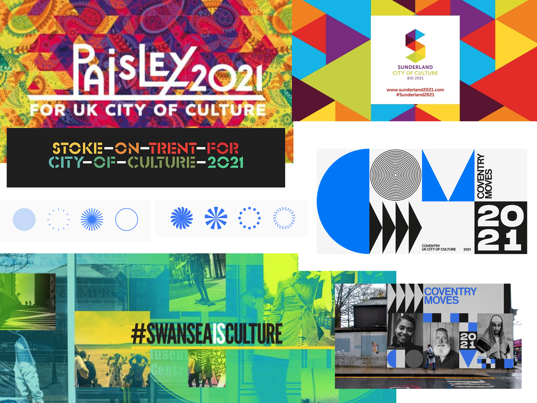
I then decided to do some research into other branding designs, specifically at past City of Culture designs to get some more inspiration, as well as at some logo designs that I liked. I was particularly drawn towards minimalistic, simple lines and shapes that could be easily used in a range of ways/colours.
Logo Sketches
Next, we decided to do some idea generation and do some initial thumbnail sketches. We figured the steel aspect was something we definitely needed to look into but my worry was that the logo could end up looking too much like a steel company logo rather than represent the city as a whole, especially seen as the steel industry in Sheffield isn't even as prominent as it used to be. Therefore, I tried to include other themes such as landscape and music.
After discussing our ideas with each other, we decided to take forward one of Olivers ideas, using the shape of an 'S'. I did some sketches based of his original drawings of how we could possibly incorporate symbols of the steel industry and music etc into the shape.
Logo Development
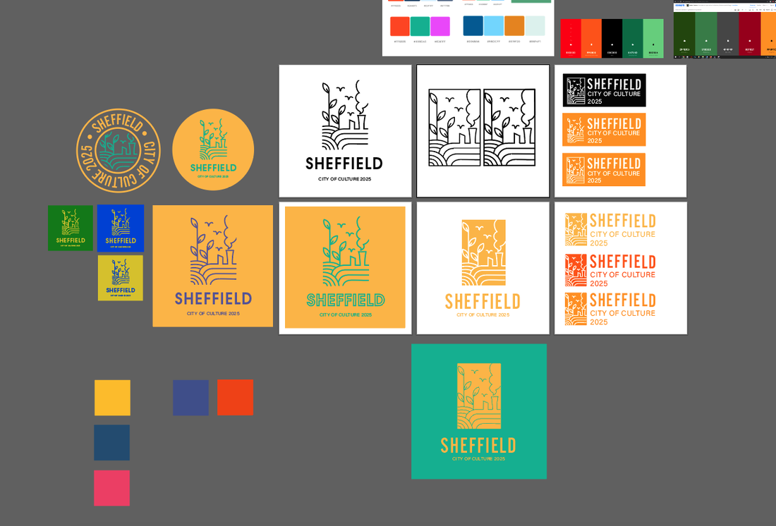
I then decided it was time to start experimenting with some of the ideas on Illustrator; I started with my original concepts to see if they could be worth pursuing as well as vectorising the symbols, then continued trying to refine the 'S' logo idea. It became apparent that incorporating any illustrations into the shape wasn't going to work well as it would be too small to be legible at smaller sizes and frankly just didn't flow well as whole. So I came up with a more simple design that used the original shape with extra lines all at the same thickness. We found this actually worked well to represent the steel industry as it gave the impression of the flow of molten metal through a mould. 
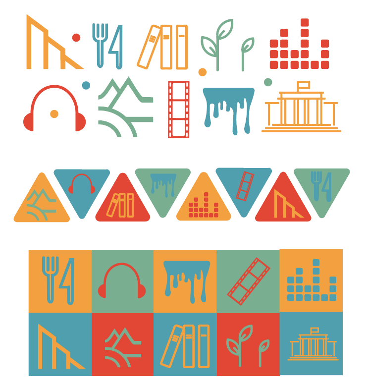
We then began thinking about colours. I wanted the colour palette to represent the city's industry using mainly oranges and yellows, combined with at least one contrasting colour.
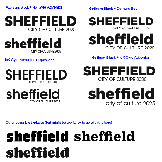
When thinking about typefaces, I thought we needed something like a thick, modern sans-serif, so I put forward what I found to the group along with some possible typeface pairings. I much preferred the way the word looked as completely lowercase and it just looked more friendly that way.
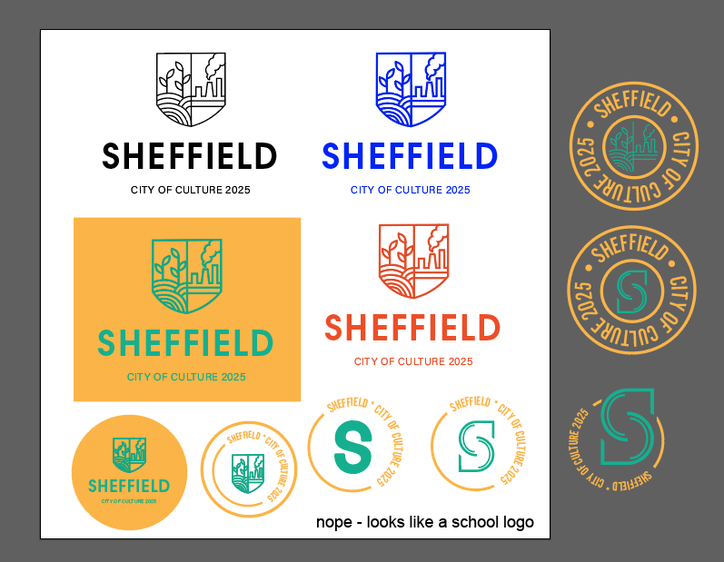
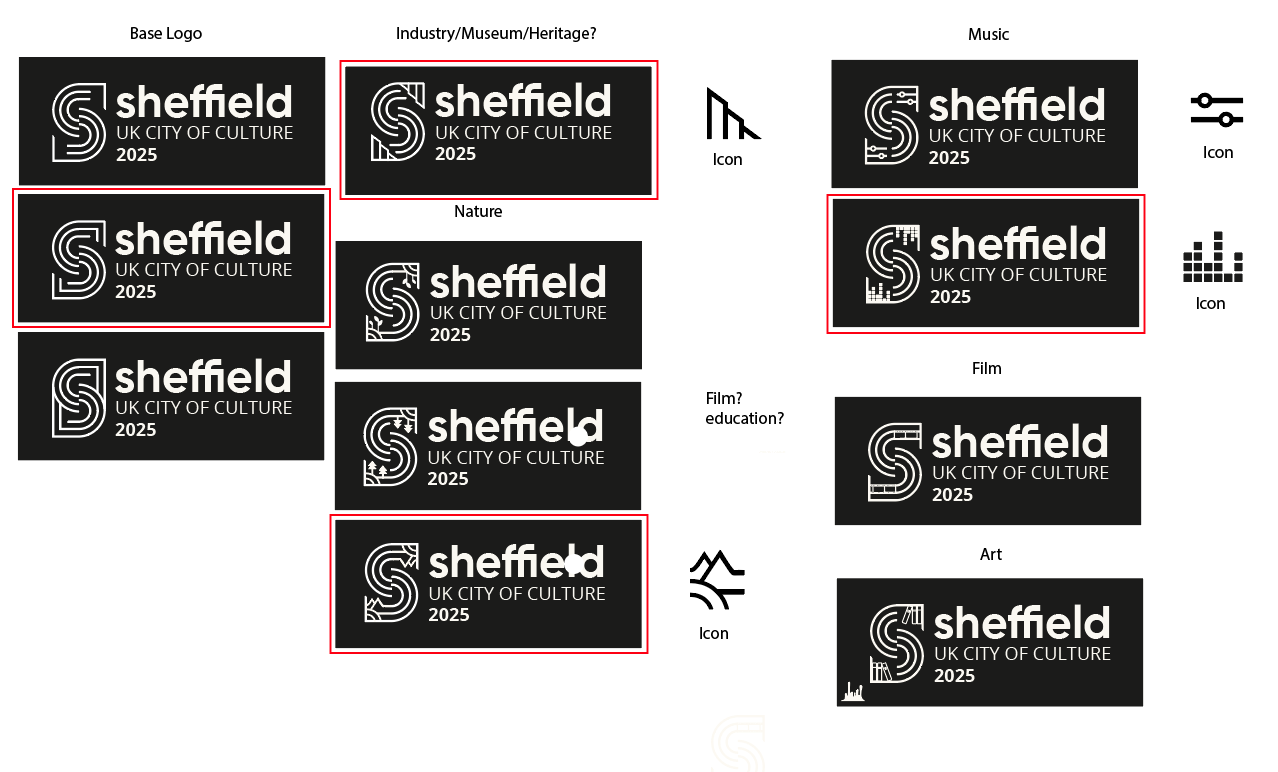
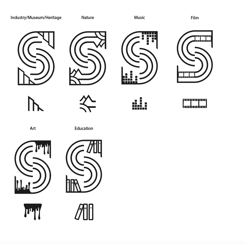
I then started trying to combine the colours and font ideas with the logo to see how it may look. I tried combining the factory shape into the logo to make it more obvious its symbolising the steel industry, however I felt it was too restricting because it didn't represent any of the other factors that make up Sheffields culture. As a result, we decided we would create a modular logo, containing of a base logo and other variations of it combining the symbols I created earlier. The idea was that each symbol would be used for different thing, for example, the music themed logo would be used for any music related brand implementation.
The most difficult part of designing these logos was trying to make the added symbols flow into the 'S' and be more seamless as I didnt want it to end up looking like the base logo with a symbol just stuck in the corner.
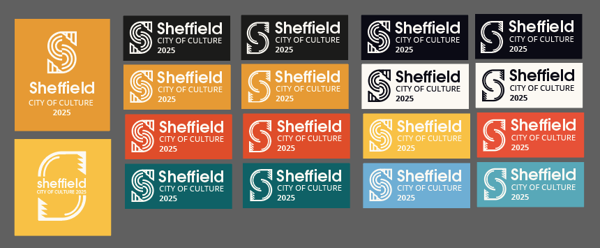
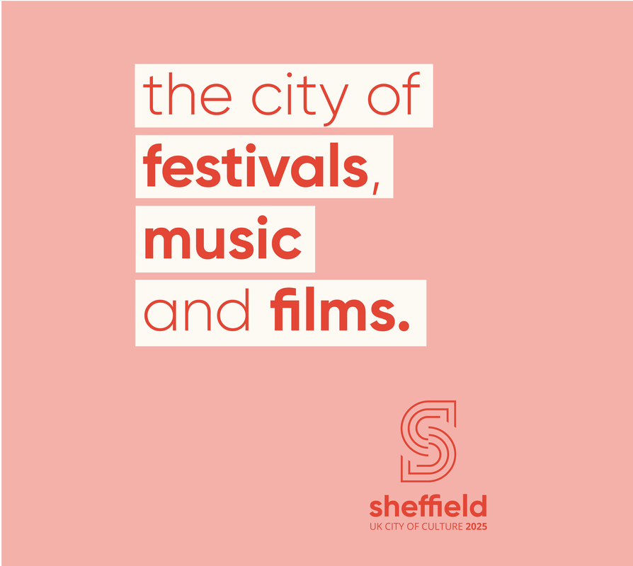
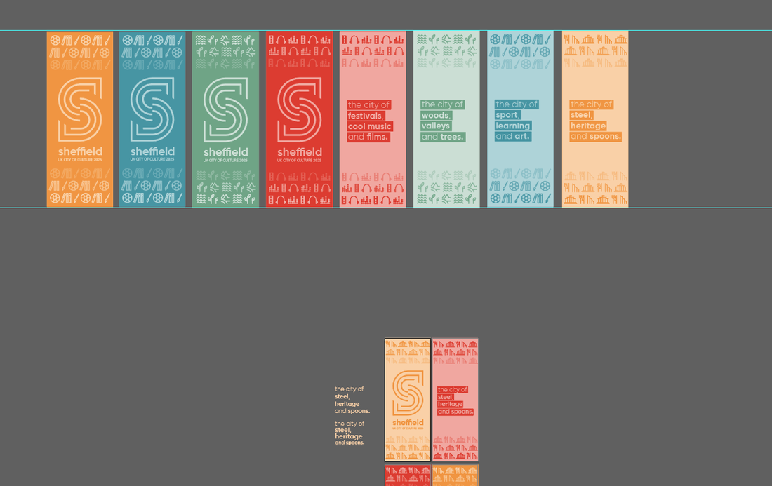
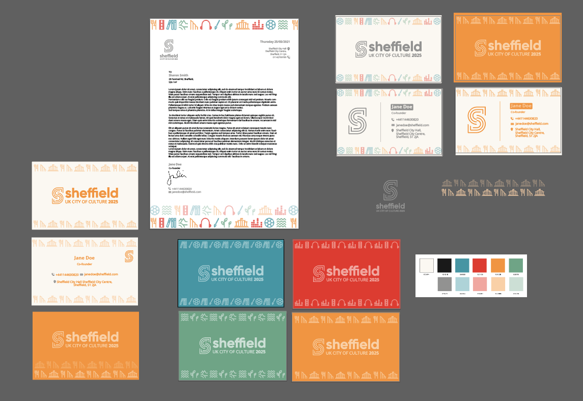
Final Assets Here is the final base logo and the other individual logos from the rest of the modular design incorporating each of the themes into the 'S', along with the accompanying symbols. I also put together some possible patterns and tag-lines (inspired by the original 'City of Steel' tagline), for use when implementing the brand.
Basic Brand Guidelines
We finally settled on our base guidelines, choosing a bold sans-serif typeface for display and an easy to read body copy font. Our final colours consist of a colour for each theme of the modular design as well as a soft black and white and complimenting pastel shades of each colour. The symbols matching tag-lines further help to establish the language of the brand. 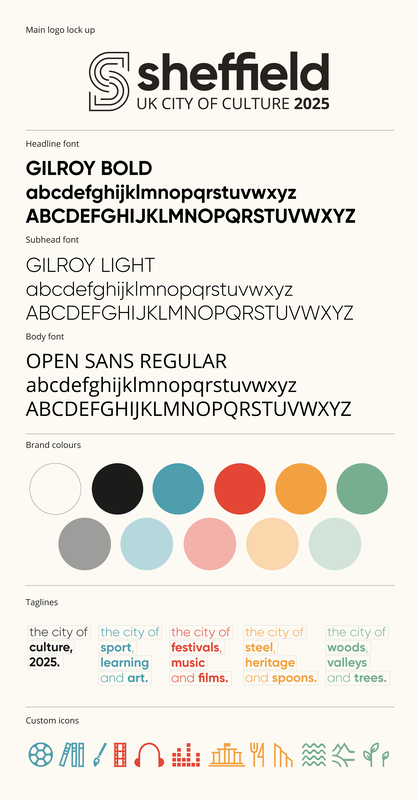
Implementation
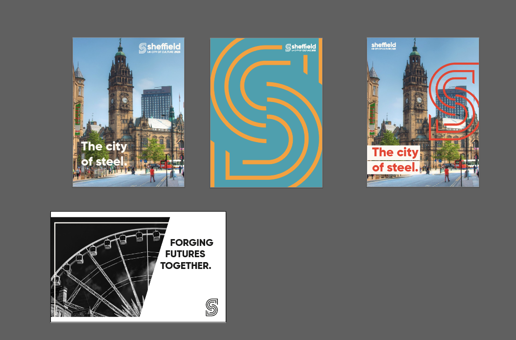
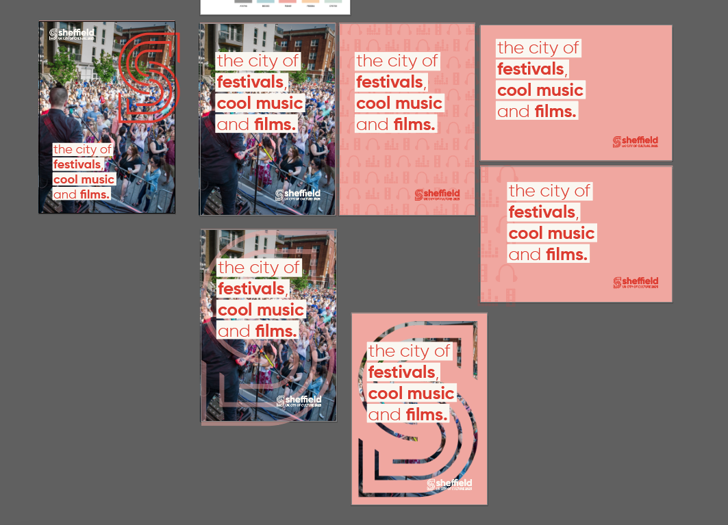
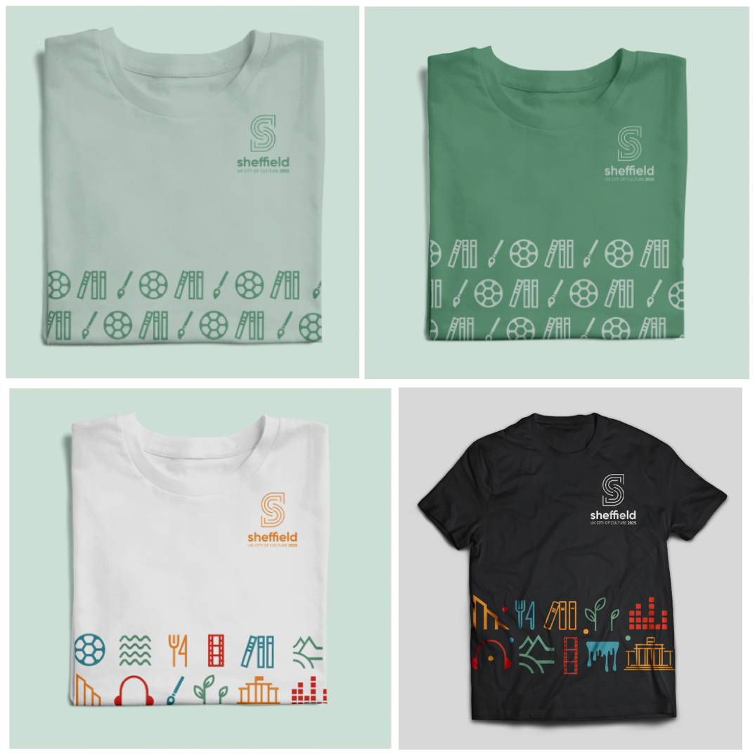
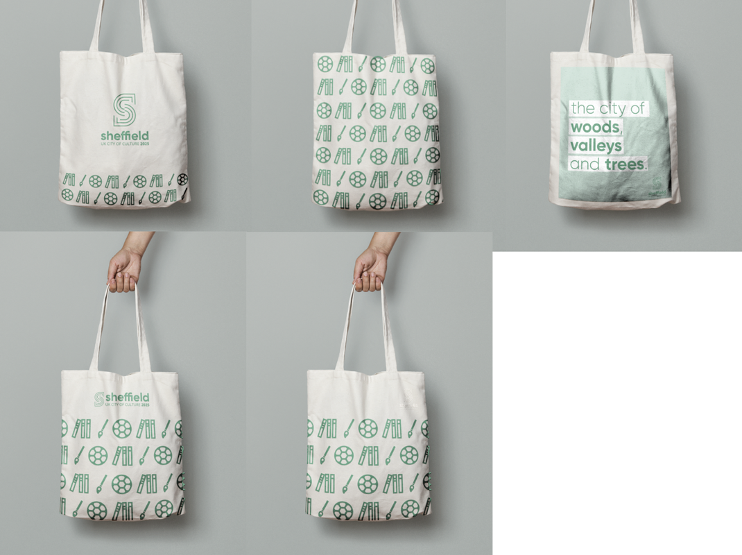
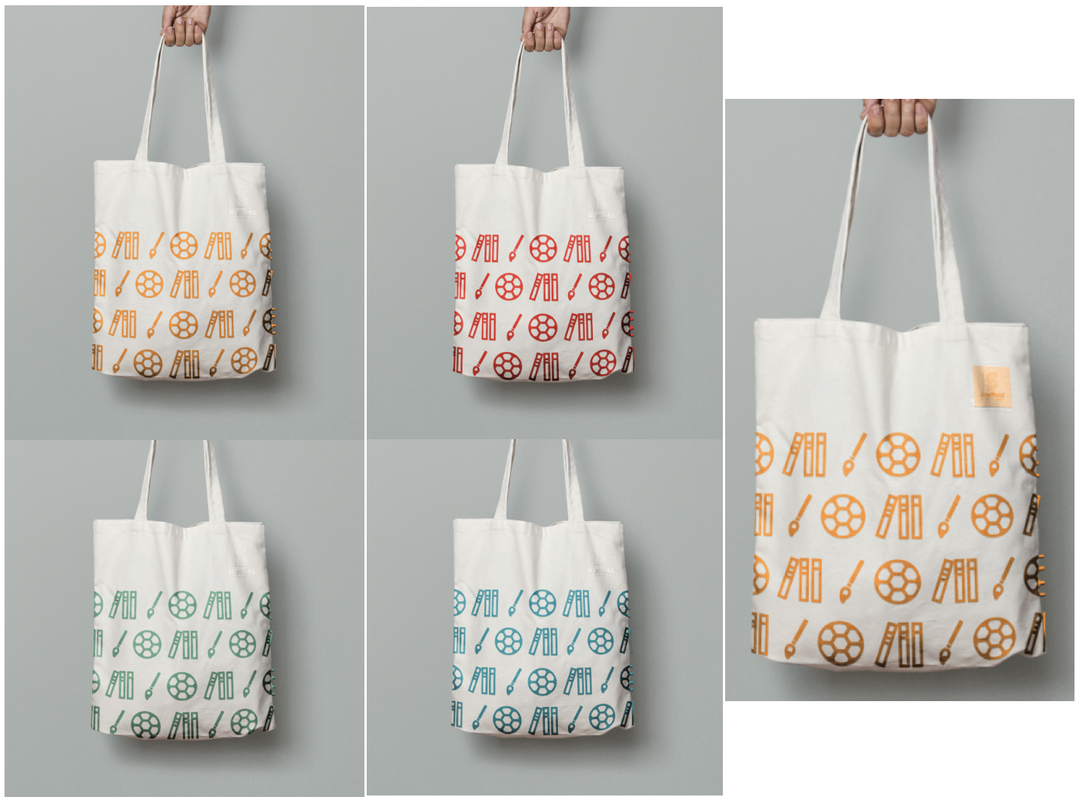
After settling on our basic brand guidelines, we started to implement the design onto a range of publicity materials, including posters/signage, online presence, stationery and various merchandise. Below are some of my experiments applying the brand guidelines to posters, flags, a city guide, stationery, as well as merchandise such as mugs, t-shirts and bags. Posters:
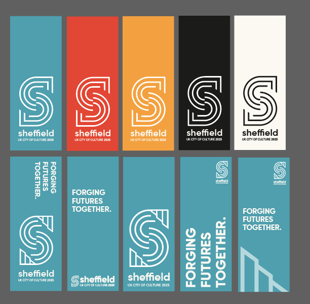
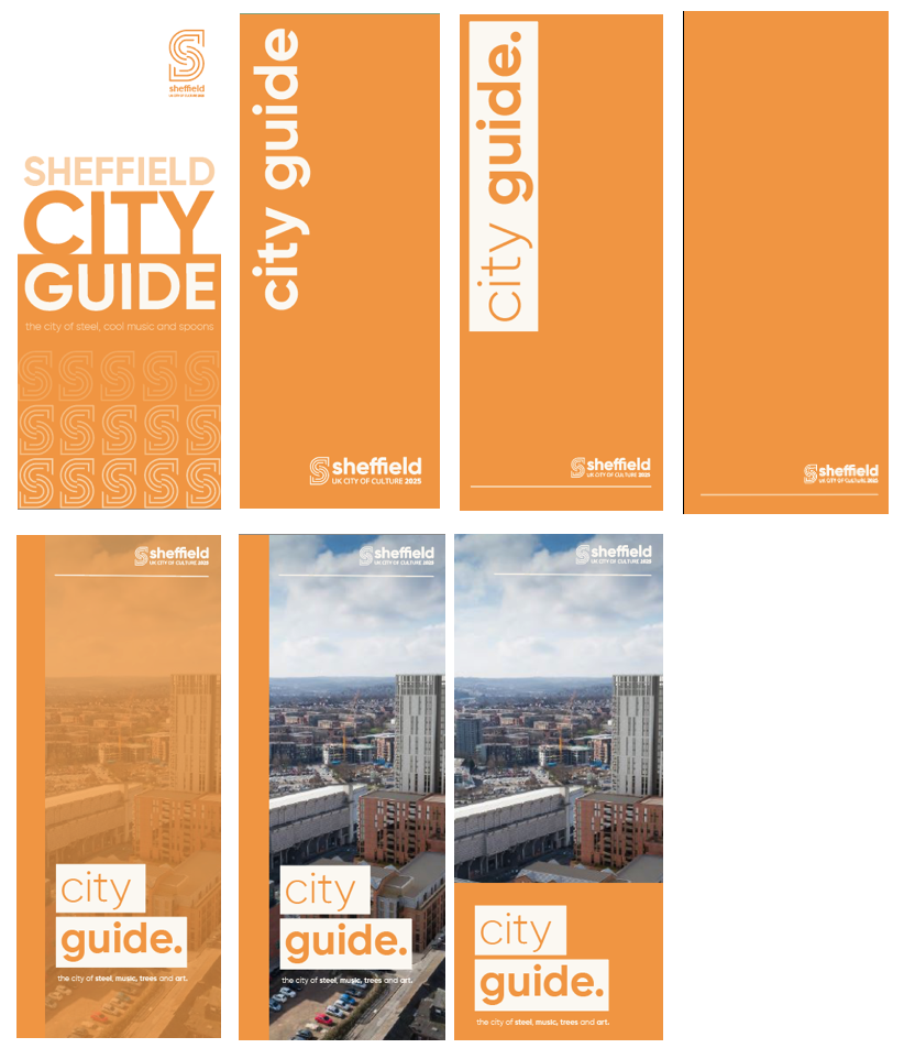
Pole Flags/Banners:
Stationery:
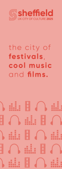
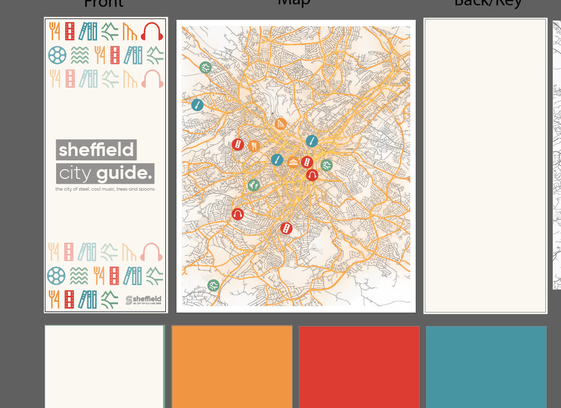
City Guide:
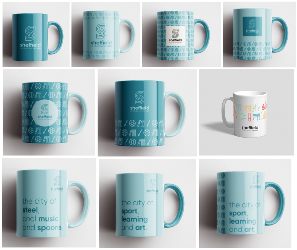
Merchandise:
Final Designs and Presentation
At the end of the project we had to present all of our work to the class as a group, showcasing the detailed brand guidelines and all the matching implementation.
0 Comments
Leave a Reply. |
AuthorHi, I'm Emma. I'm currently studying Graphic Design at the University of Cumbria. Modules
All
Archives
May 2021
|


 RSS Feed