
|
Brief
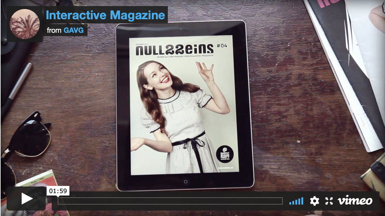
Following on from our existing print-based editorial work, we had to create a proposal for a digital version of our stories for a web-based version of the magazine. Research To begin I started by researching some examples of interactive, digital magazines to use as inspiration and give me ideas for what additional content I wanted to include such as videos, sound, and other interactive elements. I found a few that I liked on Behance and Youtube and they inspired me by how the little animations for swiping and viewing extra content enhanced the users experience. 


Addition Content
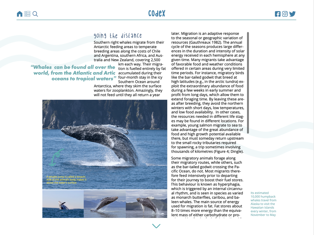
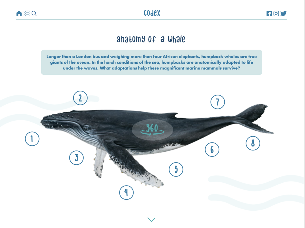
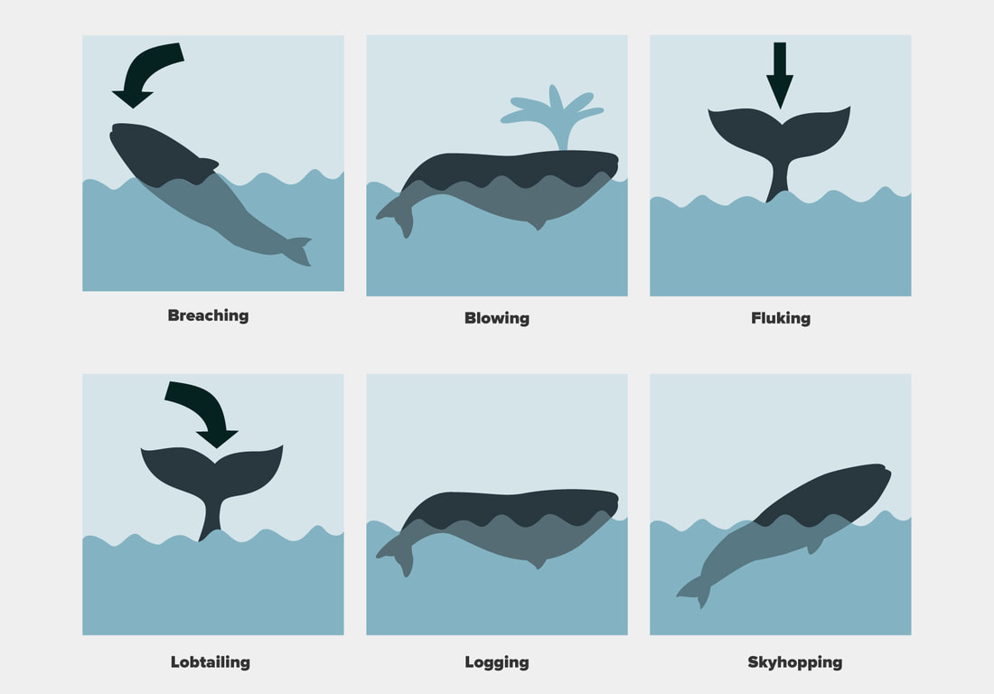
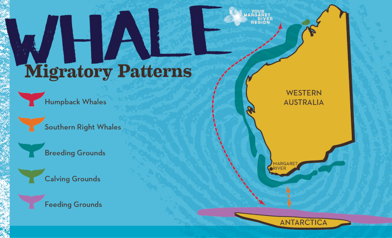
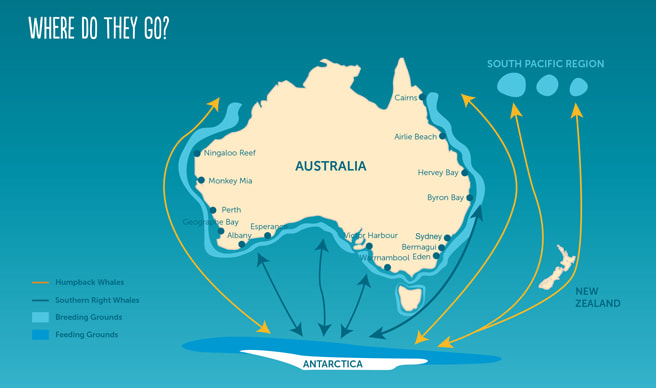
Due to this digital magazine having more pages, I needed to look for more content to include to bulk it out. I began by researching online for ideas for more relevant information. I knew I wanted to include a 3D whale image to add content around so I looked for more quick and short facts, maps to add animated elements onto, extra images for slideshows, videos, sounds, as well as general body text. Videos:
Imagery:
Information:
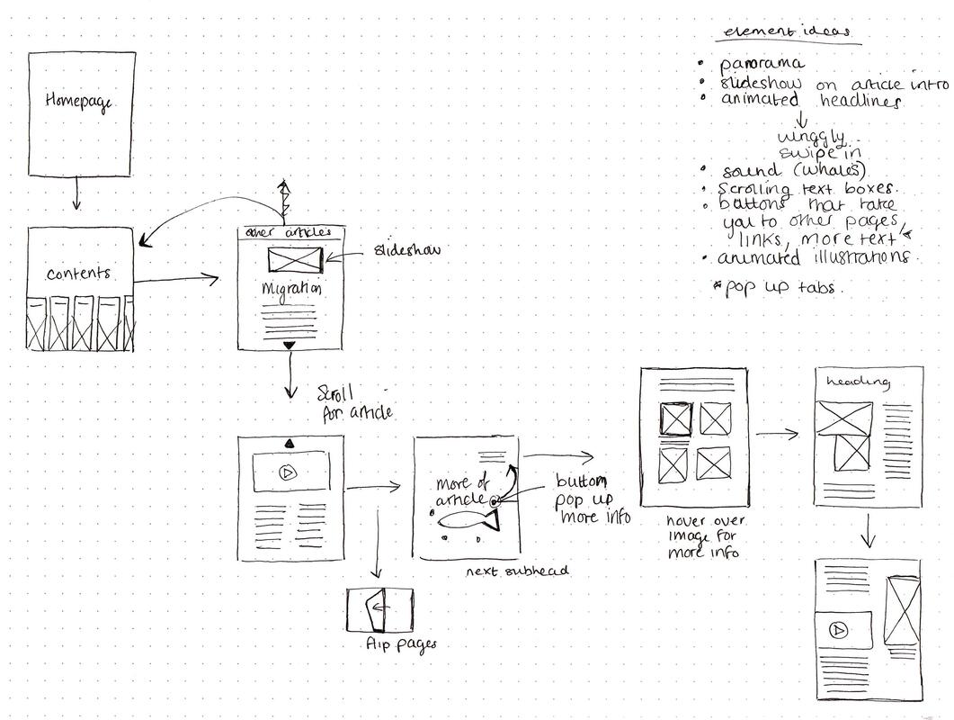
Initial Flat Plan of Sequence of Pages
After curating some additional content, I began thinking about the order of pages, and tried to get an idea on what was going on each page, as well as where the interactive elements could go.
Thumbnails
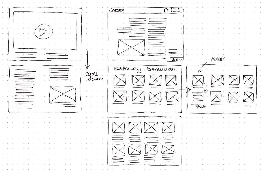
I then went ahead and drew some thumbnail sketches for layout ideas for my pages, trying to take into account that some areas would be interactive or have some sort of effect added. I also tried to think about layouts for both portrait and landscape and how the article could look if it was a page you scrolled down to see more of it rather than each being an individual page. 
Mood Board
I decided to do a quick mood board of how I wanted the style of the magazine to differ from my previous one. I wanted it to be mainly the same but include more fun, handwritten/hand drawn elements that could be subtly animated and add a bit more visual interest. 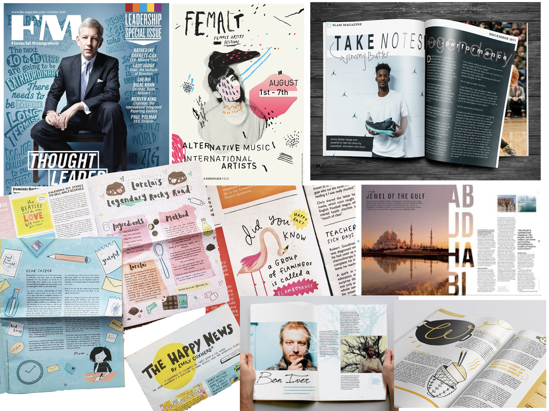
Initial Concept
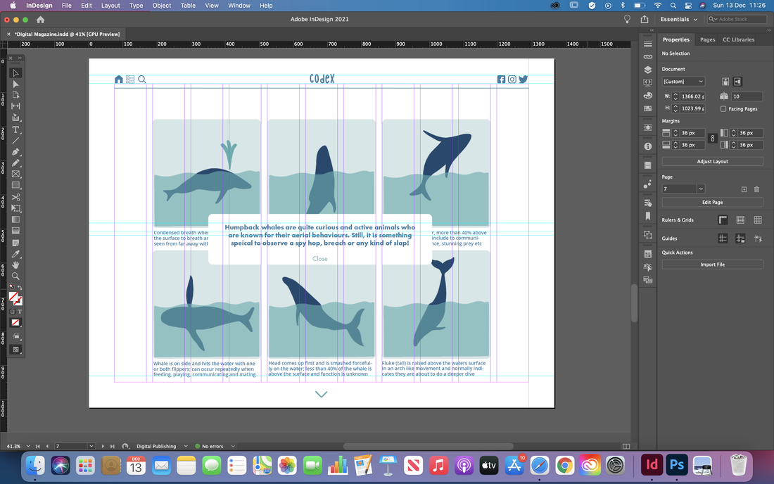
After planning out my ideas, I began to implement them on screen. I took my original spreads and edited some of the fonts and layout to fit the new style and incorporated a bunch of new interactive elements. I included animation, roll-over buttons and made gifs using Procreate to use for animated titles and sub-titles. I also included a clickable slide show of images on the articles splash page and edited a video from online to make it fit in more with my theme. 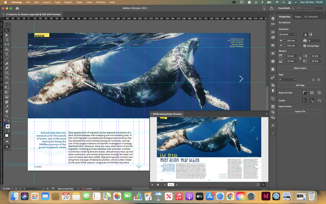


After receiving feedback on what I had done so far, I began reworking my layouts so it looked more like it was intended to be digital, rather than a printed magazine with interactive elements added to it.
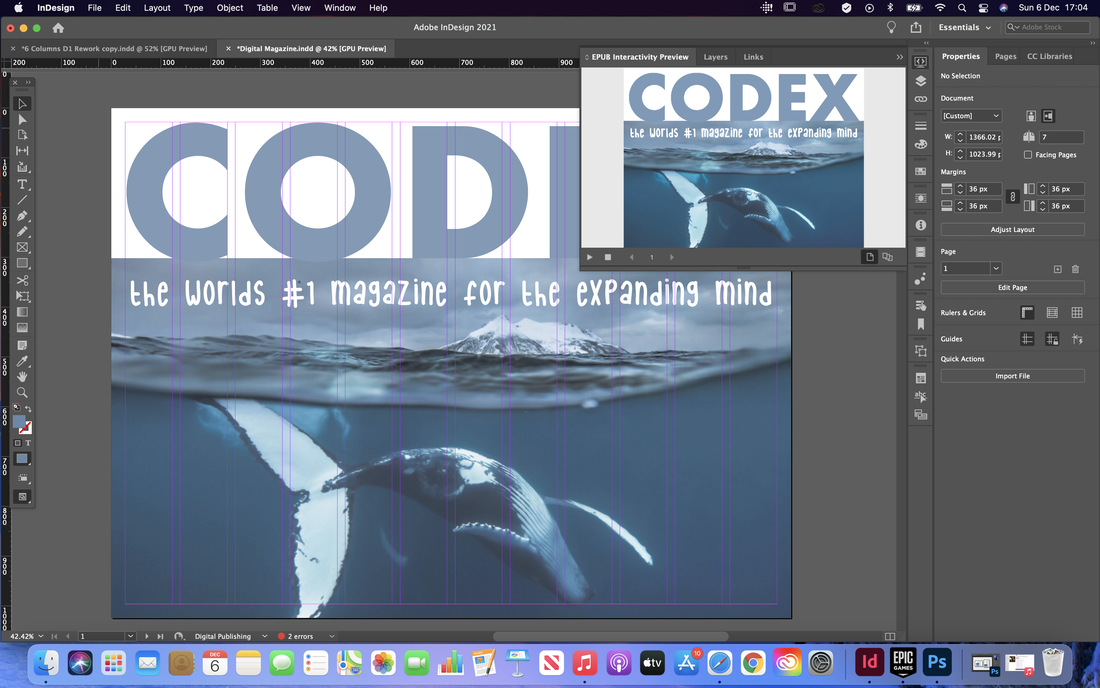
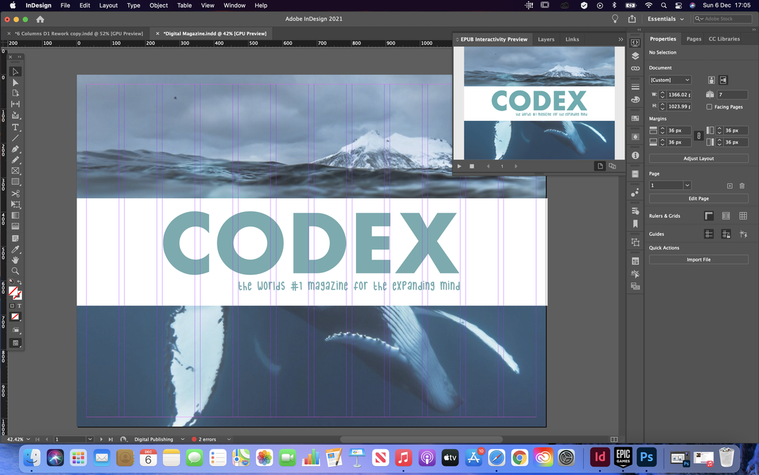
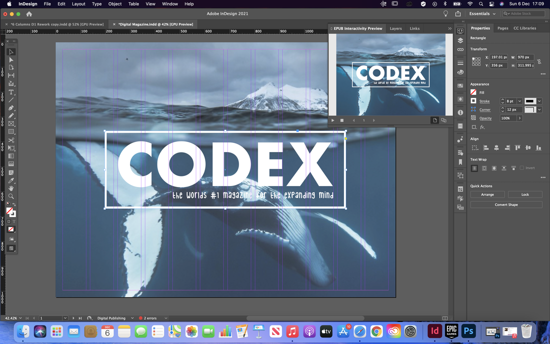
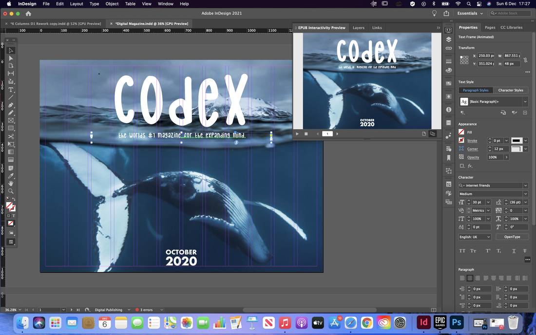
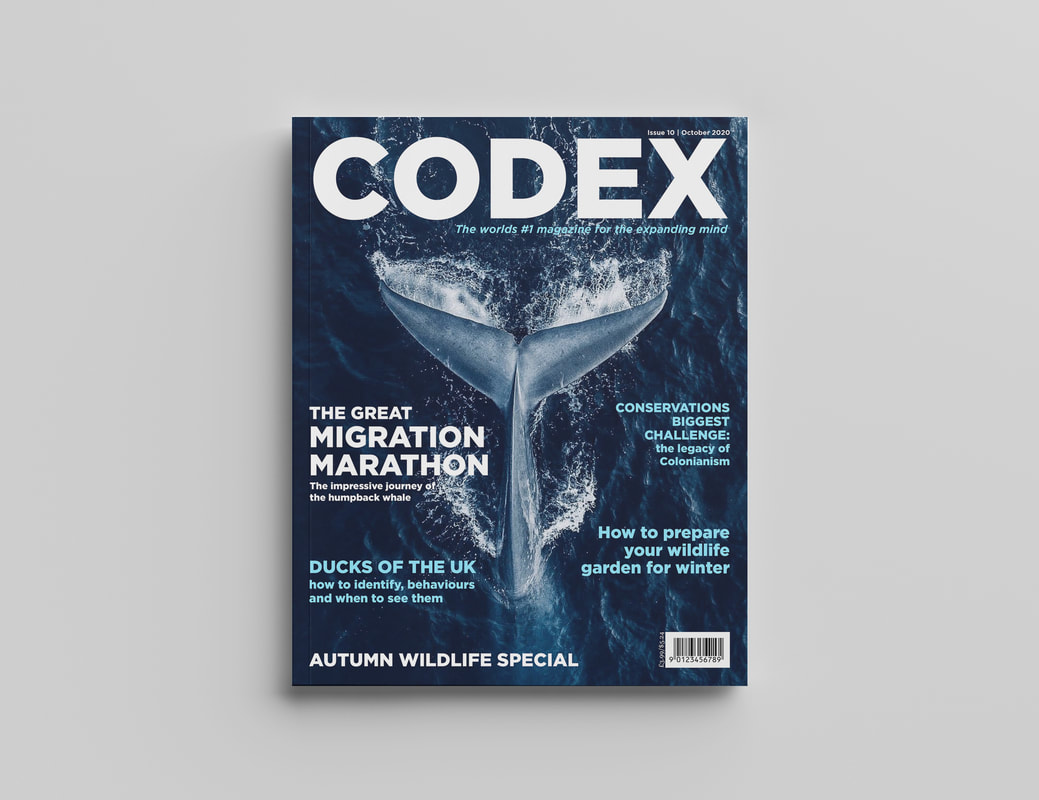
I started with the cover page, removing the featured articles so it was just an image and there name of the magazine, as the articles would be clickable on the contents page anyway so didn't need to be on both pages.
Next I started trying to design the contents page. I initially was struggling with the layout of this page but eventually settled for the hover over tiles with a bigger tile on the left with the featured articles as a clickable slideshow.
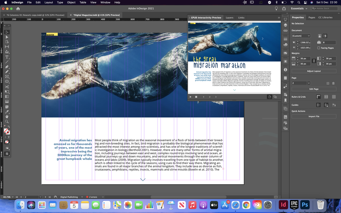
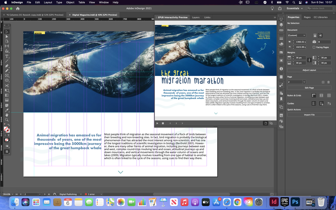
I then moved onto the article pages, rearranging the layouts to fit what a digital publication might look like. I also experimented here with landscape and portrait layouts to see how the pages might look depending on which way the reader is viewing the magazine.
I continues further making the pages using the same theme and style, rearranging the layouts till they looked visually appealing. I also decided to design a menu bar at the top to give it a more website style look and to add extra navigation.
Final Design
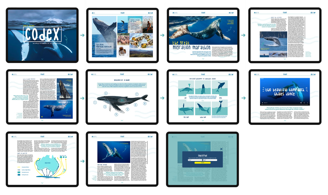
Below are screenshots of the final pages along with the interactive digital publication. I also included a storyboard with mock ups of the screens to show what it looks like on a iPad device. 


0 Comments
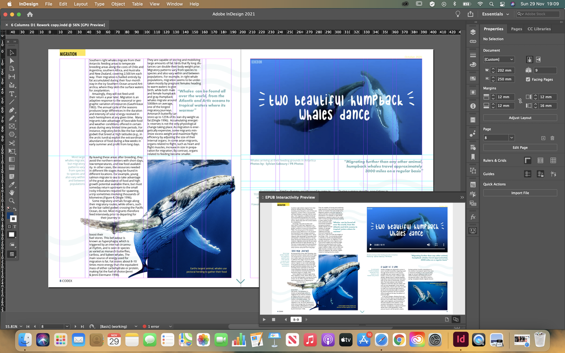
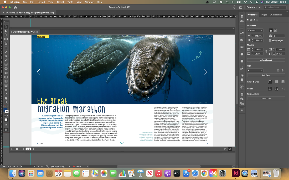
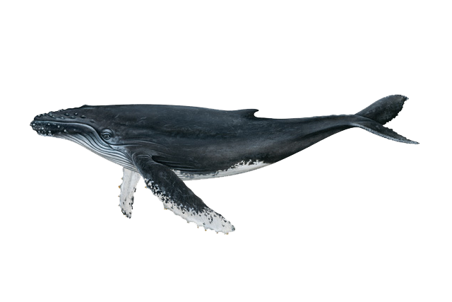
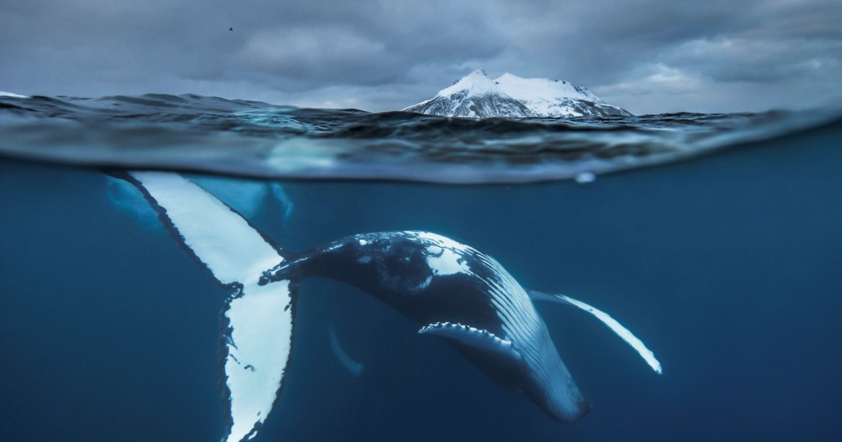
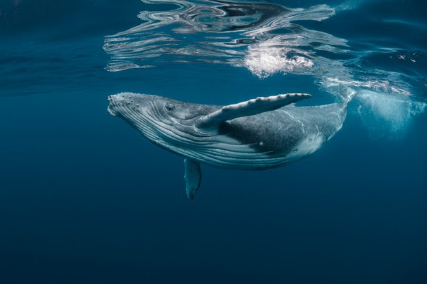
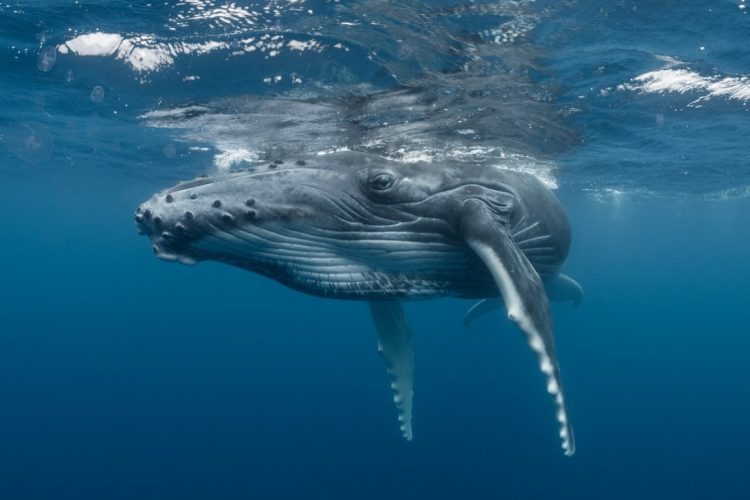
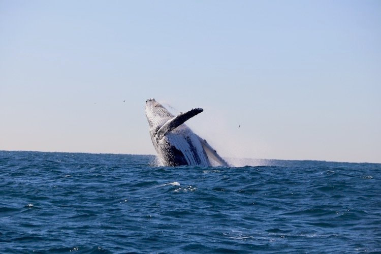
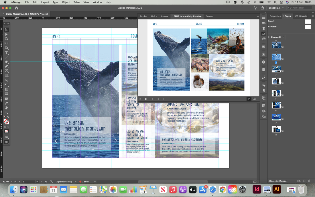
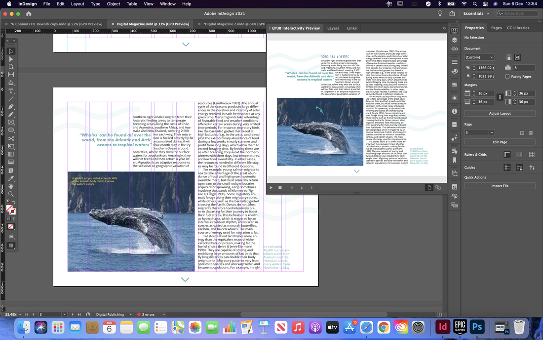
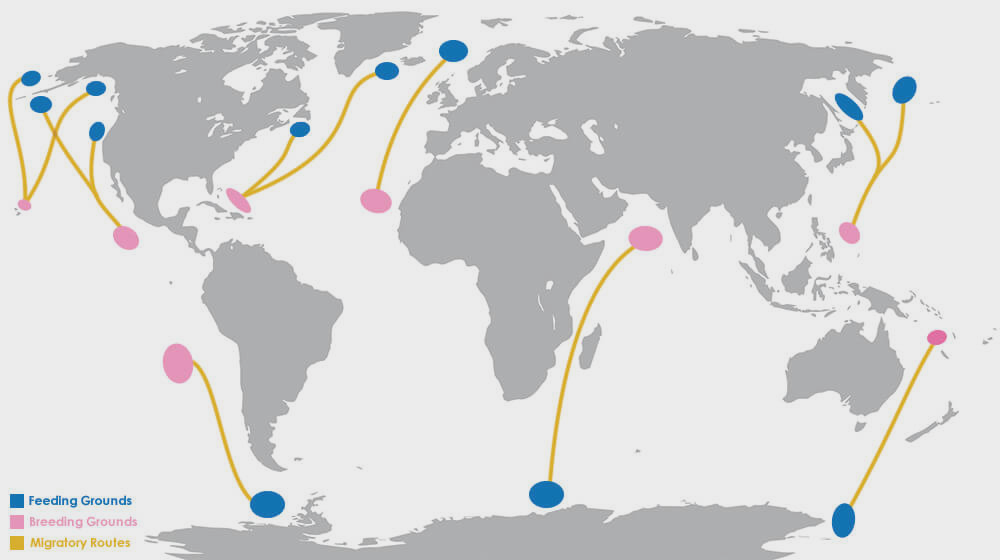
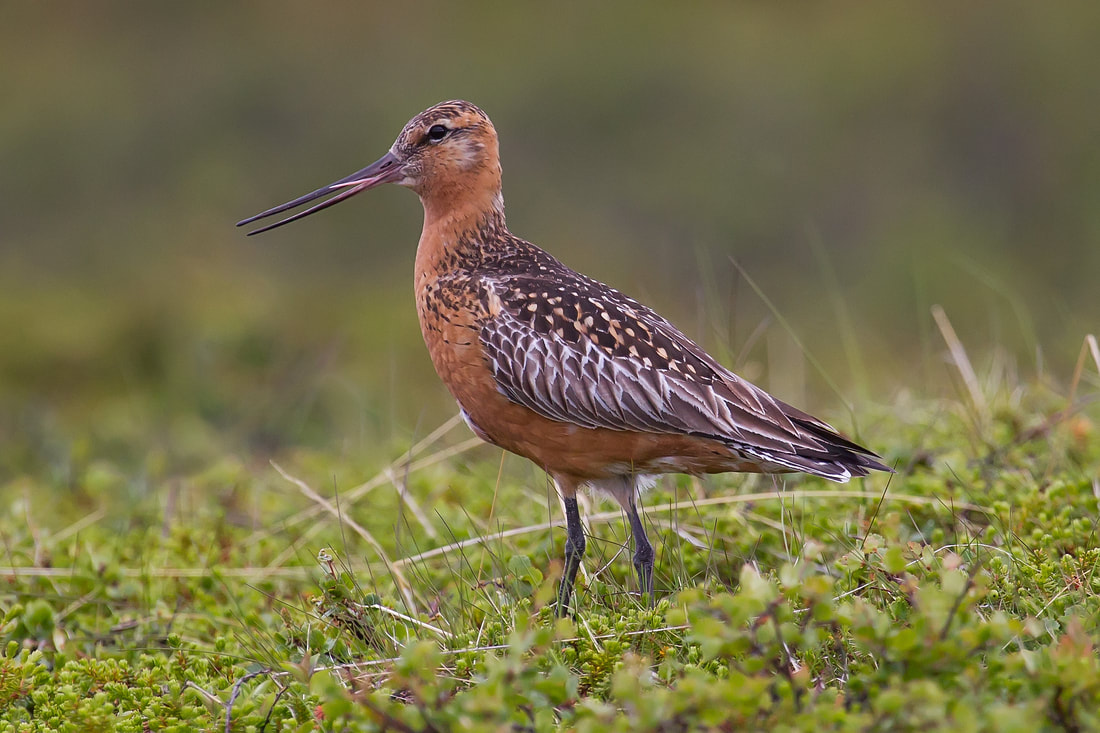
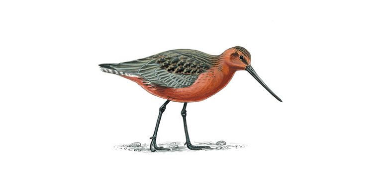
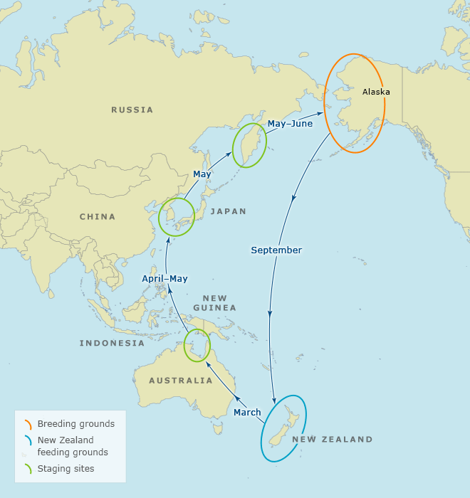
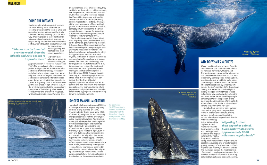
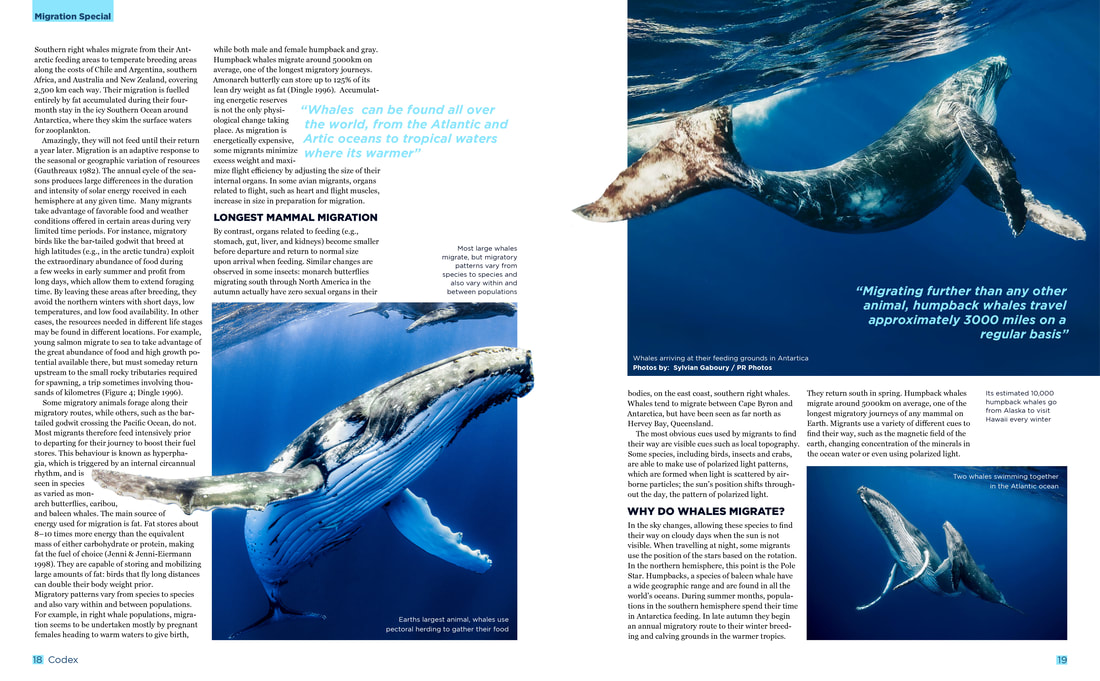
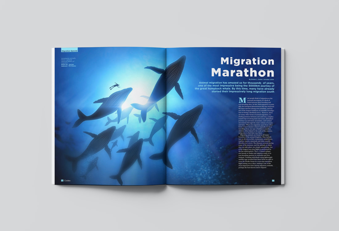
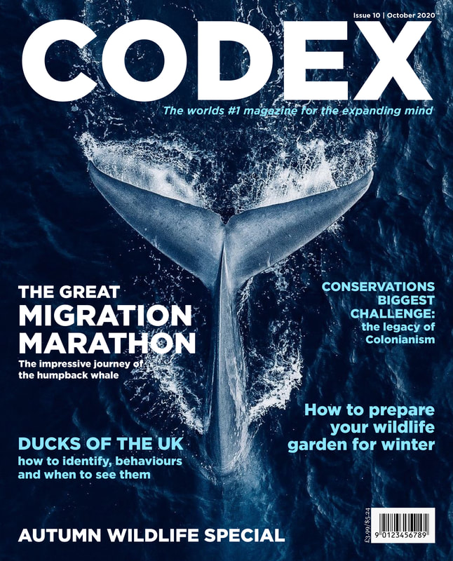
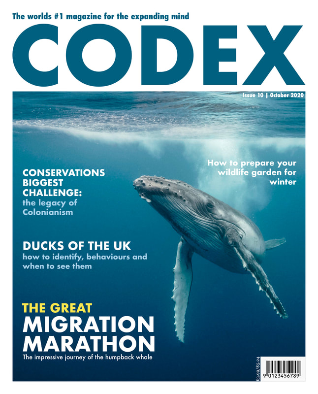
Brief Our third brief required us to develop a concept for a new independent magazine, including a feature article on the theme of 'migration'. We had to create two alternative sets of double page spreads (a 'splash' and 'turn'), as well as a masthead cover. Research I started out by doing some research to find some good examples of editorial design for inspiration. I was looking particularly for interesting layouts and use of alignment and negative space.  I also did some research on what I wanted my article to be about. I decided to base mine on animal migration so I began researching online about interesting facts to see if I could find anything interesting enough to base an entire 2 double page spread on. I drew up a mind map of the research I found with some facts to base my article on, as well as brainstormed some possible headlines. 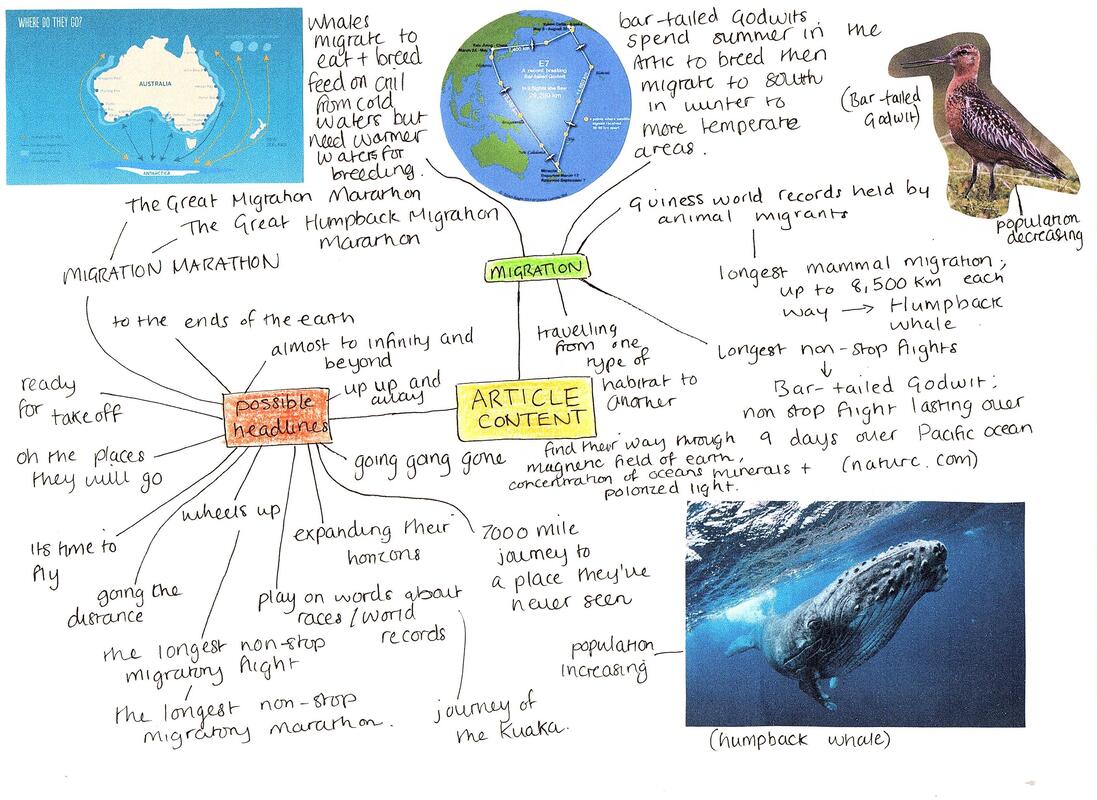 Potential Imagery Here are a view potential images I could include in my magazine spreads. I tried to find good high quality photographs as well as a few illustrations and diagrams. I must prefer the images I found on humpback whales as I love the colours and would like to use these as inspiration for the design of the rest of the pages. Thumbnail Sketches Here are my thumbnail sketches for each type of column number. I included splash and turn page layouts throughout, varying them as much as I could and using the editorial images I collected earlier for inspiration. 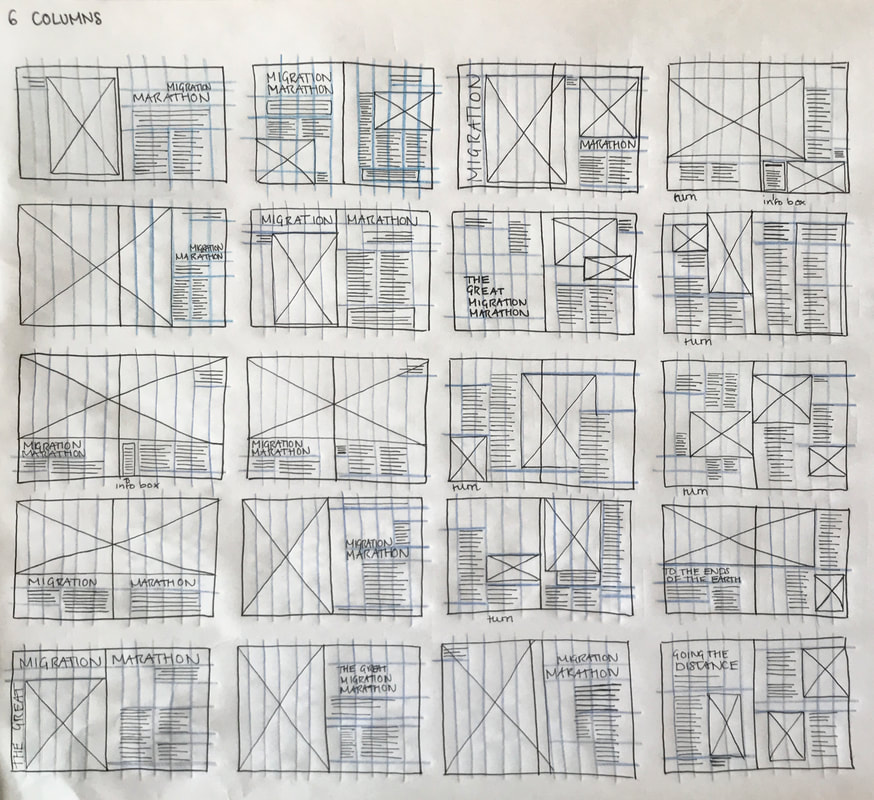   Setting Up the Grids We had to set up the documents using InDesign; 250x202mm trimmed pages, one spread with 6 columns and the other with 11 columns. 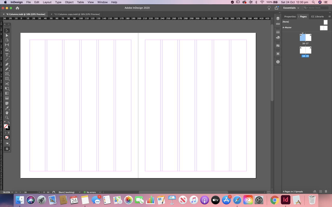  Initial Mock Ups and Developments I then started trying to recreate some of my layouts from my thumbnails using the software. Below you can see some of my process and changes I made as I went. Here is my first mock up for the splash and turn 6 column spreads. I tried out a contrasting colour scheme and a view variations of the layout. I think I prefer the first variation for the turn page more as there's more of a balance of negative space so I will probably revert back to that if I decide to take this design forward. 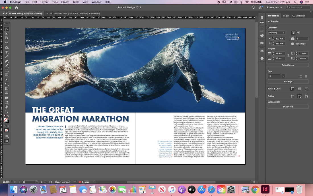    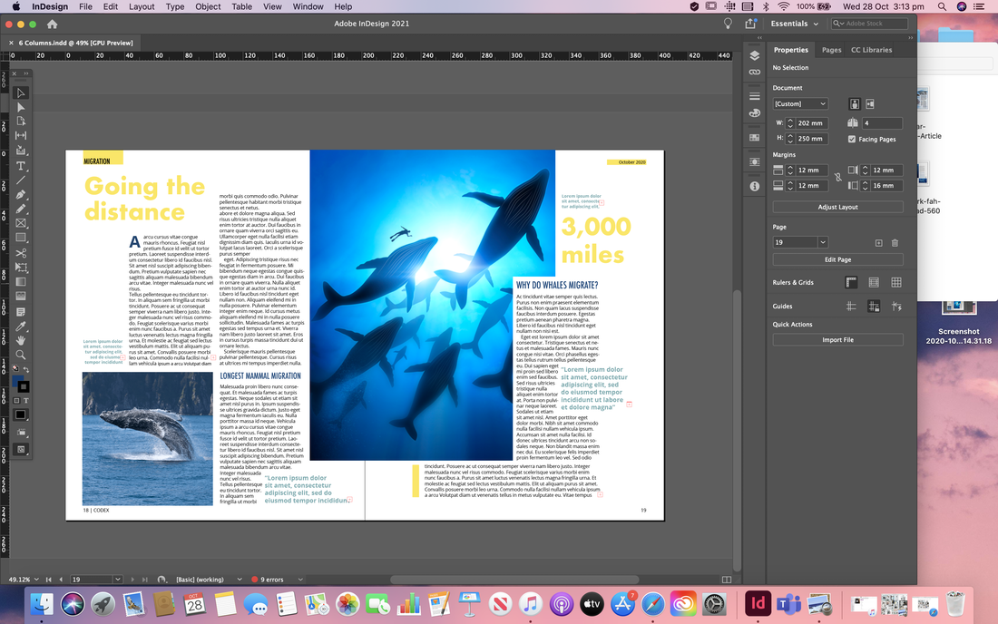 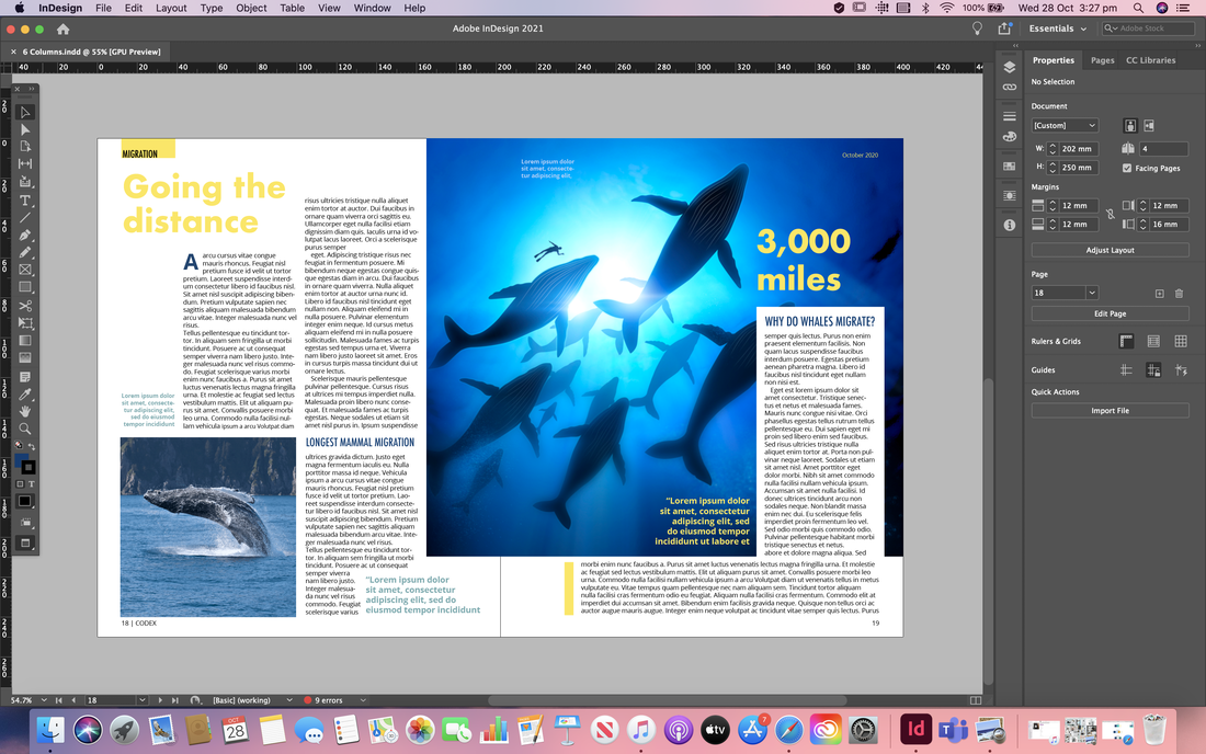 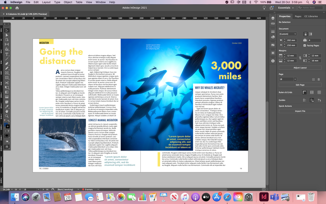  Here is my first mock up of the splash and turn for the 11 column spreads. So far I am happy with how this is going, and I especially love the more complementary colour scheme and the faded words in the background of the spread. However I think the layout of the body copy could do with a rework as I'm not sure I like it at the moment.       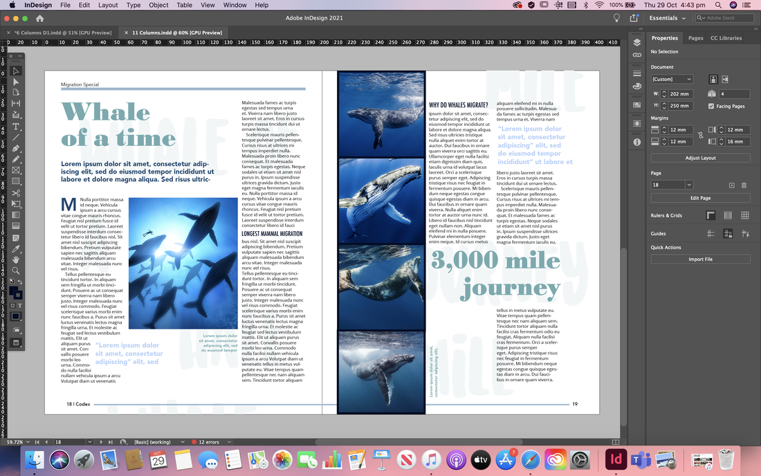 Here I tried out another layout for the 11 column grid spread, using a full bleed image for the splash page. Im not as happy with the turn page; I think there perhaps isn't enough body copy and the images are too large.  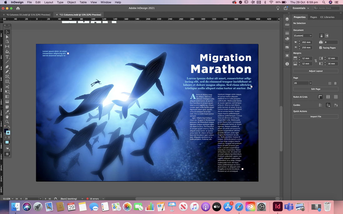  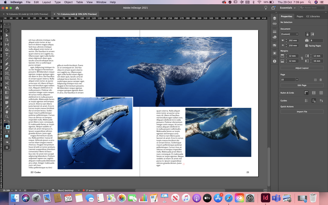  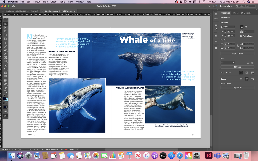 Developments After Feedback After receiving some feedback on how to improve my initial spreads I went ahead and made some changes. I was told my spreads look more like two splash pages, so for the first set I removed the big titles from the turn spread, tweaked the layout of the body copy, changed some of the images so there were smaller and then switched out all the place holder text to an actual article. I also wrote out the pull quotes, headers, sub headers, and captions etc. The second set I did mostly the same thing but I quite drastically changed the layout as I felt the images were too large and that there wasn't enough body copy. I also edited the images to that I could use text wrap.  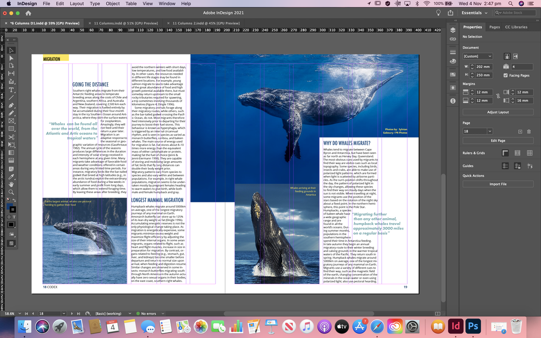    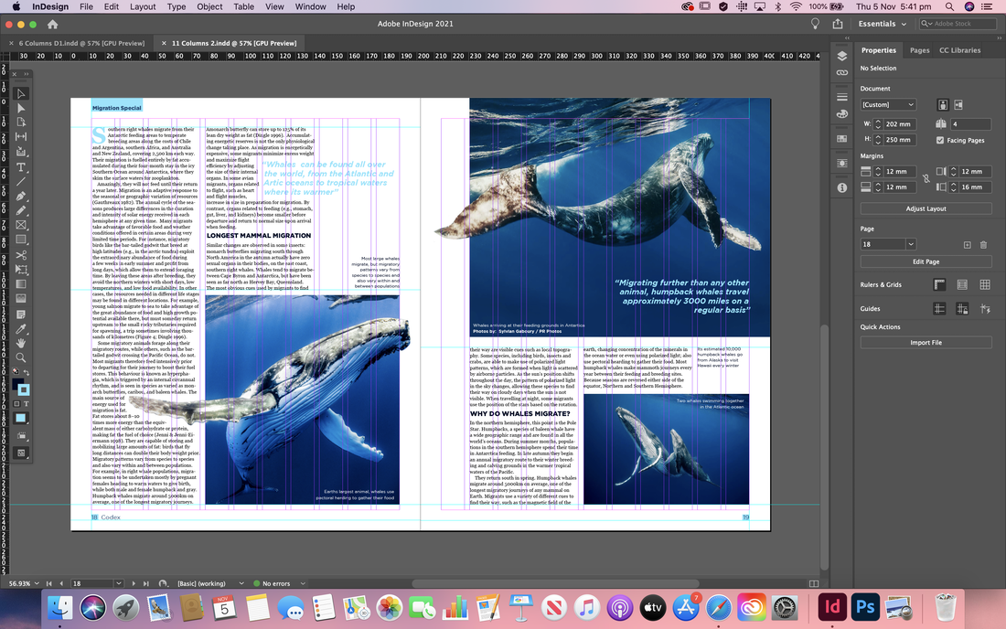 Magazine Cover For the cover I began by researching online to get some initial inspiration. I tried to find ones that were a little different from each other; some being more busy and others more minimal, focusing more on promoting the main featured article. 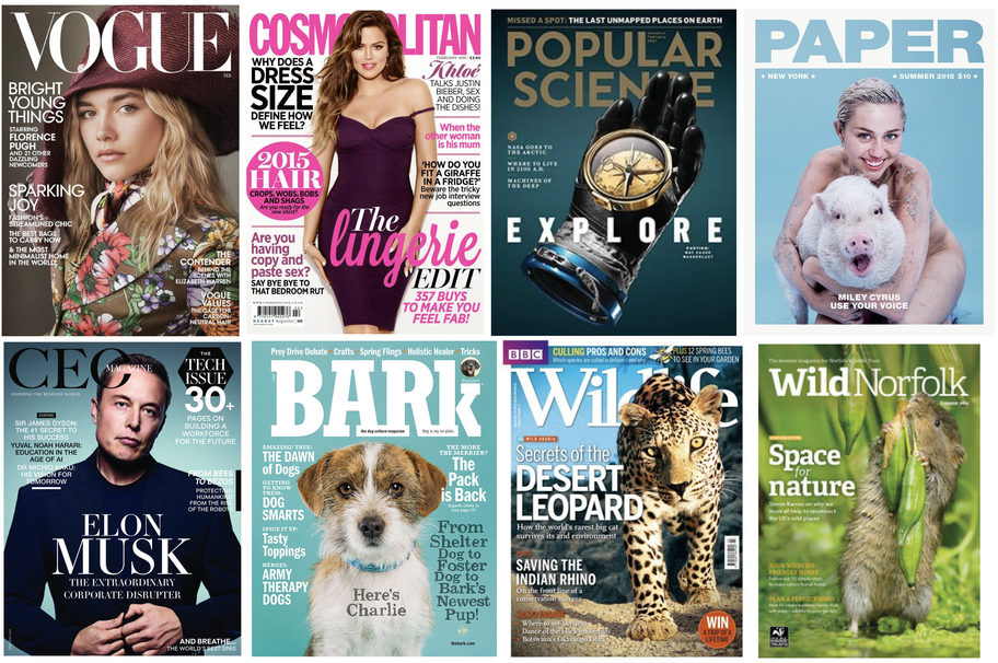 I then draw up a few quick thumbnail sketches, thinking about how I wanted to layout the elements on the cover. I knew I definitely wanted the mast head to be at the top so that it would be most visible on a shelf and then include a large, high quality image of a whale. I mainly just experimented with the placement of the featured article name and if I was going to include other articles or not. 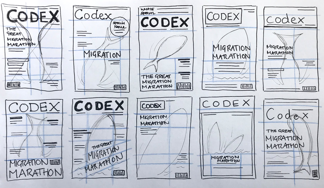 I then began transferring some of my thumbnail sketches into design in Adobe InDesign, experimenting with a colours and typefaces that would match my article spreads and create a harmonising set of work. I ended up designing two covers; one for a more affordable magazine and the other more minimal and high-end.  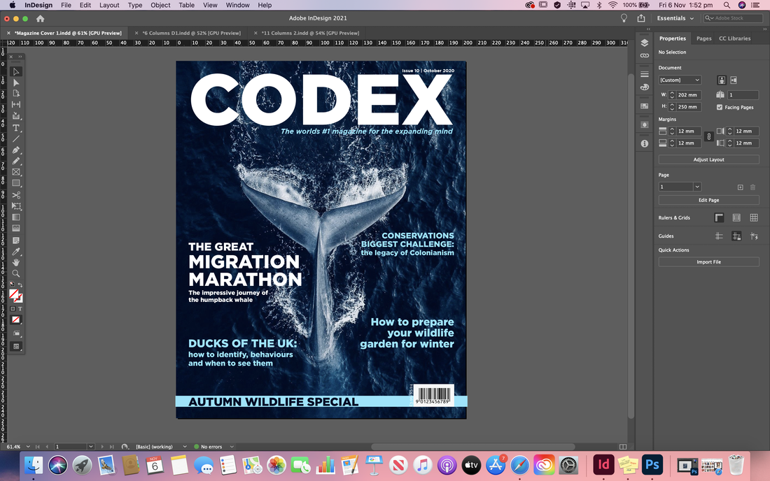  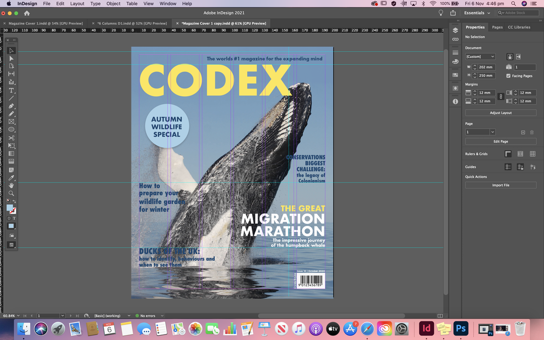 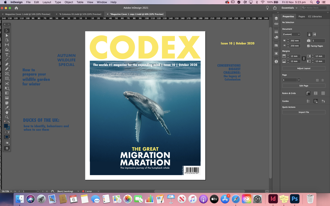 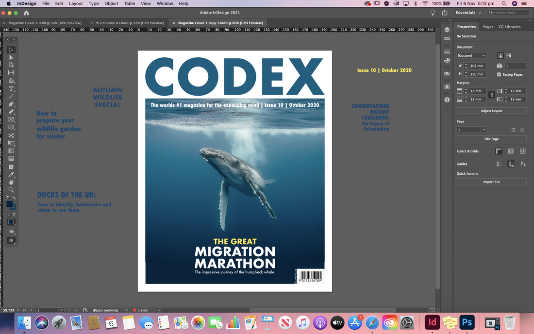 Final Designs
Here are my final designs for each of the different column grids and the cover after receiving all of my feedback. I also included mocked up versions so you can see them in action and how they might actually look in a magazine. Brief For this project we had the choice of two different events to produce three different typographic layouts for. We had to consider hierarchy, what information is most important and should be seen first etc, as well as present the information in a visually pleasing and attractive way. Each of the three layouts had to be in different formats and we had the choice of which typeface restriction we paired them with. All the copy had to be included and we couldn't add any images or colour. Inspiration First of all I took to the internet to find some interesting poster designs to inspire my typographic layouts. I also found inspiration from a couple of books ('Grid Systems' by Kimberly Elam and 'The Fundamentals of Typography' by Gavin Ambrose and Paul Harris).    Thumbnail Sketches I then started preparing as many thumbnail sketches as I could for each format. I tried to experiment with the layouts, whilst still considering legibility, even if they didn't turn out well. I also tried to consider which pieces of information should be seen first such as the title of the event which I usually wrote out fully and bolder than the rest. The other lines indicate areas of body copy or other event details that wouldn't be as prominent.    Moving over to the computer I started to transfer some of the thumbnail designs onto InDesign. This I found quite challenging as my ideas didn't tend to work very well in combination with the restrictions we had to incorporate. Never the less, below are my initial mock ups. 140x140/One typeface in as many sizes:   140x140/One typeface, and it's related bold, in one size:  115x207/One typeface in as many sizes:   245x100/Two typefaces in two sizes:     After a few further developments; mainly changing initial fonts I choose for ones more suitable for body copy, and tweaking some of the alignments.    Final Designs After receiving some feedback on my designs, I reworked them, adding the improvements suggested where I could. This mainly involved changing type point sizes and leading as well as some further alignments. I also created a mock up of the designs together so you can see how they might look in action.     |
AuthorHi, I'm Emma. I'm currently studying Graphic Design at the University of Cumbria. Modules
All
Archives
May 2021
|


 RSS Feed