
|
Comic books consist of a set of unique graphic signs that artists use to tell a story, and these are easily accepted and understood by most readers. They consist of gutters, panels, speech bubbles, sound effects, symbolic icons and character abstraction. McCloud believed more abstract, the more the reader projects their own persona onto the character. Encoding and Decoding Encoding involves cognitive reasoning in the selection, arrangement and layout of textual and visual elements that comprise the narrative. Decoding relies on the reader to read and understand the connections between textual and visual information and follow the actions from one panel and another. In a comic book, past, present and future is shown at the same time and occupies the same space. This can cause erratic eye movement because the reader has to constantly transfers and rewind across the page. Various 'reader control' strategies are used by seasoned comic strip artists to avoid this, such as page layout, strip ellipses, panel co-ordinates, page breaks/cliffhangers, negative space, reader closure and transition types. Control Strategies Page Layout The pages skeleton or multi-frame of a page; they encourage an appreciation of the creative process. The page can be approached by the level of the page, strip and panel. Panel Co-ordinates A panel has relation to the panels next to it as well as others in the multi-frame. Significant coordinates on the page include entry/exit and centre and are used to punctuate he narrative over a number of pages. Negative Space The drawn page only represents a portion of the stories content; the negative space in the margins and gutters functions as a surrogate for the omitted parts of the story. The reader has to use their imagination. Transition Types Scott McCloud suggests six transition types used in comic strips:
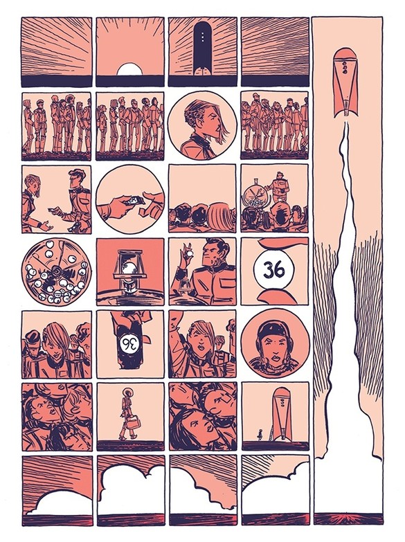
I decided to look into the Canadian comic book artist Fiona Staples. She's best known for the comic book series 'Saga' but is also illustrated comics such as 'North 40', 'DV8: Gods and Monsters', 'T.H.U.N.D.E.R. Agents' and 'Archie', from which she has won many awards. Born in Calgary, Alberta, she attended the Alberta Collage of Art and Design. 'Saga' is a fantasy comic book series written by Brain K, Vaughan and is about a husband and wife from two different worlds at war with each other. The story is occasionally narrated by their adult daughter who is born at the beginning of the series; it depicts the couple trying to flee from the authorities during the galactic war, while caring for their new born baby.  The above scene is from the second book in the 'Saga' series and shows an alien family spending time at the beach. I annotated on the pages what transition types I think were used by Staples to illustrate the scene. I believe the anchorage is interdependent as the words and images work together whilst contributing information separately. Sources:
Notes:
0 Comments
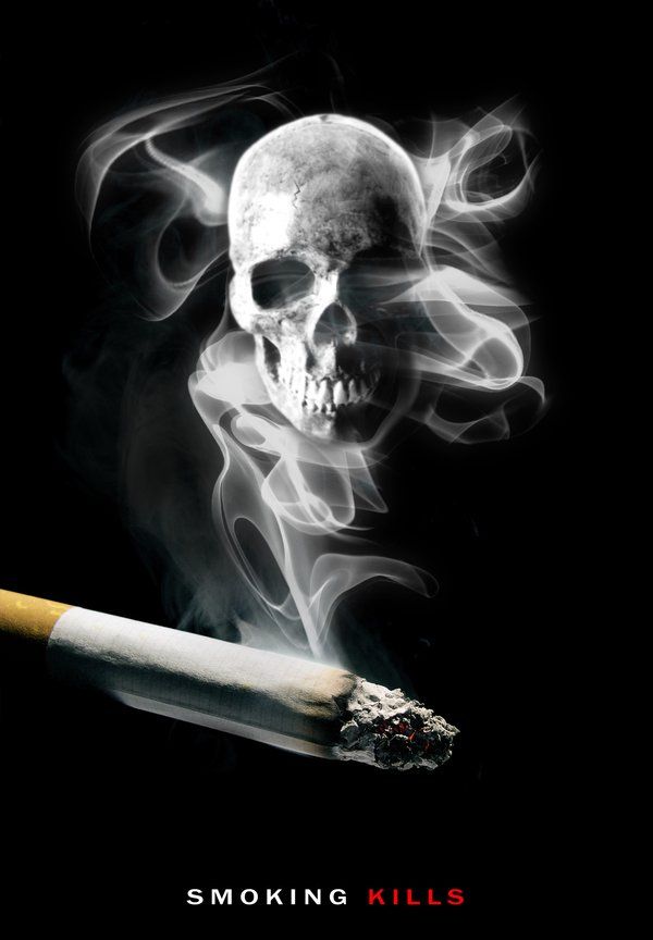
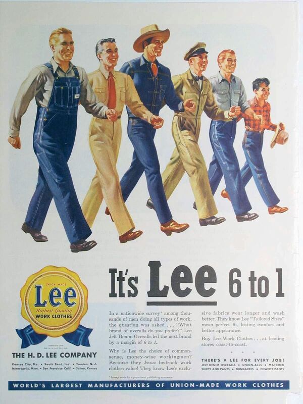
 Advertising and Myth Advertisements have currency; they are of the now and are particular to time and place. They reflect the current political/social ideals and cultural trends. Adverts reinforce particular cultural 'myths' presented as natural but represent a cultural norm or ideology. For example, adverts showing family units, such as the shown late 50s American advertisement, represent cultural norms and ways of behaviour; typical mother, father and kids living the American dream. Other ads might show a representation of gender, class and ethnicity and reinforce attitudes towards consumerism and status. Adverts reflect a target customer and aspire to plant the 'seed of need' without showing production or economic structure. Magazine Advertisments The advertising business is highly professional and competitive; a lot of money is spent on advertising and constructing brand identities in the service sector. Those who work in the industry are usually very creative and well educated, and aware of current cultural trends as well as the use of semiotics to convey messages (there is even a British advertising agency called 'Semiotic Solutions'). Magazine adverts are relatively self contained and the product is differentiated for a target audience. The use of encoding presents a constructed message to the viewer and the meaning of ads are designed to shape our experience of reality. Barthes argues that magazine ads are a mix of linguistic and image signs that form these messages, and close analysis reveals any myths contained. These linguistic and iconic signs at first sight indicate the things the image represents but these signs also have connotations that come from our culture. In his book 'Image, Music, Text', Barthes analysis's the French magazine ad for 'Panzani'. The ad has non-coded linguistic messages such as the labels on the produce, 'Panzani', and the tagline below, 'the luxury of Italy') in the French language. These both have a connotation of 'Italianicity', giving the message that it is a French advert for an Italian food company. The word 'luxury' also suggests it is a high quality brand and a knowledge of the French language is needed suggesting the target audience is French middle class. The image in the advertisement denotes a photograph of an half-opened bag of produce spilling out, with red, green and white colours. The food stuff, such as the tomatoes, denotes a non coded, literal signification of a tomato; the signifier and signified is essentially the same. The half opened bag creates connotations of abundance and a 'return from the market'; this requires an understanding of what a shopping bag represents and 'local shopping culture'. The collection of objects suggests a total culinary service and creates a link between the factory produce and the organic/natural produce. Both the types of produce and colours used signifies 'Italianicity' as they represent the Italian flag, and the composed photograph is reminiscent of a still-life painting; a work of art. Overall the advertisement sends the coded message that Panzani provides fresh, homemade, authentic Italian meals with an image specific/dual message anchorage and presents the cultural myth of normalising a cultural stereotype. Another advertisement that can be analysed is the advertisement for 'SK-II' which has non-coded linguistic messages such as the quote, tagline and information at the bottom as well as the emphasis on the name of the brand, mostly in a serif font. The quote, 'I prefer to reveal than conceal' from the face of the advert has the connotation that it is a skincare brand made to enhance natural beauty rather than cover up. The word 'essence', as apposed to 'abstract', has the connotation that it is a high luxury brand. The stylised typography gives off connotations of luxuriousness too as its a common style used for high end brands. The images in the advertisement denote a black and white photograph of the celebrity, Cate Blanchett; white ethnicity, middle age, showing her head and shoulders. Image hierarchy draws you to her eyes at the top of the page, in a zig-zag motion to the quote, bottle, and more text below; it has dual message anchorage. The photograph seems to be studio lit and digitally enhanced, with the product bottle superimposed, which creates connotations that the scene is non-spontaneous. The lack of colour creates a clean look, suggesting a clean product and accents of red give impressions of a high end, professional brand as the colour is linked with power and confidence. Her posed body language and seductive gaze creates a code of intimacy and direct engagement with the viewer. The fact she is a well known celebrity creates connotations because it transfers her own qualities, such as health, polish and natural beauty, onto the product, signifying a myth of 'feminine beauty' over to the bottle. Placing the sign of the woman and linguistic signs of the name of the product constructs a relationship between them, so to posses the product is to buy into the myth and possess some of its social value. Sources:
Notes:
Brief
For this project we were put into groups, acting as a design consultancy for a city bidding to be the City of Culture in 2025. We had to produce a brand identity for the city of Sheffield, to be used as a key element in their bid strategy across a range of media. Research We had to find out about the history, industry, commerce, geography, population, famous inhabitants, culture etc of our city too inform the concepts to develop for the brand. After delegating topics, we got to work; I researched culture and commerce; what I found can be seen in the file here. 
We then collated all of our research together into a powerpoint for presenting our findings to the rest of the class.
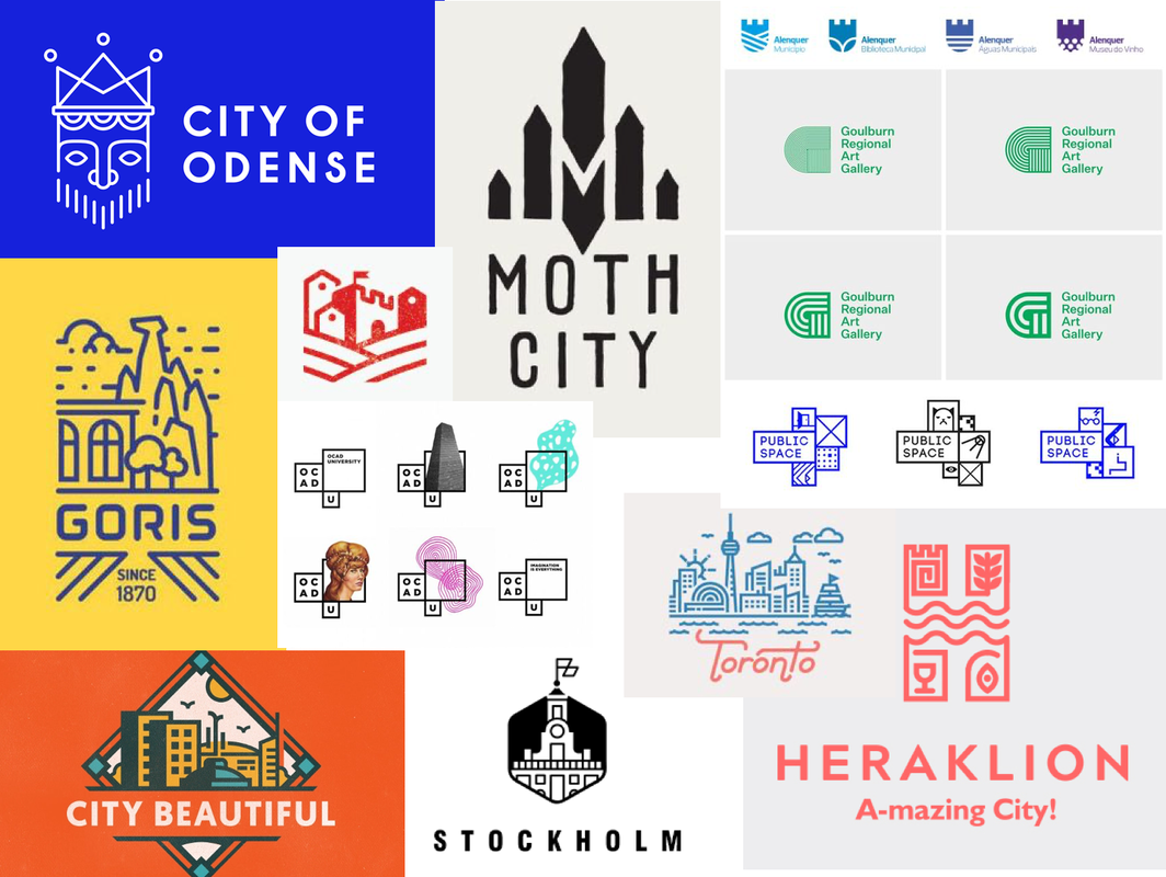
I then decided to do some research into other branding designs, specifically at past City of Culture designs to get some more inspiration, as well as at some logo designs that I liked. I was particularly drawn towards minimalistic, simple lines and shapes that could be easily used in a range of ways/colours.
Logo Sketches
Next, we decided to do some idea generation and do some initial thumbnail sketches. We figured the steel aspect was something we definitely needed to look into but my worry was that the logo could end up looking too much like a steel company logo rather than represent the city as a whole, especially seen as the steel industry in Sheffield isn't even as prominent as it used to be. Therefore, I tried to include other themes such as landscape and music.
After discussing our ideas with each other, we decided to take forward one of Olivers ideas, using the shape of an 'S'. I did some sketches based of his original drawings of how we could possibly incorporate symbols of the steel industry and music etc into the shape.
Logo Development
I then decided it was time to start experimenting with some of the ideas on Illustrator; I started with my original concepts to see if they could be worth pursuing as well as vectorising the symbols, then continued trying to refine the 'S' logo idea. It became apparent that incorporating any illustrations into the shape wasn't going to work well as it would be too small to be legible at smaller sizes and frankly just didn't flow well as whole. So I came up with a more simple design that used the original shape with extra lines all at the same thickness. We found this actually worked well to represent the steel industry as it gave the impression of the flow of molten metal through a mould. 
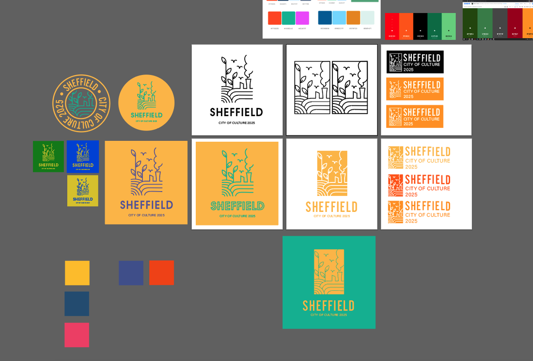
We then began thinking about colours. I wanted the colour palette to represent the city's industry using mainly oranges and yellows, combined with at least one contrasting colour.
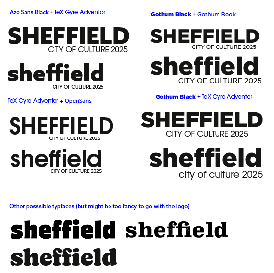
When thinking about typefaces, I thought we needed something like a thick, modern sans-serif, so I put forward what I found to the group along with some possible typeface pairings. I much preferred the way the word looked as completely lowercase and it just looked more friendly that way.
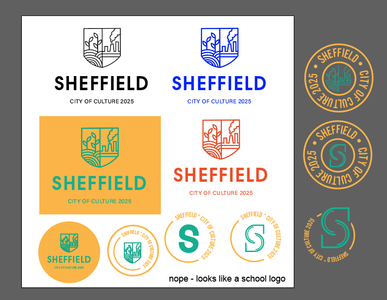
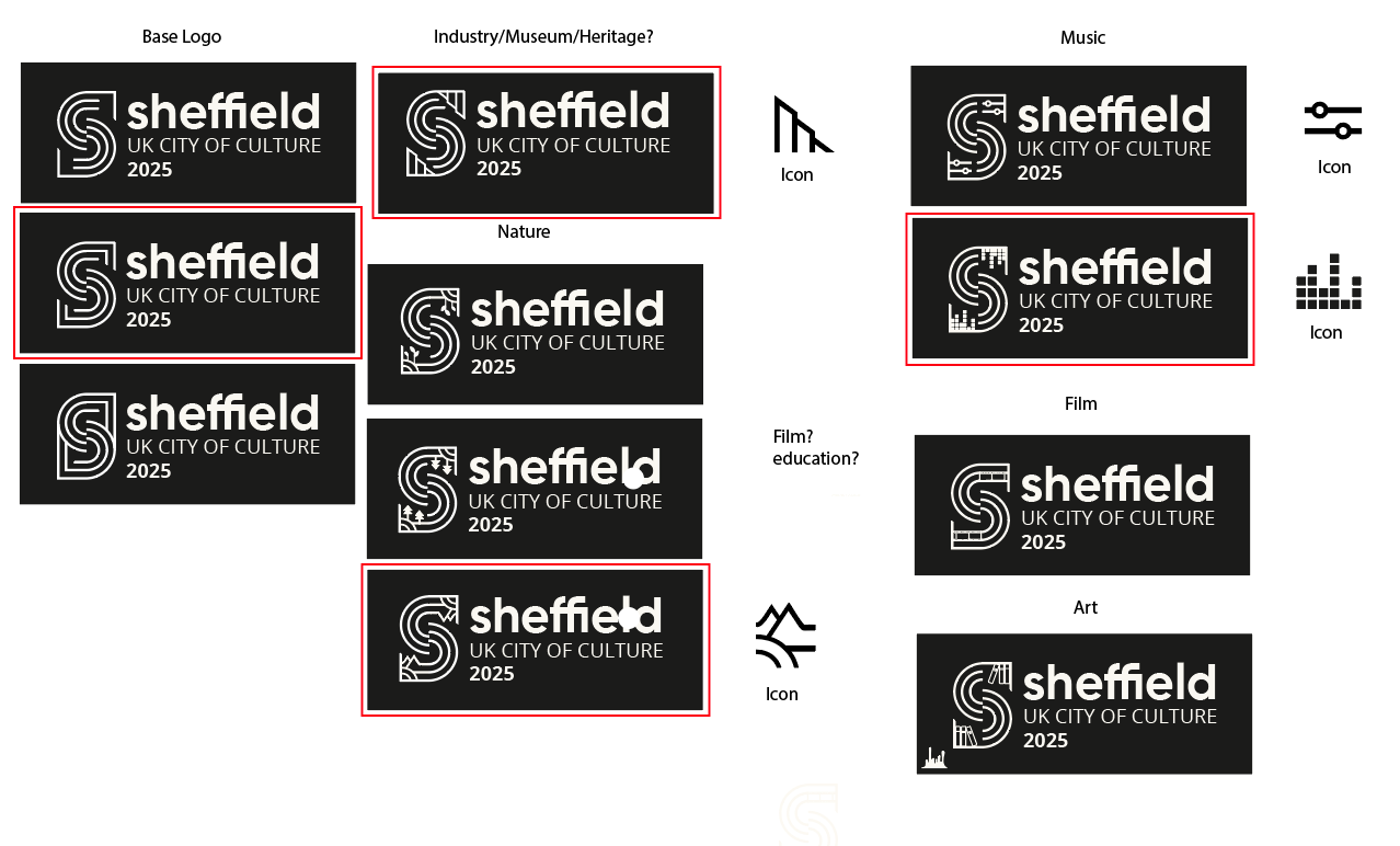
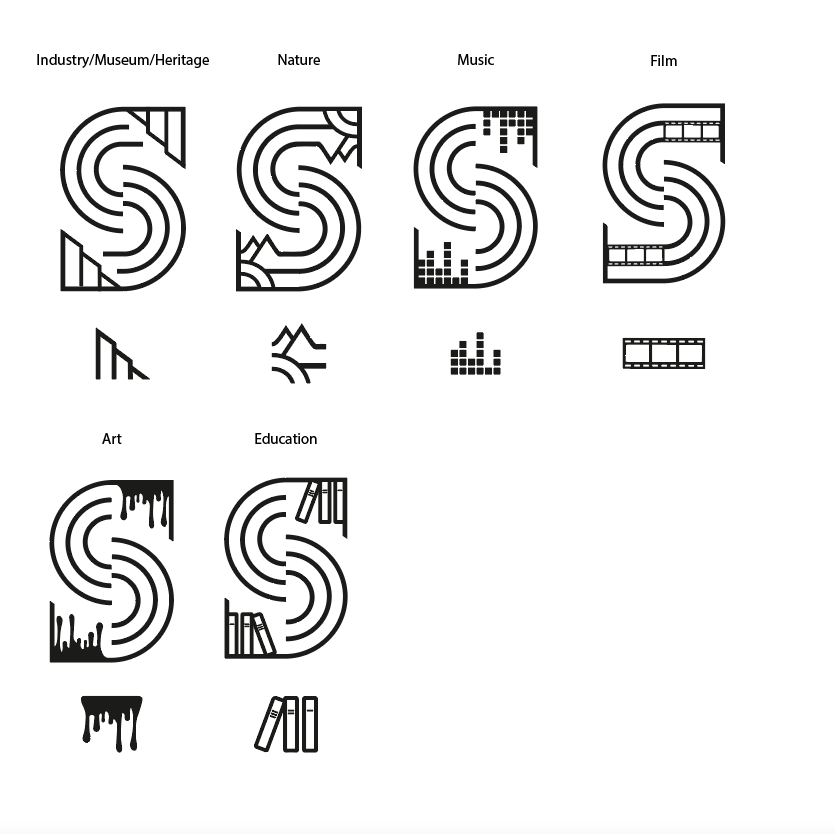
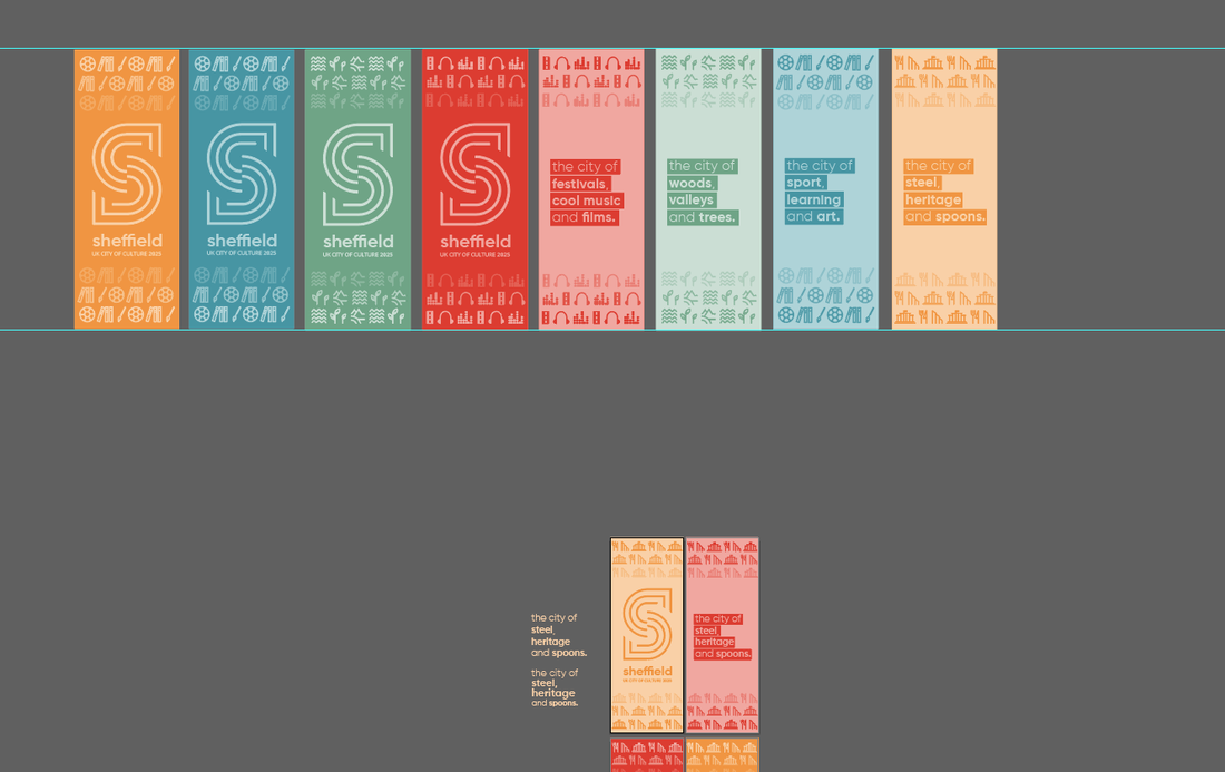
I then started trying to combine the colours and font ideas with the logo to see how it may look. I tried combining the factory shape into the logo to make it more obvious its symbolising the steel industry, however I felt it was too restricting because it didn't represent any of the other factors that make up Sheffields culture. As a result, we decided we would create a modular logo, containing of a base logo and other variations of it combining the symbols I created earlier. The idea was that each symbol would be used for different thing, for example, the music themed logo would be used for any music related brand implementation.
The most difficult part of designing these logos was trying to make the added symbols flow into the 'S' and be more seamless as I didnt want it to end up looking like the base logo with a symbol just stuck in the corner.
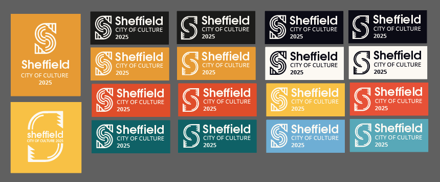
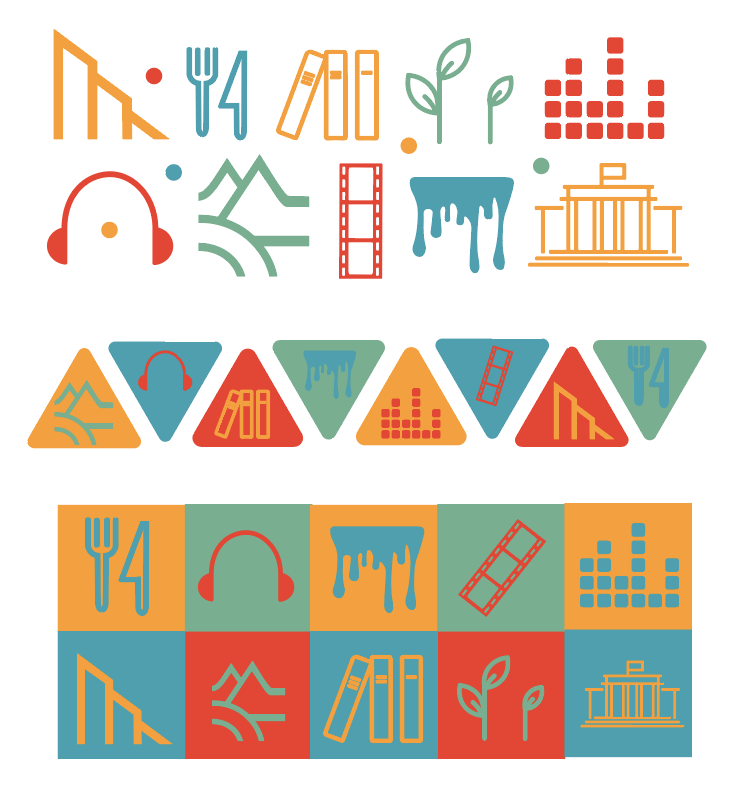
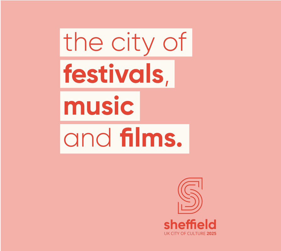
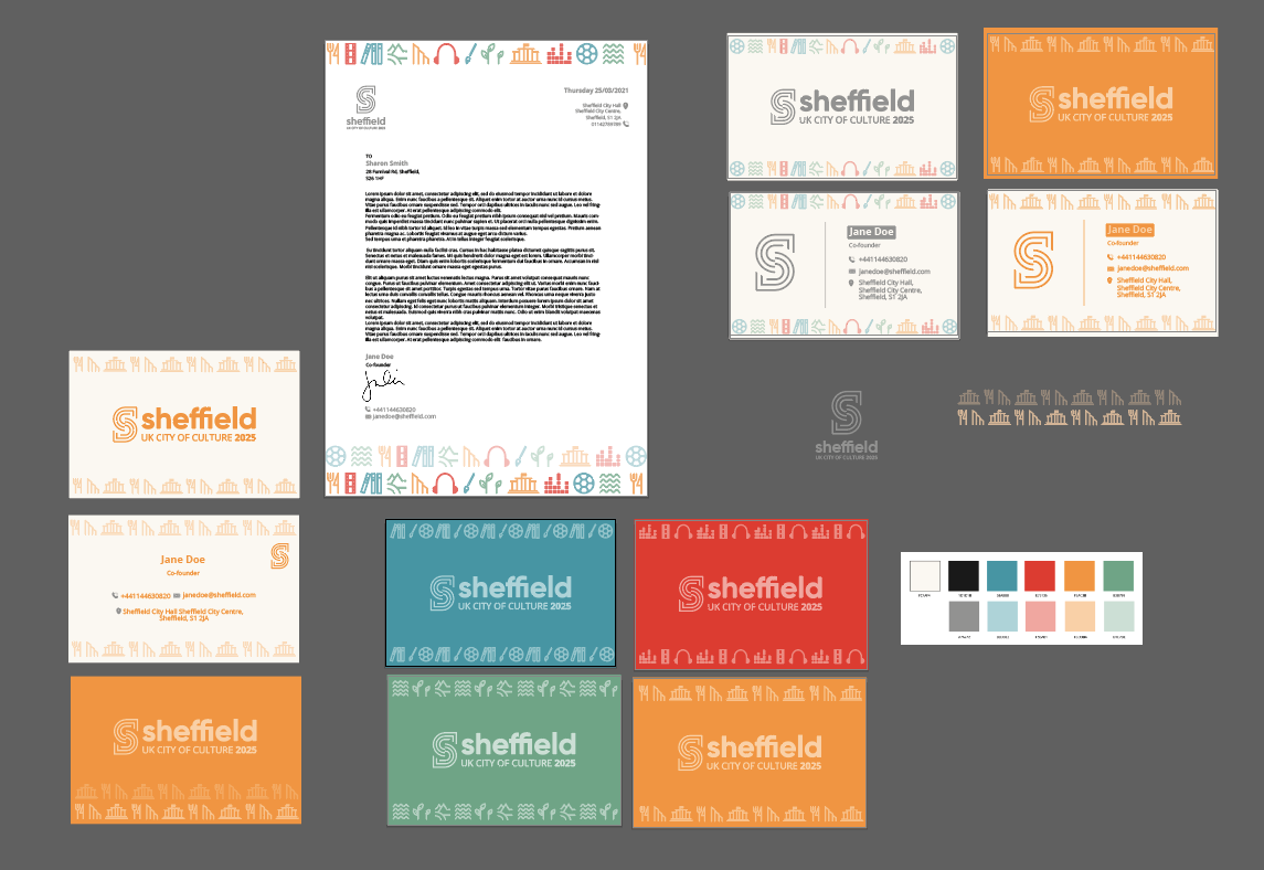
Final Assets Here is the final base logo and the other individual logos from the rest of the modular design incorporating each of the themes into the 'S', along with the accompanying symbols. I also put together some possible patterns and tag-lines (inspired by the original 'City of Steel' tagline), for use when implementing the brand.
Basic Brand Guidelines
We finally settled on our base guidelines, choosing a bold sans-serif typeface for display and an easy to read body copy font. Our final colours consist of a colour for each theme of the modular design as well as a soft black and white and complimenting pastel shades of each colour. The symbols matching tag-lines further help to establish the language of the brand. 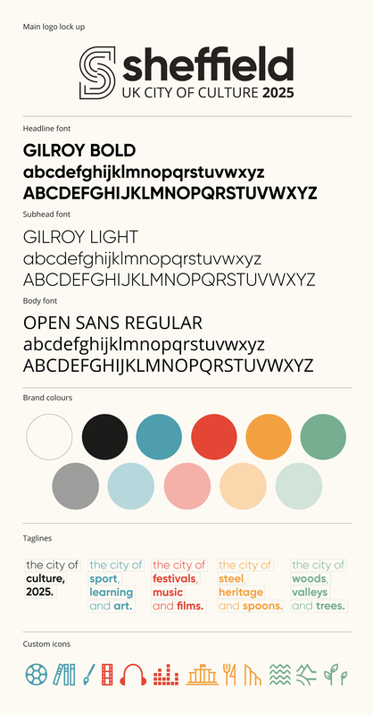
Implementation
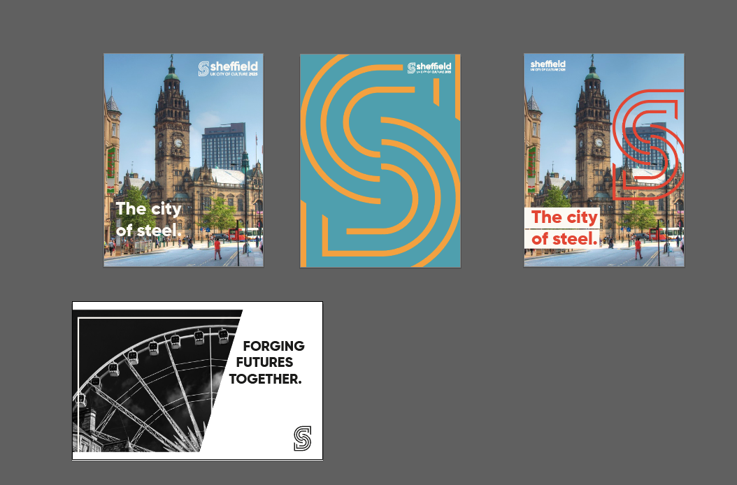
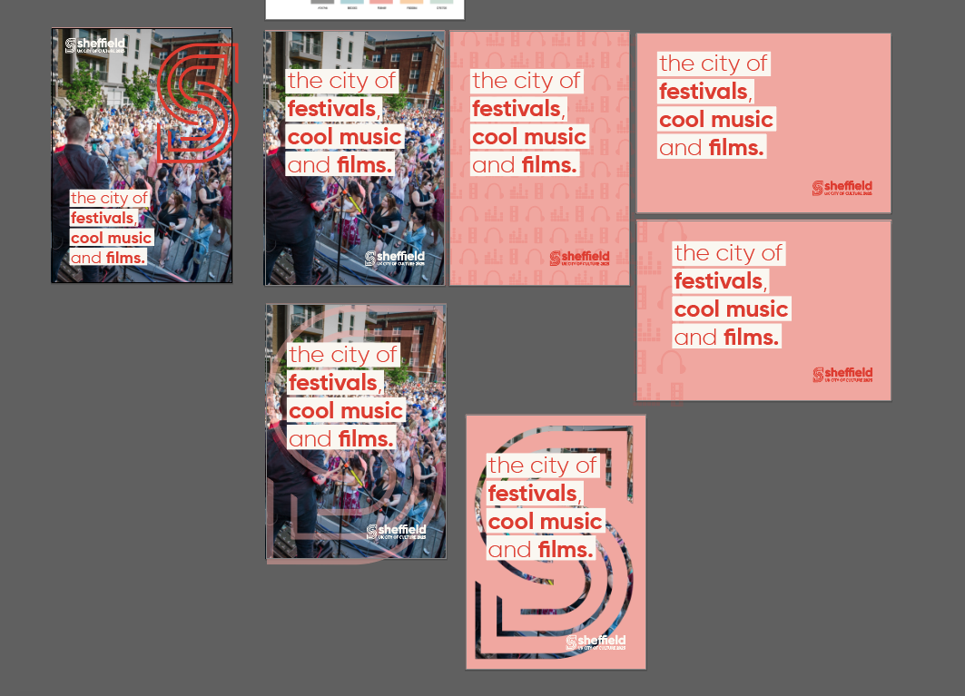
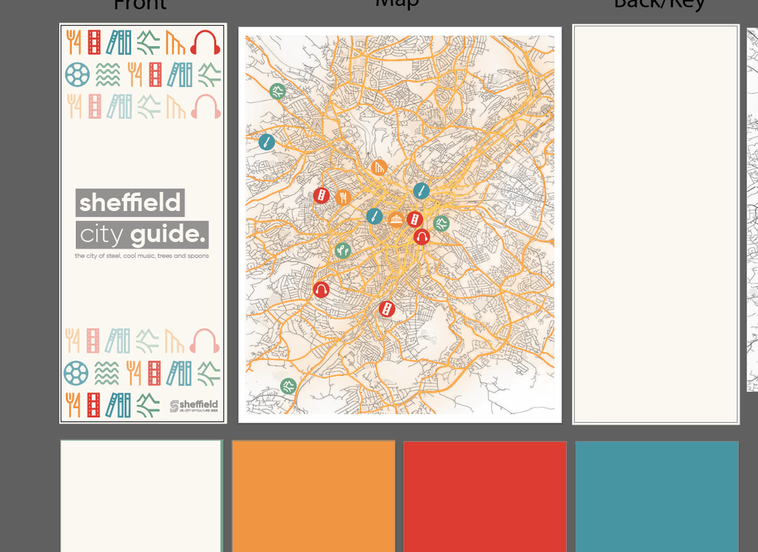
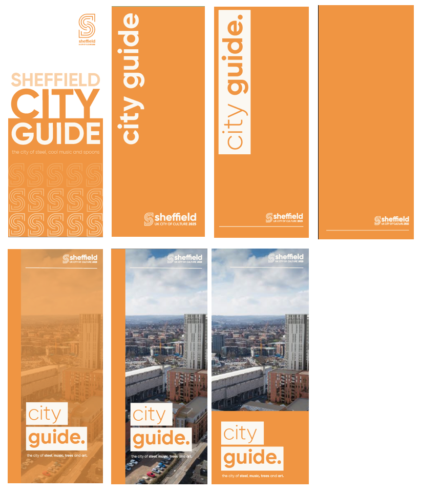
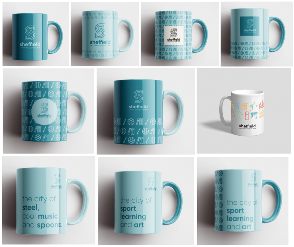
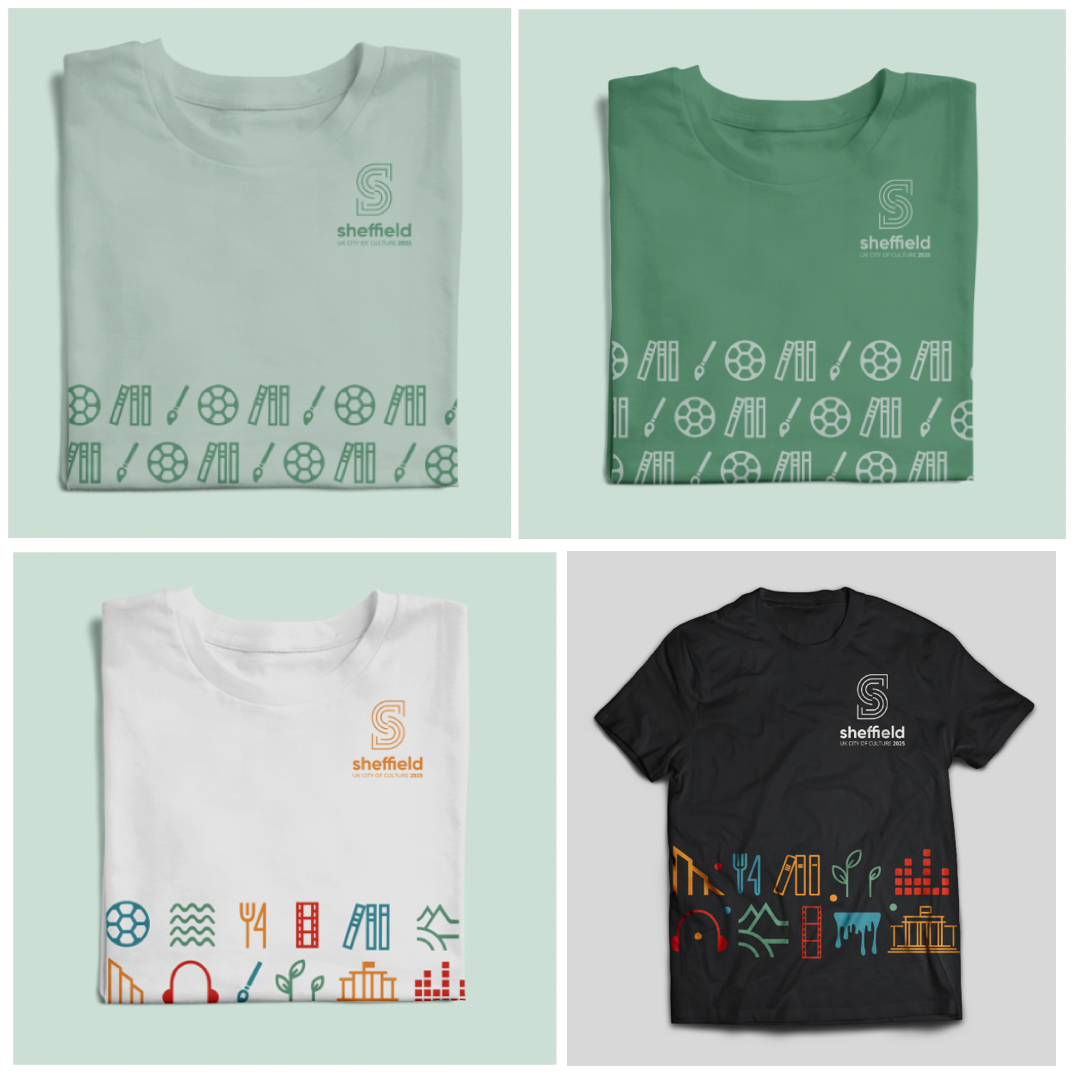
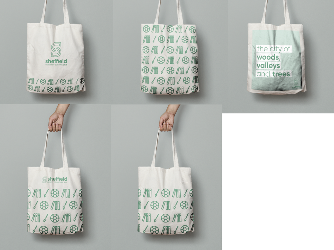
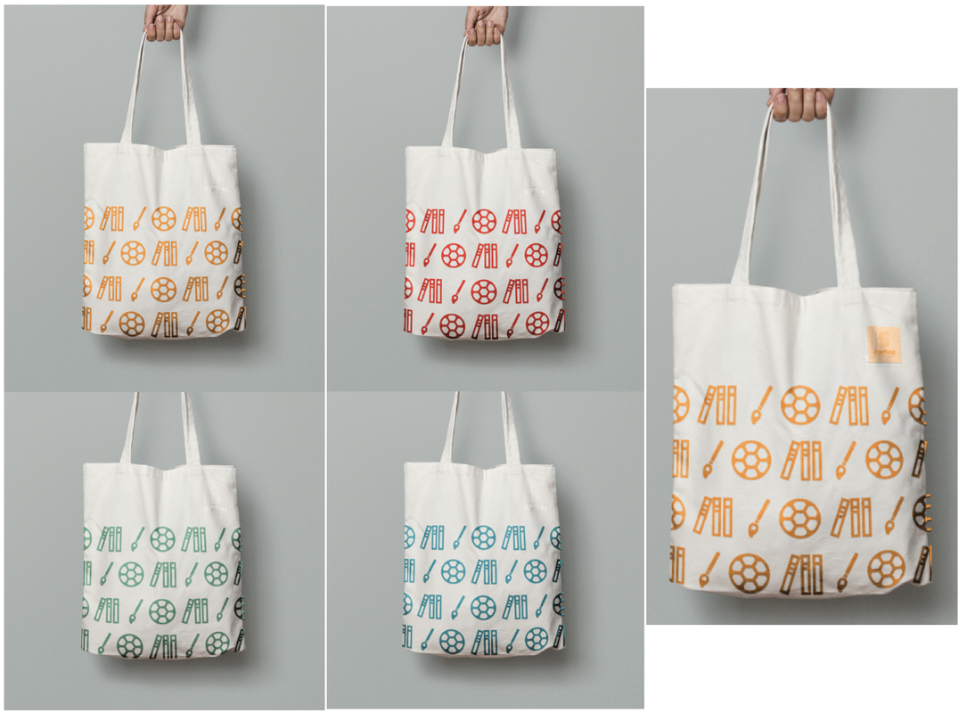
After settling on our basic brand guidelines, we started to implement the design onto a range of publicity materials, including posters/signage, online presence, stationery and various merchandise. Below are some of my experiments applying the brand guidelines to posters, flags, a city guide, stationery, as well as merchandise such as mugs, t-shirts and bags. Posters:
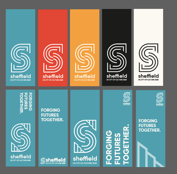
Pole Flags/Banners:
Stationery:
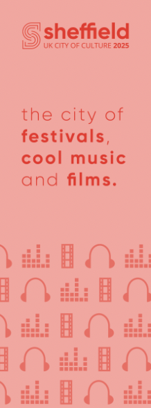
City Guide:
Merchandise:
Final Designs and Presentation
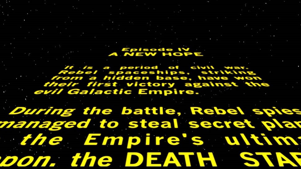
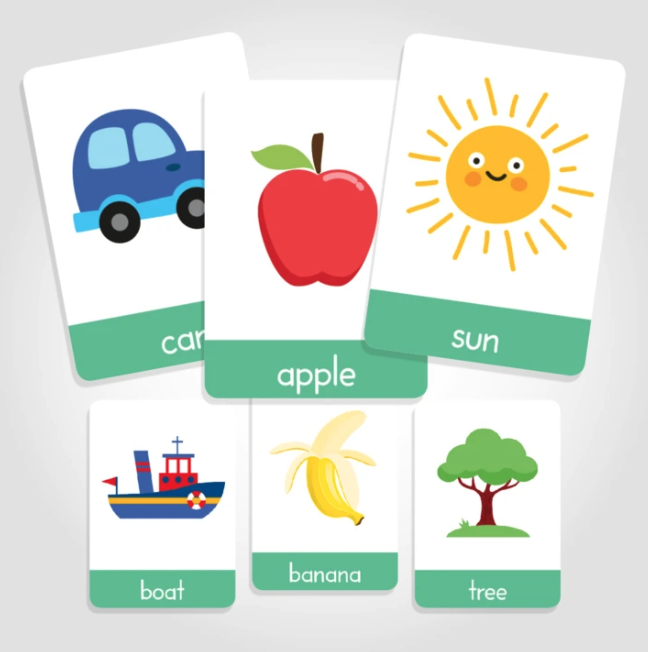
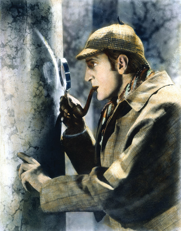
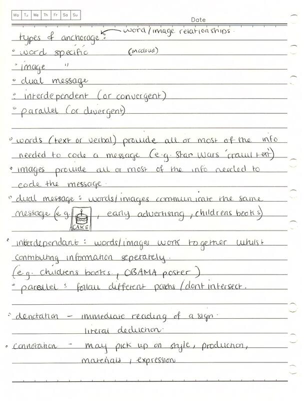
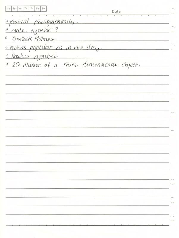
At the end of the project we had to present all of our work to the class as a group, showcasing the detailed brand guidelines and all the matching implementation. Planes of Expression and Abstraction Words are arbitrary signifiers; they don't resemble what they describe and they require the knowledge of language, linguistic forms, rules and culturally learnt definitions. How something is said, written or designed affects the 'reading of meaning' and this is called the 'plane of expression', (e.g. fonts used). Images are iconic signifiers because they resemble what they describe and they are usually learnt/viewed/experienced before words, (e.g. memories are experienced before we use language to frame them). The 'plane of abstraction' refers to how the way an image is captured and rendered visually affects the 'reading of meaning', (e.g.photographs, drawings, icons). Types of Anchorage Barthes stated that anchorage is used to describe the 'relay' between words and visuals and they are rarely not placed together, such as on webpages, illustrated books, packaging and advertising. In the book 'Understanding Comics', Scott McCloud listed the different types: Word specific - words (text or verbal) that provide all or most of the information needed to decode a message, for example the 'Star Wars' crawl text'. Image specific - images that provide all or most of the information needed to decode a message, for example in Jesse Lonergan's comic 'Hedra'. Dual message - words and images that communicate the same message, for example in children's early learning books/flashcards. Interdependent/convergent - words and images that work together whilst contributing information separately, to convey an idea they couldn't do alone, for example, in comic books. Parallel/divergent - words and images that follow different paths or communicate ideas that don't intersect, for example also in comic books. Denotation and Connotation Denotation is the the primary meaning; the non-coded, most immediate reading of a sign. Connotation is the secondary reading, for example the reader may pick up on style, production or materials which triggers off associated readings or link to other concepts. Barthes stated that coded interpretation (myth) is relayed at the level of connotation and argues that signs are polysemous and open to many interpretations. For example: 'DOG' Denotation - domesticated four legged carnivore Connotation - loyalty, obedience, sense of smell, breed, Pavlov, cultural perspective, Beatles song lyrics (intertextuality - echos other cultural texts) signifier + signified = denotative sign and connotative signifier Connotative signifier + connotative signified = connotative sign + connotative signifier The Treachery of Images The 'Treachery of Images' is a painting by surrealist painter René Magritte (1929) that shows an a pipe with the French translation for 'this is not a pipe' below it.  The literal reading of the text has denotations of 'this is not a pipe' and the signature, handwritten in the French language as a statement of fact. This links to connotations of personal expression and of the creation being of value, as well as the work 'pipe' signifying associations of its own. The image denotes a realistic oil painting of a pipe (an iconic signifier). This links to many connotations, such as smoking, bad health, being old-fashioned, male symbols, status symbols. The plane of abstraction signifies the artist is skilled as the painting is almost as realistic as a photograph. It also has intertextual connotations such as Sherlock Holmes and Peaky Blinders. However, these connotations are dependant of the time and place it is being viewed. The anchorage used here is 'interdependent/converging'; the text and image work together whilst contributing information separately. At first glance they convey contradictory messages but it is a 2D illusion of a 3D object; the painting itself is not a pipe; it is an image of a pipe. Sources:
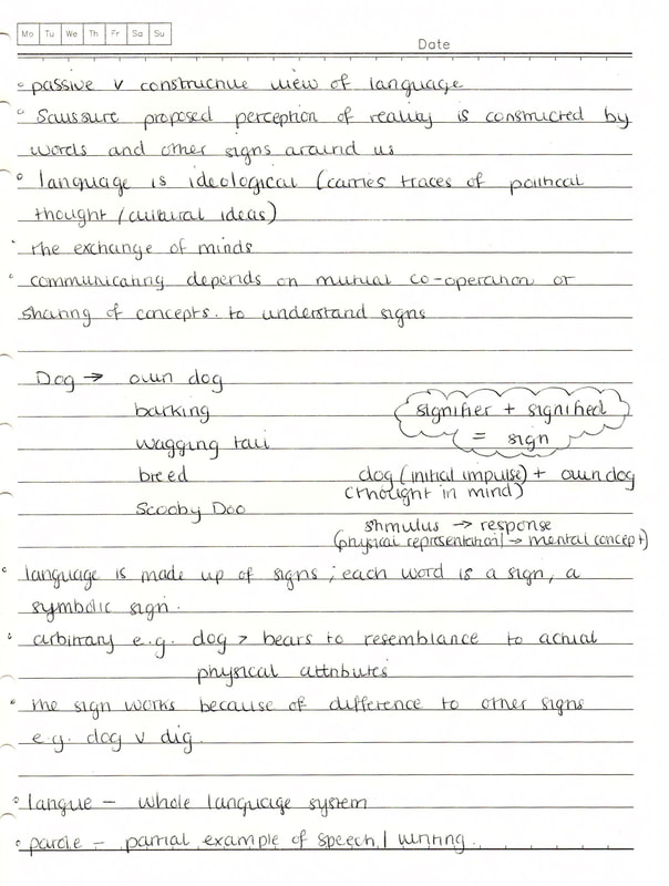
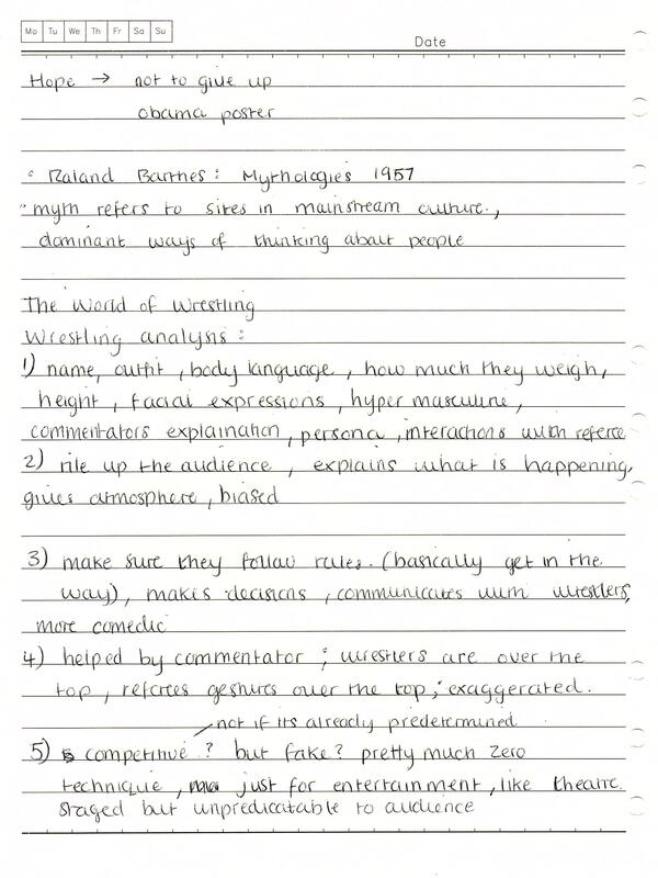
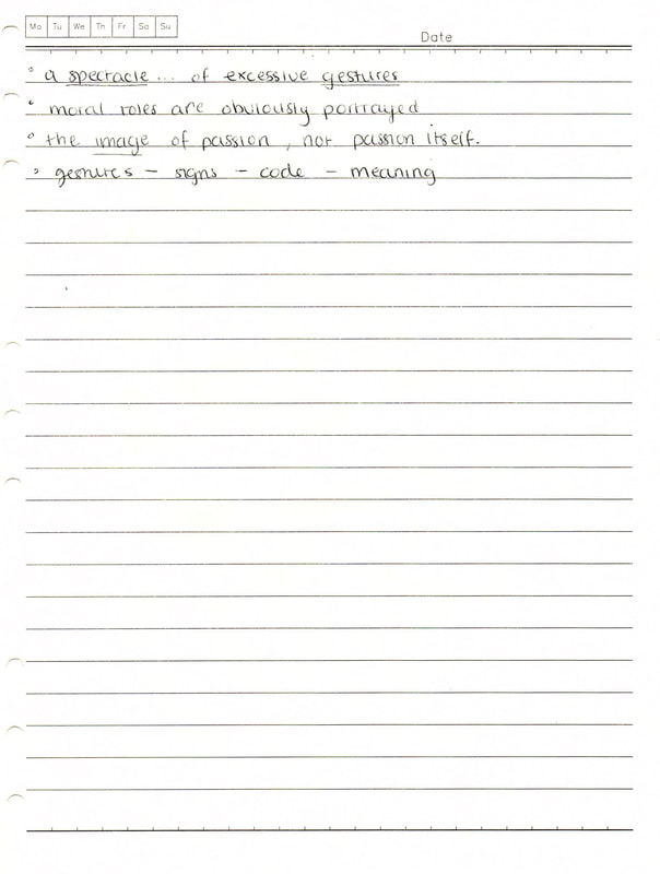
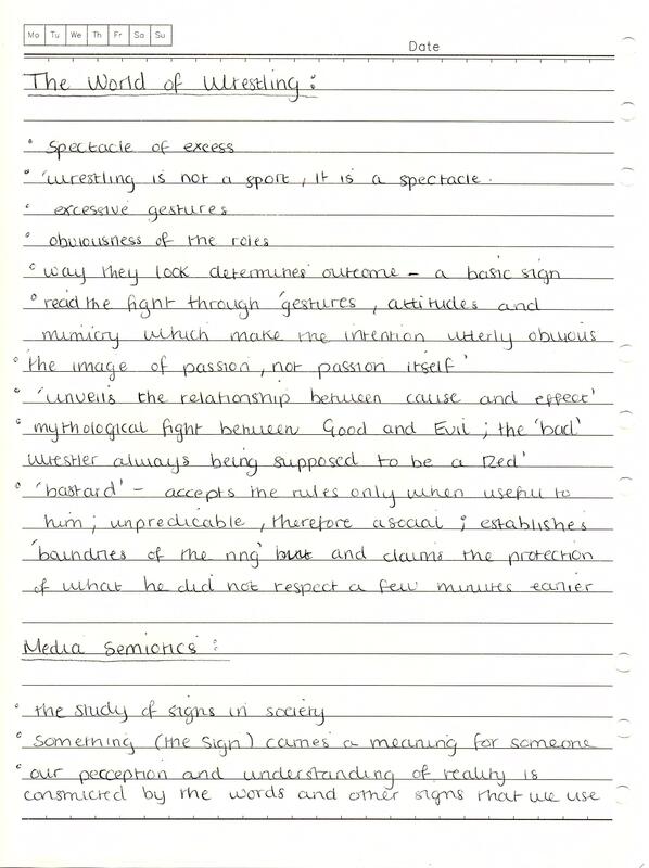
Notes: Structuralism and Semiotics 'Structuralism' refers to the theory that the way we communicate starts as a blank slate and that the culture and society that surrounds us effects who we are. The counter argument to this is the idea of 'essentialism'; we carry it in our DNA and through memories from past generations. Semiotics follows the same concept as structuralism. Semiotics is the study of signs and sign systems in society; anything that conveys meaning is a sign such as words, images, symbols, gestures, clothes etc. Our perception and understanding of reality is constructed by the words and other signs that we use. For example, the word 'children' makes us think of very young people as a group different to adults. However, different social groups around the world at different points in time may have a different distinction between the two, such as age, religion etc. Culture and society decide what the sign means rather than from nature/biology. Therefore, our own sense of identity is dependant on existing signs in society and are only meaningful if they are accepted in a social context. For example, denim jeans used to be considered as work attire, whereas today they are a sign of casual style. A lot of signs are grouped together to form codes, for example certain pieces of clothing can form a dress code (e.g. top hat and tail jacket for formal weddings). Semiotics is a critical methodology, in that it refers to how signs communicate and how we relate to them. It's a useful framework for deconstructing visual texts beyond the surface for underlying cultural messages/ideas. Saussure's' Key Ideas Literary theorist, Roland Barthes, stated that a cultural sign system has 'strong communicative value and is used on a daily basis to negotiate meaning and interact on the basis of that meaning'. This idea can be traced back to two linguists: Ferdinand Saussure and Charles Pierce, both who advocated a synchronic approach to language. Saussure's key ideas related to a passive versus constructive view of language. He proposed that our perception of reality is constructed by words and other signs around us. As a result, language is ideological and carries traces of political thought and cultural ideas. He believed that communication through language is about the exchange of minds and the understanding of signs depended on sharing particular concepts. Language is made up of signs; each word, written or spoken, is a symbolic sign. Signs are arbitrary in that they bear no resemblance to an actual physical appearance or attribute, and they work because of their differences to other signs (e.g. dog versus dig, cat). Every sign has two sides illustrated by the equation: sign = signifier + signified The signifier refers to the physical representation/stimulus and the signified refers to the mental concept/response. For example, d-o-g (initial impulse) + four legged creature (thought in mind) = the sign.  Semiotics Terminology The term langue refers to the whole language system such as the system of rules in chess and the term parole is a partial example of speech or writing, such as the particular moves made in a game. For a comment to be meaningful it has to conform to the system of rules (langue) in the English language. A syntagm refers to a complete, ordered sequence of signs (e.g. a sentence, such as 'the dog bites the man). Each sign could also be replaced by another that is related to it and this is called a paradigm; a point of substitution in a sentence (group of signs) which allows for an exchange of a similar sign without changing the overall structure (e.g. my dog smells/pongs/hums etc). Pierce's Key Ideas Visual signs, such as gestures, traffic signs, advertising images etc, can be approached in similar way to linguistic signs. In a photograph of a cat, the signifier is the colour and shape in the picture, and the signified is the concept of a cat. An iconic sign refers to when the signifier resembles the referent (e.g. a photograph of a specific cat); the signifier, signified and referent can be merged together. When a cat meows to gain attention, the sound points to its presence and this is called an indexical sign. We use signs to describe and interpret the world; they label things but also have 'connotations'. For instance, a photograph of Buckingham Place signifies the building itself but also has connotations with royalty, wealth and power, and this comes from our social experiences. This concept is used in TV, advertising, news etc to trigger a range of connotations to a sign that shapes a particular message; a 'myth'. An example of this can be seen in an advert for shoes that includes an image of Buckingham Palace which attaches connotations of wealth. Myth uses existing signs and makes a new sign system out of them through the use of metaphors and metonymy so they play a particular social role. 'The World of Wrestling' From Mythologies In Roland Barthes' 'The World of Wrestling from Mythologies', myth refers to sites in mainstream culture which reflect dominant ways of thinking about people, products or places (cultural norms). They are structured to send messages on cultural stereotypes, and may be ideological. Barthes' refers to wrestling as a 'spectacle... of excessive gestures'. This idea can be illustrated in the above video of a wrestling match. The role of each wrestler/character is defined and communicated to the audience through their name, appearance and the exaggerated gestures they make, and the obviousness of their roles determines the outcome to the audience - a basic sign. For example, it is a mythological fight between Good and Evil; the 'bad' wrestler being the one in the darker, scruffier attire. The roles are also influenced by the commentators introduction and their interactions with the referee so moral roles are clearly portrayed. The role of the commentator is also to rile up the audience and give atmosphere as well as explain what is happening, usually in a biased way that favours one competitor over the other. The role of the referee is to make sure the wrestlers are following the rules; the 'bastard' accepts the rules 'only when useful to him', giving further signs to the audience to how the fight will play out. Based on these observations, it makes it hard to classify wrestling as a sport as the show is more like theatre; most of the events taking place have been predetermined, even though its unpredictable for the audience. As Barthes put it: 'wrestling is not a sport, it is a spectacle'. Semiotics in Graphic Design Semiotics is used in graphic design all the time, through the creation of visual signs. Designers manipulate visual elements in their work to trigger a response in the viewer. For example, the logo shown was created as a part of a corporate identity for an auto-servicing business. The logo was rejected because it reminded them of the 'deadly sin of gambling'. This represents how his own life experiences influenced his impression of the visual sign. Sources:
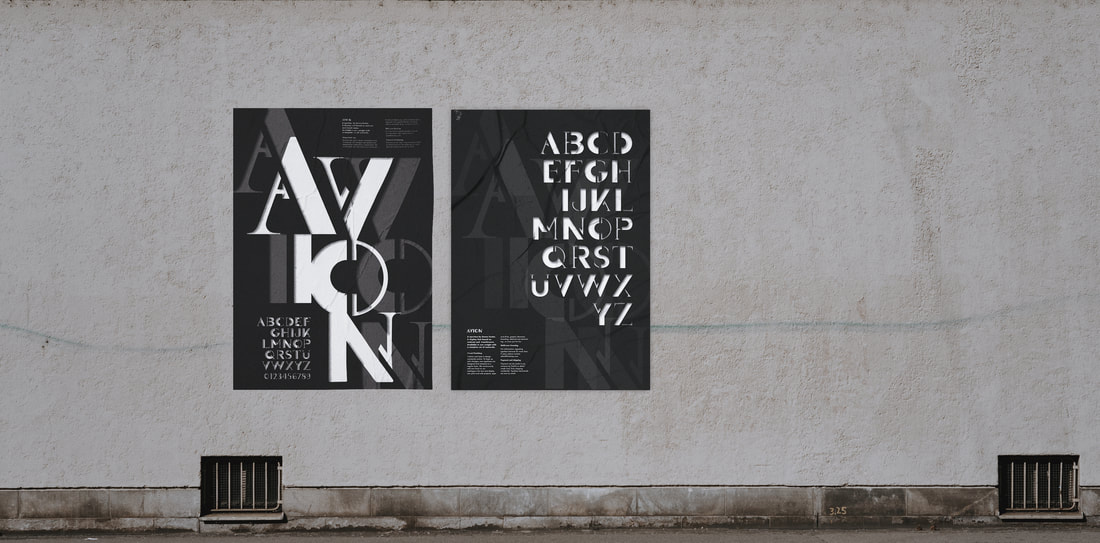
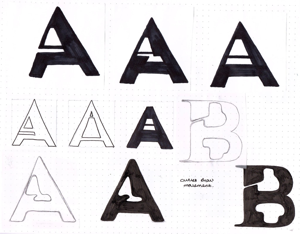
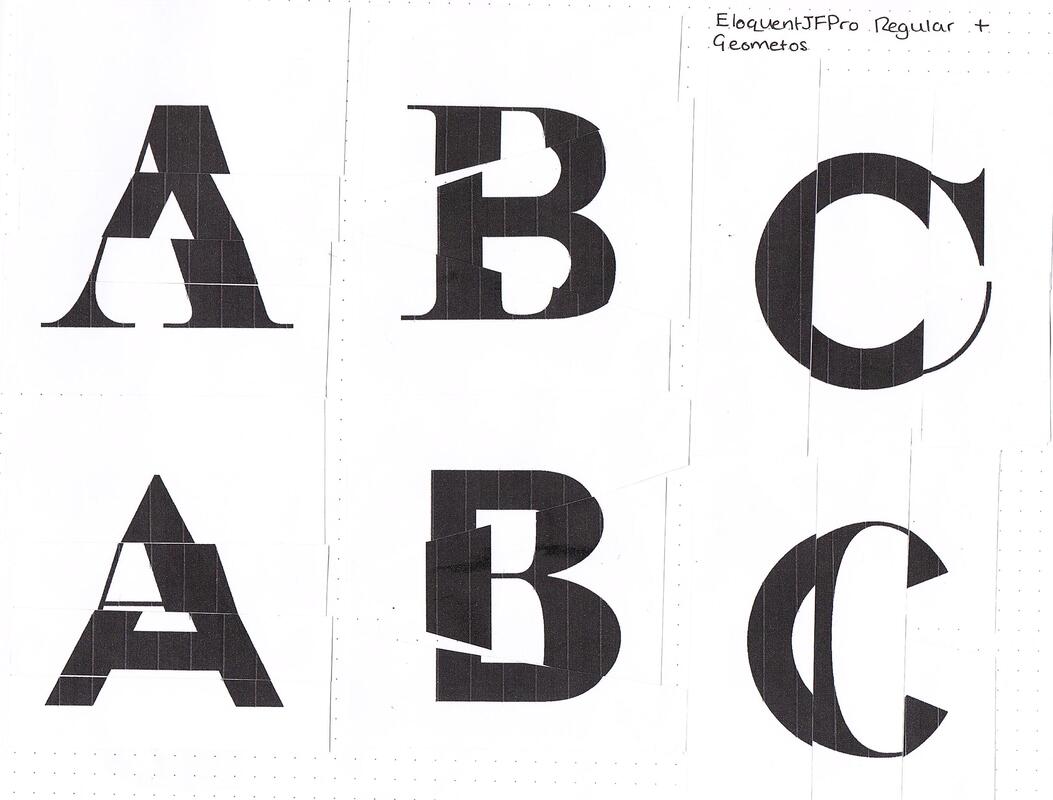
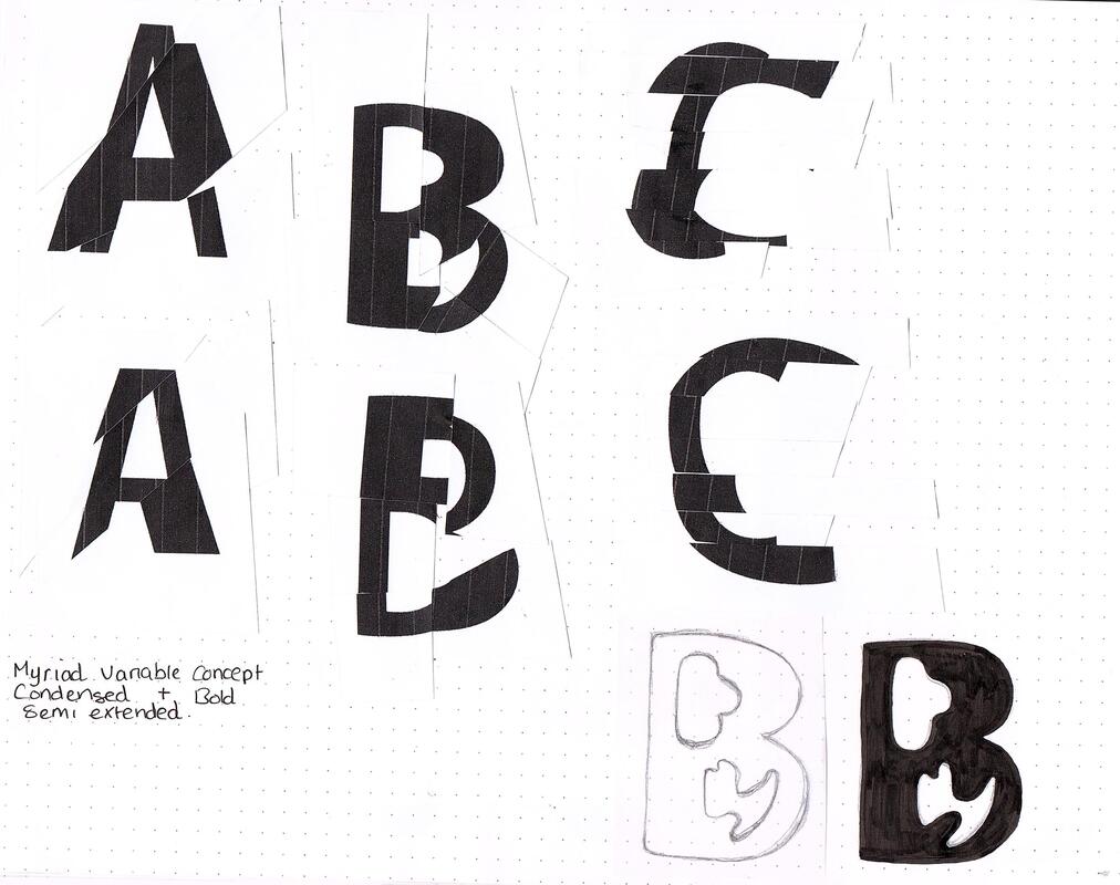
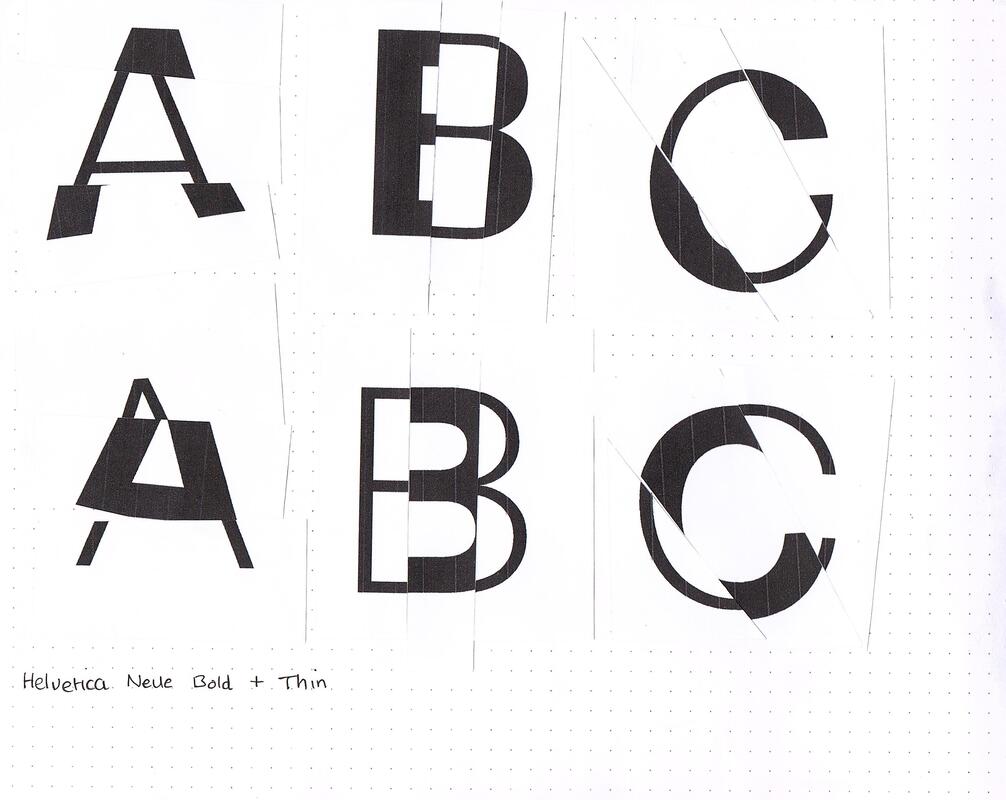
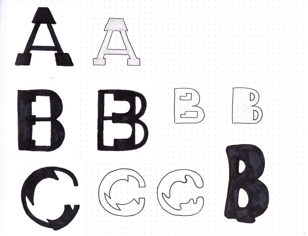
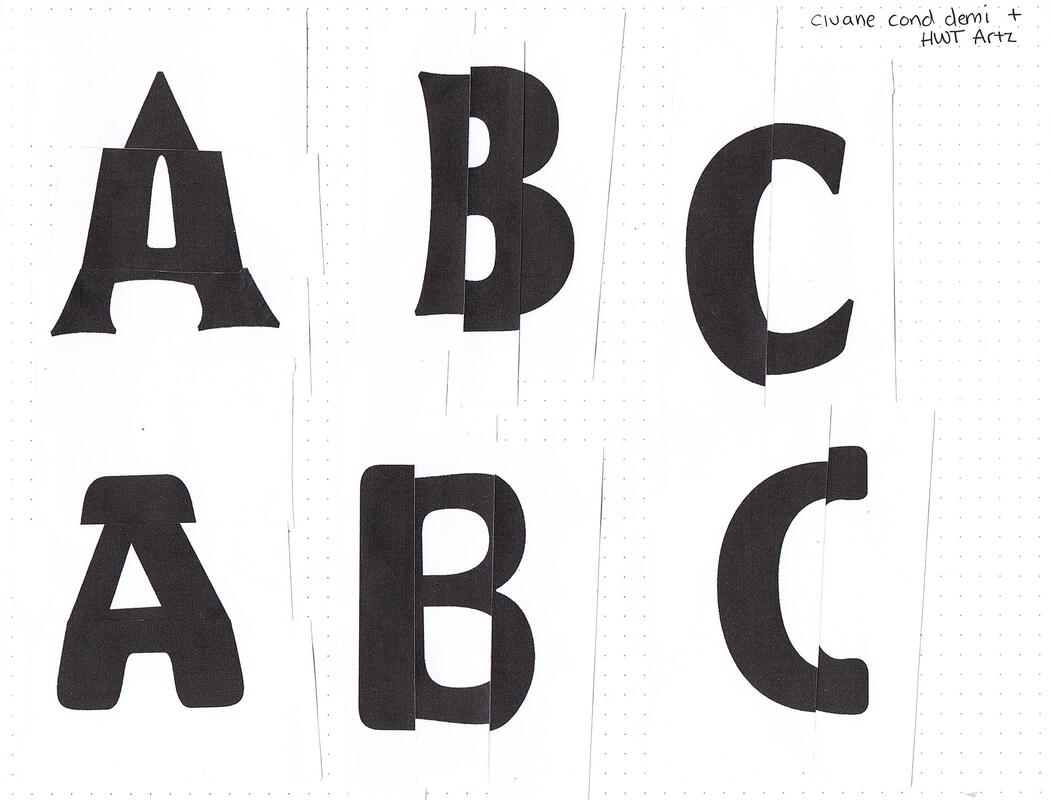
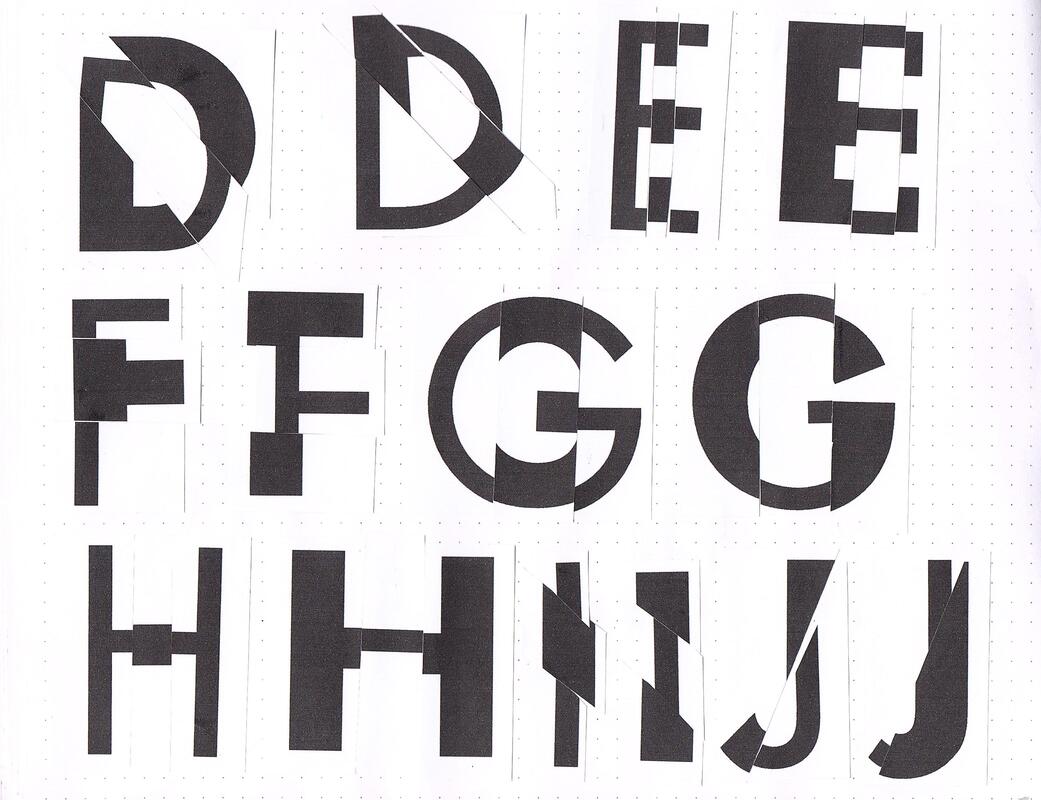
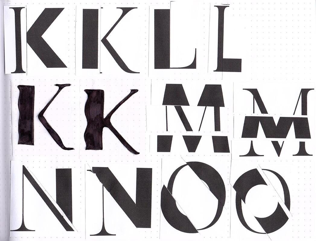
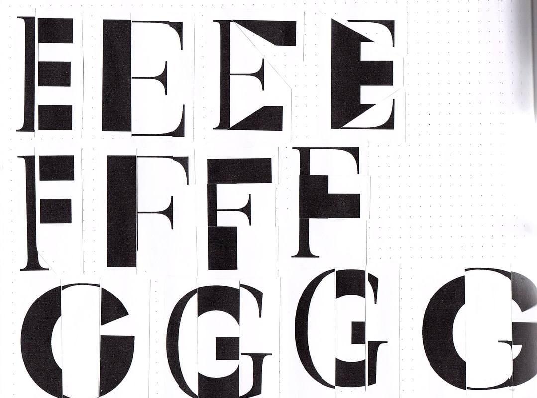
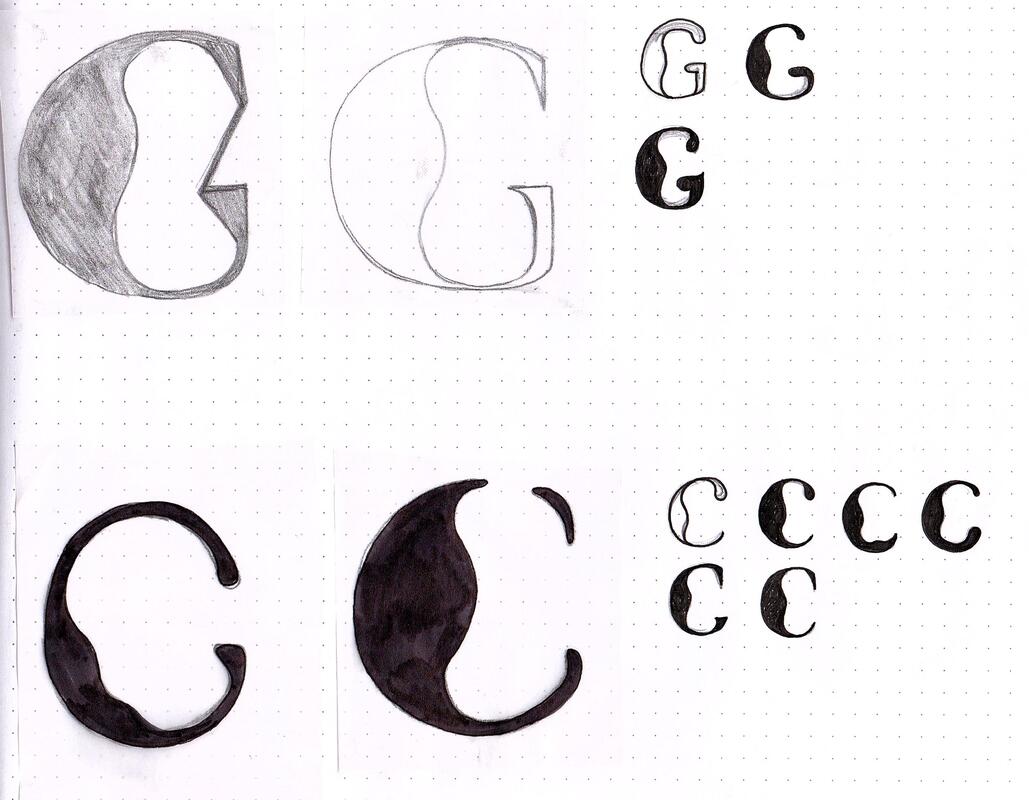
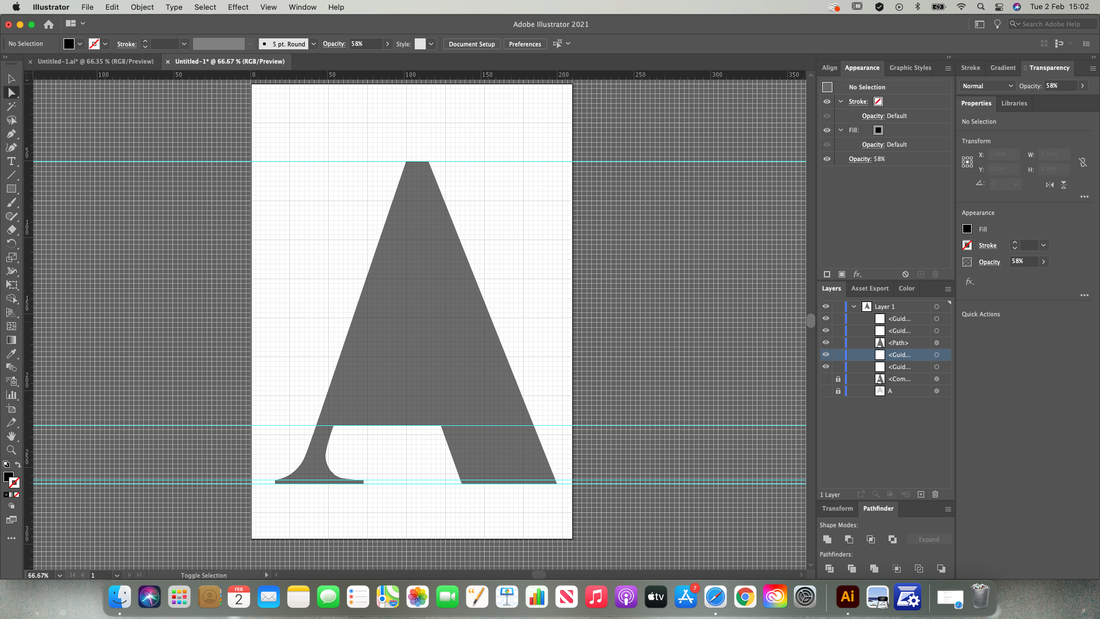
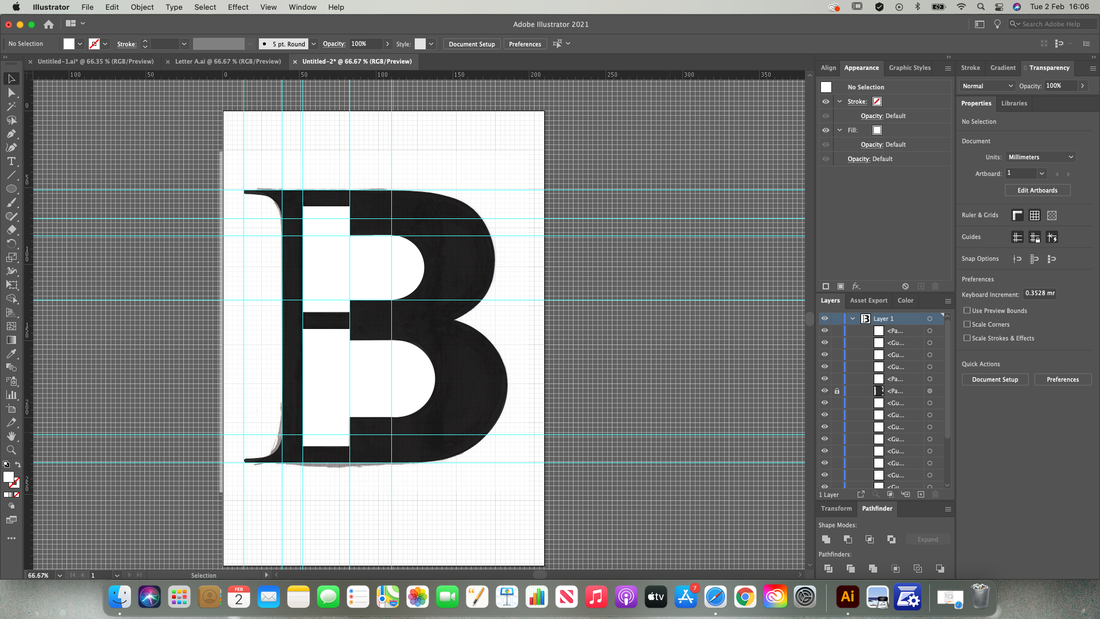
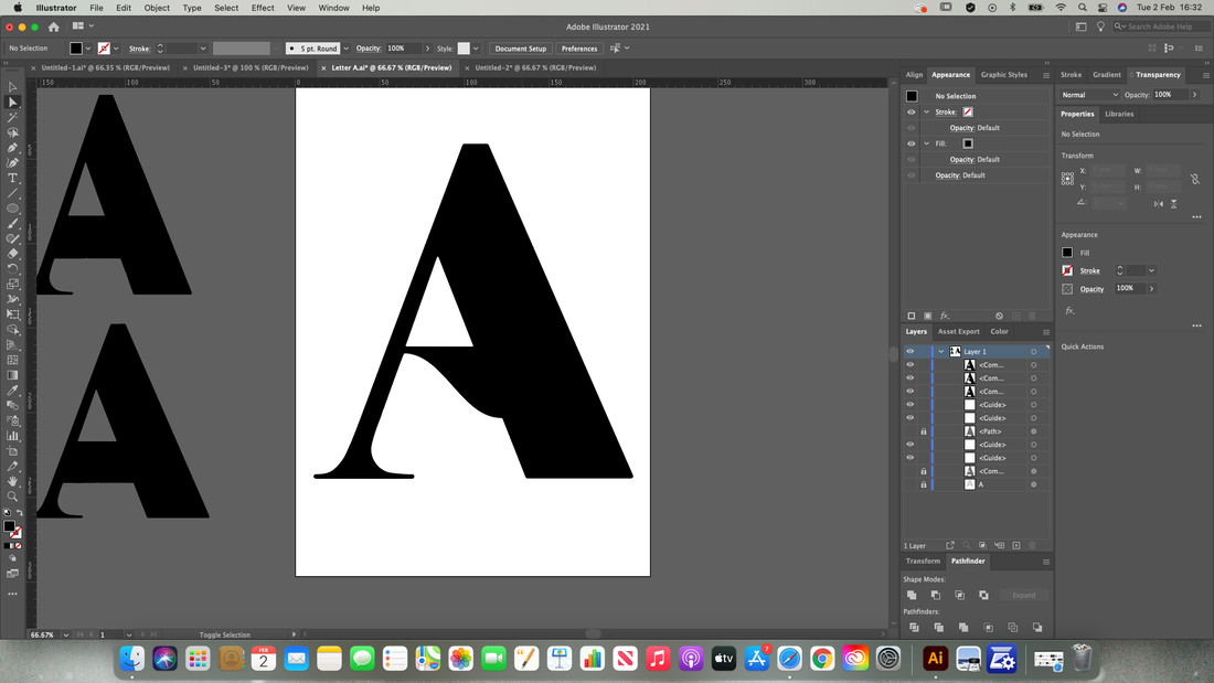
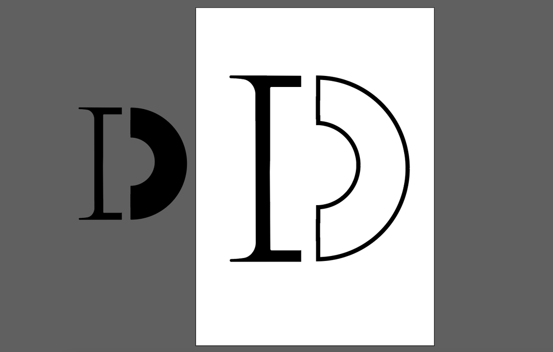
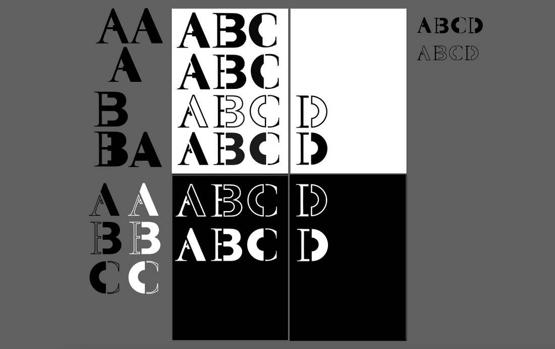
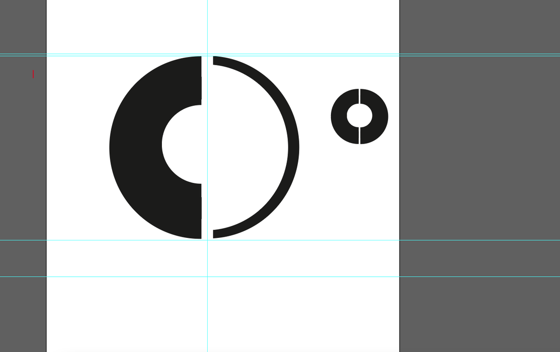
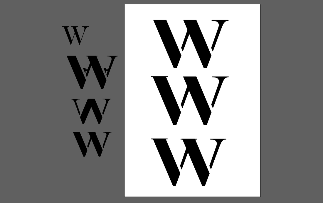
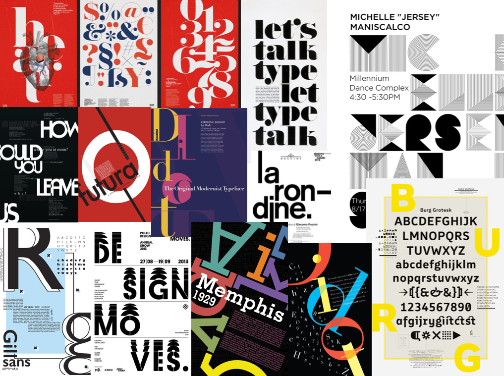
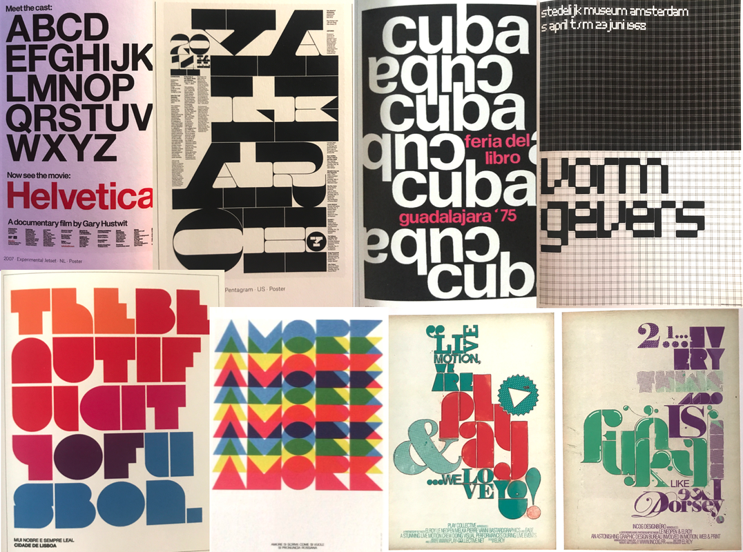
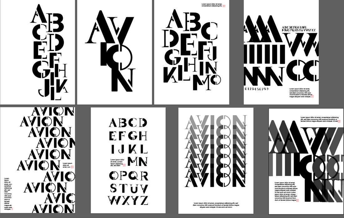
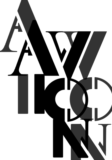
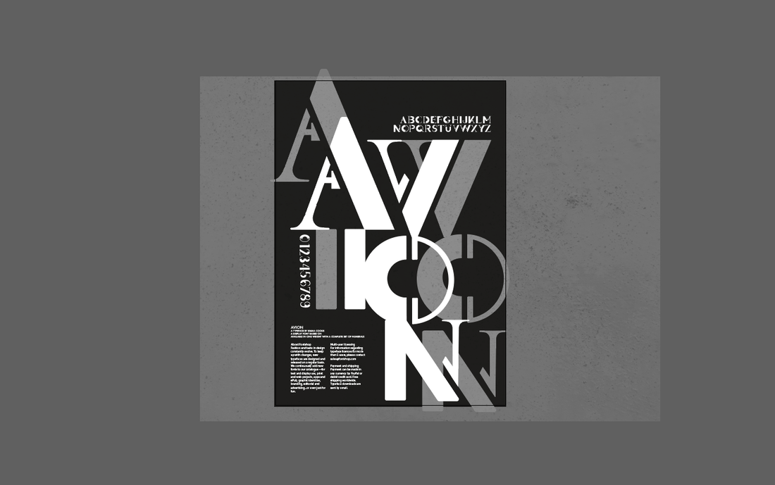
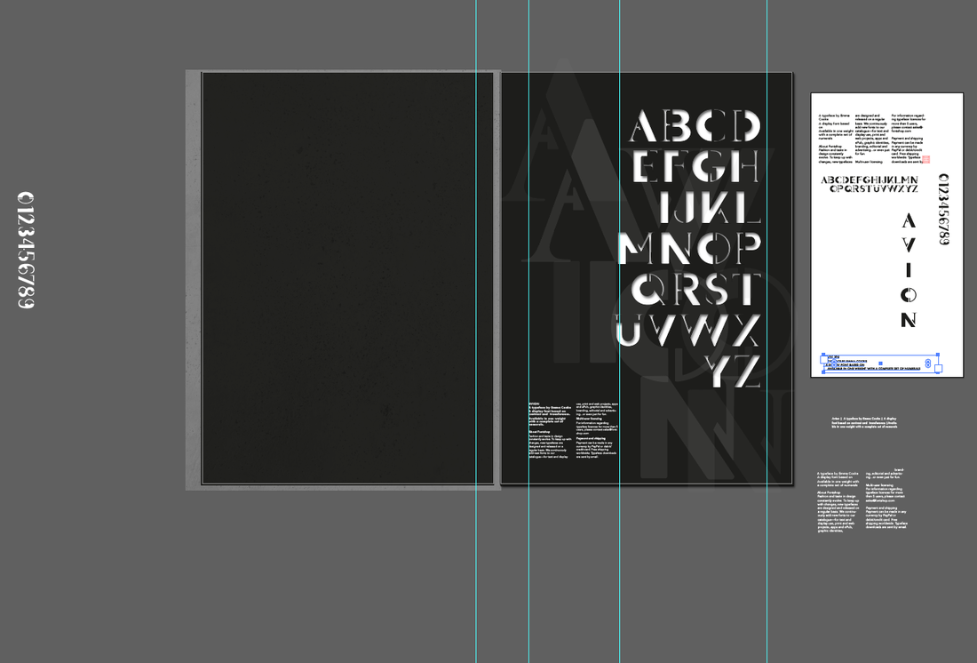
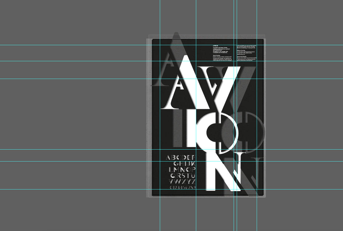
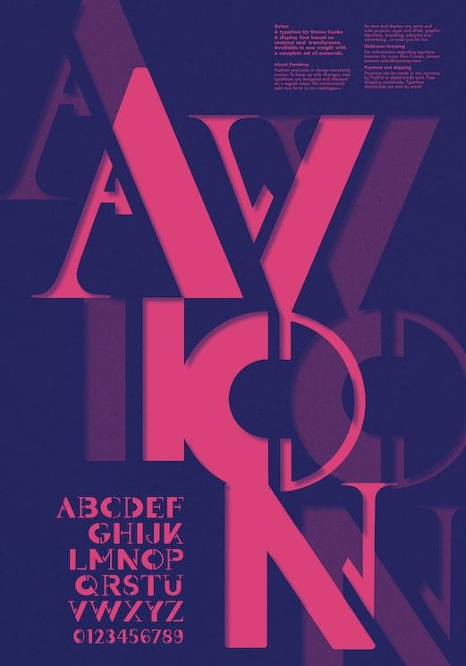
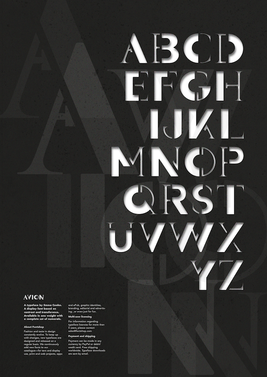
Notes: Brief For this project we had to design a display font with a complete set of characters from 'A' to 'Z', either uppercase or lowercase, plus a set of numerals. In addition, we then had create a poster to showcase and promote our typeface. Typeface Research We were given the word 'migration' as a starting point to base our font on, so I began by investigating its different meanings and interpretations. Migration can have multiple meanings such as referring to a group of people or animals migrating together, movement of people to a new area or country in order to find work or better living conditions, or in chemistry the shifting of one or more atoms from one position in the molecule to another. Below are some images I found inspiring. I liked the images that used shapes because they could be arranged in an interesting way in order to indicate movement, which was initially the path I wanted to take.  I also did some research on some already created typefaces inspired by movement. I love the way they some of them flow and look almost like liquid. I was trying to think of ways movement could be suggested such as showing speed, slight blurriness, and having a sort of shaking effect. I also like how some of these styles look quite retro and show a lot of character. 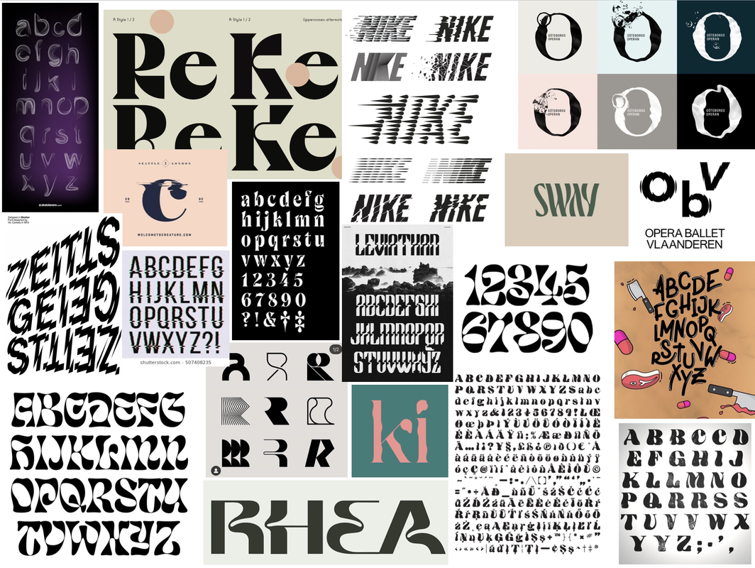 Initial Sketches and Ideas We were given two different approaches to try in order to get us started. Using dotted paper we had to use a 9x9 square grid to work with to form the basis of each character. I began by starting off with the 'control characters' first, which represent the basic square and round letterforms.    The second approach involved taking two already existing typefaces that are very different from each other, slicing and reassembling them to create new versions of the letters. The idea was the experiment as such as possible but still keep the typeface we design balanced. Throughout these sketches are also drew out new versions inspired by them; I really liked the suggested movement in the form of curvy shapes. I experimented combining the same typeface at different stroke weights (Futura Bold and Medium) and also a serif with a sans-serif (Futura Bold and Butler), combining them at different angles. Experimentation and Development I was inspired by some images I found on the internet in which I liked the shapes and wondered if I could create letters using similar shapes. Previous creations with the above techniques inspired me to combine the inspirations and experiment a bit more with some of the letters I made as well as use some other materials such as inks to create more a more flowy and organic effect. I then kept drawing further from the shapes I created from the cut and stick exercise, trying to incorporate my previous ideas of having the letters look flowy. After some feedback, I realised that trying to make the letters look flowy actually took away the interest in the letters that was created from the original cut and stick creations. So I went back to those, using tracing paper to draw over them and making subtle changes to transform them. After I had a good idea of the design, I created some quick sketches applying the same approach to the rest of the letterforms and numbers, ready to vectorise. 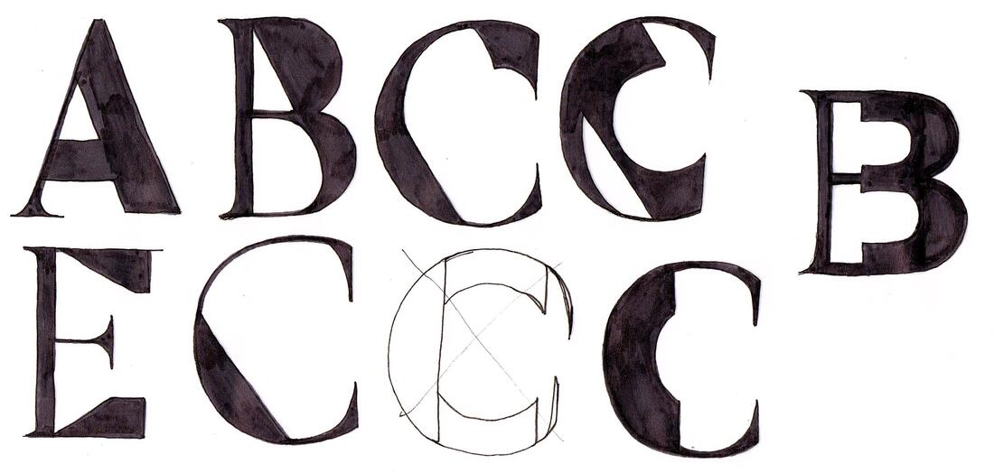 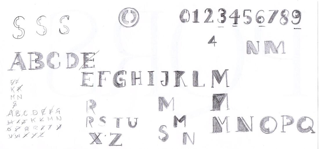 Next, I took my drawings into Illustrator to vectorise and develop them into a working typeface using my sketches and collages as a guide. I really liked idea of leaving gaps between the thick and thin parts to make it look a little like a stencil. Here is the finished typeface, shown with a few variations. It's interesting how far from my original ideas this turned out, as its more geometric than organic but I'm happy with it.  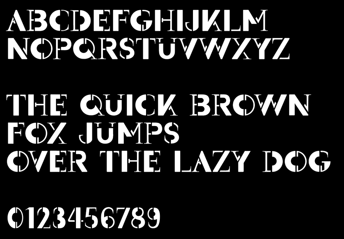  Promotion Poster Research After putting the final touches to my typeface design, I then moved on to researching ideas for the promotional poster. Looking online, I made a mood-board of some posters that I was most drawn to. I especially liked the idea of incorporating and experimenting with more colour into the design. I created another mood-board of some inspirations I found looking through the books I had at home. ('Playful Type' and 'The History of Graphic Design Vol 2') Thumbnail Sketches I then did some thumbnail sketches to figure out layout ideas for the poster. I was undecided on whether I wanted the poster to feature the name of the typeface, a quote, or focus more on just the alphabet itself. I also tried to think about how I could incorporate colour. 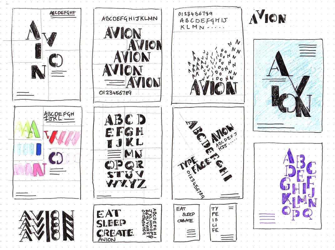 Development I then went into Illustrator to try and make the poster digitally, using my thumbnails as a guide. I started out keeping the designs black and white then eventually experiment with some colour to make the typeface pop more. Final Design Here are my final designs, as well as the typeface file below. I actually ended up sticking with the original black and white as I liked it better. I also did a mock up of them in action.
|
AuthorHi, I'm Emma. I'm currently studying Graphic Design at the University of Cumbria. Modules
All
Archives
May 2021
|
||||


 RSS Feed