
|
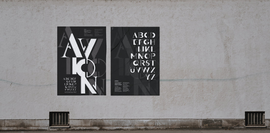
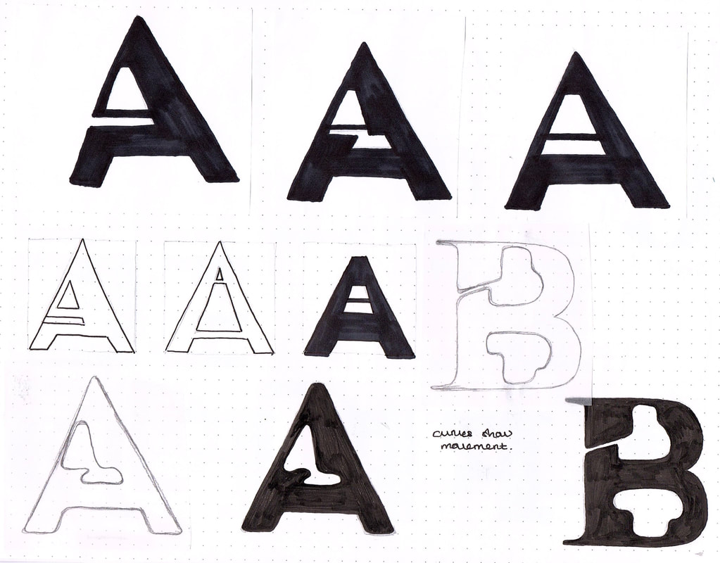
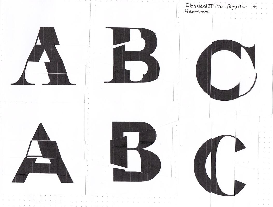
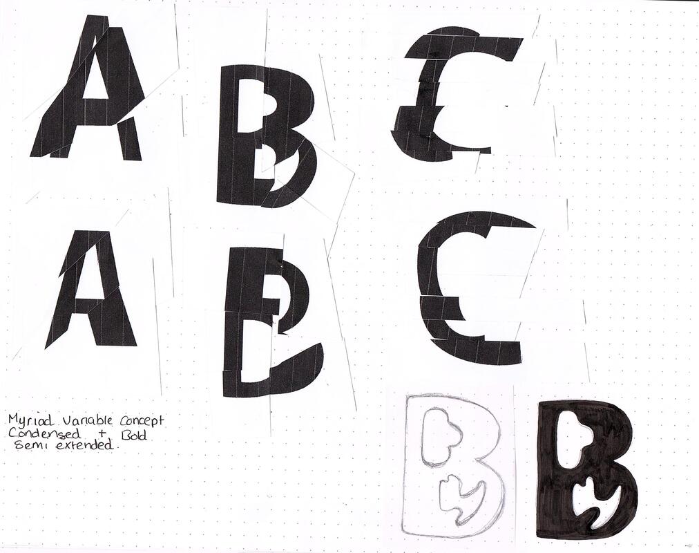
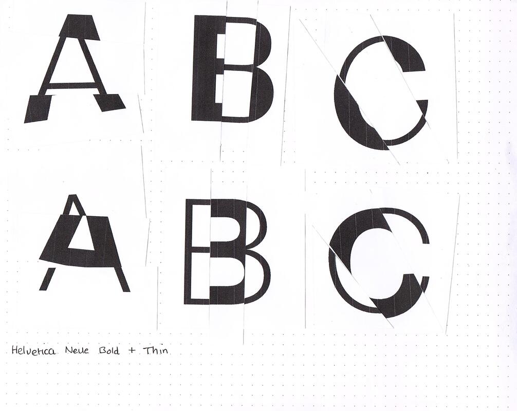
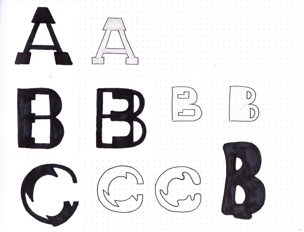
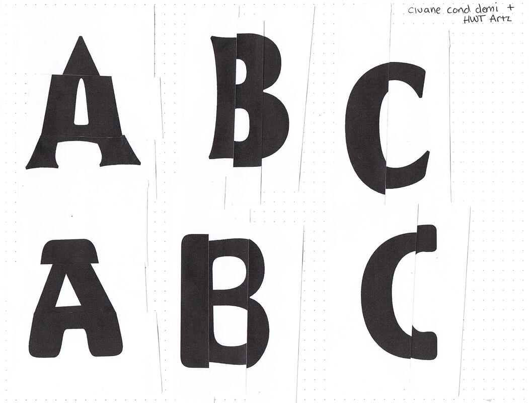
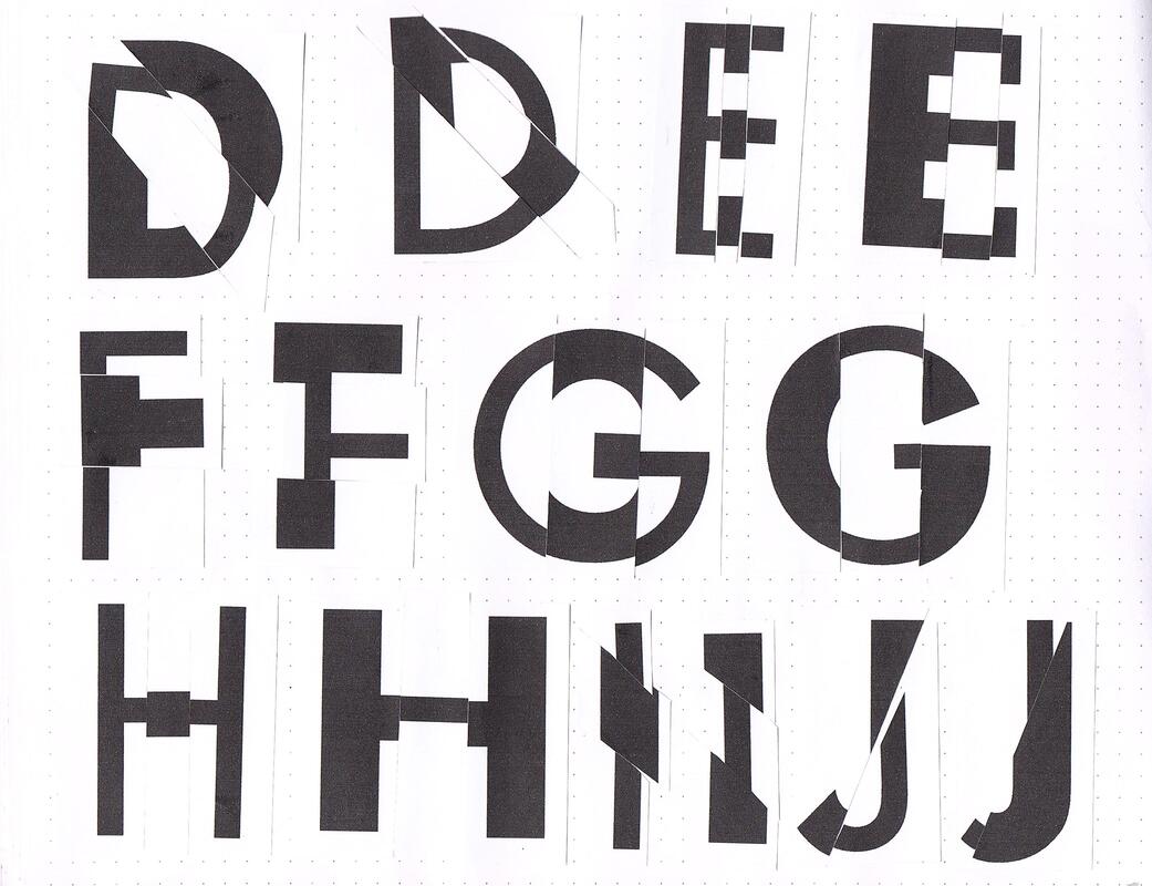
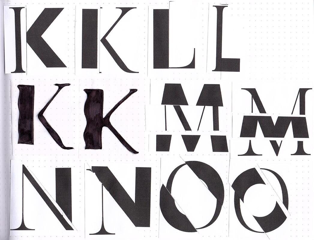
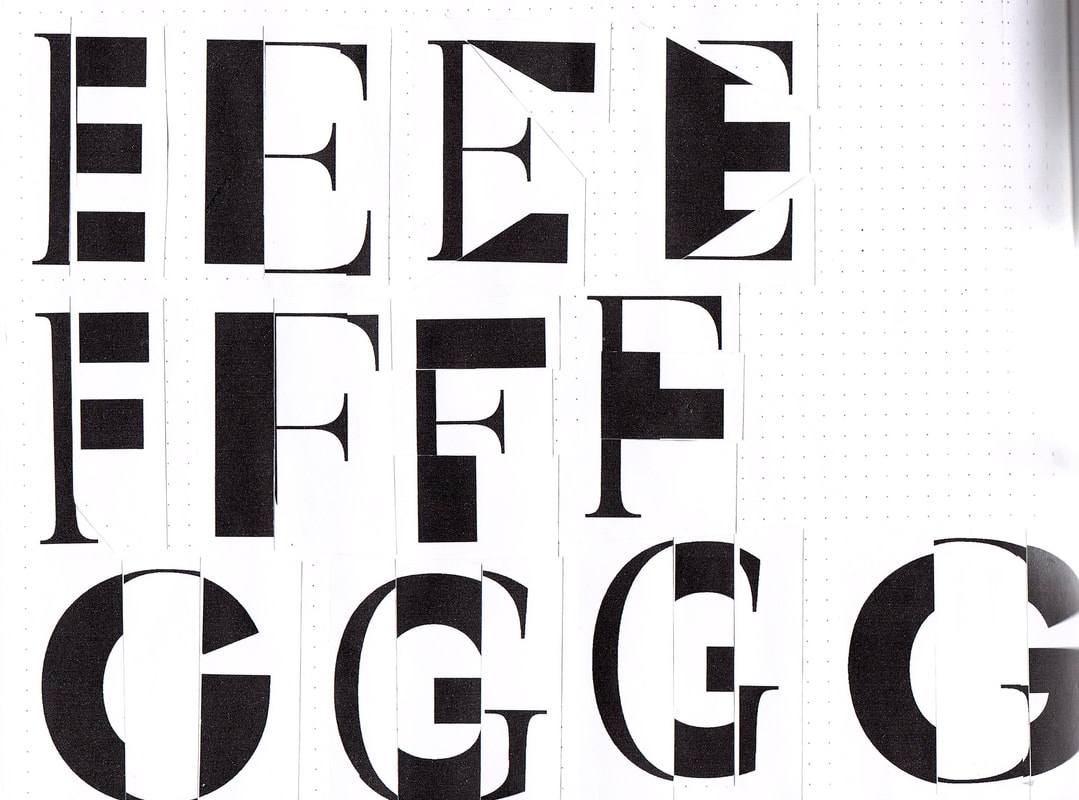
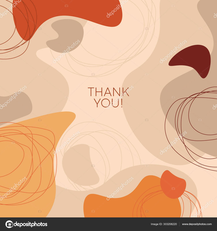
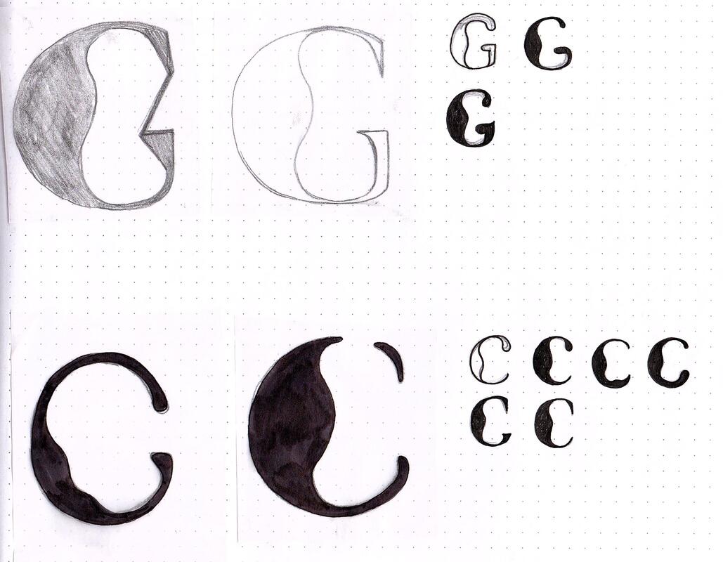
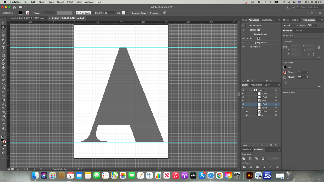
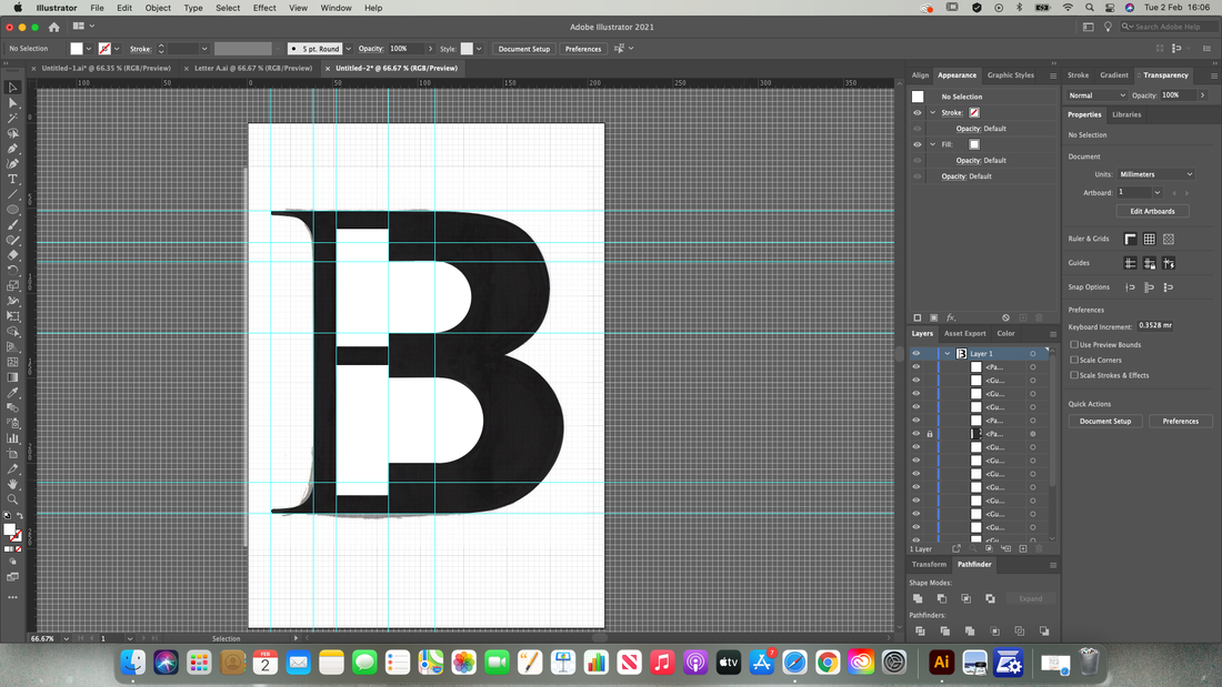
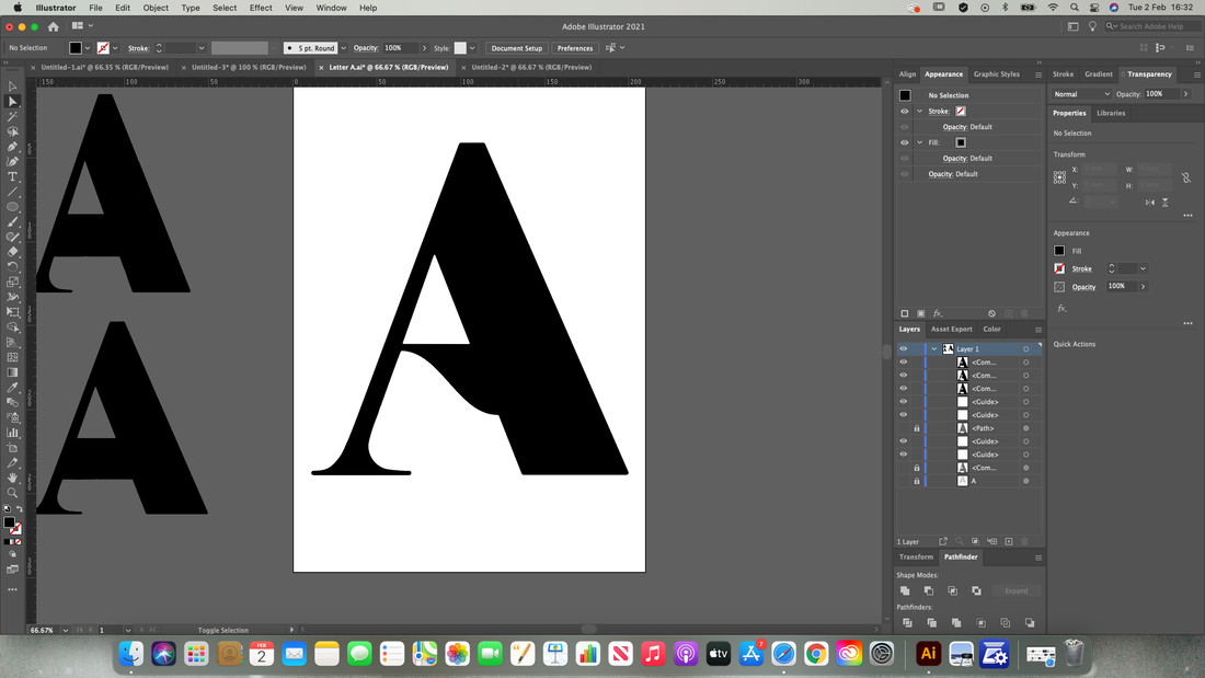
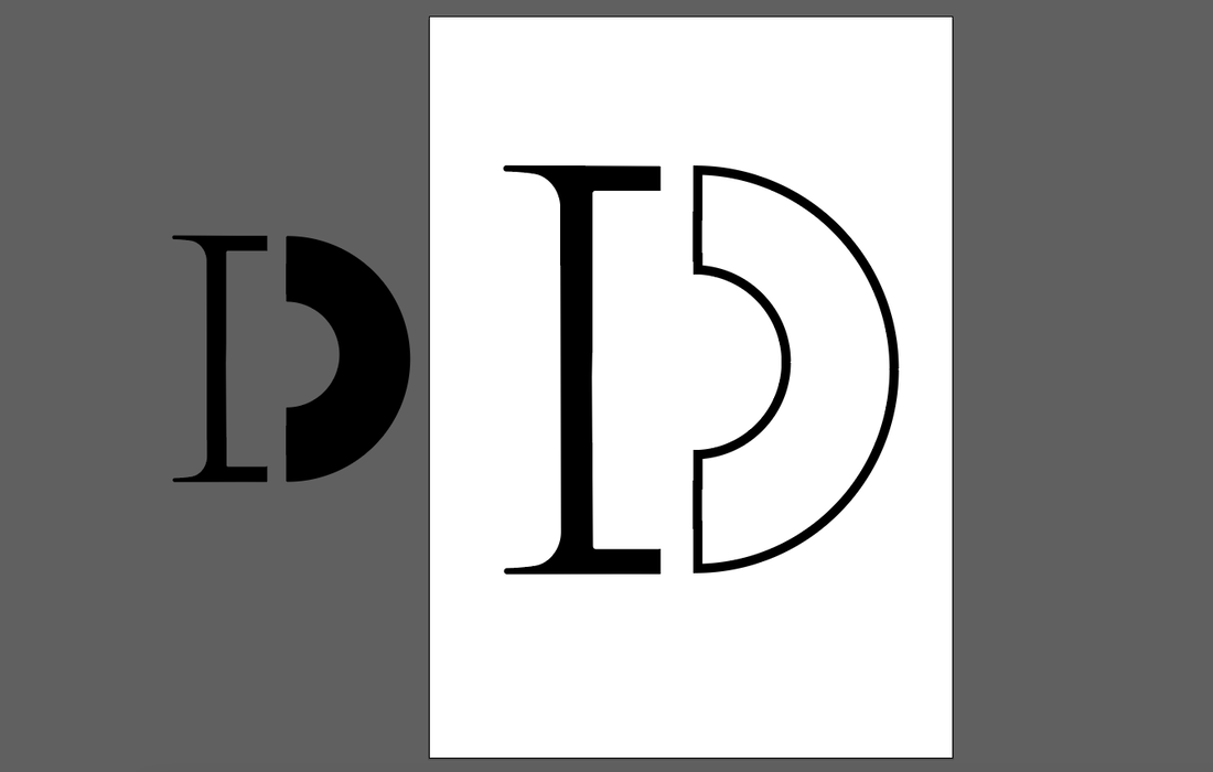
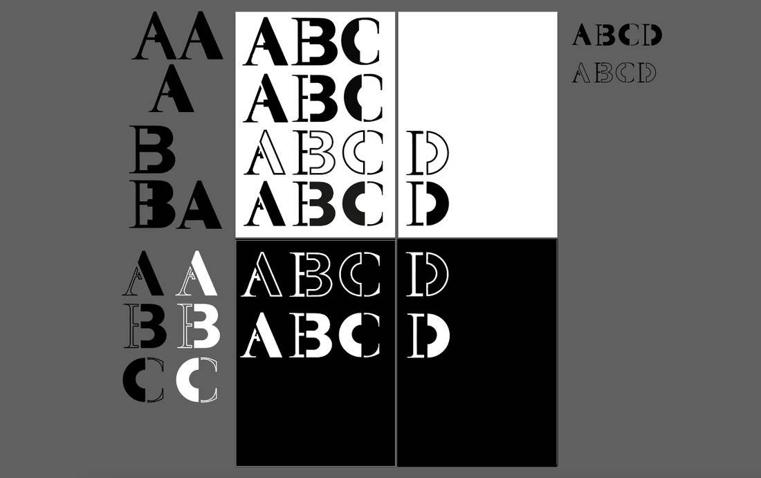
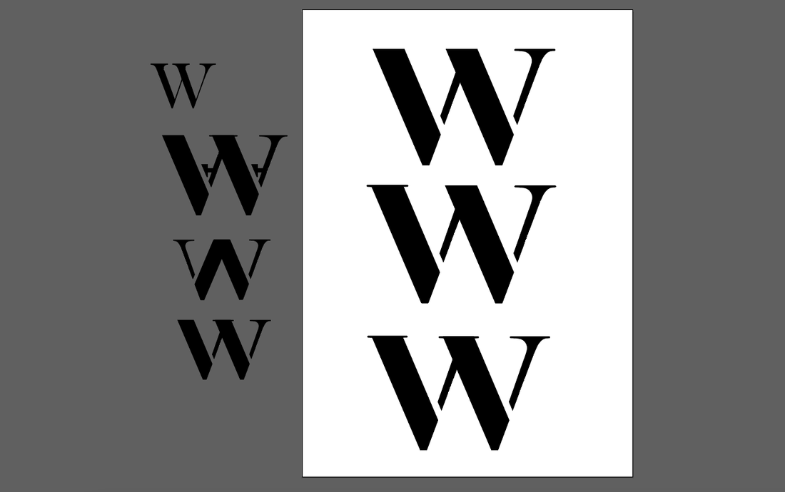
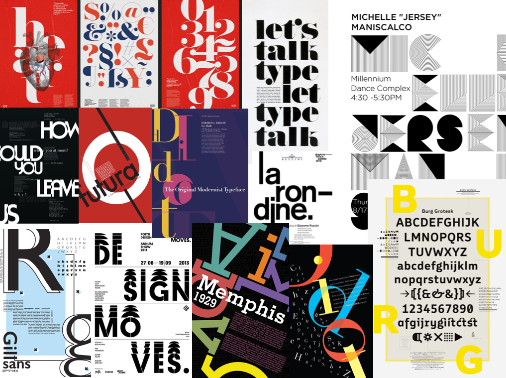
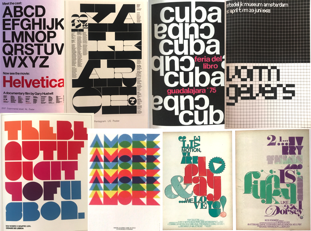
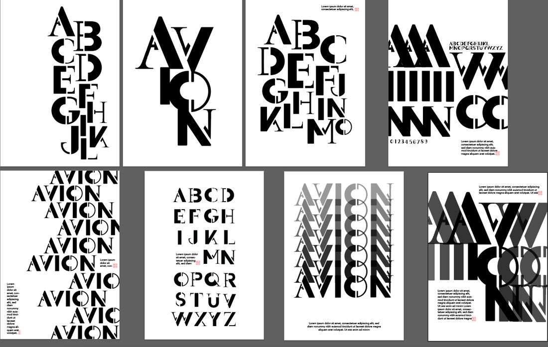
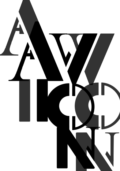
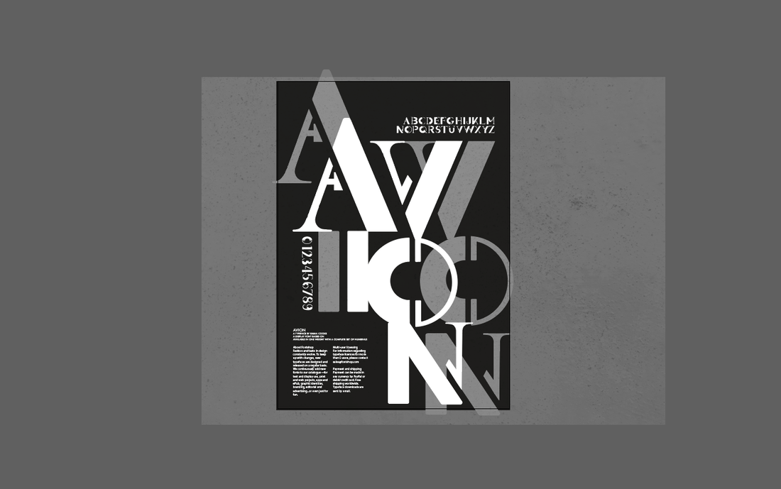
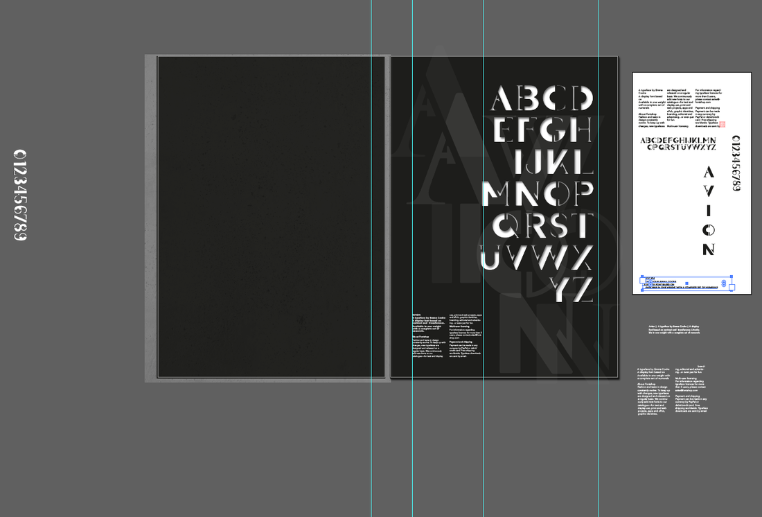
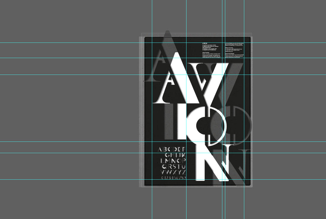
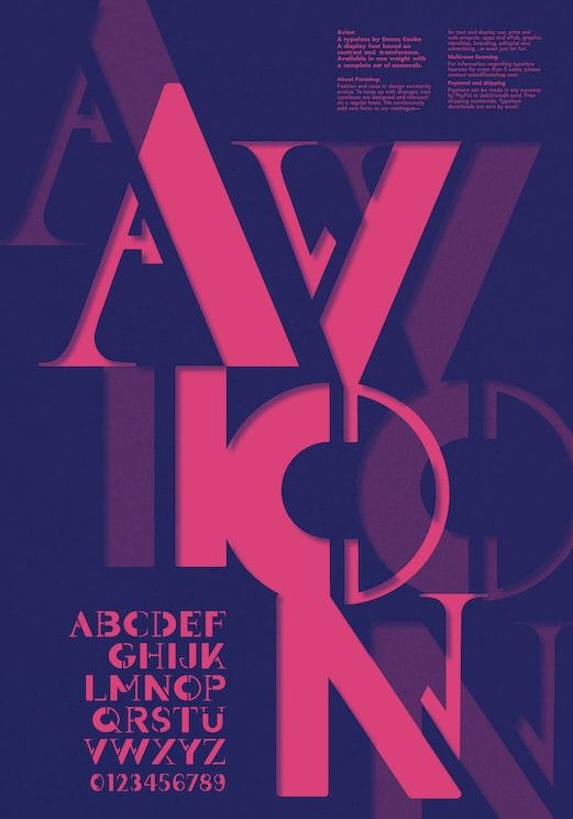
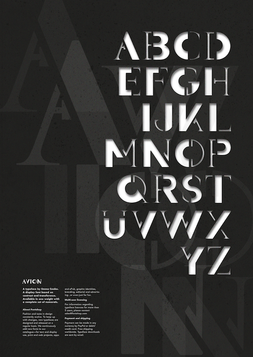
Brief For this project we had to design a display font with a complete set of characters from 'A' to 'Z', either uppercase or lowercase, plus a set of numerals. In addition, we then had create a poster to showcase and promote our typeface. Typeface Research We were given the word 'migration' as a starting point to base our font on, so I began by investigating its different meanings and interpretations. Migration can have multiple meanings such as referring to a group of people or animals migrating together, movement of people to a new area or country in order to find work or better living conditions, or in chemistry the shifting of one or more atoms from one position in the molecule to another. Below are some images I found inspiring. I liked the images that used shapes because they could be arranged in an interesting way in order to indicate movement, which was initially the path I wanted to take. 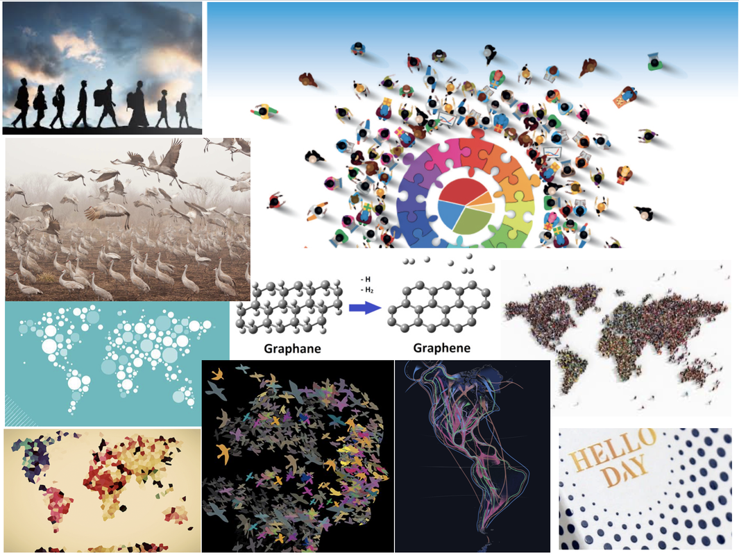 I also did some research on some already created typefaces inspired by movement. I love the way they some of them flow and look almost like liquid. I was trying to think of ways movement could be suggested such as showing speed, slight blurriness, and having a sort of shaking effect. I also like how some of these styles look quite retro and show a lot of character. 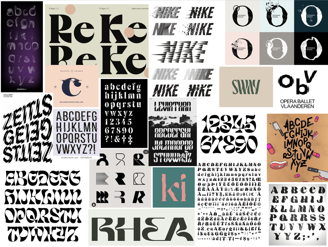 Initial Sketches and Ideas We were given two different approaches to try in order to get us started. Using dotted paper we had to use a 9x9 square grid to work with to form the basis of each character. I began by starting off with the 'control characters' first, which represent the basic square and round letterforms.    The second approach involved taking two already existing typefaces that are very different from each other, slicing and reassembling them to create new versions of the letters. The idea was the experiment as such as possible but still keep the typeface we design balanced. Throughout these sketches are also drew out new versions inspired by them; I really liked the suggested movement in the form of curvy shapes. I experimented combining the same typeface at different stroke weights (Futura Bold and Medium) and also a serif with a sans-serif (Futura Bold and Butler), combining them at different angles. Experimentation and Development I was inspired by some images I found on the internet in which I liked the shapes and wondered if I could create letters using similar shapes. Previous creations with the above techniques inspired me to combine the inspirations and experiment a bit more with some of the letters I made as well as use some other materials such as inks to create more a more flowy and organic effect. I then kept drawing further from the shapes I created from the cut and stick exercise, trying to incorporate my previous ideas of having the letters look flowy. After some feedback, I realised that trying to make the letters look flowy actually took away the interest in the letters that was created from the original cut and stick creations. So I went back to those, using tracing paper to draw over them and making subtle changes to transform them. After I had a good idea of the design, I created some quick sketches applying the same approach to the rest of the letterforms and numbers, ready to vectorise. 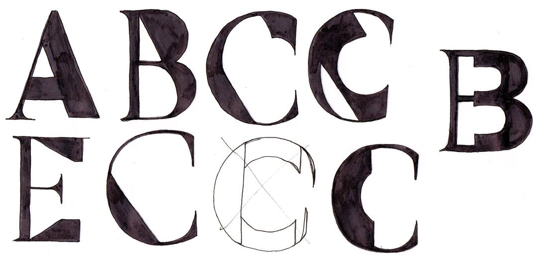 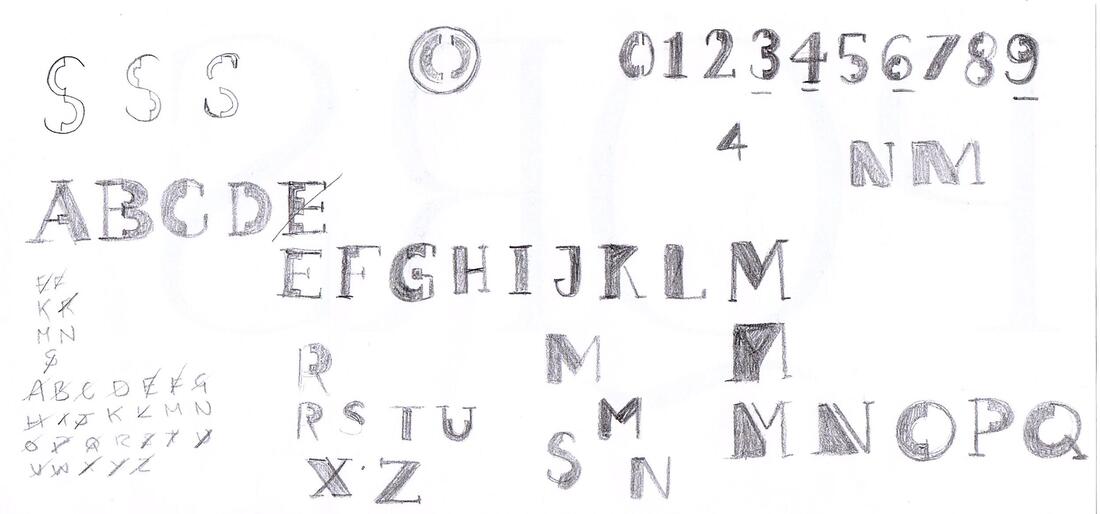 Next, I took my drawings into Illustrator to vectorise and develop them into a working typeface using my sketches and collages as a guide. I really liked idea of leaving gaps between the thick and thin parts to make it look a little like a stencil. Here is the finished typeface, shown with a few variations. It's interesting how far from my original ideas this turned out, as its more geometric than organic but I'm happy with it.  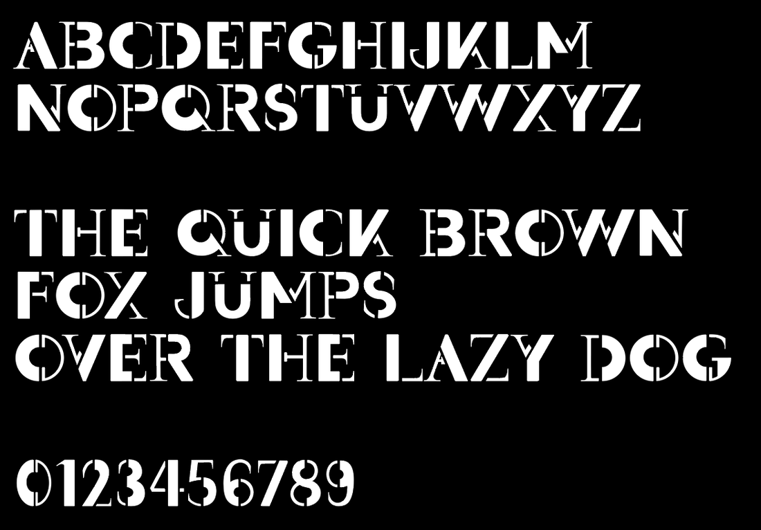  Promotion Poster Research After putting the final touches to my typeface design, I then moved on to researching ideas for the promotional poster. Looking online, I made a mood-board of some posters that I was most drawn to. I especially liked the idea of incorporating and experimenting with more colour into the design. I created another mood-board of some inspirations I found looking through the books I had at home. ('Playful Type' and 'The History of Graphic Design Vol 2') Thumbnail Sketches I then did some thumbnail sketches to figure out layout ideas for the poster. I was undecided on whether I wanted the poster to feature the name of the typeface, a quote, or focus more on just the alphabet itself. I also tried to think about how I could incorporate colour. 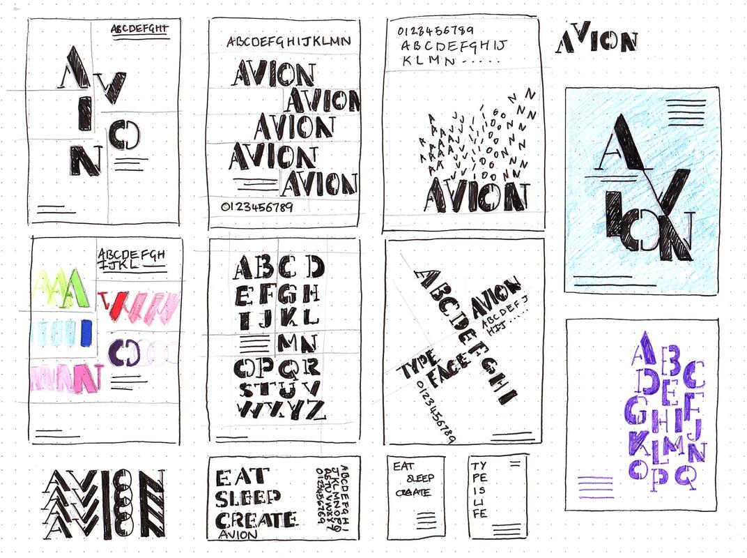 Development I then went into Illustrator to try and make the poster digitally, using my thumbnails as a guide. I started out keeping the designs black and white then eventually experiment with some colour to make the typeface pop more. Final Design Here are my final designs, as well as the typeface file below. I actually ended up sticking with the original black and white as I liked it better. I also did a mock up of them in action.
0 Comments
Leave a Reply. |
AuthorHi, I'm Emma. I'm currently studying Graphic Design at the University of Cumbria. Modules
All
Archives
May 2021
|
||||


 RSS Feed