
Balance and ColourFor our third exercise we had to create designs for an iPad resident app using the principles of balance and colour. The designs had to include a landing page and a product page, one set using symmetrical balance, the other asymmetrical as well each of those using complimentary colours and contrasting colours. I began by doing a bit of research into app design, as it was something completely new to me. I wanted to make the layout simple so I could focus more on experimenting with the colours. 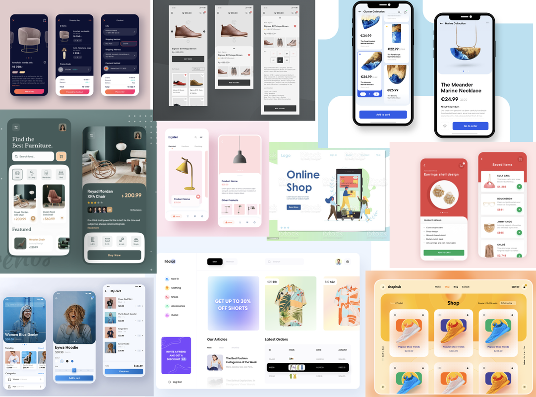 I then sketched out some thumbnails to give me an idea of the layout of the two app pages before I went into Photoshop, taking inspiration from the above mood board and trying to think about how I could implement symmetry and asymmetry. I then decided to do a little research on complimenting colour combinations I could try out.  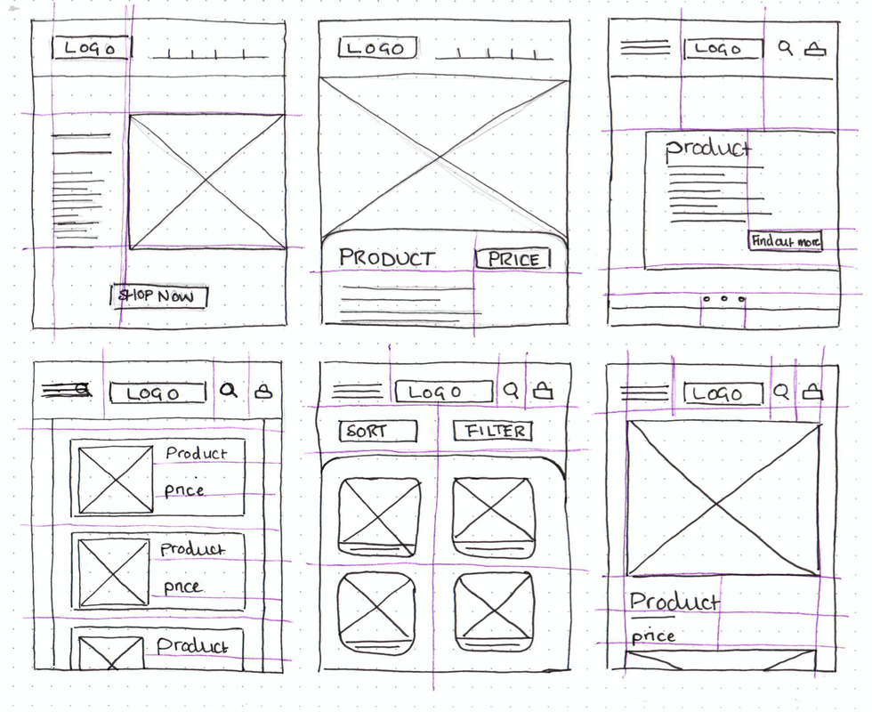 I then found an online wire framing tool (MockFlow) that I thought would be helpful to further figure out some of my layouts. 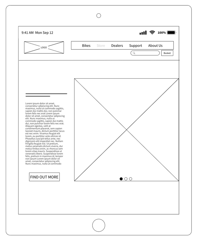 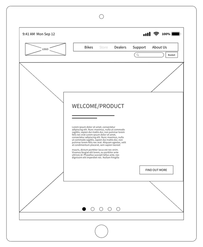   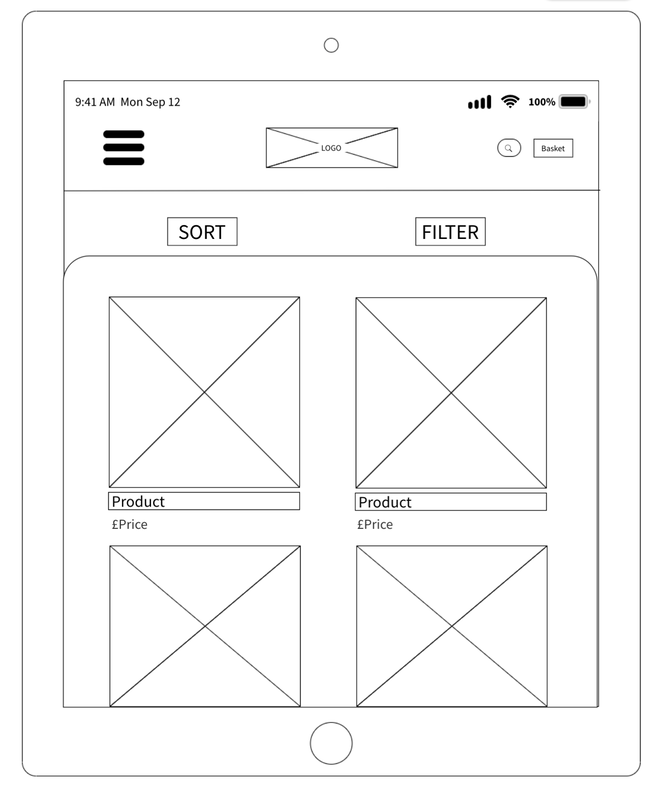 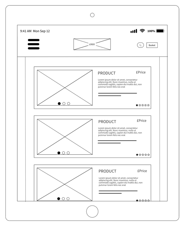  I also began looking into possible contrasting and complementary colour schemes before I started creating my designs on Photoshop. I used the websites ColourSpace, Coolors and Adobe Colour. I was leaning more towards using a palette that was still eye-catching but had mainly earthy tones to match the theme of bikes and being outdoors. 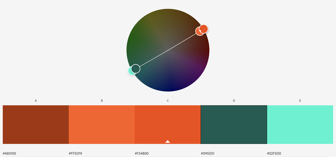     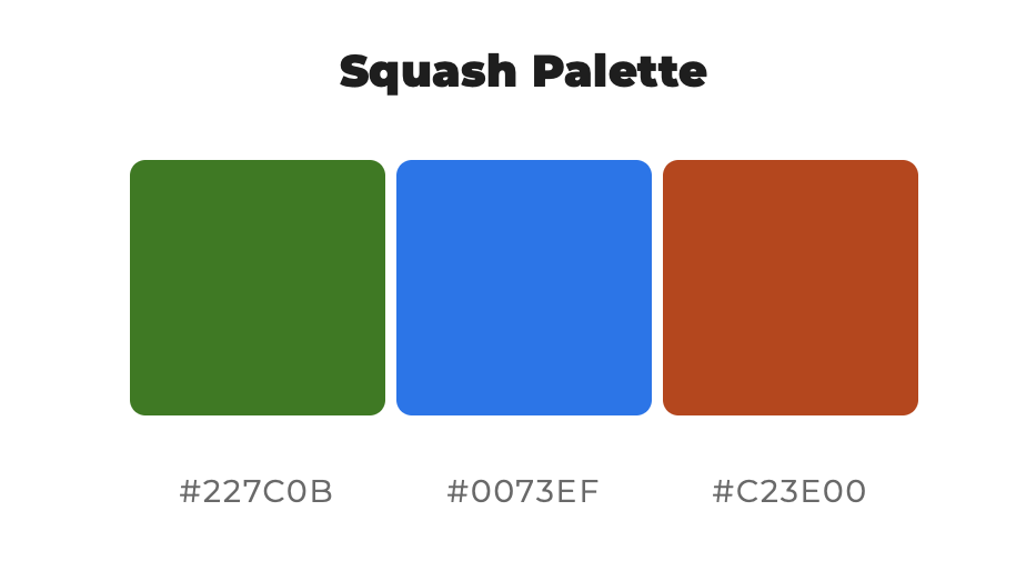   Symmetrical/Contrasting Colour Moving into Photoshop, I began creating my final designs, experimenting with the colour schemes as I went. I initially was going to use earthy colours such as greens and browns but actually preferred the way the navy and orange looked more for this contrasting, symmetrical design. 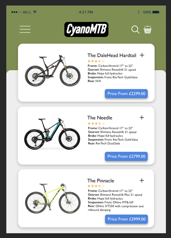 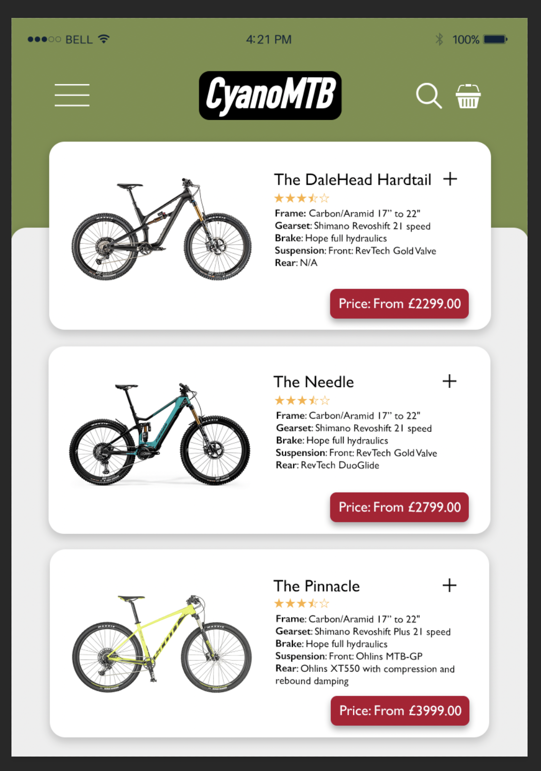 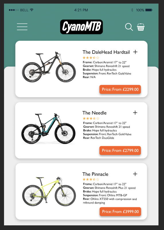  Here as some brief progress shots of my designs; I rearranged some elements and made subtle changes as I went to make the symmetry more obvious. 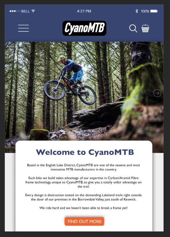 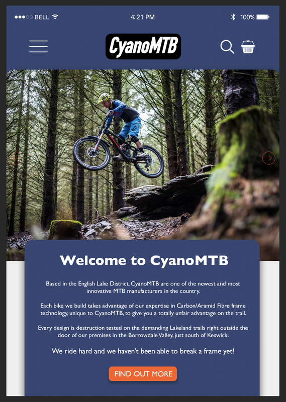 Here are some screenshots of the Photoshop documents showing the grids I used to show the layout and alignment:  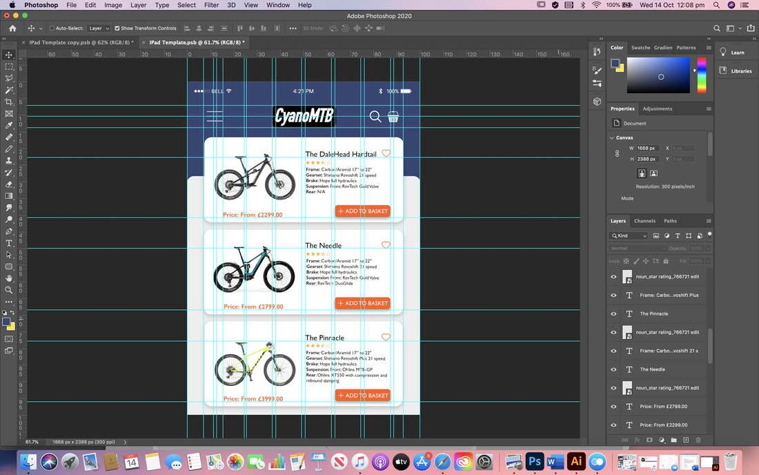 Final designs for symmetrical balance and contrasting colour scheme:  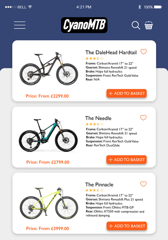 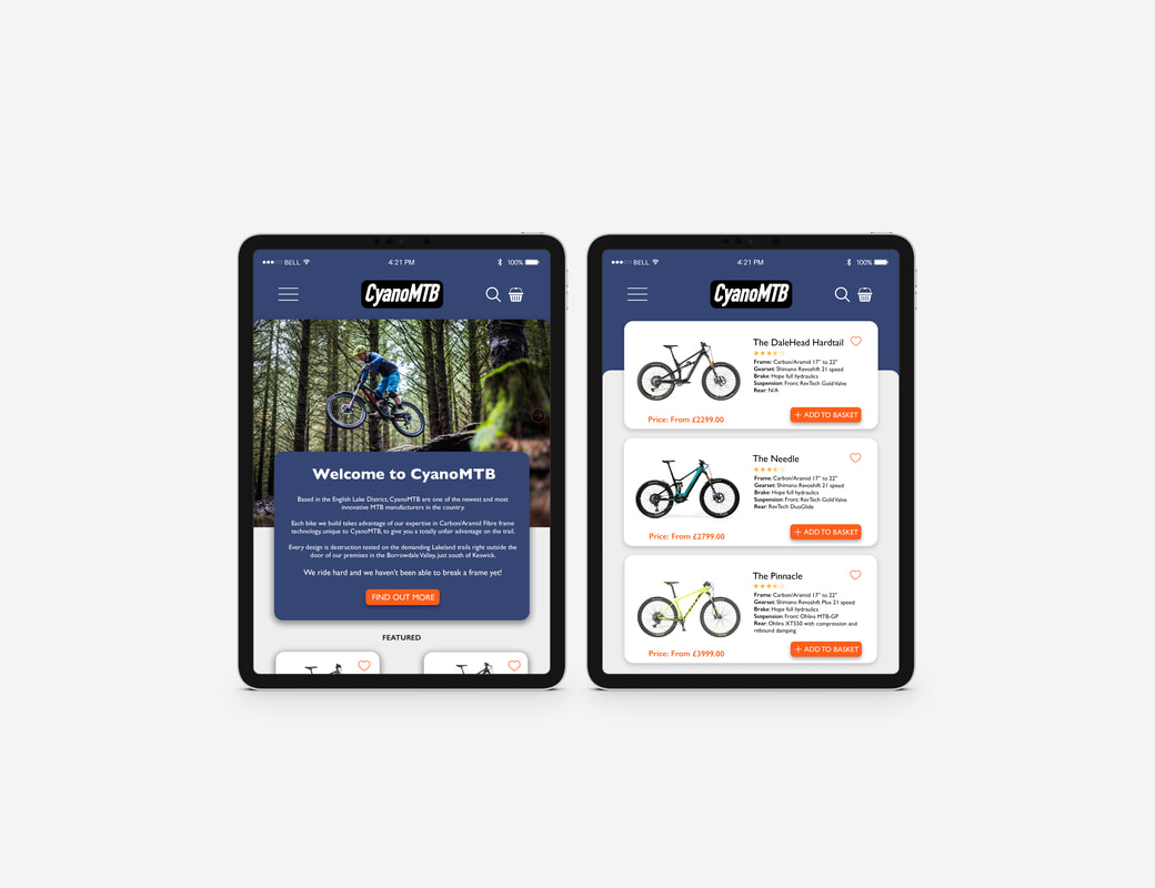 Asymmetrical/Complimentary Colour I then began designing my second set which would be asymmetrical with a complementary colour scheme. I experimented briefly with a couple different colour options until I settled on the green and yellow; a classic representation of adventure and the outdoors.   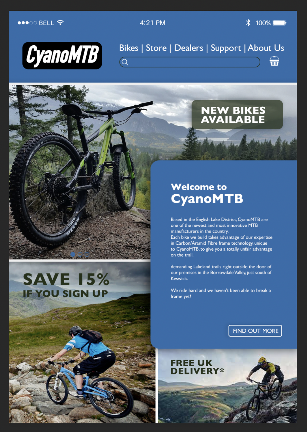  Here are some screenshots of the Photoshop documents showing the grids I used to show the layout and alignment: 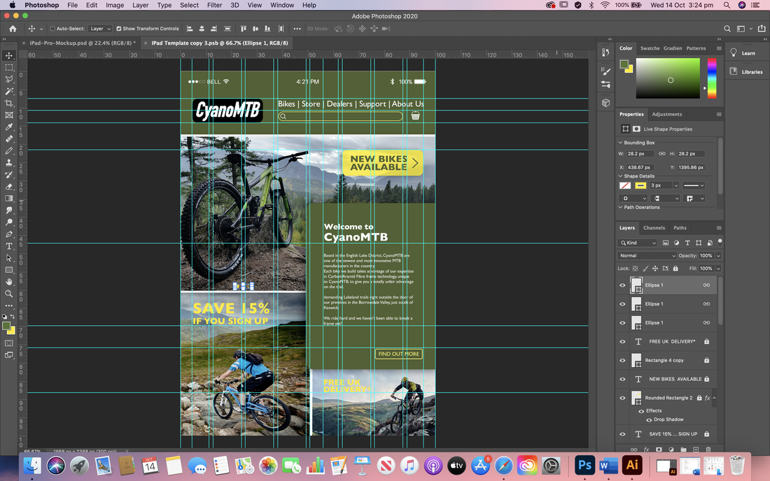  Final designs for asymmetrical balance and complimentary colour scheme:   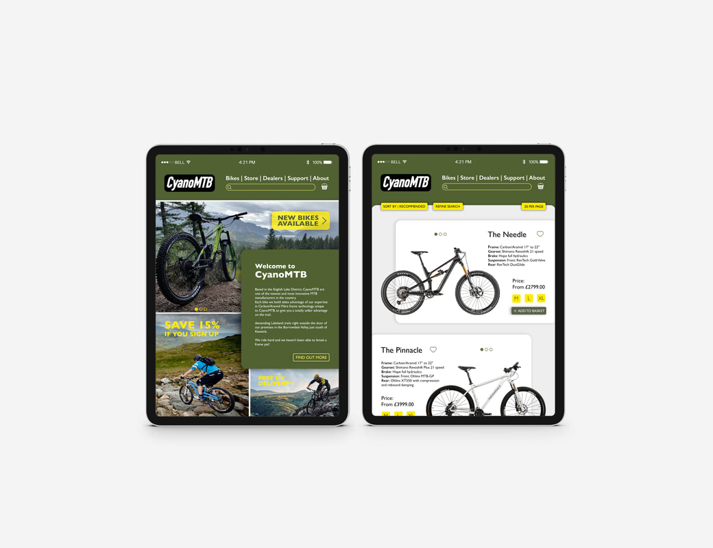
0 Comments
Leave a Reply. |
AuthorHi, I'm Emma. I'm currently studying Graphic Design at the University of Cumbria. Modules
All
Archives
May 2021
|
 RSS Feed