
|
Brief For our final project of the year, we had to design an infographic on a subject of our choice, by assembling data and presenting it in an engaging and informative way. Research I began by doing some general research on some examples of existing infographics to inspire me. I particularly liked the designs with bright colours, vector style illustrations and ones in a long portrait format so more information can be included. I also watched the LinkedIn course we were linked to on Blackboard to understand more about the process. I then began thinking about topics I was interested in and that would have good statistics t include in my infographic. Some of my interests I thought could work include, veganism, animal testing, space, 'Zelda', plants, Harry Potter, and mental health. I eventually decided on researching about animal agriculture, a topic I'm passionate about. I have been following a vegan diet myself for the last five years after discovering many shocking facts about what really goes on in the world of mass animal farming; how cruel it is, and how it effects your health and the environment. Animal Agriculture Research
Effects of animal agriculture on the environment:
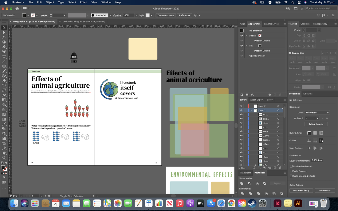
Initial Ideas After doing some research, I began sketching some initial ideas to visually show the data I found; using related objects and cutting them up to show percentages and numbers, using illustrations to represent statistics, etc.  I then tried to sketch out some possible layouts/wireframes to explore how the data could be arranged. My idea is to have a section for each sub-topic; animals killed/percentage of meat eaters vs non meat-eaters, water usage, pollution, land usage and possibly also a section on fishing, so its easier to digest. I thought a long portrait format would help organise the sub-topics in an order but I also thought a landscape poster would work well, possibly as a double-page spread in a vegan lifestyle magazine to give it more context. For example, it could have a main illustration (maybe a map) in the centre, then little graphics and graphs surrounding, or the sections in blocks of colour.  I then looked for some inspiration, specifically for the styling of the infographics illustrations. I wanted it to be digitally drawn with a vectorised feel but look slightly more organic with more texture. I was inspired by how some of the images below were just simply hand-drawn style line art, and even the more detailed illustrations being still very minimal.   I then thought about colour combinations that I could experiment with; lots of green, blue and orange to represent the environmental theme. I also looked into typefaces. I really like the more handwritten, organic style shown in some of the above posters, but also thought a more simple, serif font would pair nicely with the illustrations and be more eligible. I wanted the whole design to look friendly so that the theme of the infographic didn't make the viewer feel like they were being made to feel bad or being shouted at for contributing to the issues. Development Here I started to experiment a little with the styling, using my original sketches and recreating them digitally, first in a simple flat vector style, then trying to add some texture and shading.   I then began experimenting a little with pairing the initial illustrations with the typography to see how it could be laid out. I thought the more sketchy typeface went pretty well with the more vectorised, flat visuals but I also wanted to flip this around and do the opposite; going back to my original pen and paper sketches and pair those with a simple, sans serif font. I then began trying to develop the whole layout of the magazine spread. Many of the illustrations I tweaked or drew from scratch as I was going so that they would fit perfectly into the spaces and make the whole page flow properly. After a lot of experimenting with type choice, I settled on 'DIN' and 'Palatino', which both had a good range of different weights for variation. I liked how the styling developed into a sort of newspaper style. 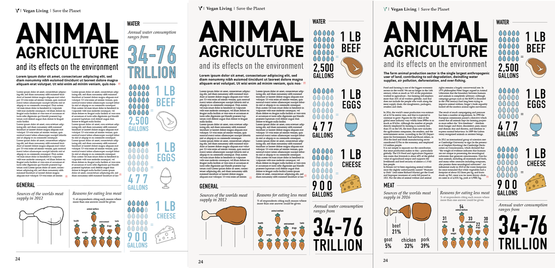  Here are the final illustrations for my infographic data visuals. I tried to keep the hand drawn feel, using a textured digital brush on Procreate and used a friendly looking colour palette. 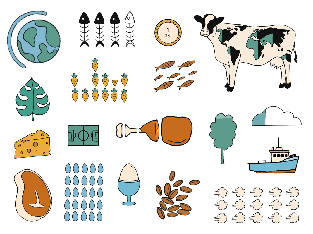 Final Piece Here is my final design, all mocked up as well as some close ups. Im actually quite happy with how it turned out; I think I managed to keep the charm of my original sketches with the hand drawn, contemporary vibe, even though its a lot different to how I originally envisioned. I did consider changing the bold type to a colour other than black to make it pop more but I felt like there would either be too many colours or the balance would be off so I kept it black.   Sources: https://www.vegansociety.com/news/media/statistics https://www.cowspiracy.com/facts https://www.bbc.co.uk/news/business-44488051 https://ourworldindata.org/land-use https://www.theguardian.com/news/2018/may/07/true-cost-of-eating-meat-environment-health-animal-welfare Image References:
0 Comments
The Global Village and Trade Without Borders Globalisation contains two interlinking themes, one of which is the 'global village', the occurrence of the world being connected by means of communication such as the internet. It is thought that this community share a common destiny, containing a mix of local/indigenous culture with global influences. There is also a disproportionate effect of one culture over another, and an economic and technological impact on community relations due to it being a post-traditional community. Traditional communities tend to have a sense of roots, belonging, and historical ties, and have fixed local work patterns. They also usually contain a fixed spatial environment of private and public spaces, shared rituals such as celebrations and community events, and a respect for community hierarchy. In post-traditional communities, people move around more frequently, either for work or leisure, through the generations. The spatial environment changes to accommodate socio-economic change, and the internet creates a growth of online virtual communities. Growth in global economies trace back to the 1980s, showing movement in the west from manufacturing to service based, and a collapse of institutional barriers to trade and rise of global brands. Global Corporations The Canadian author, social activist, and filmmaker, Naomi Klein, argues that this growth marked the movement from production to branding. Corporations are immortal, accumulating power, wealth and influence, as well as able to change their operation quickly. They are also aggressively competitive, driven by profit and growth and can change their ideology to suit location. A corporate brand is a signifier of image, lifestyle, attitude and myth; it includes a designed identity and logotype that is spread via methods such as advertising, celebrity endorsement and product placement. The growth of high concept advertising means there's an absence of product and the production process is hidden from view; its not part of the brands construction. The manufacturing process is outsourced, usually from parts of the developing world such as Indonesia, Korea, etc, to minimise labour costs. Ethical Design The anti-corporate movement has been growing since the early 1990s, creating an increase in politicisation, awareness and anti-consumerism. The use of social media creates subcultures and community forums in cyberspace where design is used as a weapon of propaganda, subversion and culture jamming. Some creative resistance strategies include brandalism, detournement (hacking), subvertising, pranksters and interventions, urban environmentalists, virtual communities, and ethical and sustainable design/art practice. The 'First Things First' 2000 manifesto is a rewrite of the 1964 FTF document, redesigned for a global/corporate age and signed up to by leading designers/artists; design as a weapon for social change. A designers ethical code expresses how responsible you feel you are for the work you put out into the world and how far you should be guided by your conscience as a creative. There are many artists and designers who take a strong ethical and/or political stance in their work, one of which is Jessica Walsh, who alongside Stefan Sagmeister, illustrated 40 pins consisting of designs that protest Donald Trump and instead encourage Americans to vote for Hilary Clinton. The idea behind this project came from the popularity of pins among young people and it was thought that it could inspire them to register to vote. It was discovered that in the 2012 election, only 26% of millennial voted, meaning 48 million votes were lost. The designs 'promote love, tolerance and kindness' and encourage voters to 'wear their heart and politics on their sleeves'. Another artist who takes a strong ethical stance in their work is Benjamin Von Wong, a Canadian artist, activist, and photographer famous for his 'environmental art installations and hyper-realist art style'. His photography 'combines everyday objects with shocking statistics' to create awareness on plastics, electronic waste and fashion pollution. There are also many well known graphic designers with strong opinions on ethics/politics, one of which is Milton Glaser. He originally intended to be as professional as he could, but later made the realisation that graphic design is essentially unprofessional; "what is required in our field, more than anything else, is continuous transgression. Professionalism does not allow for that because transgression has to encompass the possibility of failure". In other words, designers can not be sure that their ideas will be successful. Herb Lubalin is another American designer with strong ethics; he quit working for a successful agency to set up his own design studio as he didn't like the idea of selling people things they didn't need. Sources:
Notes: Defining Gender 'Sex' refers to the biological differences between men and women, whereas 'gender' refers to the cultural roles of masculinity and femininity; they are social constructs. Definitions of gender are specific to time and place and roles change over time to reflect broader social change within media and wider visual culture. Non-binary is a spectrum of identities, and transgender suggests that gender identity does not correspond with a persons birth sex. The Male Gaze - Laura Mulvey In this essay, man is said to make themselves better than by making woman lesser than. The male gaze refers to the act of representing women in media from a male point of view, reducing them to objects of male pleasure. The British feminist film theorist, Laura Mulvey pointed to three perspectives; the man behind the camera, the characters in the film and the male viewer. Therefore, women are presented in a way that depicts them as being passive and observed and the men as the active observers; the male gaze projects its fantasy on the female figure. Pleasure from film comes from 'using another person as an object of sexual stimulation through sight', and/or identifying with the image seen, developed through narcissism and composition of the ego. The woman's function is as an 'erotic object for the characters within the screen story, and as an erotic object for the spectator' watching. Whereas I do agree that in the past these ideas of sexual objectification were very obviously portrayed in the media, I feel a lot has changed since then; we now see a lot more powerful female leading roles in todays movie scene, where they are not as sexualised, but there is still a lot of room for improvement regarding equal portrayal of males and females. The Power Dynamic Gender roles suggests that men inhabit the world of paid work whilst women inhabit the world of the home, and are rarely shown in positions of power in the workplace. Men are displayed as active, forceful, reserved and alert whilst women as seen as passive, emotional and tactile; the 'feminine touch'. Analysing Style Magazines It is questionable that magazines accurately reflect real men and women and could actually be promoting myths about femininity and masculinity. They occupy the world of leisure/pleasure, selling a future happier self, potentially linking the consumption of content with gender identity. Bignal argues that style magazines amplify differences between masculinity and femininity and draw upon familiar cultural codes.  Mens style magazines seem to be firmly heterosexual in their content, reinforcing outdated, misogynistic ideologies of a society in which men hold all the power. They tend to use unrealistic male role models such as above, suggesting a more serious tone, in conjunction with the article titles and colour palette. This contrasts to women style magazines which tend to link femininity with consumerism and regularly depict different viewpoints on things such as a woman's body image. The above example depicts a posed, airbrushed celebrity; the 'feminine touch', with articles mainly related to fashion, beauty and sex, suggesting women are self-obsessed and superficial. Sources:
Notes: What is Subculture? Subculture goes back to the 1800s and early studies refer to it as as deviant groups or urban underclass. It is also associated with post 1945 youth subcultures, defined as a 'group' who rebel against the mainstream; their beliefs don't always align with those of wider culture. Mainstream culture is the organisation of a society into hierarchical structures shaped by politics, media, social and corporate interests and reflects the interests of powerful social groups which can only operate through agreement/consensus. "A subculture...signals a breakdown of consensus" as it involves a refusal to participate and desire to disrupt elements in mainstream culture (Hebdige). According to Ross Haenfler, those within a subculture share an identity and see themselves different to others, and 'many subcultures feature connections to particular music styles and fashions. Both serve as vehicles of self-expression and collective opposition'. 'New Age' Subculture One example of a subculture is 'New Age', consisting of groups that share enthusiasm for creation of a new era full of harmony and enlightenment. They believe that a heightened spiritual consciousness and social/personal transformation can eradicate hunger, sickness, poverty, racism, sexism and war.The movement grew popular during the 1970s and 1980s through the teaching of people such as David Pangler, an American spiritual philosopher and self-described "practical mystic", and originates from ideas such as Hinduism and Buddhism.  Those a part of the new age subculture practice physic readings, tarot cards, yoga, mediation, astrology, reincarnation, crystal healing, natural healing and traditional medicines such as acupuncture, herbal therapy, natural foods. A lot of the music in this genre is instrumental and electronic, creating visions of a better future and world; celestial and ambient. Style usually includes long hair and dreadlocks but also short and brightly dyed with bright eccentric clothing such as Indian pyjamas panned and nomad tops. Sources:
Notes: |
AuthorHi, I'm Emma. I'm currently studying Graphic Design at the University of Cumbria. Modules
All
Archives
May 2021
|


 RSS Feed