
|
Brief For our final project of the year, we had to design an infographic on a subject of our choice, by assembling data and presenting it in an engaging and informative way. Research I began by doing some general research on some examples of existing infographics to inspire me. I particularly liked the designs with bright colours, vector style illustrations and ones in a long portrait format so more information can be included. I also watched the LinkedIn course we were linked to on Blackboard to understand more about the process. I then began thinking about topics I was interested in and that would have good statistics t include in my infographic. Some of my interests I thought could work include, veganism, animal testing, space, 'Zelda', plants, Harry Potter, and mental health. I eventually decided on researching about animal agriculture, a topic I'm passionate about. I have been following a vegan diet myself for the last five years after discovering many shocking facts about what really goes on in the world of mass animal farming; how cruel it is, and how it effects your health and the environment. Animal Agriculture Research
Effects of animal agriculture on the environment:
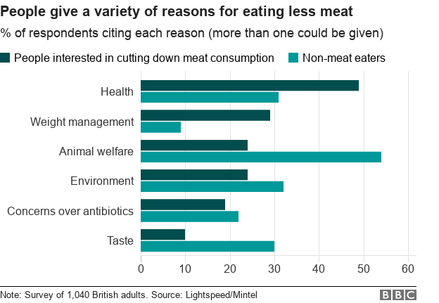
Initial Ideas After doing some research, I began sketching some initial ideas to visually show the data I found; using related objects and cutting them up to show percentages and numbers, using illustrations to represent statistics, etc.  I then tried to sketch out some possible layouts/wireframes to explore how the data could be arranged. My idea is to have a section for each sub-topic; animals killed/percentage of meat eaters vs non meat-eaters, water usage, pollution, land usage and possibly also a section on fishing, so its easier to digest. I thought a long portrait format would help organise the sub-topics in an order but I also thought a landscape poster would work well, possibly as a double-page spread in a vegan lifestyle magazine to give it more context. For example, it could have a main illustration (maybe a map) in the centre, then little graphics and graphs surrounding, or the sections in blocks of colour.  I then looked for some inspiration, specifically for the styling of the infographics illustrations. I wanted it to be digitally drawn with a vectorised feel but look slightly more organic with more texture. I was inspired by how some of the images below were just simply hand-drawn style line art, and even the more detailed illustrations being still very minimal.   I then thought about colour combinations that I could experiment with; lots of green, blue and orange to represent the environmental theme. I also looked into typefaces. I really like the more handwritten, organic style shown in some of the above posters, but also thought a more simple, serif font would pair nicely with the illustrations and be more eligible. I wanted the whole design to look friendly so that the theme of the infographic didn't make the viewer feel like they were being made to feel bad or being shouted at for contributing to the issues. Development Here I started to experiment a little with the styling, using my original sketches and recreating them digitally, first in a simple flat vector style, then trying to add some texture and shading.   I then began experimenting a little with pairing the initial illustrations with the typography to see how it could be laid out. I thought the more sketchy typeface went pretty well with the more vectorised, flat visuals but I also wanted to flip this around and do the opposite; going back to my original pen and paper sketches and pair those with a simple, sans serif font. I then began trying to develop the whole layout of the magazine spread. Many of the illustrations I tweaked or drew from scratch as I was going so that they would fit perfectly into the spaces and make the whole page flow properly. After a lot of experimenting with type choice, I settled on 'DIN' and 'Palatino', which both had a good range of different weights for variation. I liked how the styling developed into a sort of newspaper style. 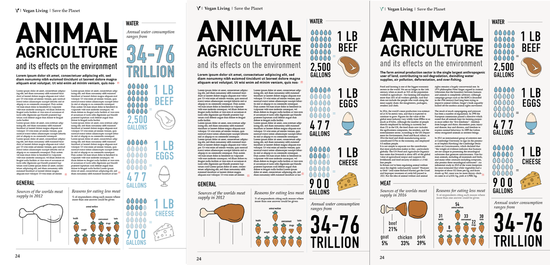  Here are the final illustrations for my infographic data visuals. I tried to keep the hand drawn feel, using a textured digital brush on Procreate and used a friendly looking colour palette. 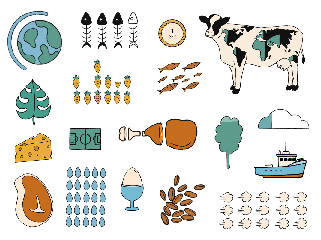 Final Piece Here is my final design, all mocked up as well as some close ups. Im actually quite happy with how it turned out; I think I managed to keep the charm of my original sketches with the hand drawn, contemporary vibe, even though its a lot different to how I originally envisioned. I did consider changing the bold type to a colour other than black to make it pop more but I felt like there would either be too many colours or the balance would be off so I kept it black.   Sources: https://www.vegansociety.com/news/media/statistics https://www.cowspiracy.com/facts https://www.bbc.co.uk/news/business-44488051 https://ourworldindata.org/land-use https://www.theguardian.com/news/2018/may/07/true-cost-of-eating-meat-environment-health-animal-welfare Image References:
0 Comments
Leave a Reply. |
AuthorHi, I'm Emma. I'm currently studying Graphic Design at the University of Cumbria. Modules
All
Archives
May 2021
|


 RSS Feed