
|
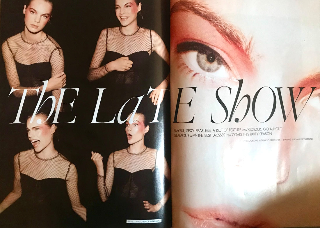
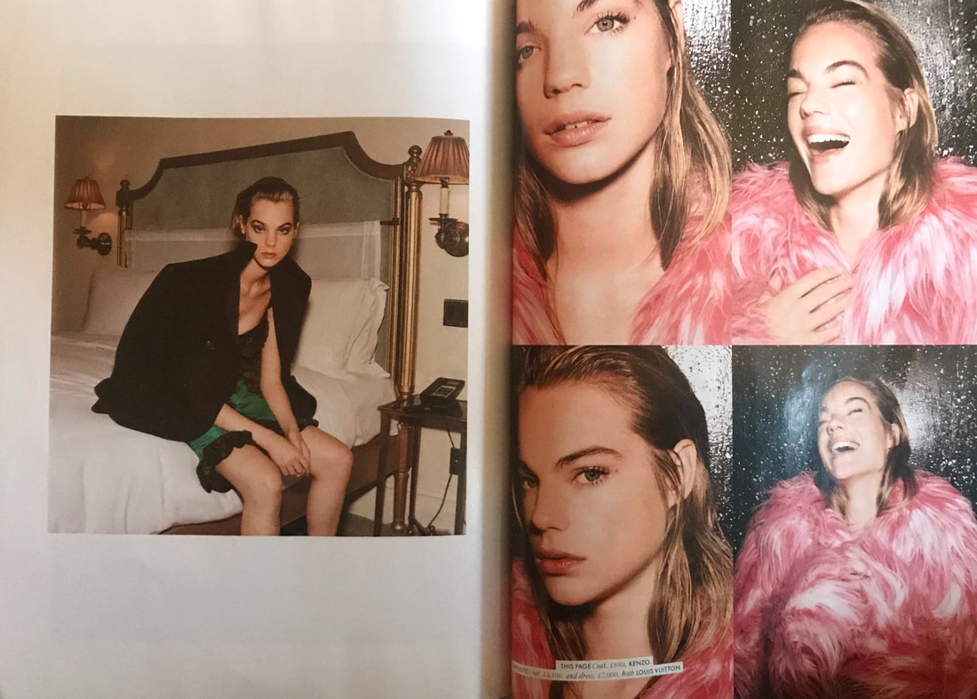
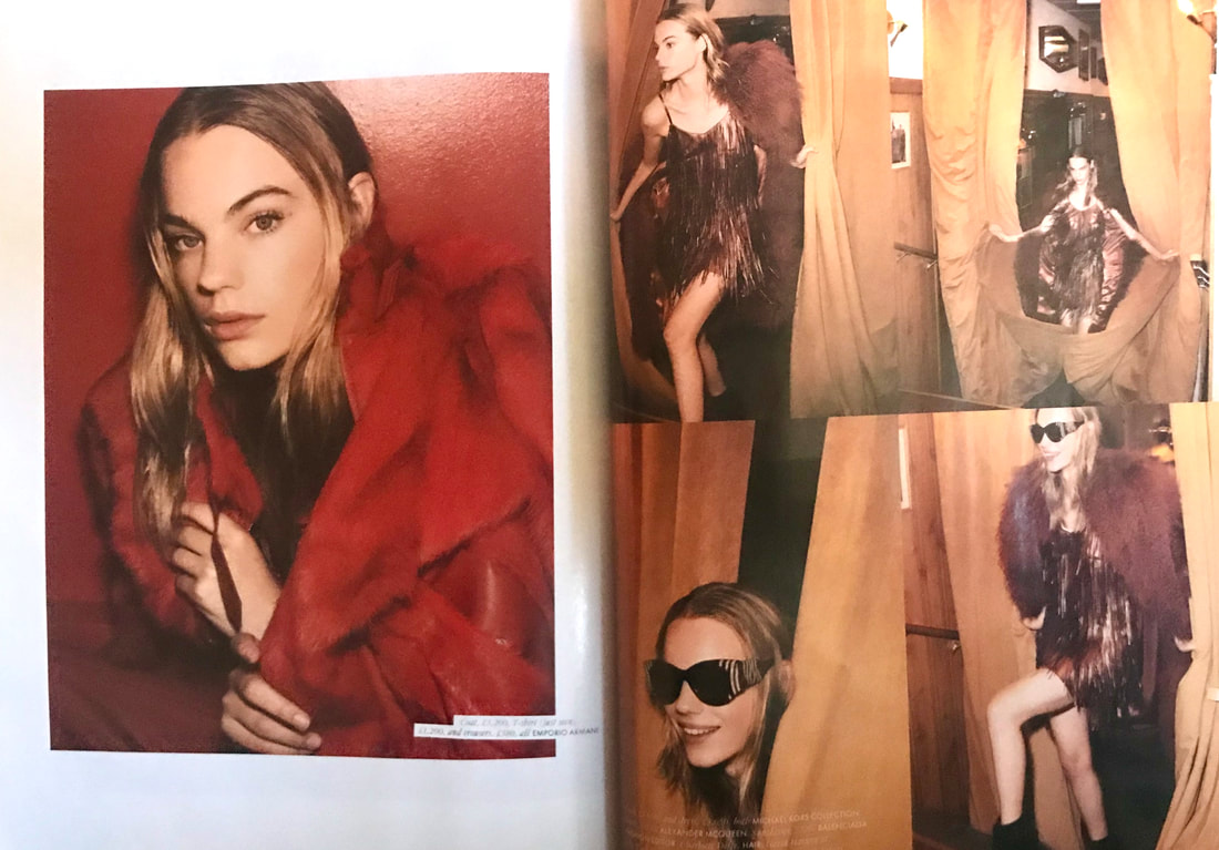
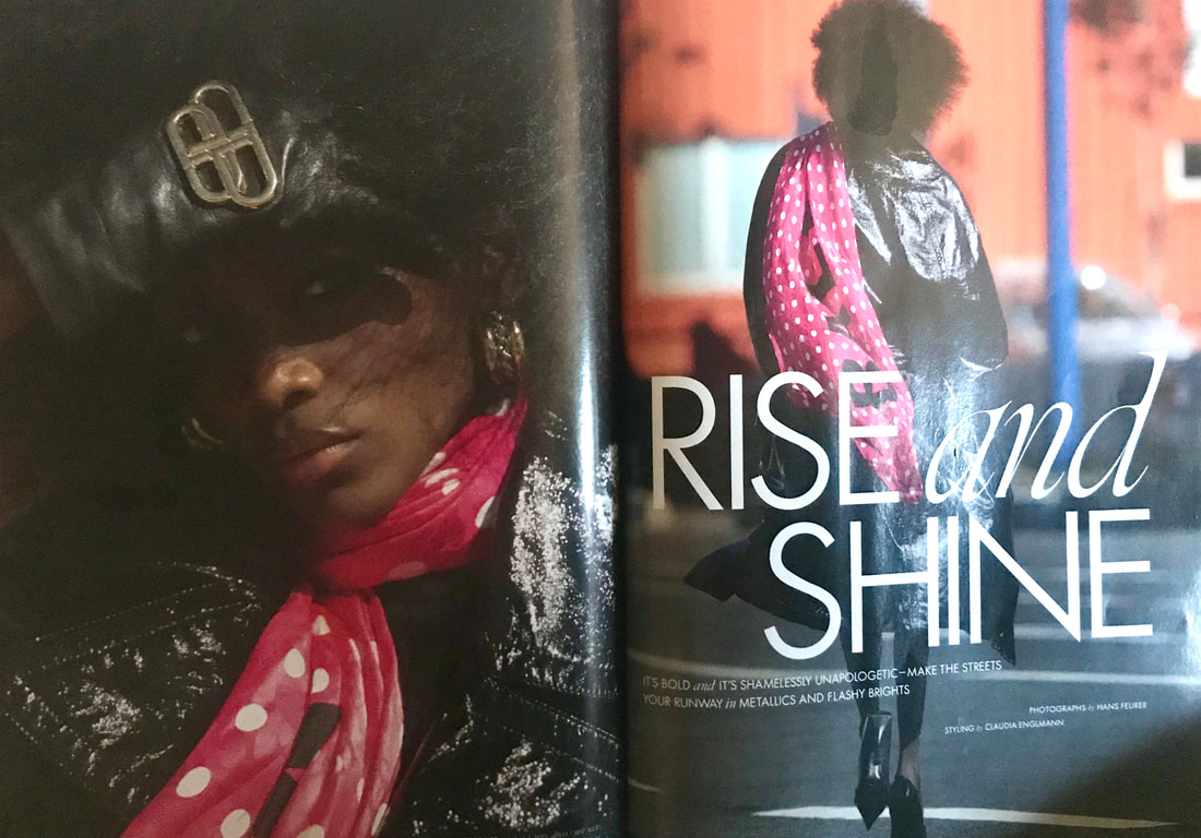
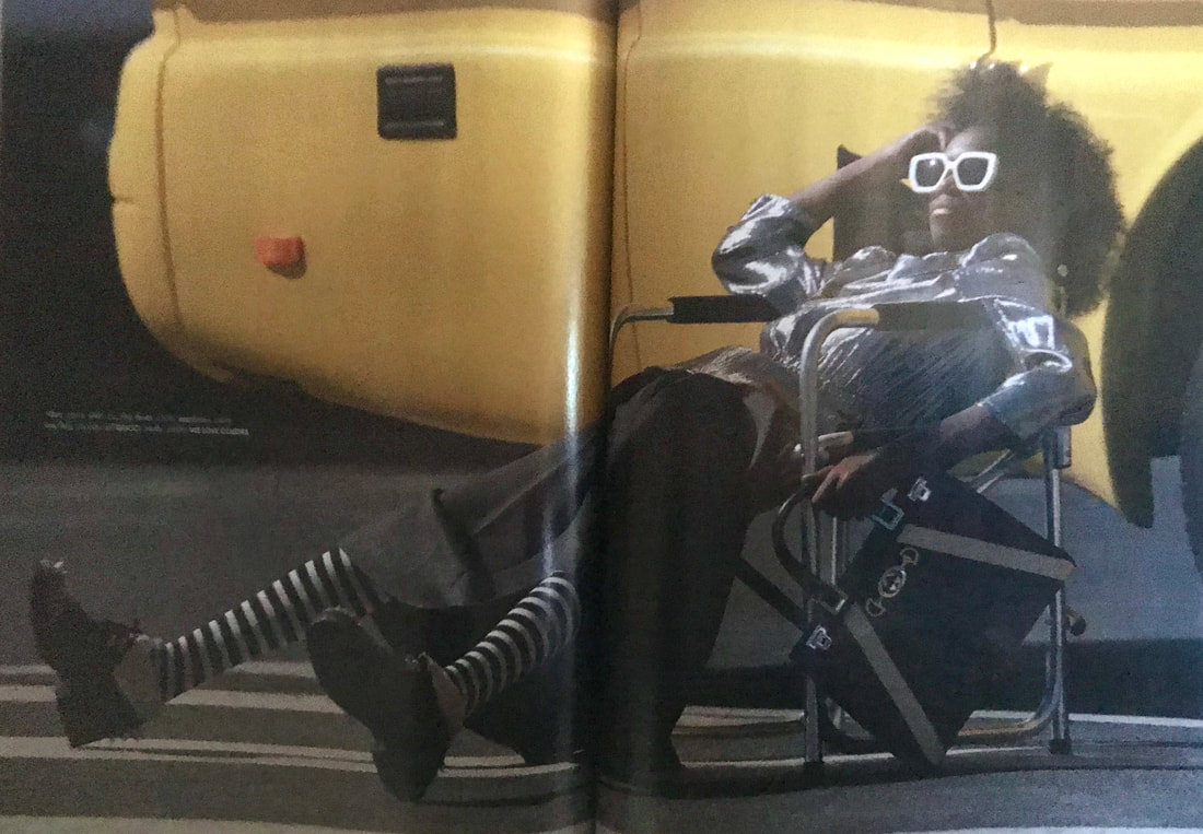
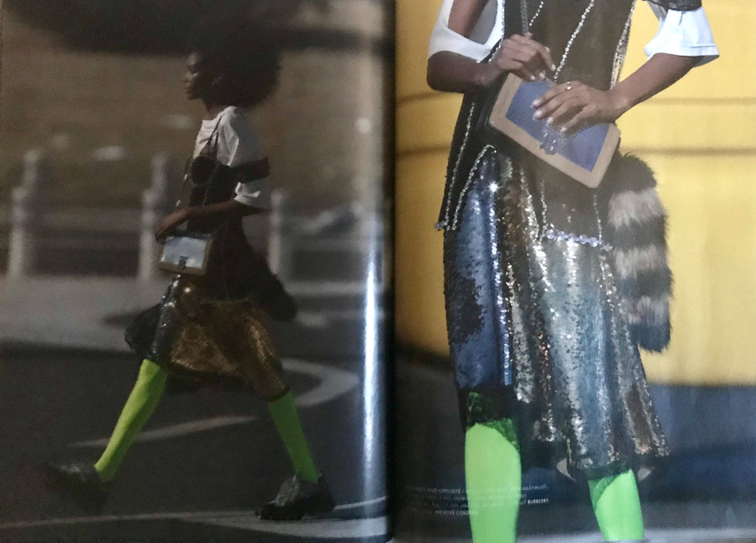
Fashion editorial storytelling refers to visual photographic stories used commercially and is considered to be a creative way of revealing the attitudes and tastes of the time, as well as woman self image. However, there are doubts as to whether it is to be considered a serious form of art or that it lacks in artistic integrity. After scanning through a few fashion publications, I chose to critique some fashion stories from the December 2019 issue of 'Elle' magazine. The first was called 'The Late Show' and illustrates the best dresses and coats for an audience interested in fashion for the party season. It depicts the models glamorously, using photographic imagery with playful poses, various candid shots and dark filters that make them look as if they were actually taken at a party. The typography is interesting as it contains a gentle mixture of serif fonts in addition to added curves and italics onto some of the letters. I think this could be said to represent the strength of the female but also the soft femininity of some of the elements of clothing advertised. Composition of the pages is kept slightly varied to give more interest, having some pages as single framed images and others more collage like to show a sequence of emotions and the movements of the models. Colours are also kept constant in every photo; outfits are complimented by the colours of the setting they are in. The entire piece just screams the vibe of having a good time. The second fashion story I wanted to critique is called 'Rise and Shine'; a fashion story featuring bold and colourful pieces for those who want to be noticed. The model is seen wearing a variety of interesting pieces; the photographic compositions are set in the streets to highlight the idea of standing out from the crowd. In addition the backgrounds are given slight pops of colour in contrast to the darker looking clothing, giving the images more interest. Poses are also mixed up, ranging from purposeful, typical type poses to more candid ones of the model walking through the street to give it a more real life feel, using natural light to capture the reflections of some of the shiny pieces. The typography is kept relatively simple, using a clean bold sans serif type face, leaving the real eye-catching parts to the photographic images themselves. Layout of images is also kept simple with constant use of covering the whole page and some double page spreads. Class Notes:
1 Comment
farwa
16/12/2023 04:48:30 pm
You highlight the significance of online revenue in your post.For more details,<a href="https://www.toprevenuegate.com/gr0pn8bu?key=3ba9748000ed23c471e3898c135fb943" target="_blank">Click here</a>. Leave a Reply. |
AuthorHi, I'm Emma. I'm currently studying Graphic Design at the University of Cumbria. Modules
All
Archives
March 2020
|
 RSS Feed