
|
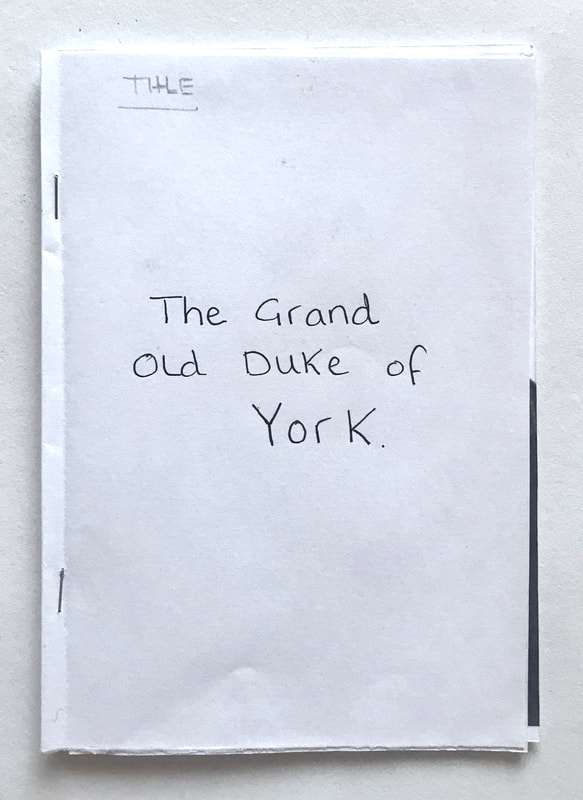
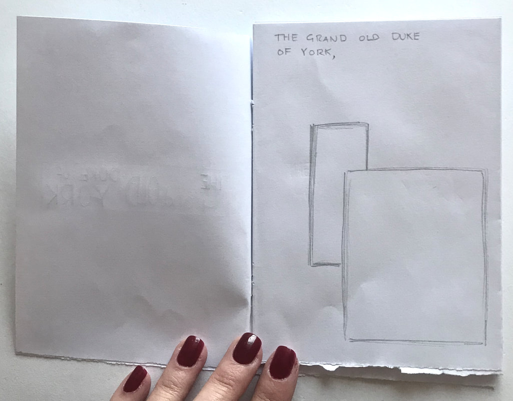
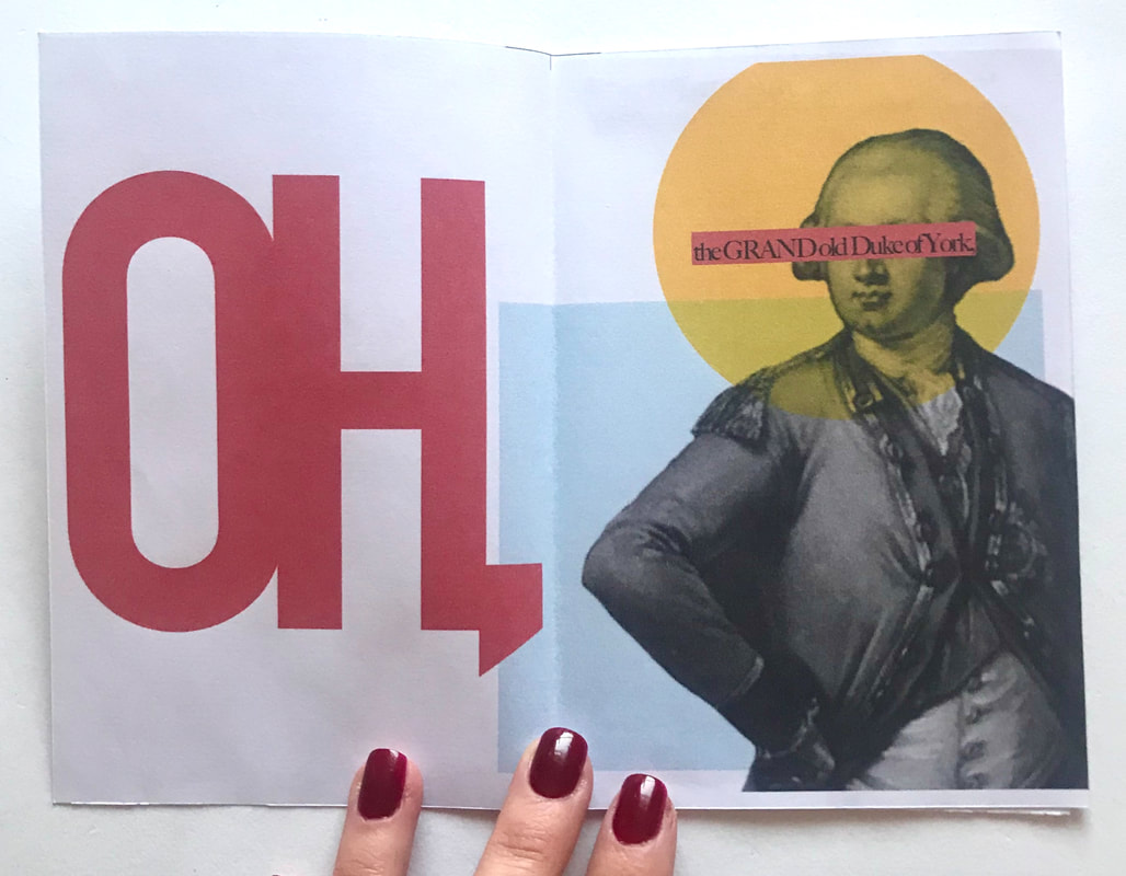
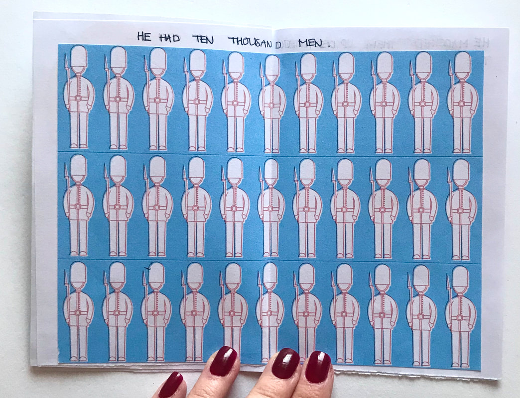
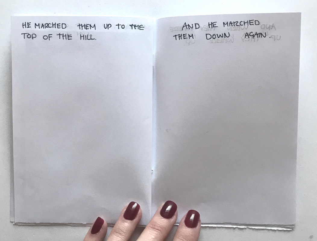
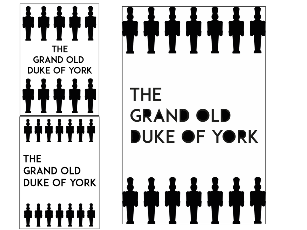
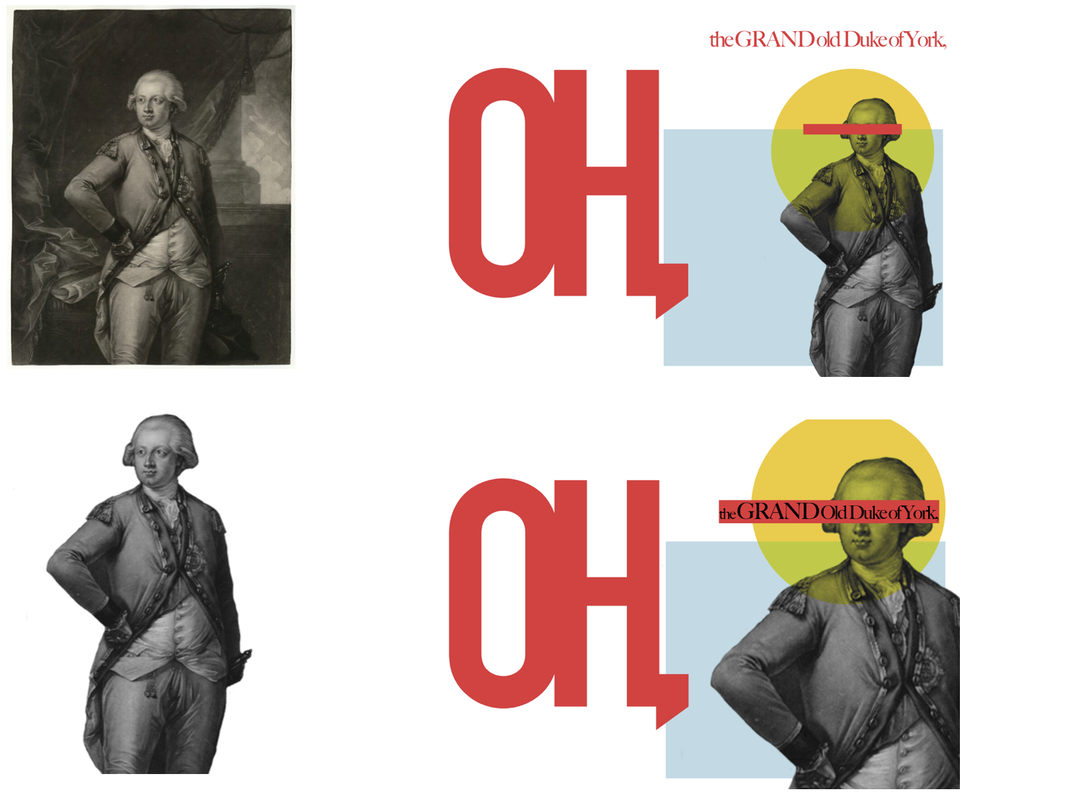
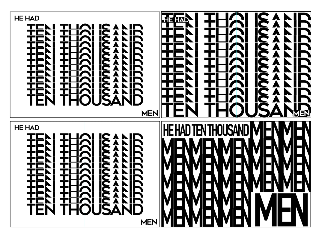
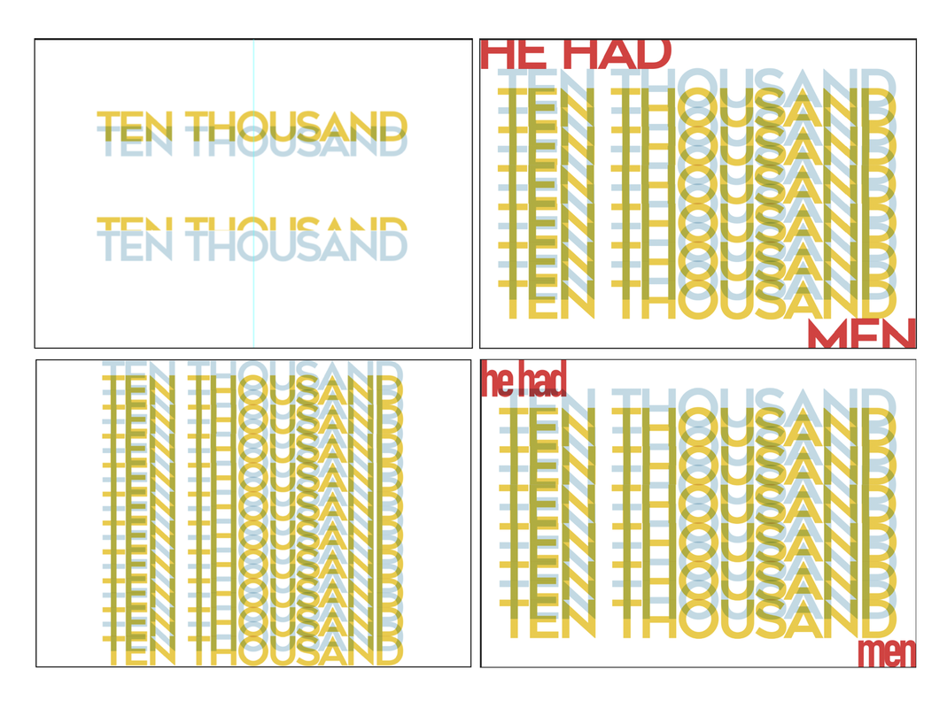
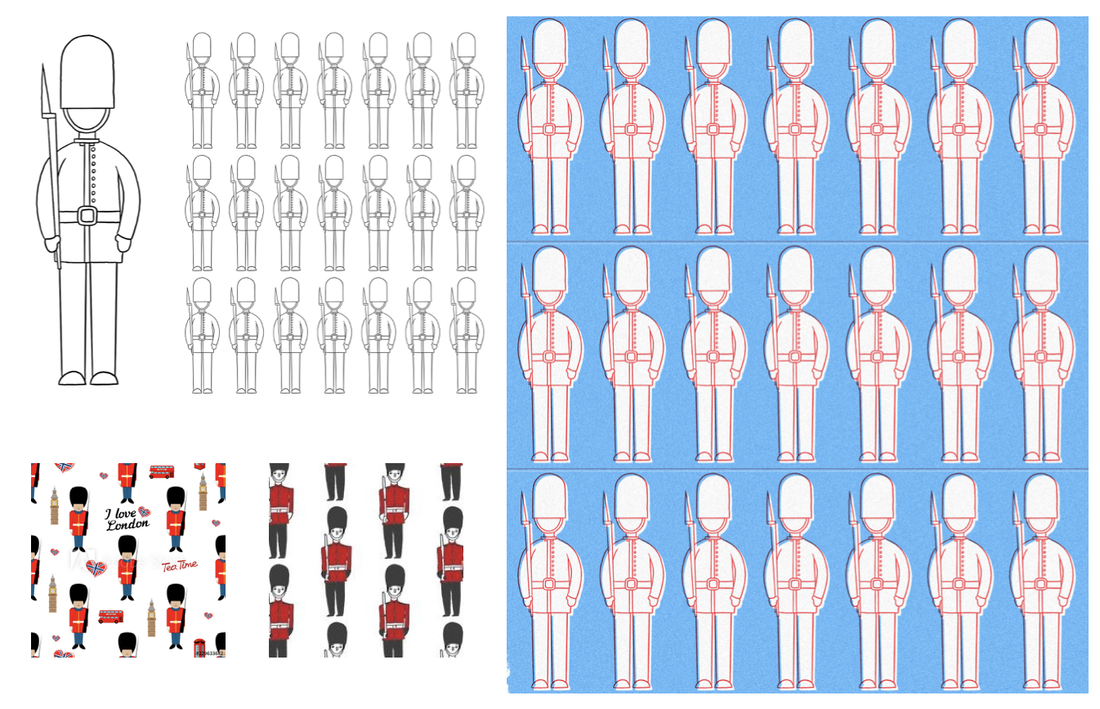
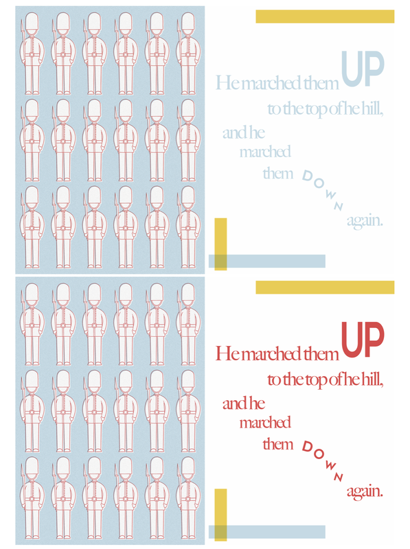
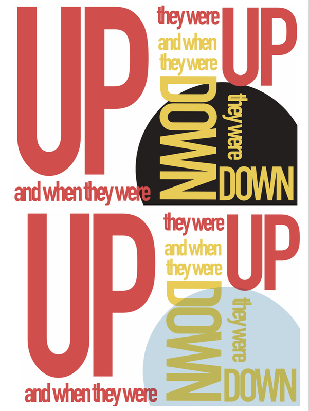
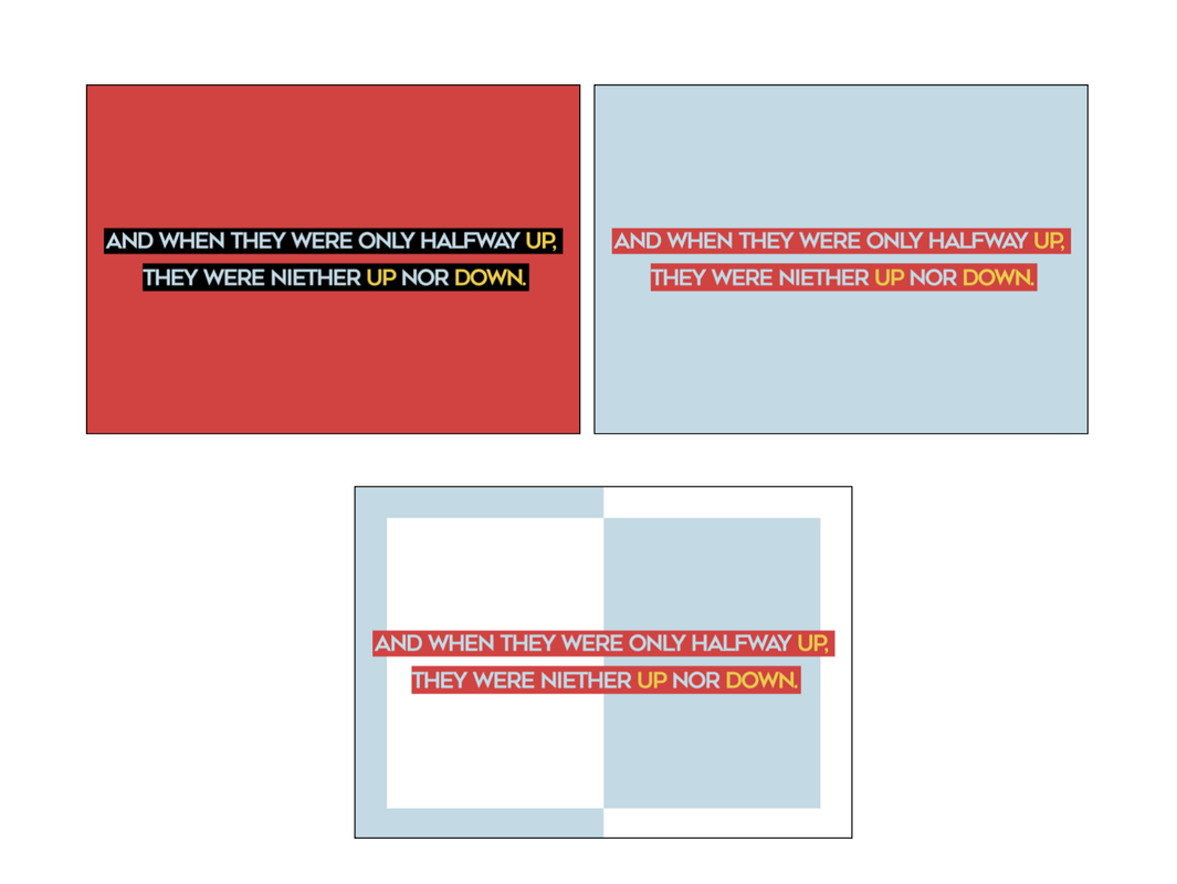
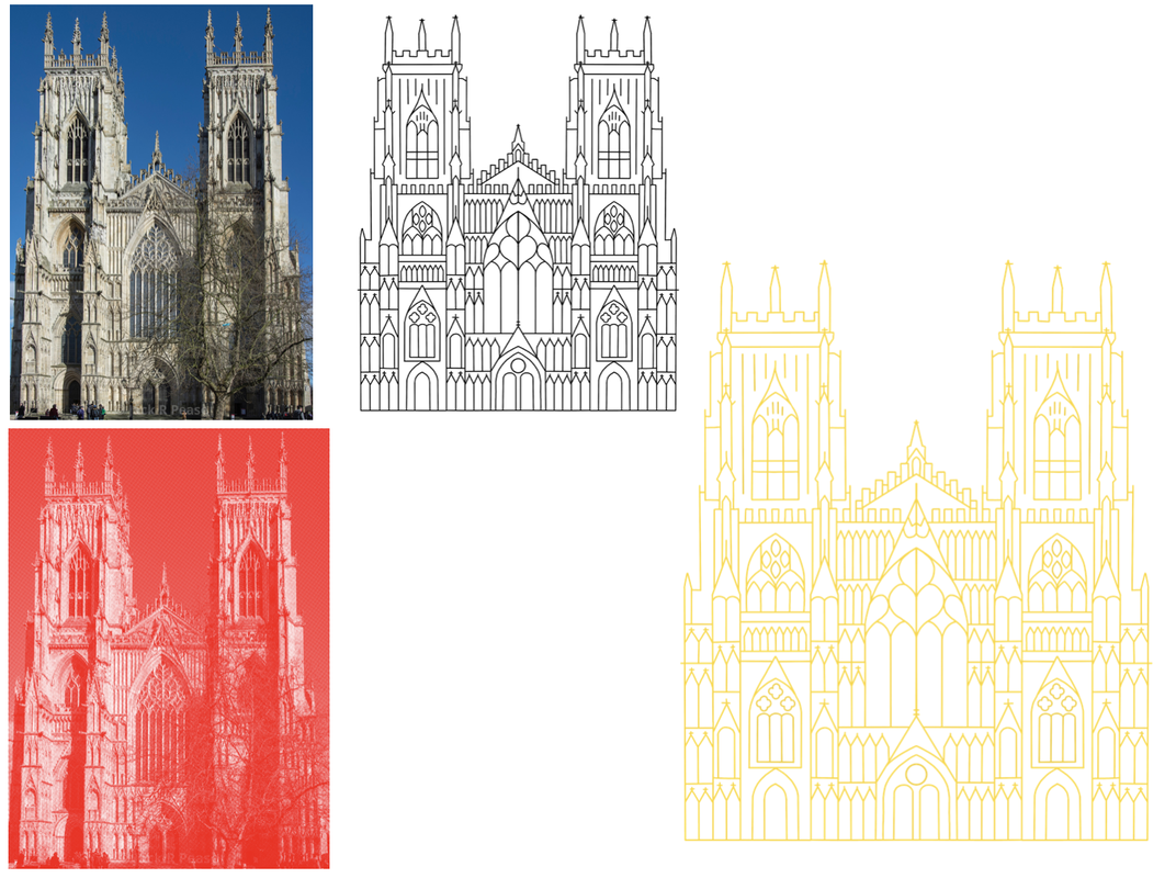
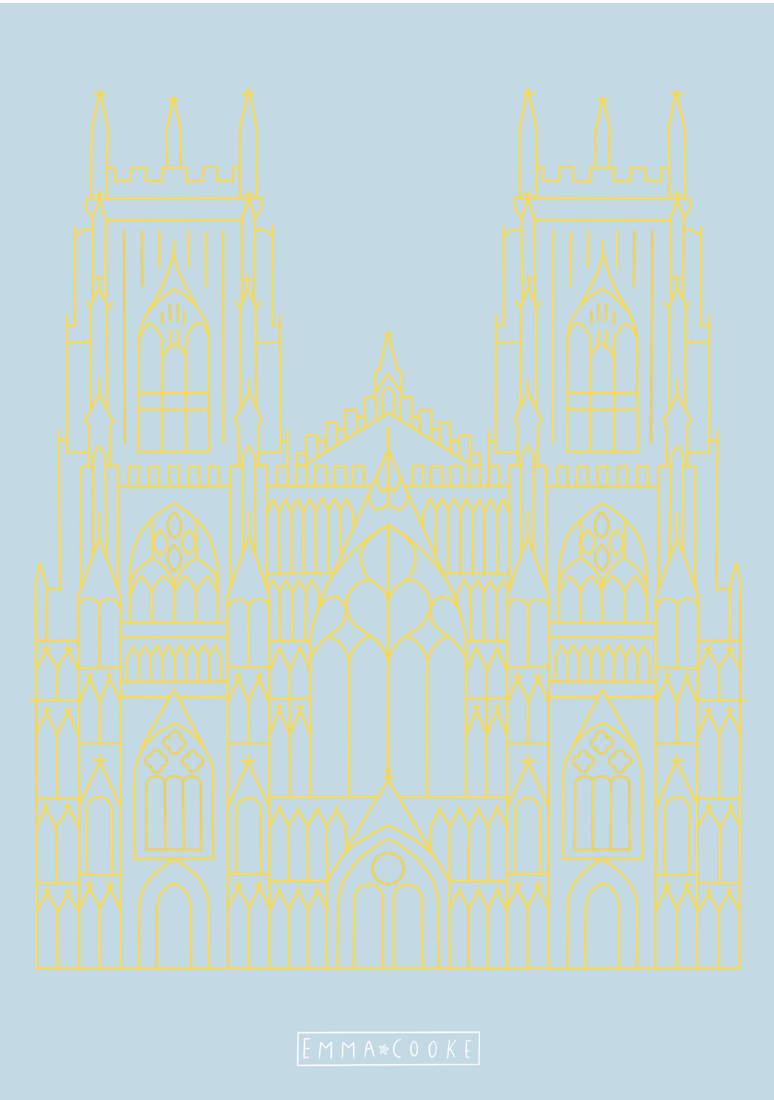
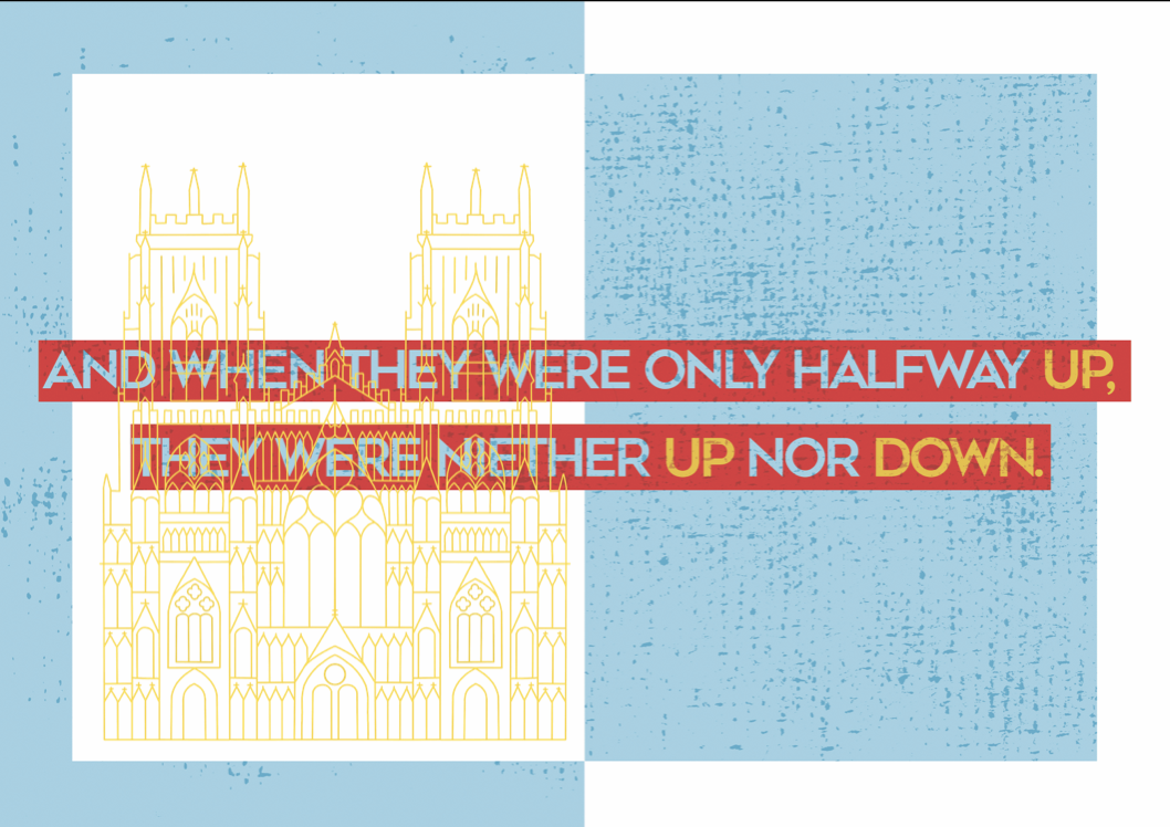
Brief For this brief, we were asked to create a 12-page bound book as a personal response to a nursery rhyme. I chose 'The Grand Old Duke of York'. The design did not have to be aimed at children and we had complete freedom with size, format and technique. Research I began by researching the rhyme online, trying to find any hidden or underlying meanings behind the storyline. I found that one theory behind the rhymes origins was that it is a reference to Prince Frederick, Duke of York and Albany during the French Revolutionary Wars, the 'hill' being the town of Cassel. The rest of my research revolved around looking up techniques for in Photoshop. I found a good set of tips from this website here, which I used to help me create a few of the effects in my book. I then began drawing up a couple of thumbnail ideas, thinking about if I wanted to include any variations of spreads, or cutting shapes into the pages. 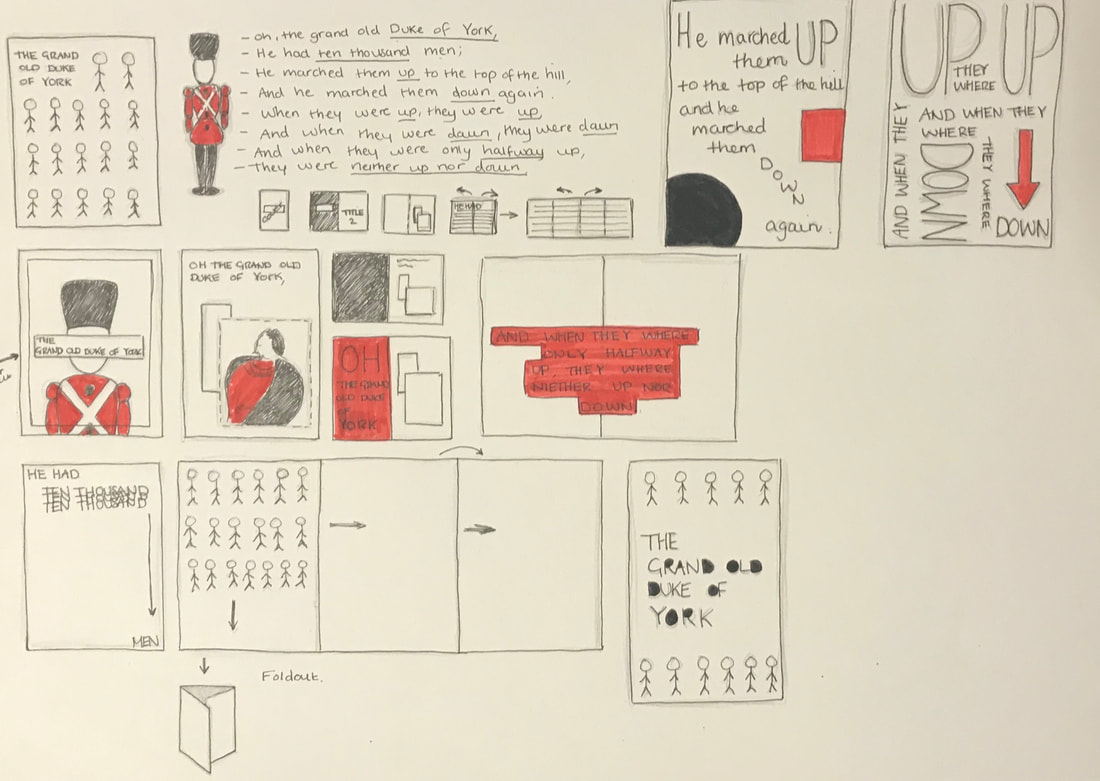 Mock Ups After my thumbnails I created a few quick mock ups in order to explore how I wanted it to be structured and which lines of the rhyme where going to be on each page. I decided due to the rhyme being short and because I needed it to fill up 12 pages, that there would be mostly double page spreads. I also experimented a little bit with cutting out the letters on the front cover to add more variation and interest. Development I began developing my ideas on Photoshop, trying out different layouts and ways to use type to represent the lines of the rhymes. I knew I wanted to focus more on using typography then actually illustrating the rhyme, but I still wanted to add some imagery so for the first line I chose to include a photo of the Duke of York (linked here). In addition, being inspired by some of the work I did for the activities the previous week, I wanted to incorporate simple shapes and colours throughout the pages. For the second line I played around with different ways to represent a 'thousand men' using type. For the third line I created a pattern for one of the pages taking this vector image of a soldier. I then created a rise print effect and played around with the colours to make it coherent with the other pages. I also played around with overlong a vector of the York Minister (here) onto one of the pages but later decided against it as I preferred the page without. Final Piece When I had done layout out my pages, I wanted to add some texture using noise and overlaying textures I downloaded here, in order to give it a more printed effect. For the cover I cut out the soldier silhouettes using a craft knife and stuck onto the underlying colours, and for the back I kept it simple and just added a little logo I made. I then uploaded the pages into Adobe InDesign, and printed and bound the book together using a simple saddle-stitch (stapled). I'm happy with the outcome of the project considering my lack of expertise with the programs I used. I did find it quite difficult to find different ways to change the type as the same words were repeated often in the rhyme but I think the pages work well together as a complete book nonetheless. 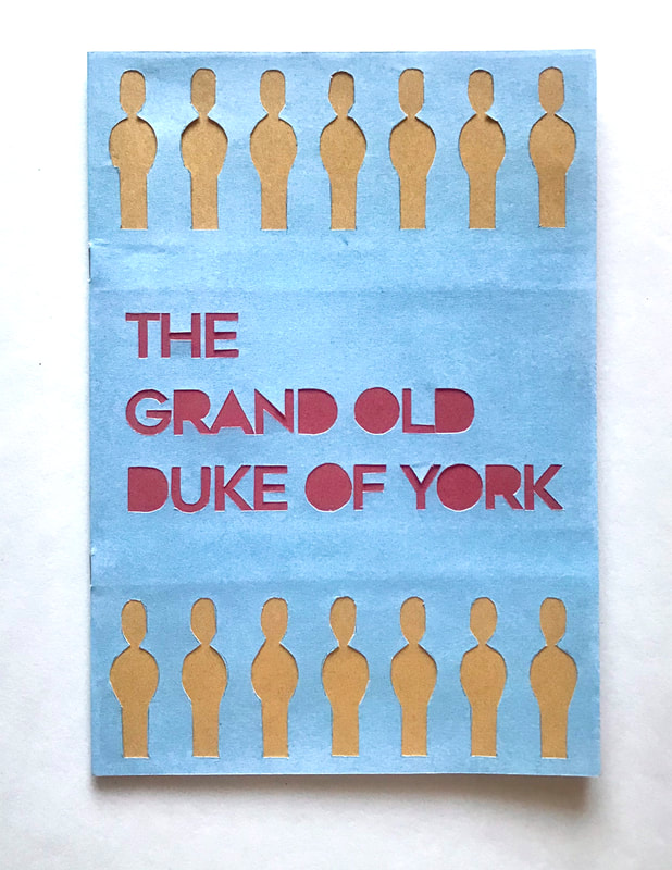 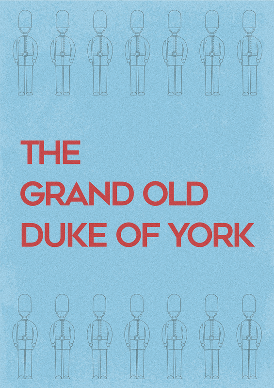 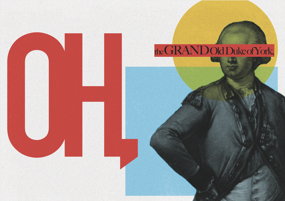 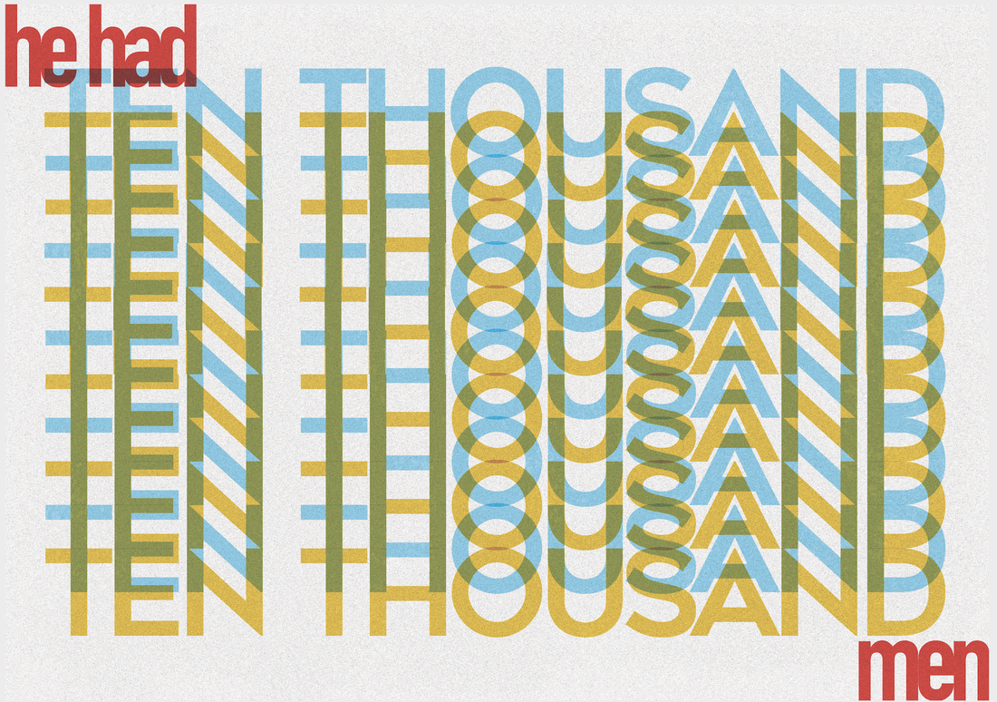 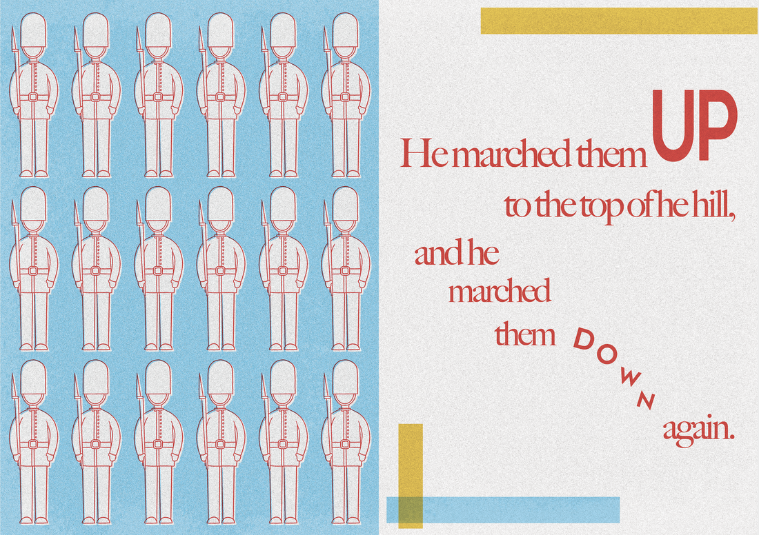 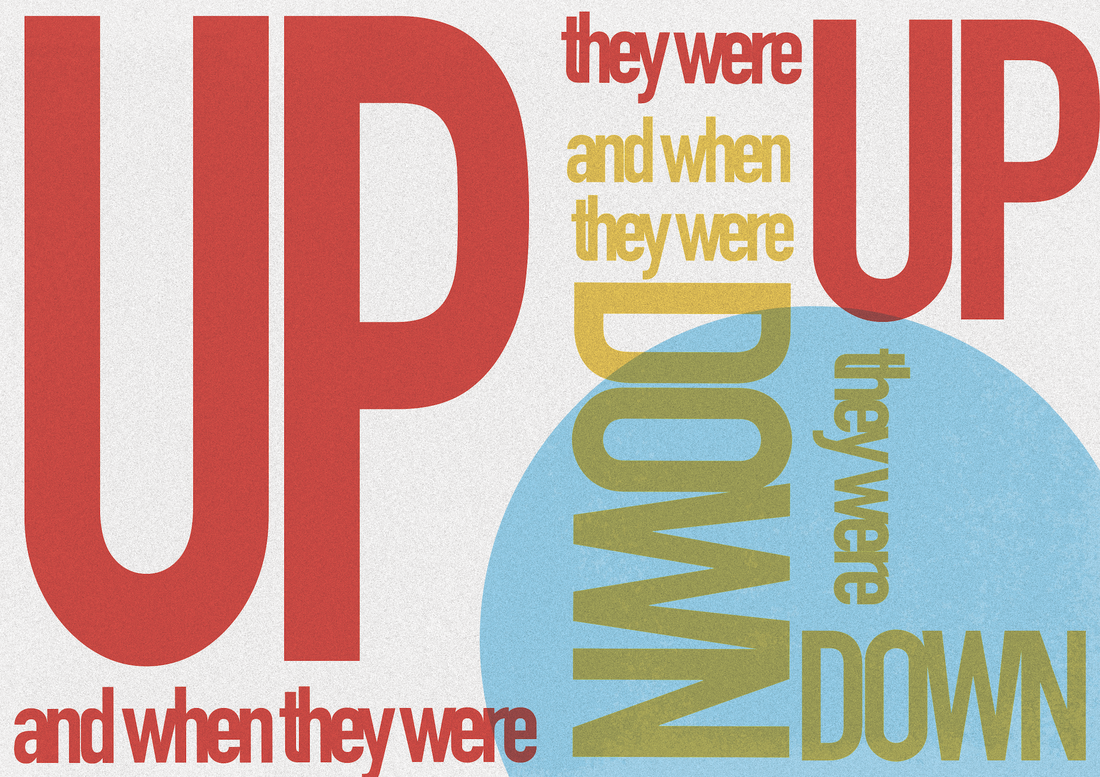 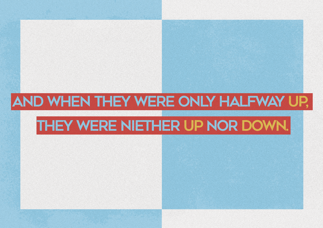 
0 Comments
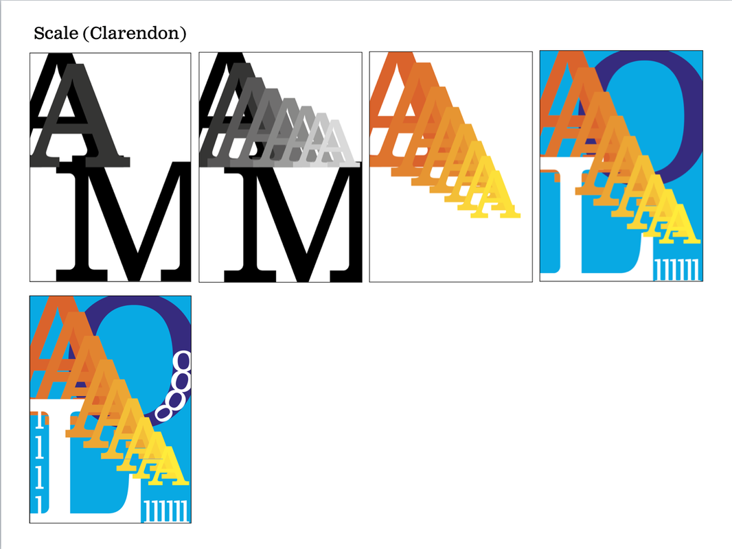
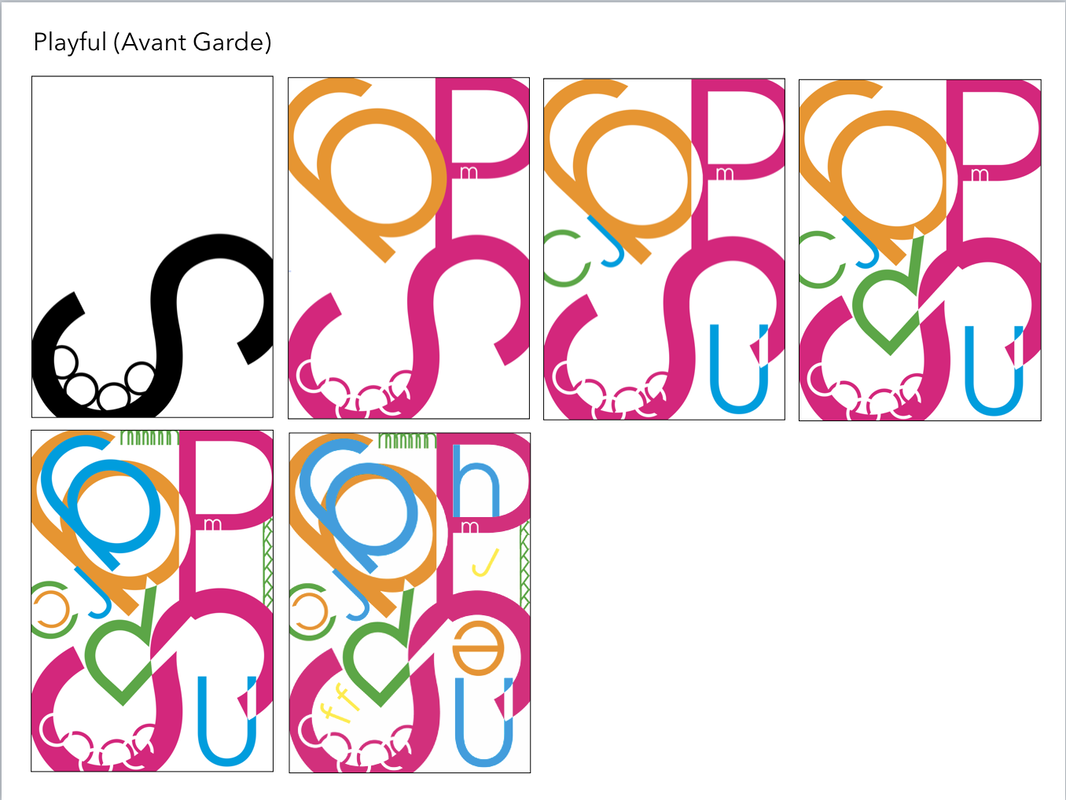
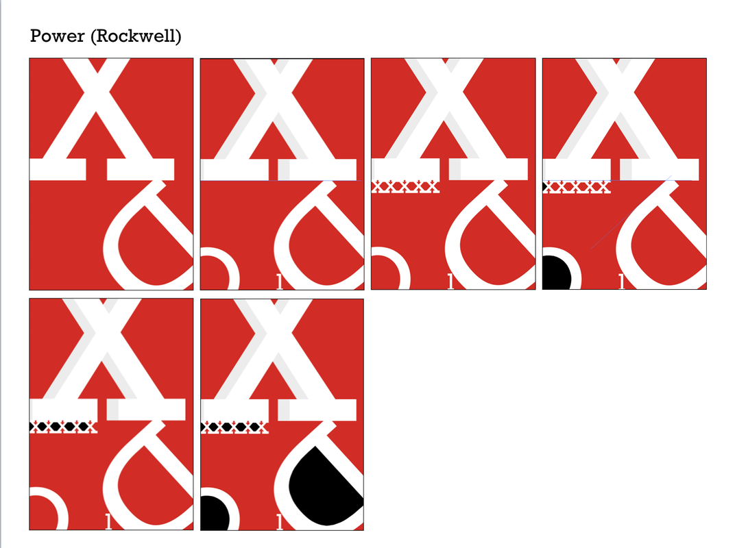
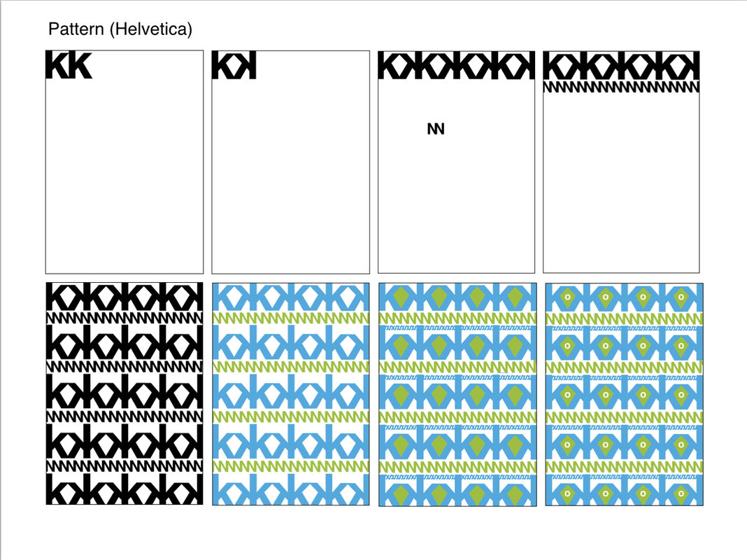
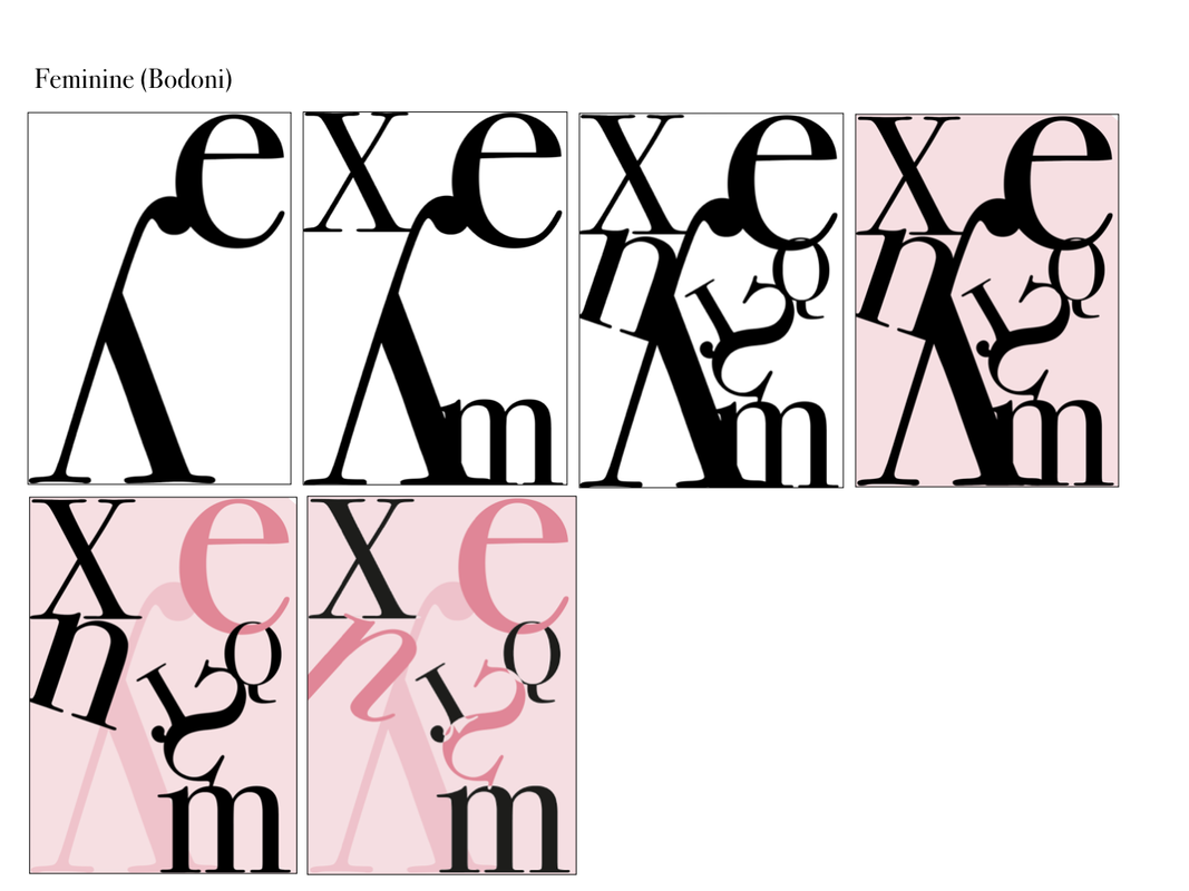
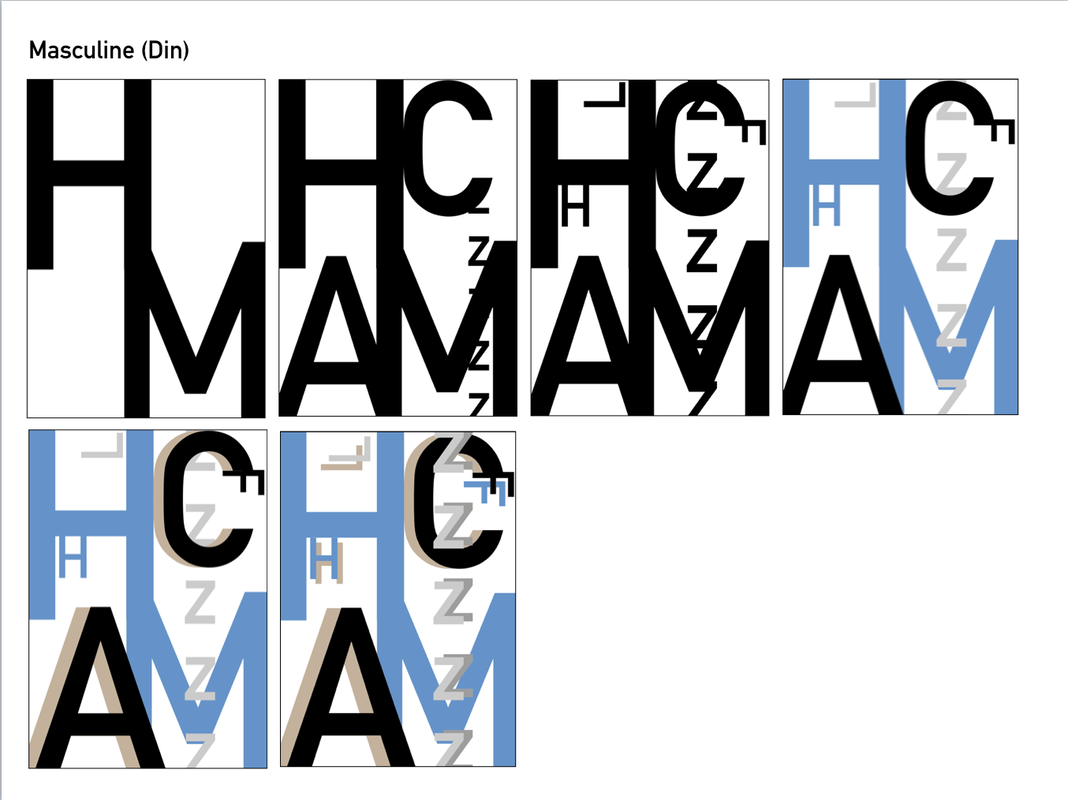
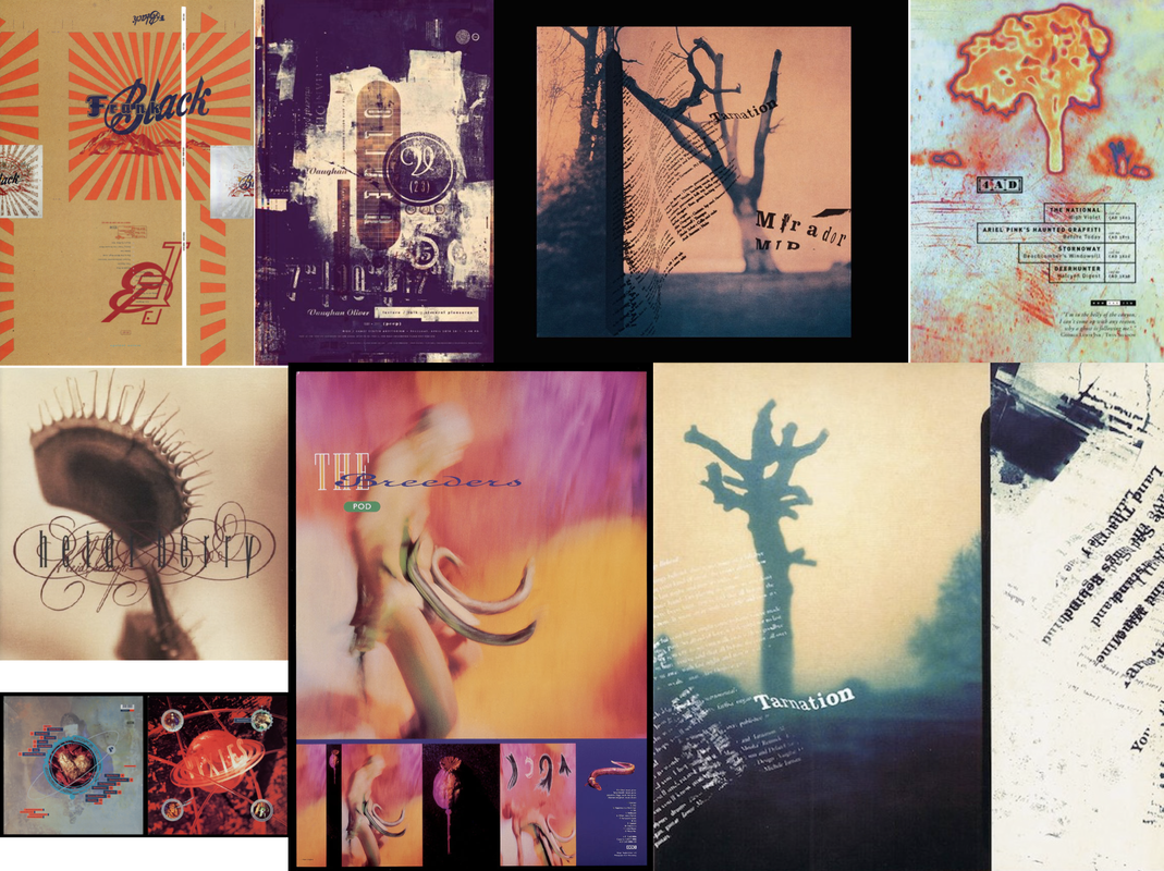
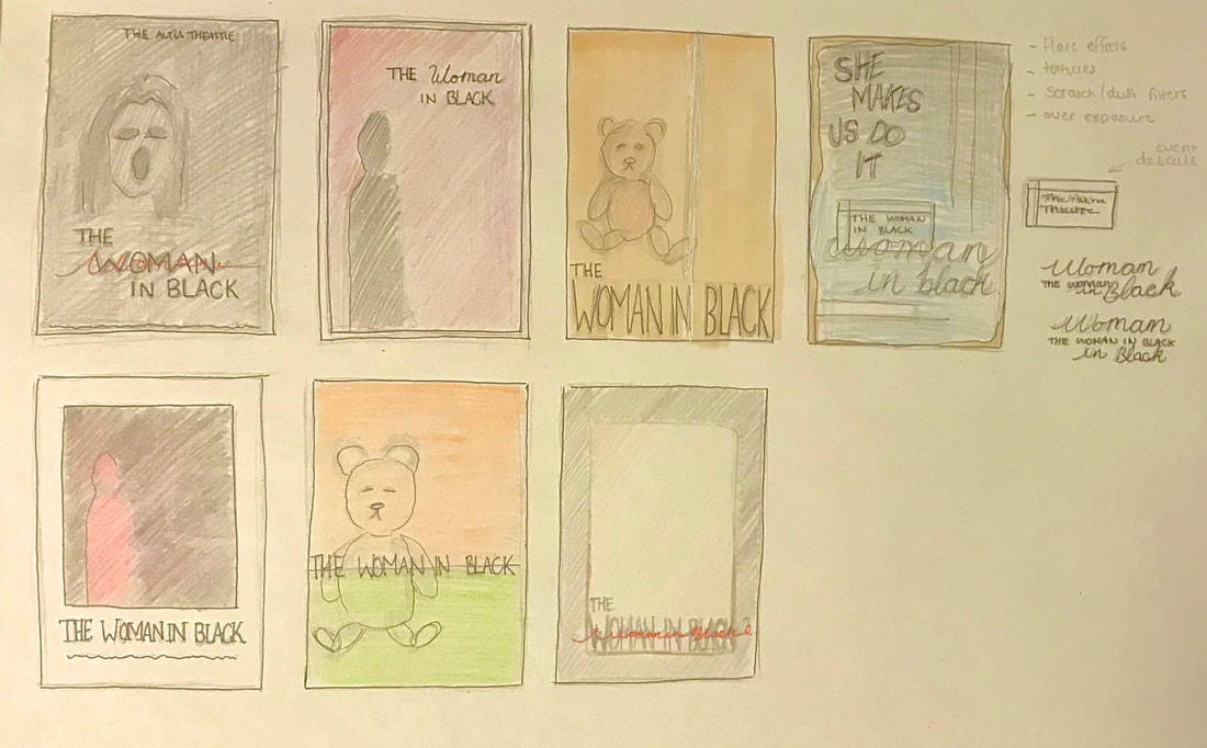
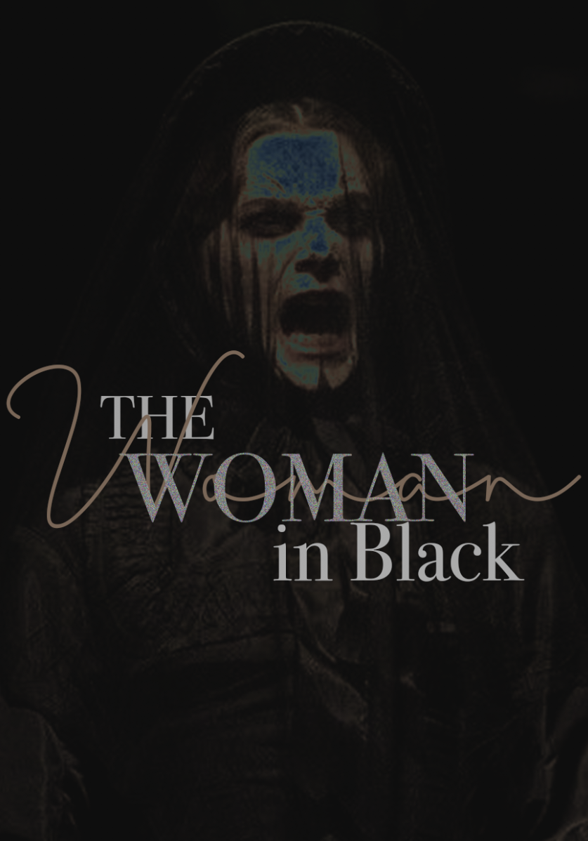
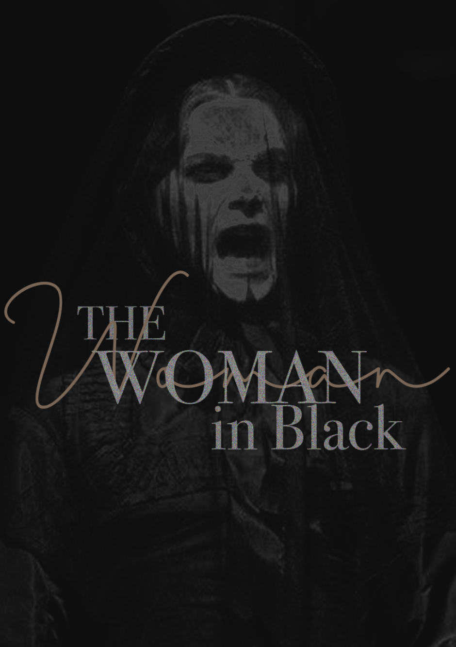
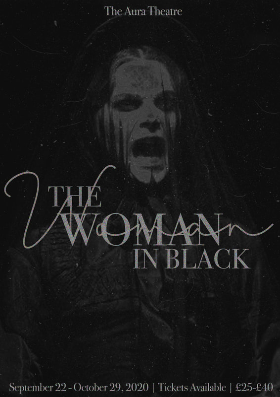
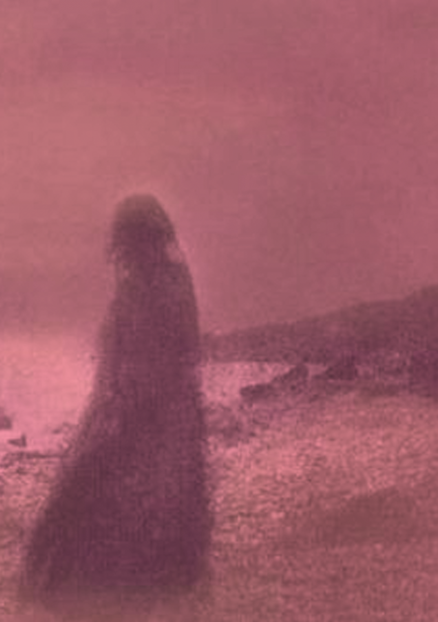
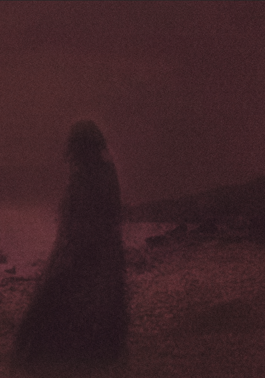
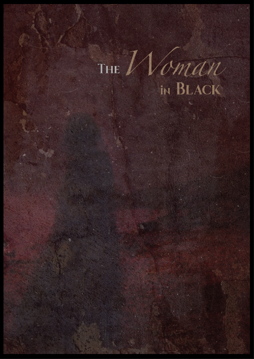
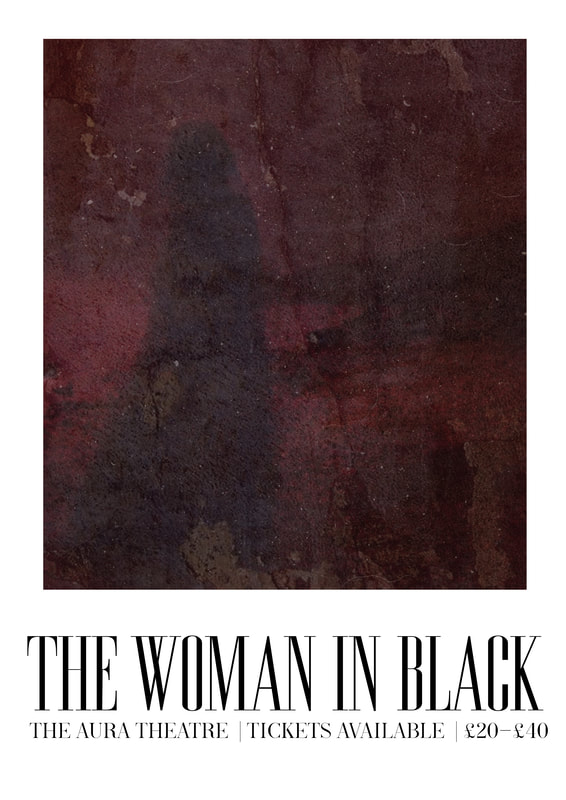
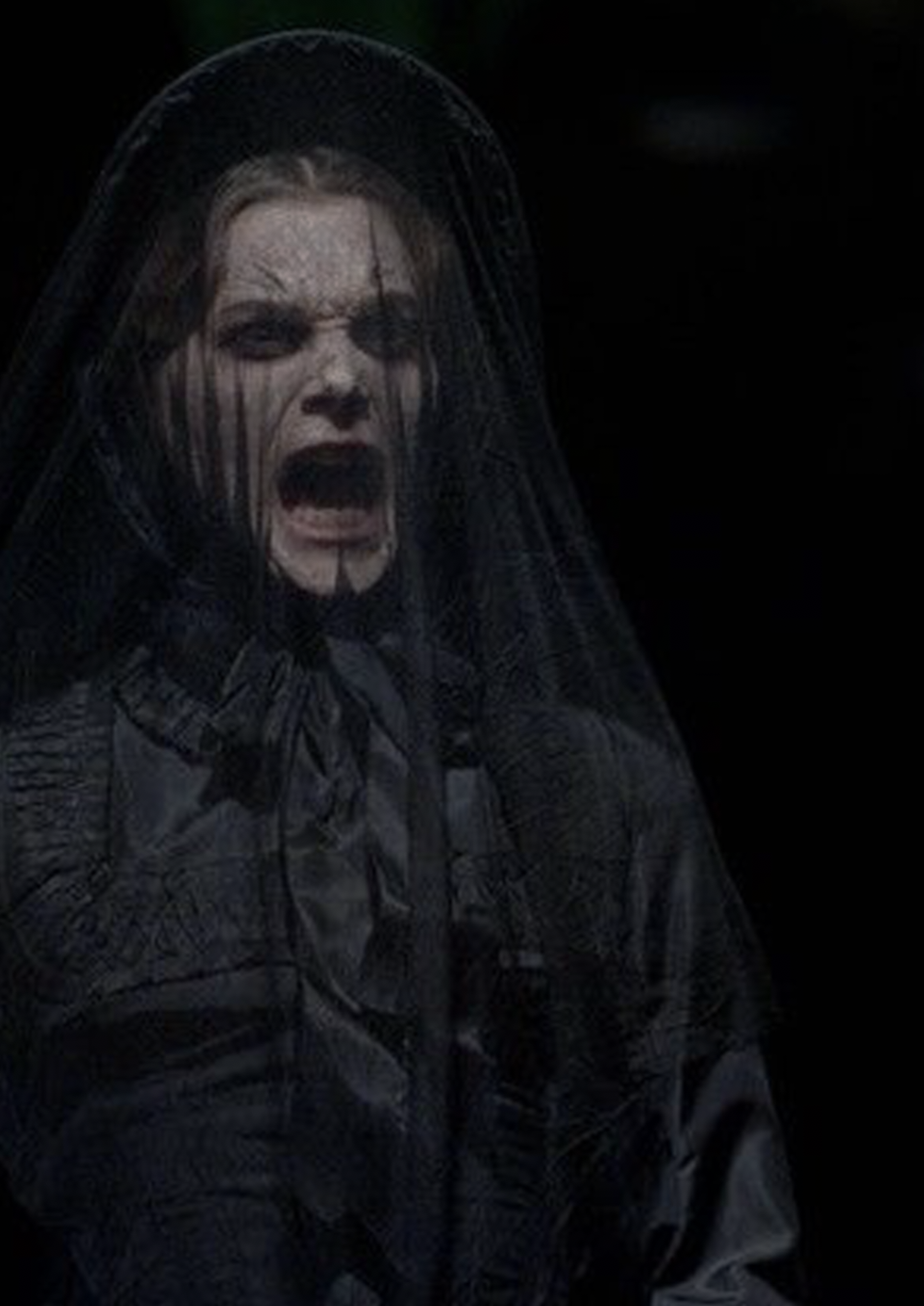
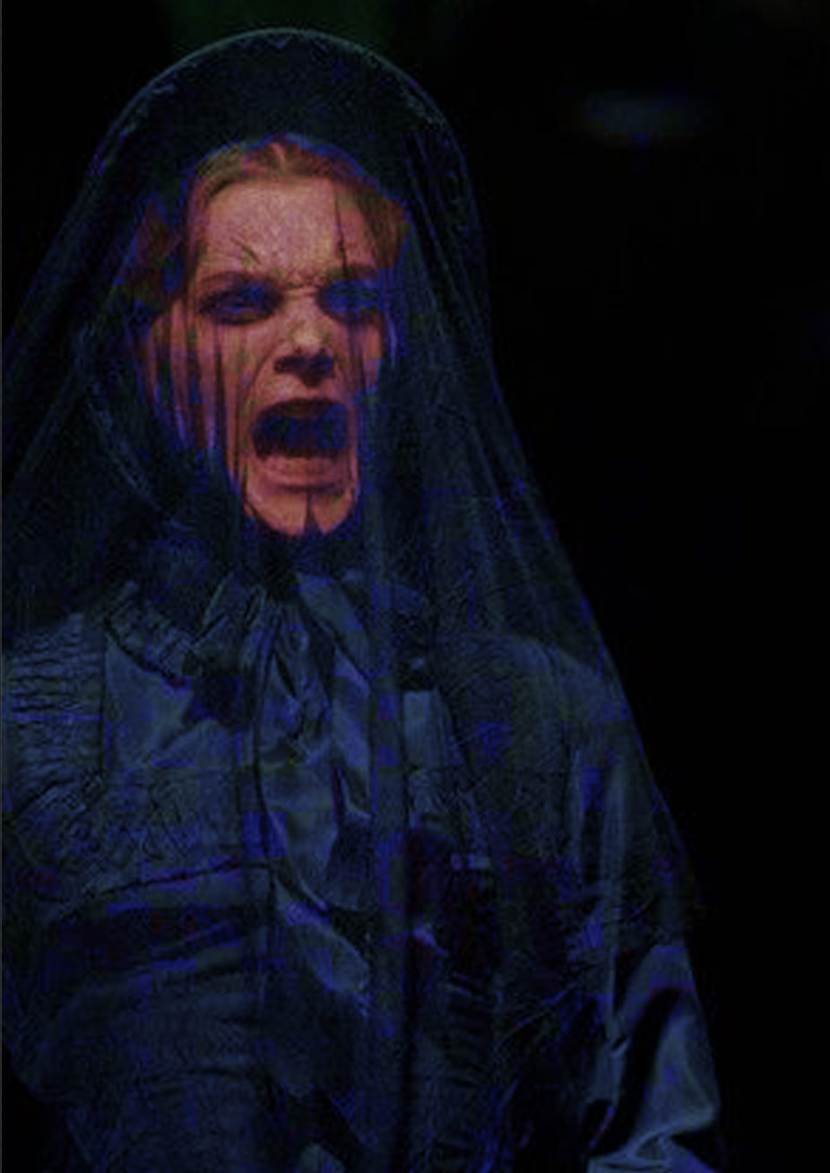
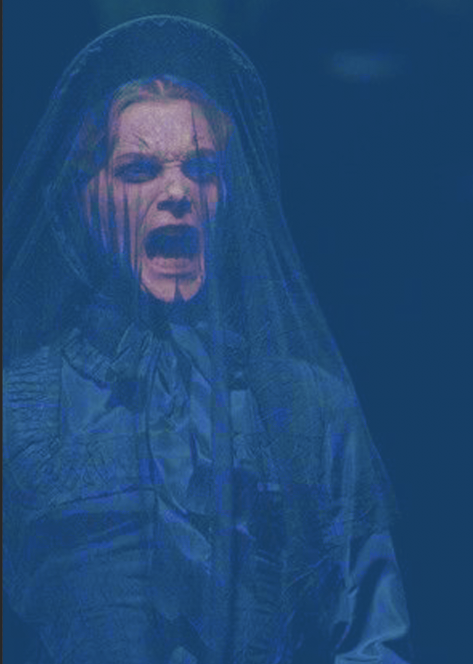
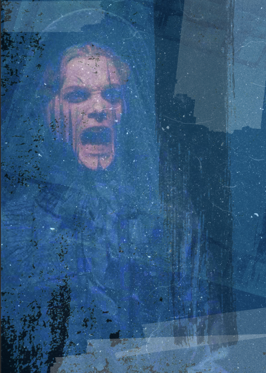
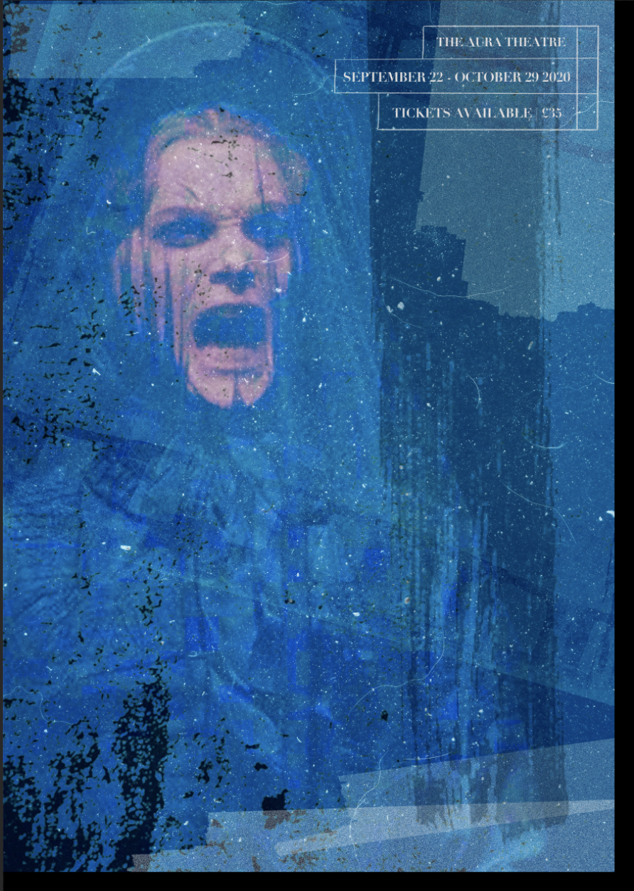
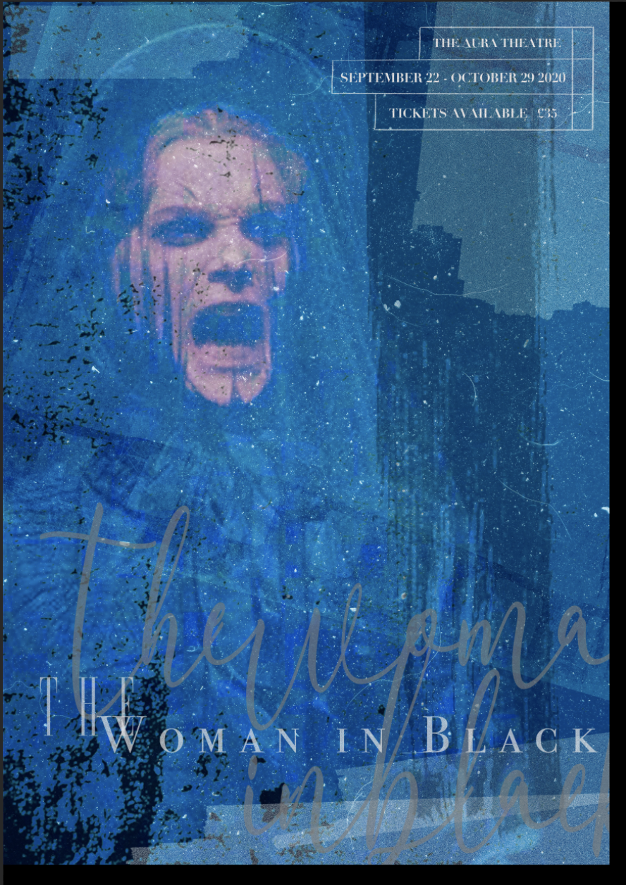
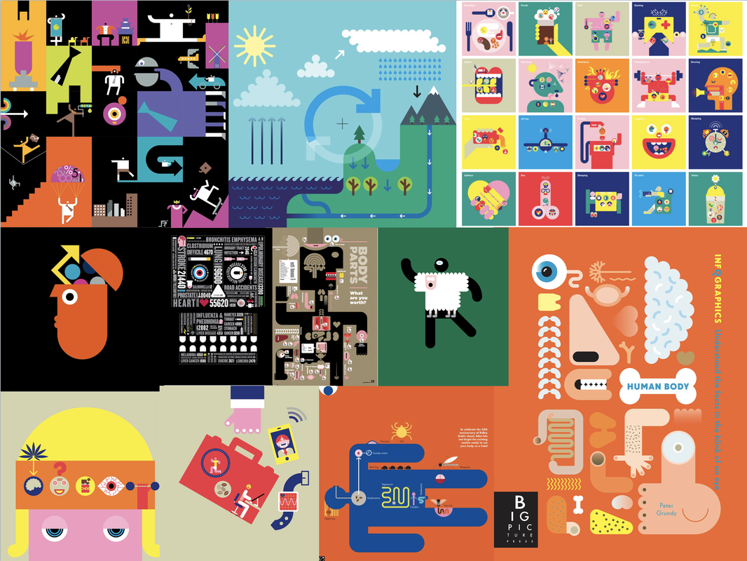
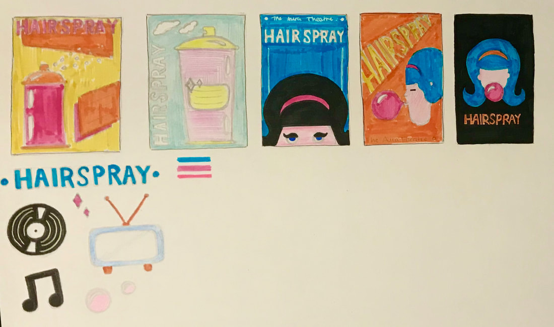
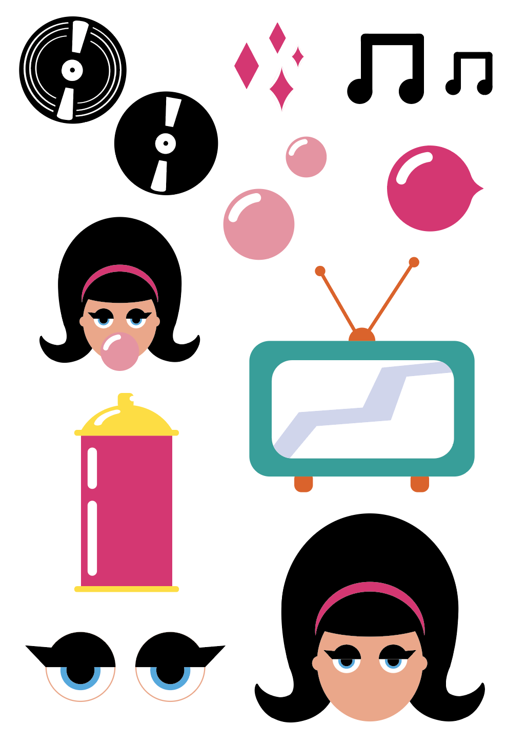
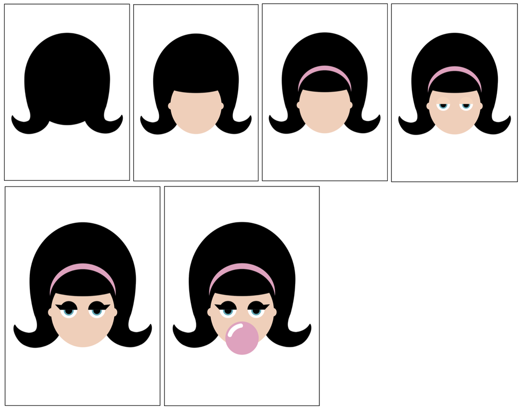
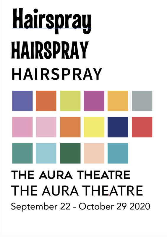
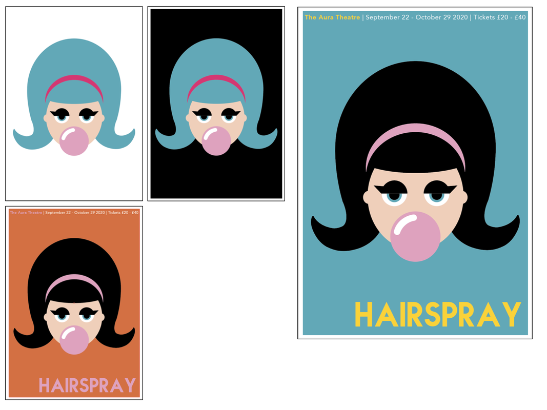
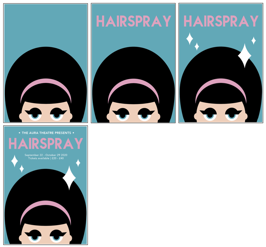
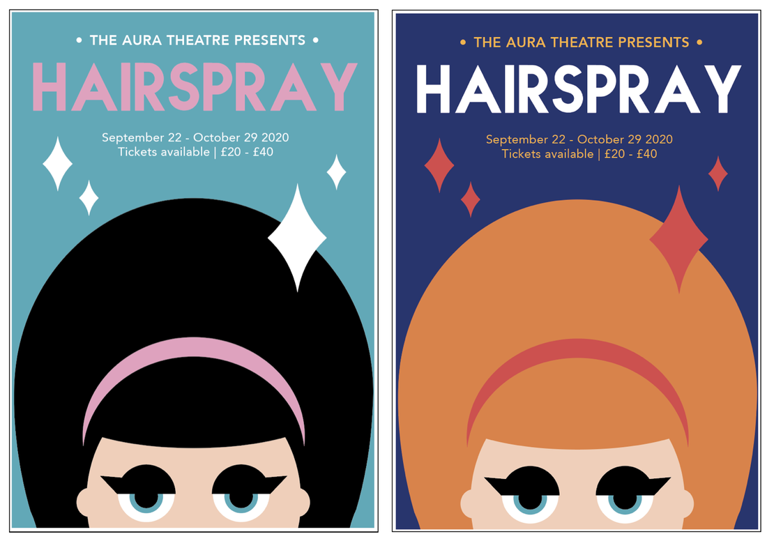
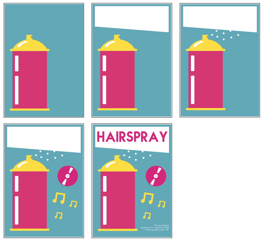
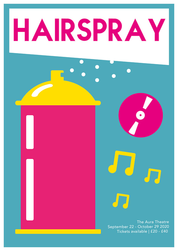
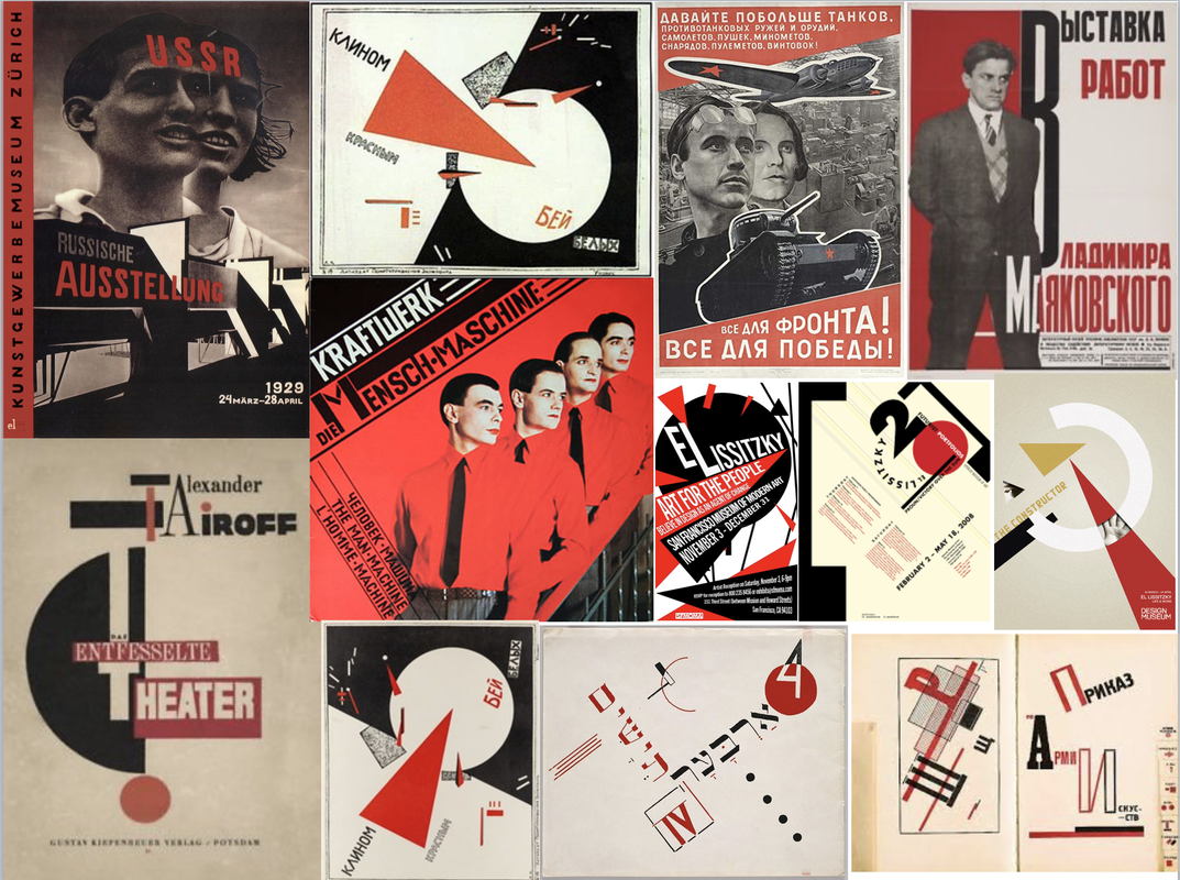
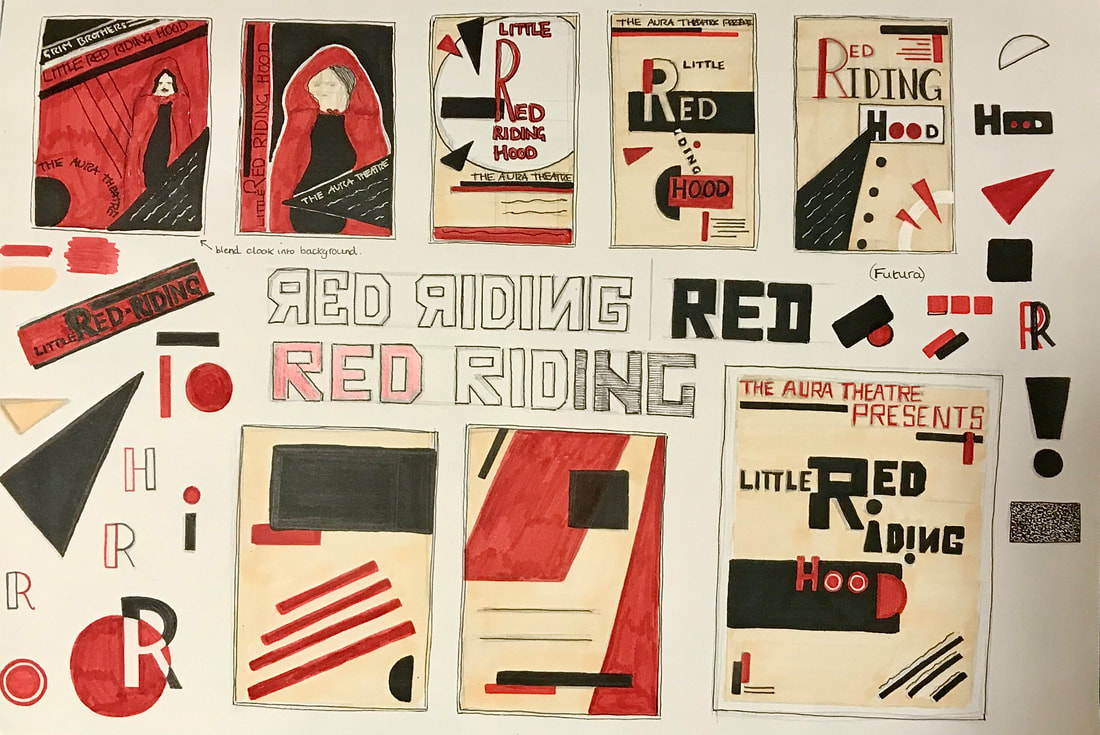
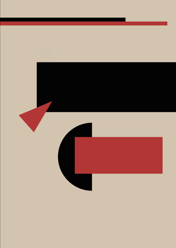
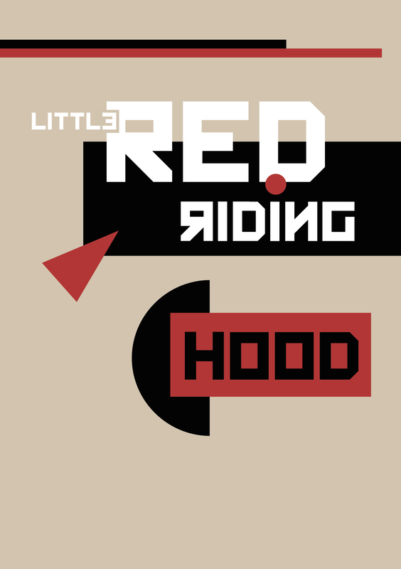
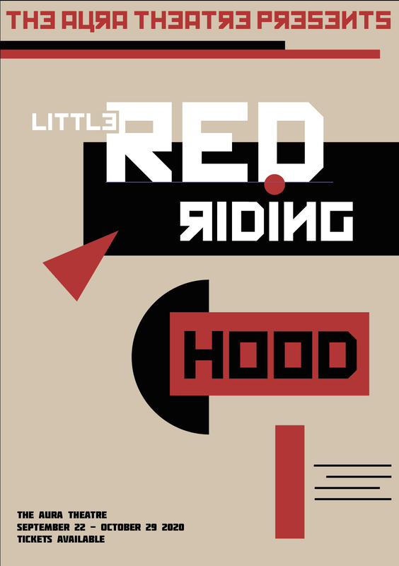
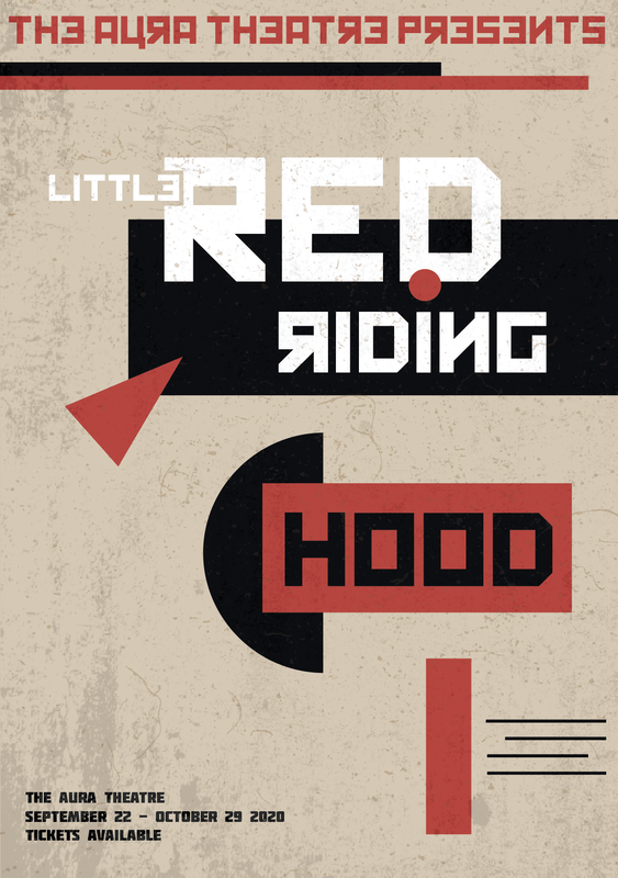
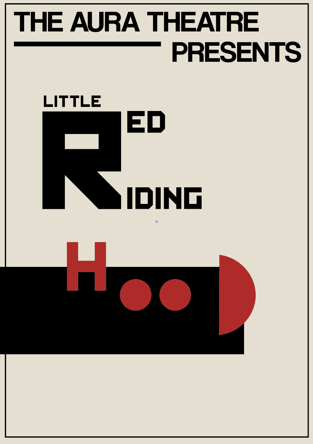
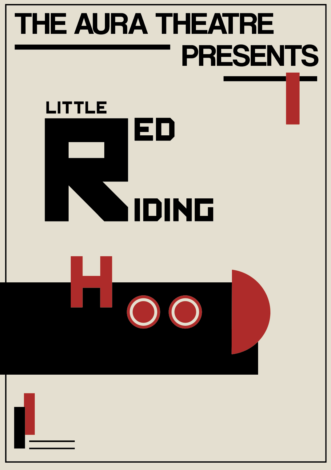
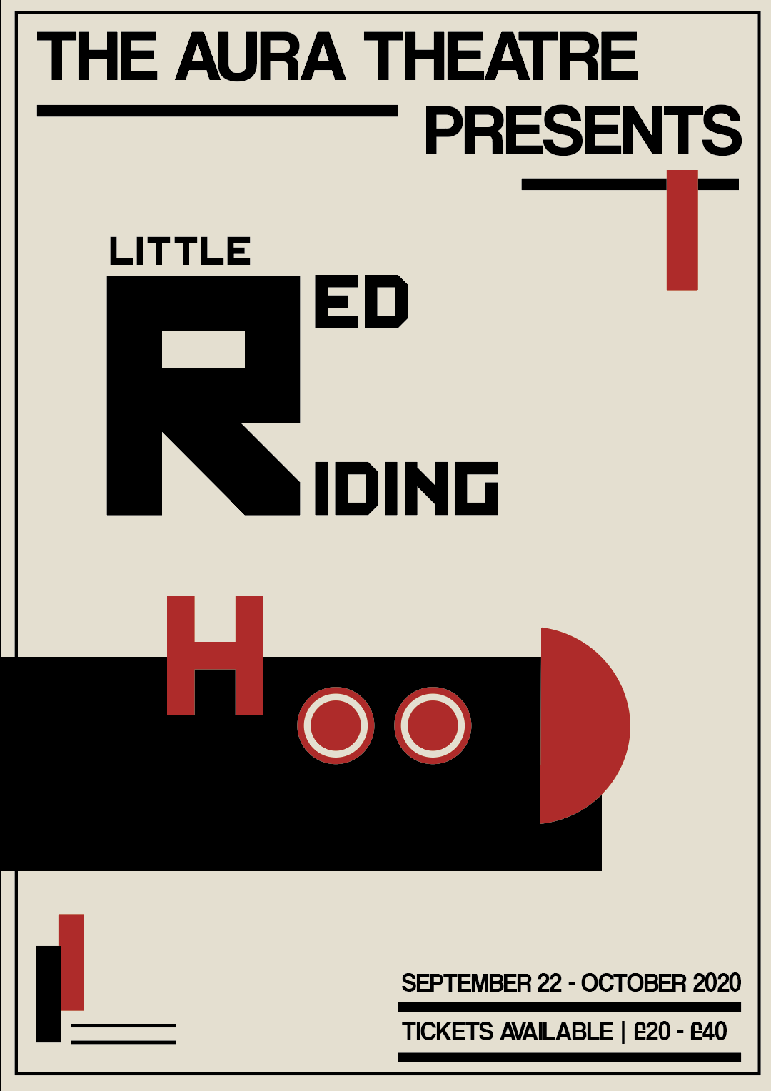
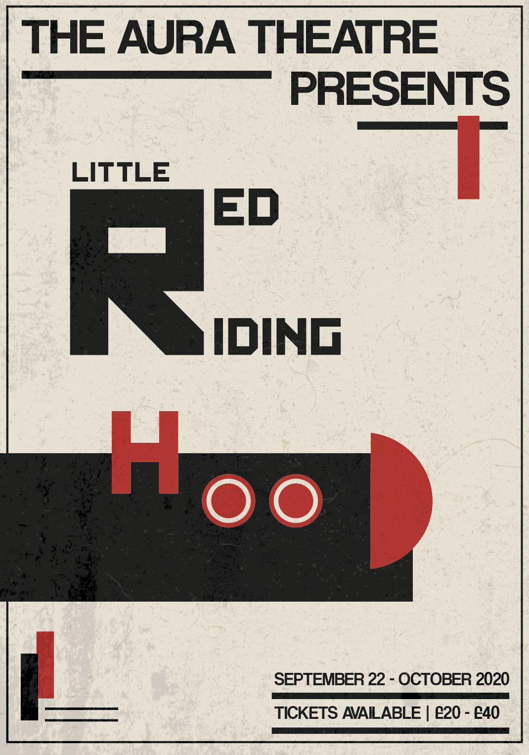
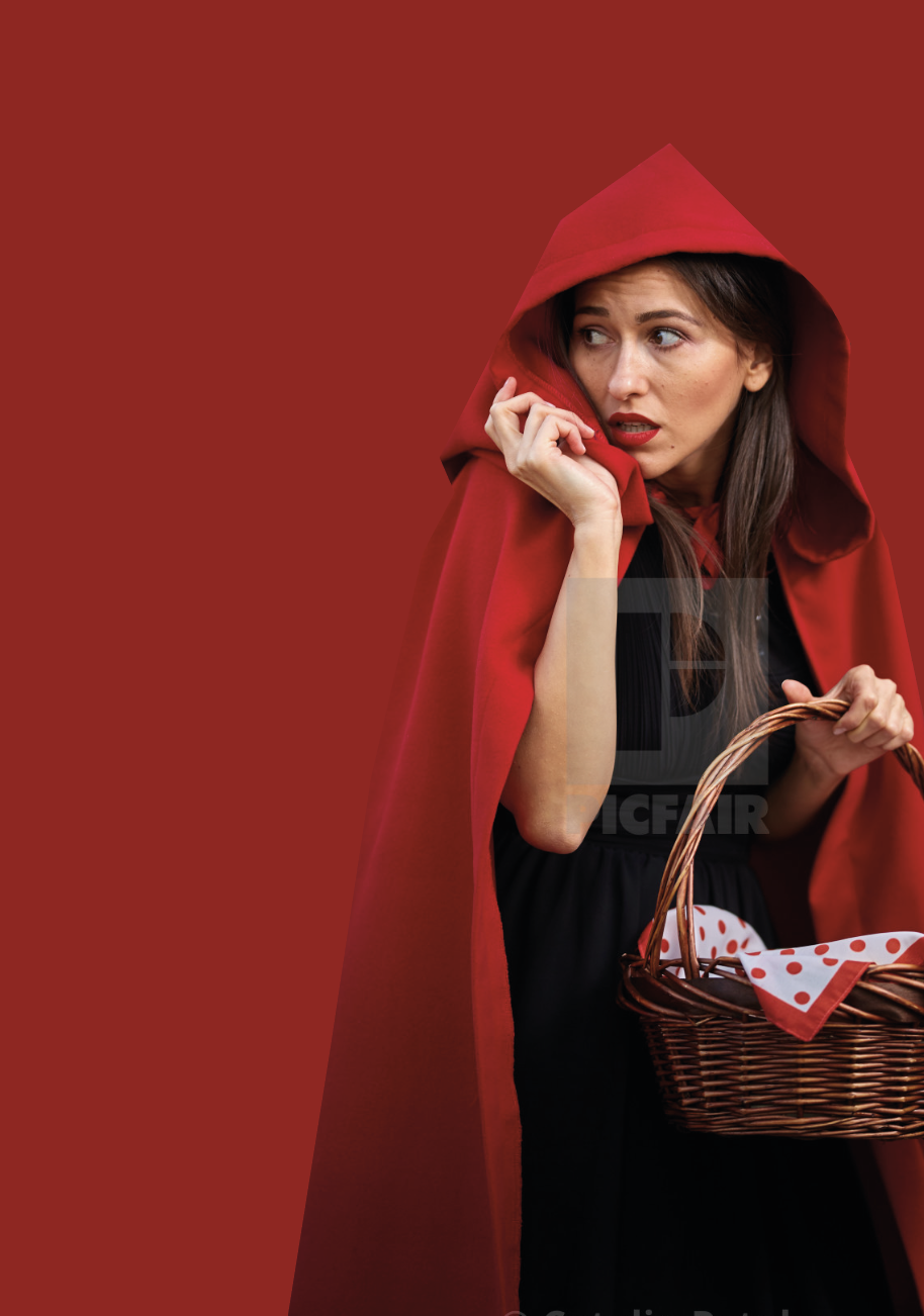
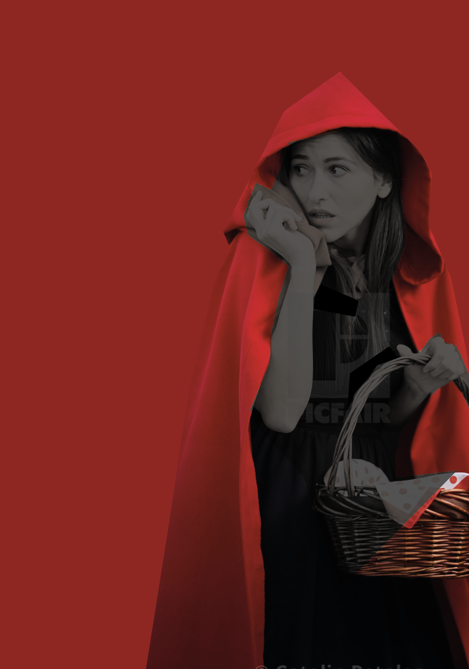
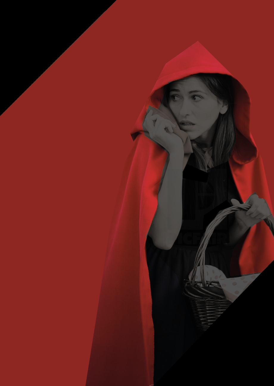
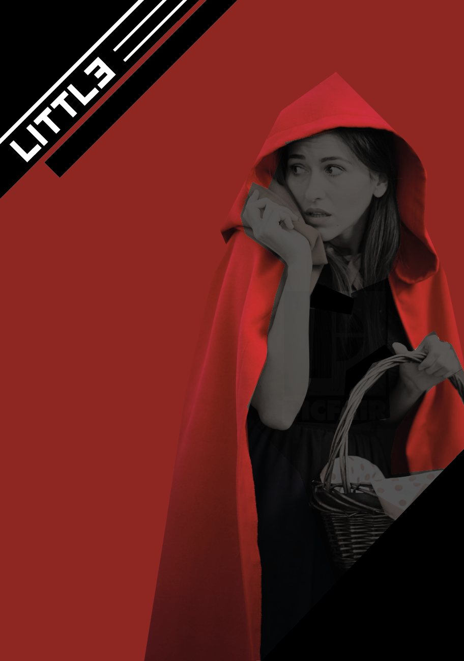
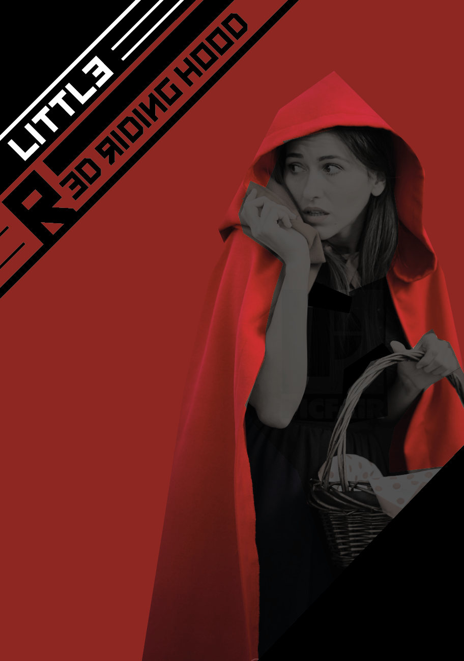
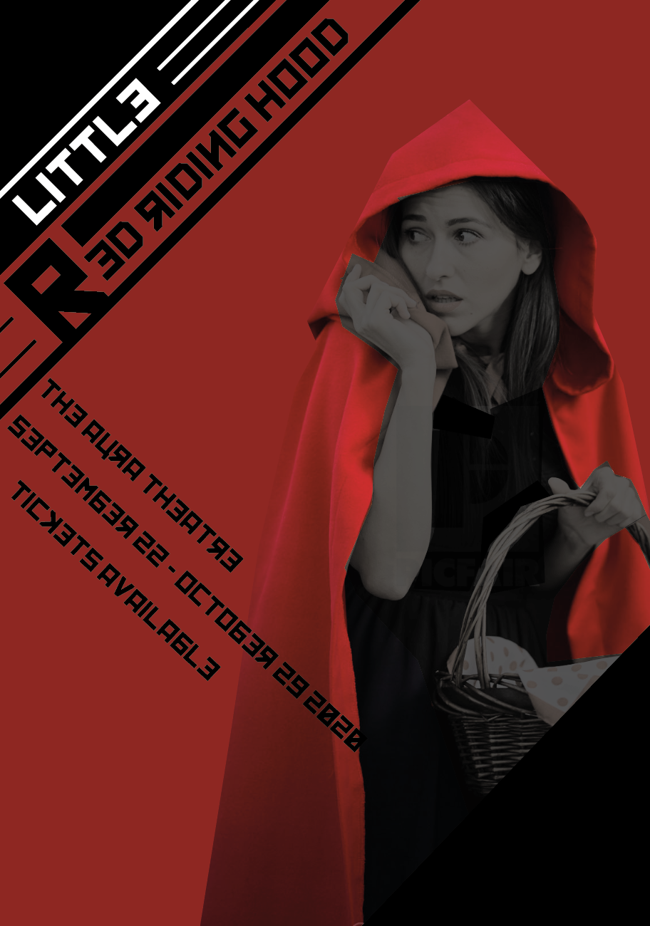
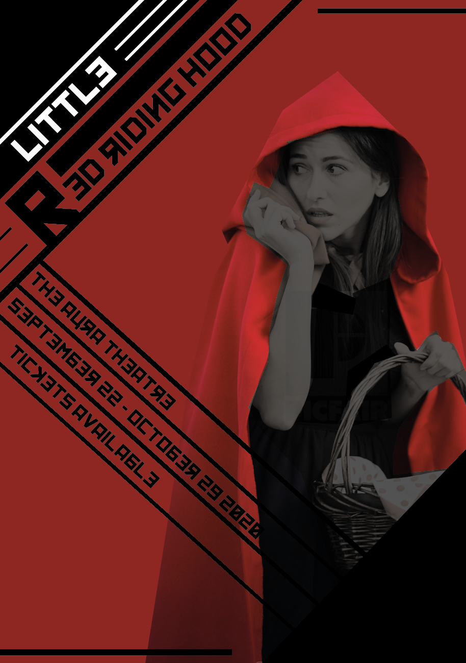
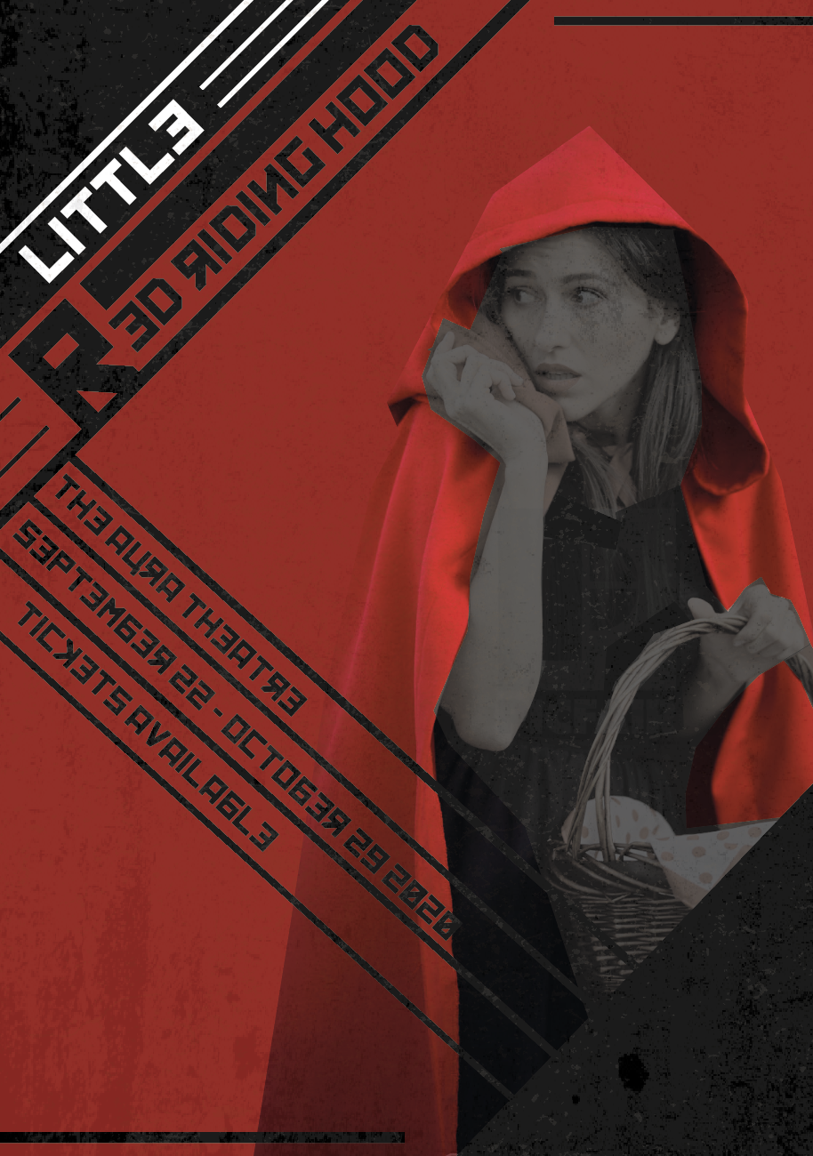
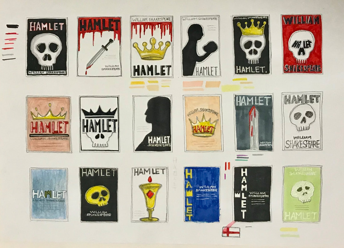
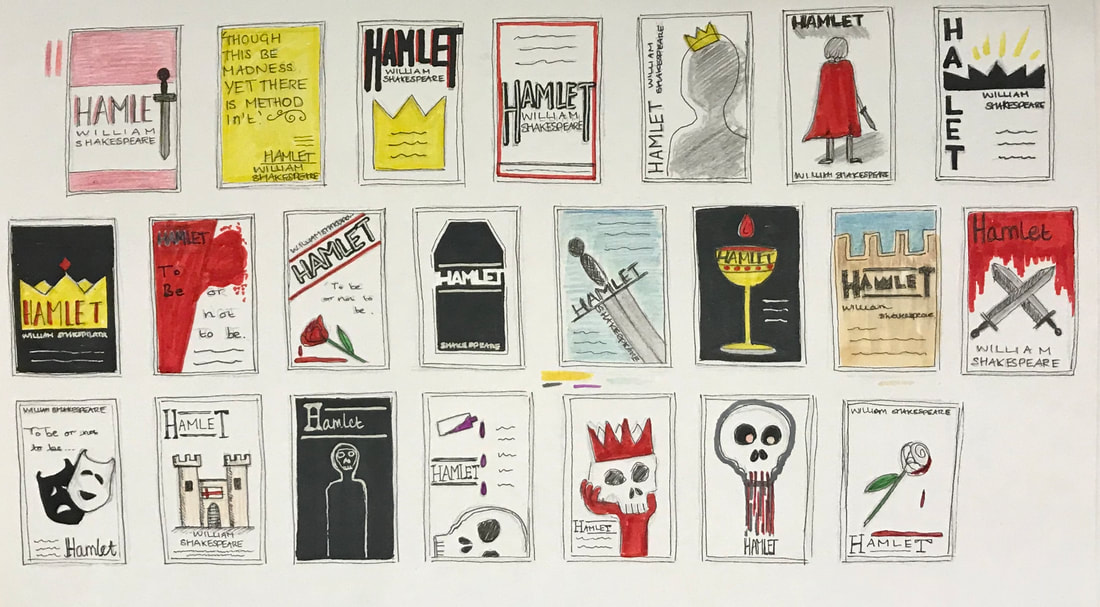
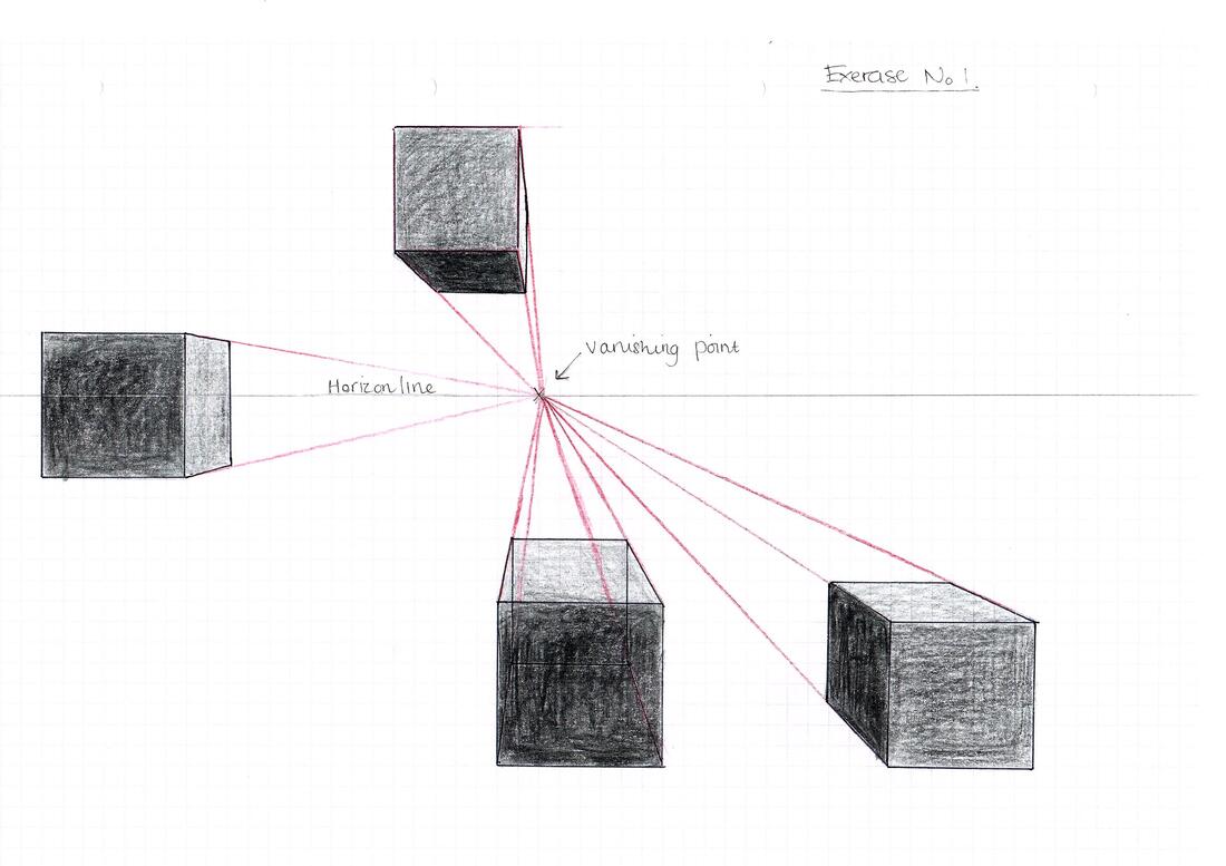
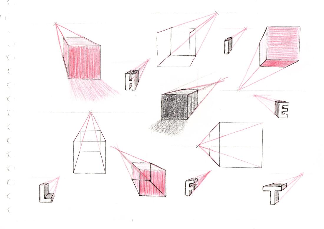
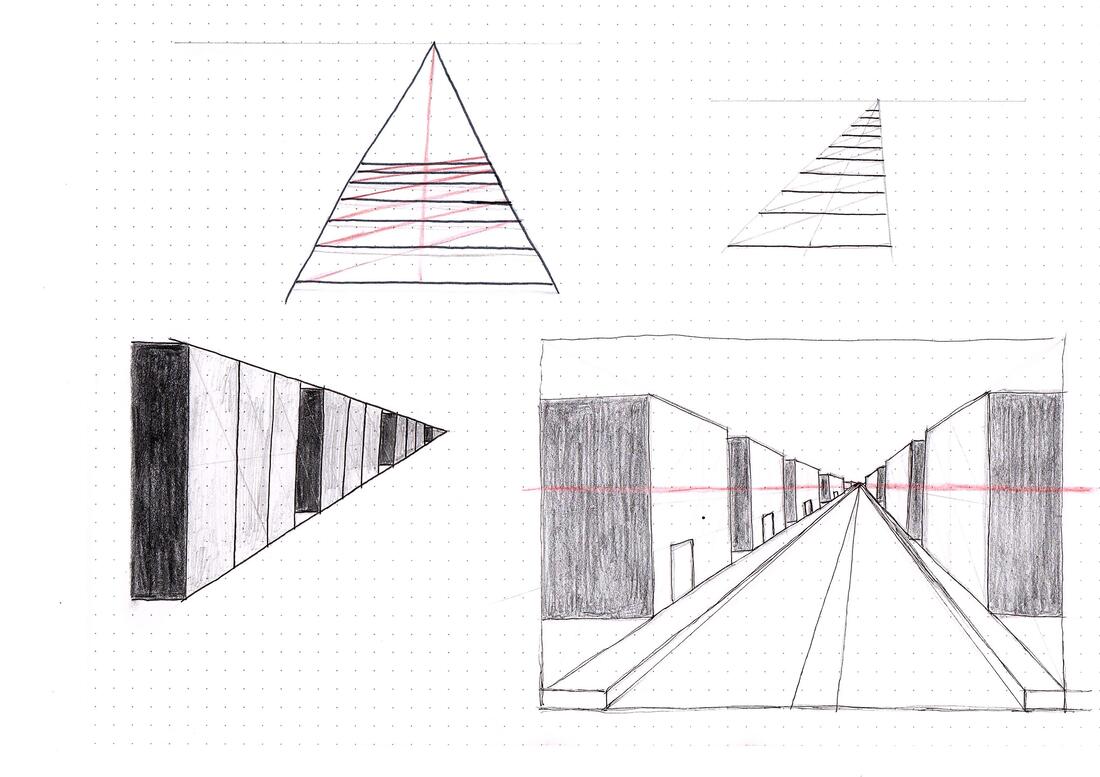
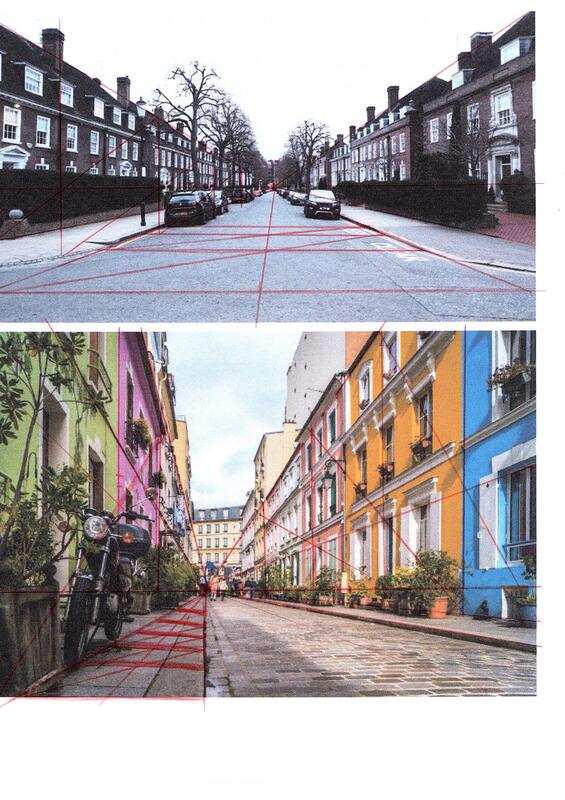
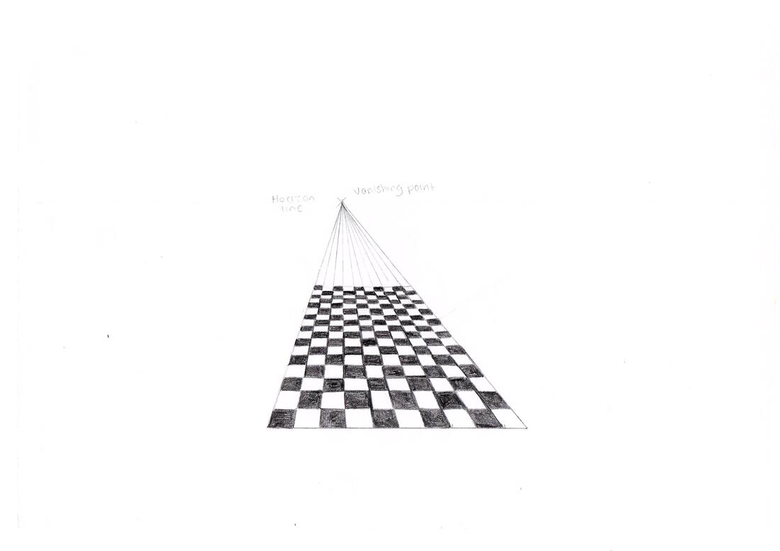
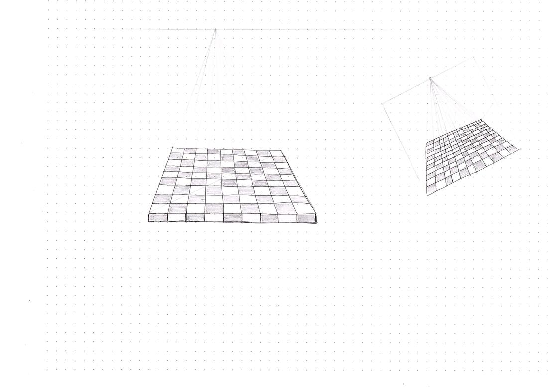
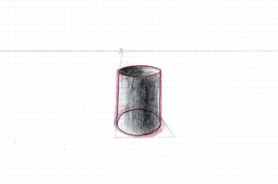
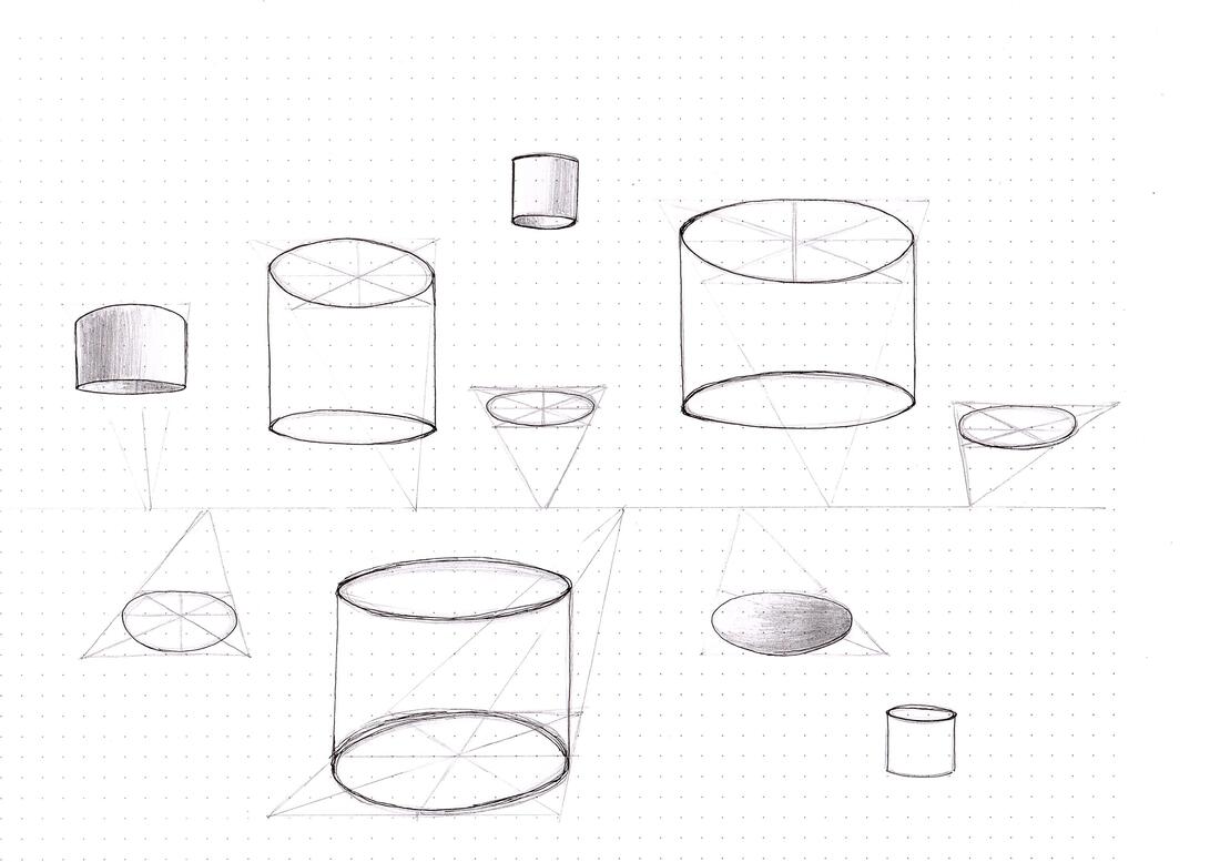
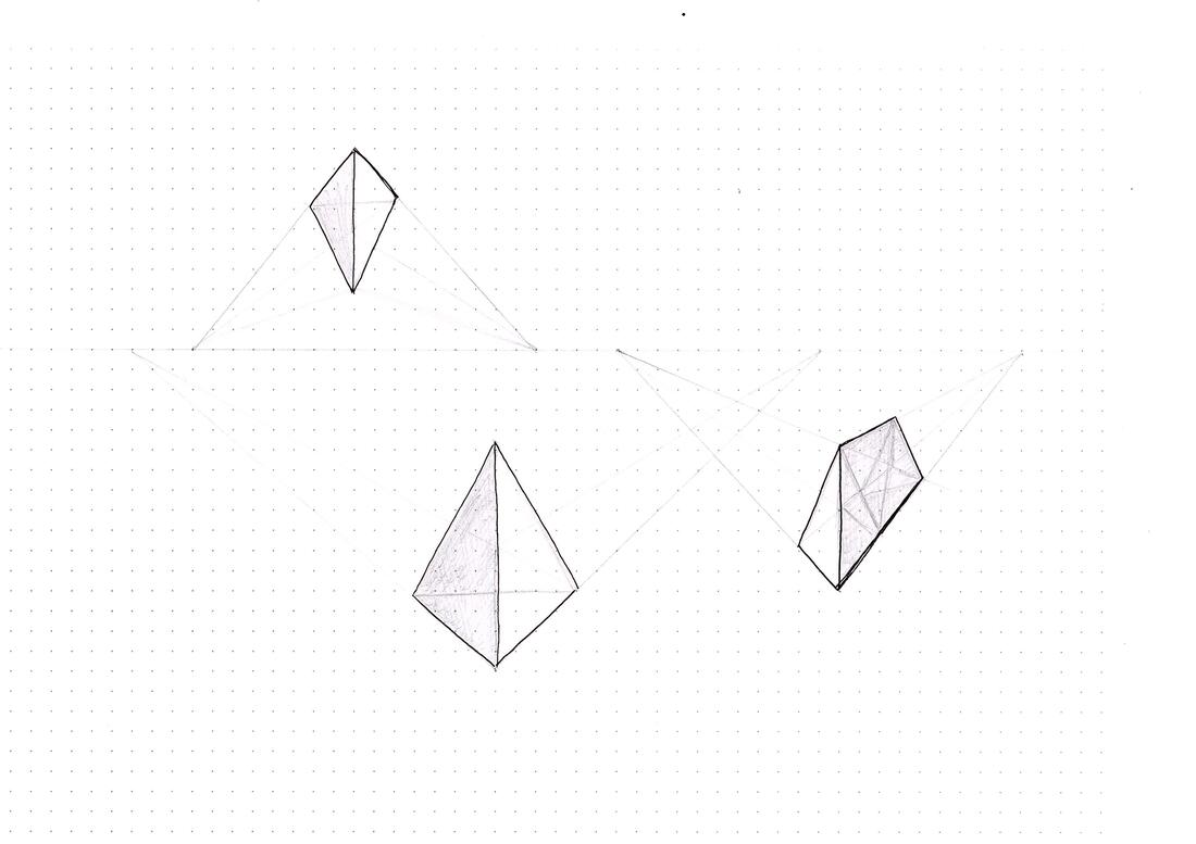
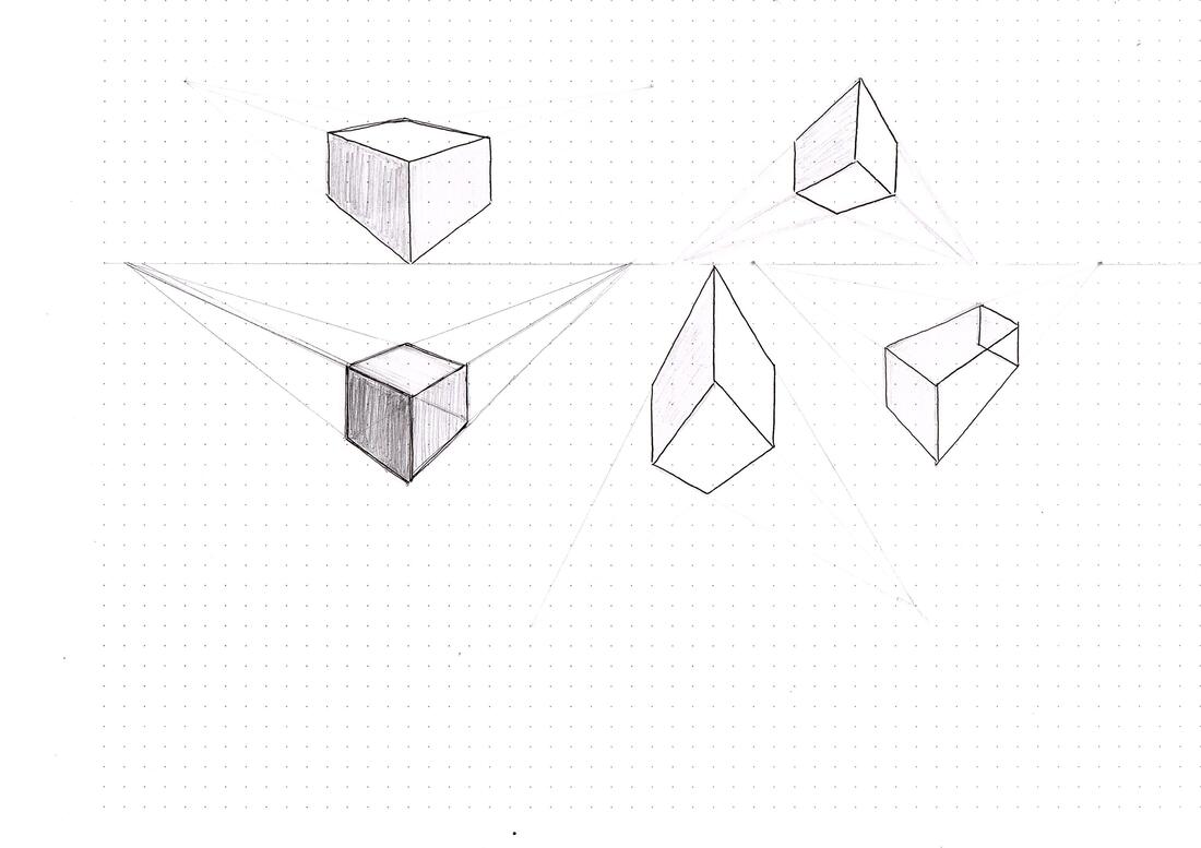
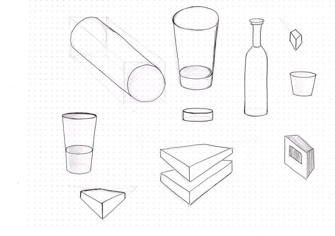
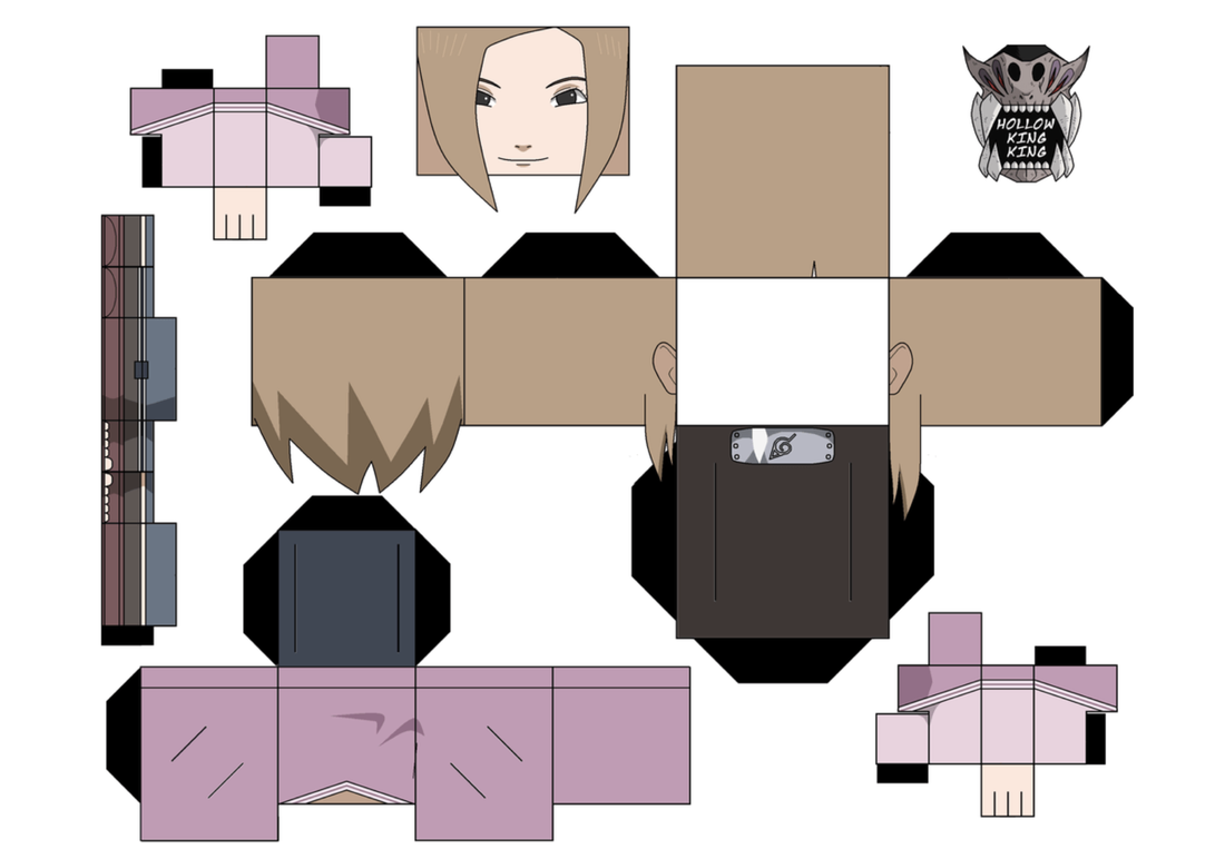
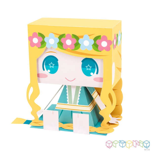
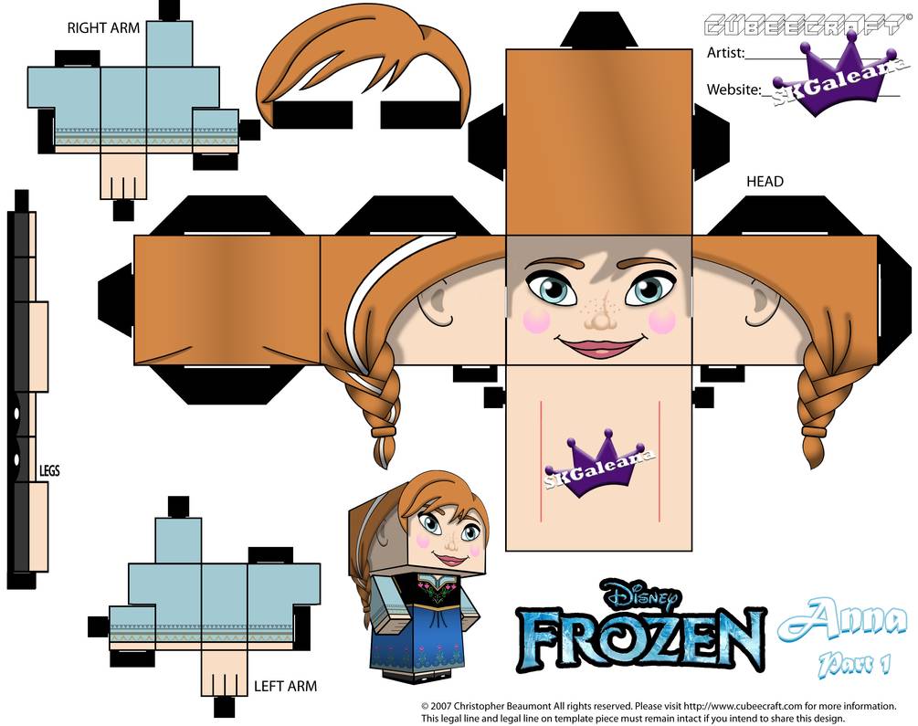
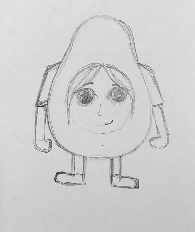
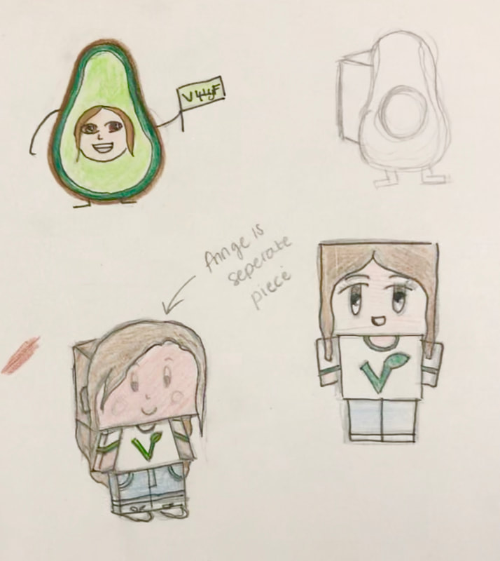
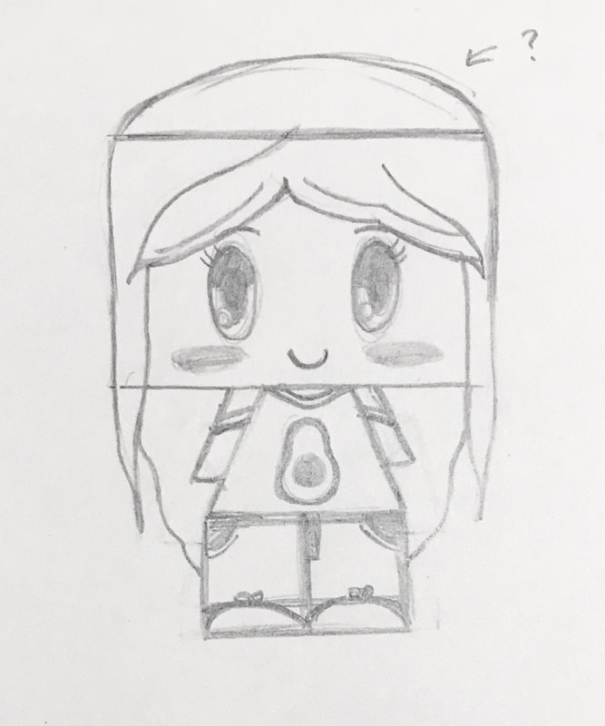
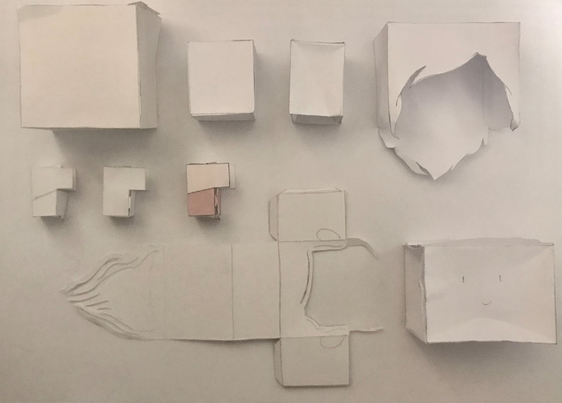
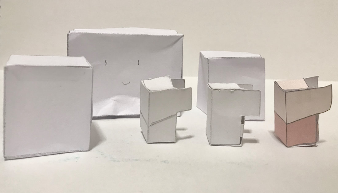
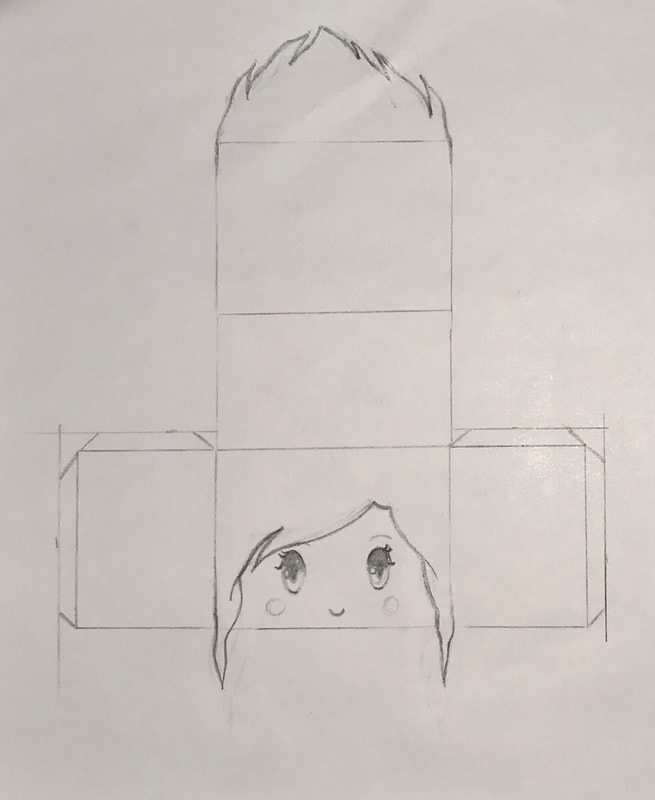
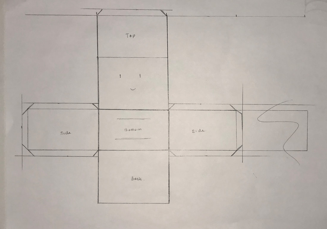
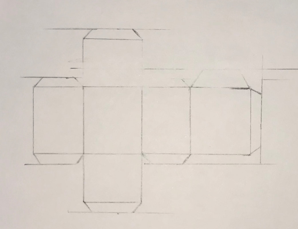
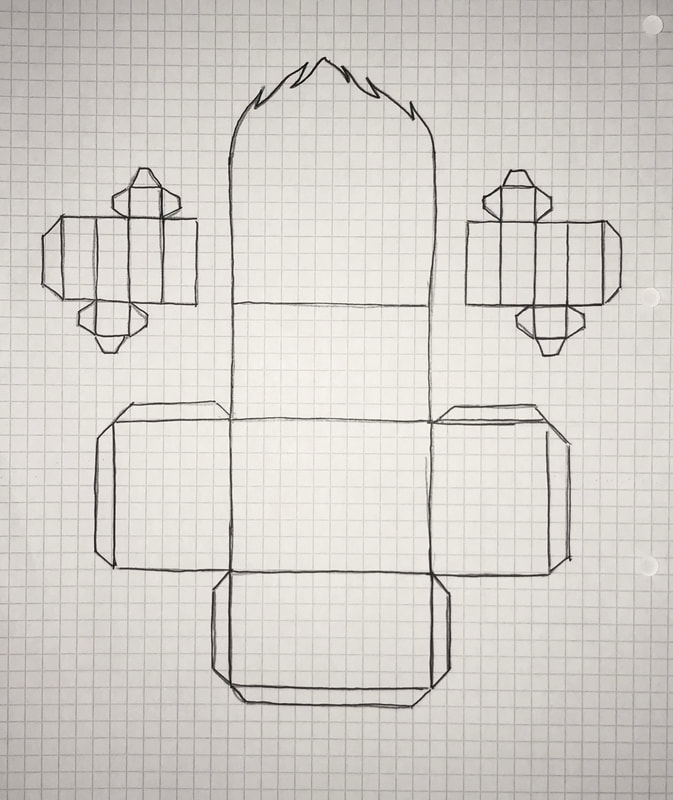
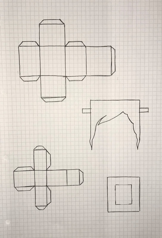
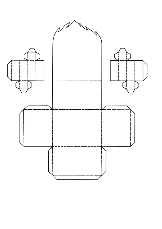
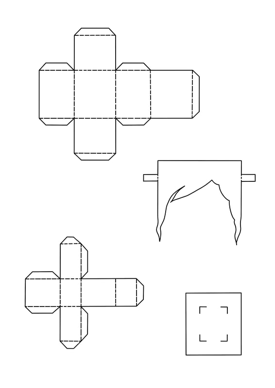
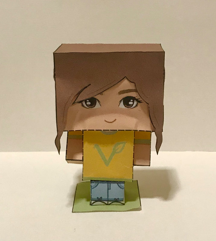
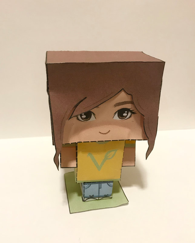
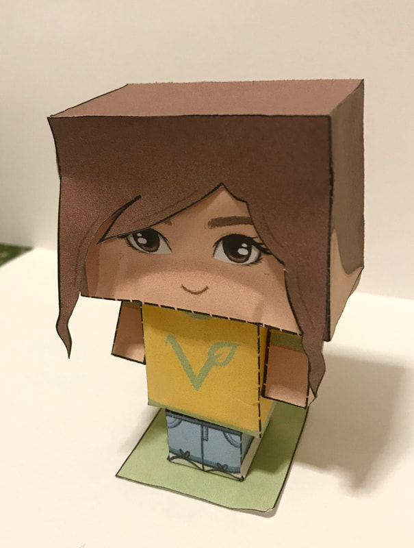
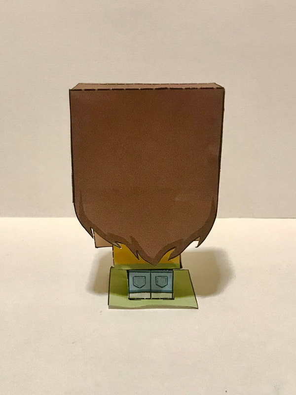
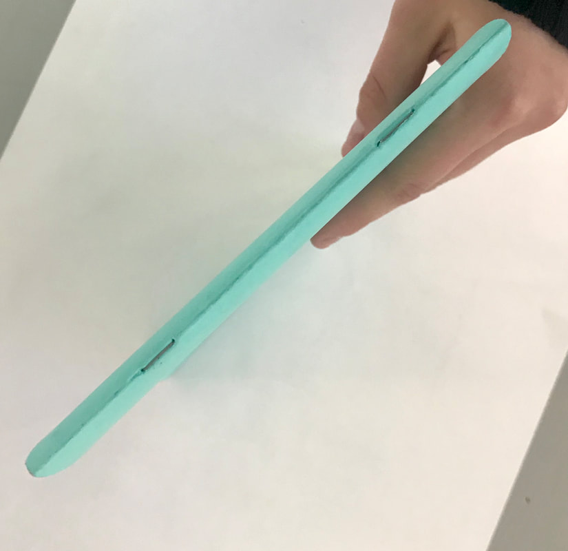
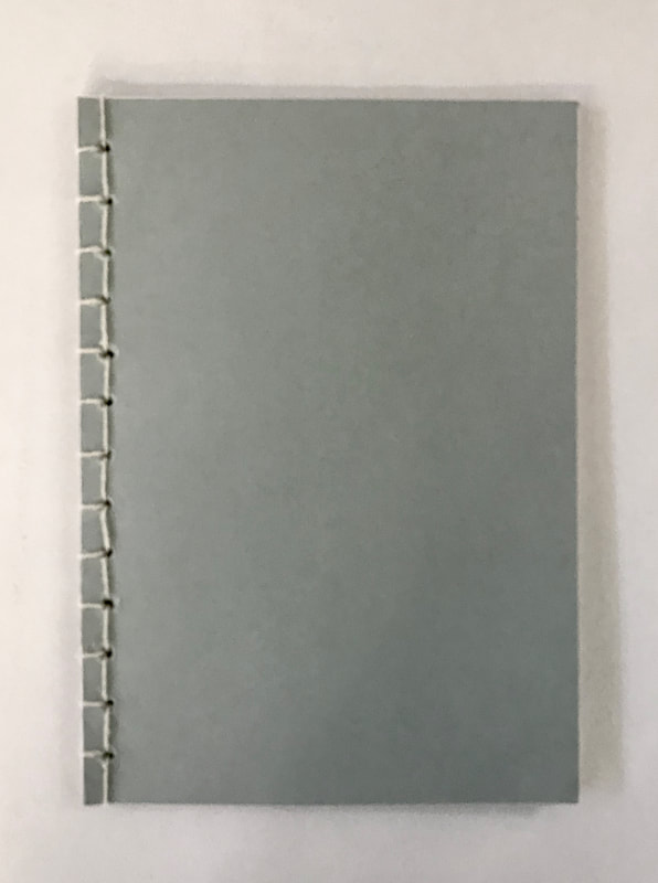
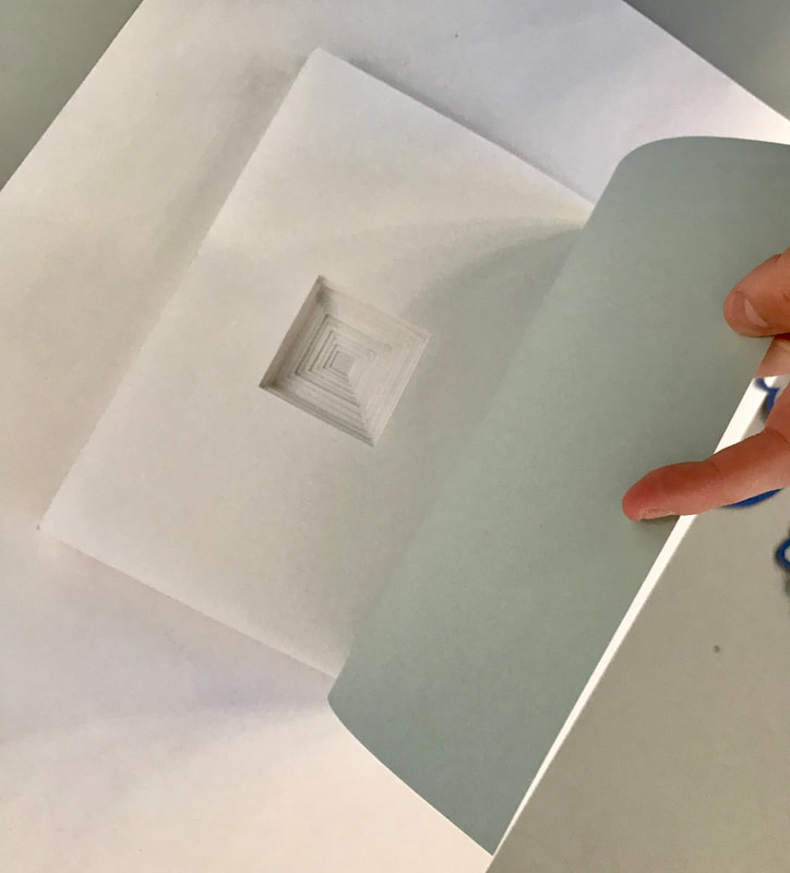
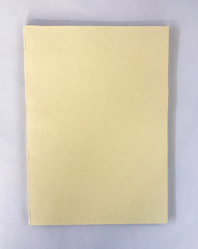
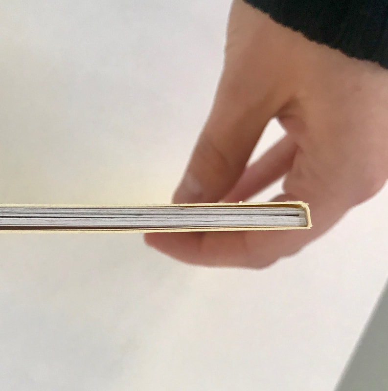
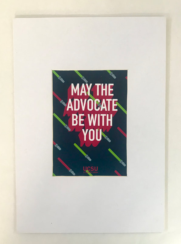
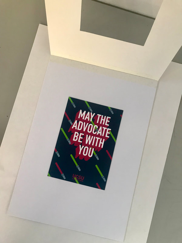
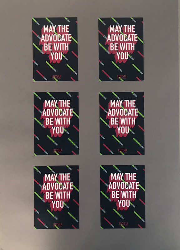
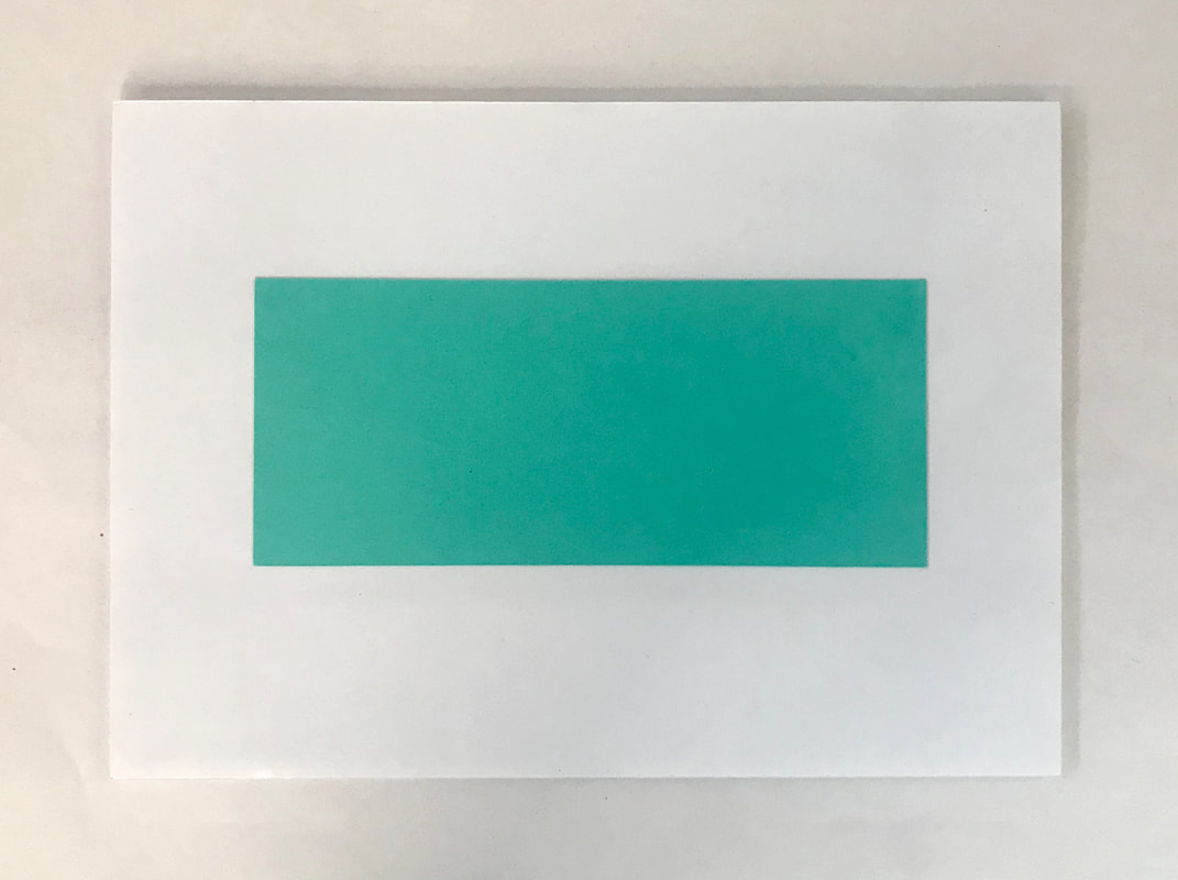
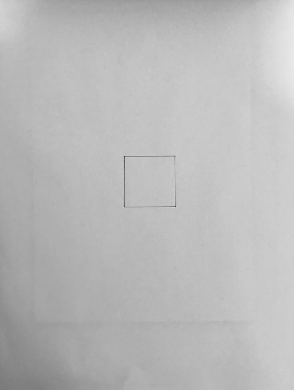
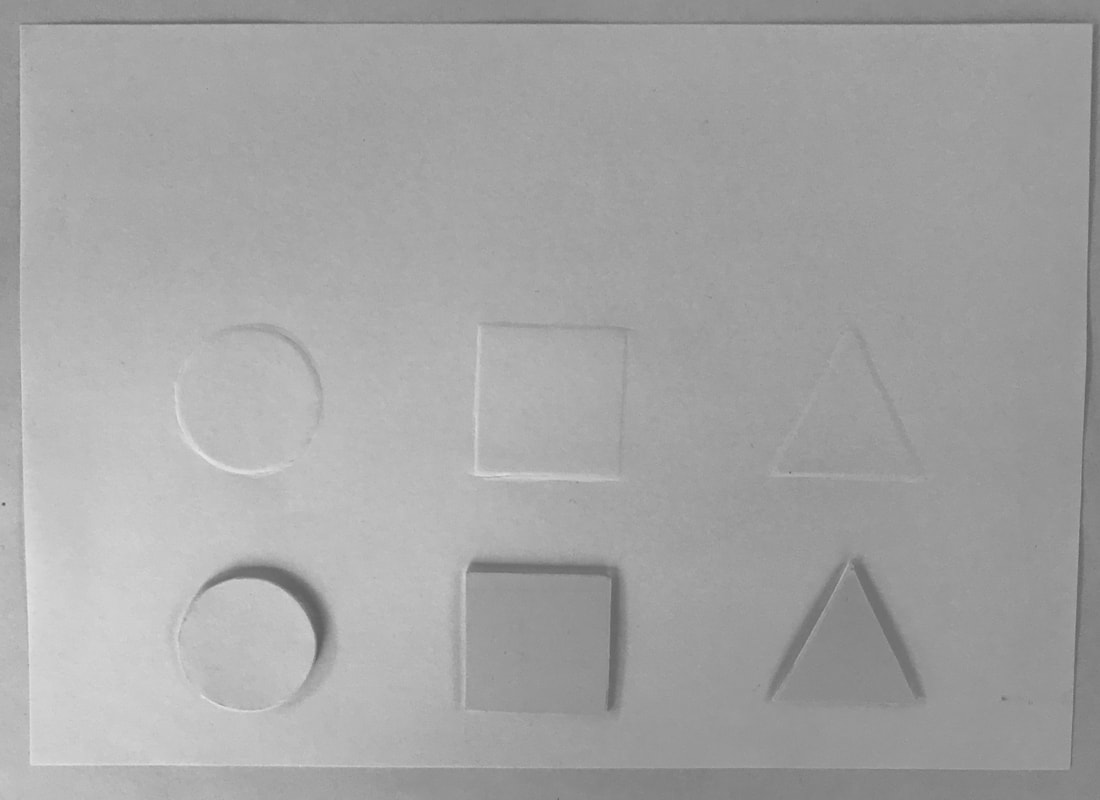
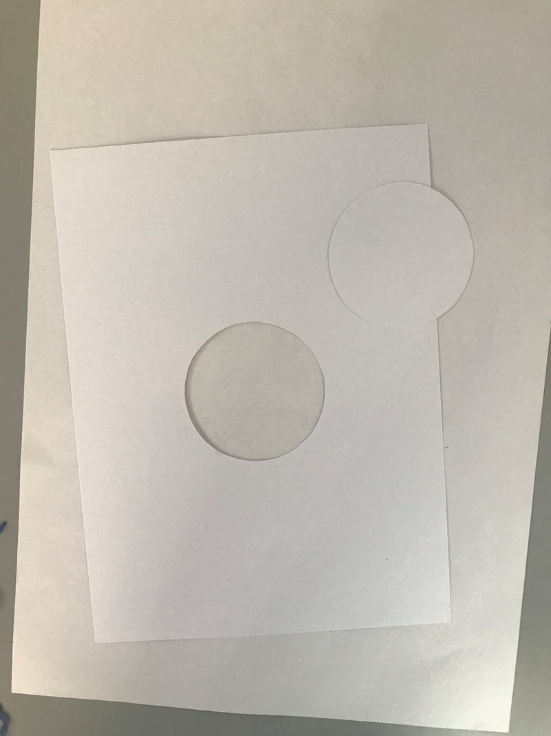
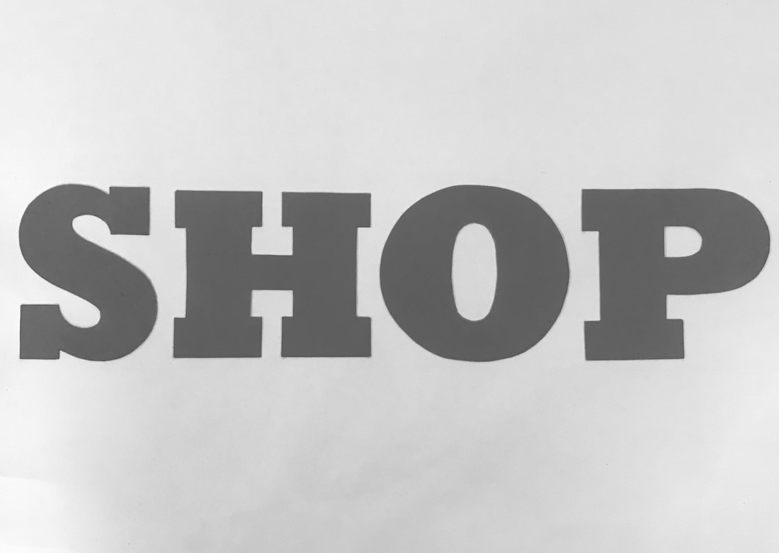
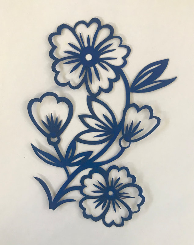
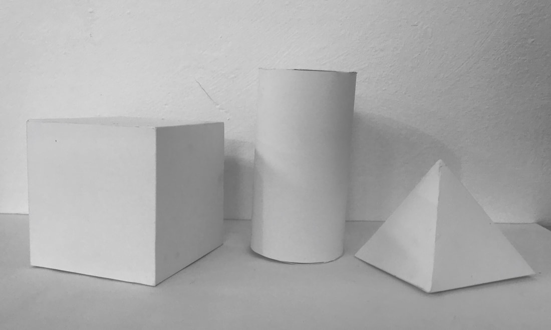
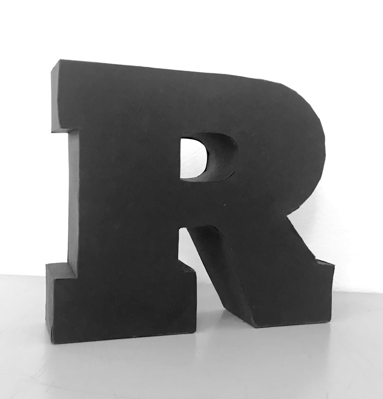
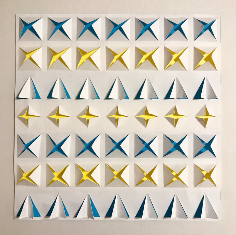
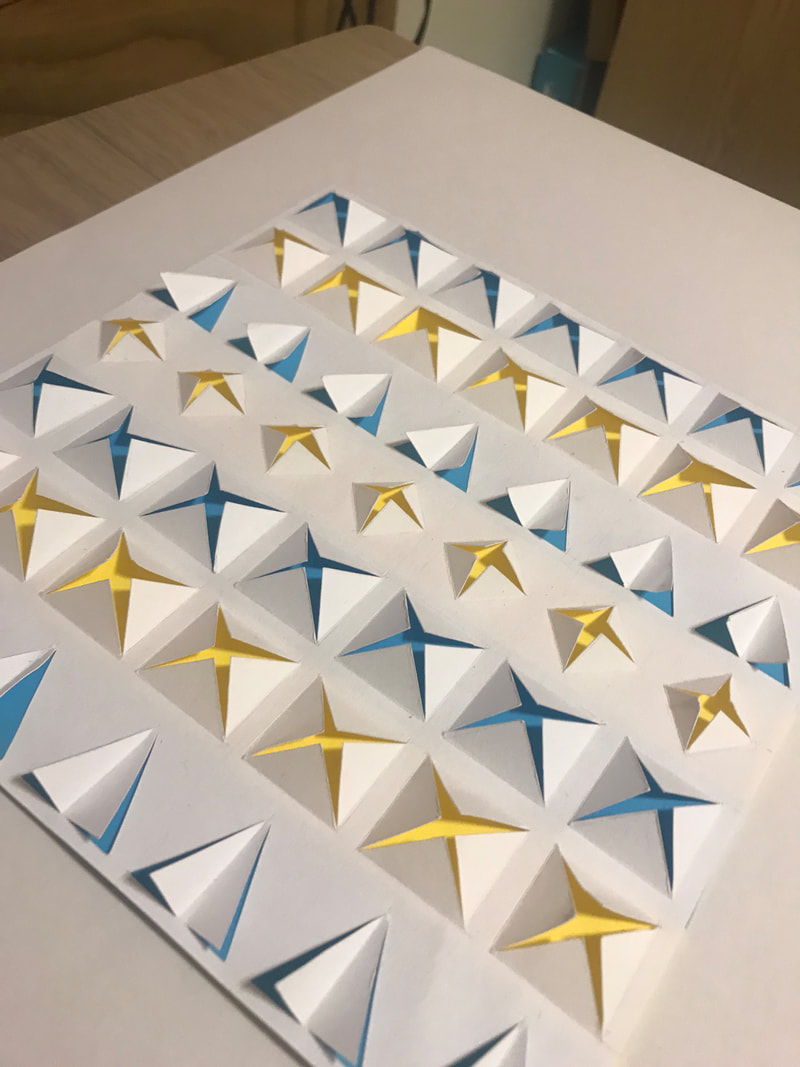
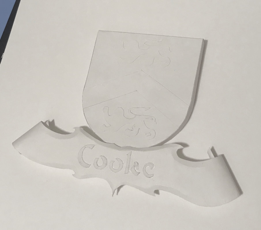
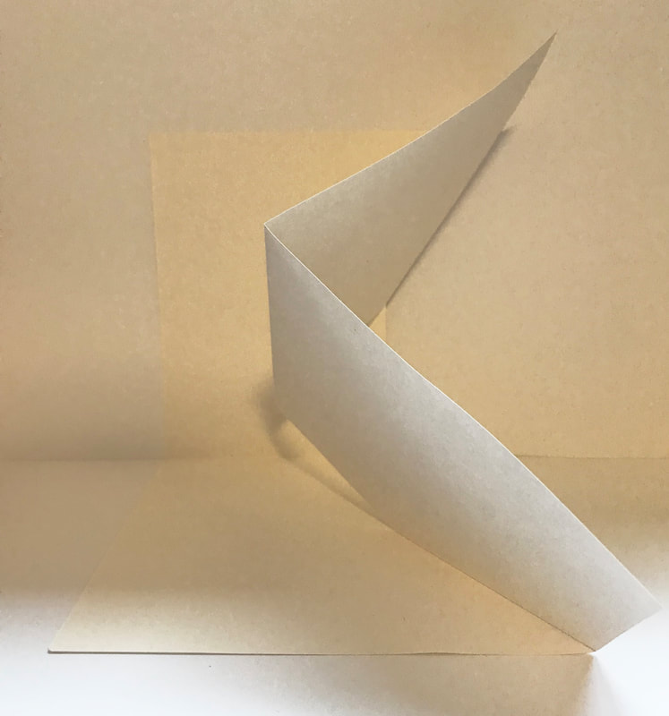
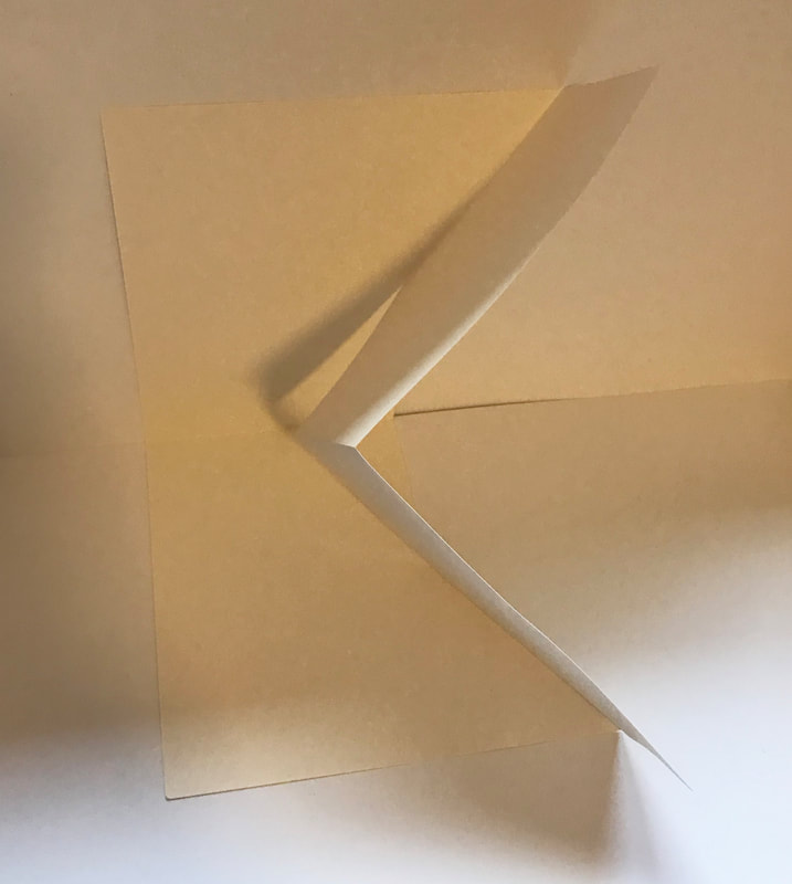
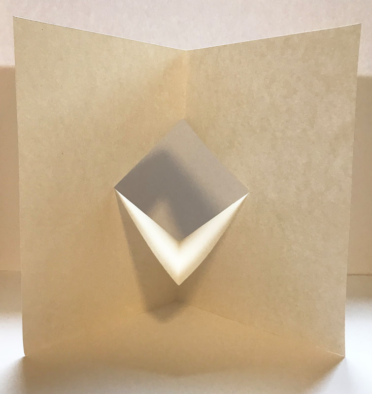
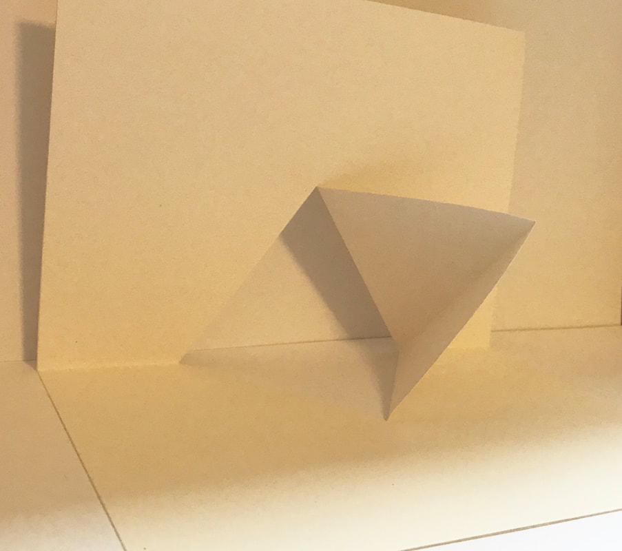
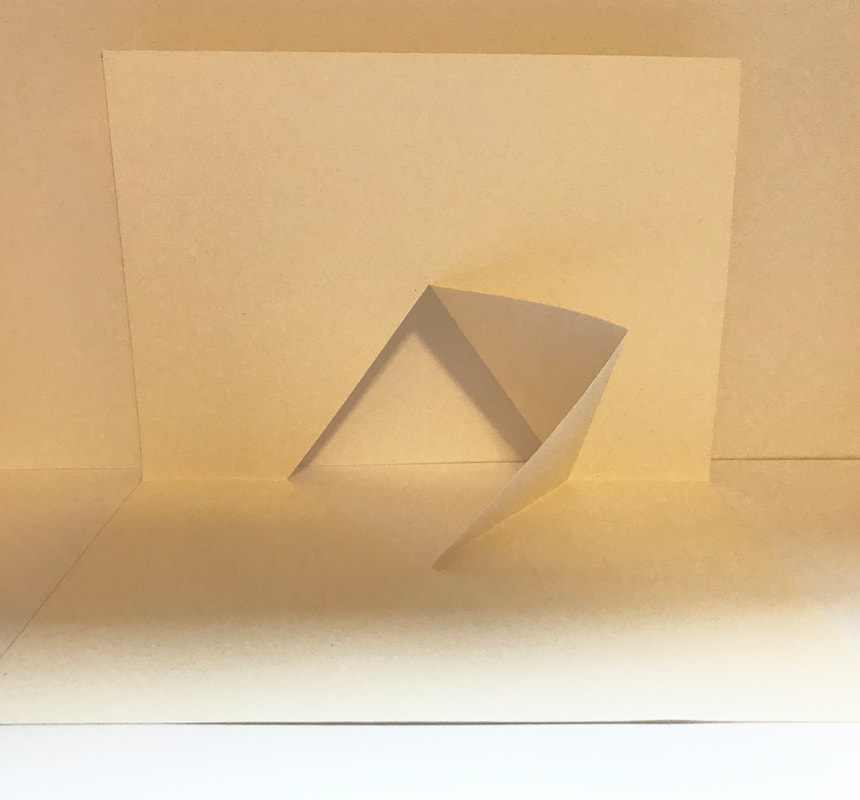
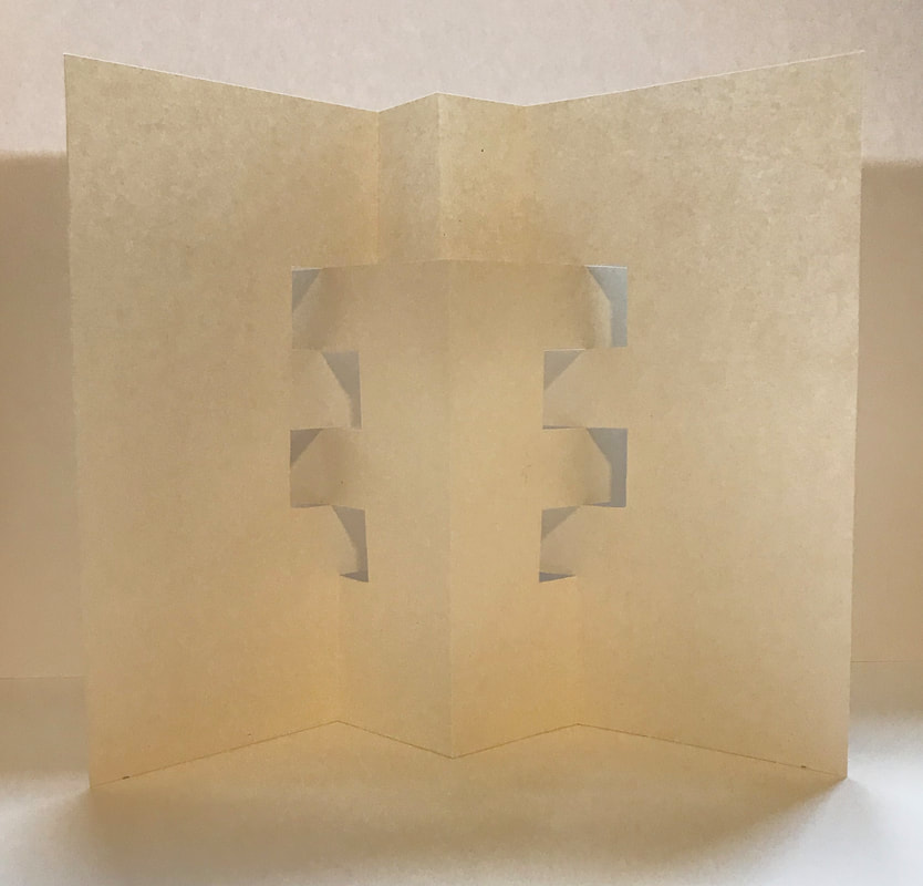
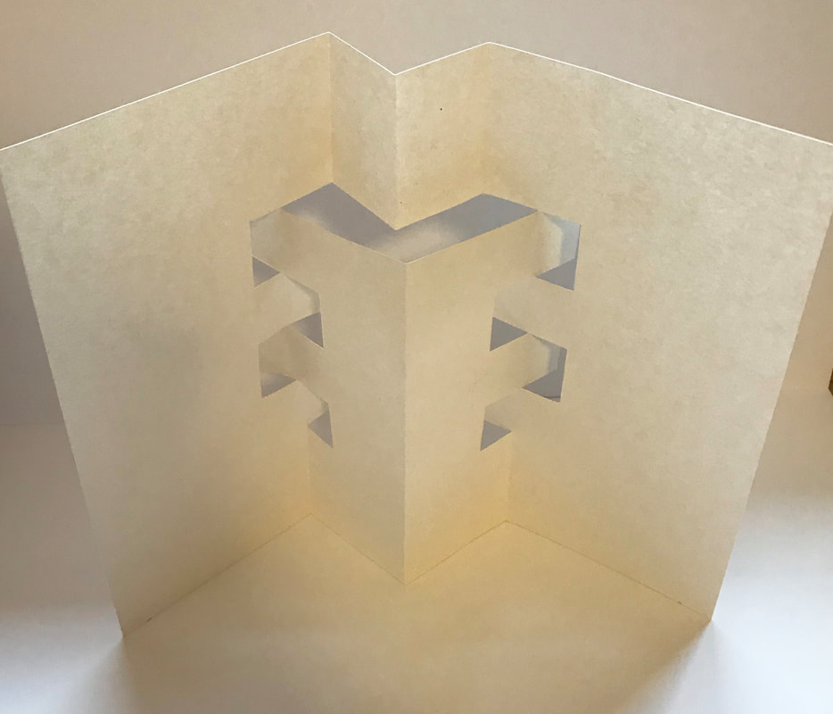
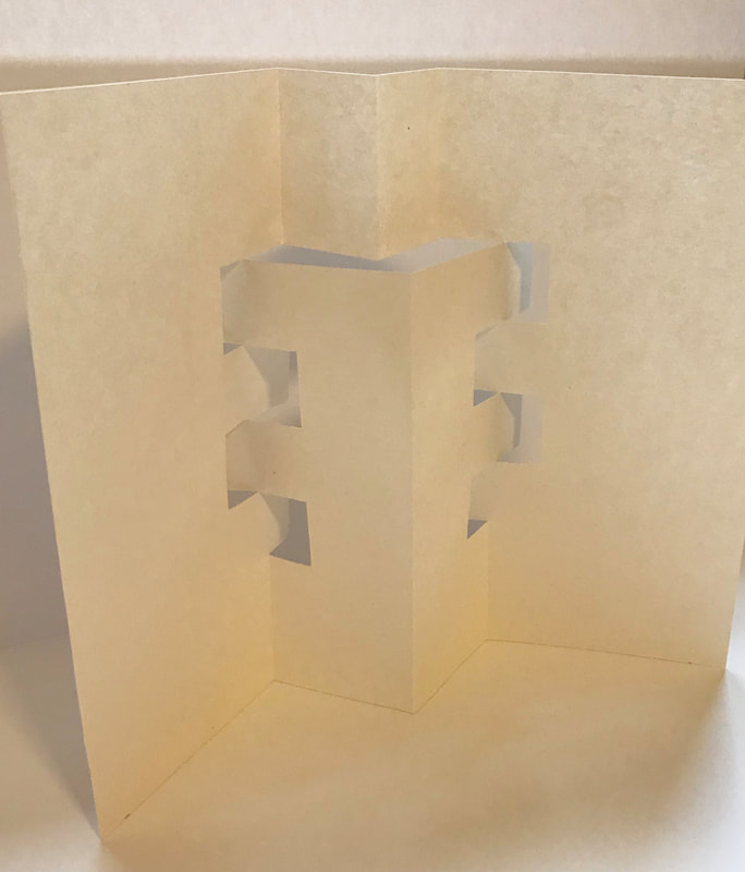
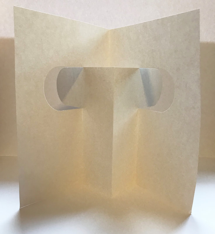
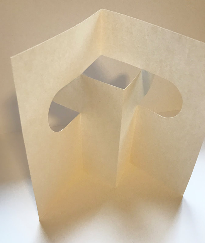
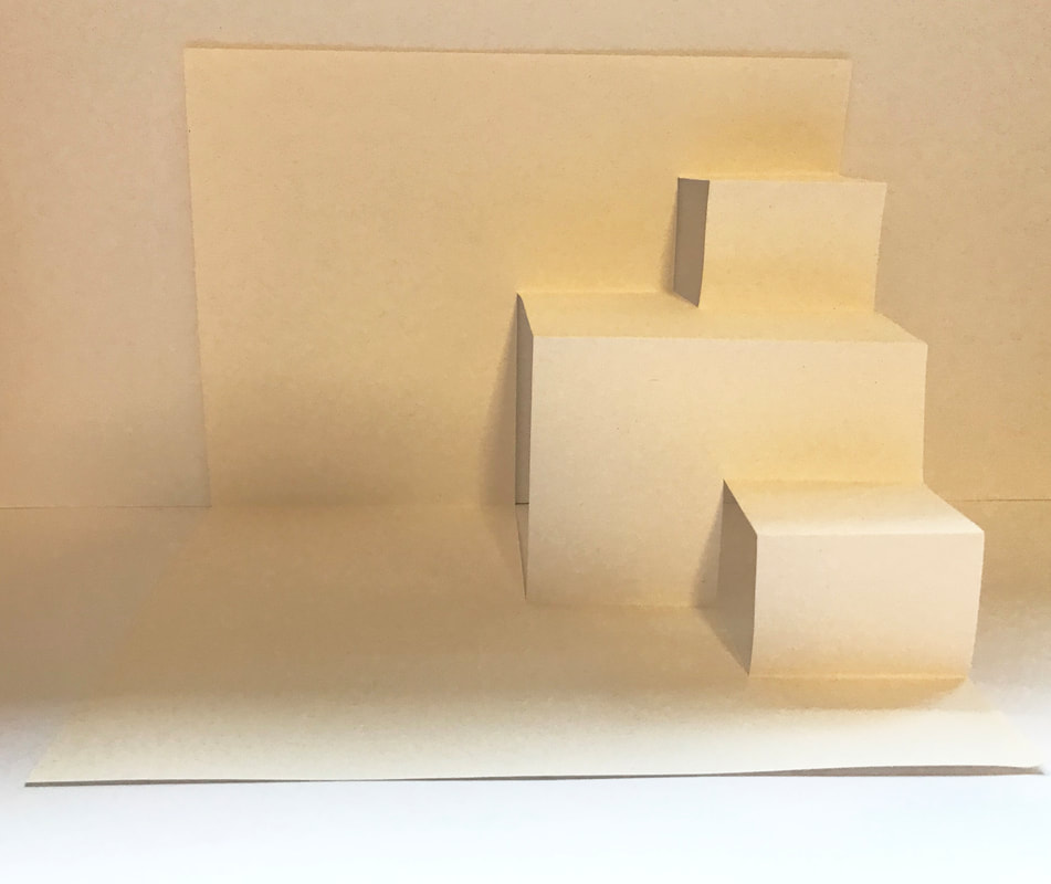
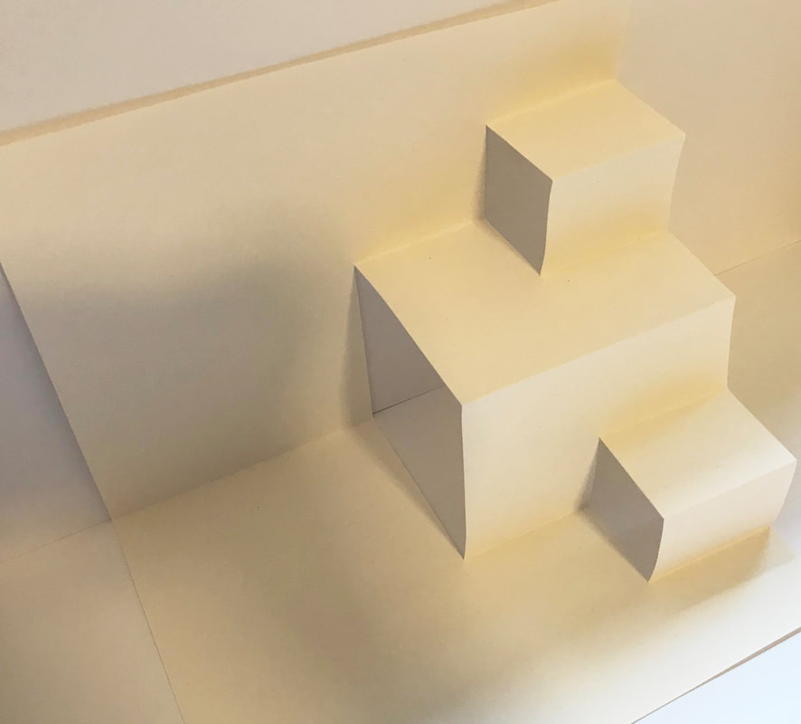
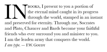
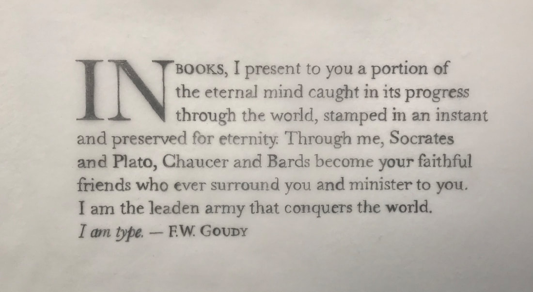
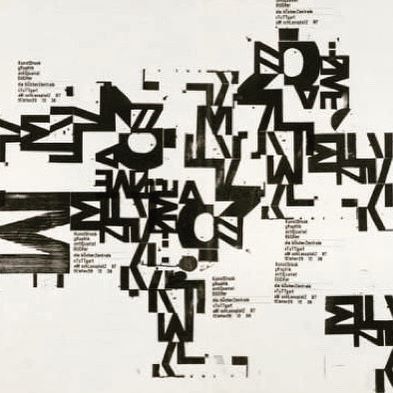
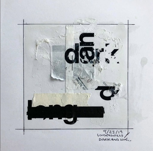
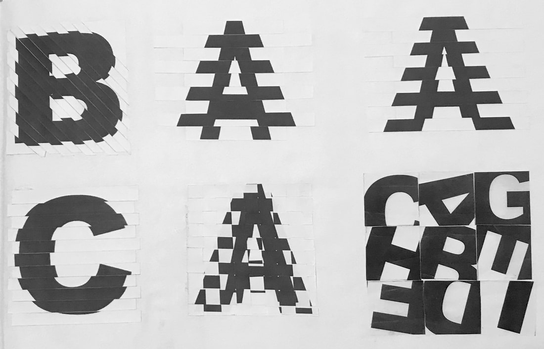
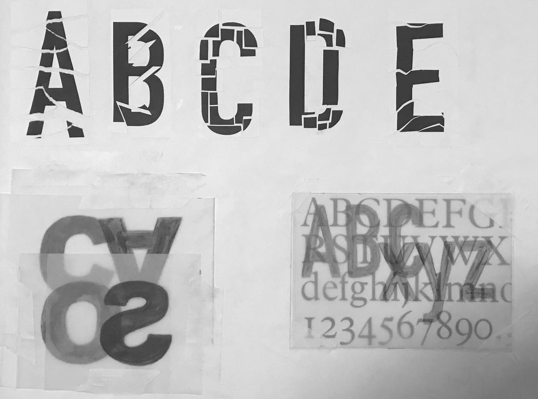
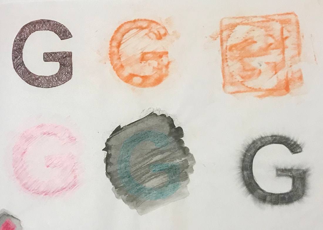
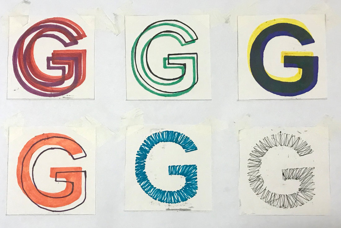
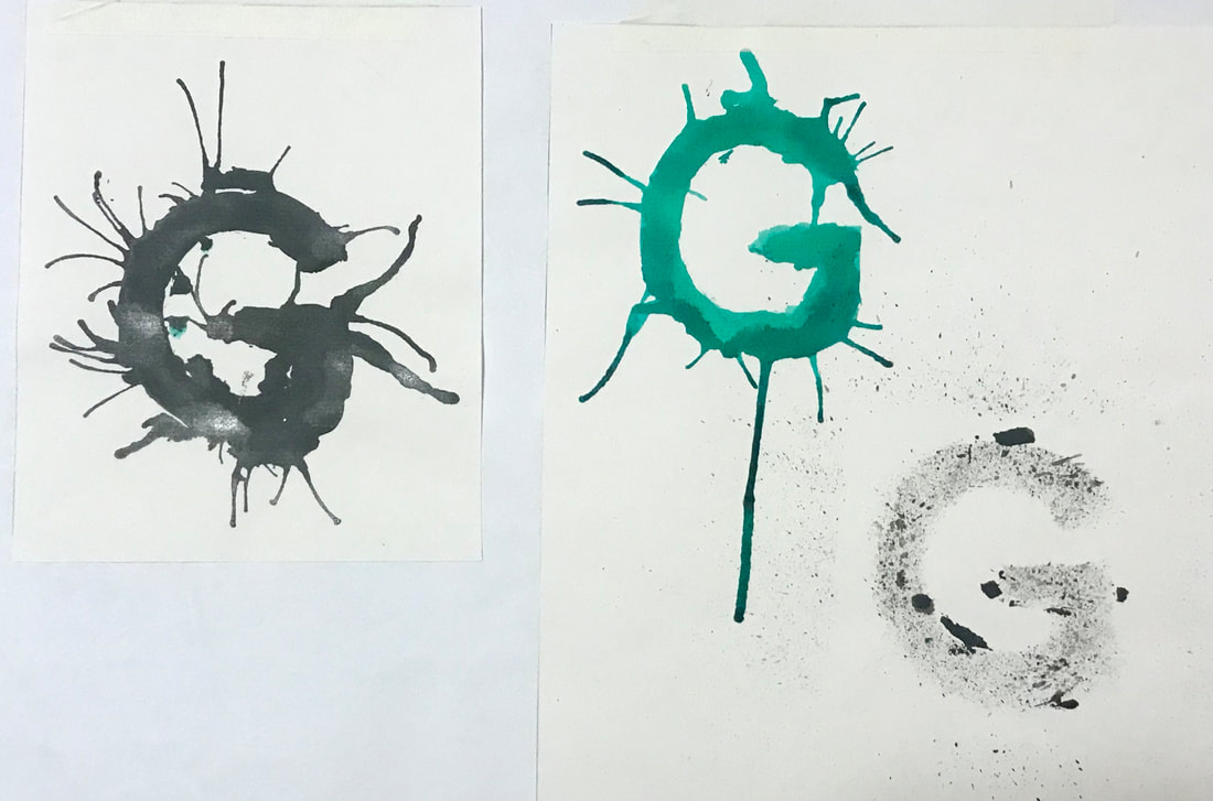
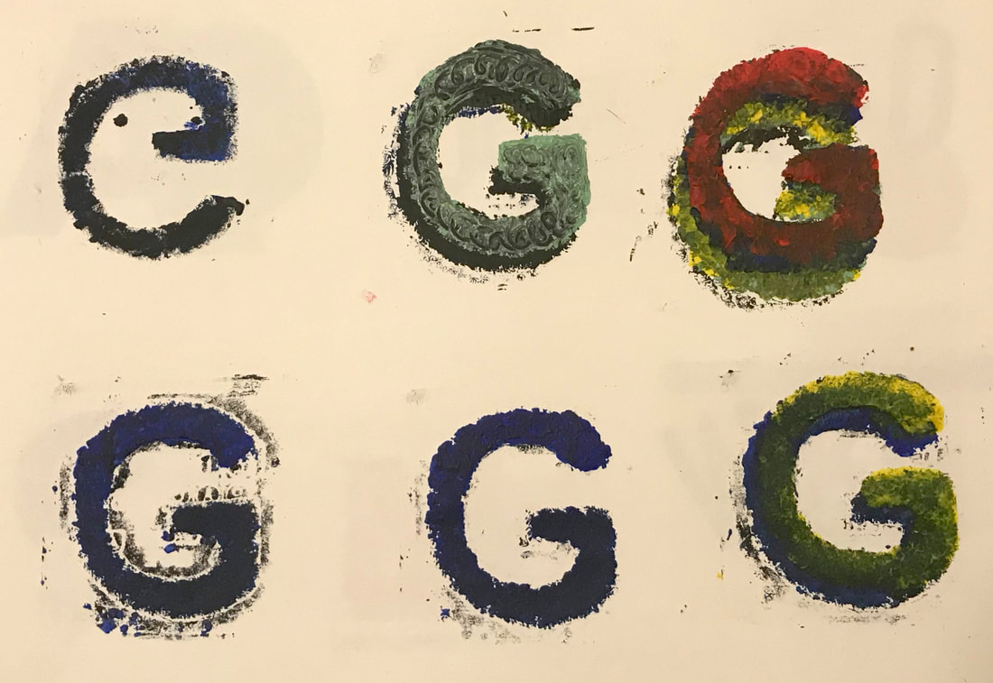
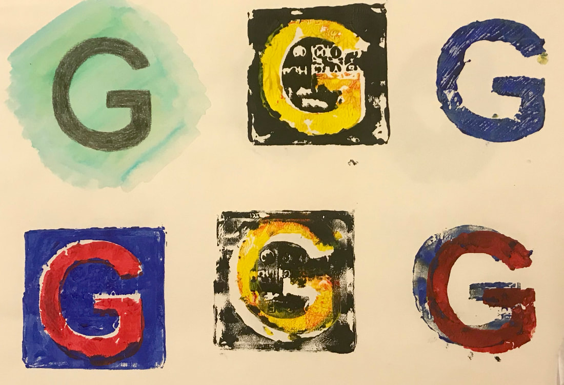
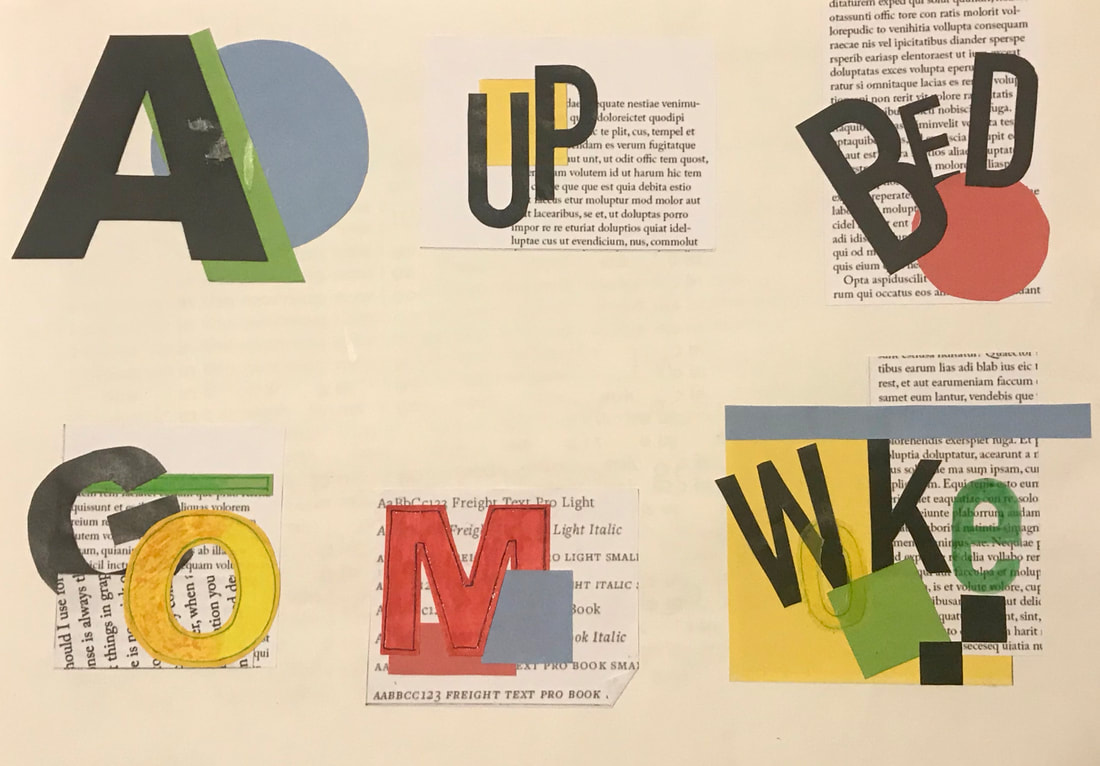
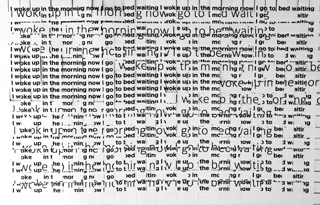
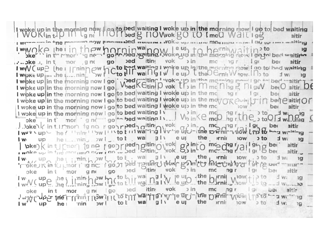
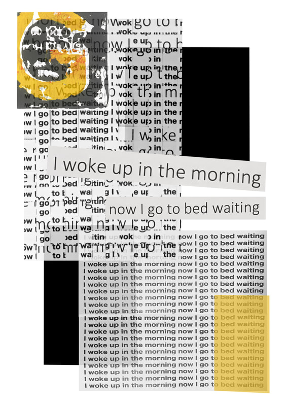
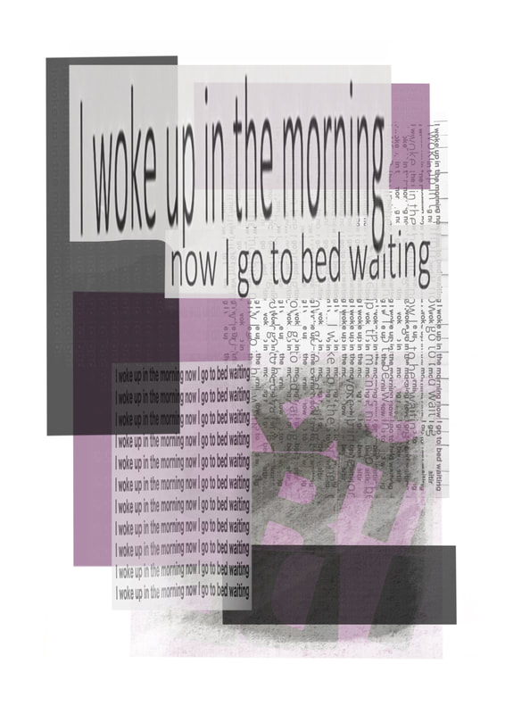
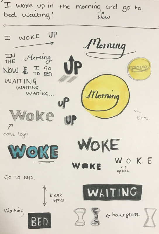
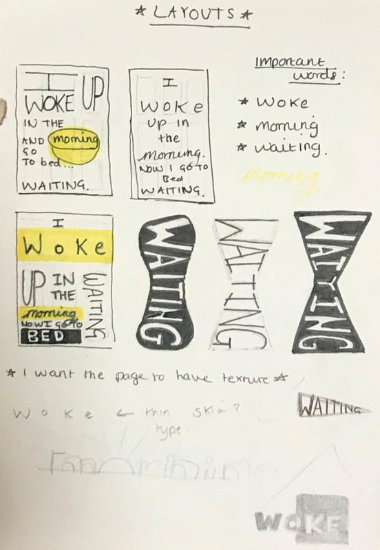
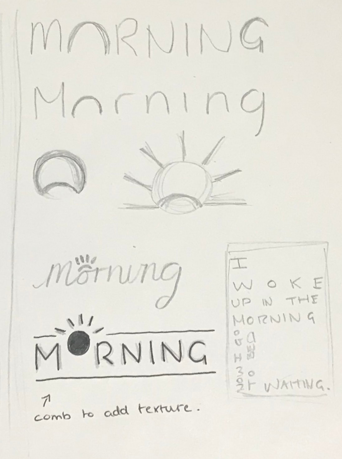
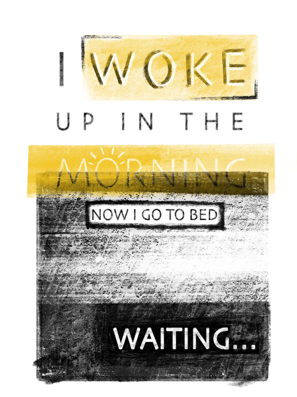
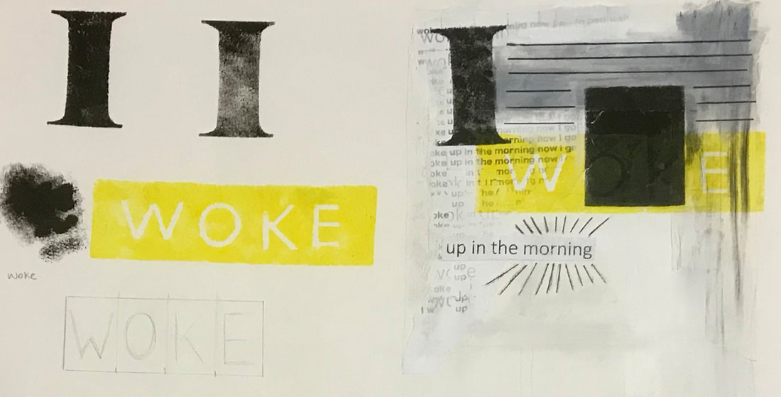
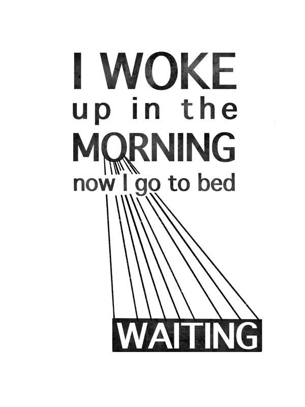
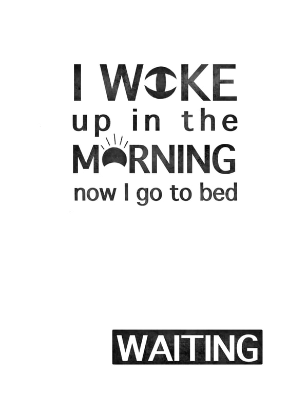
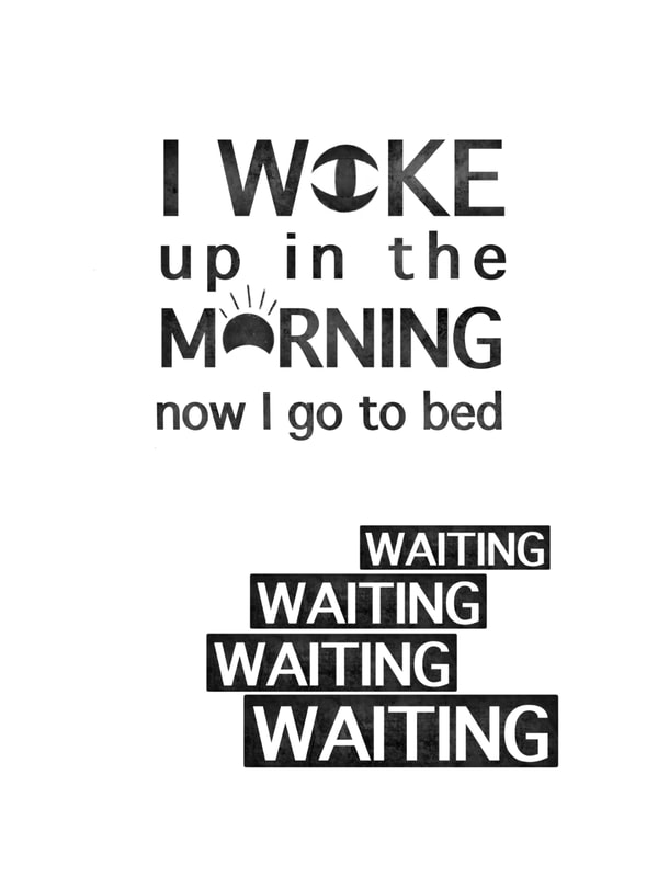
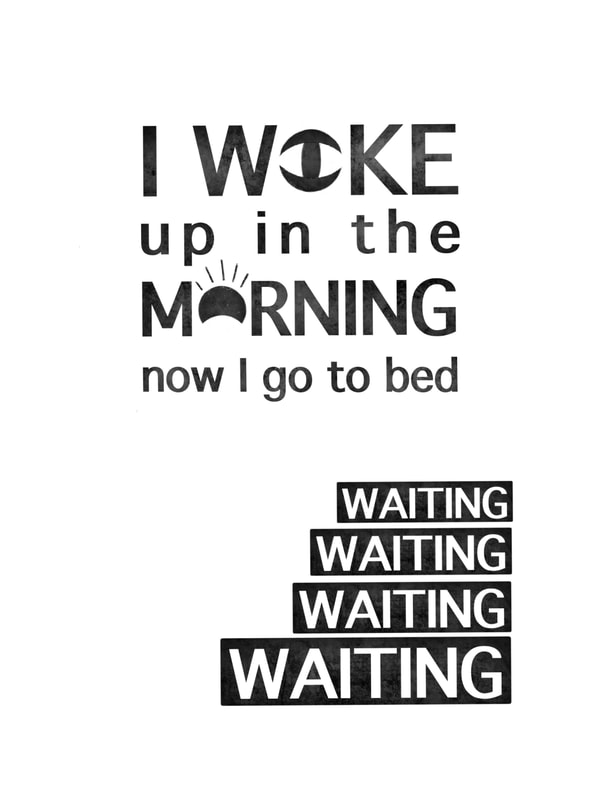
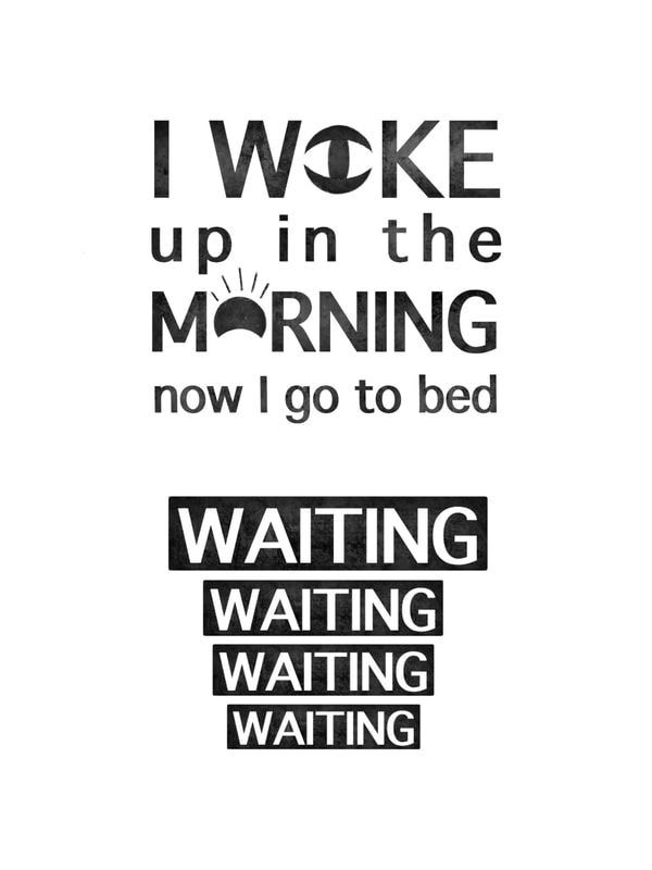
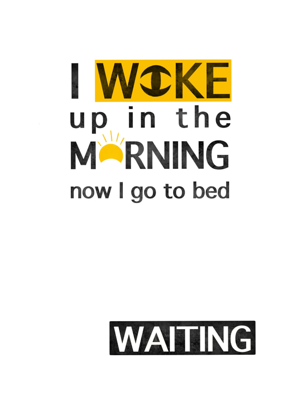
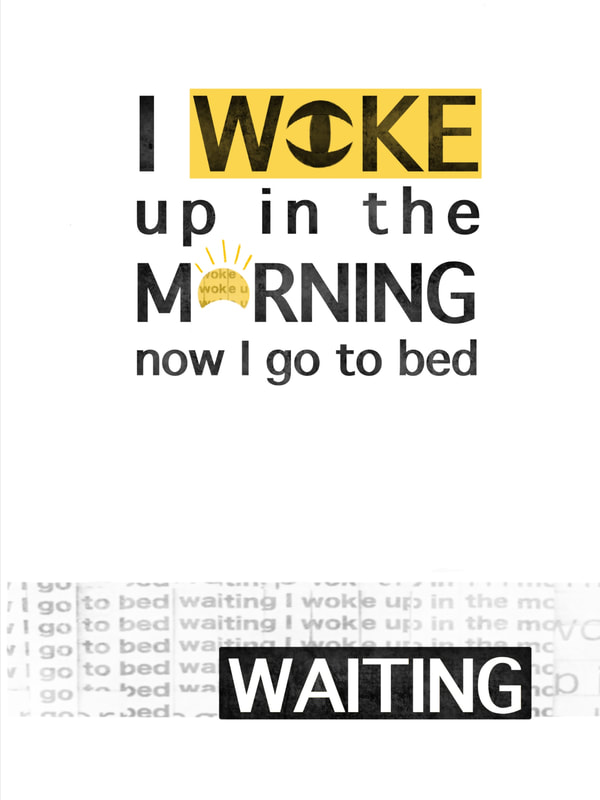
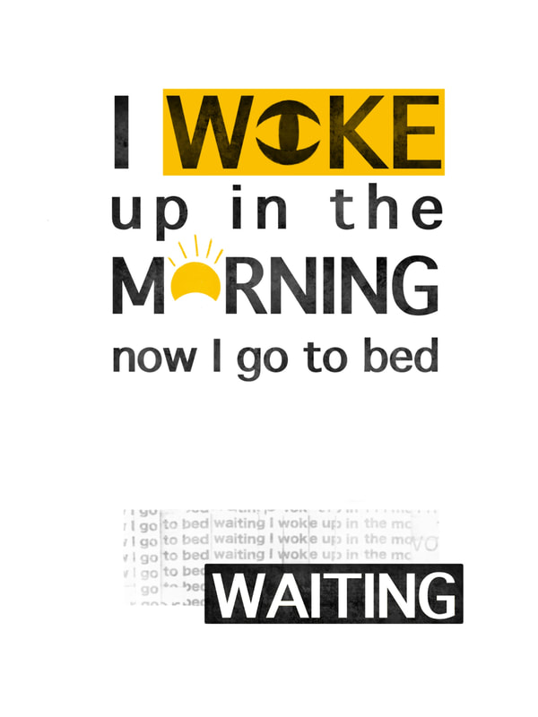
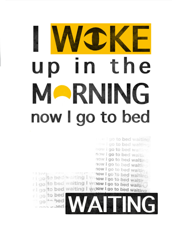
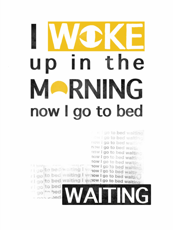
The first two weeks of this project revolved around exploring how colour and arrangement are a crucial part of visual communication, working using both analog and digital processes. Colour Theory To start the analog activities, we had to paint a colour wheel using only red, blue and yellow paint, showing the primary, secondary and tertiary colours. Next to this we had to create two sixteen step tonal scales, one using just black and white paint and the other using black and white along with one of secondary colours we mixed for the colour wheel, attempting to make each step tonally identical to the grey scale. 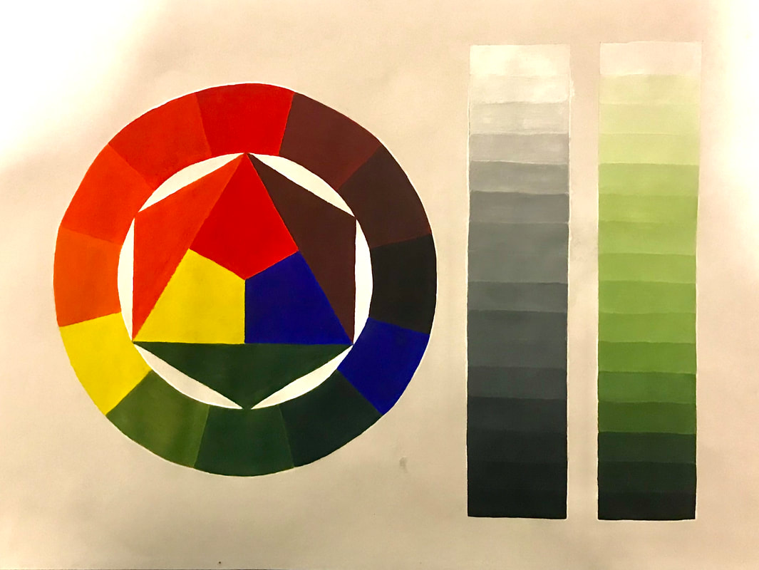 We then moved on to re-create the classic Bauhaus colour and personality exercise in order to explore the potential of colour communication. Using square grids we had to use the three primary colours along with black and white to mix colours we liked, making sure every square was different. We then had to use the same technique to create arrangements of coloured squares that communicated 'Mumbai, a rainforest, Blackpool, a misty morning, Autumn and a hospital ward. 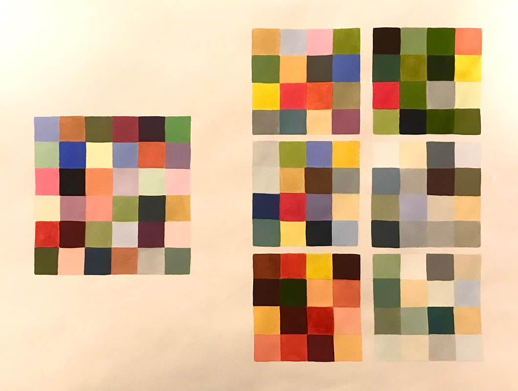 Designing with Type Our next task required us to use only letterforms to create six final digital typographic designs using given typefaces in combination with as many colours as we saw fit in order to answer a 'problem'. The point was to help us explore the infinite possibility of shape, arrangement, colour and contrast as tools to communicate.       Using Adobe Illustrator, the process of creating these type designs can be seen through the screen grabs below: Colour Materials and Abstract Collage Another analog activity required us to explore the possibilities of paint, coloured paper and glue to create arrangements and experiment creating pleasing compositions to set us up for our next lecture. 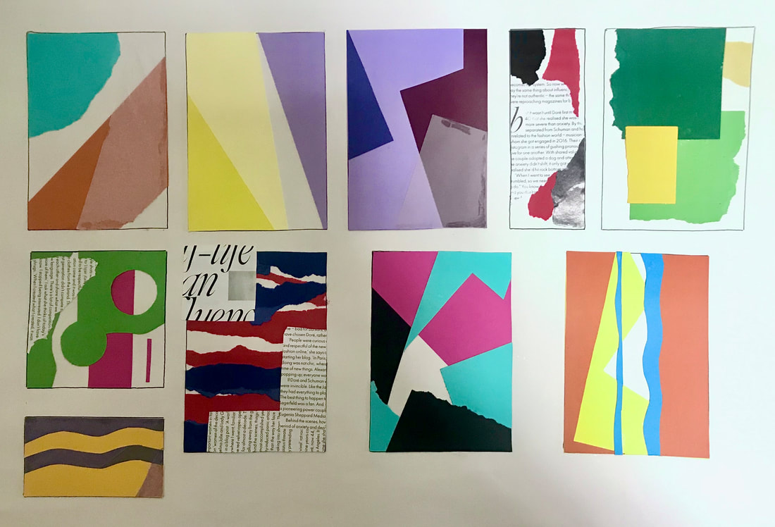 Composition This week we had to research and work in the style of three designers: Vaughan Oliver, Peter Grundy and El Lissitzky. The aim was to understand the key elements of their work; how they use composition, colour, type, imagery, and replicate their styles using Adobe InDesign, Illustrator and Photoshop. We had to produce A3 posters in the style of each of the designers for the theatre productions: Little Red Riding Hood, The Woman in Black and Hairspray. Vaughan Oliver/The Woman in Black Vaughan Oliver is best known for his work designing album covers for The Pixies, combining dark photography and experimental typography, and using digital and analog techniques. I collated a few of his works together to use as inspiration, all found on Google Images. For my thumbnail sketches, tried to play around a little with different poster layouts and placements for the typography as well as a few ideas of what kind of imagery I wanted to use to represent the theatre production. I chose to use this artist for 'The Woman in Black' due to it incorporating such dark imagery and texture, which I felt fit in well with the theme of horror. I then began experimenting with some ideas using Adobe Photoshop, playing around with different filters for the imagery, (the image I used is linked here) and combining different fonts to see which looked the most pleasing. I also added texture by overlaying some dust/scratches (linked here) to make it look for worn away and old as well as noise as it looked too clean. For this design I tried to combine a serifed font with a calligraphy font. Being new to this program, I similarly experimented with some more designs (image used linked here; texture linked here). Before created my final poster, I wanted to experiment a little with combining different typefaces so see what worked well together; I tried to make them look sort of grunge. However, I did find this quite difficult. 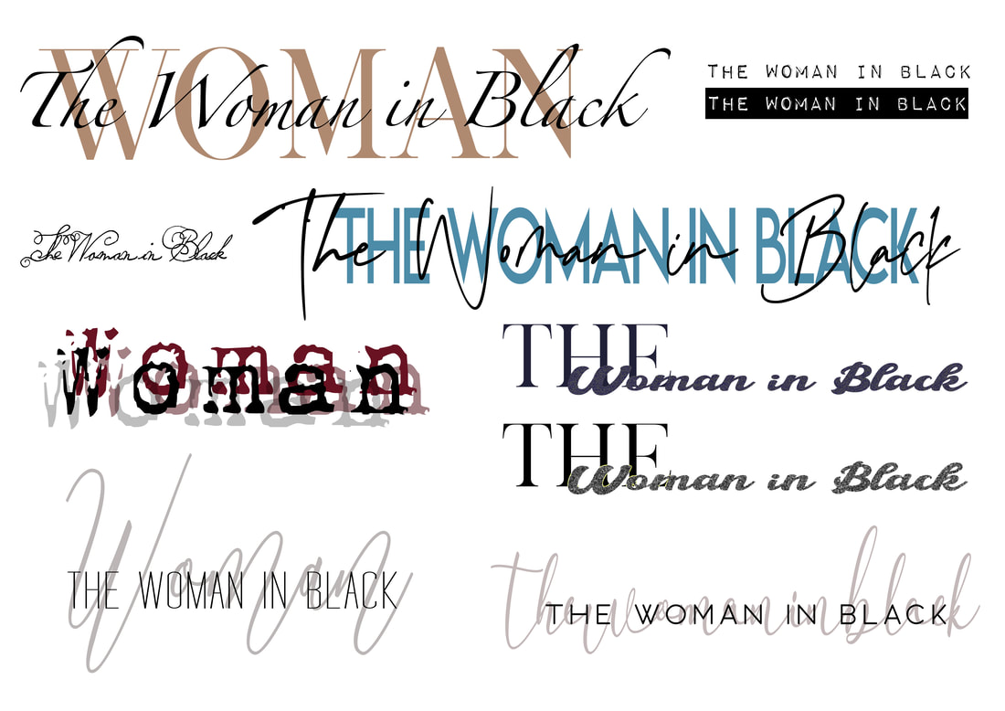 For my final poster, I used one of the images I used before, layering on different filters to make it look over exposed and grunge looking. I also added textures and noise to add to the worn away, old photo effect. I then added boxes to include the information about when and where the production is held, and then finally, I chose to use a calligraphy font in a muted colour behind two complimenting serif fonts of the title of the theatre production in order to make it pop more. Peter Grundy/Hairspray Peter Grundy is an illustrator and designer known for his work on infographics, highlighting the power of playful colour and basic shapes to communicate. I collated some images from Google to help inspire me. I then drew up a couple of thumbnails of ideas for my 'Hairspray poster'. Using Adobe Illustrator, I began by creating a few elements using vectors that I could use for my poster designs, by combining individual shapes to create images. I then experimented with some colour palettes taking inspiration from Grundy's work, as well as some simple sans serif fonts to communicate the information about the production clearly. Here I experimented with some other poster layouts. The first one I kept the type centred and added a few extra elements to create more interest. For the other design I chose to include some of the other vectors I created, focusing on using complimentary colours in order to make the poster stand out. El Lissitzky/Little Red Riding Hood I began my research by googling images of his work, collating images I found had appealing compositions that would inspire me in creating the poster. Lissitzky was most well known for his Russian modernism, constructivist designs, greatly influencing the Bauhaus movement. A master at mass communication, his limited colours and fonts created powerful dynamic geometric layouts. Looking at his work its clear he favoured a particular colour palette: red, black, white and sometimes some muted yellows, and thought that would work really well with the theatre production I chose to do in his style. When drawing up my initial thumbnail ideas, I tried to incorporate his dynamic use of layout using simple shapes, and tried to think about how to couple the shapes with the type. Some designs I also wanted to included some photographic imagery. I began using Adobe Illustrator to draw out the shapes and then added the type on top (the font was downloaded here). I didn't like the cleanliness and flatness due to it being done digitally; his actually work was hand printed, so I added some textures and noise to give it more of a printed effect. For this design I used a photographic image (found here), and using the same kind of colour palette and font I incorporate some simple line/geometric shapes. Final Posters I'm really happy with how my final posters turned out and think they reflect the artists techniques well. My abilities will improve the more I get used to using the software. 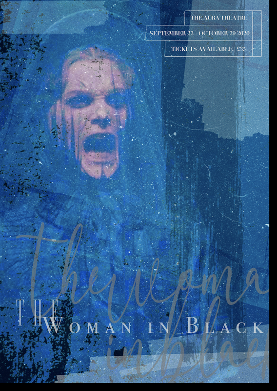 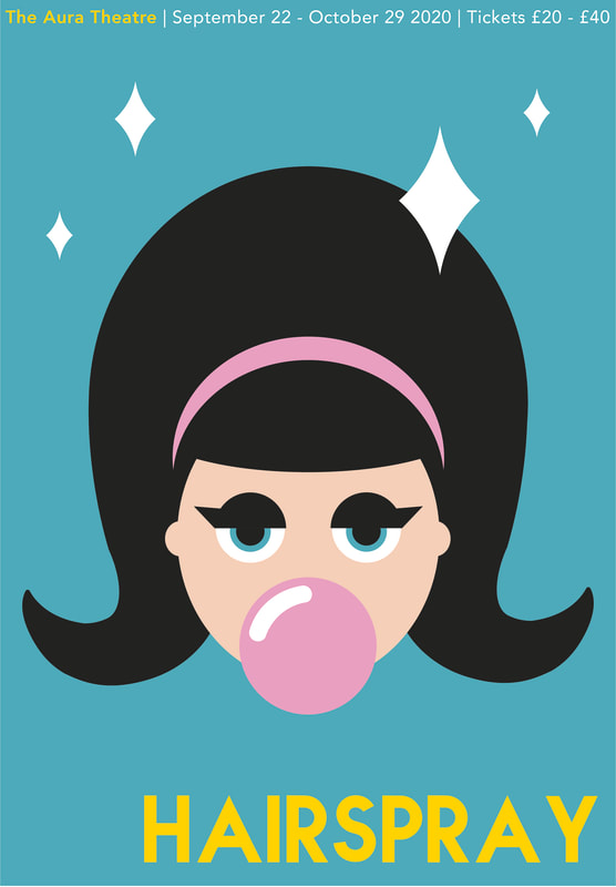 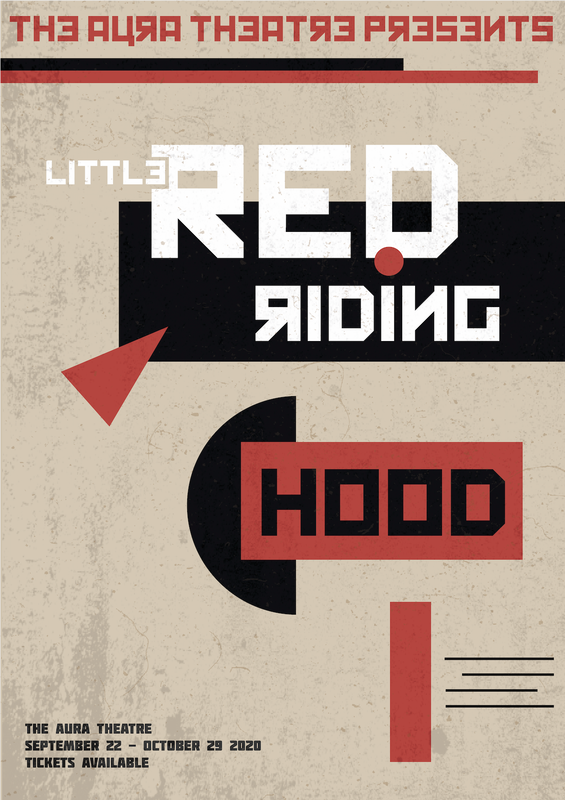 Brief For this project we had to design 40 different thumbnail ideas for a portrait format theatre poster. We then had to take five of our ideas and and refine/develop them further. Finally we had to take the three best designs and work them up as more detailed client visuals on a slightly bigger scale. Research/Thumbnails I chose to design a poster for the theatre production 'Hamlet', a play about the ghost of the King of Denmark telling his son to avenge his murder by killing the new king, who is Hamlets uncle (research taken from here). Themes of the play revolve around madness, life and death and revenge, so many of my ideas feature elements such as skulls, swords, ghostly figures and blood. Developments I really liked the idea of using a crown shapes as part of the lettering so I explored this idea further when developing my poster thumbnails. I also looked at a few different typefaces; ones that had a more medieval look to them. I tried to think of different ways to layout the poster, trying some posters with the main title of the play at the top and others in the centre. 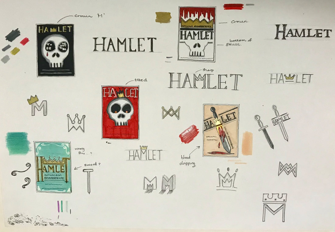 Final Piece These are the designs I was most pleased with and choose to work up in more detail. The first design I chose to make more ornamental/decorative, to represent the 'royal' theme of the play, using gold and blue and further developing the idea of added a crown onto of the type itself. The second design also played with the idea of using the crown onto of the text but in a different style. This design also incorporated the skull to represent the theme of death and the character, Yoricks, skull itself. I preferred the cleanness of this poster in contrast to the third design which features a sword dripping with blood. I liked the idea of incorporating the crown into the type as the letter 'M' and also making the layout a bit more dynamic by having the text on a slant rather than it all being uniformly straight and centred. Overall, I'm happy with the outcome of the project as I think my designs are all quite different from each other, allowing the client to have a good variation of ideas to choose from. It was a big challenge trying to come up with so many ideas as its something I'm not used to doing but I will continue to improve on this as the course progresses. 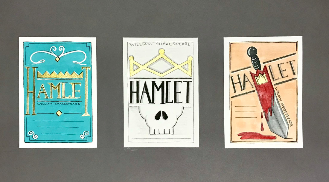 These two weeks revolved around developing confidence in drawing and sketching. One Point Perspective Perspective drawings make an object appear solid using a linear illusion of depth, making objects look solid and three-dimensional. One point perspective uses a single vanishing point... Moving cubes and boxes around the horizon within the frame: Playing around with fences: Playing around with grids/chessboards: Playing around with ellipses/cylinders: Two/Three Point Perspective Thumbnail Visuals Warm Up Session  Brief For our second project we were asked to transform ourselves into an inventive 'designer' paper toy. We were required to present the made up 3D model of our character, in addition to the A4 net with associated typography, graphics, instructions and cutting lines. Our toy had to be in some way recognisable as ourselves, reflecting our own culture, background, interests, sense of humour and concerns. It could be rendered digitally or as traditional artwork. Research Paper toys are constructed by cutting, folding and glueing paper to form desired shapes. They originate from the art of origami (research from here). I began my research by looking at other designs for paper toys online, particularly at different ways to layout the nets to create the shapes/pieces. I wanted to be able to draw out the net myself from scratch rather than just using a template. Here are some of the ones I used for reference (links are in the captions): Development I first brainstormed some ideas of how I wanted my paper toy to represent me by doing a quick mind map of some of the things I associate with myself. For example, my interests include Harry Potter so one idea was to create myself wearing a Hogwarts robe, holding a wand or spell book. Another idea involved representing me being a vegan; wearing an avocado costume to add some humour, simply a typical outfit with the vegan symbol on the shirt, and extras such as holding vegetables to link to the stereotype of vegans only eating healthy. Here I also thought a little bit about the net itself with the idea of having an interchangeable face to show different emotions.  I then did a few quick sketches of some of the initial ideas. I decided to move away from the avocado costume idea as I wanted my paper toy to still have sharp edges and be cube-like similarity to how they are traditionally. So I focused on drawing visuals of myself wearing a typical outfit I would wear that still showed a part of my lifestyle with the design on the top. Here are some mock ups/experiments of some of the shapes I wanted to create. Inspired by one of the paper toys I linked above, I tried to make a net for the head and hair separately as I thought it made it look like it had more dimension. Next I started to draw out rough diagrams of the nets for the shapes that would make up my paper toy. thinking about where the tabs needed to be placed for gluing. I chose to create nets for the top, left arm and right arm, bottoms, head, a hair piece and a base. I then decided to draw the nets onto graph paper in order to keep them as accurate as possible. Using a light pad, I cut around the nets so that I could arrange them to fit on A4 paper before scanning them and drawing them out digitally on Procreate, making sure the lines were crisp and clean. After this, I constructed the mock up nets into their 3D models using a craft knife and ruler to cut out the nets, score the fold lines and glue the tabs together. 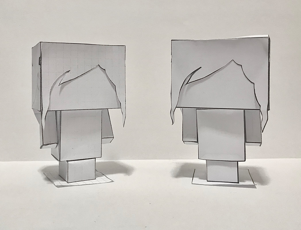 Final Piece Once I was happy with the nets, it was time to add colour. Using my preliminary sketches of designs as inspiration, I used Procreate to colour my paper toy. I wanted it to be realistic and true to my likeness, but in a cartoony style. I coloured the tabs black to make it clear they were the parts to add glue to and also made the lines that are scored and folded as dashes. I then designed the page to include instructions for construction as well as labels to each of the pieces to make it look more like a finished product. 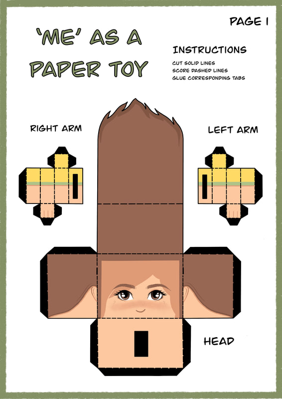 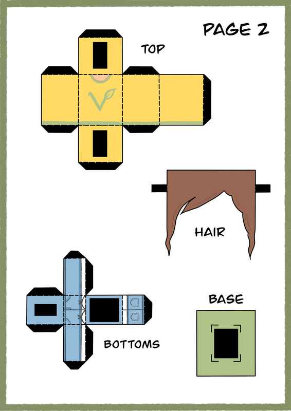 Overall, I am happy with my finished paper toy and I feel it fits the brief well as it represents me and my interests. The things I think I could improve on the most is that my research could have been more thorough, in addition to the amount of initial ideas being drawn up as thumbnails so that I had more designs to work from. However, I did experiment with the nets and shapes and how I could draw out the grids before committing to the final piece, showing development from start to finish. Below is the made up 3D model of my paper toy. The first two weeks of this project revolved around us practicing, experimenting, planning and exploring. The aim was to get us to develop competence independently and learn from looking at the work of others; to engage with the world. We were given two weeks of old school projects to work through to showcase our problem solving, showing no glue or construction marks. Books Our first few tasks instructed us to make three books; saddle-stitched, stab-stitched and perfectly bound. Each of these included certain specific requirements such as size and decorative motives on the covers and inside the pages. Presentation The next tasks involved working on our presentation skills, mounting postcards, drawing out shapes pristinely and embossing. Each of these had to have specific size requirements and be centred correctly. Cutting We then moved on the cutting. Tasks included cutting out a circle perfectly with a 40mm radius, cutting out and mounting type in a specific size and font and creating our own decorative paper cut out using a craft knife. The Third Dimension These tasks involved making 3-D shapes of specific measurements, experimenting with surface patterns and creating our own paper sculptures using cutting and folding techniques. Paper Play Session This sessions aim was to encourage us to think about folding, cutting, light and shape by creating mini pop-ups and photograph them from a series of different angles. Anatomy of Type and Type Personality Workshop There are different features that make up letters. For this workshop we were tasked to render a sentence accurately on tracing paper, making sure to consider the anatomy of each character, 'thicks and thins', and the leading and kerning of each character/word. The Brief For our first two week project we worked as a team to create a book of experimental typography consisting of lines of text we were each given to work with to create our own individual pages. The final book is to be commercially printed and sold at the Lakes International Comic Arts Festival. A comic is most commonly described as being made up of a series of panels containing images used to express ideas. These are usually combined with text or other visual information (research from here). As graphic designers, our aim was to use type and typography to interpret and create an abstract response to the text we were given. The compositions had to be entirely typographic and created using analogue techniques and in addition to this, we were restricted to using only black and one other colour of our choosing. The aim of this project was experimentation and exploration, rather than design problem solving. Research To start me off on the right track I began with researching experimental typography to gain some inspiration. Experimental typography can include altering and manipulating the shapes of letters, playing with letter spacing (white/black space), font size, texture, and layout to create new unique designs (research from here and here). One of the graphic designers I looked into was the Swiss typography work of Wolfgang Weingart, who is known for breaking the rules of typesetting. I was particularly interested in his technique of distorting type by spacing out letters, curving lines, collaging and reorganising type to create new compositions. Furthermore, another designer I liked was Chris Ashworth, who similarly to Weingart, was inspired by Swiss design, known for using barcodes, horizontal lines and multiple transparent layers (research from here) Experimentation In order to get us started with experimenting ourselves, a workshop was held from which we were encouraged to explore different techniques and approaches. These involved taking typefaces of various sizes and styles; slicing letterforms into multiple parallel strips and sliding them against each other, mashing up two contrasting typefaces, interweaving two differing typefaces of the same letterform. Other techniques included cutting out a viewfinder to crop portions of letterforms and rearranging the squares, tearing to create an illusion of the letters disintegrating, and using tracing paper to overlap multiple layers of type. Below you can see these techniques in play through my own experimentation. I then continued to experiment further with different materials and mediums. In another workshop we were encouraged to create our own print block of a large letterform from a piece of polystyrene, and print with one/two colours, messing around with misalignment and overprint effects, using acrylic paint, crayon and coloured pens. In addition to this, I chose to distress some of the prints I made; blowing ink to create a dripping effect, sponging paint onto the stencil, overlaying wax crayon with ink and smudging charcoal. I then went on to experiment with collage techniques, trying to think about positive and negative space and the differing scales of the shapes. Development After all that experimentation it was time to start combining it with the line I was given for the comic to make my page. My line was: ‘I woke up in the morning now I go to bed waiting’. To begin, I decided to use one of the techniques by printing out two pages of the line repeated in differing fonts and sizes and interweaving them to create an abstract effect.I then decided to distress it further using an effect on Procreate to fade certain areas to make it look more worn away. I then decided to have a play on Procreate, using some of the collage techniques I learnt previously through the workshops to distort the text. I tried to think about the use of black and white space, adding small pops of colour to add more interest. The only thing I don’t like about these quick compositions is I felt it looked a little too busy, and because I did it digitally I wasn’t happy with the lack of texture that you would get if it was purely analogue. After this, I then went on to think more about the layout of the pages; how I wanted the lines to be lined up on the page and which words I wanted to put particular interest on. One idea involved setting up the page so the line ‘I woke up’ started off small and gradually got bigger to put emphasise on ‘up’. However, I decided against this as I thought that word wasn’t as important as some of the others. Another idea involved abstracting the word ‘waiting’ to look like an hourglass. In addition, I tried to think about way I could manipulate the text to create images representing the words, for example, taking away part of the ‘O’ in ‘woke’ to look like an eye and ‘morning’ to make it look like a rising sun. I also thought about how I could represent the meaning of the words through different typefaces, for example, thin, clean, spaced out letters for ‘woke’. Next I decided to play around a little more in Procreate to create a pleasing composition using some of my ideas. I was happy with the outcome but for further development I attempted to create an analogue version using the techniques from experimenting. I made stencils of some of the words and used a sponge to print the letters on the page, creating a more old-fashioned printed texture, and took the interwoven piece I did previously, adding rips and making it look faded into the background. However, I struggled with not making it look too overworked and as a result chose to go with a different approach. Here I experimented with different layouts: the first containing horizontal lines connecting the words as a way of representing rays of sun light. I also thought about repeating some of the words to add more emphasis. Once I was happy with the overall layout of the main text, I added some colour, keeping it towards the top of the page to link to the time of day, and also playing around with how I could add the interwoven text to the background to keep the page balanced. I also decided to try adding some of the faded text to the ‘O’ in ‘morning’, whilst still having the yellow shine through.  Final Piece Once I was happy with the layout of the design and had a good idea of what I wanted it to look like I began to cut out the letters in the font I chose to arrange on the page. I purposely printed out the letters to look sort of worn and faded in areas to give the impression it was cut from a newspaper. I then cut out stencils of the words 'woke’ and 'waiting’ to print them onto the page using black acrylic paint and a sponge to add texture. I also decided I wanted the text for 'woke’ to be in white to keep the pages lights and darks more balanced, and I chose to not use the eye shape; I preferred it just filled in white as it looked more open. After this I scanned my work onto the computer and used Photoshop to add a section of the interwoven text I created earlier to the bottom of the page and also faded over the sun shape in the word ‘morning’, making sure the entire piece lined up to the template we were provided. The finished piece is pictured below.  Overall, I am happy with the outcome of my piece and feel it fits the brief due to it being an entirely typographic way of interpreting the text. I experimented with a wide range of techniques and mediums and have shown good development in my work through exploring differing layouts and compositions, giving myself multiple designs to work from.
The only thing I’m not so happy with is that I think the piece needed more texture and less white space to look more experimental and more like a collage. In conclusion, although improvements could be made I am proud of what I’ve achieved and know I will have plenty of opportunities to improve my technical and design skills throughout the rest of the course. |
AuthorHi, I'm Emma. I'm currently studying Graphic Design at the University of Cumbria. Modules
All
Archives
March 2020
|

 RSS Feed