
|
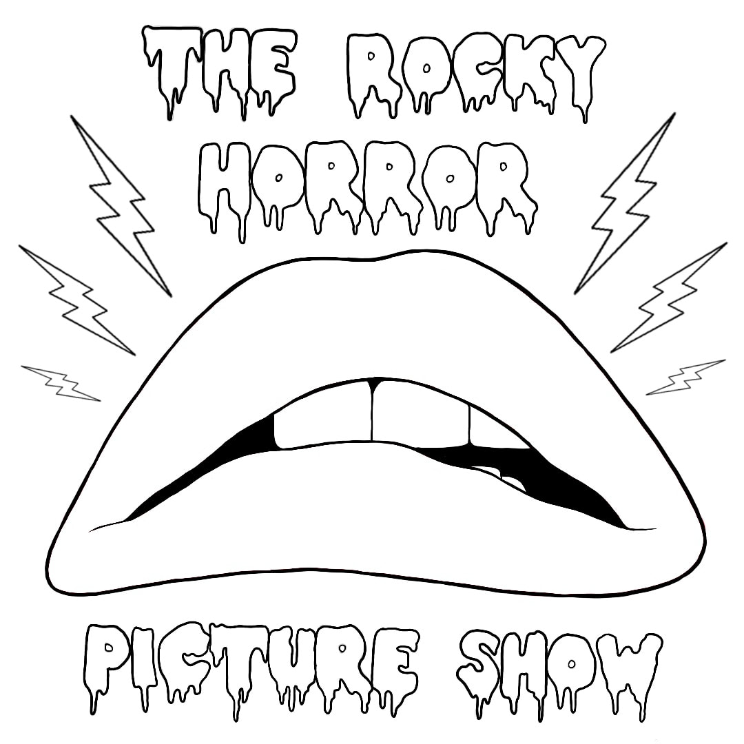
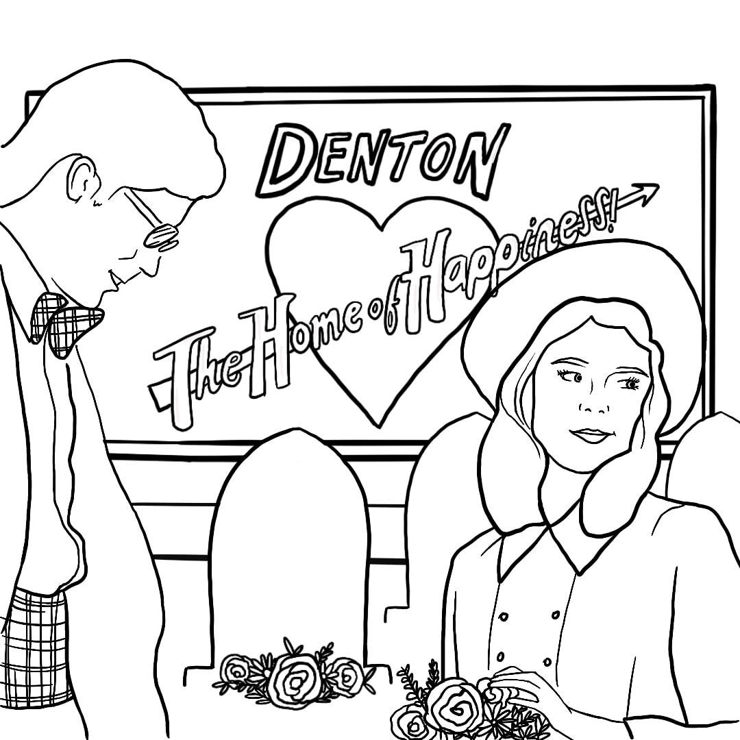
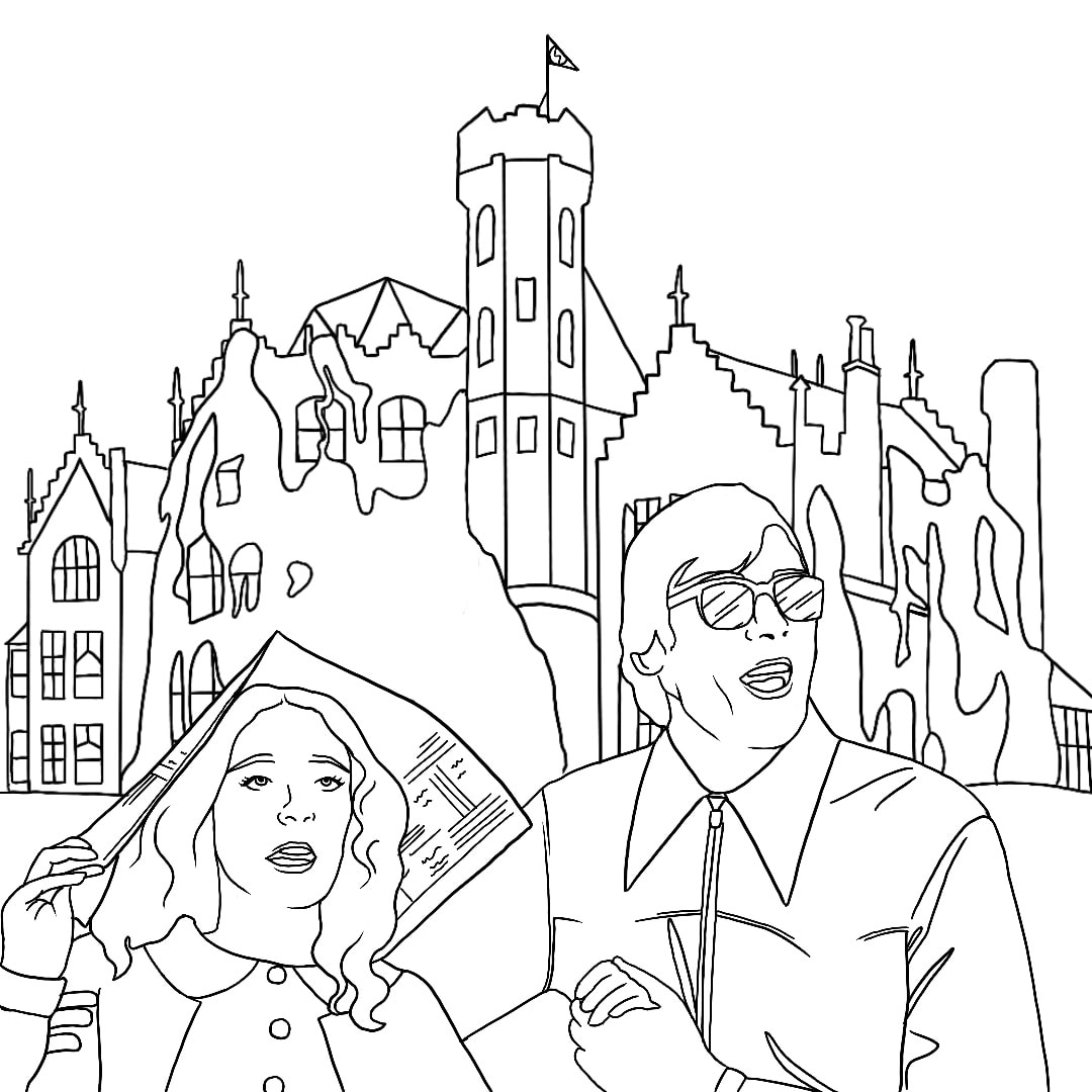
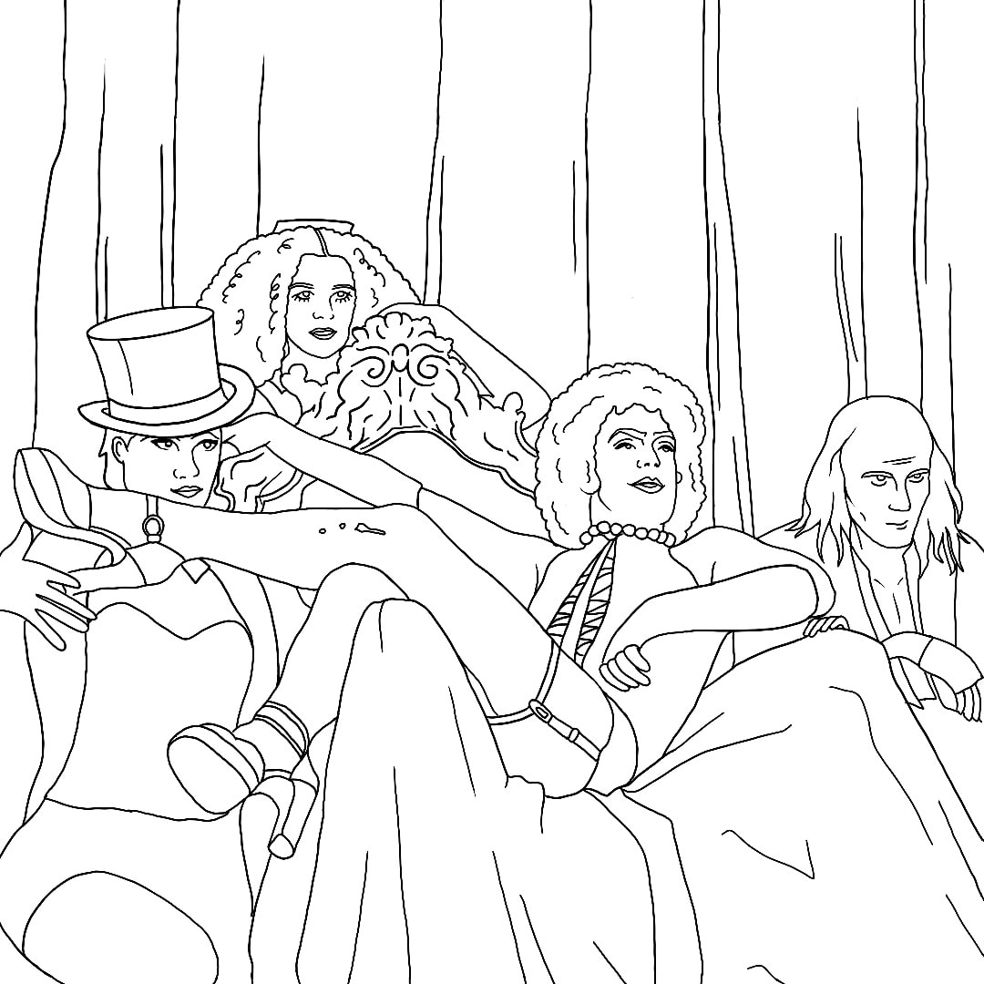
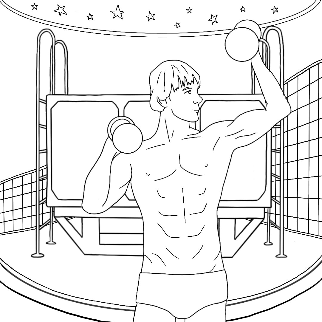
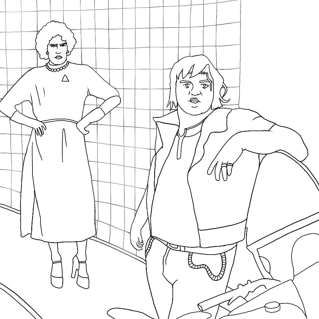
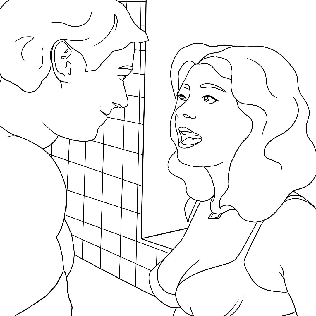
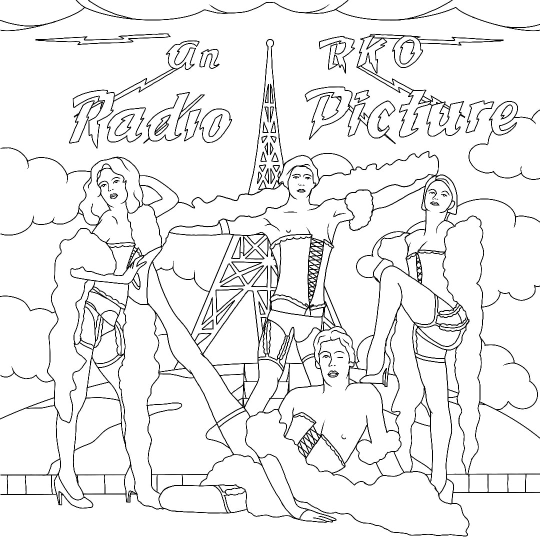
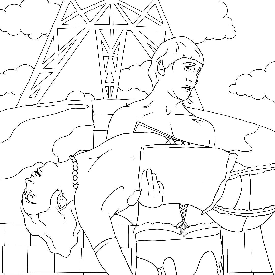
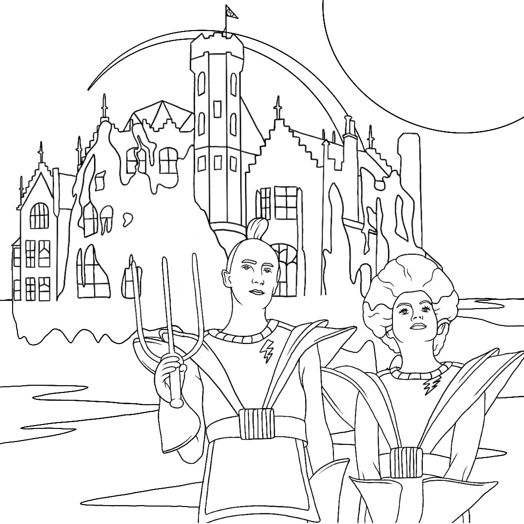
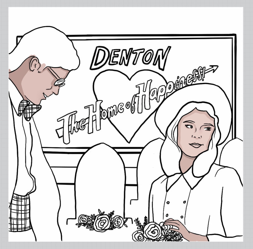
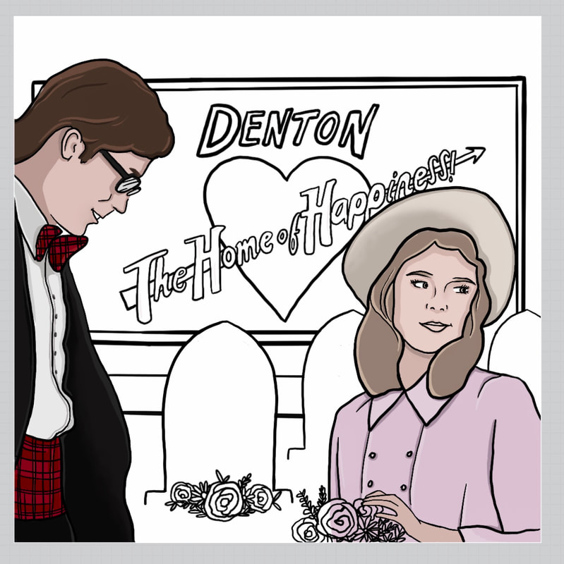
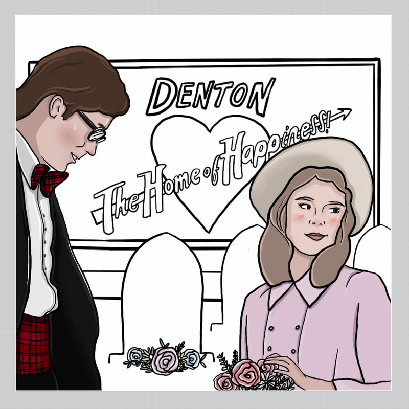
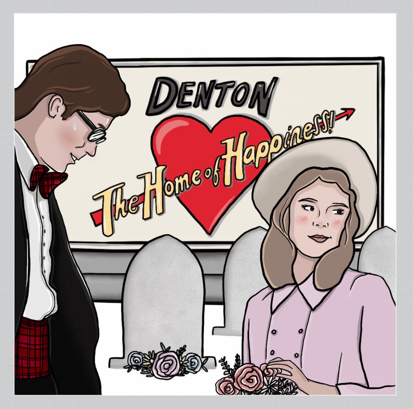
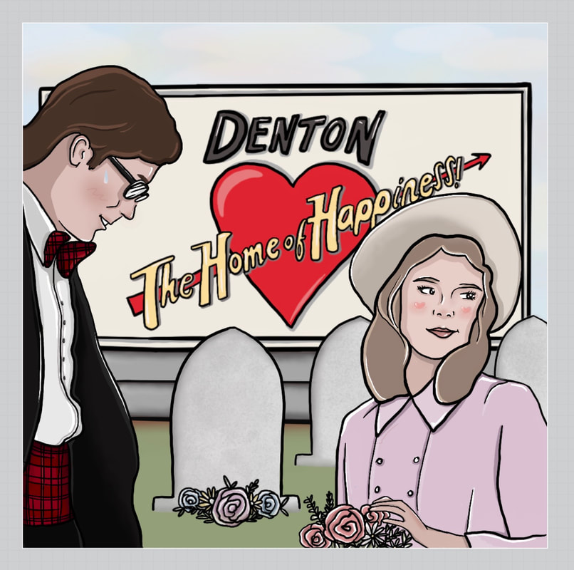
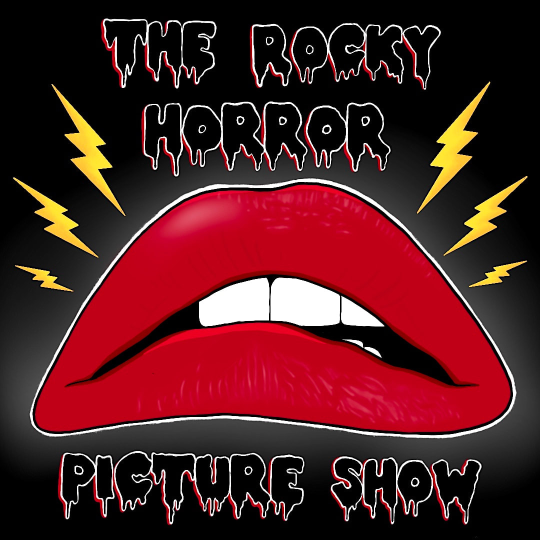
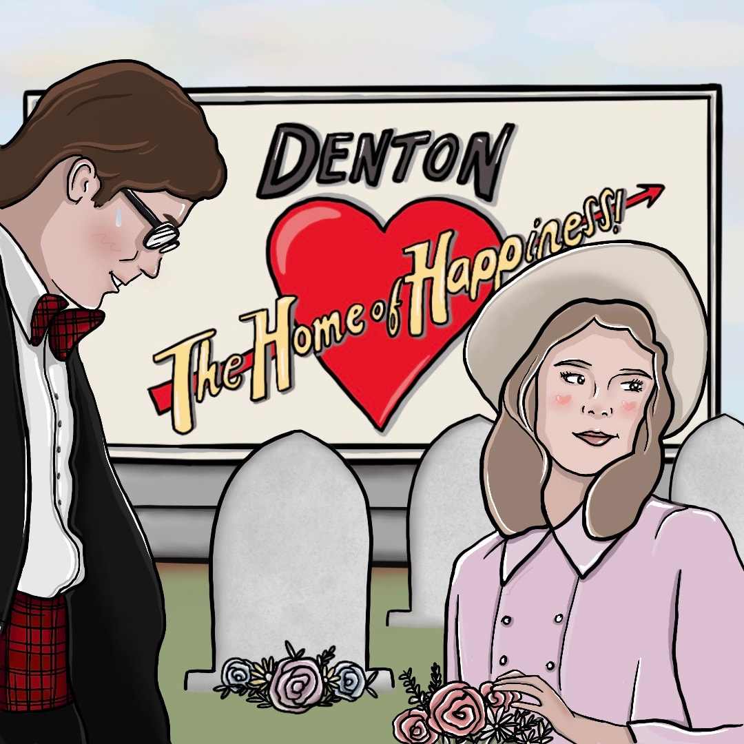
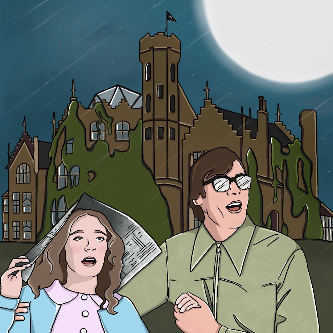
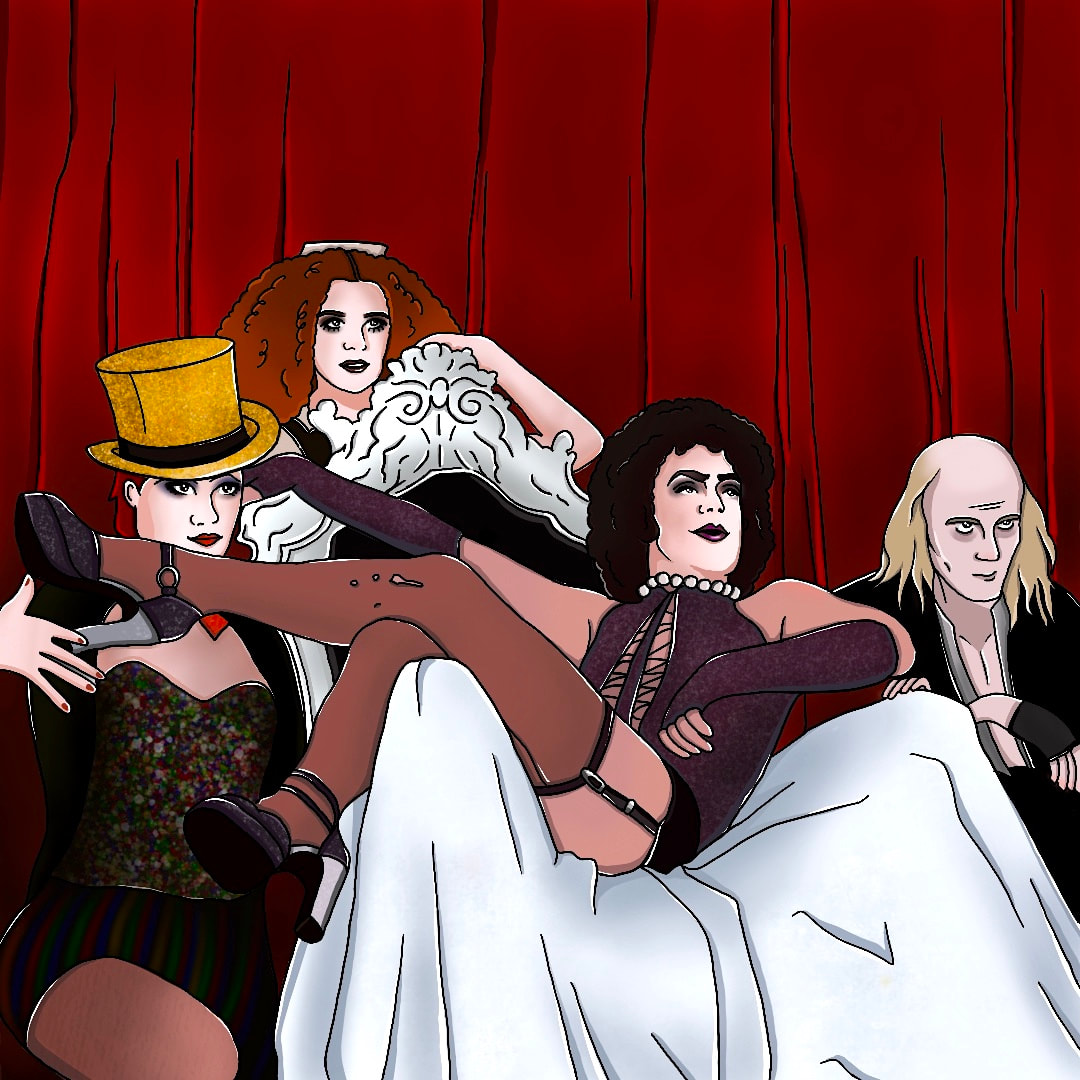
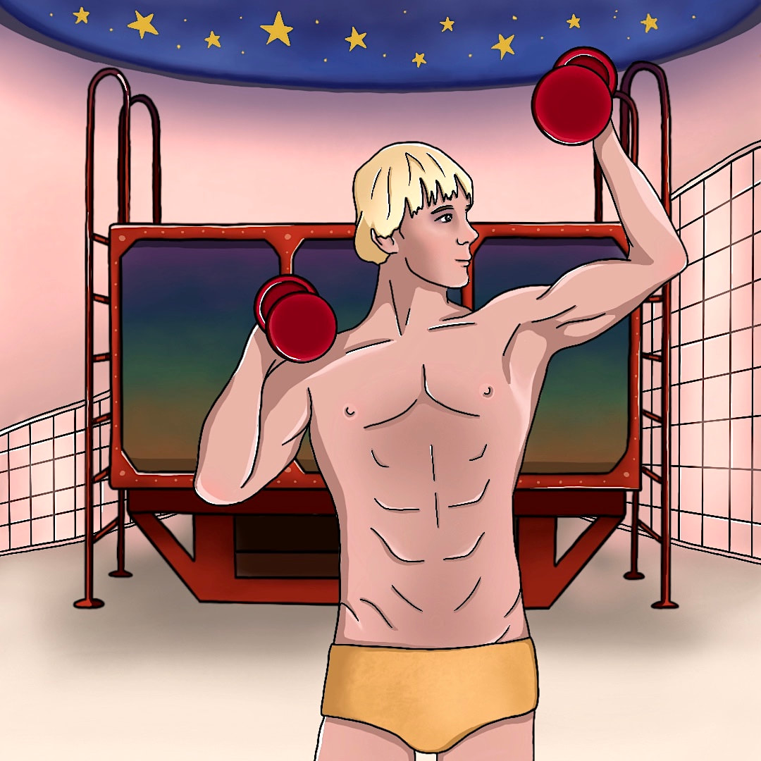
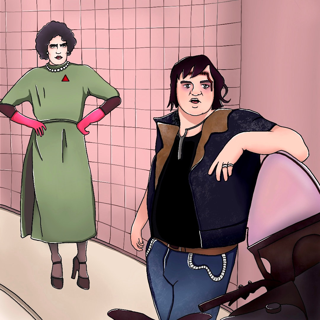
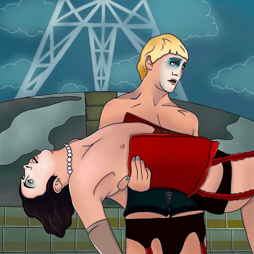
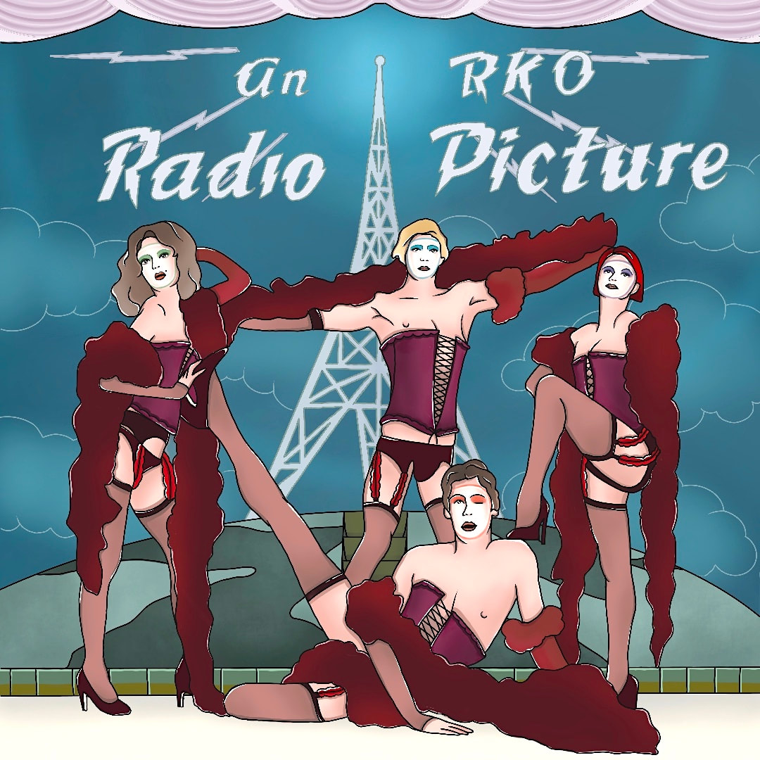
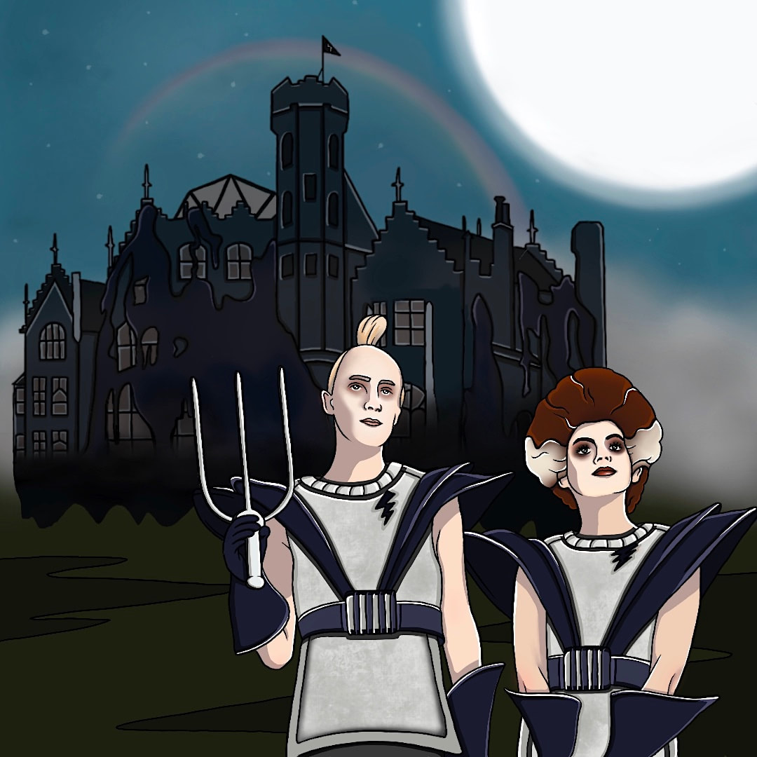
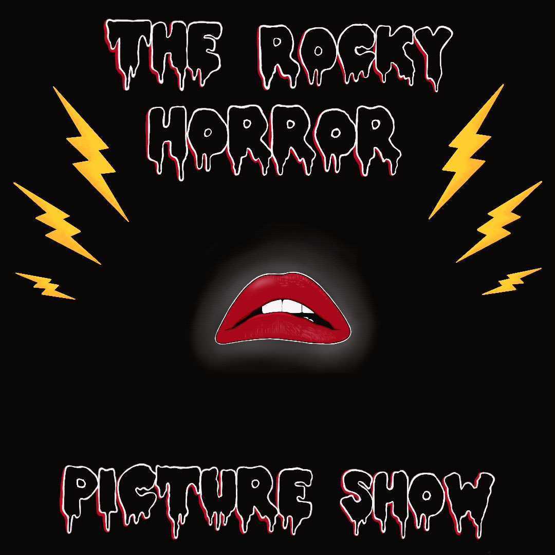
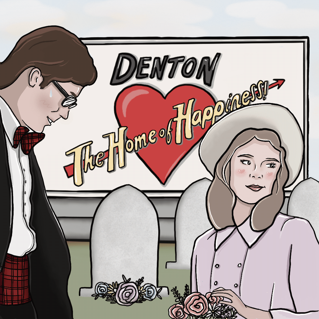
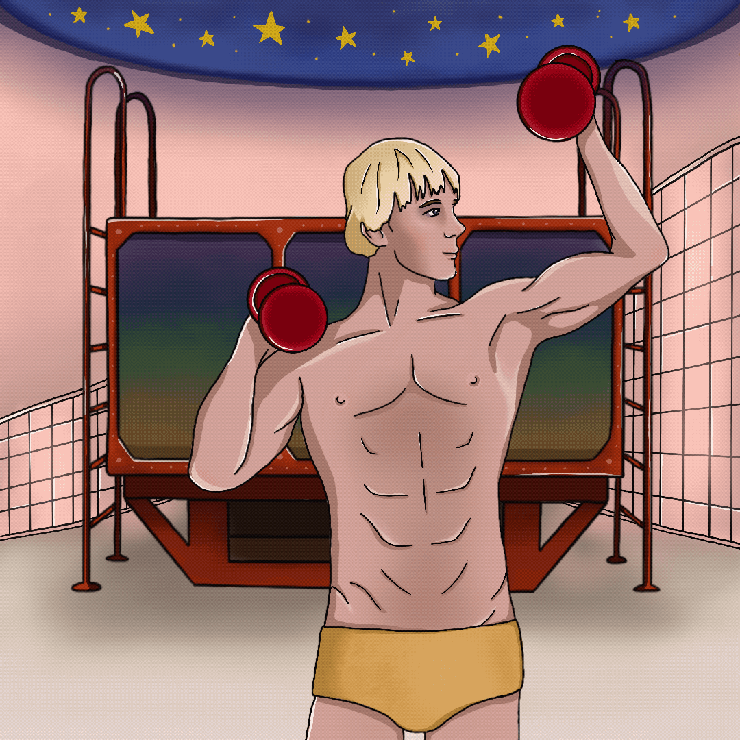
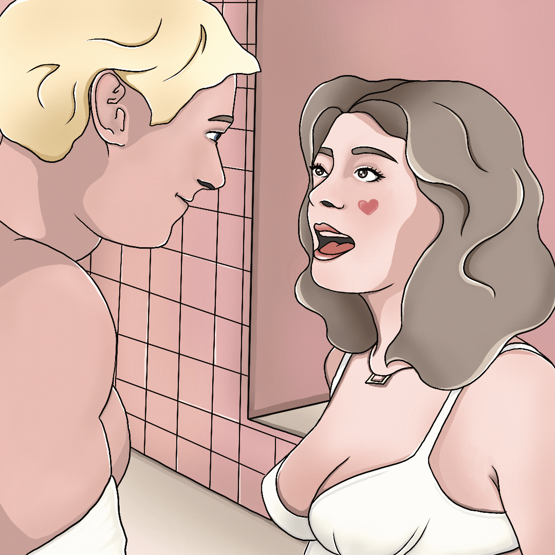
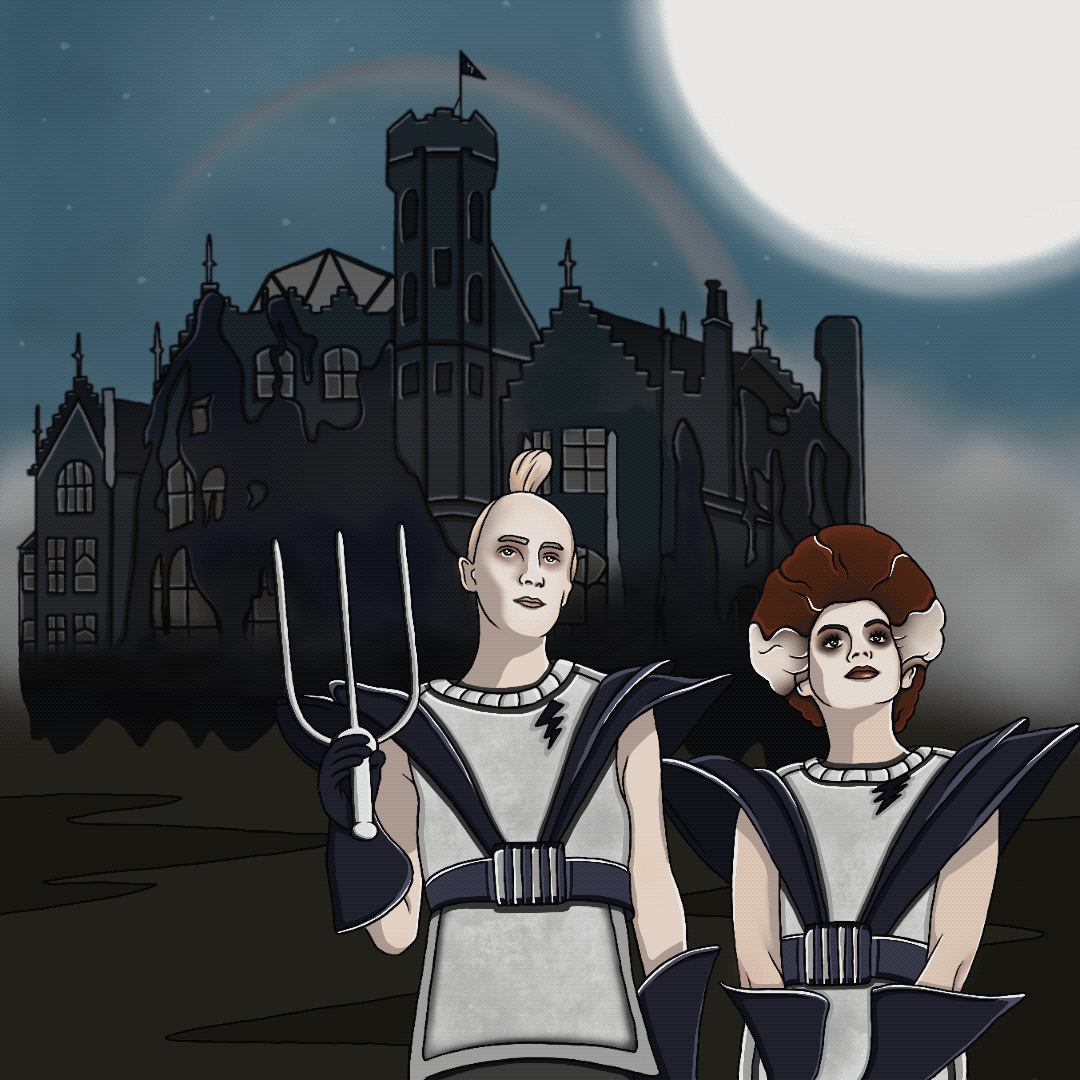
Brief Originally we were suppose to be creating an animation for our last project but unfortunately unforeseen circumstances made that difficult. As a result we were given an alternative brief; without losing the essence of the plot, condense a film or book into 10 images for a social media platform such as Instagram. The film I chose was the Rocky Horror Picture Show. Research I began looking into different styles I could use for my images. I wanted to explore a more illustrative style for this project so I researched a few different approaches. My idea was to create single images that combined the main elements in the story without having to rely on words to describe it.  Storyboarding The musical by Richard O'Brian follows the story of a newly engaged couple who after getting caught in a storm find themselves at the home of a mad transvestite scientist, Dr Frank-N-Furter. He unveils his new Frankenstein style creation in the form of a perfect muscle man named Rocky, before the party is crashed by ex-delivery boy, Eddie, whom Frank then takes down. The film then progresses to the couple beginning to embrace Franks seduction, ending with the deaths of most of the inhabitants of the castle while it blasts off back to Transylvania. I did further research into the movie, finding images to use as references for my drawings and to help me figure out which scenes I wanted to cover. 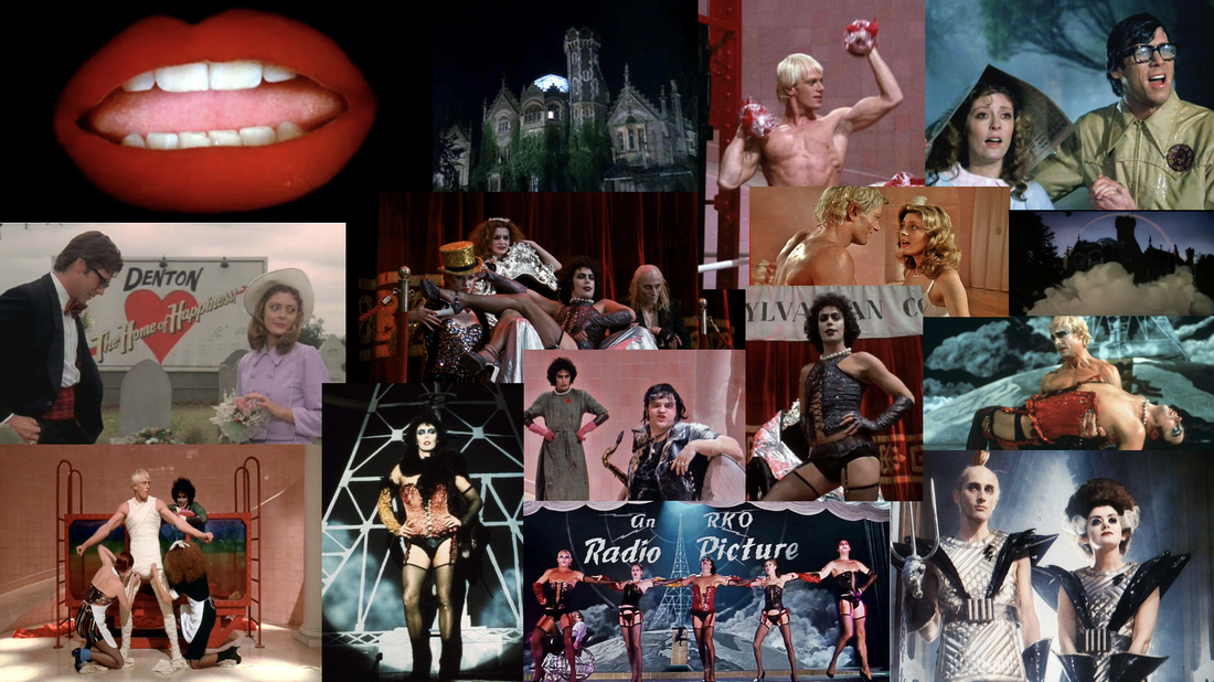 I began condensing the plot of the film into 10 images to represent only the essential information of storyline development. I created a ten step storyboard to show what each image would include and brain storm ideas for what could be animated. 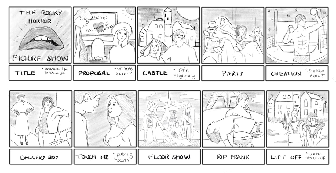 Developments I chose to go with a simple comic style for my images, using mainly block colours, similar to vector illustrations even though I used Procreate instead of a vector based program; I wanted to use a program I was more comfortable drawing freehand with. I started out drawing out the black line work first. I then began adding the colour; you can see the process I went through when adding the different layers. Final Piece Here are the 10 finished images after adjusting the saturation and contrast and displayed on my Instagram page. After completing the main flat images I added a little bit of animation to a few of them, turning them into GIFs using the Procreate animation feature. All of my designs including the animated GIFs for this project can be seen here on my professional instagram account. 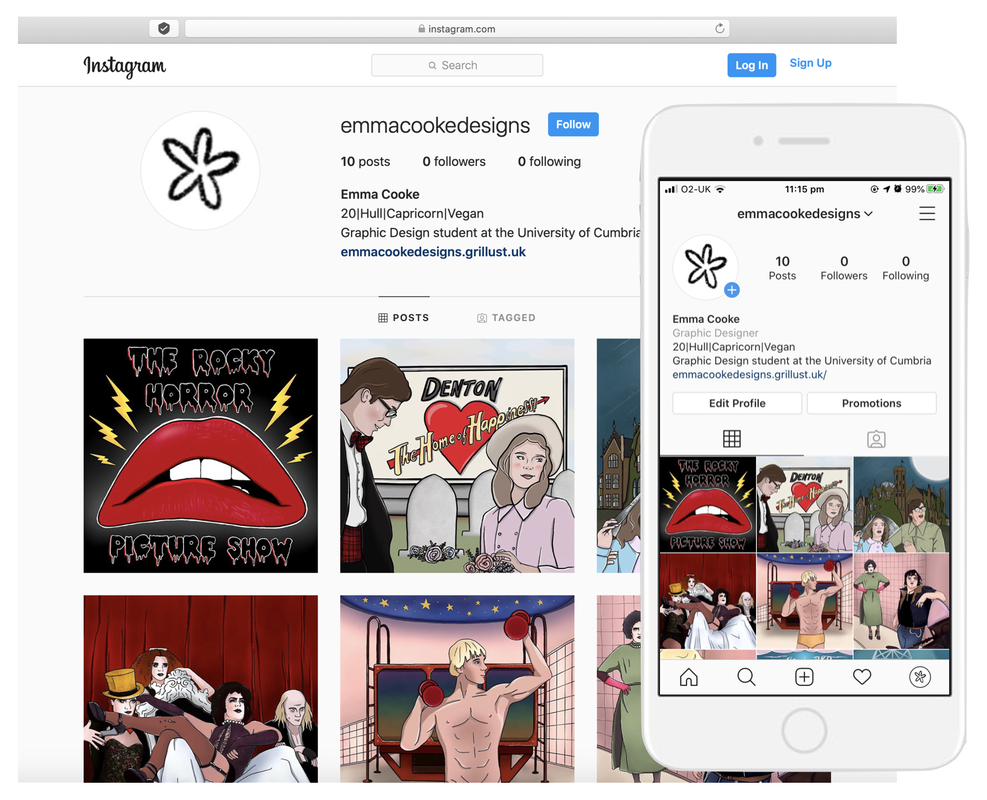
0 Comments
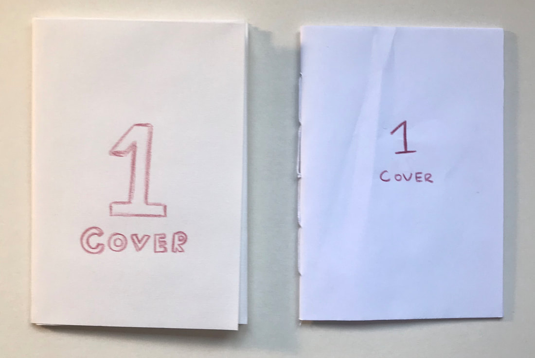
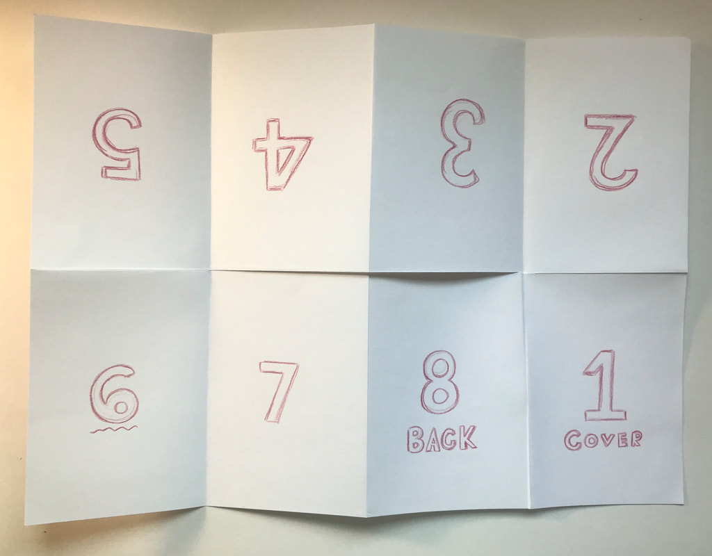
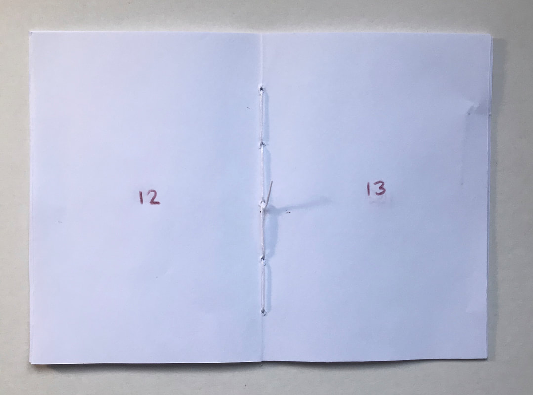
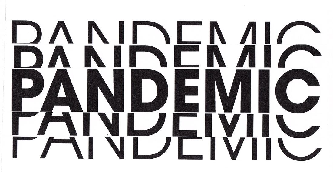
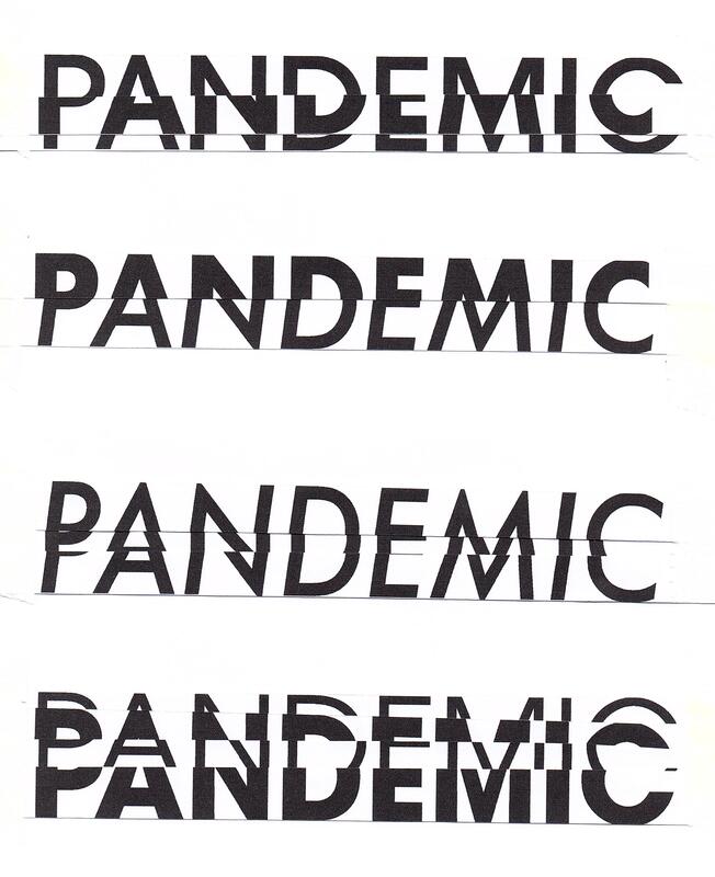
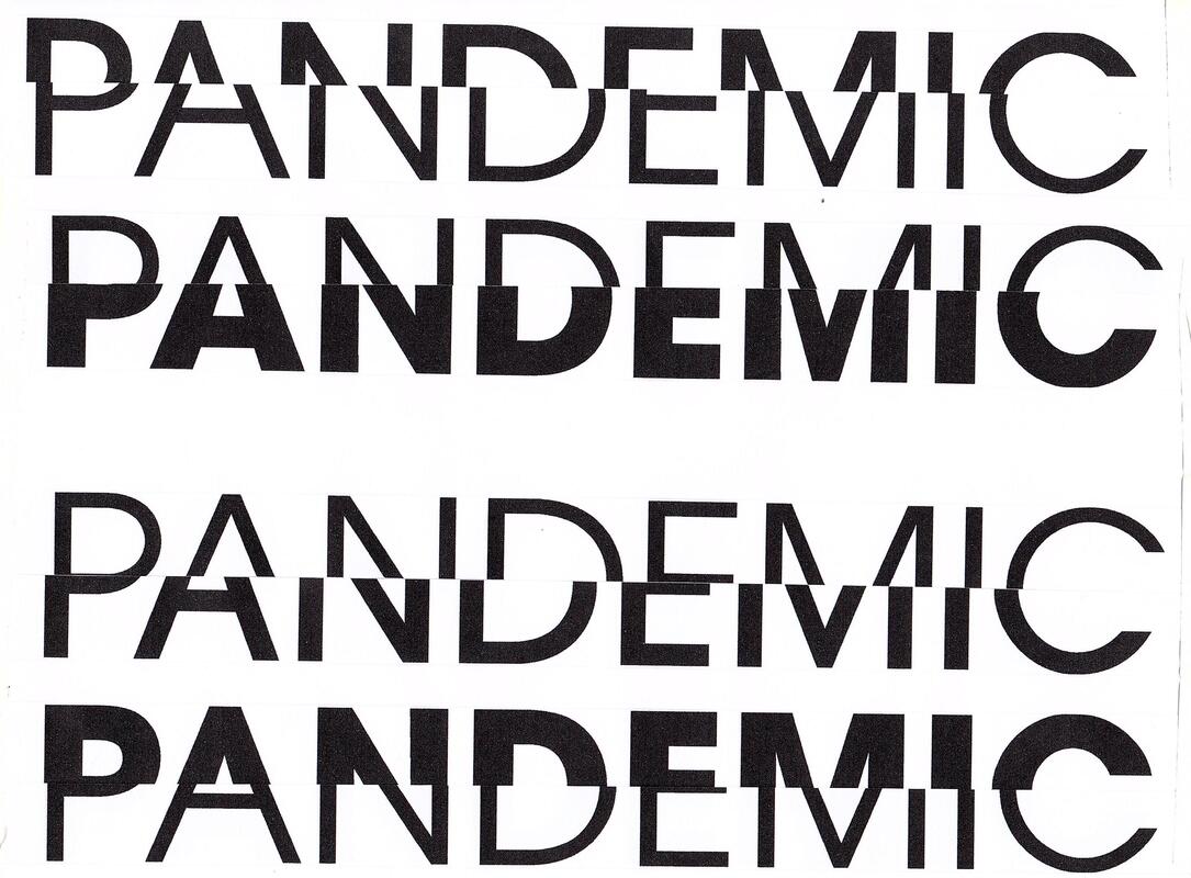
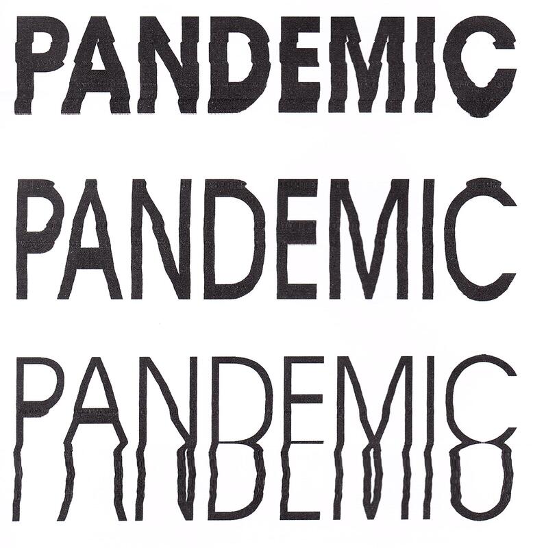
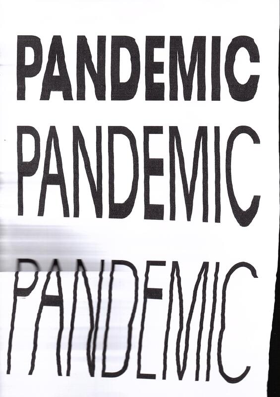
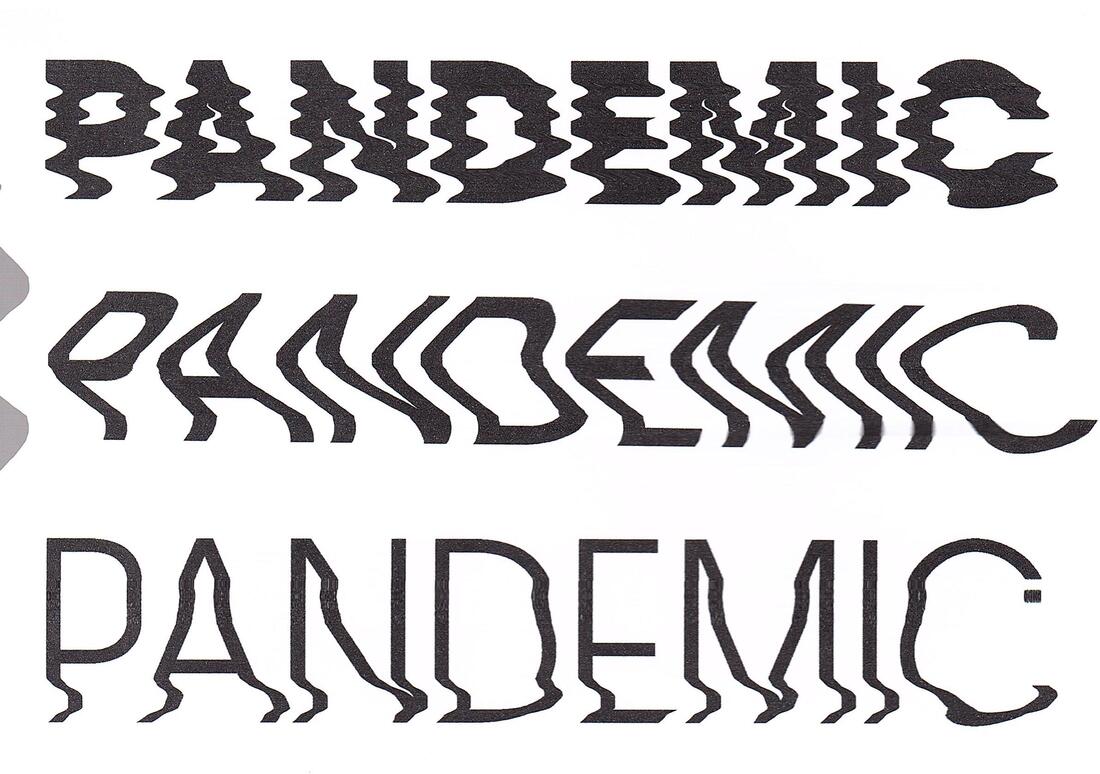
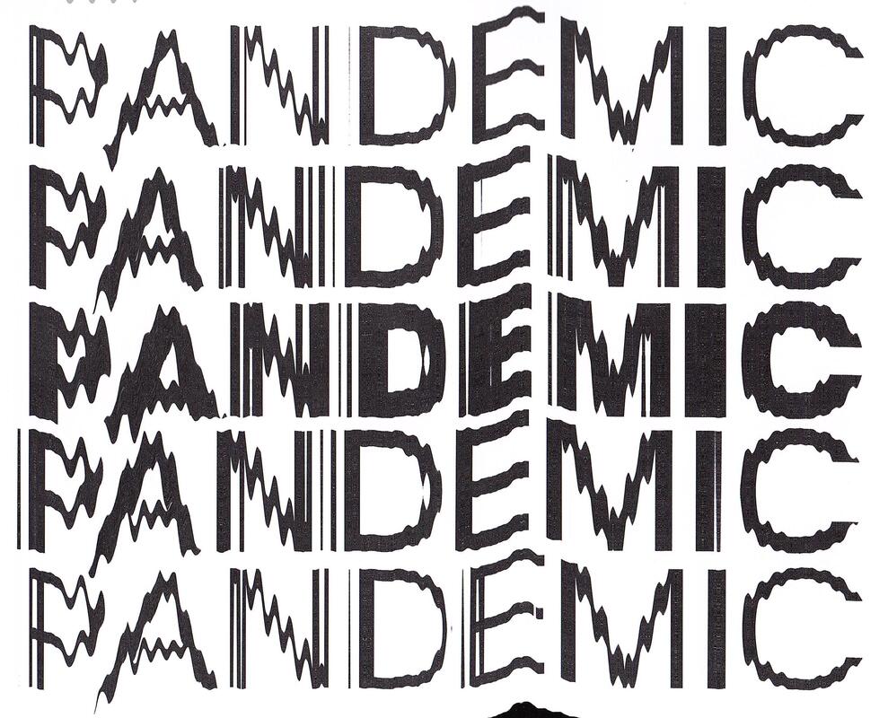
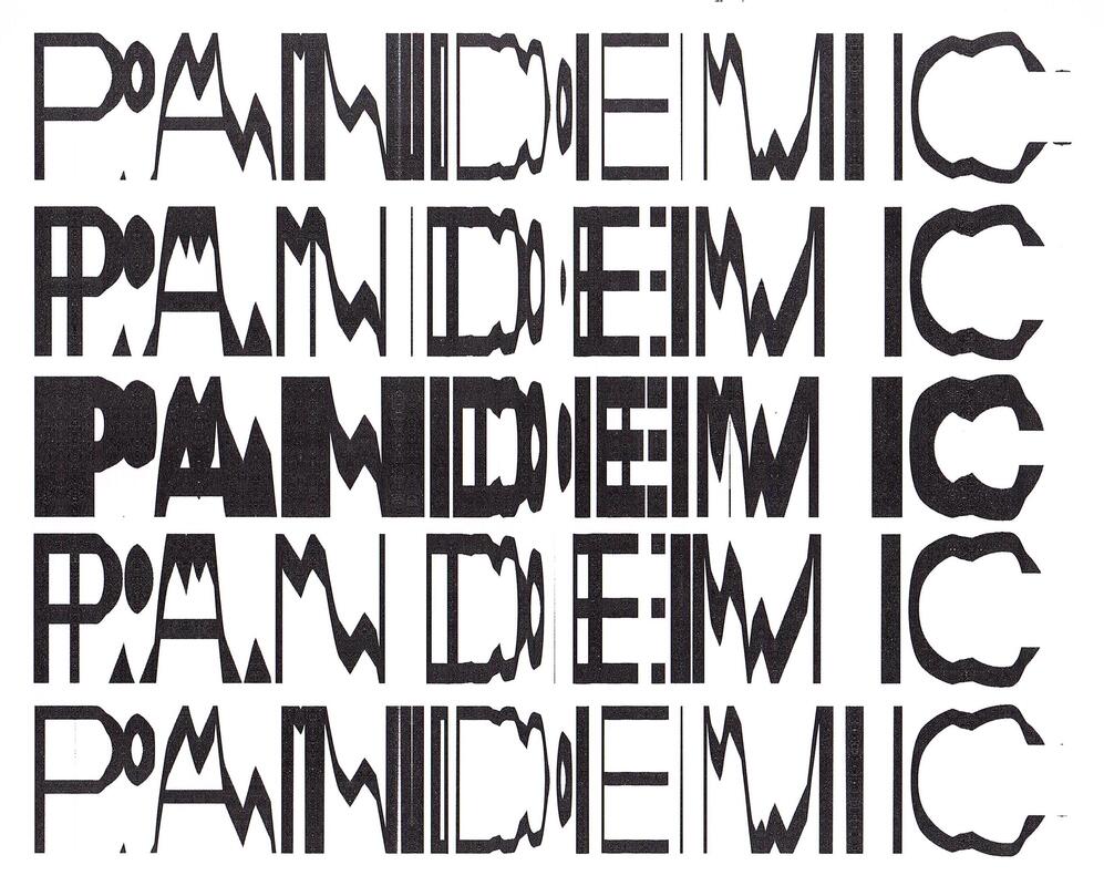
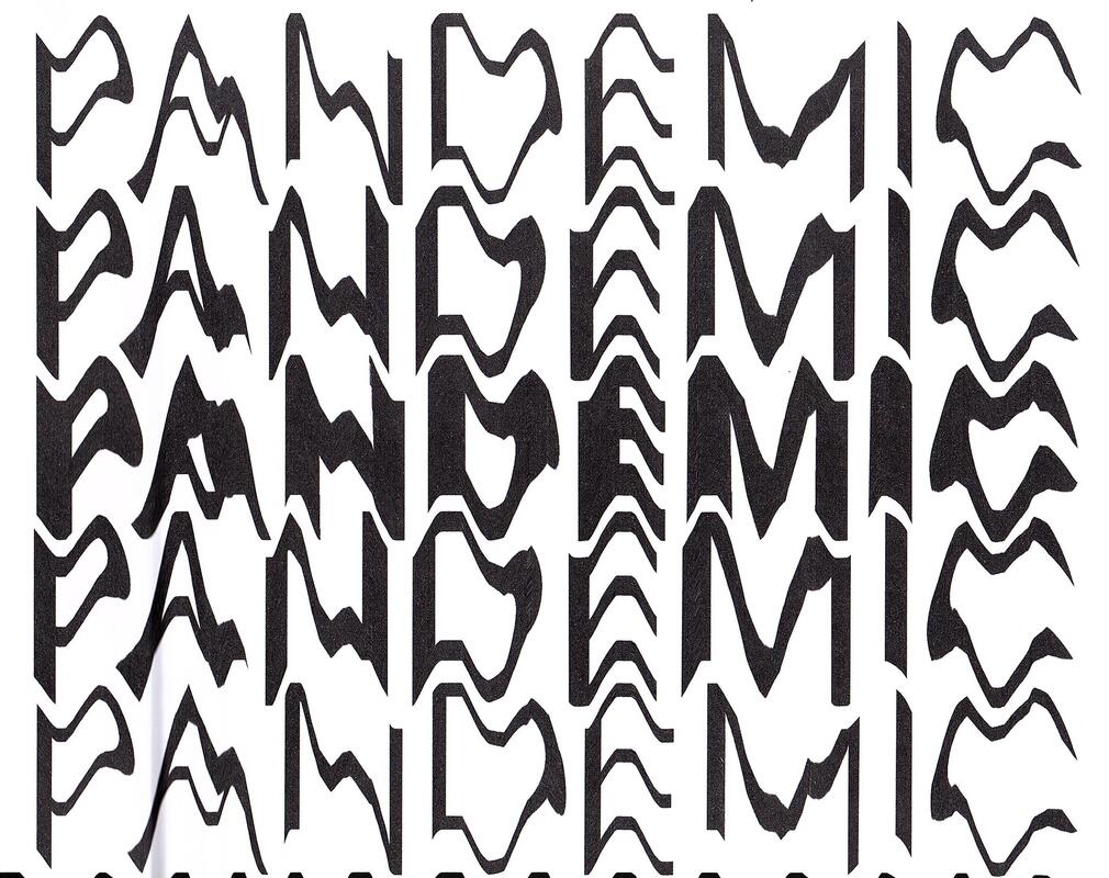
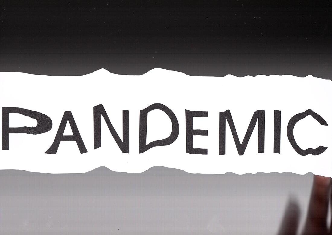
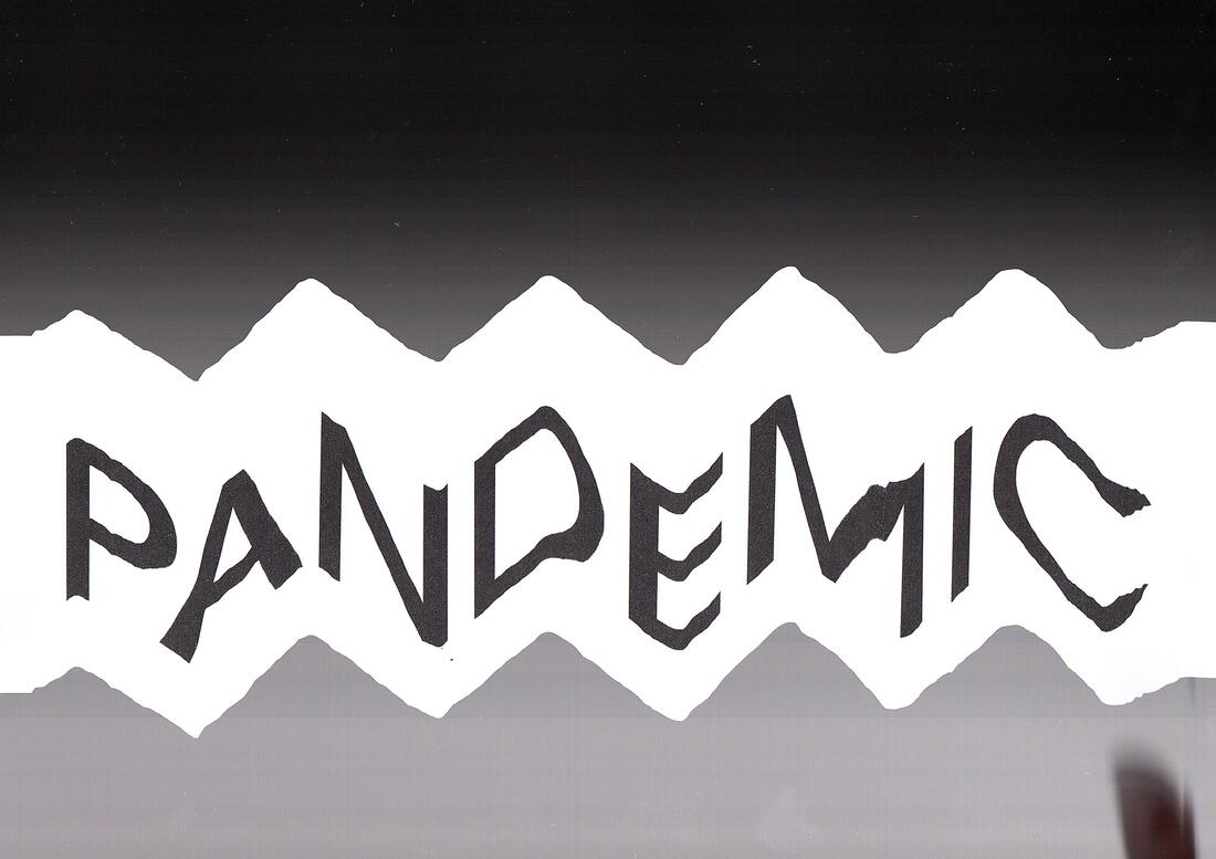
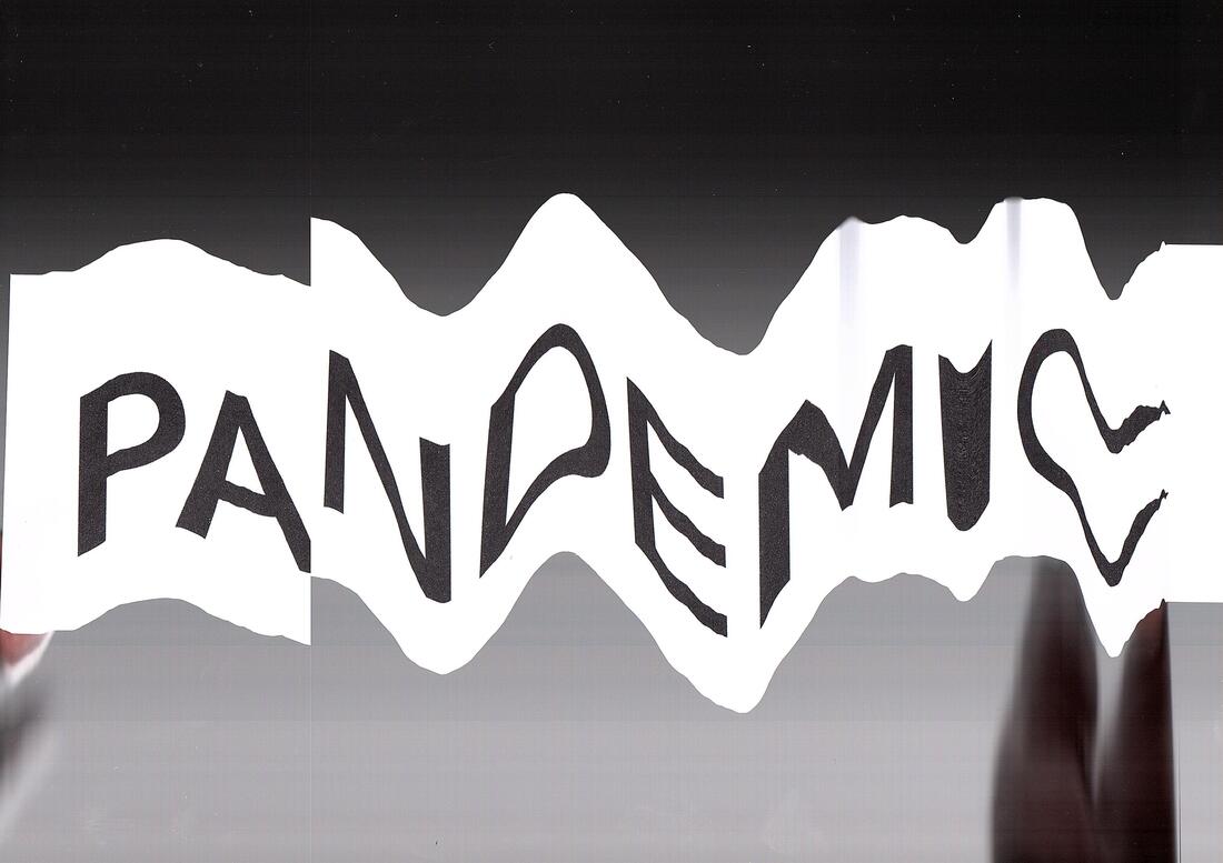
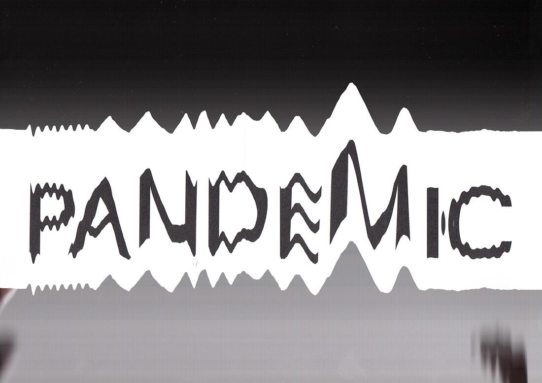
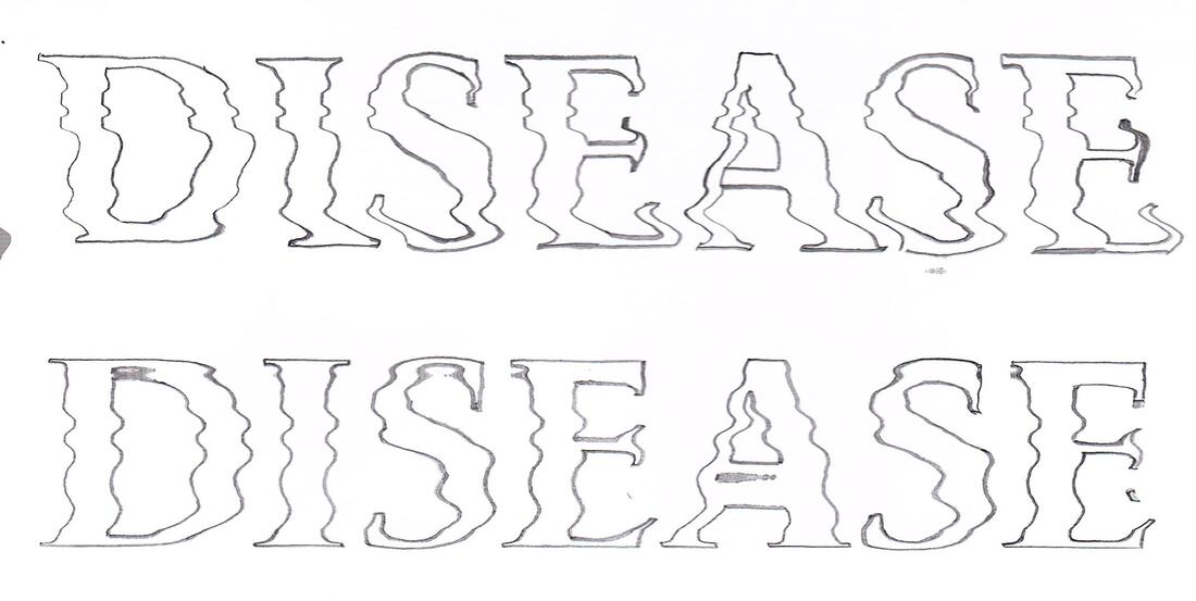
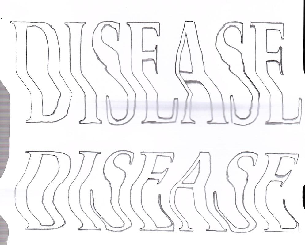
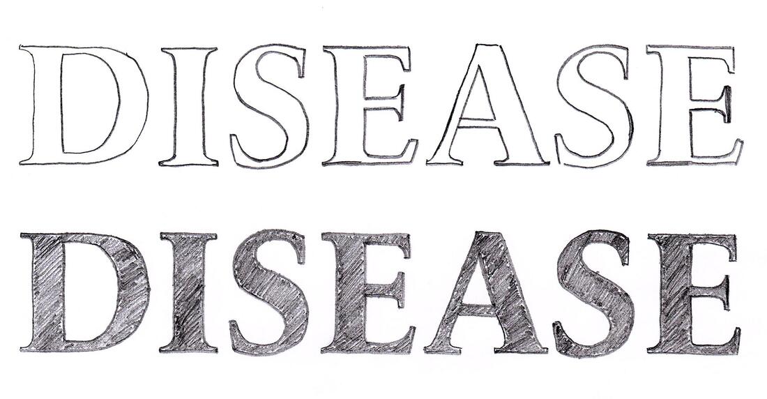
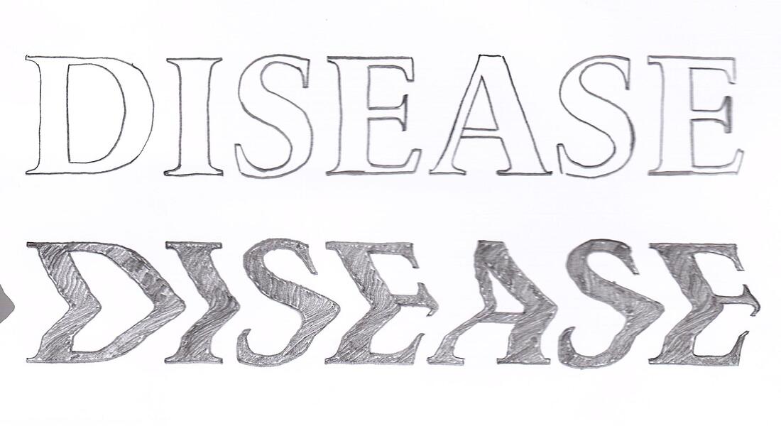
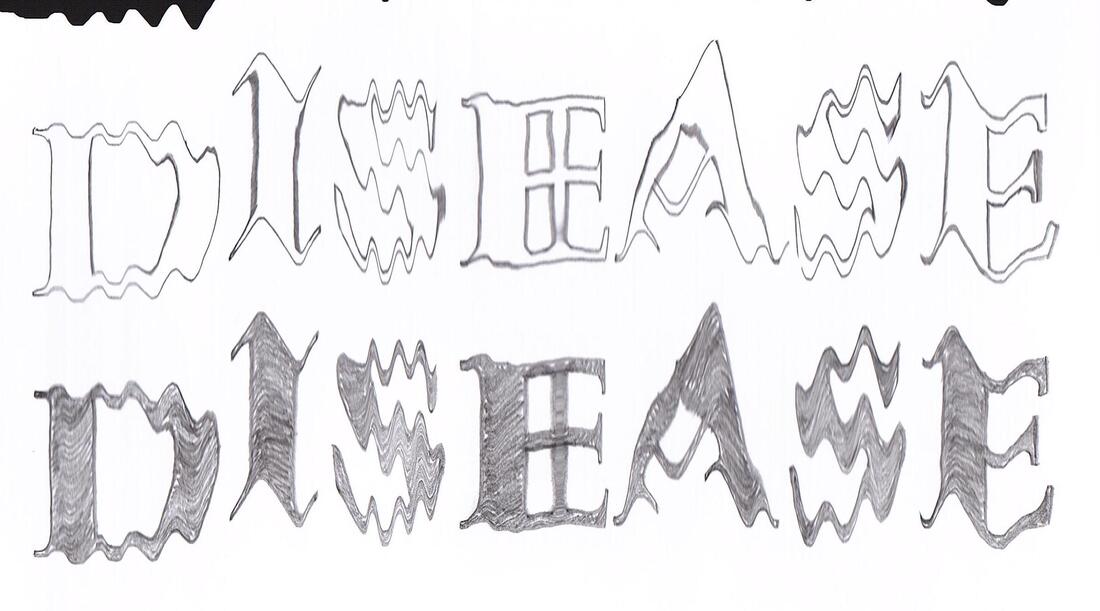
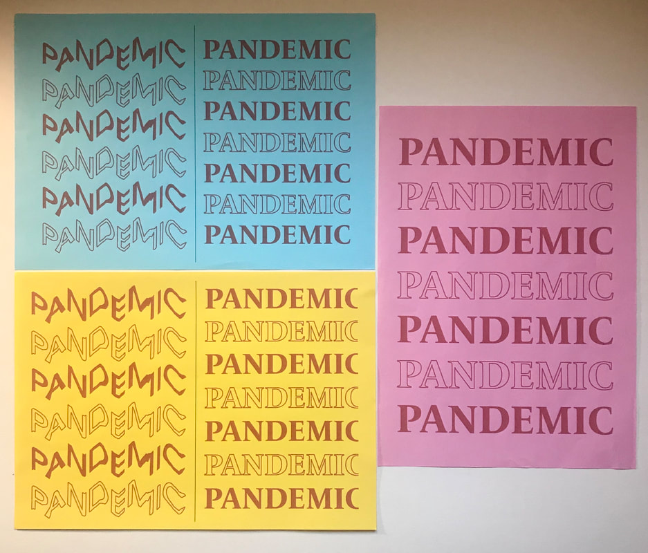
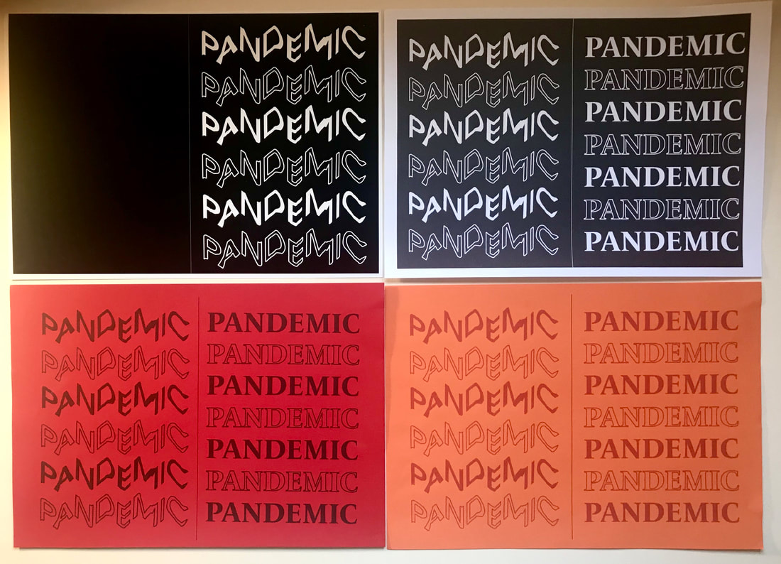
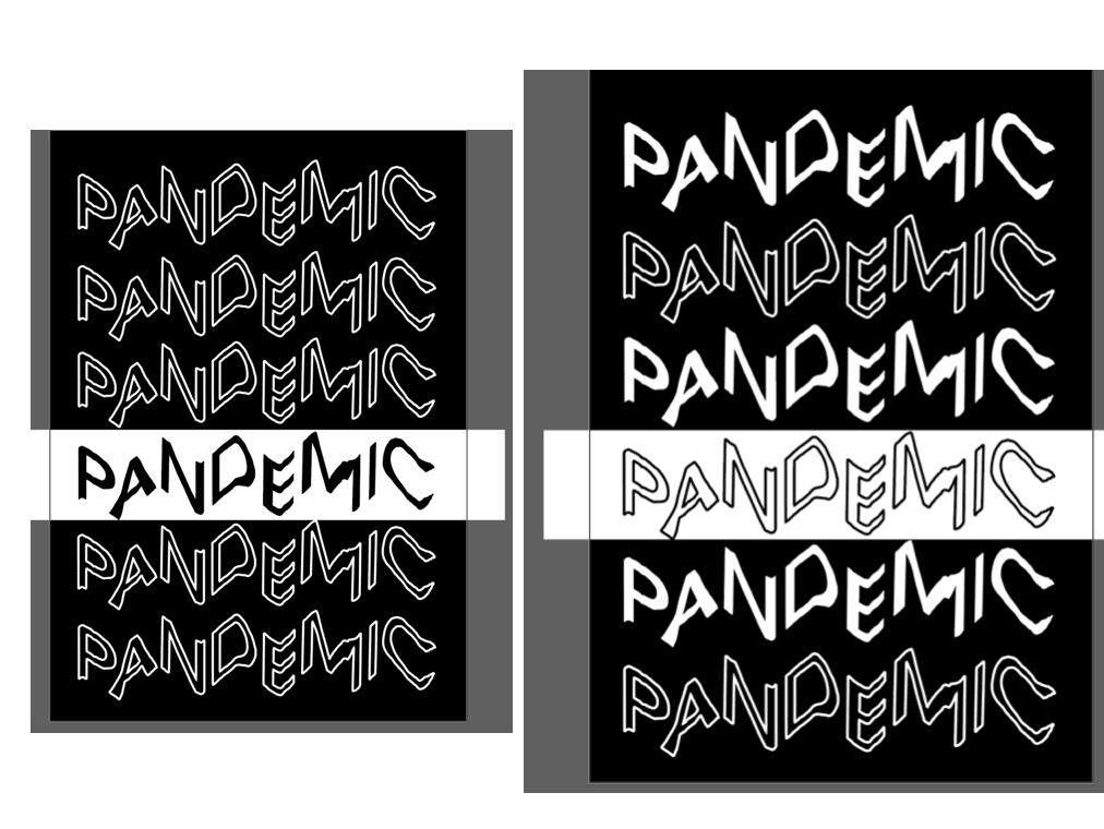
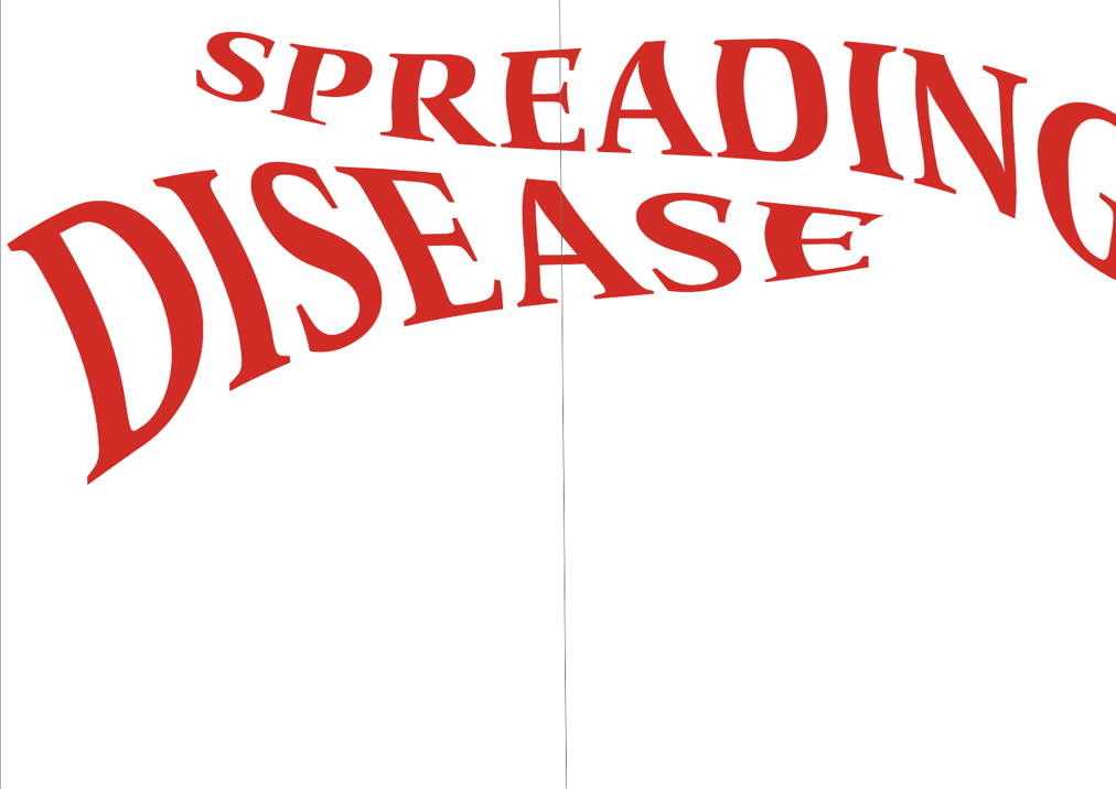
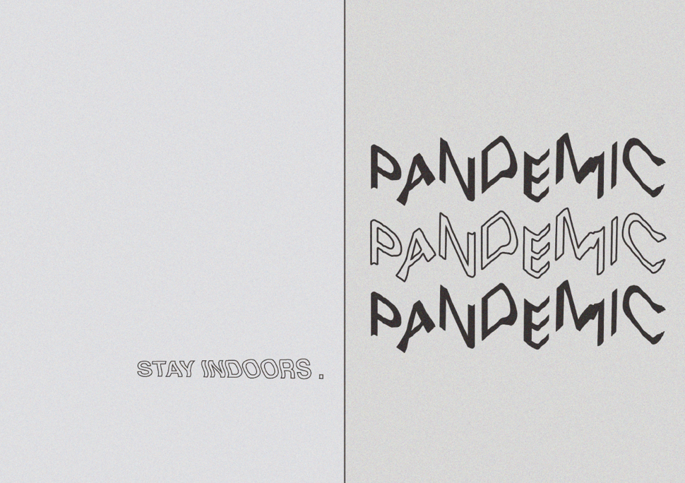
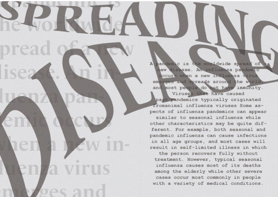
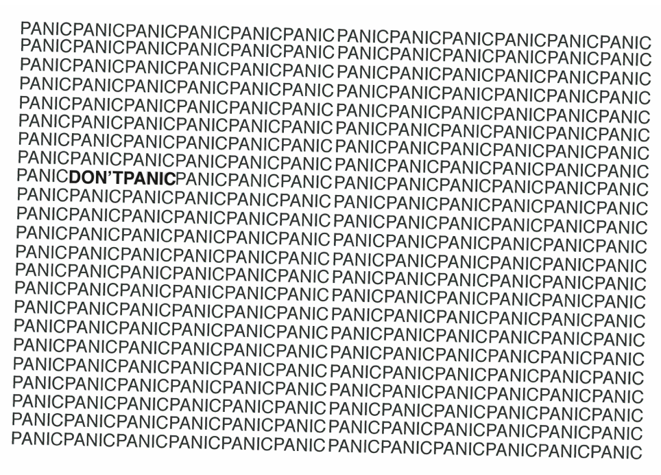
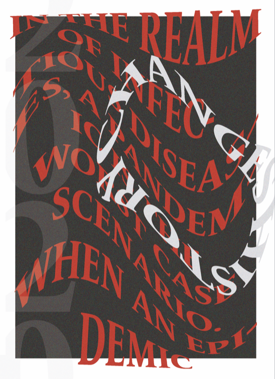
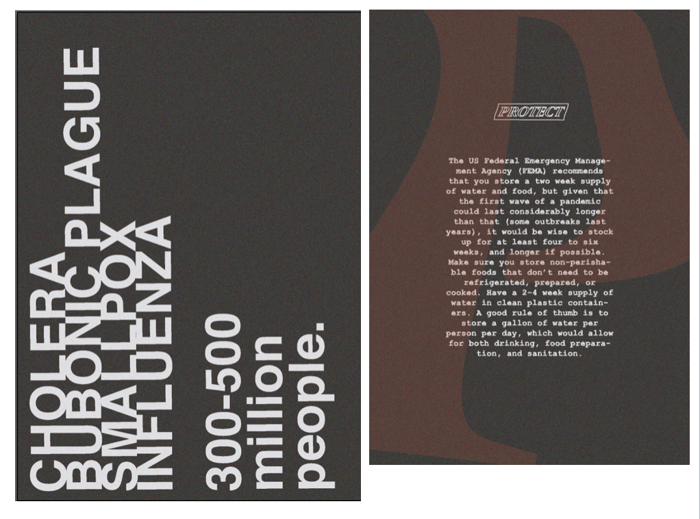
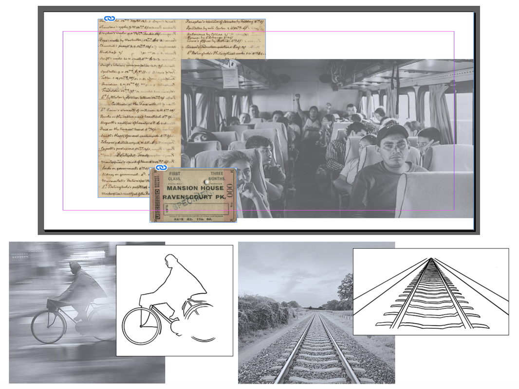
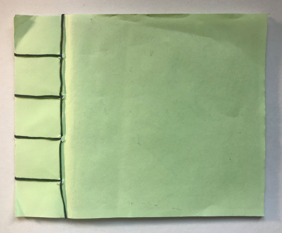
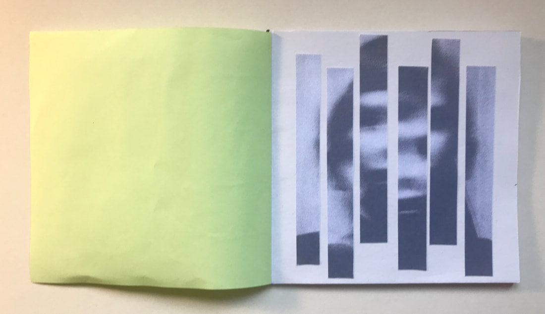
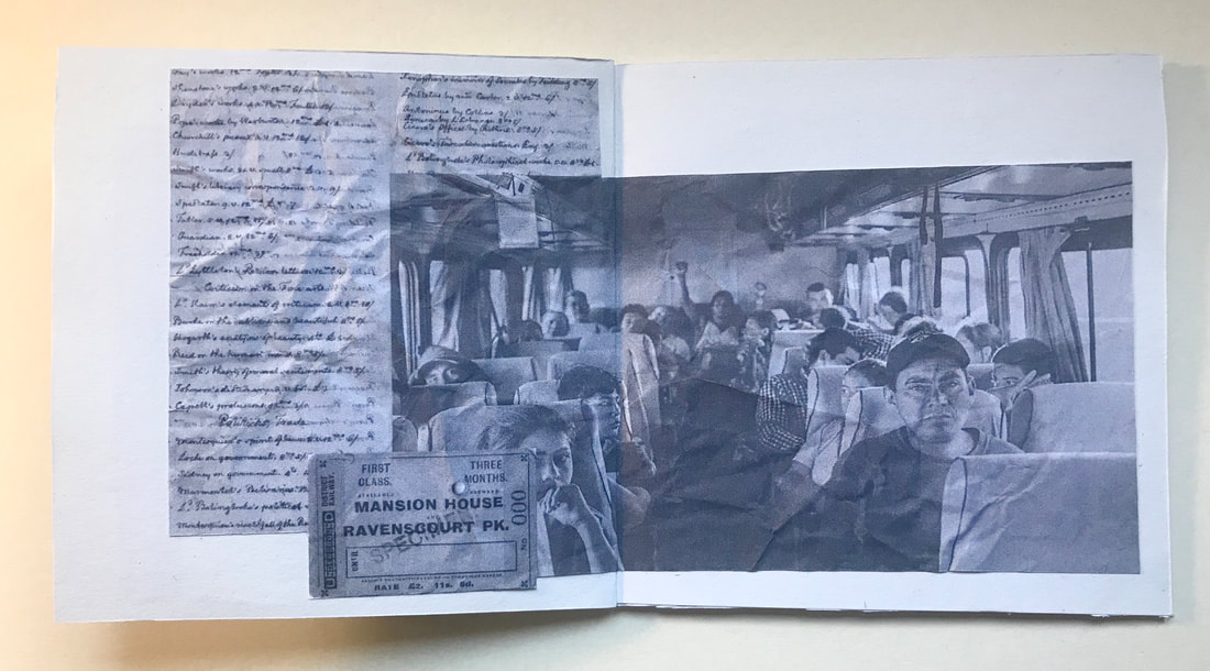
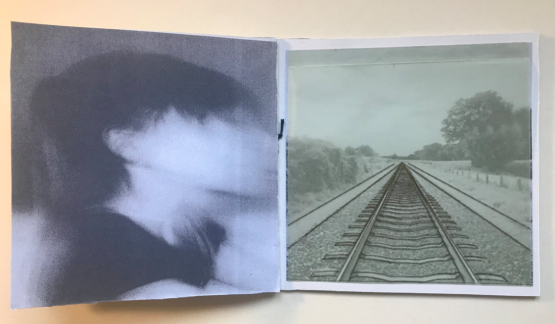
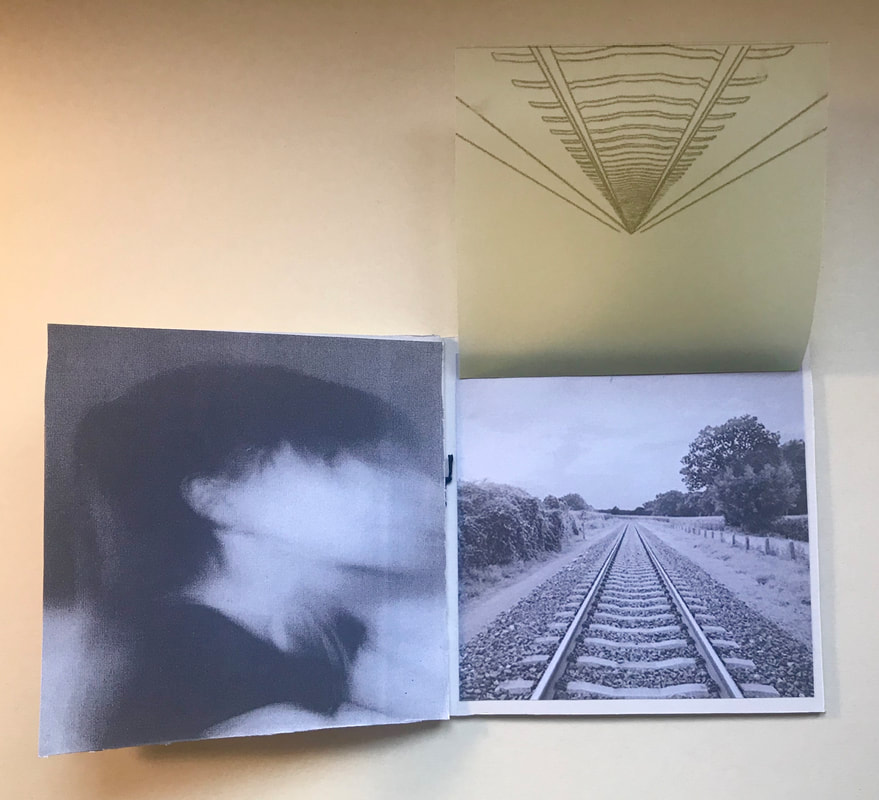
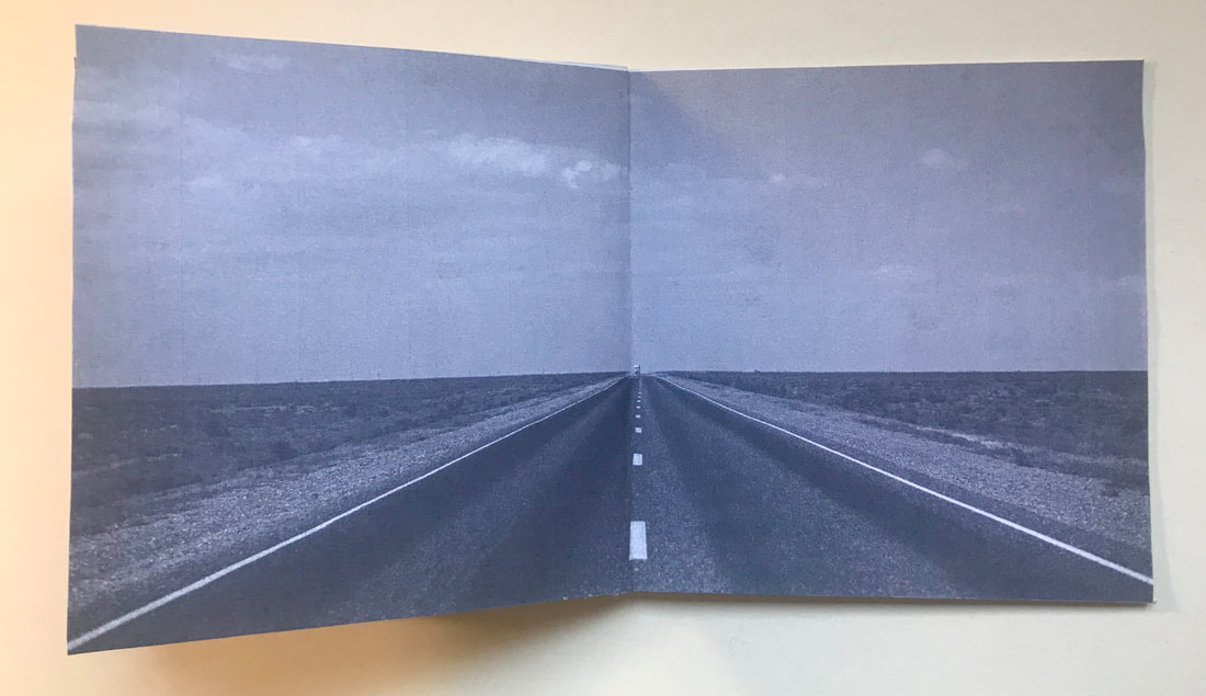
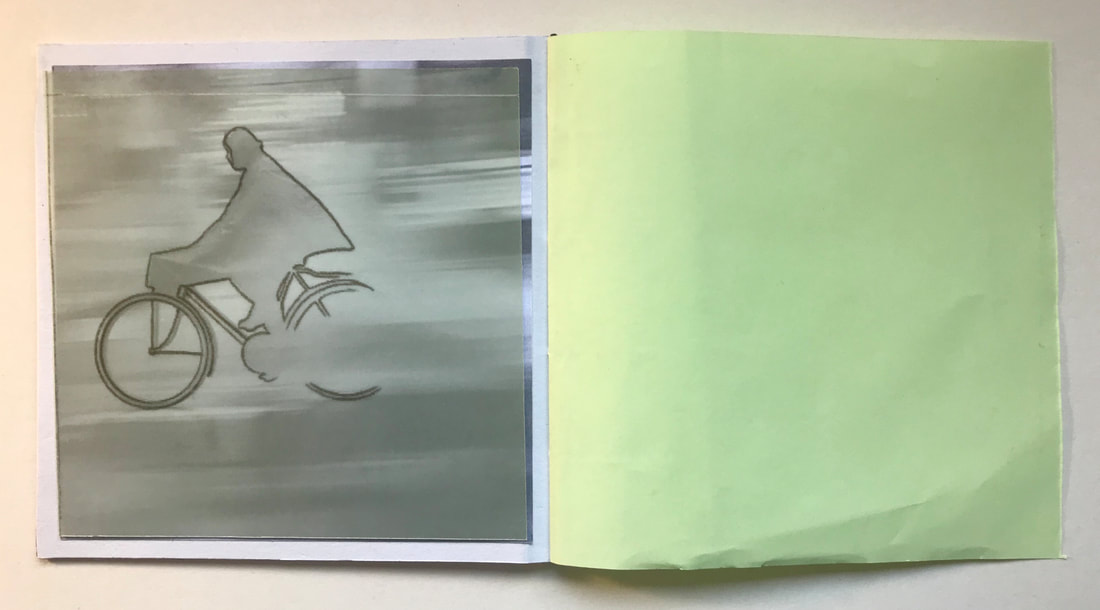
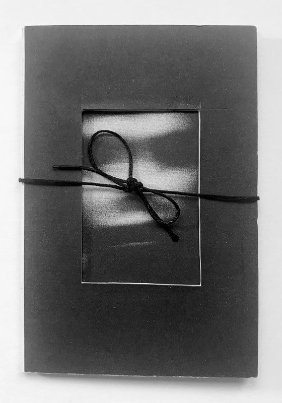
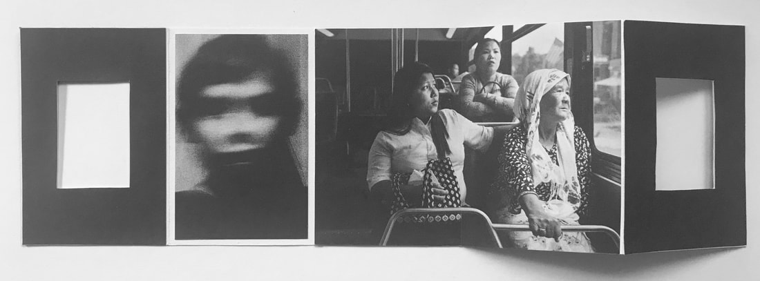
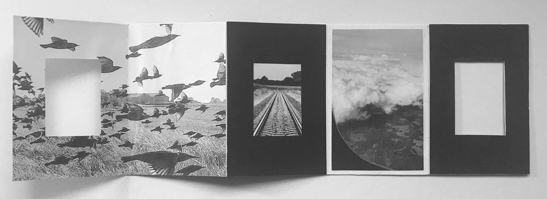
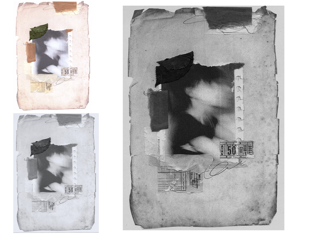
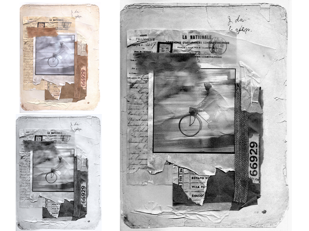
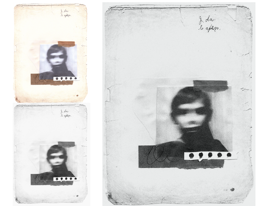
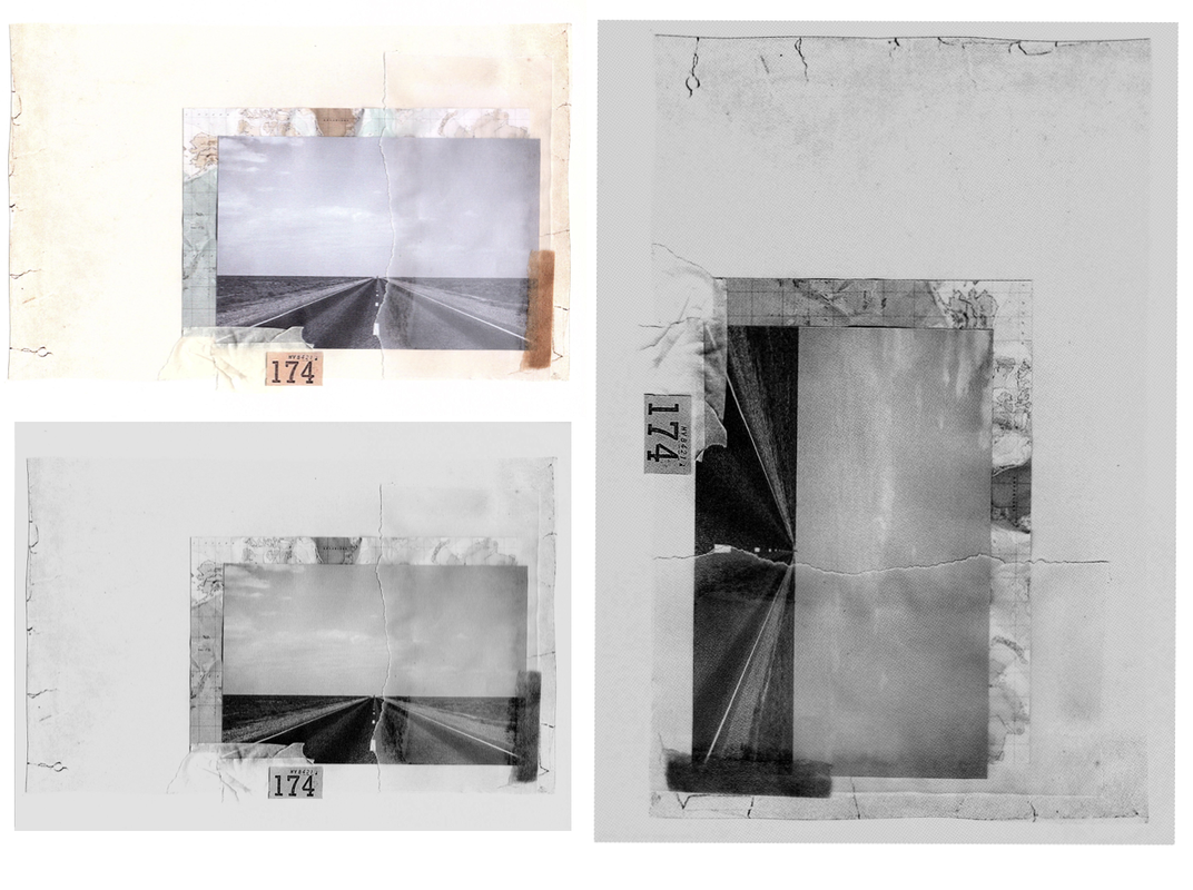
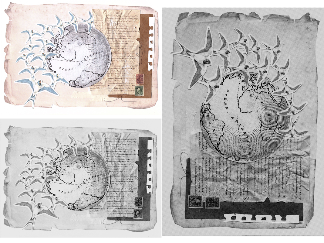
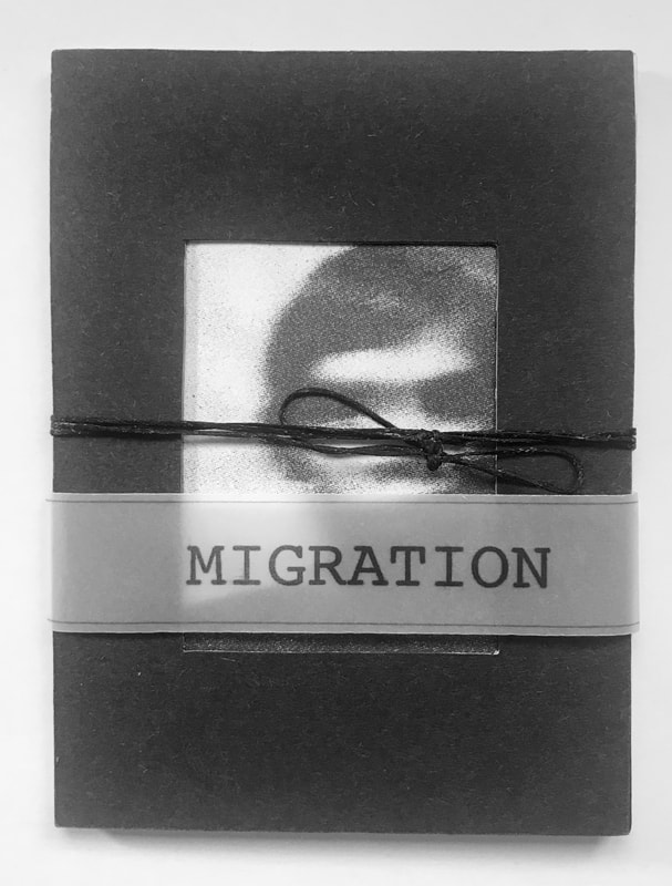
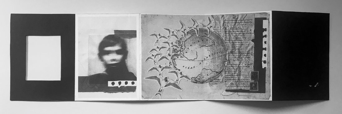
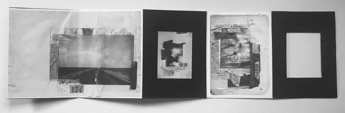
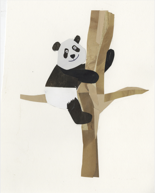
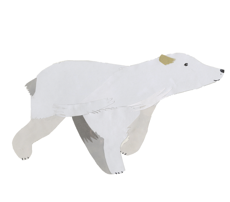
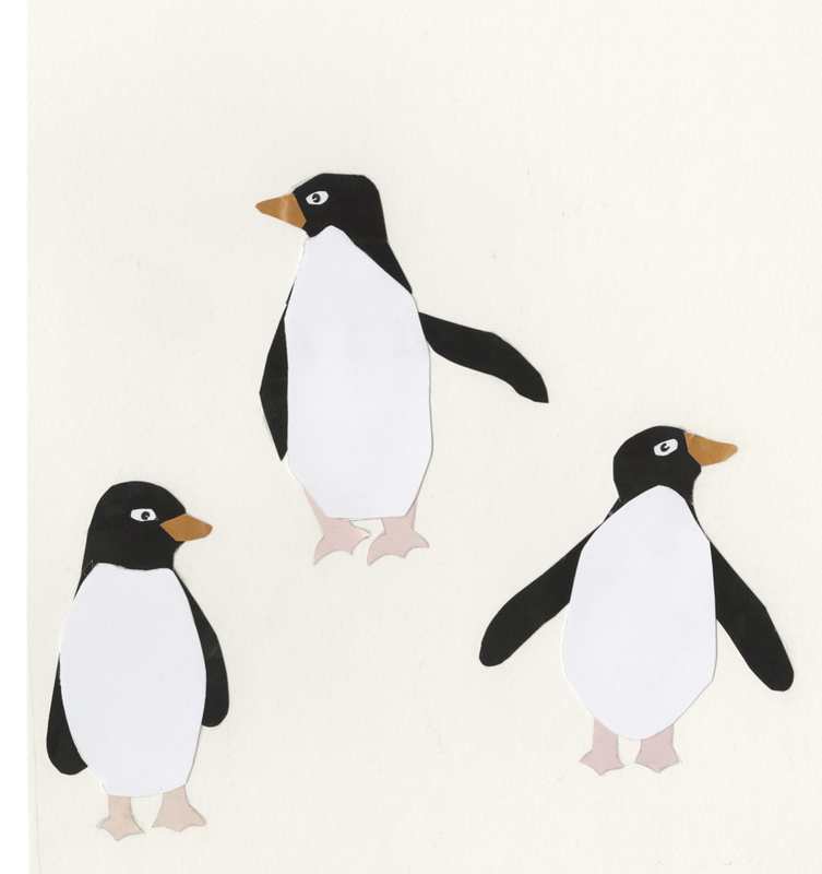
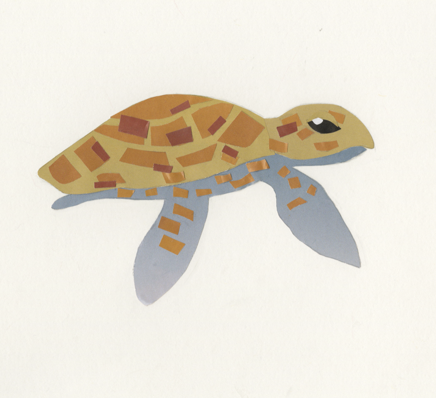
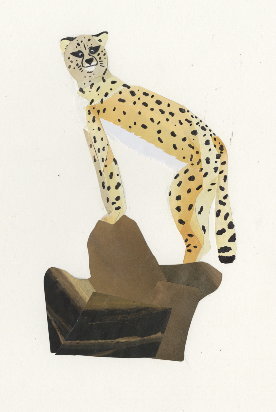
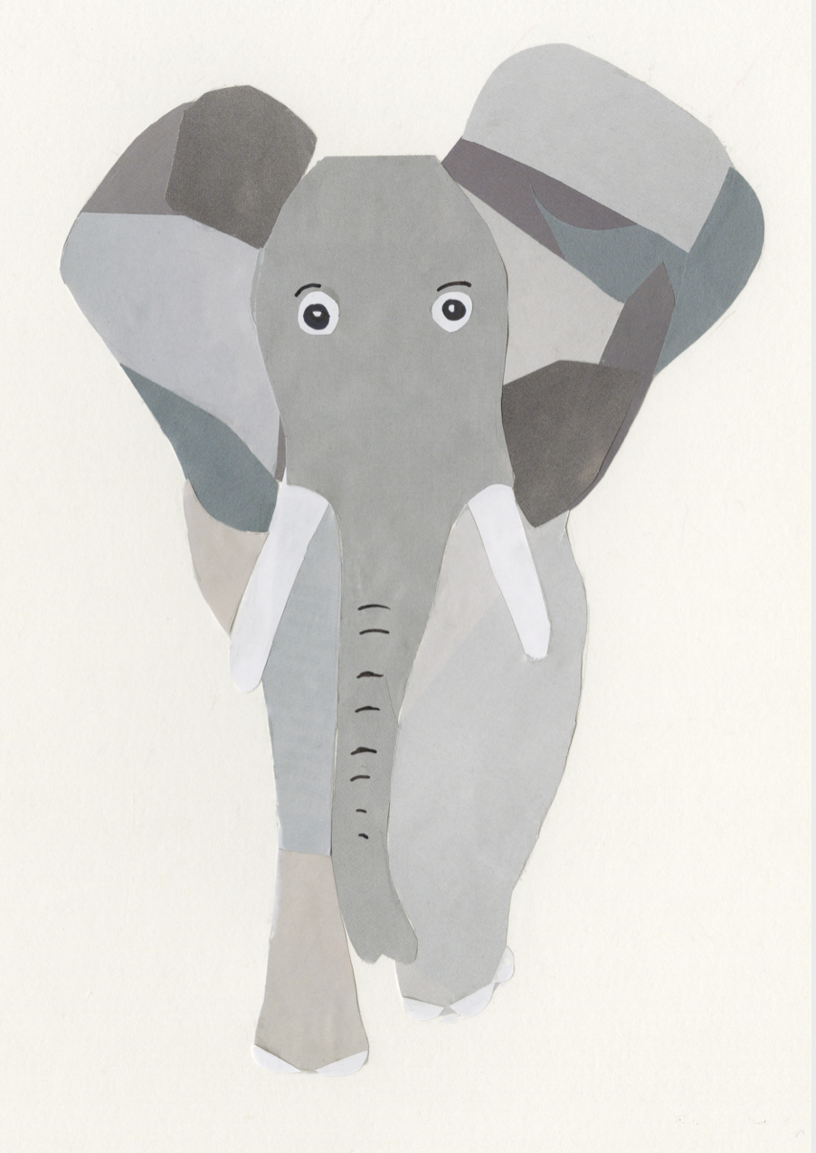
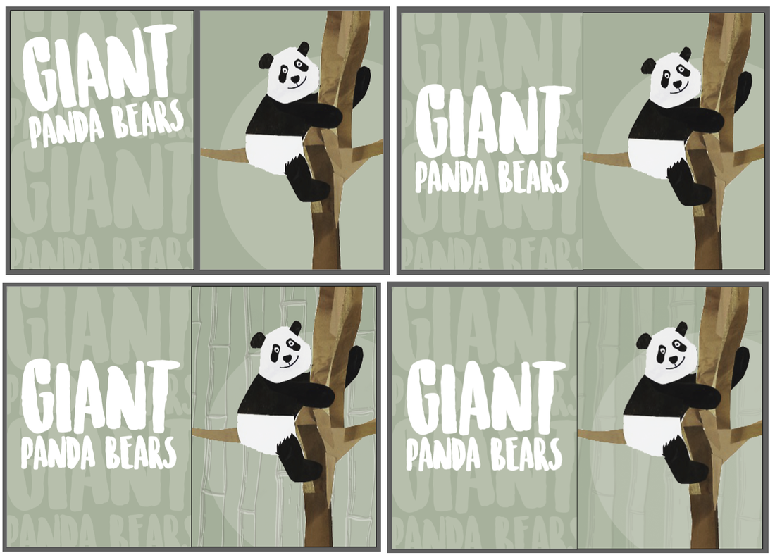
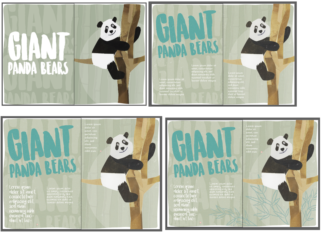
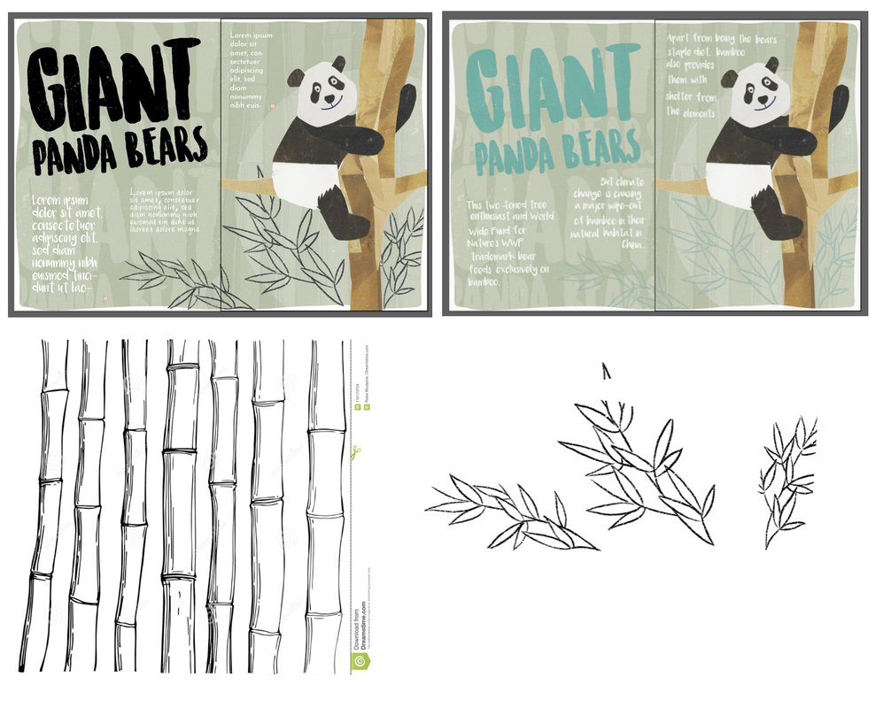
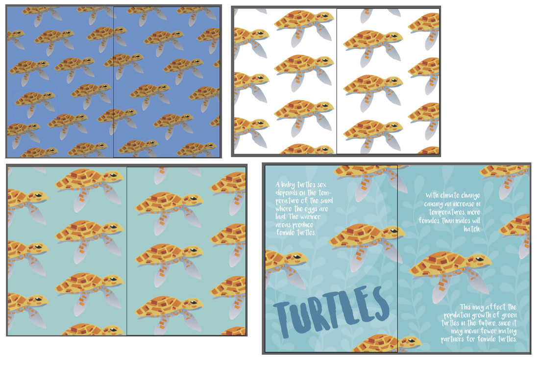
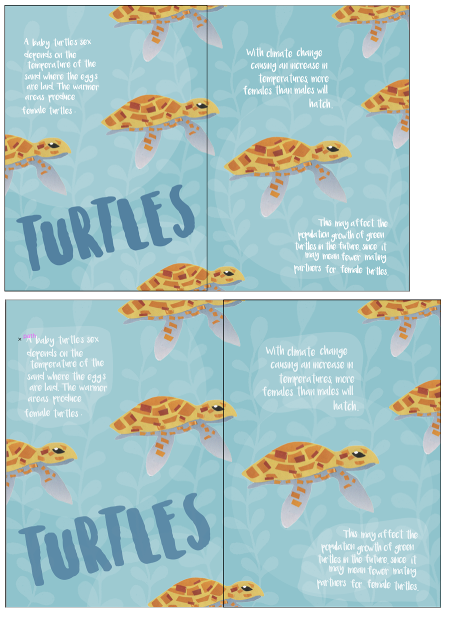
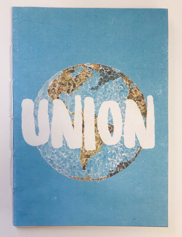
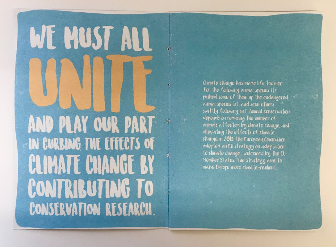
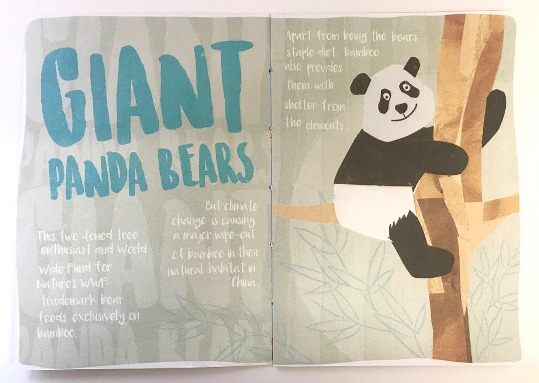
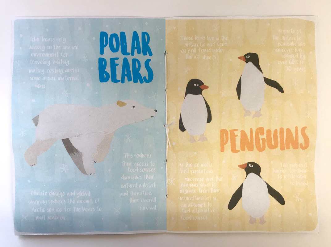
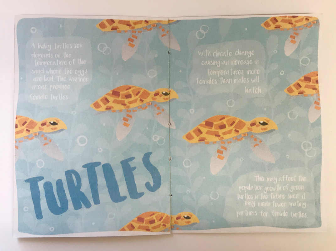
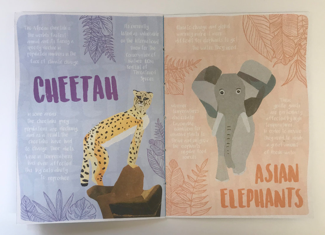
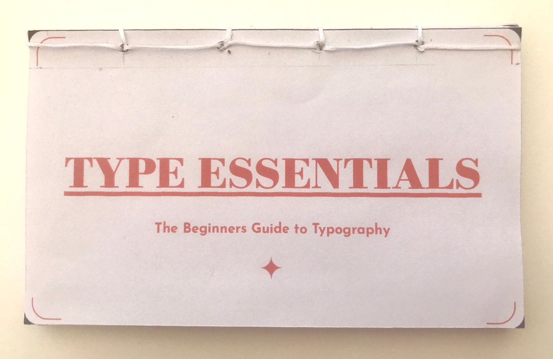
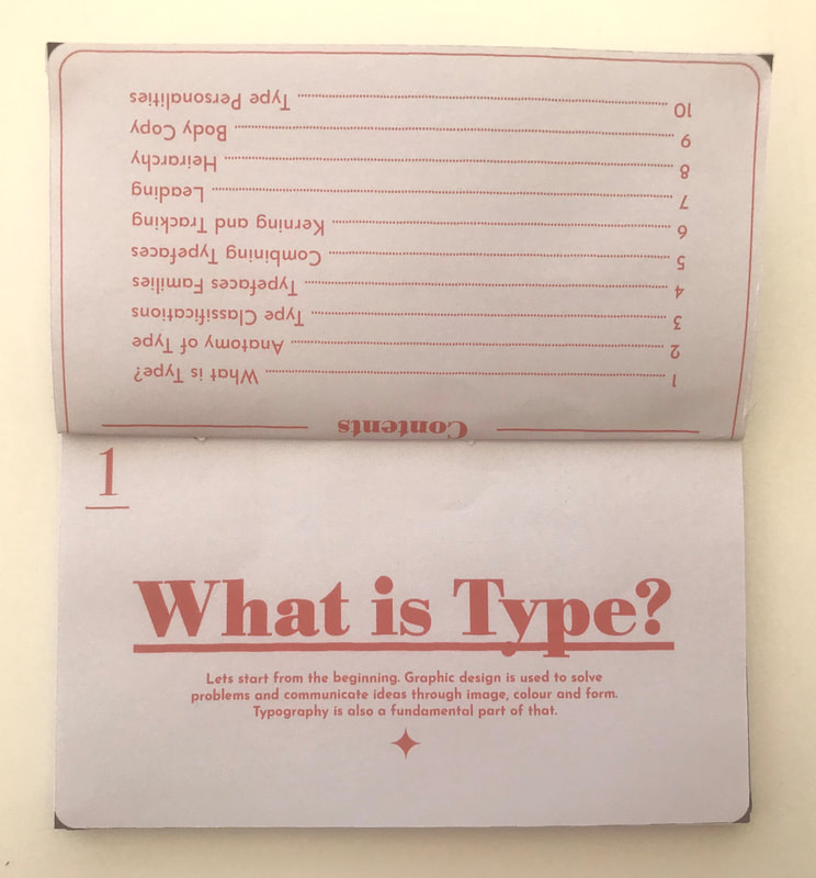
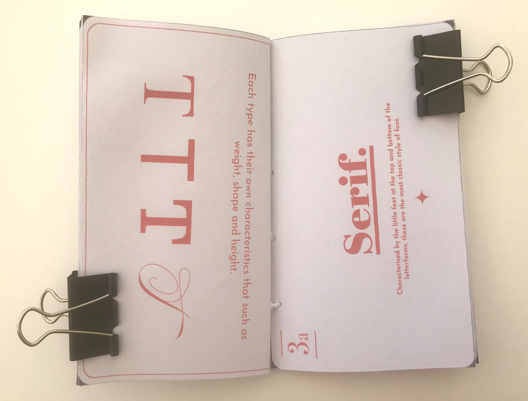
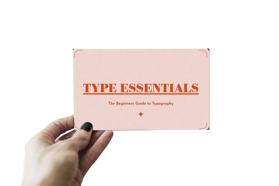
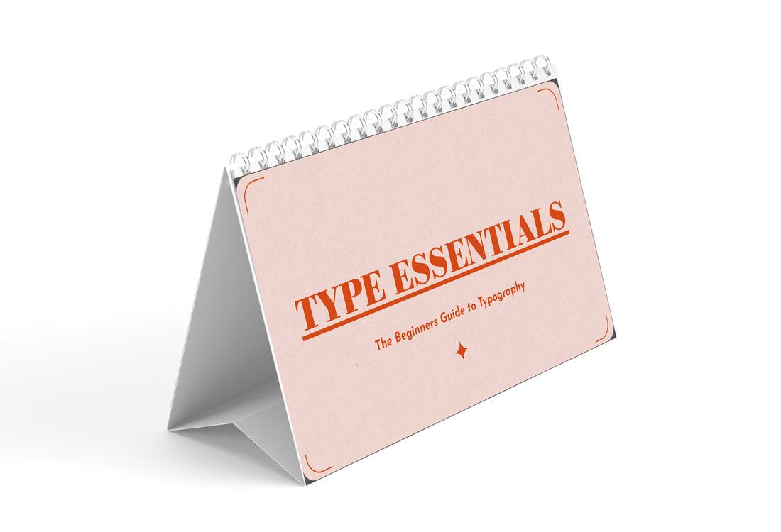
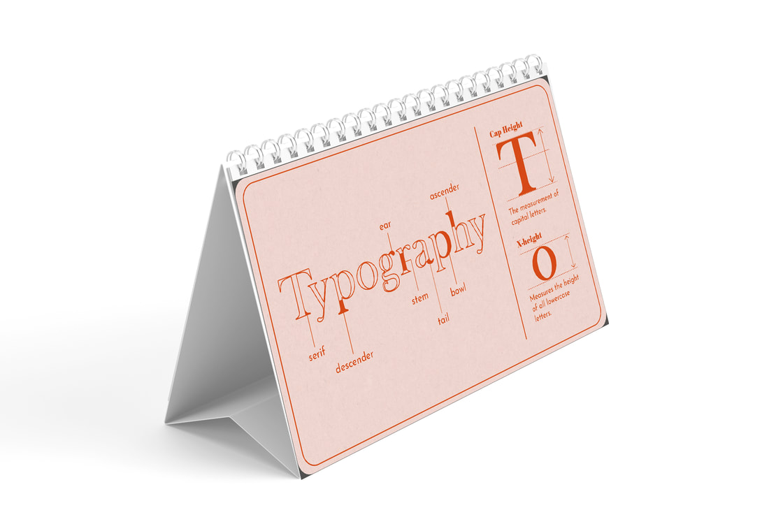
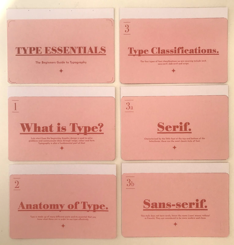
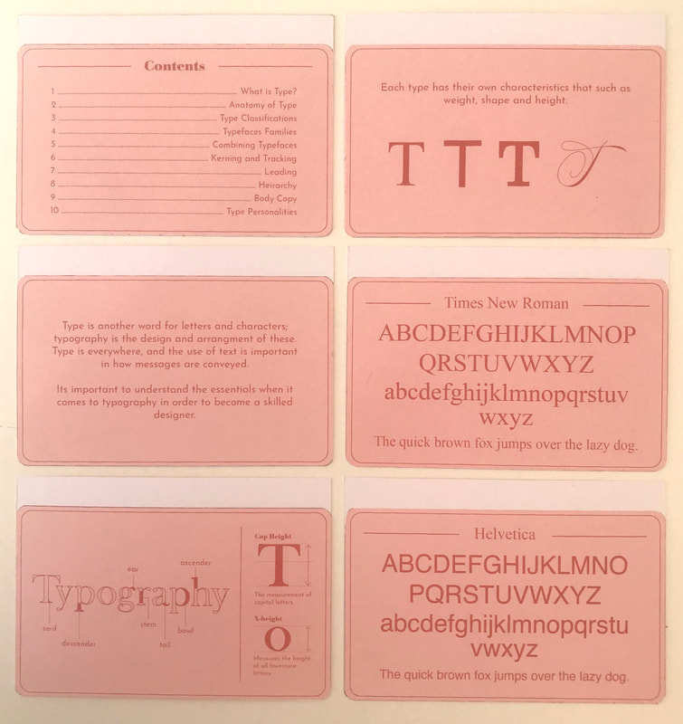
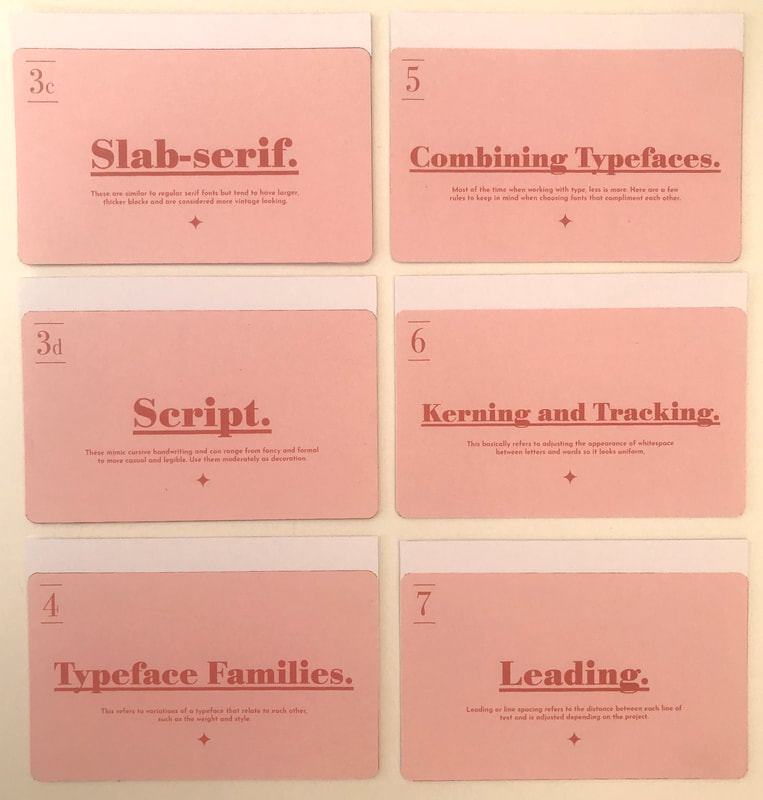
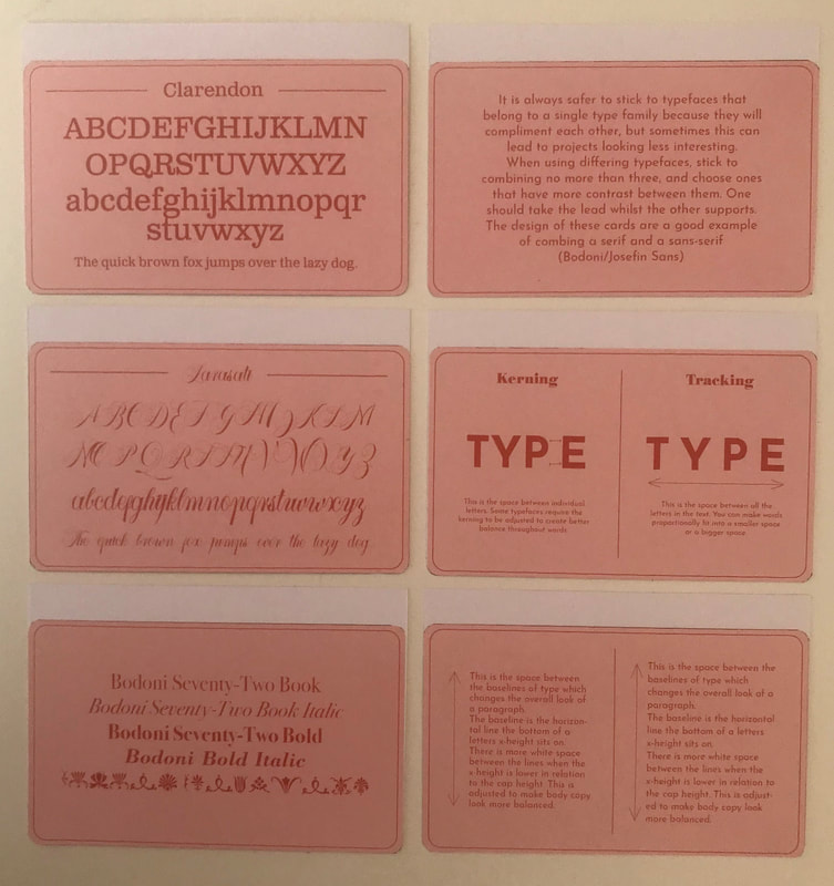
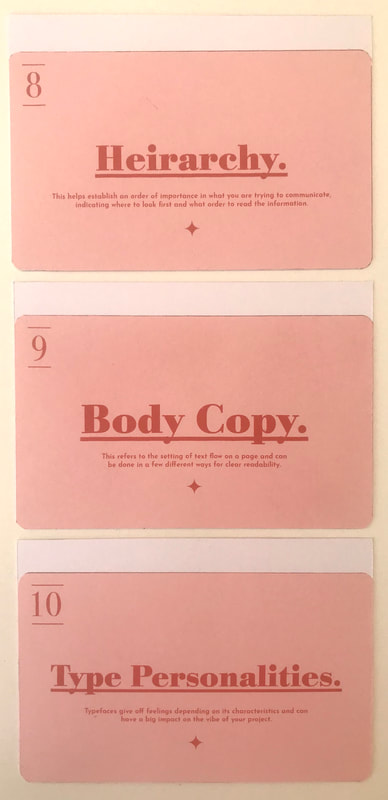
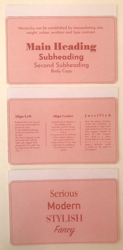
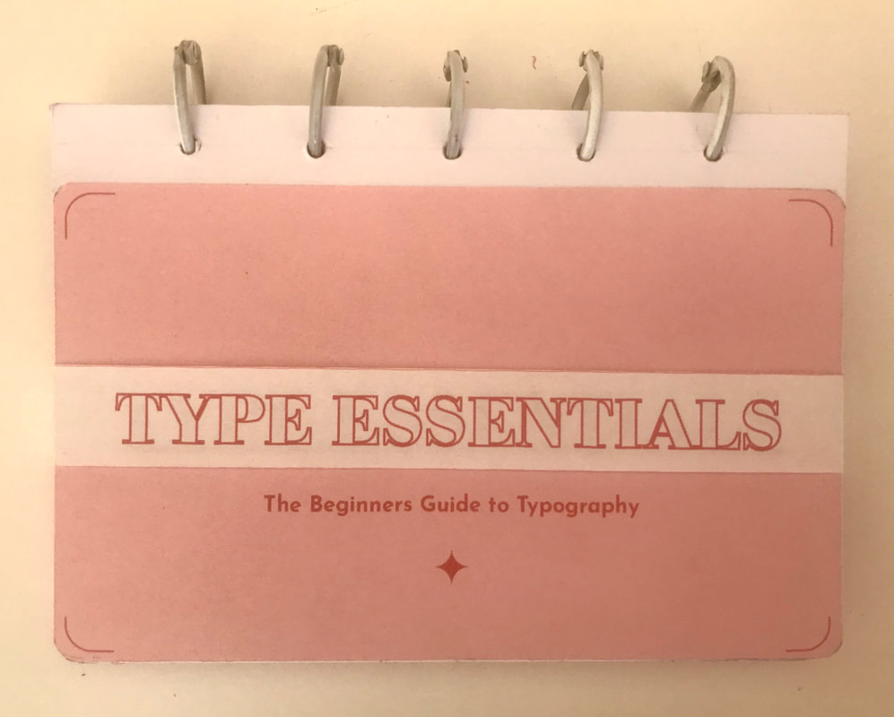
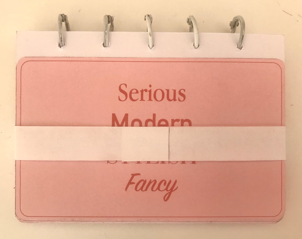
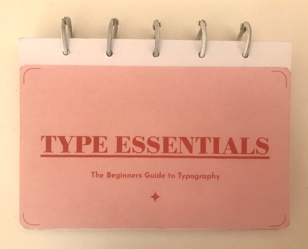
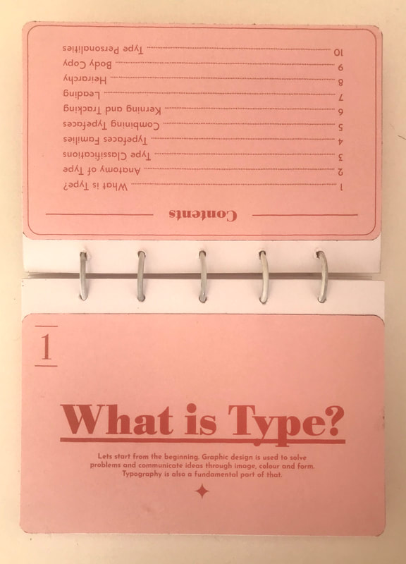
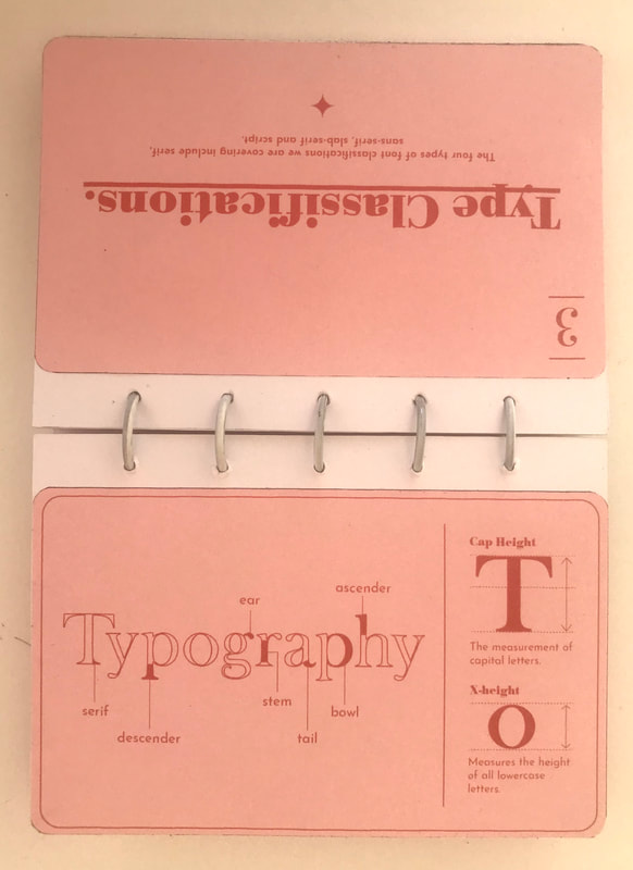
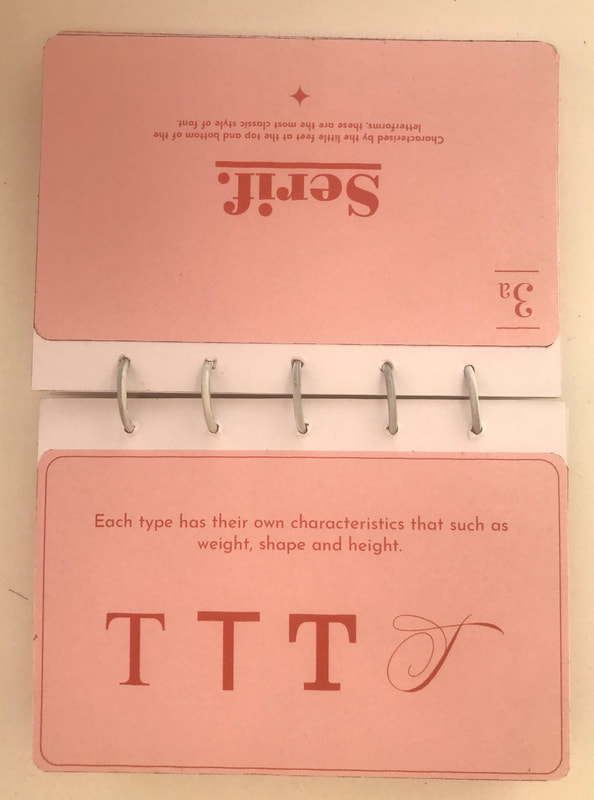
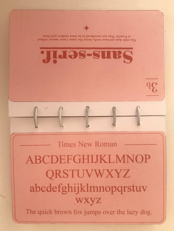
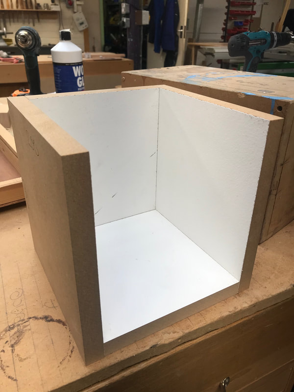
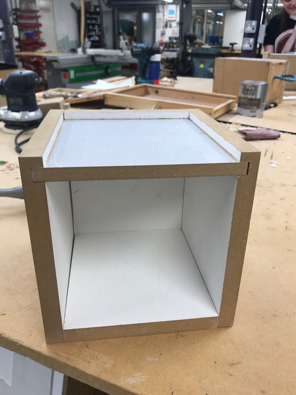
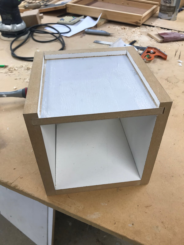
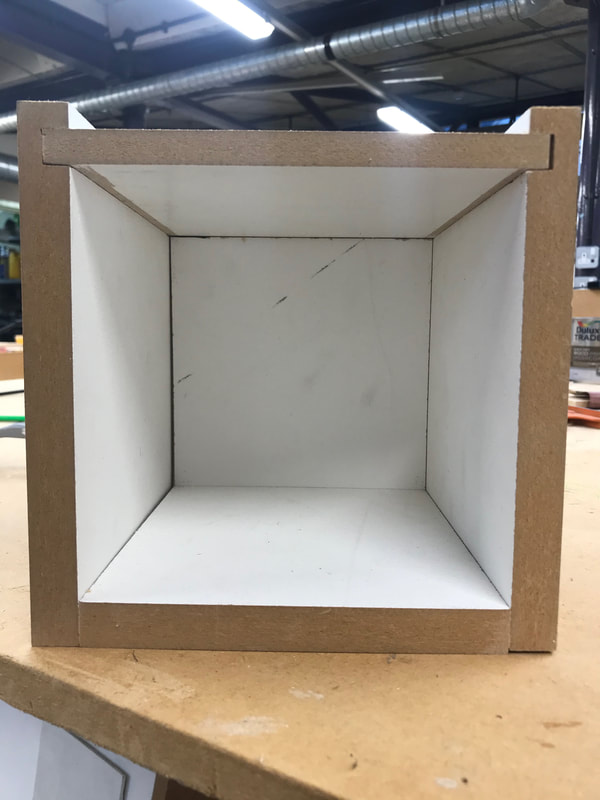
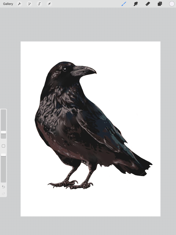
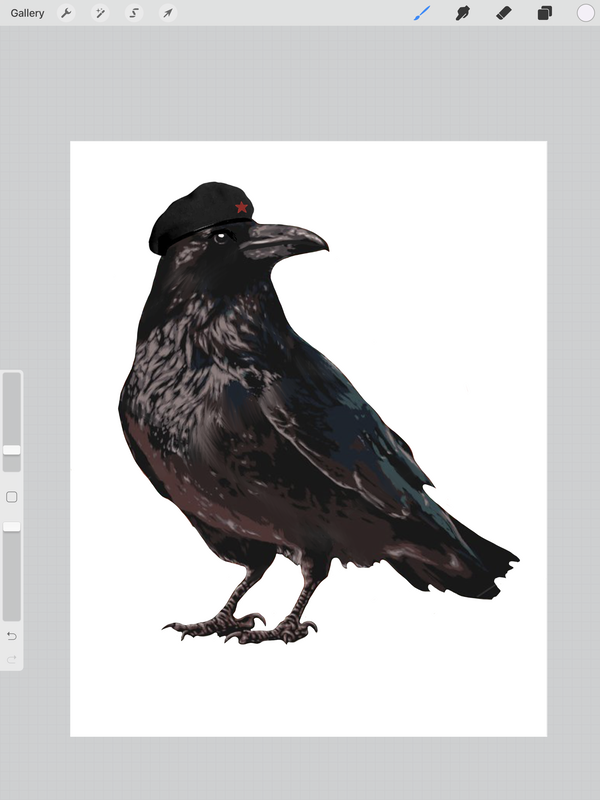
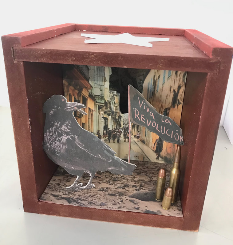
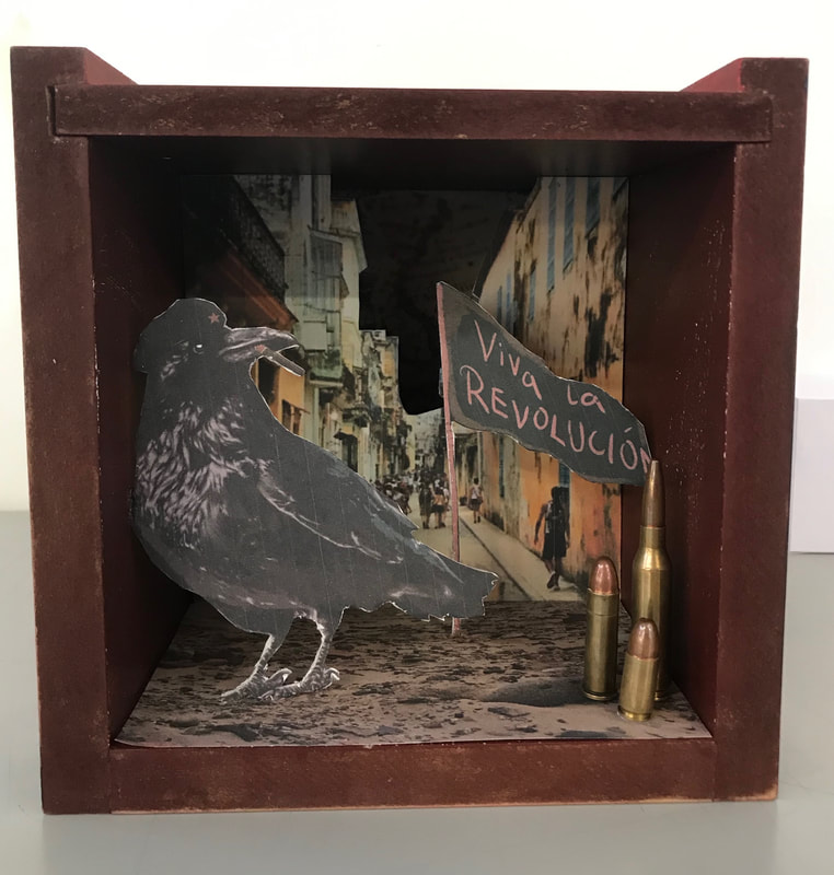
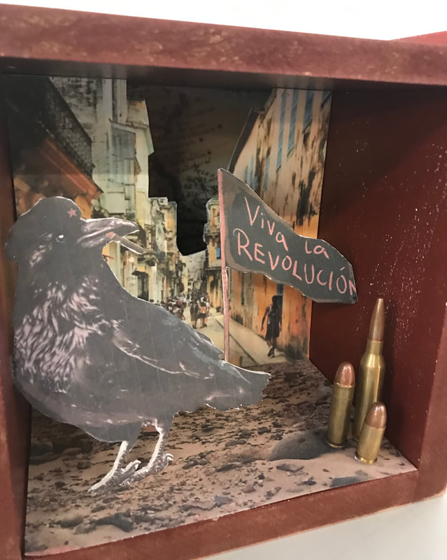
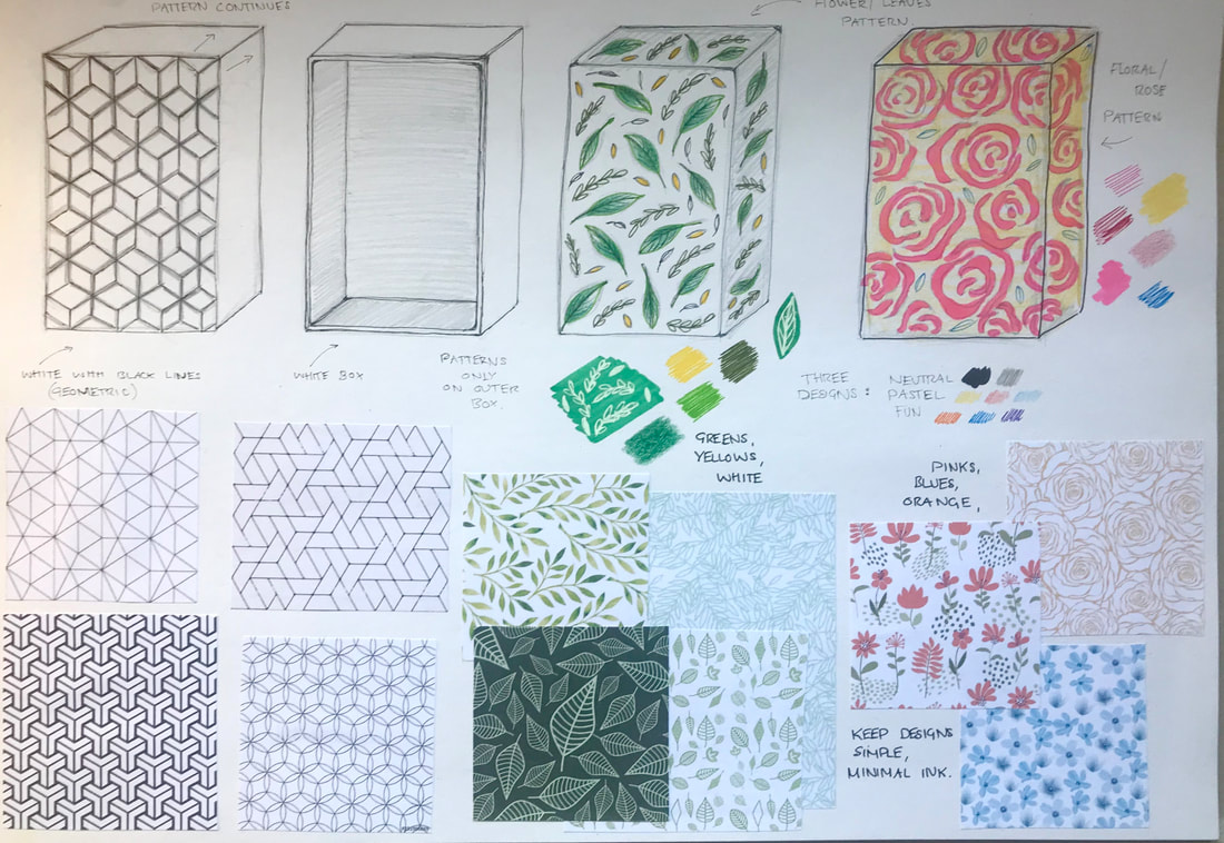
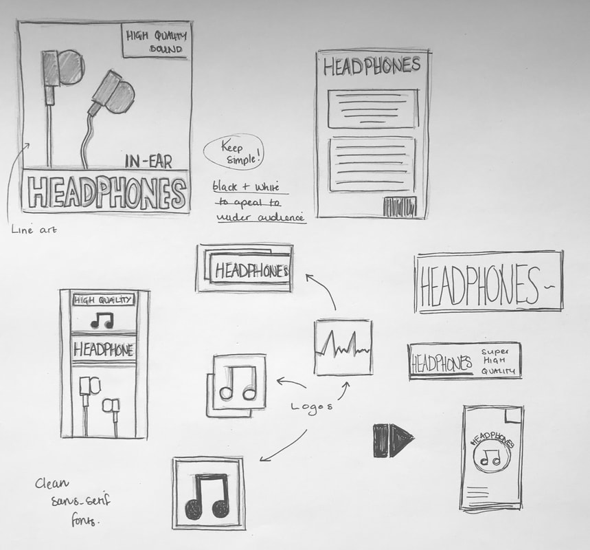
This project focused on 2D illustration and graphic design and was split into 3 parts in which we had to produce a zine for each. A zine is an unofficial publication that can be cheaply and quickly reproduced and are a way for artists to explore and voice their opinions out into the world. Part A: 'Pandemic' For the first zine we had to produce we had to explore the word 'pandemic', exploring how we might represent it visually, but only through the use of type and letterform. I started off doing a little bit of research into zines and the different styles. I knew I wanted to go out of my comfort zone and produce something more experimental. I also did a few quick sketches of possible layouts and ideas. 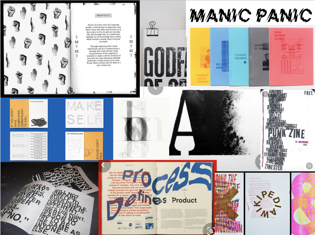 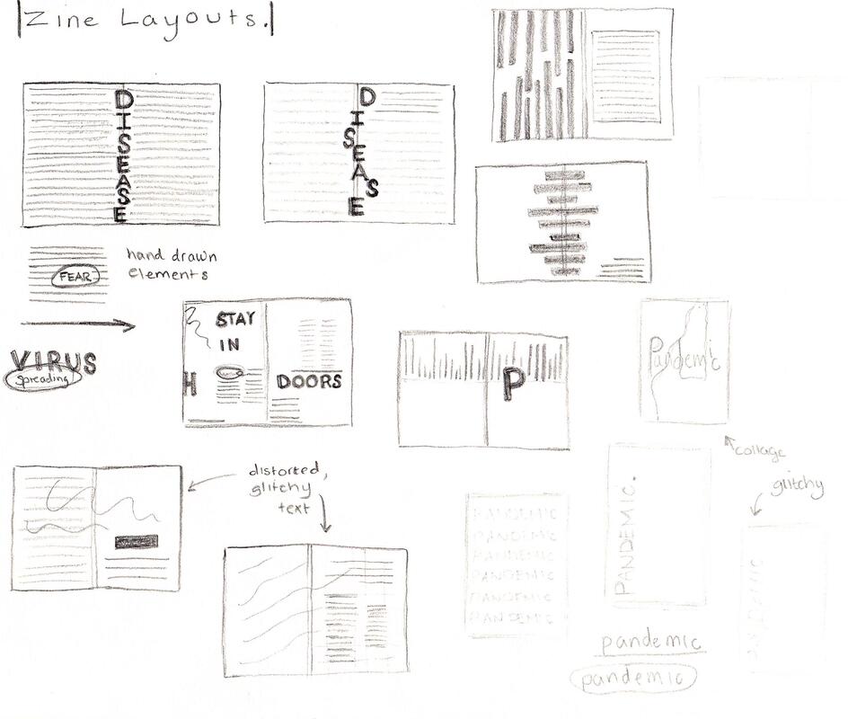 I next explored a few different formats for my zine; one sheet, unbound as well as a saddle-stitch using wax thread, trying to figure out page numbers and layout. I then started experimenting with type. I explored tracing, cutting up and combining words in different typefaces for texture as well as using a scanner to create distorted glitchy text. I thought this was a good way to represent the theme of the zine as it looked visually hectic and showed lack of control. After experimenting further with printing on different paper stocks and colours, I started using Adobe Photoshop and Indesign to develop some of these experiments so that they could be used for the pages of my zine. I included texts that I thought were relevant with the theme using online resources we were provided for the content. After designing all the pages I printed them out onto plain printer paper in red and white. For the front cover I chose to double it up and add a rip just to make it more interesting. I also chose to include a mini zine in the middle and include some of the cutting and scanning experiments I did. 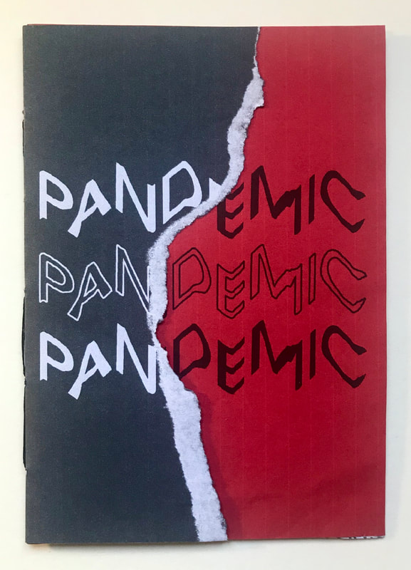 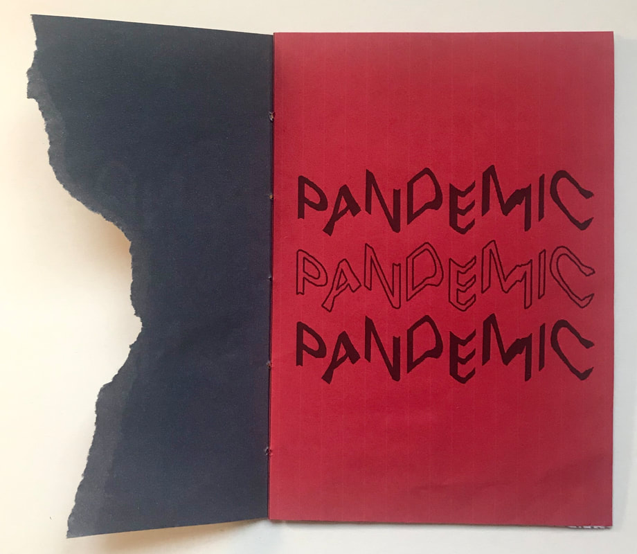 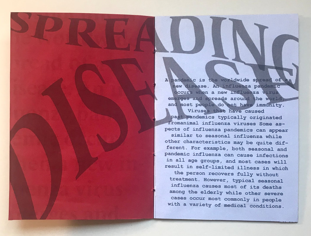 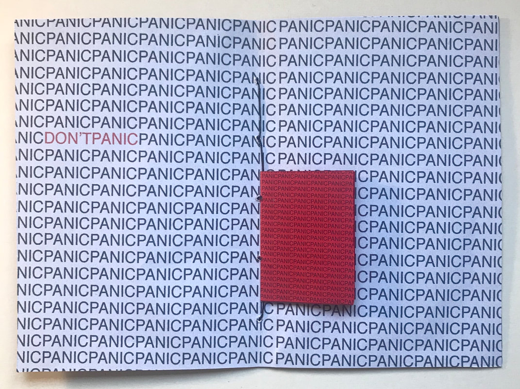 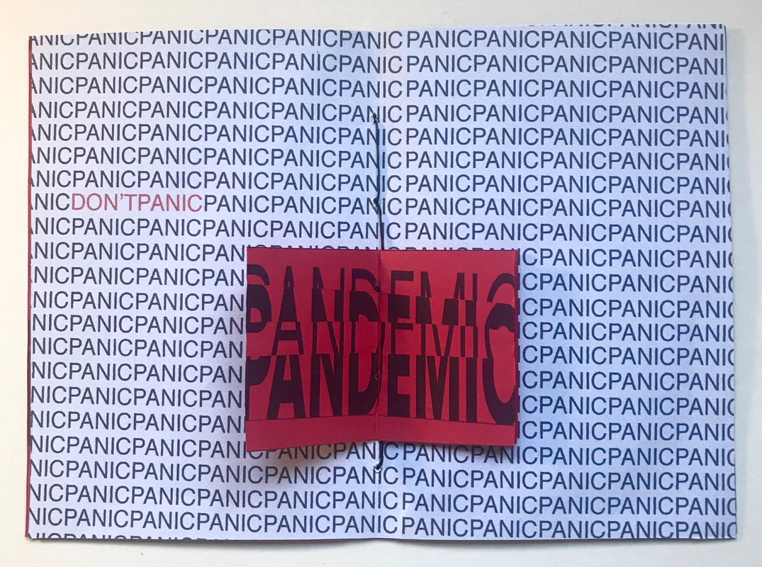 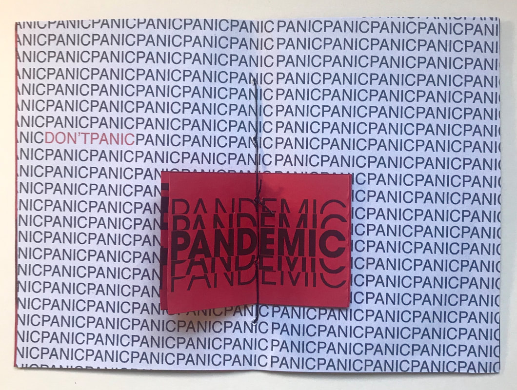 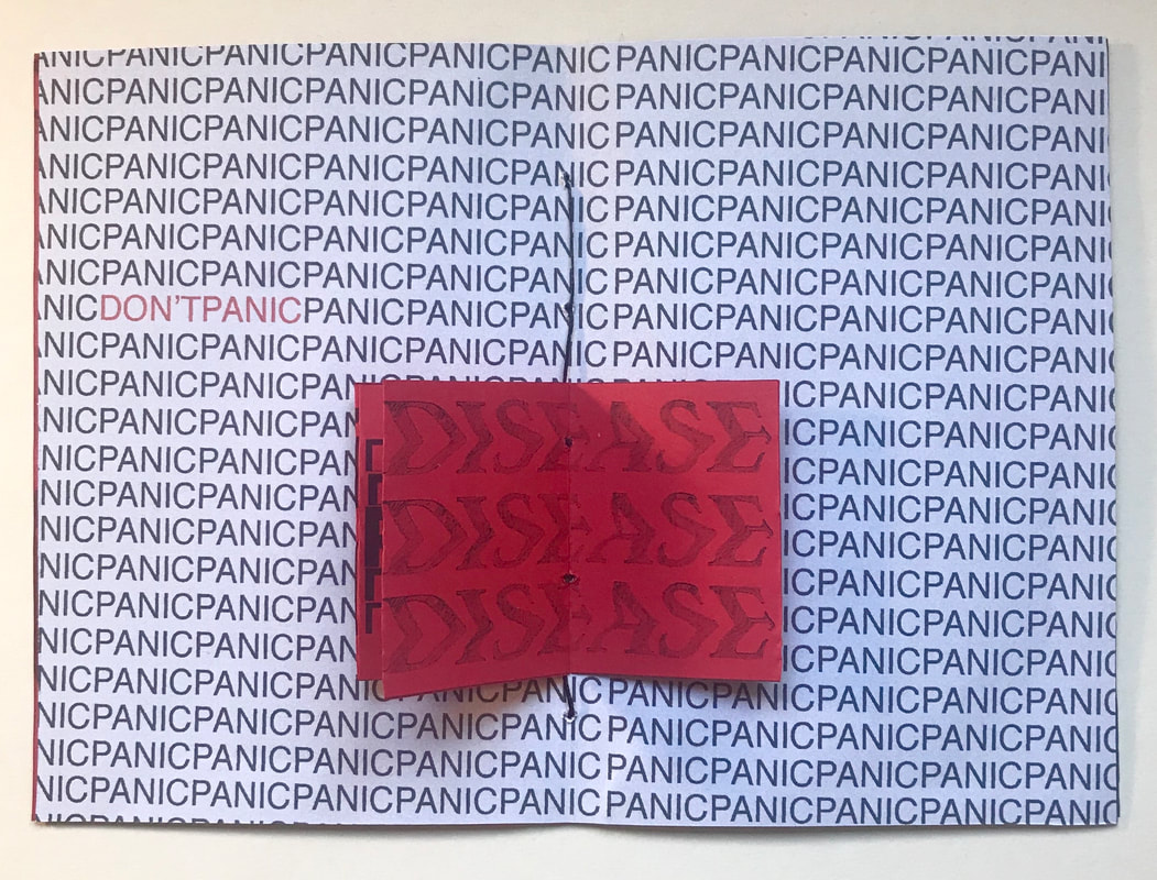 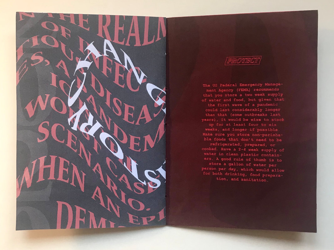 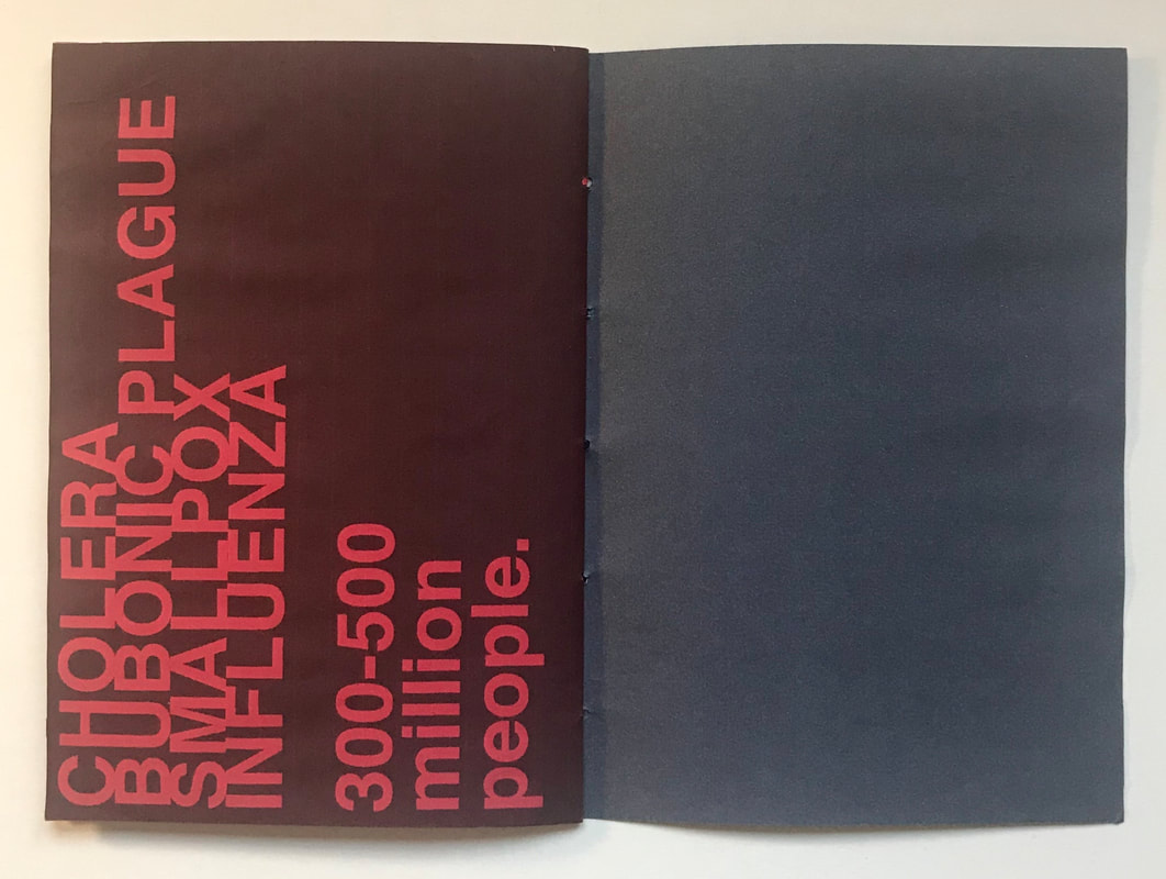 Part B: 'Migration' The second zine we had to produce had to explore the word 'migration', this time exploring it purely through imagery. I began with some visual research, looking mainly at photography zines so that I could incorporate some of my own photographs combined with images found online. I particularly liked the accordion format and I wanted to experiment a little with the use of printed vellum.  The images I used created myself I took by changing the shutter speed to show the motion of the movements and making them greyscale to give them more of an eerie vibe. I thought these photos linked in well with the theme of the zine as migration is a type of movement. After printing them out I scanned them into my computer to add more texture. I chose to create a mock up zine first to experiment with a few ideas, using a Japanese binding and experimenting with some collaging and vellum techniques to add interest. I used a combination of my own images with ones I found online related to travel. I then went on to produce another mock up using an accordion format. I love the aesthetic of using purely black and white so I continued with that. I also stuck the images onto thicker card with an added black wax chord to make it feel more professional. I wanted to combine the two mock ups I did to create my final zine. I produced a series of collages, combining my own photography with collage elements I printed out such as tickets, maps and paper scraps. I love how converting them to greyscale added more contrast. I then arranged the collages onto the pages, using thick card and increasing the scale so you could see the details better in the collages. I decided to also add a vellum belly band and black wax chord as a sort of packaging and to keep the whole thing together. Part C: 'Union' The last zine had us explore the word 'union' but this time not only did we have to use both type and image, we had to produce it in collaborative teams. I was responsible for all the graphic elements whilst my partner produced the main illustrations. We decided to base our zine around endangered animals and how we should all unite as one to combat the issue. All information used came from this website. Whilst my partner started working on the illustrations for each animal we were going to cover, I did some visual research on how the graphic design could look to match. In contrast to the two previous zines, I wanted this one to be colourful and fun with hand drawn elements.  These are the collaged illustrations my partner sent me which I later edited using photoshop, removing the backgrounds and doing some general tweaking of saturation and contrast. I then got to work on the graphics using Adobe Illustrator and Photoshop.. Below you can see the process I went through when designing a few of the pages. I add hand drawn elements throughout the backgrounds that related to each animal such as leaves and bubbles and added all the type, using handwritten looking typefaces. After I had finished designing all the pages I added textures and adjusted the contrast and exported them as jpegs to add to an InDesign file ready to be printed. 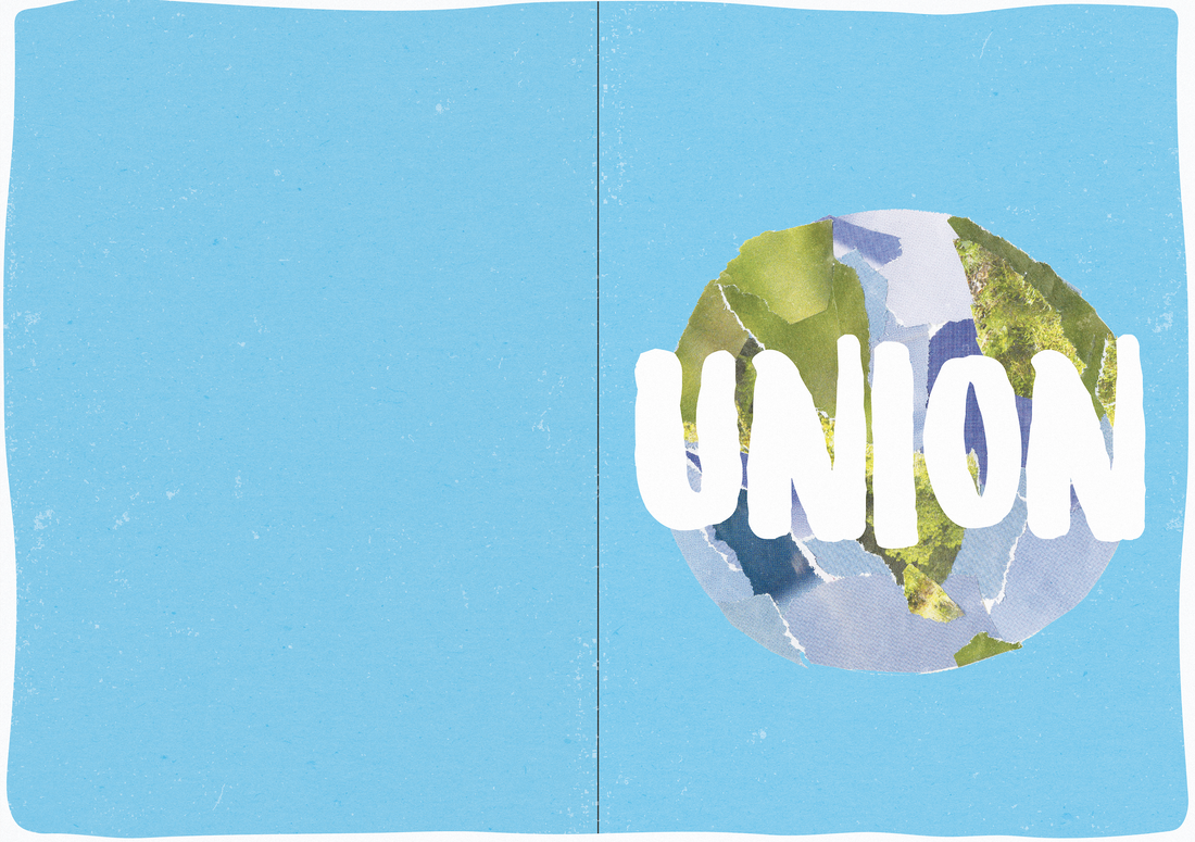  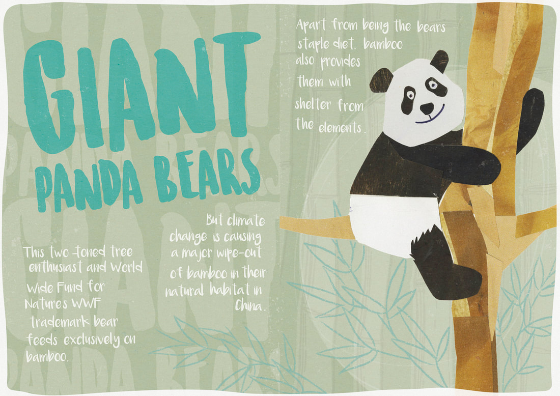 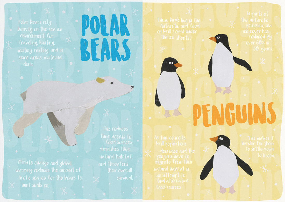 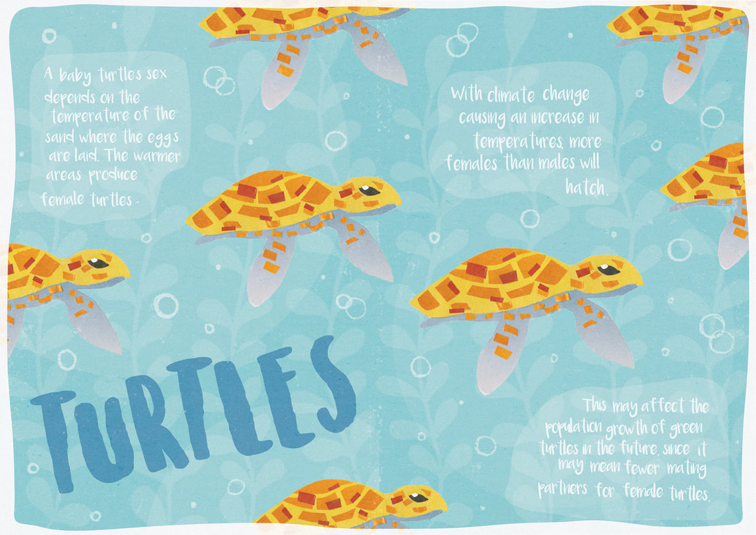 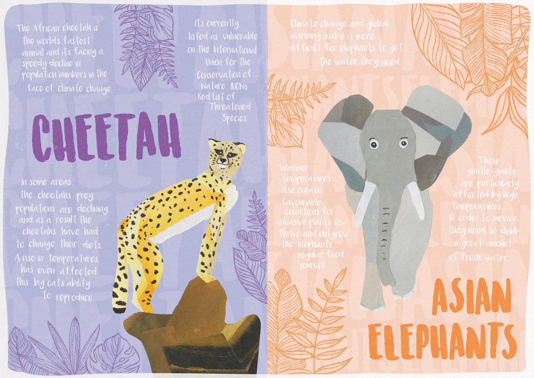 I first created a mock up printed out on regular printer paper, creating an A5 booklet which I bound using a simple threaded saddle stitch. This zine was my most ambitious and took the longest out of all three zines and so I wanted to make sure it looked professional. I decided to print this zine out onto nice A4 matt photo paper, to enhance the colours and sharpness so no details were lost. Then to create the A4 booklet I bound each single sheet using a coptic sewing variation to maintain that homemade touch. 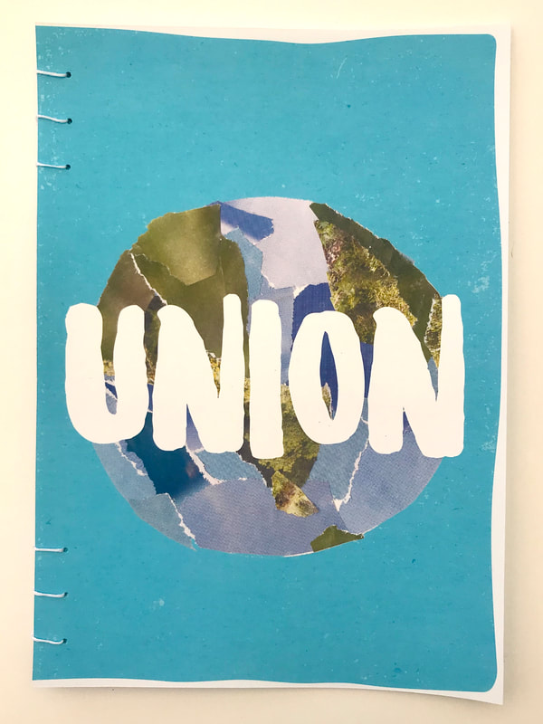 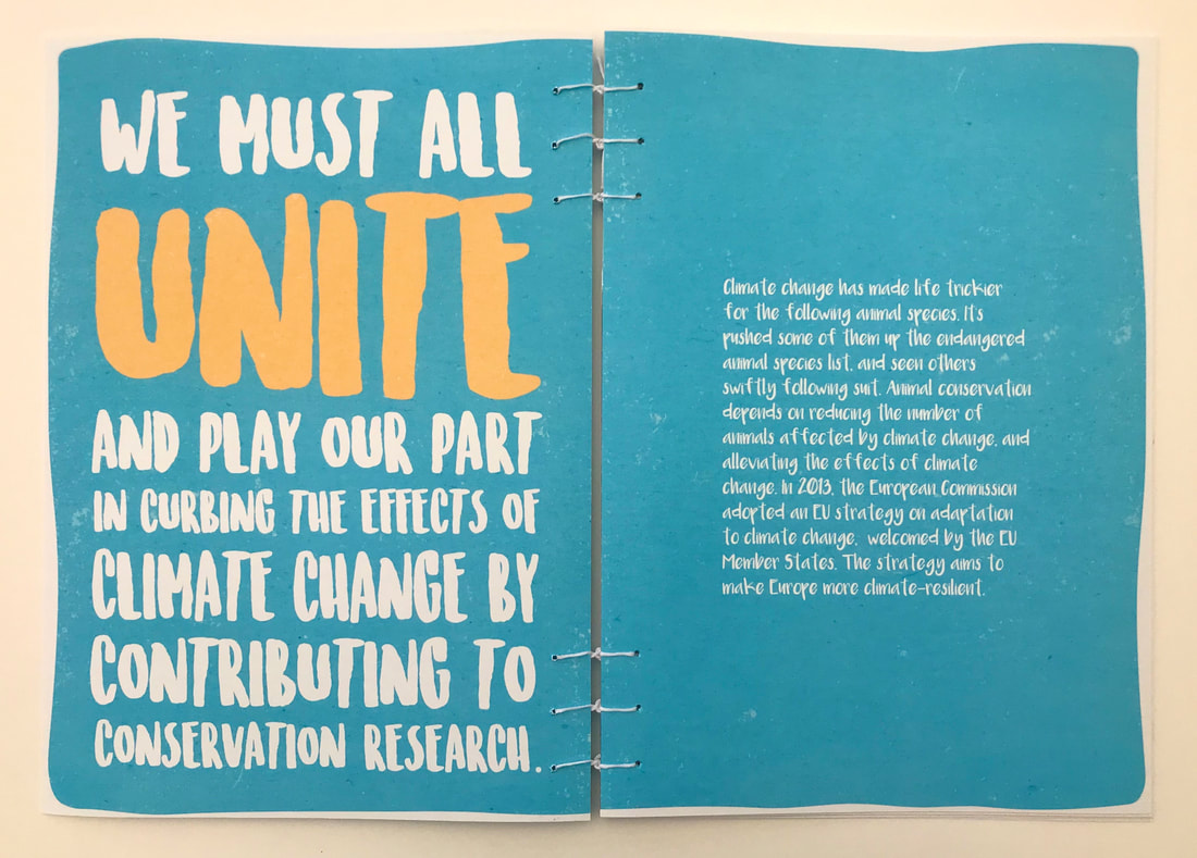 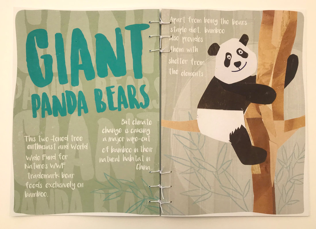 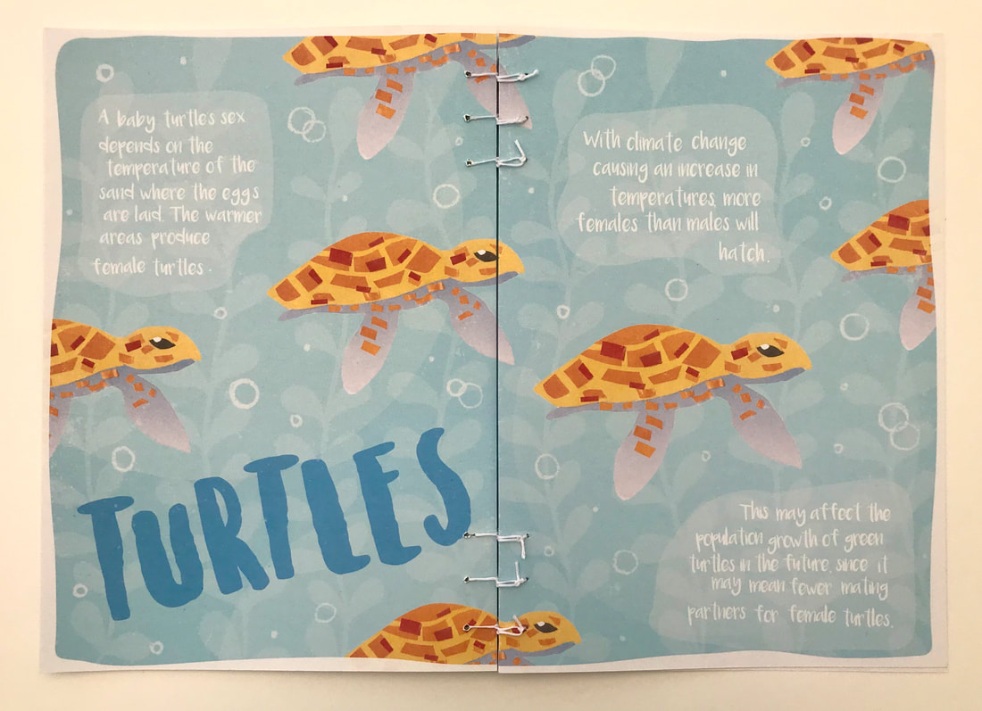 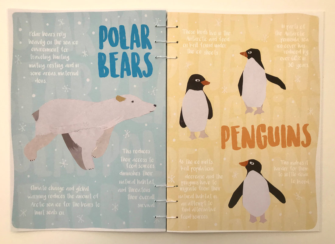 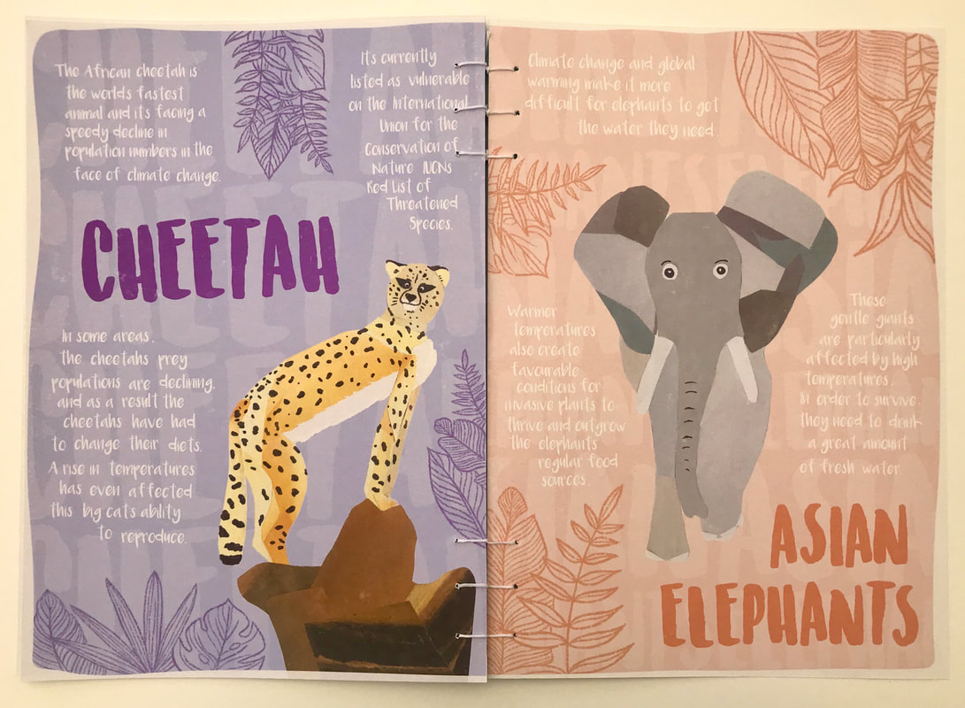  Brief For our first project for this module we had to design and create a 'manifesto', rule book or instruction manual that informed learners of the basics of typography in ten steps or facts. Theme, content and format had to be carefully considered. Research I began my research looking in books and online for some inspiration to get me started. I initially thought about creating an interactive hard cover book with pop-ups and other interactive elements, however due to unforeseen circumstances I felt it necessary for me to change this idea to something simpler to guarantee I could present a finished piece. Due to this my initial research was geared more towards my first idea but I still took inspiration from the design layouts I found when working on the idea I finally went with. I wanted the design of the pages to be as simple as possible so that the information was easy to see and understand. I found looking at other published books on typography that I found them too cluttered, with too much information on the pages which caused me to feel overwhelmed and not want to read everything. I wanted the theme and content of my piece to appeal to the absolute beginner, focusing on the absolute basics. 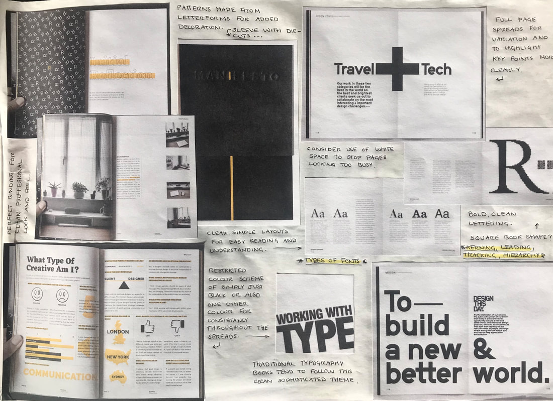 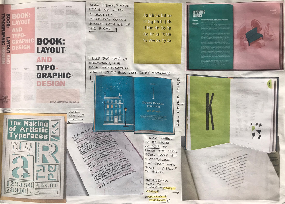 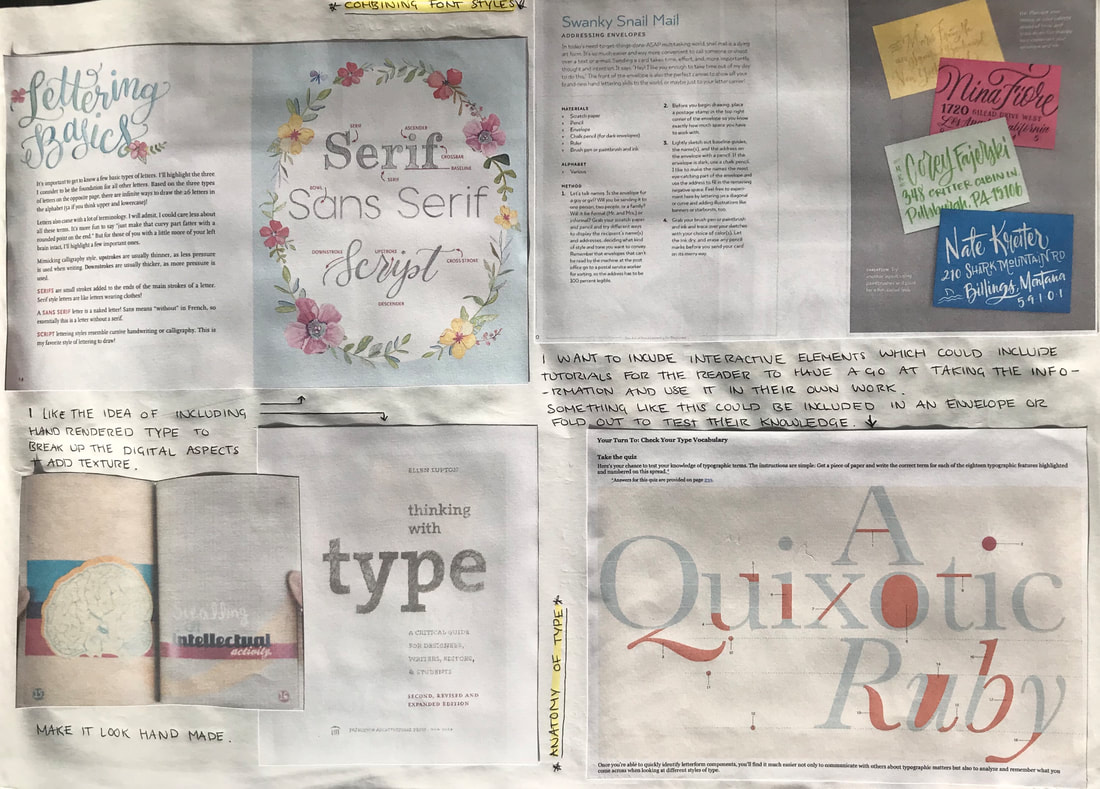 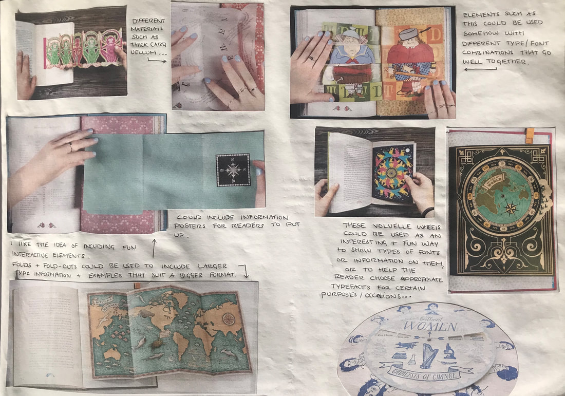 My second idea was inspired by study cards, used to learn and memorise key points of information in a simple and portable way. I thought this was a good idea as it meant I could summarise the absolute necessities when it comes to understanding typography due to the smaller format and keep the graphics themselves clean and simple in order to utilise that limited space. 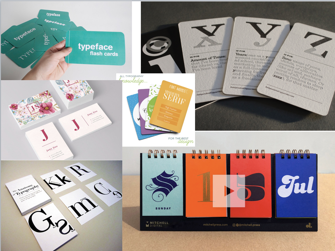  Initial Ideas Here are my layout ideas for the format of my interactive book; my initial idea. I was trying to come up with different ways to deliver the information that was fun so that the reader stayed engaged enough to keep reading. A few of these ideas were taken from a book I got from the library called 'Making Handmade Books' by Alisa Golden, and others i was inspired by a book I owned myself by the graphic design studio MinaLima, 'The Little Mermaid and Other Fairytales'. This book is part of a series of old classics which they illustrated with interactive elements. 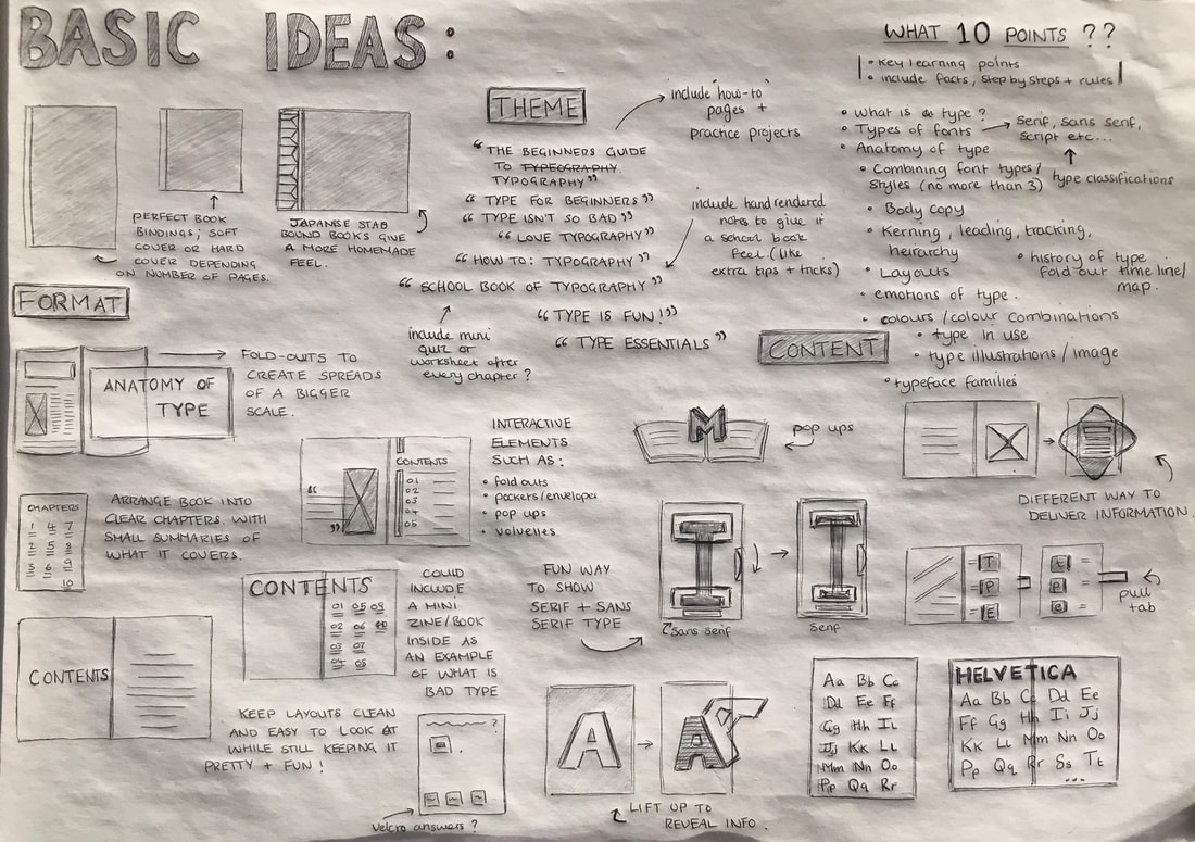 Developments Using Adobe Illustrator, I began creating the pages for my study cards. I chose to use a very simple colour scheme of red and pink as I liked the way the complimented each other. I also followed the advice given on one of the cards themselves of restricting myself to using just two typefaces; a serif font and a non-serif font, also making sure I considered hierarchy of information throughout. The last step involved me added some textures over everything so everything looked a little less flat and had more definition. Below you can see the process for one of the cards, step by step:  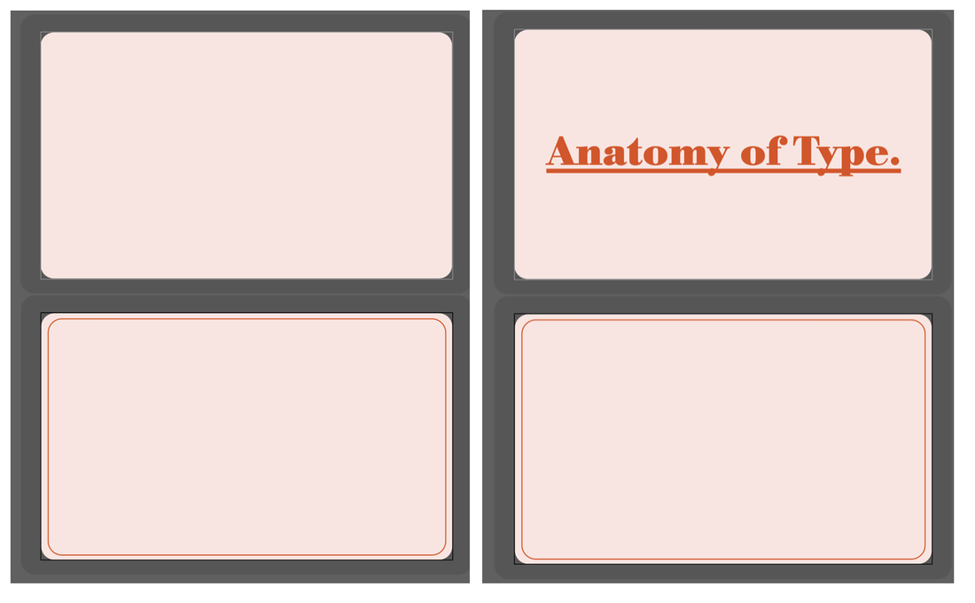     After I had figured out the general style and layout I wanted to go with I began creating the other cards. They each had the title of the topic on one side and the information on the other side, just like a general study card. I also chose to make a card for the 'cover' with the contents of what information the other cards covered on the back. I also designed a belly band to keep all the cards together, sort of like outer packaging. I did these exactly like the one shown above but removed the pink background as I chose to print the cards directly onto pink paper. 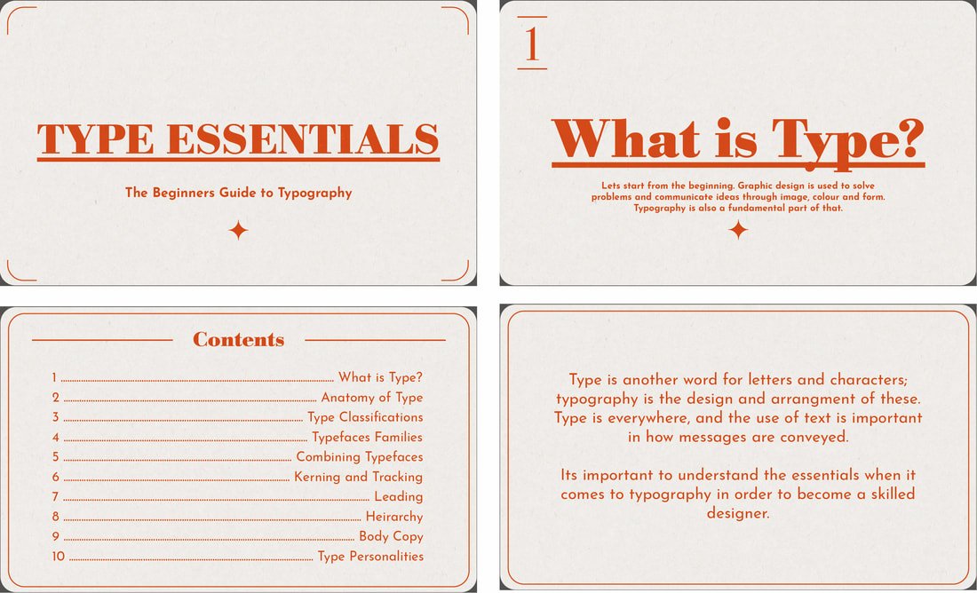 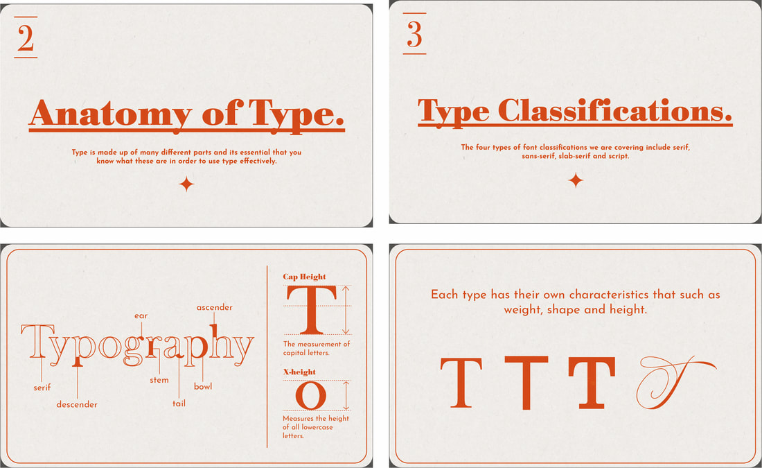 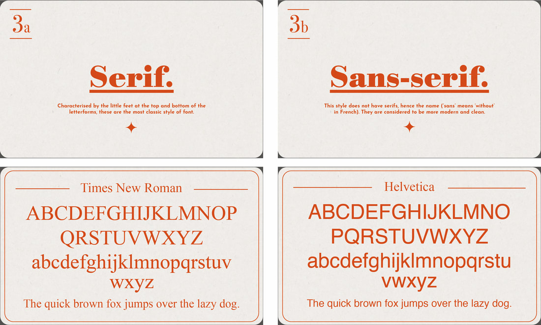 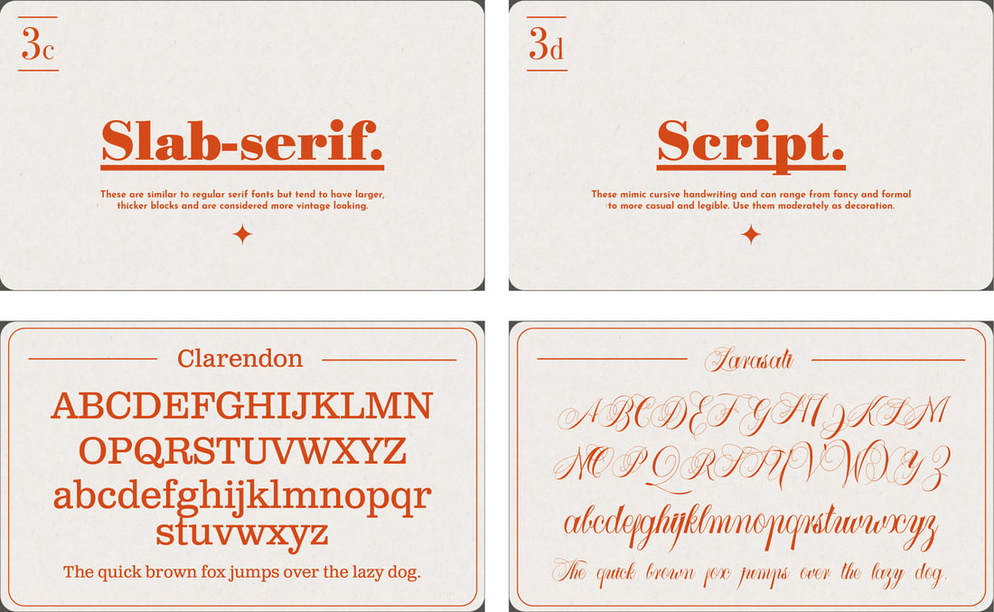 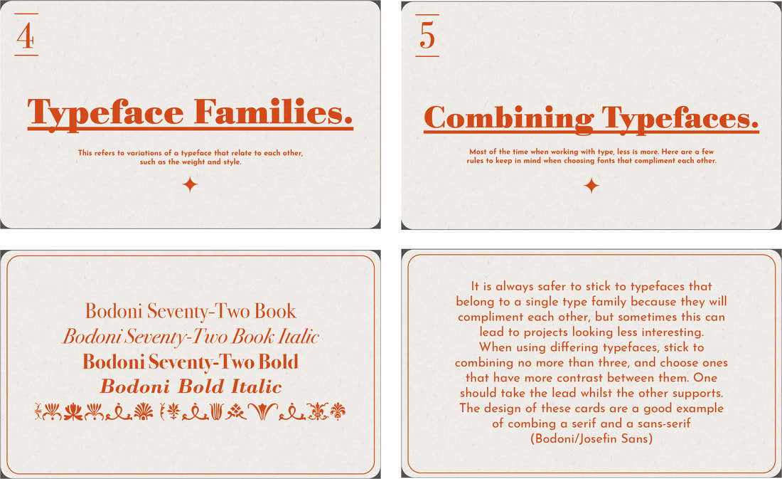 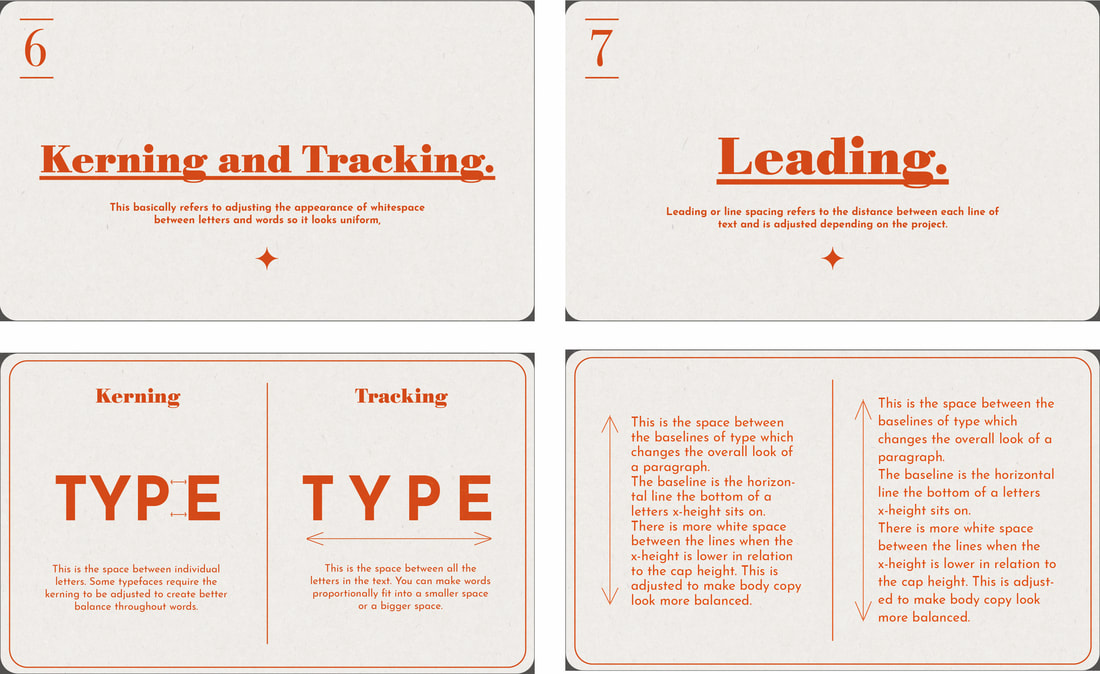 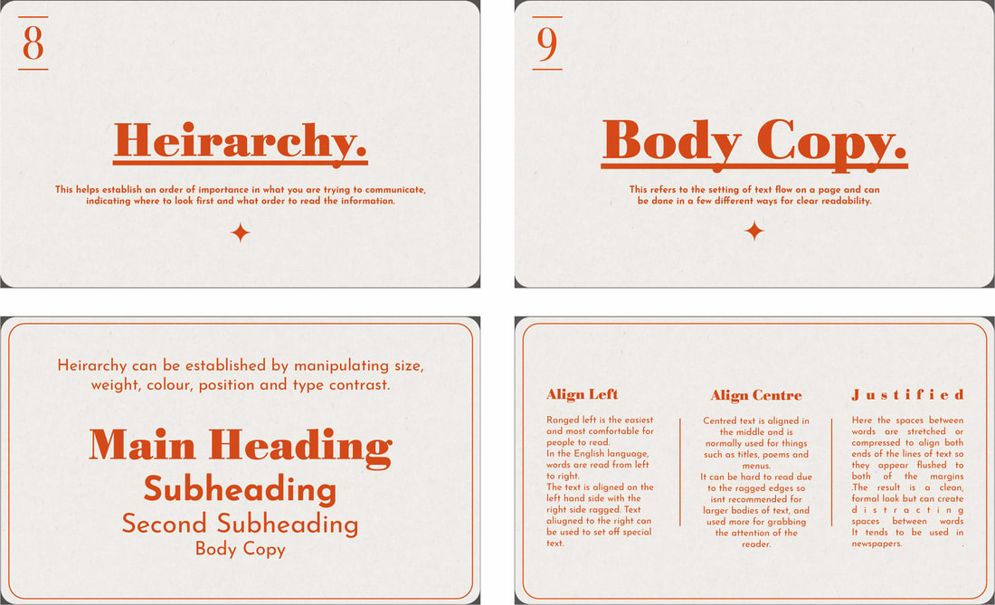 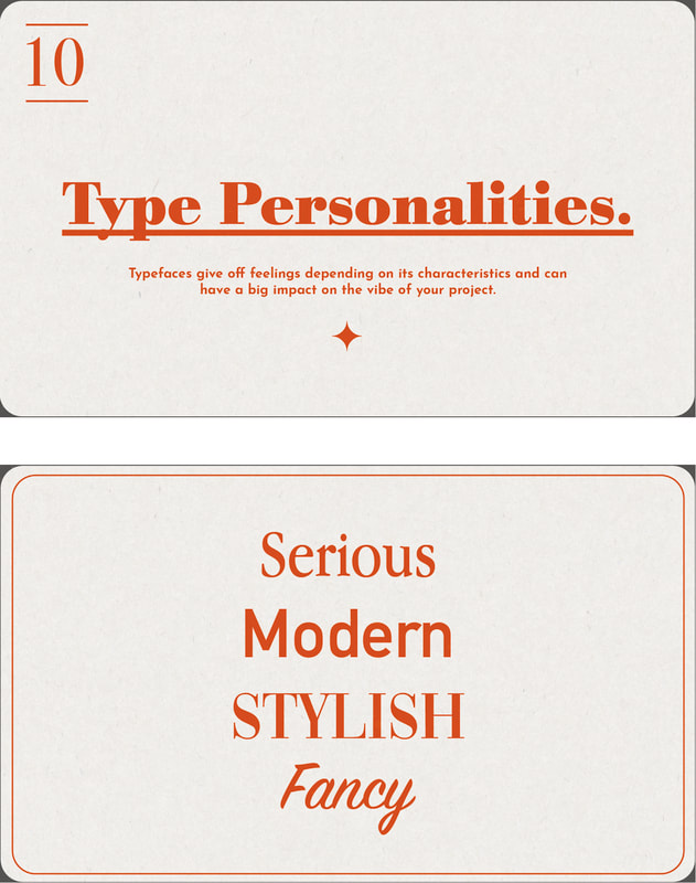  Mock Ups My first print out I did on plain white printer paper. I knew I wanted to find a way of binding the cards together so they were in more of a book format so I first experimented with a Japanese stab binding using wax thread and some other book binding tools I owned and wanted to utilise. However, the paper was too thin and flimsy and I wasn't a fan of how cheap and poorly made it looked so I decided to mount each of the cards onto some thick card using spray mount. This made the cards look way more professional and much more durable. I decided to also create a few digital mock ups to show how the cards could be professionally made, as lack of equipment and materials prevented me from producing them in this way myself. Final Piece Shown here are the final mounted cards. I left space above each card in order to create holes for binding. I decided to improvise and create my own ring binding using 0.75 inch loose leaf binder rings which I spray painted white. Overall I am satisfied with my final outcome even though things had to be changed last minute. I still think I managed to produce a meaningful 'manifesto' that highlights the basics of typography to a complete beginner in an interesting, easy to understand way. Ampersands One of the mini activities we were given were to collect 20 different ampersands. I chose to display mine in booklet form using a saddle stitched binding using thread. 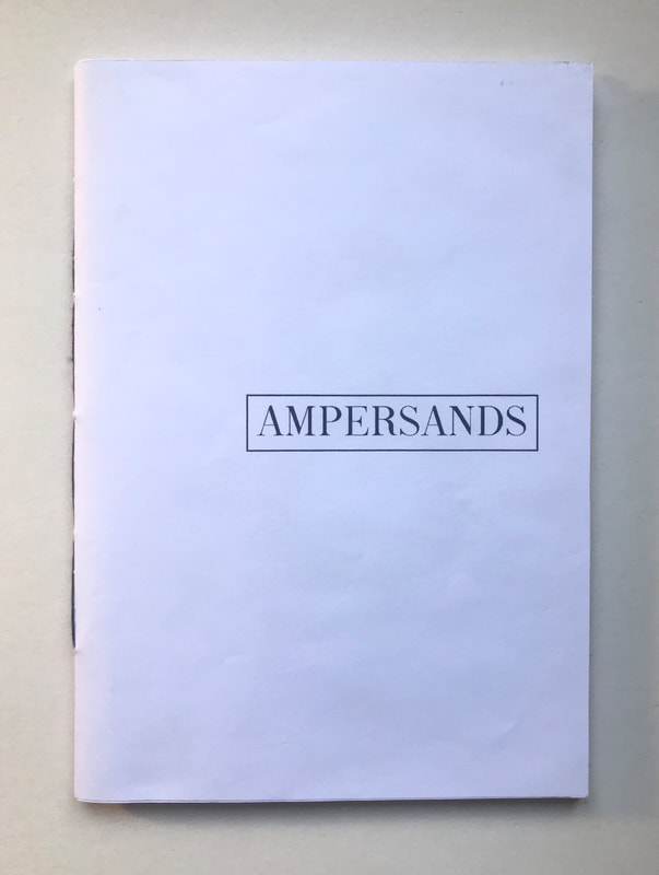 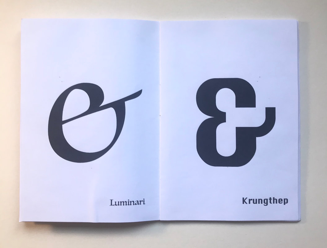 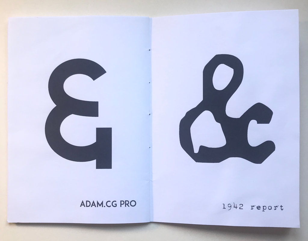 Talking Type/Type Personality The next activity involved us being given a choice of two scripts which we had to translate into typography. We had to assign an appropriate typeface to each person that represented them and so that we could "see" their voices. Choosing the script from Harry Potter, I started out experimenting with a few typefaces for each character first. I wanted the typeface for Hagrid to infer his size so chose a thick, bold font. For McGonagal I tried to find a typeface that represented her seriousness using a thin, clean serif font. I wanted Dumbledores to come across as the most interesting using a typeface with serifs to represent his authority, but also showing some quirkiness. 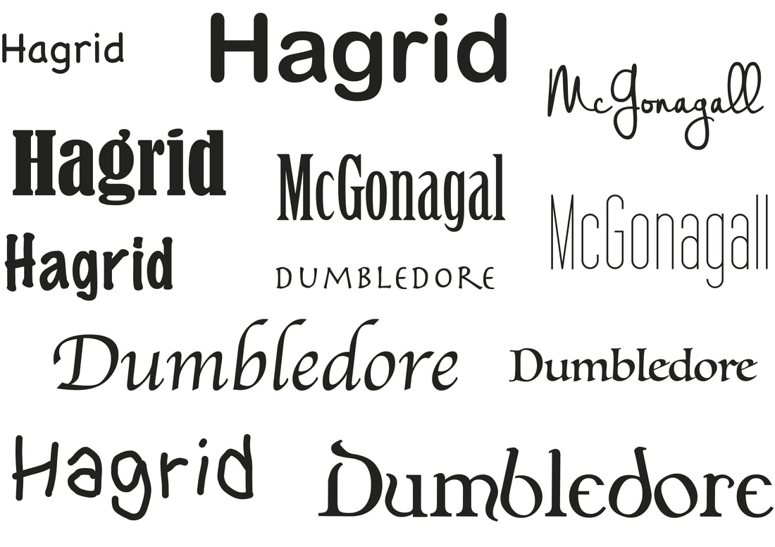 I then experimented with a few different layouts, first digitally and then by cutting and sticking onto layout paper.    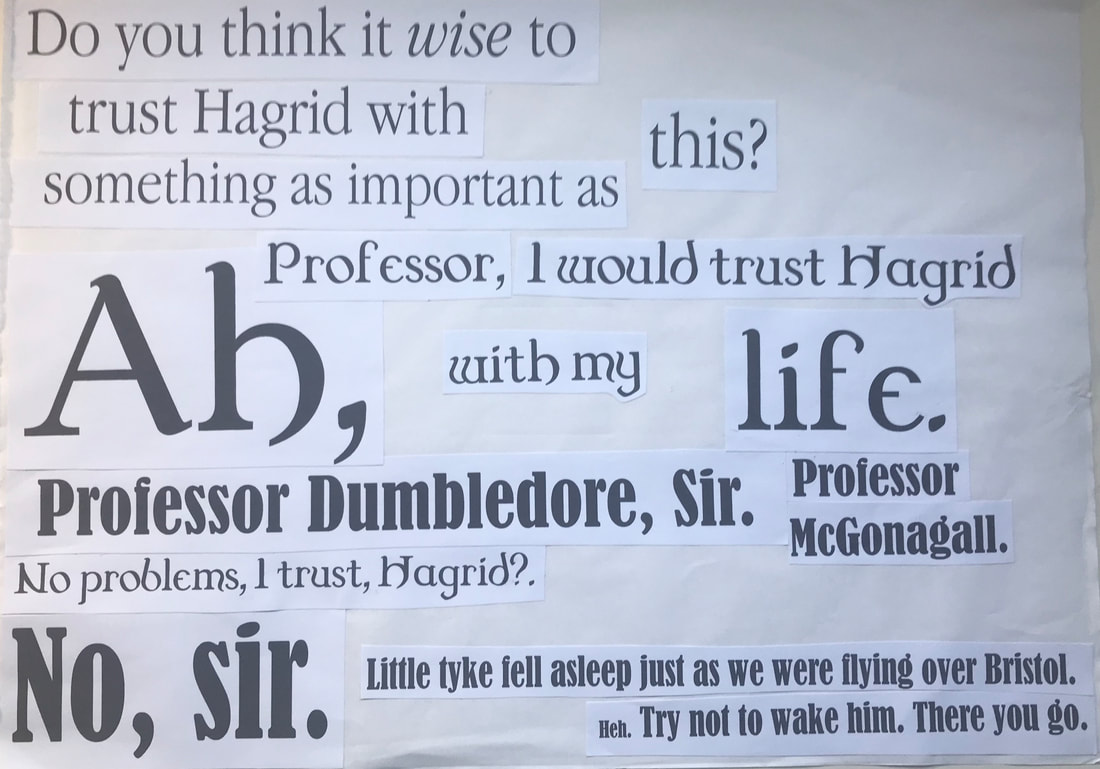  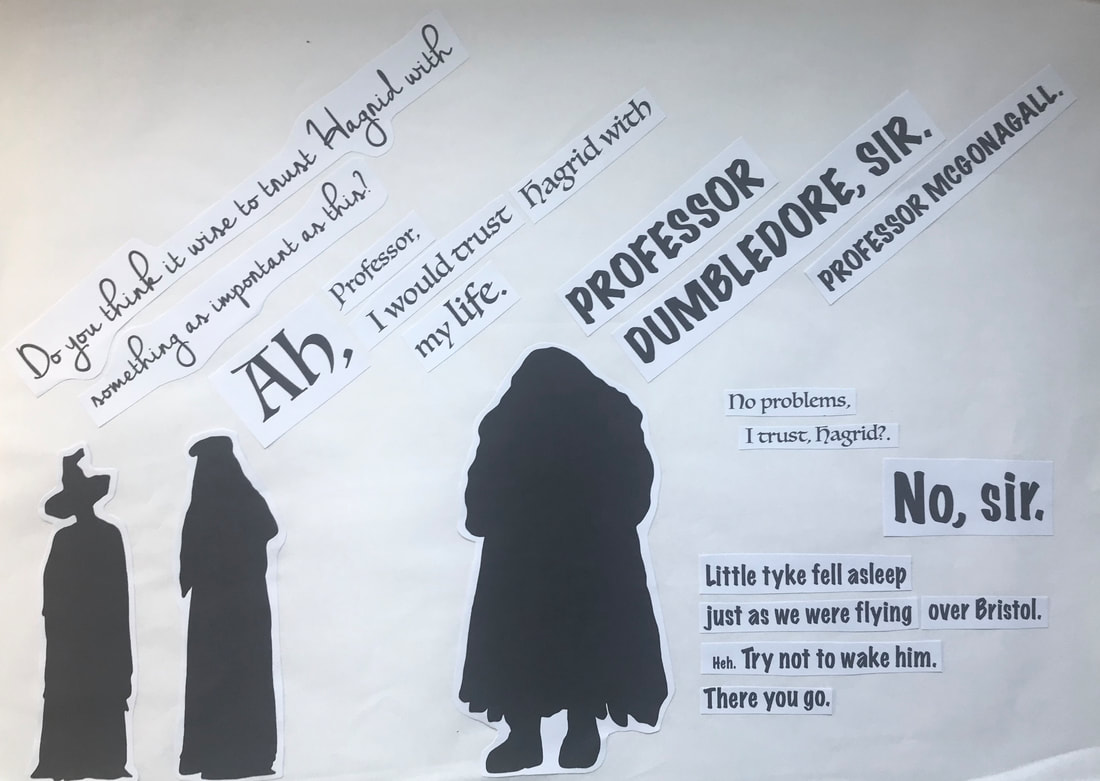 DIY Alphabet For this activity we were given a day to create our own DIY alphabet inspired by the various alphabets in presentation we were shown. I chose to make up the letters using different office-like supplies I had available to me in my room such as paperclips, push-pins, staples, felt-tips, post-it notes and biro pens. 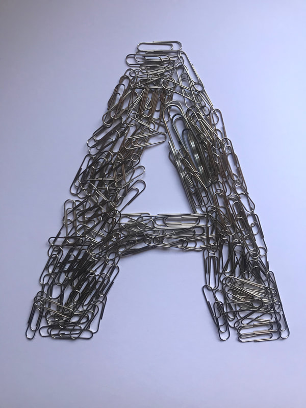 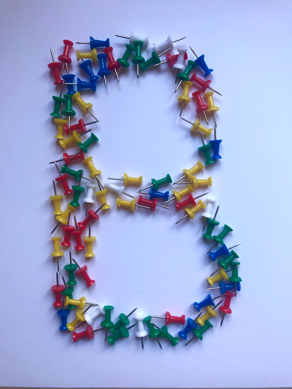 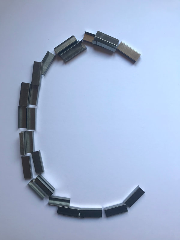 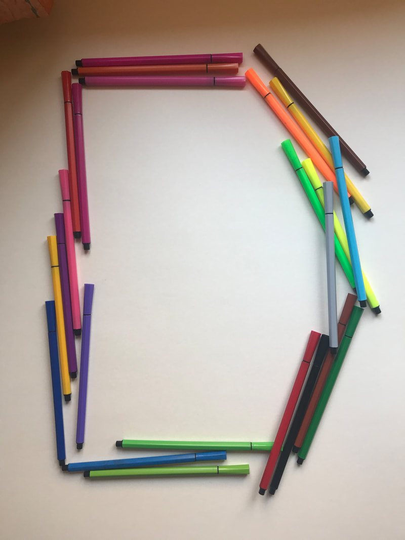 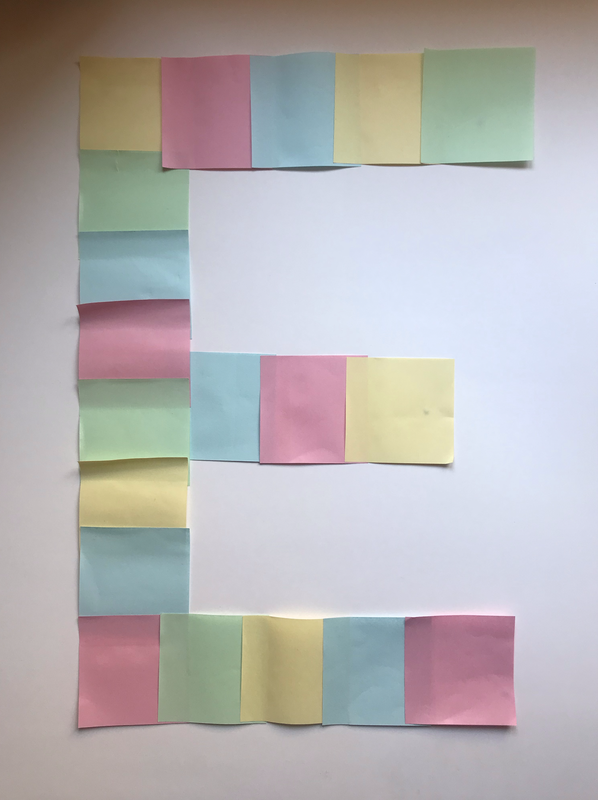 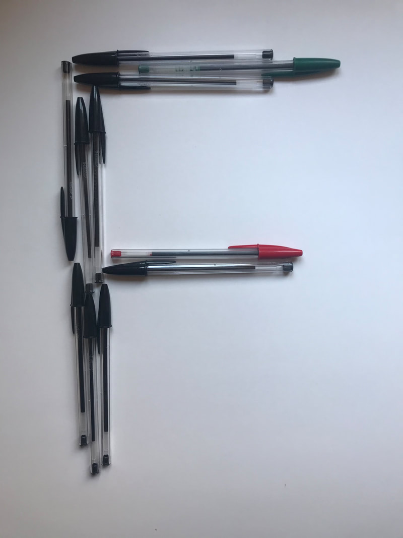 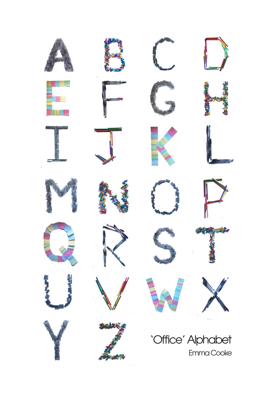 Brief Our first project for this module required us to design and create a box that represented the celebrity/historical figure we were randomly given. The cube could be as bizarre as we wanted as long as it communicated a reasonable about of information about the person, didnt break out of the dimensions (200x200x200mm) and didn't include the persons face. Research To begin we had to thoroughly investigate the person we were given. I was given the historical figure Che Guevara, who I had practically zero knowledge of, so after very thorough research online I manage to get my head around who he was and why he was an important person in our history. Ernesto "Che" Guevara was a Marxist revolutionary leader, particularly during the Cuban Revolution. He was born in Argentina into a middle class family and studied medicine at the University of Buenos Aires. During his travels across South America he witnessed the extremely poor living conditions, leading him to believe only revolution could bring them justice. During the late 1950s, he aided Fidel Castro in overturning the Batista government. He was later captured in Bolivia where he was executed in 1967. I then took my visual research and created a mood board/collage. I include images of Cuban symbols such as their national bird and flower, as well as symbols related to revolution. 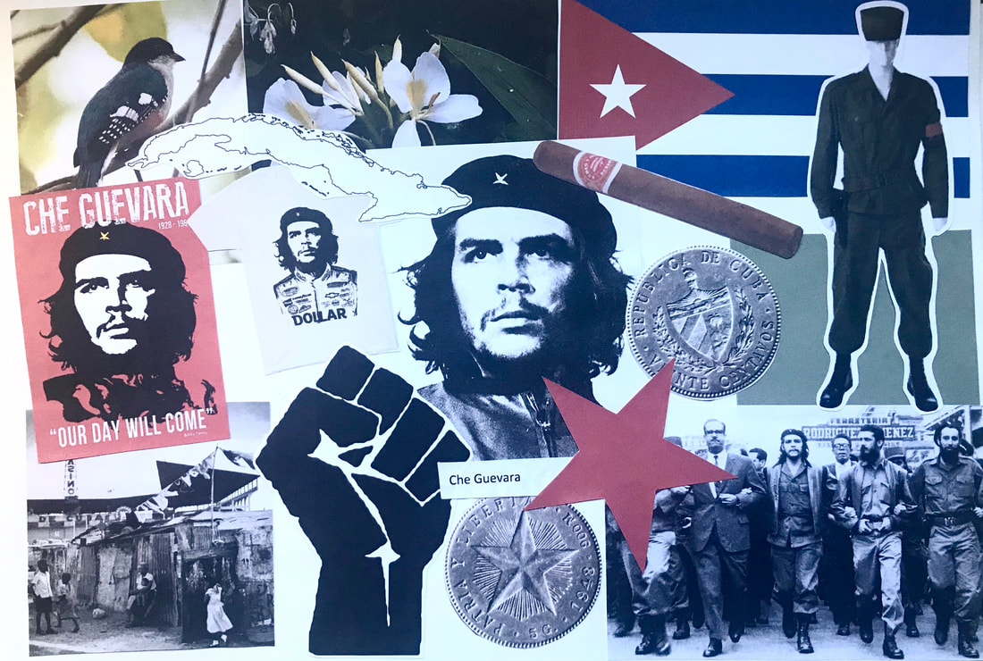 Initial Ideas After researching I began to get some initial ideas down on paper; ways I could represent Guevara without using his face or name in my finished piece. One of the ideas that stuck was to represent him using an animal that I thought could match his personality and the way he looked. He seemed to be a very strong minded person with lots of leadership-like qualities. A raven is a very intelligent and cunning bird, and due to them having black feathers I thought it was a good match. I did also think about using the Cuban national bird, but seeing as he wasn't born in Cuba and the bird itself was very colourful I didn't think it would match his persona as well so I stuck with the raven. 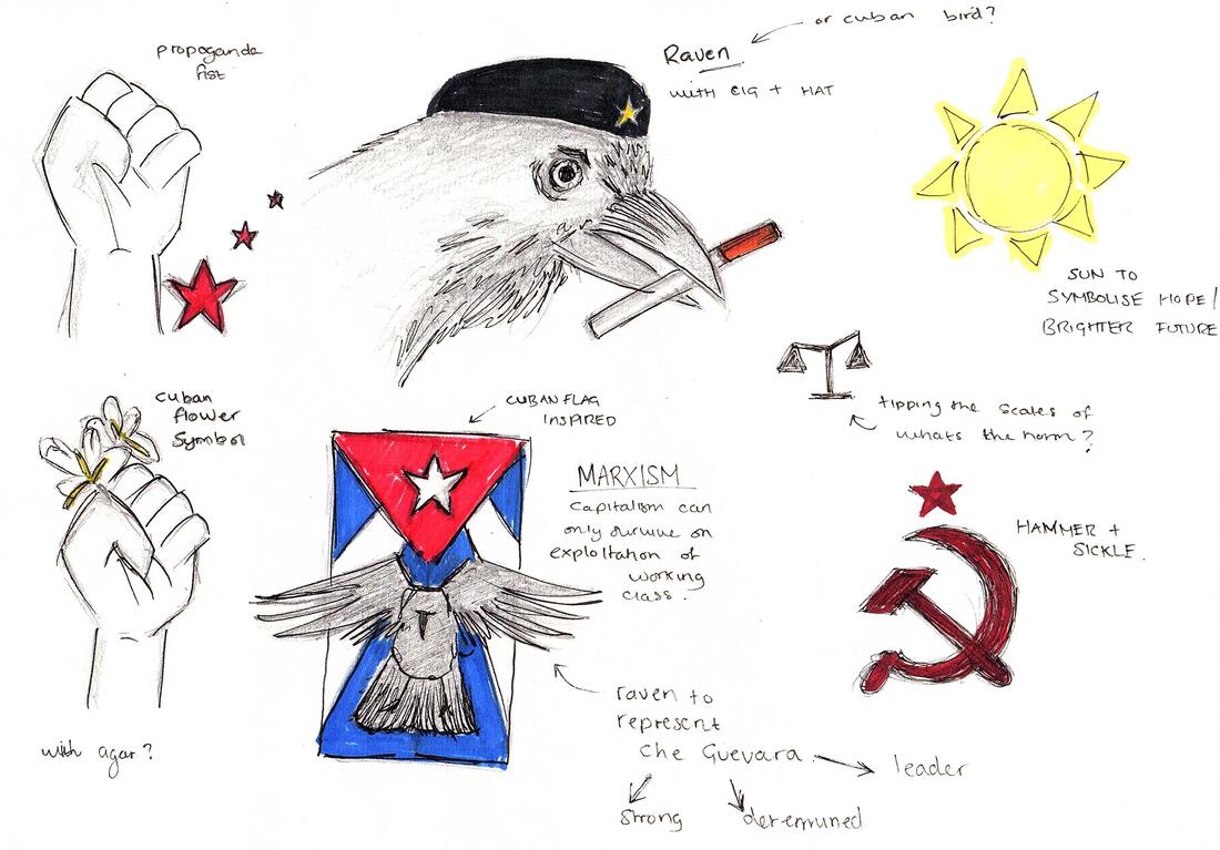 I then started to think more about how to design the box itself. I decided I would make my box inspired by a peep show box theatre, adding dimension using layers of different images related to Guevara. Some of my ideas involved making it look like a sort of 'box of curiosities', inspired by the work of Joseph Cornell, filling it with little trinkets related to the figure such as maps, bullets, flags, cigars and propaganda posters. I also started to think about how I wanted the outside of the box to look. At least three sides had to be decorated with nothing going outside the dimensions so I thought I would just paint the outside using colours inspired by the Cuban flag. 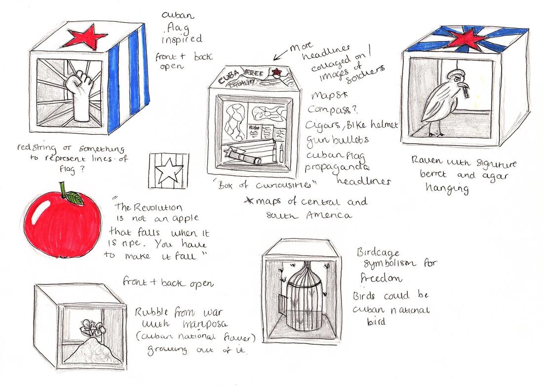 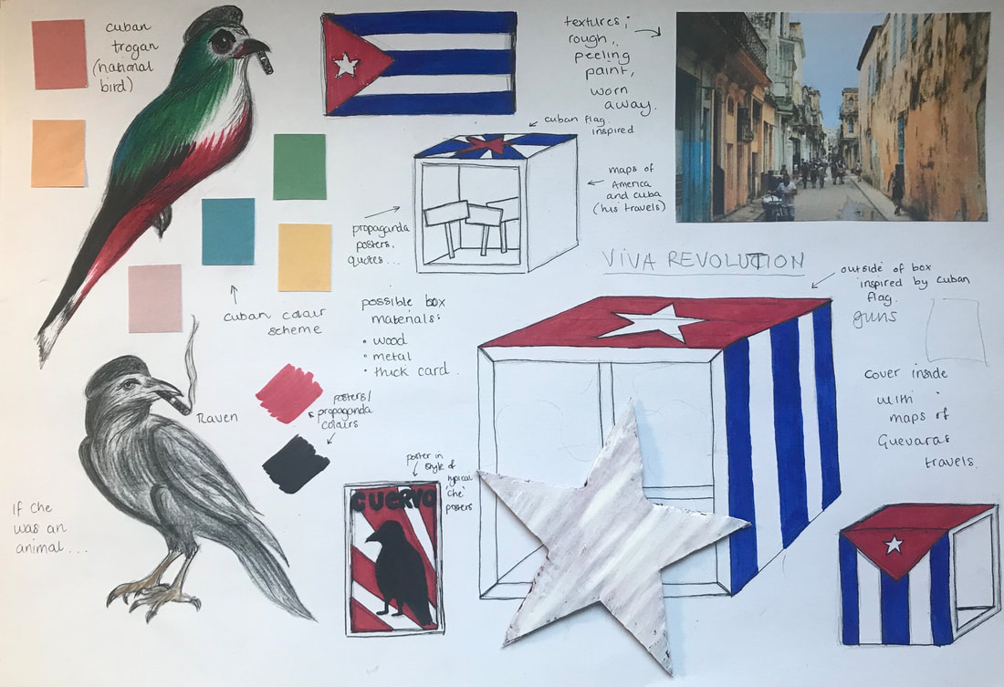 Mock Ups Here I was experimenting a little with how exactly I wanted the outside of the box to look as I wasn't sure whether to do it exactly like the flag with the stars or just inspired by it. I leaned more towards the latter as I thought too many stars would be overpowering and I preferred using the big star on the top by itself instead.   Developments I needed to create a box that had an open front to it, but so I could also lift the top off in order to insert the inside layers properly. Using scrap MDF and some help from a technician, I created a very sturdy, well constructed cube with a slide out top so I could accomplish this. After being painted and all elements put inside the top would no longer need to be removed and would be more of a seamless cube, apart from the open front. After the cube as finished, I started working on the inside elements. Taking an image of a raven, I used Procreate to edit a beret onto its head similar to the one Guevara was often seen wearing, as well as his iconic cigar. I also tried to make its face look more stern and determined. Final Piece It then came to adding all the elements together. I started with painting the outside and areas of the inside using acrylic paint and sandpaper to make it look more old and worn away, like a gun crate from the war. I then pasted images of maps related to Cuba and his travels around South America at the back, representing that being the beginning of his motivations. The next layer I pasted onto some thick foam board to give it more sturdiness and a 3D-effect. I used an image of a Cuban street for this. The bottom I used an image of some gravel to give the impression of destruction and war. The layers in the foreground included the image I create of Guevara as a raven as well as a flag and some bullets to further indicate the revolution. Overall, I am happy with the outcome considering it was so much out of my comfort zone; researching a historical figure I had no idea about in addition to creating a physical 3D object. The only thing I would seek to improve on in the future is the materials I used to create the inside elements as they didn't look as clean and sharp as I would of liked, mainly due to cutting skills and printer quality. However, I love how the layers give the piece dimension and encourage the viewer to look deeper, much like Guevara himself. Brief Our first project involved us having to identify a product that's currently packaged and distributed using unnecessary single use plastic or mixed materials and design a new packaging solution using 100% carton board or corrugated board. Both the structure of the pack and the surface graphics had to be considered. Research I began first by exploring a range of different 3D forms to see what different materials could do and also help inspire a product to package. I started off using plain paper to practice folding and construction techniques and then moved onto using a more sturdy material than could possibly be laser cut. 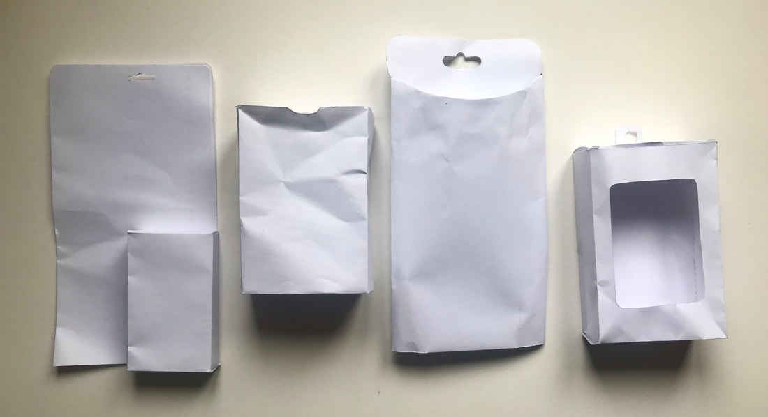 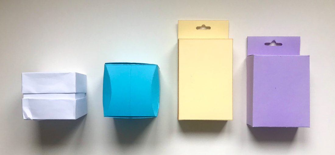 After careful consideration, I settled on my product; ear-bud headphones. I chose this product because they are very often covered in unnecessary plastic which is not only bad for the environment but also makes it very difficult to get into without damaging the wires inside. I decided I wanted to try and design a box that was just as aesthetically pleasing and still protected the product. 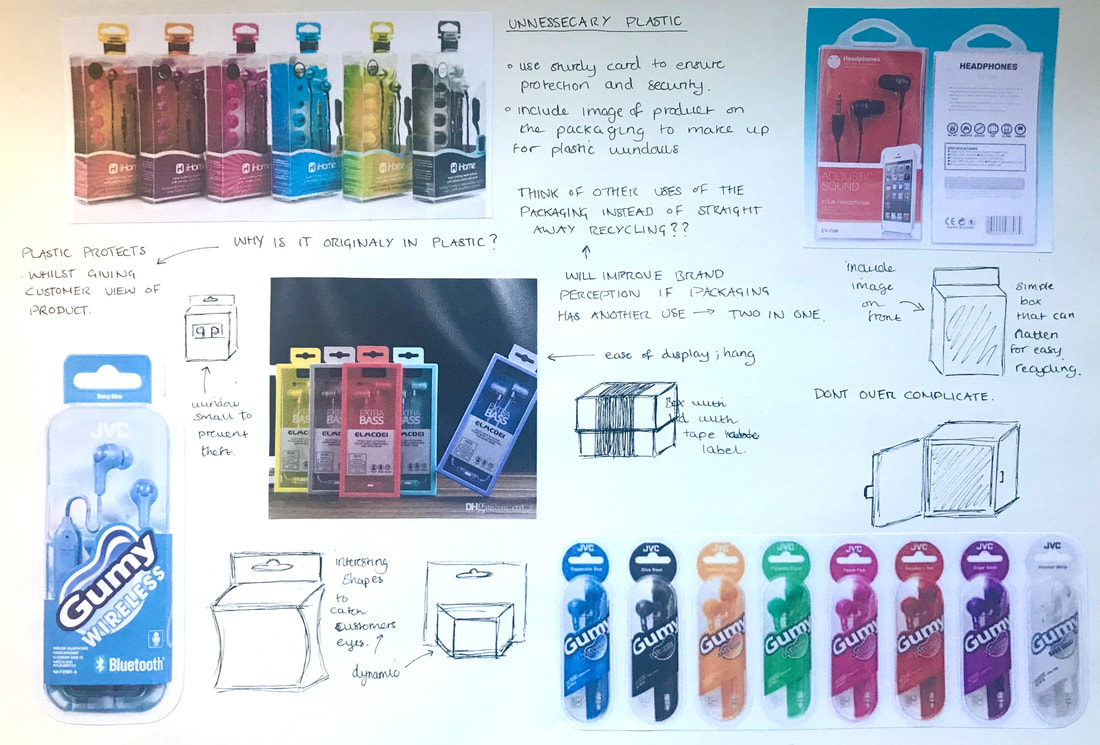 Initial Ideas I started drawing up some concepts for the box, wanting it to still be easy enough to hang on shelfs and be displayed easily. I explored designs that were a little more dynamic with their shape to begin with but eventually thought I would be able to make better use of the space inside if the box remained a more simple shape. 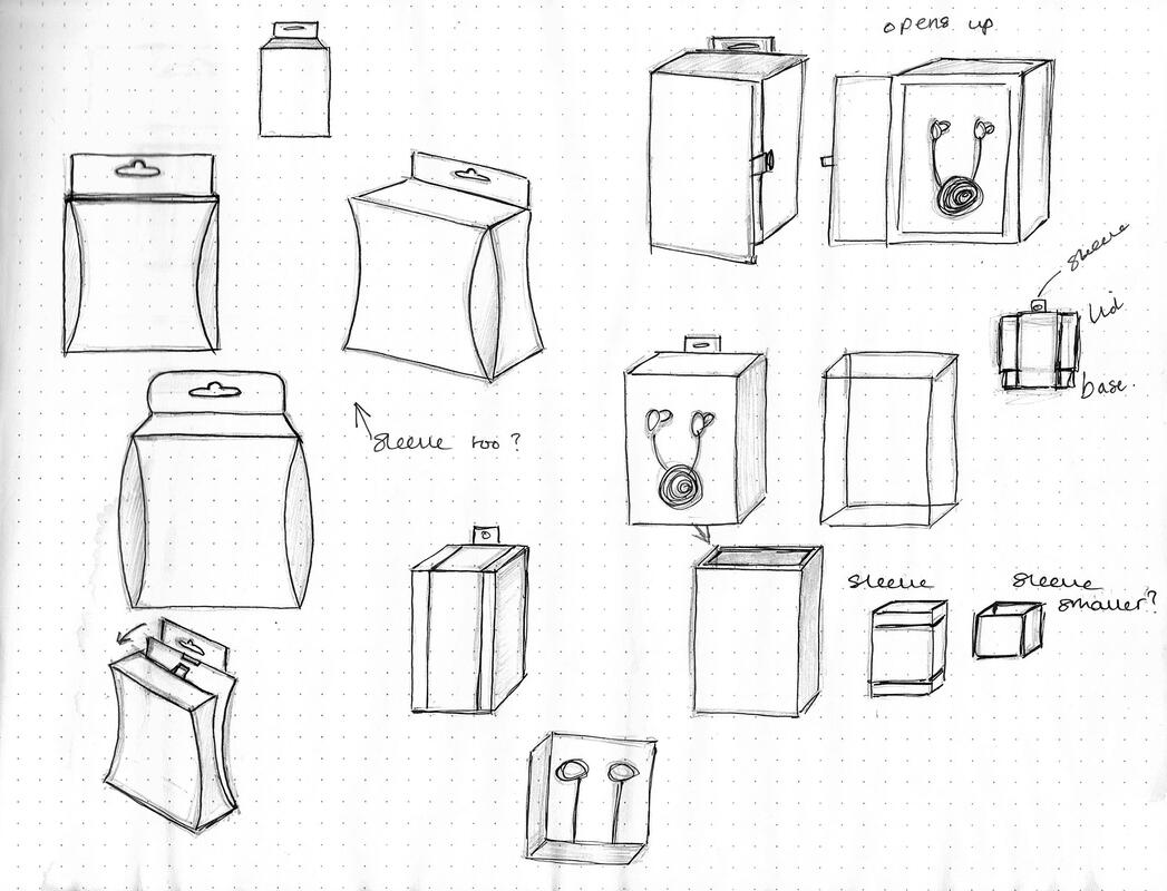 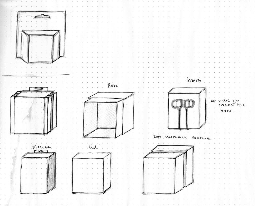  Development I finally settled on an idea for the box which was to create a slide-out matchbox with an outer cover packaging that would contain all the surface graphics and keep the box more secure whilst displayed. I also explored how to place the headphones themselves inside the box as I didn't want them to be loose. I thought about using layered corrugated card and laser cutting out the shape of the ear pieces and wire but was struggling with the shapes. Through more research I then came across a concept were people were cutting up old credit cards to wrap their headphones around in order to stop the wires from becoming tangled whilst travelling. 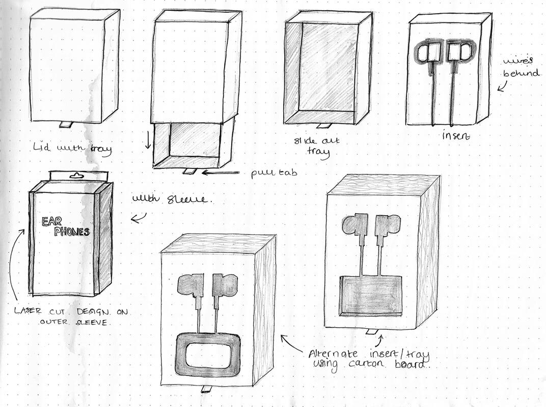 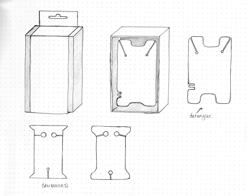 Mock Ups I then began making some 3D mock ups of my design, first just with plain paper and then I experimented a little with the corrugated cardboard. I struggled quite a bit with figuring out how big the box should be so that was a bit of trial and error. I wanted it to be as compact as possible so that the matchbox could also be reused to store the headphones in instead of being thrown away. 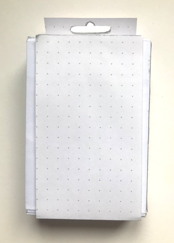   Here I did try to create the cut outs for the inside packaging by hand using the thicker brown card which was a lot easier to work with, but the shapes of the headphones were just too tedious. As a result I went with the other design instead inspired by the credit card trick and experimented with a few different shapes for the headphones to wrap around as securely as I could with it being a less study material.   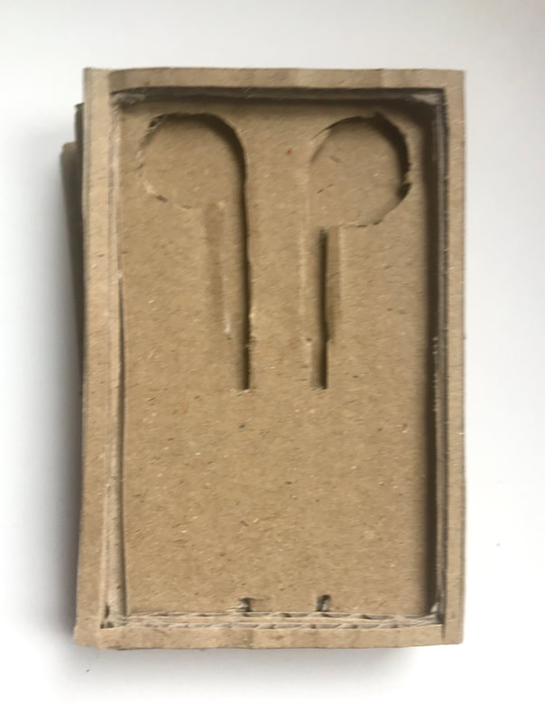 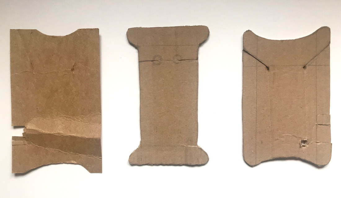 Further Development After deciding on what size the box should be I began creating the final net and its dimensions. I used a matchbox template from a website called Template Maker as a guide to drawing out my own net. The final net I drew straight onto the brown card so the scans are not as clear as I would have liked them to be. 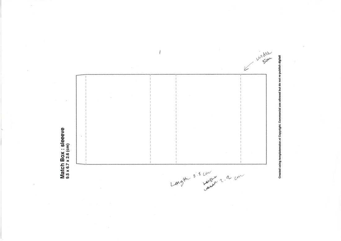 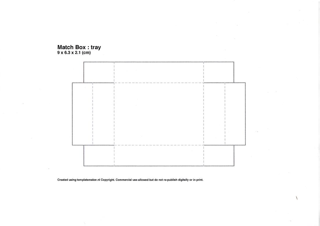 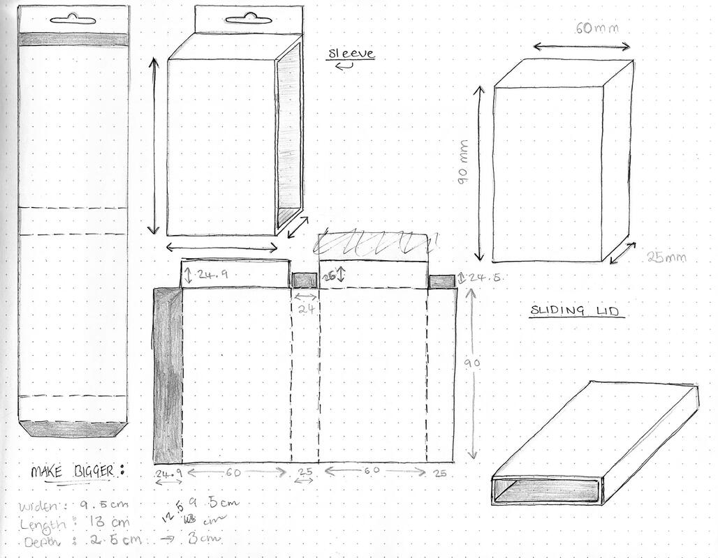 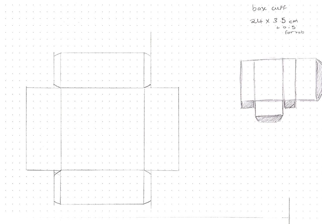 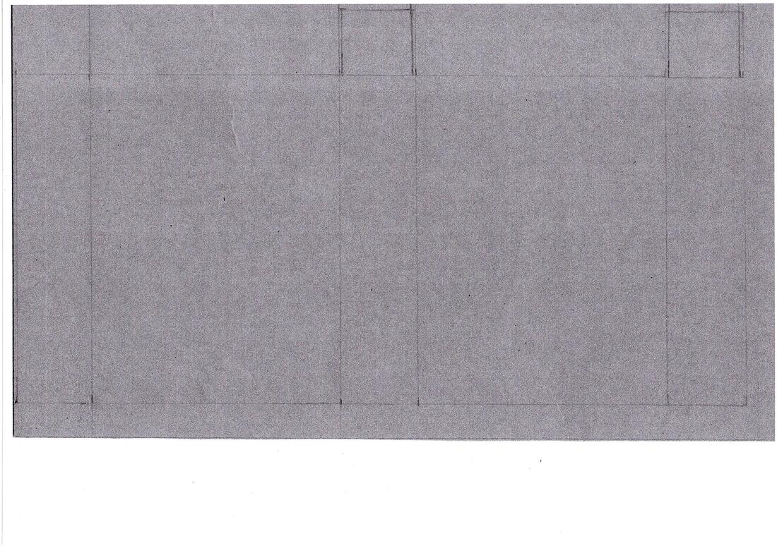 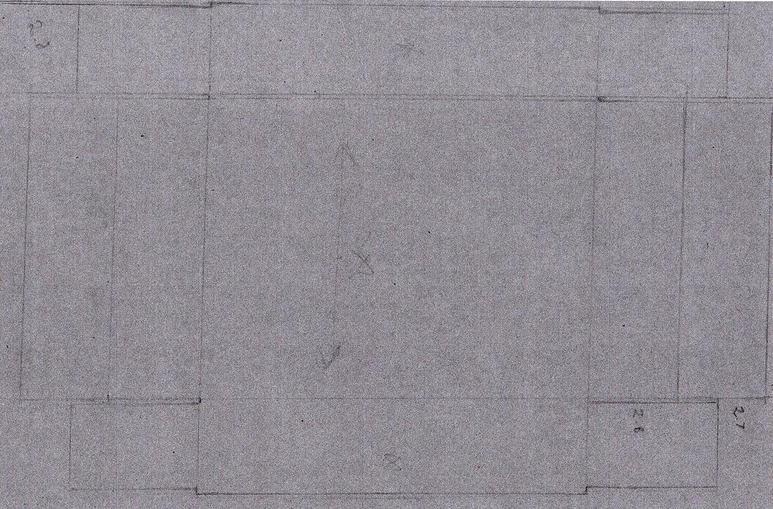 Surface Graphics Development Initially I had the idea of adding a pattern to the matchbox so the buyer would be encouraged to reuse it but I wasn't sure how I was going to transfer the design to the card as I couldn't print directly onto it, and I also quite liked the minimalistic look of the cardboard anyway. I then moved on to focus more on the surface graphics for the sleeve instead, still keeping to a minimal design. I chose to include an image of the headphones I drew in Procreate to make up for the fact you cant see the product through any plastic. I created the final surface graphics using Adobe Illustrator, drawing out the net of the sleeve in the correct dimensions. I used the barcode and other symbols from the vector resources folder we were provided. I kept it modern looking by using purely sans-serif typefaces, with a simple black and white colour scheme so that it would appeal to a wider range of customers. I also created a little logo for the packaging, using a vector from this website, as well as a little card to go inside the box so it looked more professional. You can see the process below: 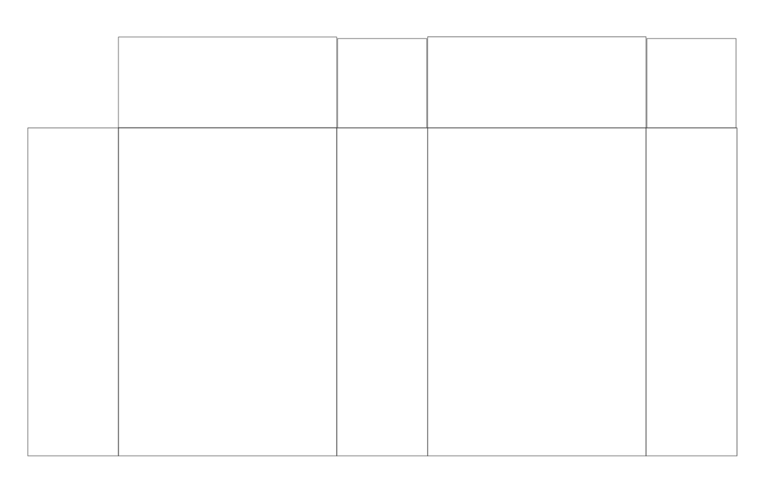 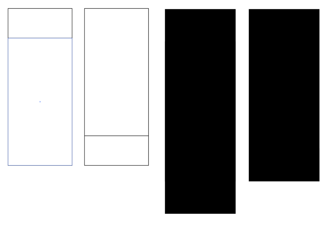 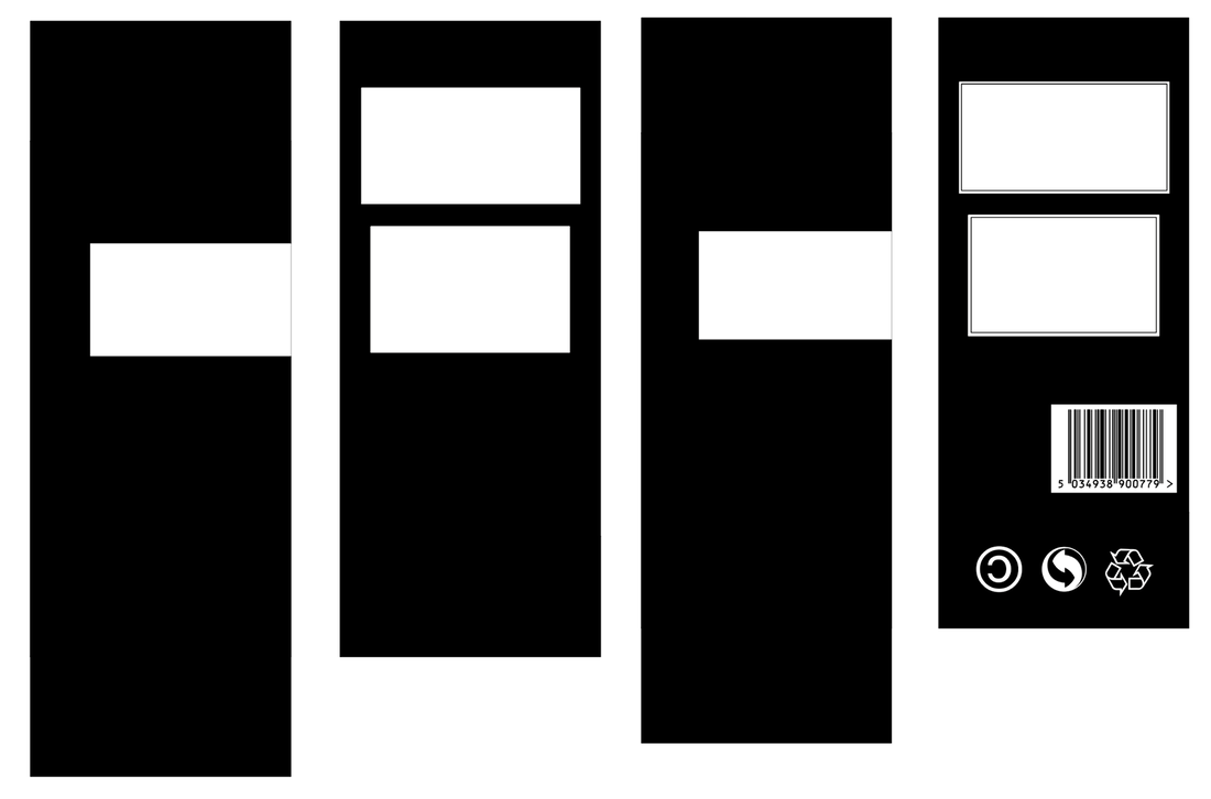 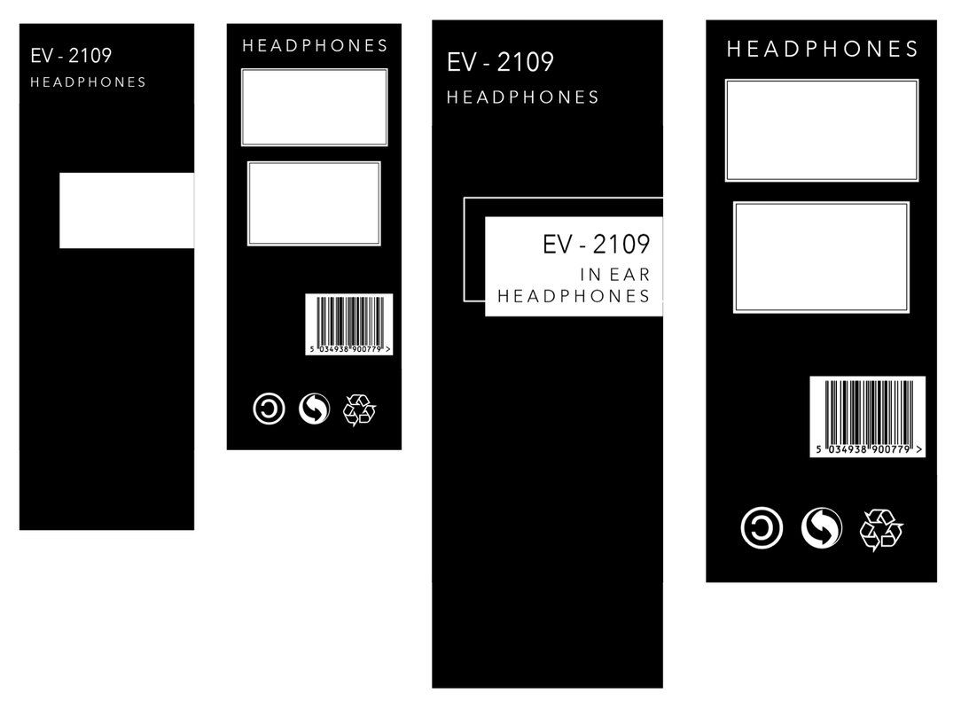 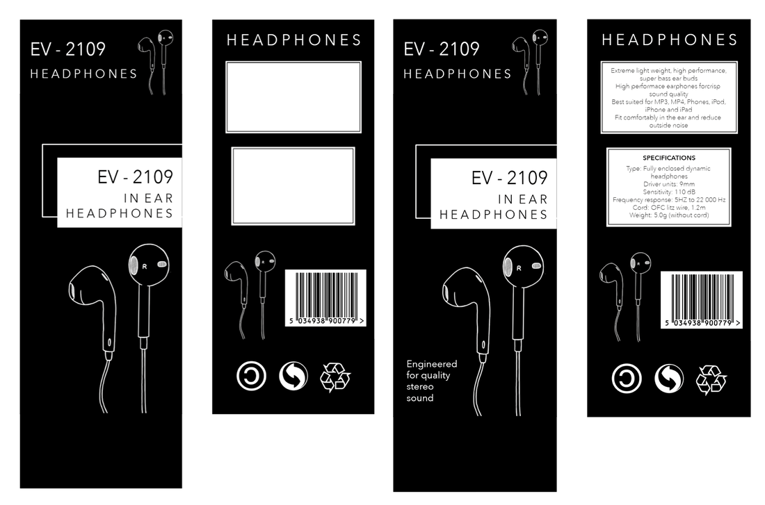 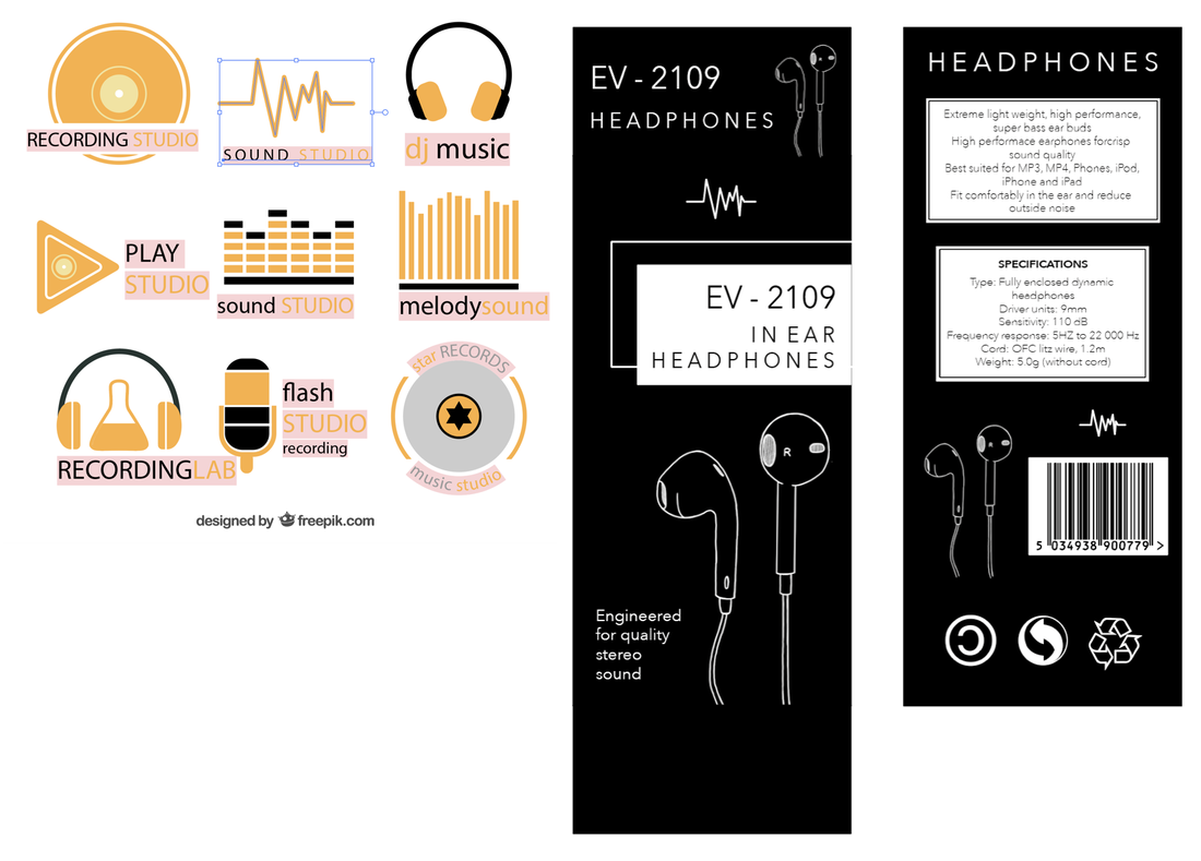 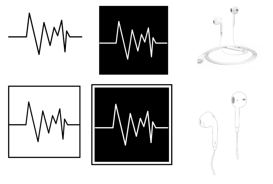 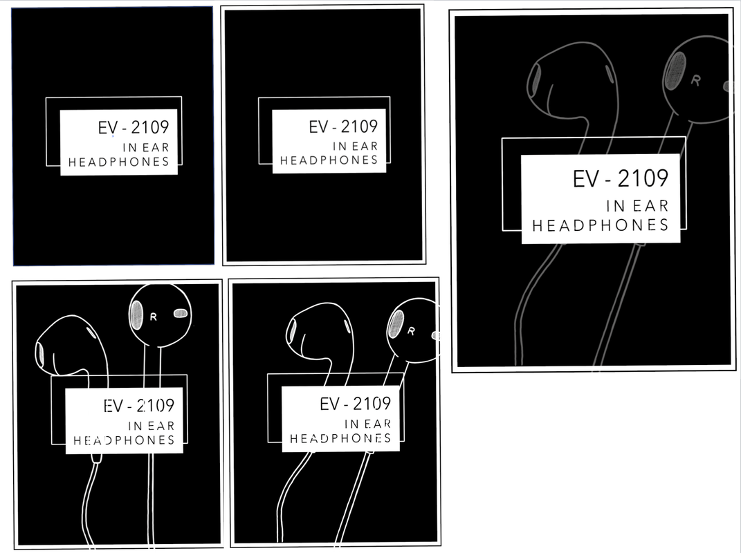 Final Piece After I had finished designing the surface graphics it was time to combine them with the 3D pack itself. I used spray mount to stick the labels onto the nets. Below you can see the unfolded net of my packaging solution as well as images of the 3D folded dummy version at various angles and containing the product.  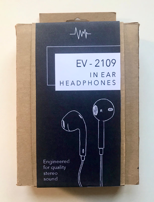 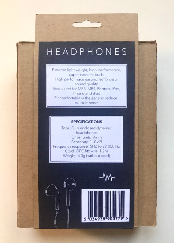 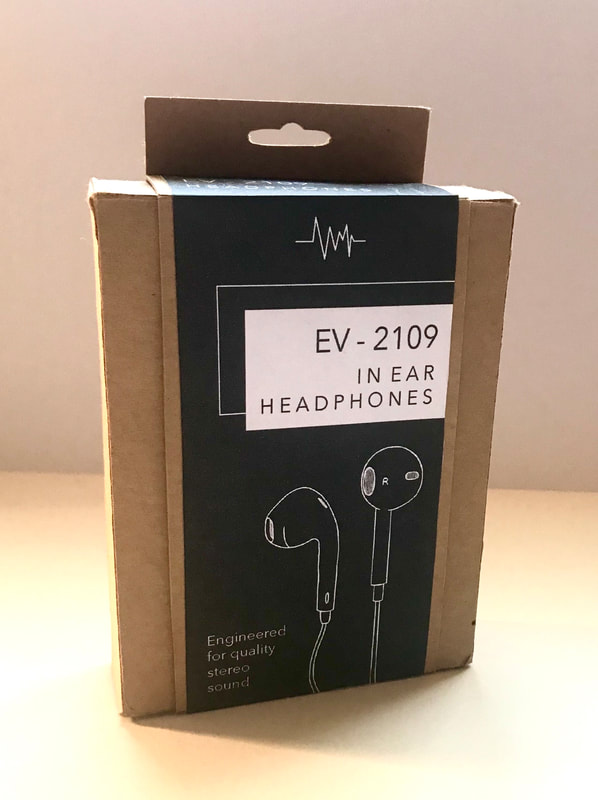 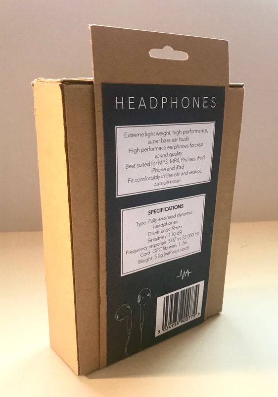 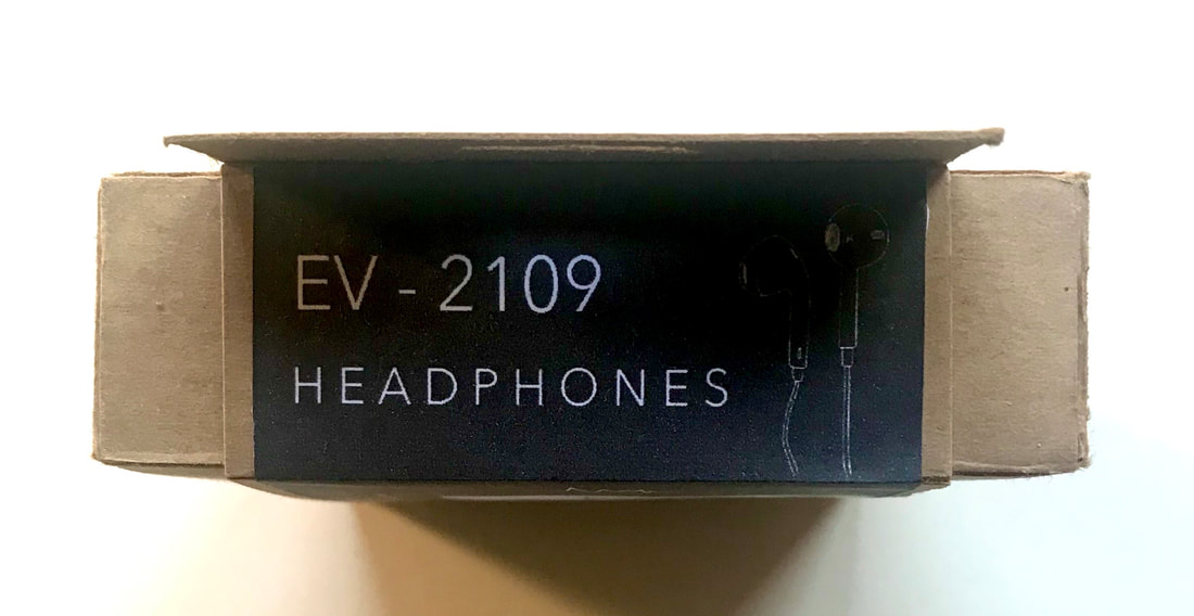 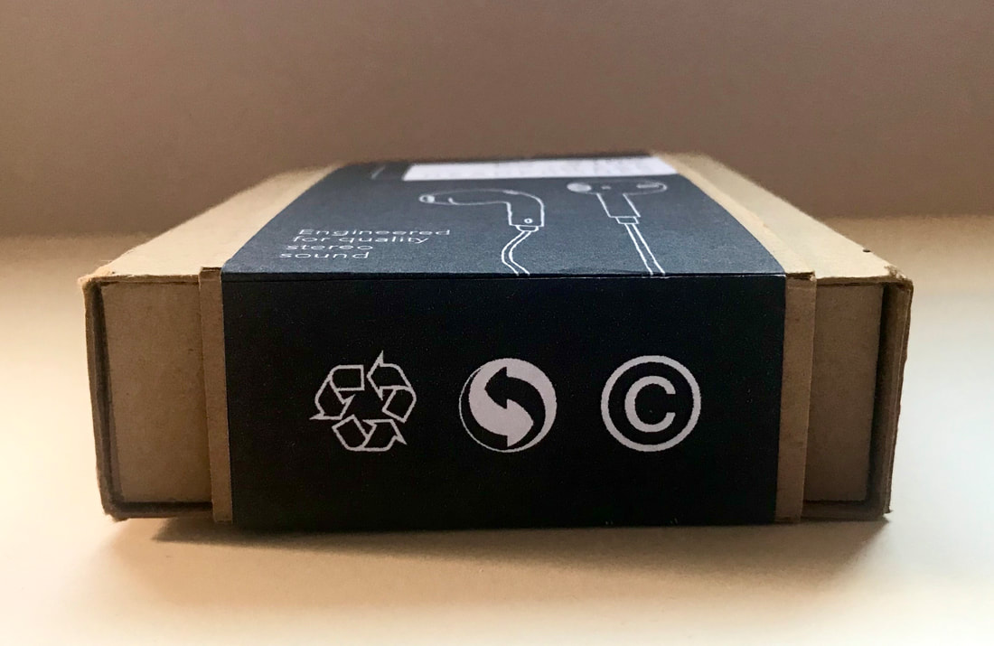 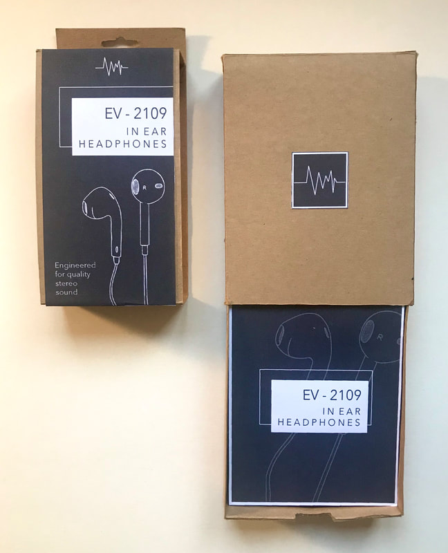 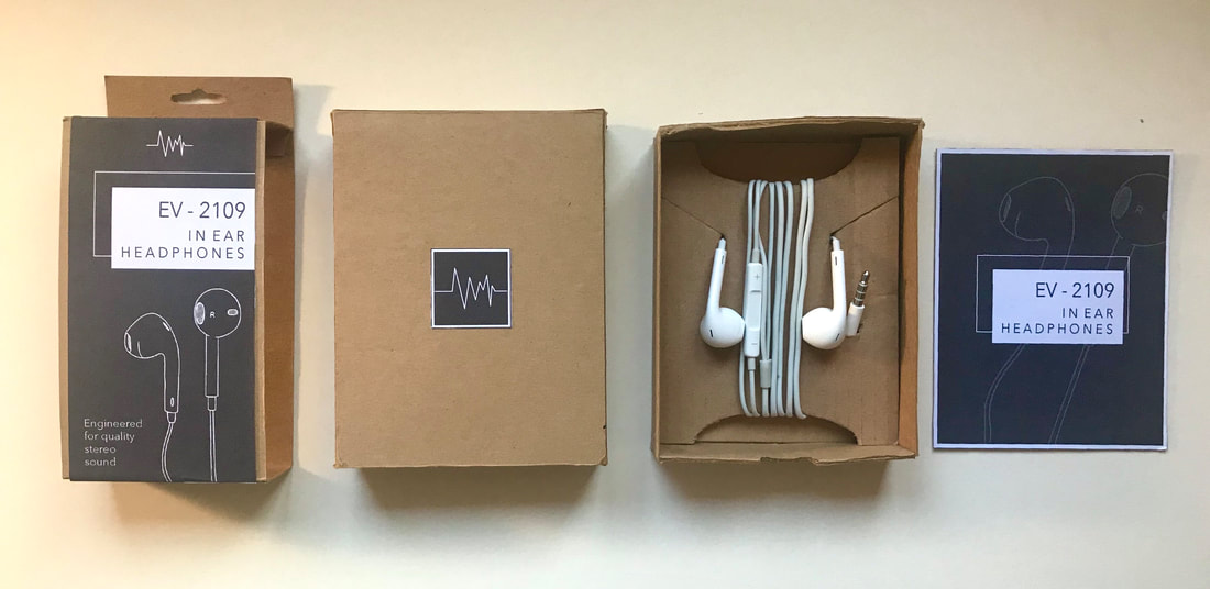 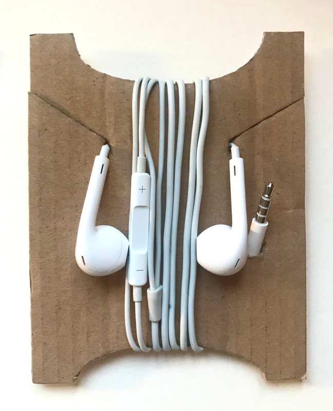 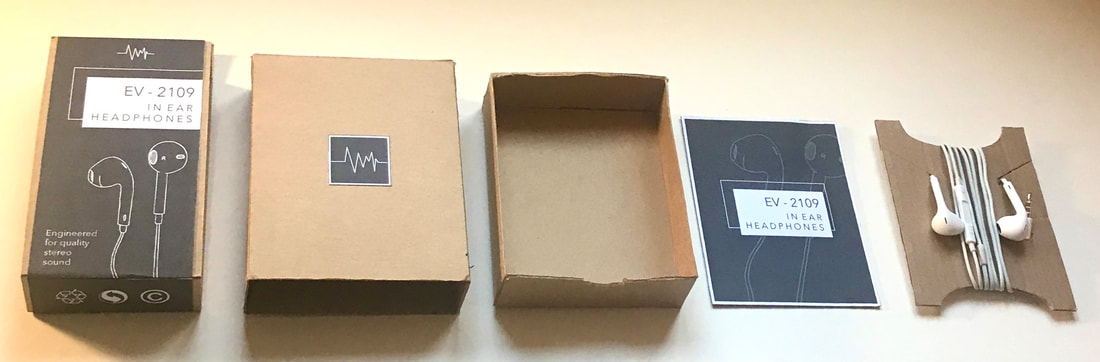 Culture in the 1980s is considered to have two categories; official and unofficial. Official cultures refers to the mainstream, more popular values and norms during the time period. Ideologies are integrated into society to reflect what was considered to be acceptable and popular by those in power and authority. Unofficial authority refers more to the minority and the rebelling of official culture; going against the status quo. Here is a visual mood board outlining differences between ‘official’ and ‘unofficial’ culture: 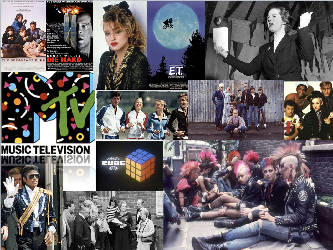 Examples of official culture include the typical neat clothing styles, popular music culture such as Michael Jackson and Madonna and the politics of the times led by Margaret Thatcher.
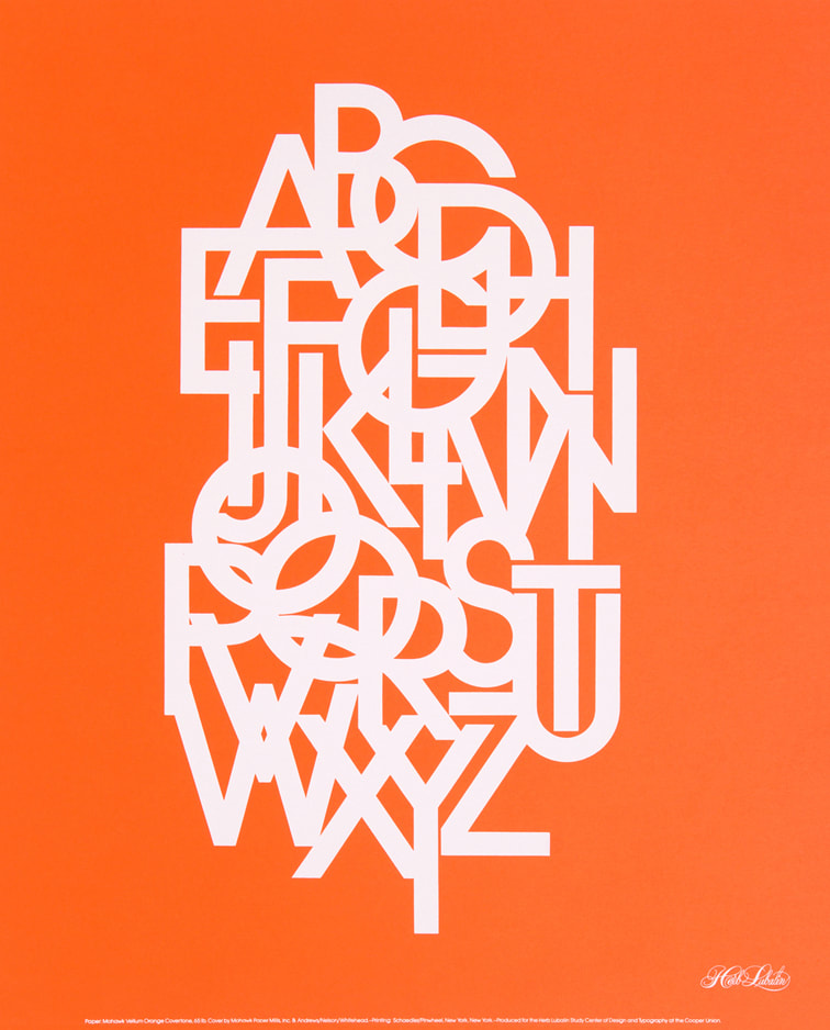
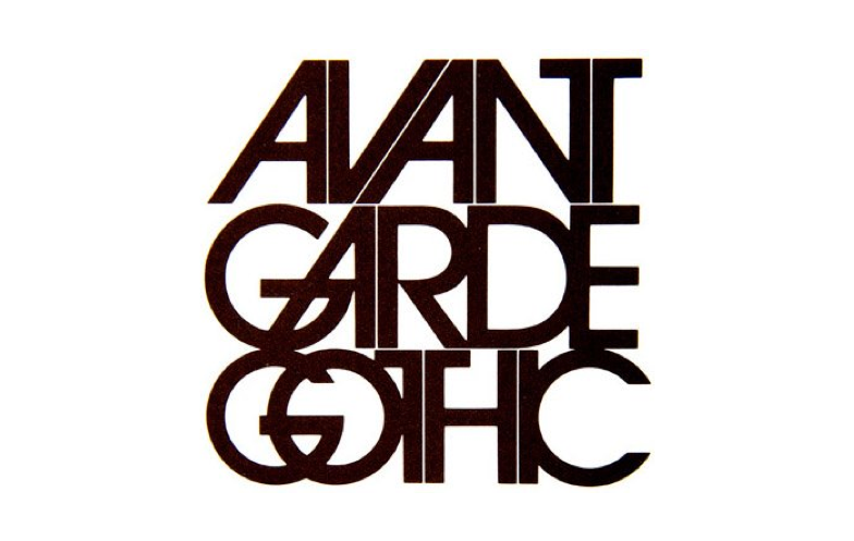
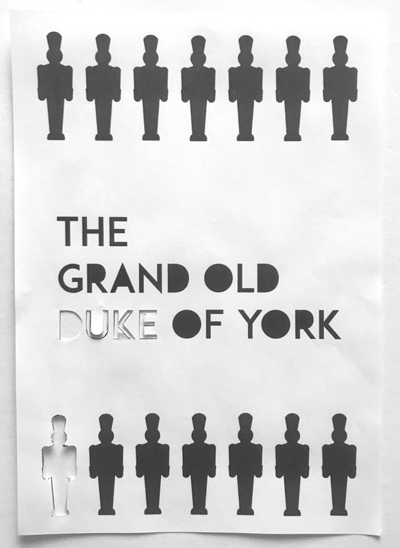
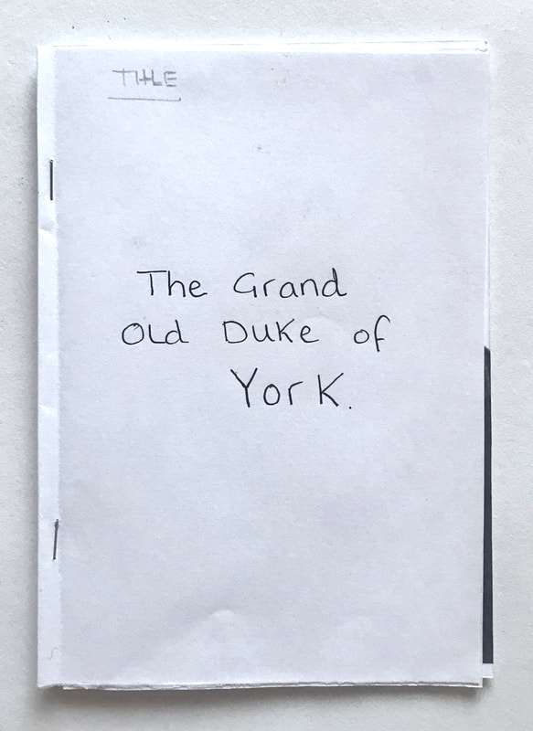
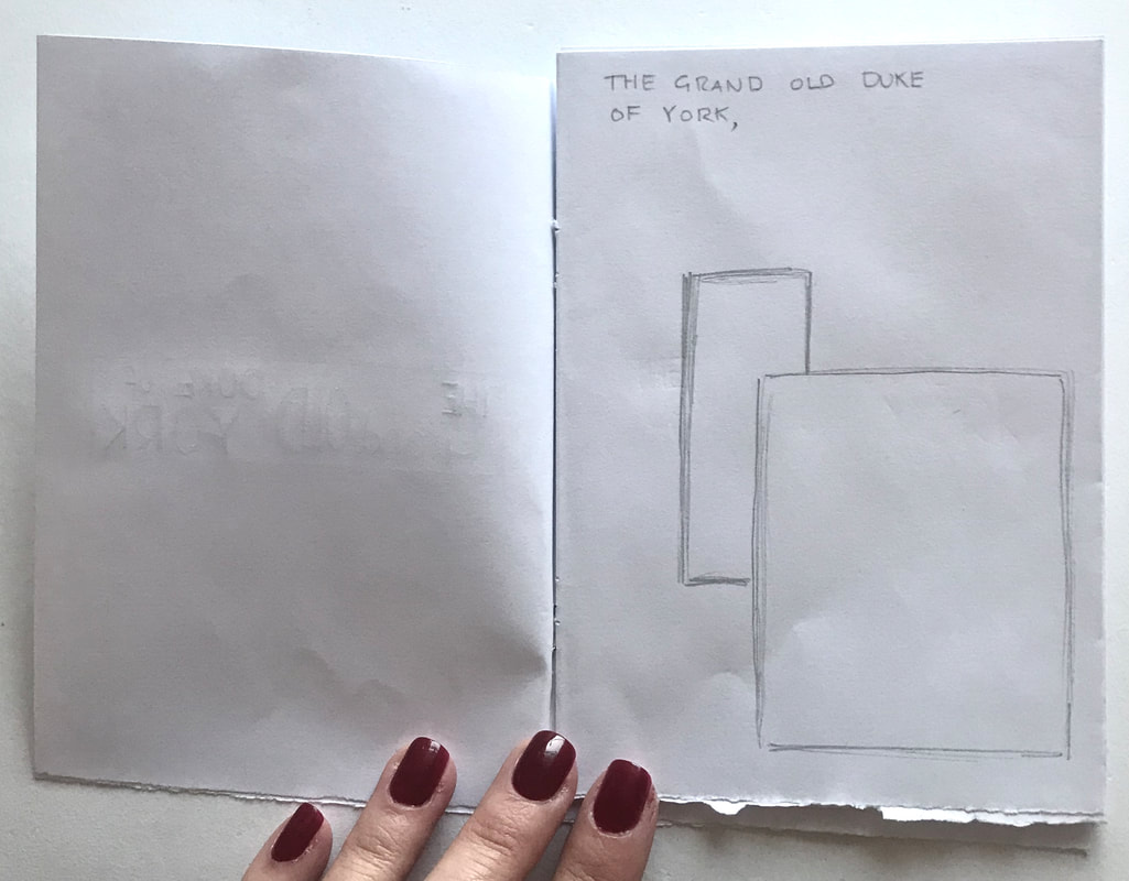
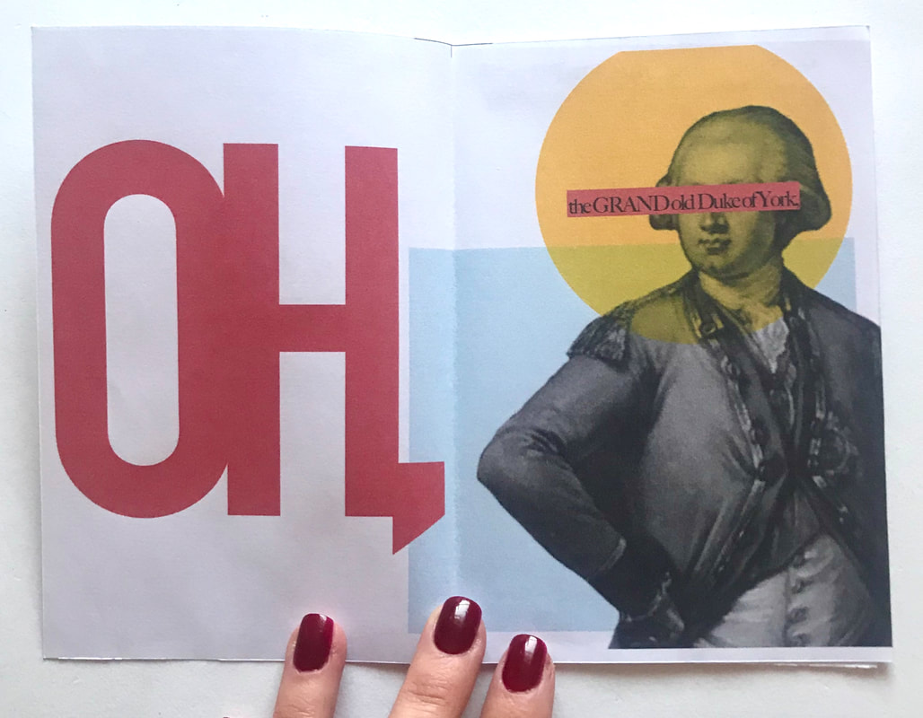
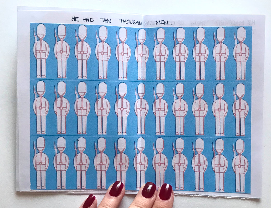
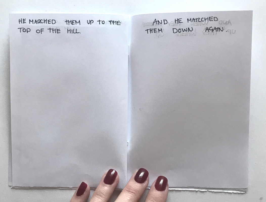
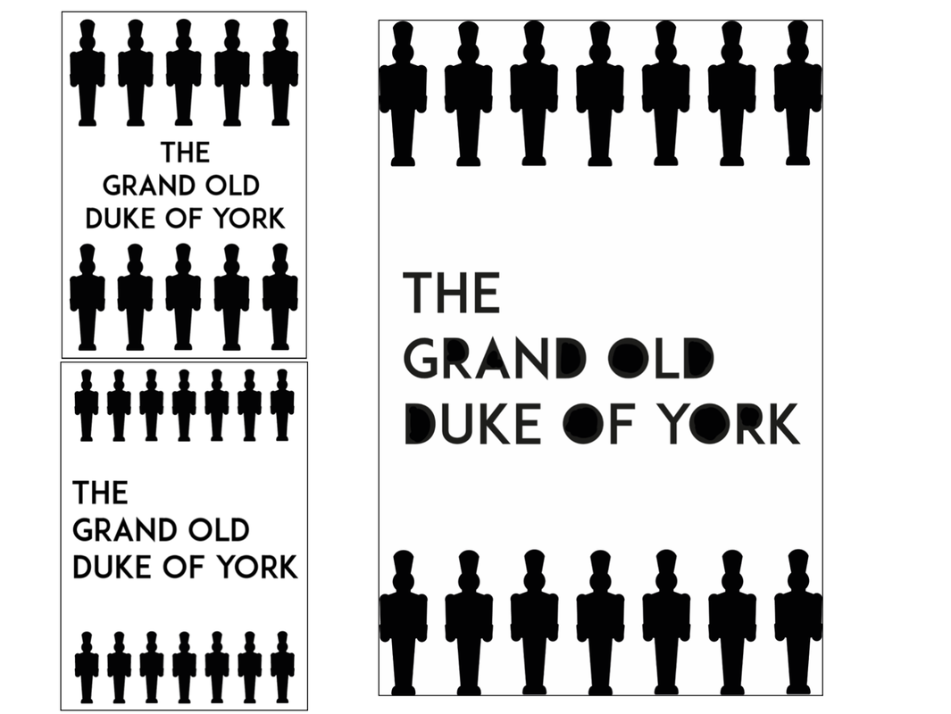
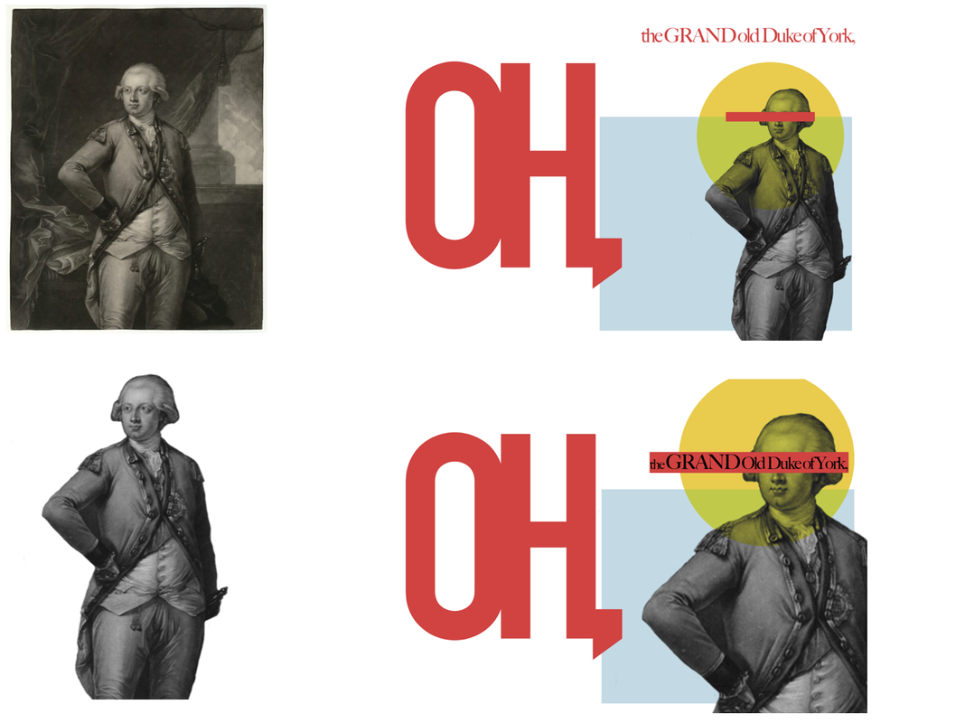
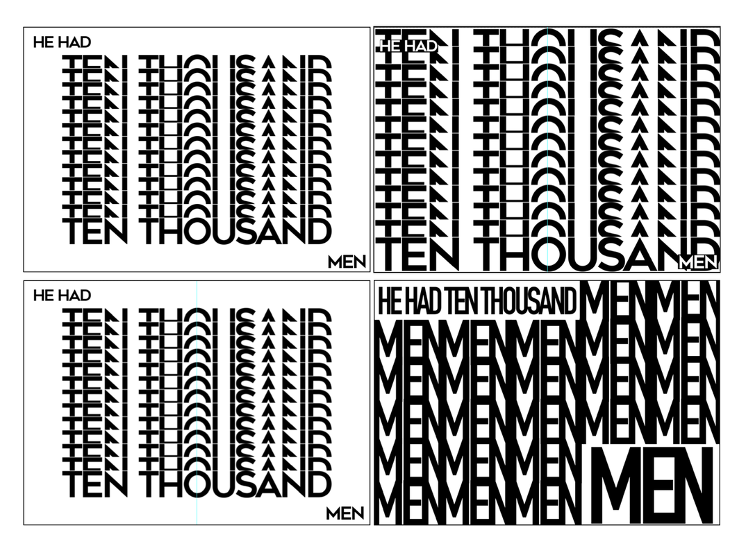
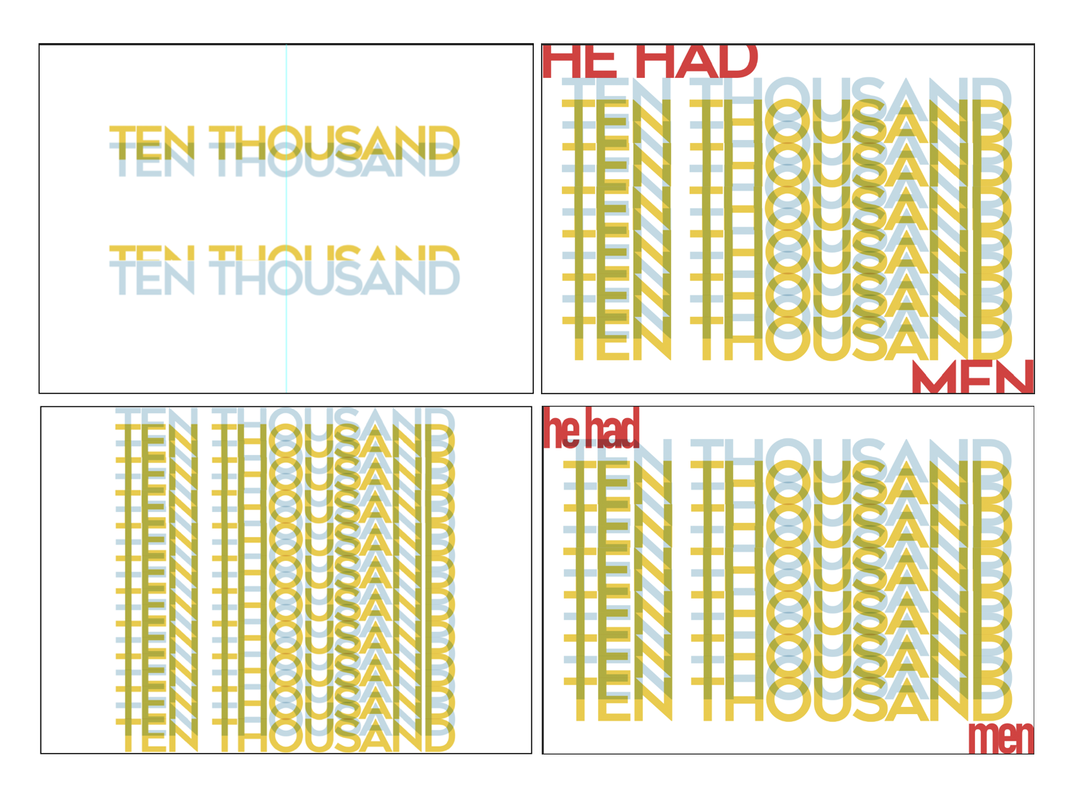
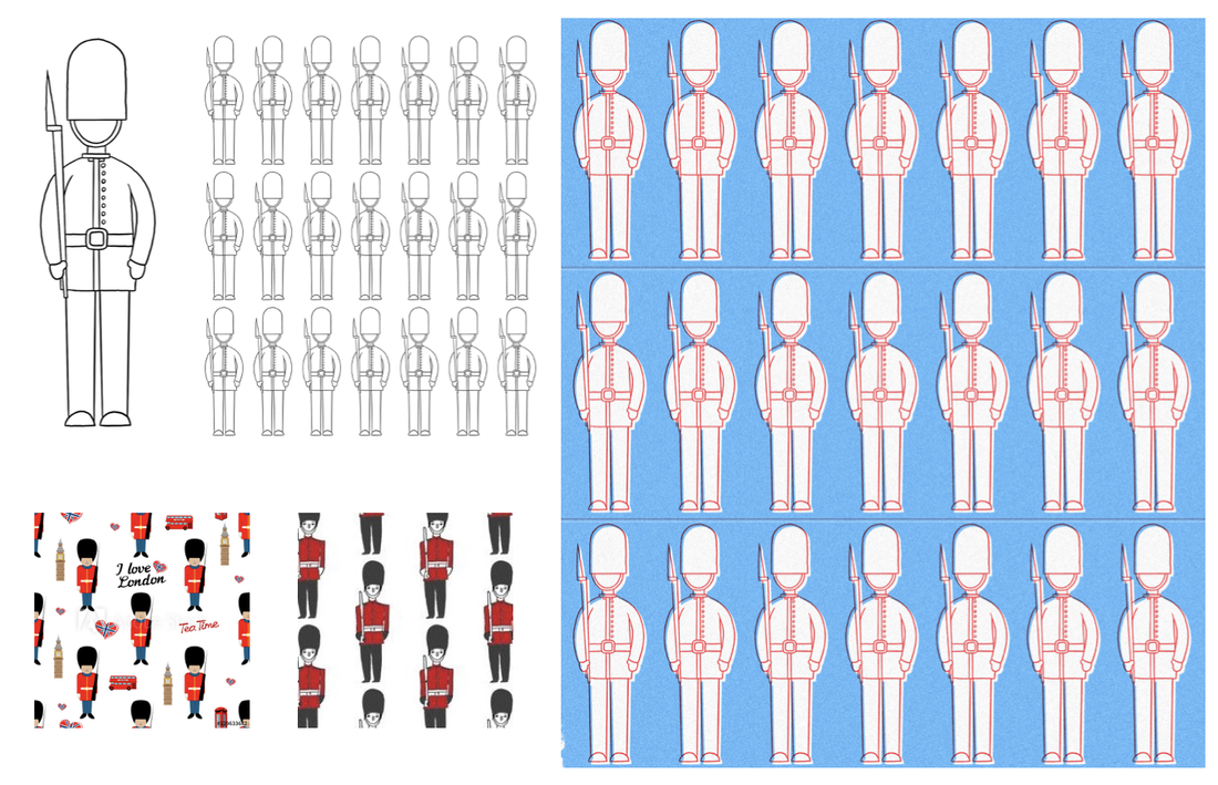
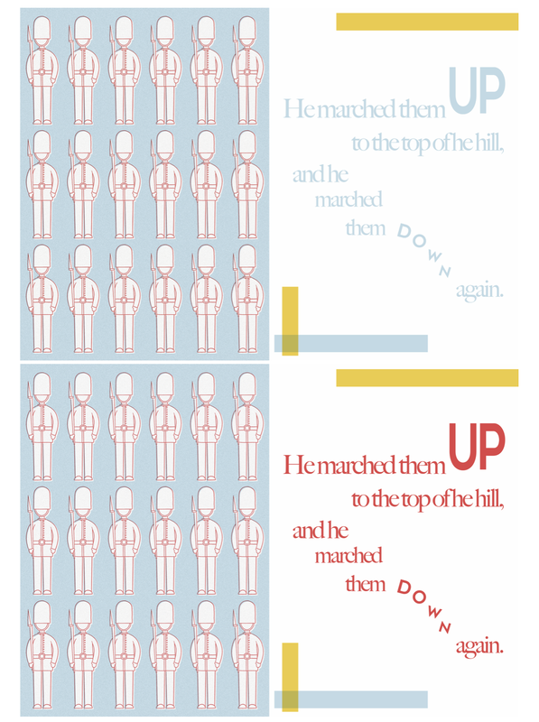
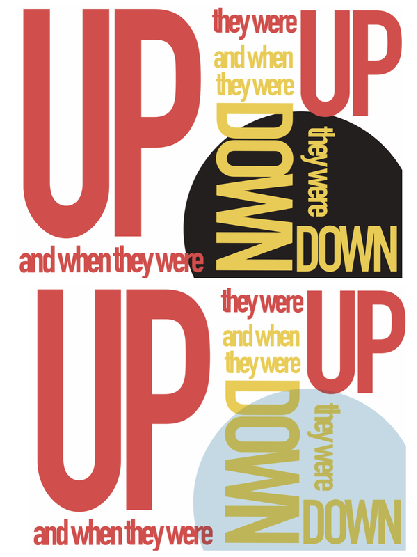
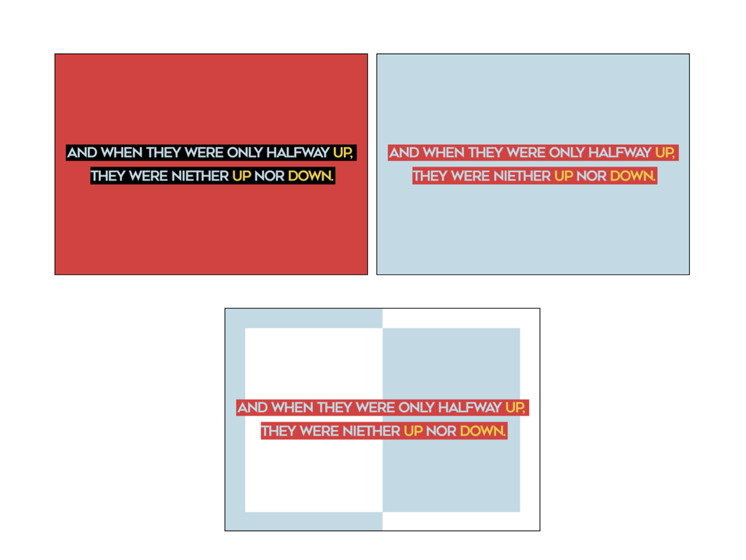
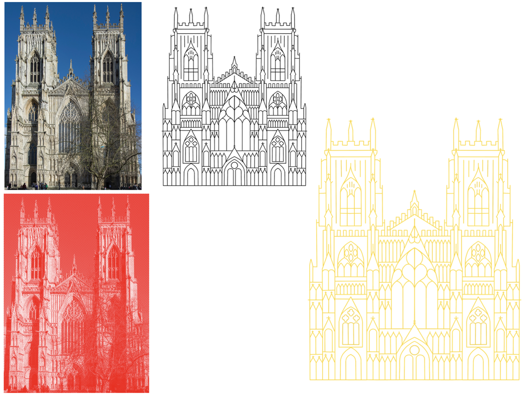
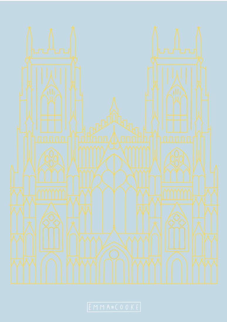
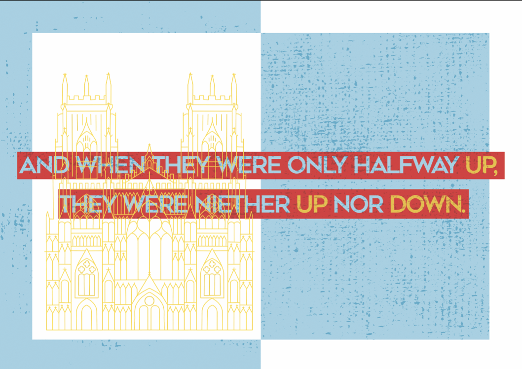
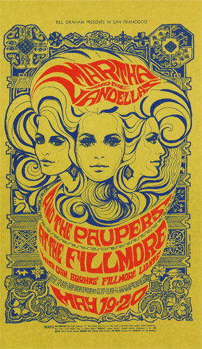
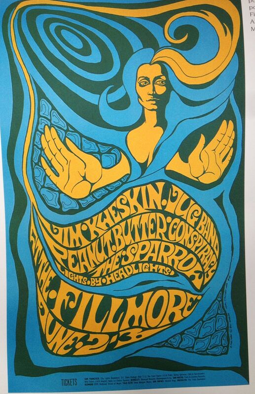
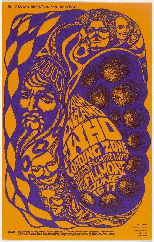
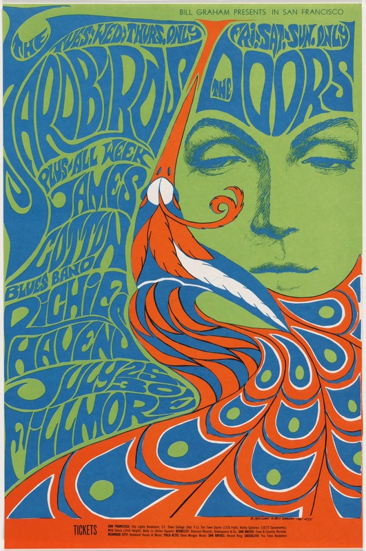
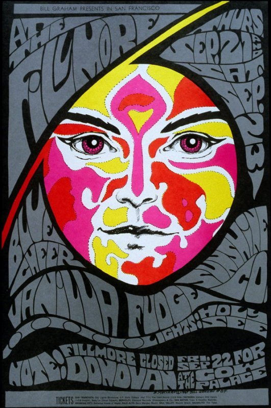
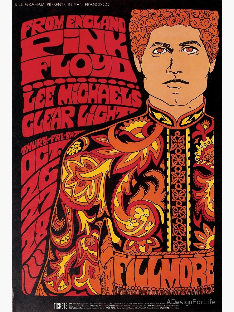
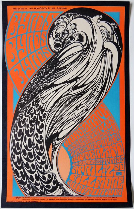
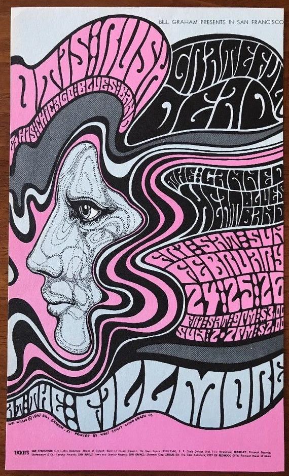
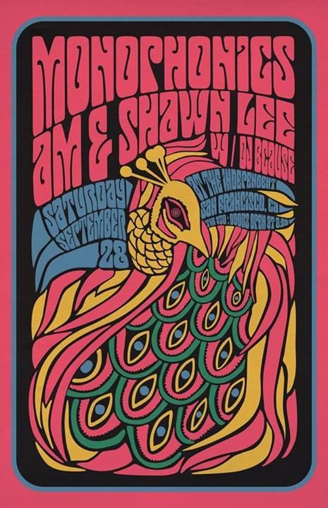
Unofficial culture examples include much less mainstream fashion choices, such as bright hair and bold, grunge looking clothing. Herb Lubalin Due to not being given a blog task for this session, I chose to do look a little more into Herb Lubalin's work who was an American graphic designer. He is most well known for his creation of the 'Avant Garde' typeface and his iconic logo designs, loving the way he could express the meanings behind words by using different fonts. He specialised in poster and magazine design, as well as packaging and creating identities. He is also well known for his collaborations with Ralph Ginzburg on his magazines 'Bro', 'Fact' and 'Avant Garde'. Brief For this brief, we were asked to create a 12-page bound book as a personal response to a nursery rhyme. I chose 'The Grand Old Duke of York'. The design did not have to be aimed at children and we had complete freedom with size, format and technique. Research I began by researching the rhyme online, trying to find any hidden or underlying meanings behind the storyline. I found that one theory behind the rhymes origins was that it is a reference to Prince Frederick, Duke of York and Albany during the French Revolutionary Wars, the 'hill' being the town of Cassel. The rest of my research revolved around looking up techniques for in Photoshop. I found a good set of tips from this website here, which I used to help me create a few of the effects in my book. I then began drawing up a couple of thumbnail ideas, thinking about if I wanted to include any variations of spreads, or cutting shapes into the pages. 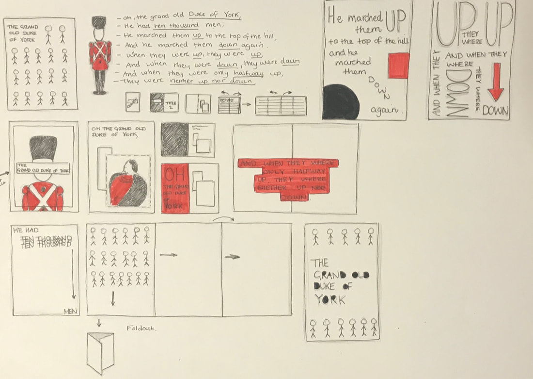 Mock Ups After my thumbnails I created a few quick mock ups in order to explore how I wanted it to be structured and which lines of the rhyme where going to be on each page. I decided due to the rhyme being short and because I needed it to fill up 12 pages, that there would be mostly double page spreads. I also experimented a little bit with cutting out the letters on the front cover to add more variation and interest. Development I began developing my ideas on Photoshop, trying out different layouts and ways to use type to represent the lines of the rhymes. I knew I wanted to focus more on using typography then actually illustrating the rhyme, but I still wanted to add some imagery so for the first line I chose to include a photo of the Duke of York (linked here). In addition, being inspired by some of the work I did for the activities the previous week, I wanted to incorporate simple shapes and colours throughout the pages. For the second line I played around with different ways to represent a 'thousand men' using type. For the third line I created a pattern for one of the pages taking this vector image of a soldier. I then created a rise print effect and played around with the colours to make it coherent with the other pages. I also played around with overlong a vector of the York Minister (here) onto one of the pages but later decided against it as I preferred the page without. Final Piece When I had done layout out my pages, I wanted to add some texture using noise and overlaying textures I downloaded here, in order to give it a more printed effect. For the cover I cut out the soldier silhouettes using a craft knife and stuck onto the underlying colours, and for the back I kept it simple and just added a little logo I made. I then uploaded the pages into Adobe InDesign, and printed and bound the book together using a simple saddle-stitch (stapled). I'm happy with the outcome of the project considering my lack of expertise with the programs I used. I did find it quite difficult to find different ways to change the type as the same words were repeated often in the rhyme but I think the pages work well together as a complete book nonetheless. 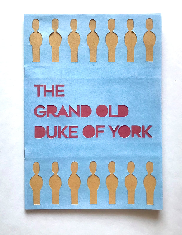 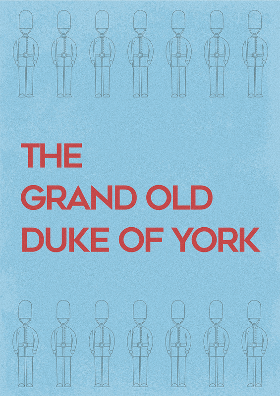 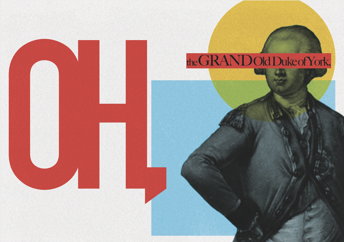 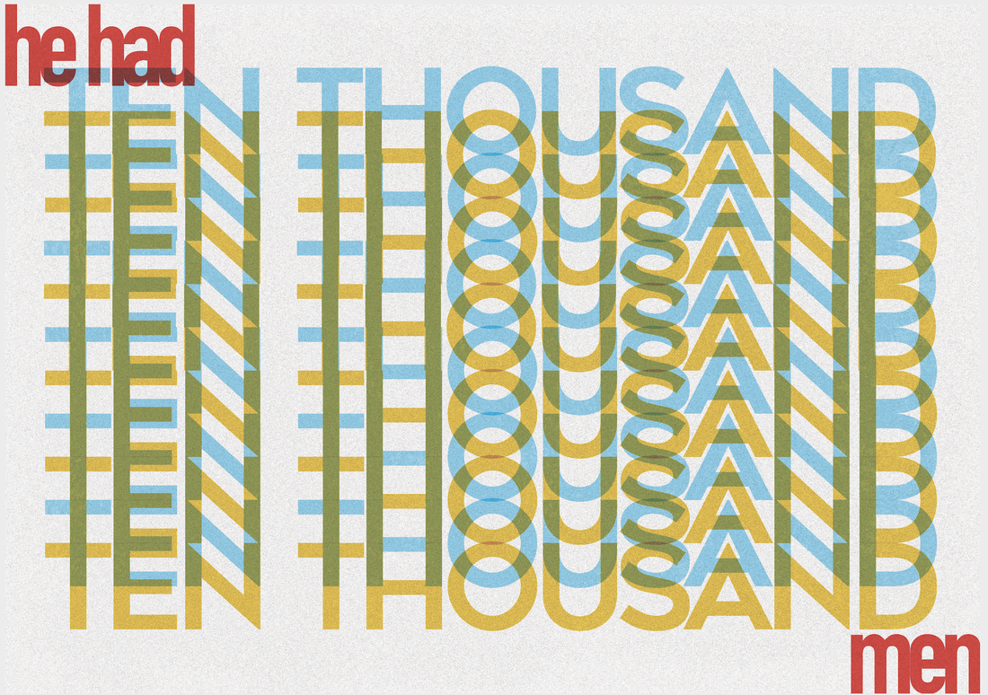 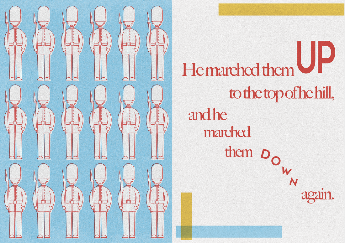 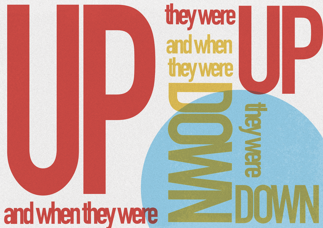 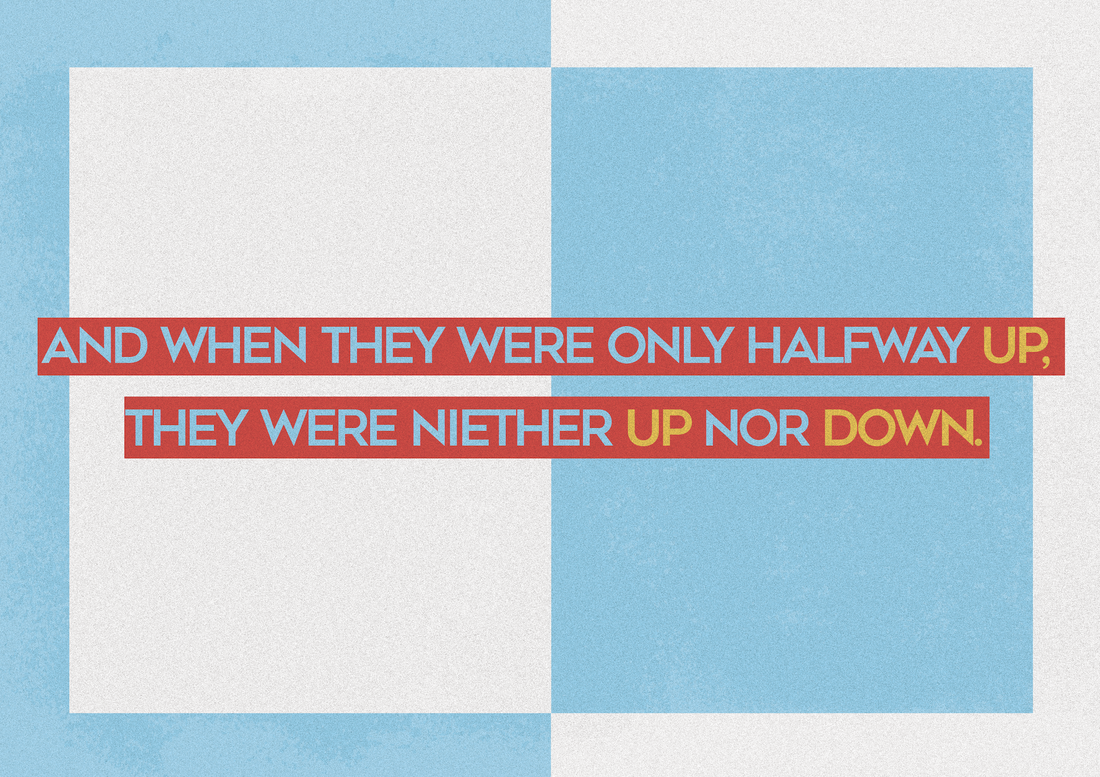   Historical Context/The Rise of the Counterculture in the USA America profited from the war.; soldiers came back from the war to a different world feeling like they didn't fit it. As a result, the 1950's saw the invention on the teenager, rather than children growing up to be their parents. Protest then came about due to the combination of liberal values, affluent, time-rich youth and conservative politics. New powerful youth began producing stuff for this new audience of hedonistic people, creating a whole new set of artists and designers. One example was though music; ground breaking packaging and posters were created to reach this market. Things were slightly different back in the UK, when the 'Swinging Sixties' was occurring, but it was still apparent that the content within art and design was starting to become more drug fuelled and sexually liberated. For the first time artists were designing for themselves and their own generation rather than for clients and corporations. This gave them a huge amount of freedom. However, eventually the world caught up and counter culture was shoaled back to the people who originated it, subduing into the mainstream. Psychedelic Design of the 1960's Things produced initially were thought to be inspired by Art Nouveau but it is also clear that the artists were very heavily influenced by the likes of LCD, especially shown through uses of colour and type. One key figure is Bonnie MacLean, an American artist known for her classic rock posters from the 1960/70s. Her early work is considered to be quite heavily influenced by the work of Wes Wilson, one of the most leading artists of psychedelic art posters, after he quit working for the Fillmore Auditorium and she took over his job. It is clear to see where MacLean look inspiration from Wilsons designs, from the brightly coloured illustrations to the contrasting swirly typography. The shapes of the letters are altered to fit around the imagery, giving off the effect of movement that psychedelic drugs gives. This almost illegible type is a huge technique used by both designers and the influence of art nouveau and pop art is also seen clearly in the contrasts of colour, catching the viewers eye and drawing them in further much like they are 'tripping out'. |
AuthorHi, I'm Emma. I'm currently studying Graphic Design at the University of Cumbria. Modules
All
Archives
March 2020
|


 RSS Feed