
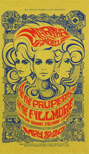
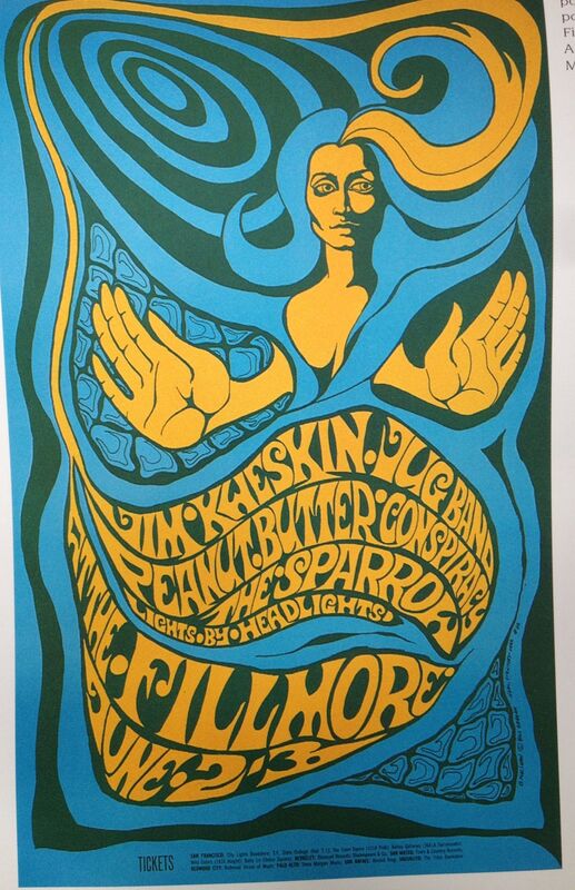
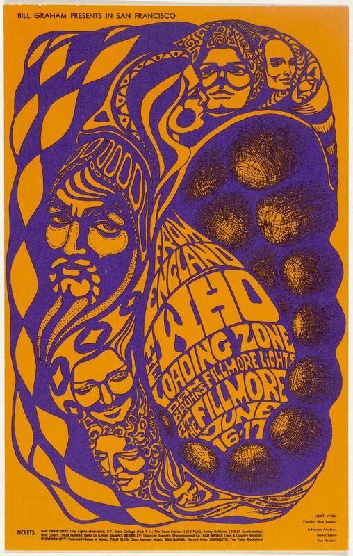
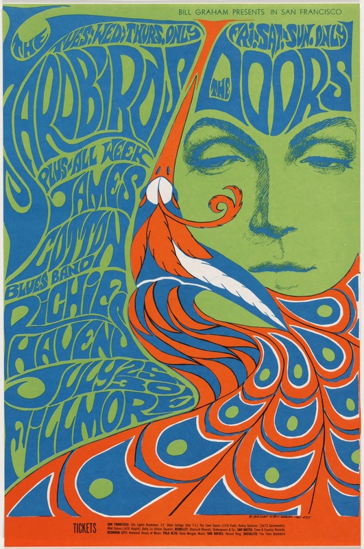
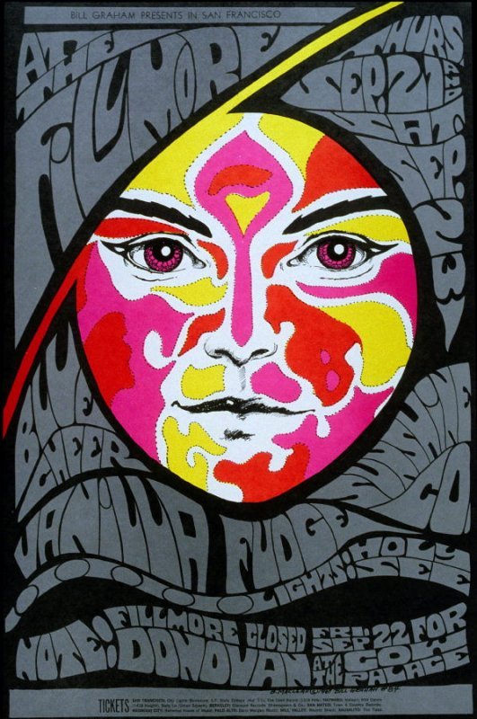
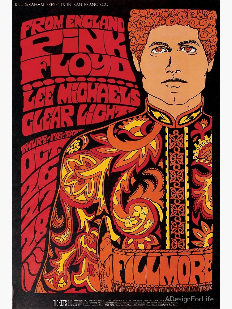
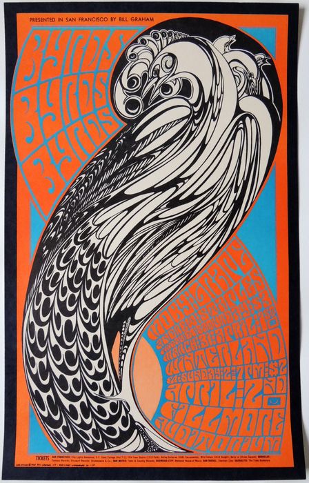
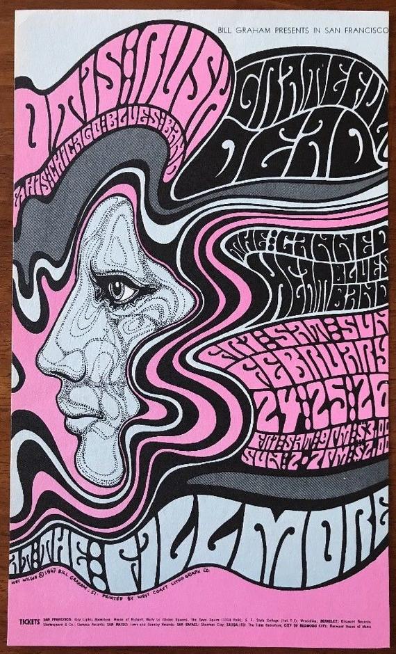
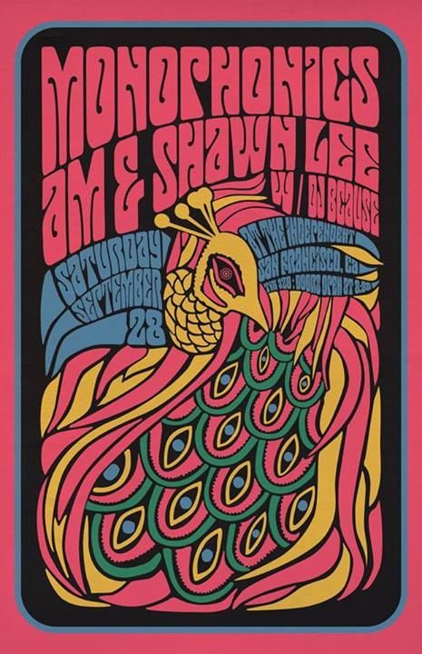
 Historical Context/The Rise of the Counterculture in the USA America profited from the war.; soldiers came back from the war to a different world feeling like they didn't fit it. As a result, the 1950's saw the invention on the teenager, rather than children growing up to be their parents. Protest then came about due to the combination of liberal values, affluent, time-rich youth and conservative politics. New powerful youth began producing stuff for this new audience of hedonistic people, creating a whole new set of artists and designers. One example was though music; ground breaking packaging and posters were created to reach this market. Things were slightly different back in the UK, when the 'Swinging Sixties' was occurring, but it was still apparent that the content within art and design was starting to become more drug fuelled and sexually liberated. For the first time artists were designing for themselves and their own generation rather than for clients and corporations. This gave them a huge amount of freedom. However, eventually the world caught up and counter culture was shoaled back to the people who originated it, subduing into the mainstream. Psychedelic Design of the 1960's Things produced initially were thought to be inspired by Art Nouveau but it is also clear that the artists were very heavily influenced by the likes of LCD, especially shown through uses of colour and type. One key figure is Bonnie MacLean, an American artist known for her classic rock posters from the 1960/70s. Her early work is considered to be quite heavily influenced by the work of Wes Wilson, one of the most leading artists of psychedelic art posters, after he quit working for the Fillmore Auditorium and she took over his job. It is clear to see where MacLean look inspiration from Wilsons designs, from the brightly coloured illustrations to the contrasting swirly typography. The shapes of the letters are altered to fit around the imagery, giving off the effect of movement that psychedelic drugs gives. This almost illegible type is a huge technique used by both designers and the influence of art nouveau and pop art is also seen clearly in the contrasts of colour, catching the viewers eye and drawing them in further much like they are 'tripping out'.
0 Comments
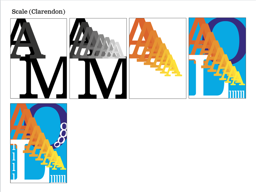
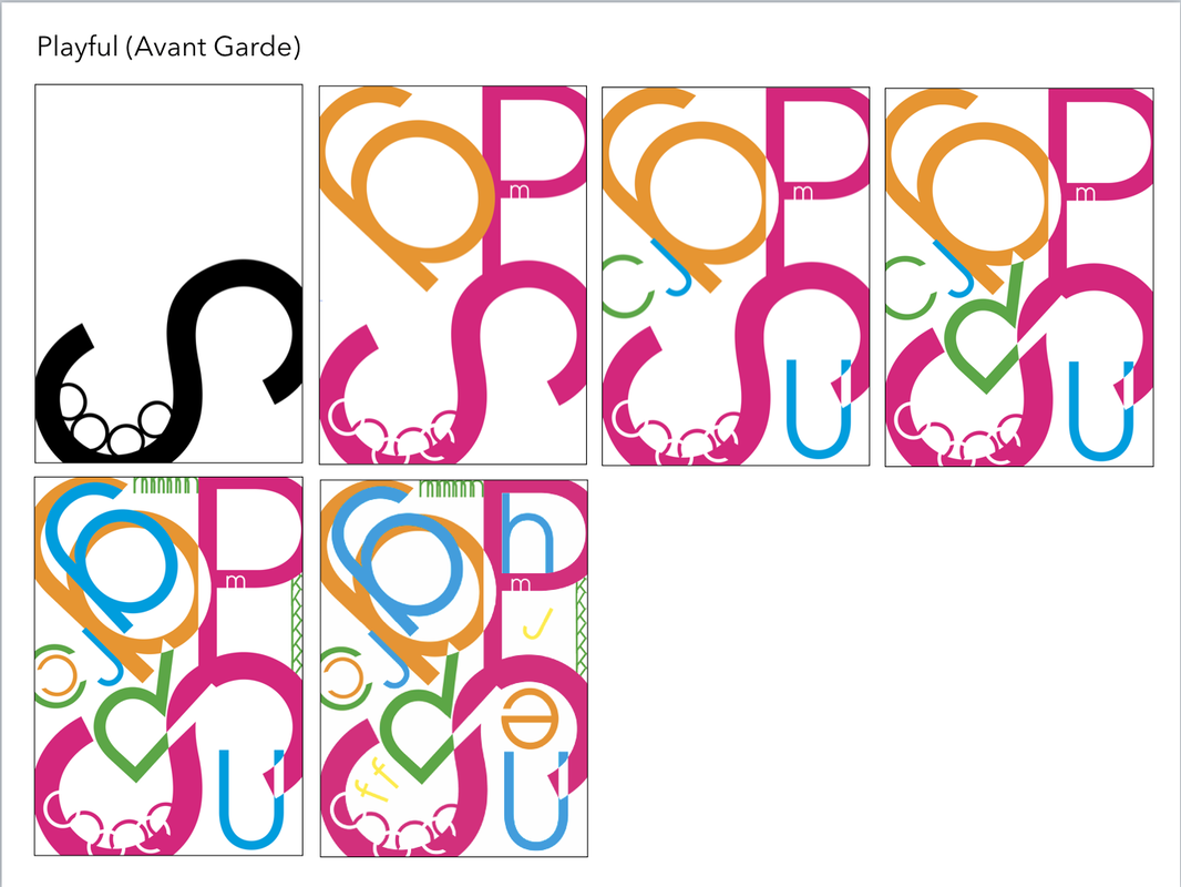
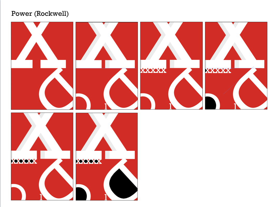
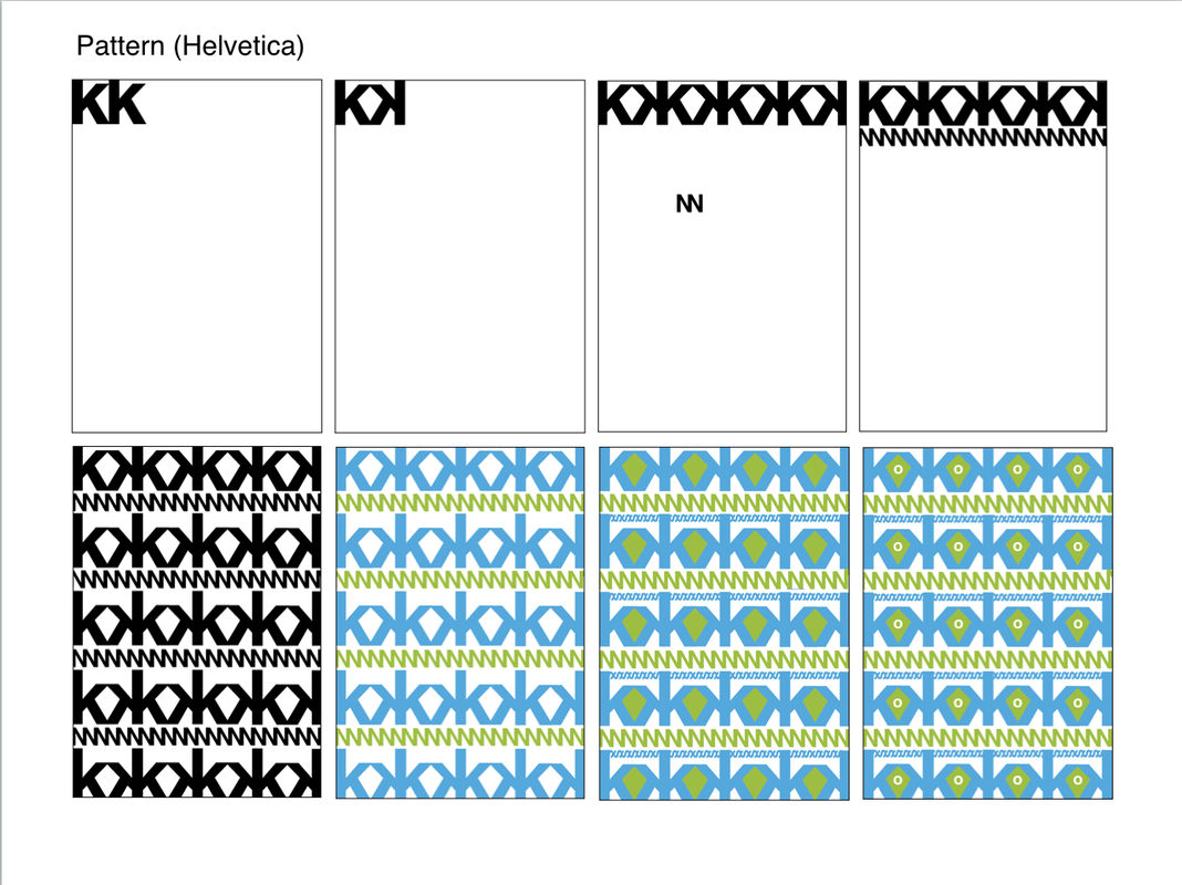
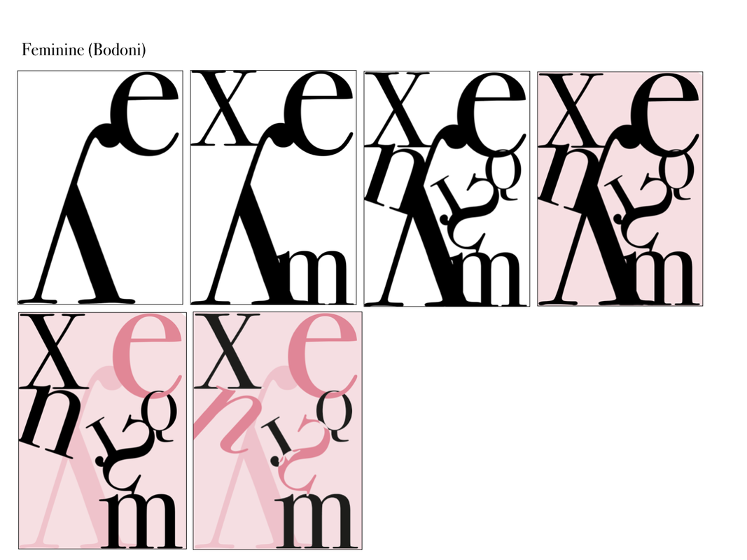
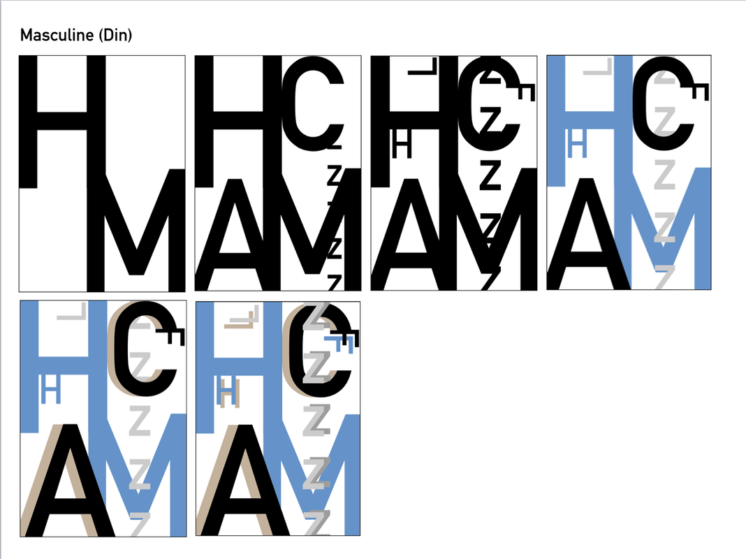
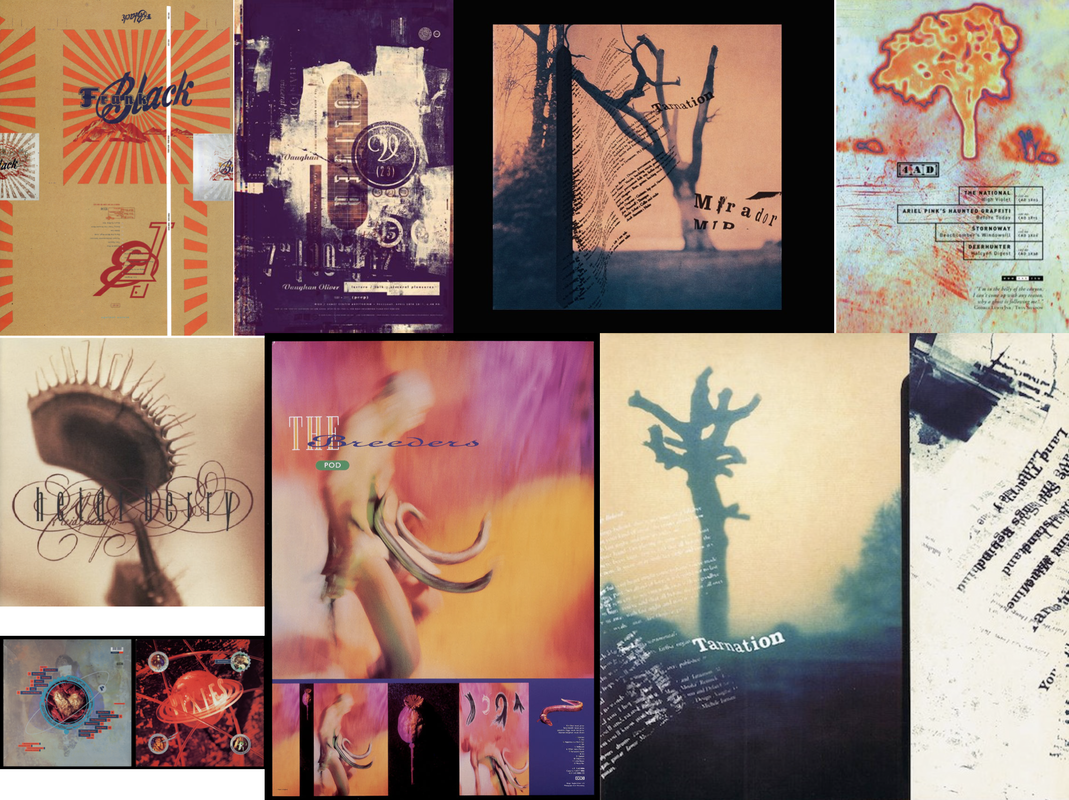
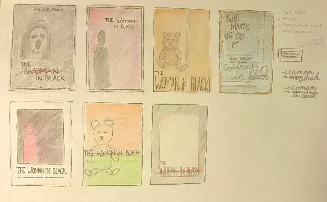
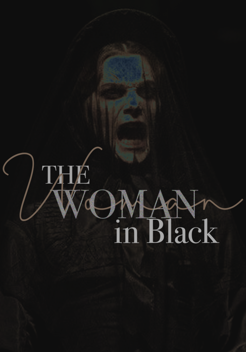
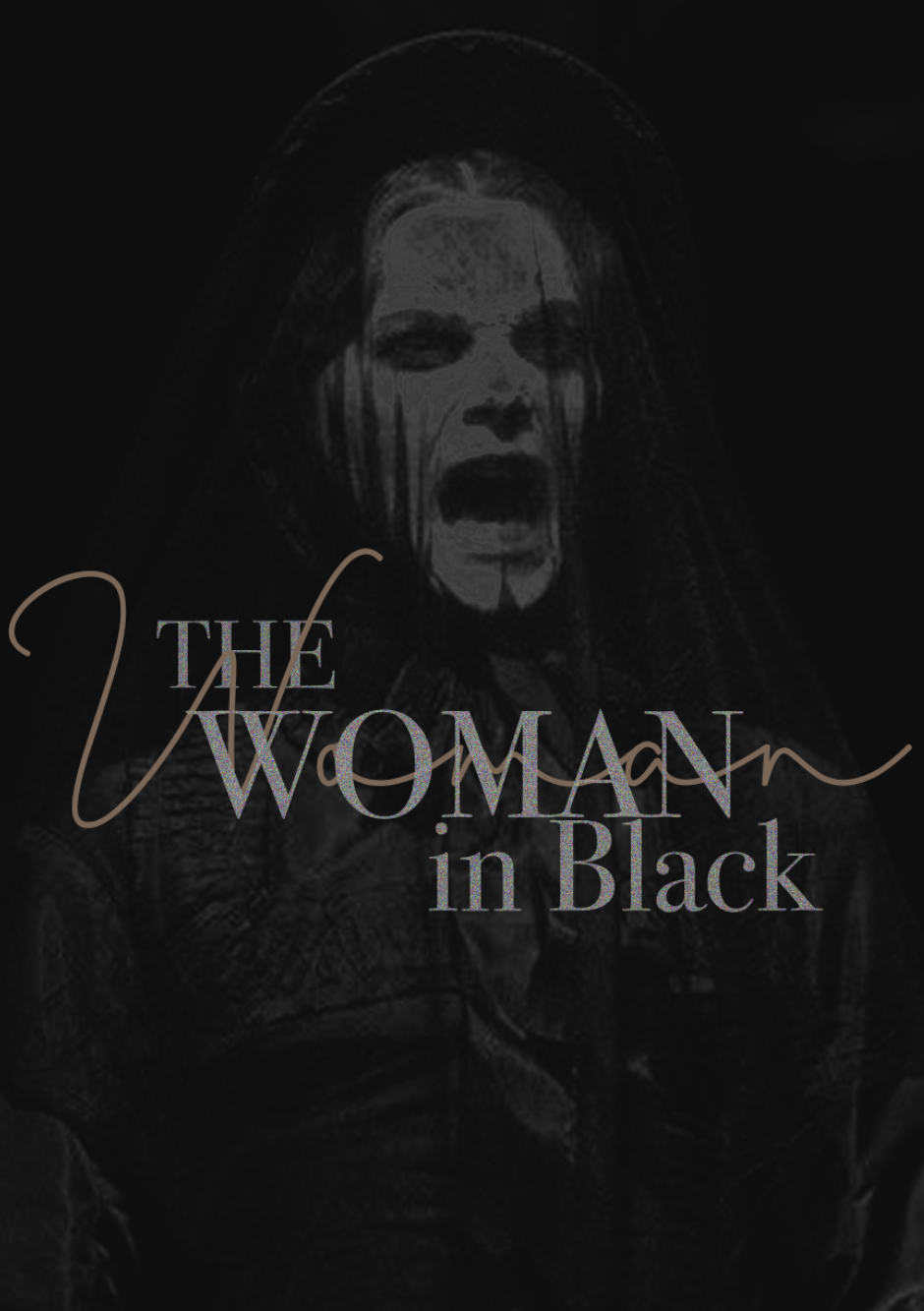
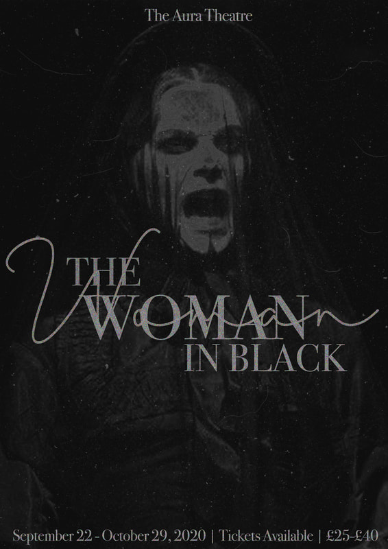
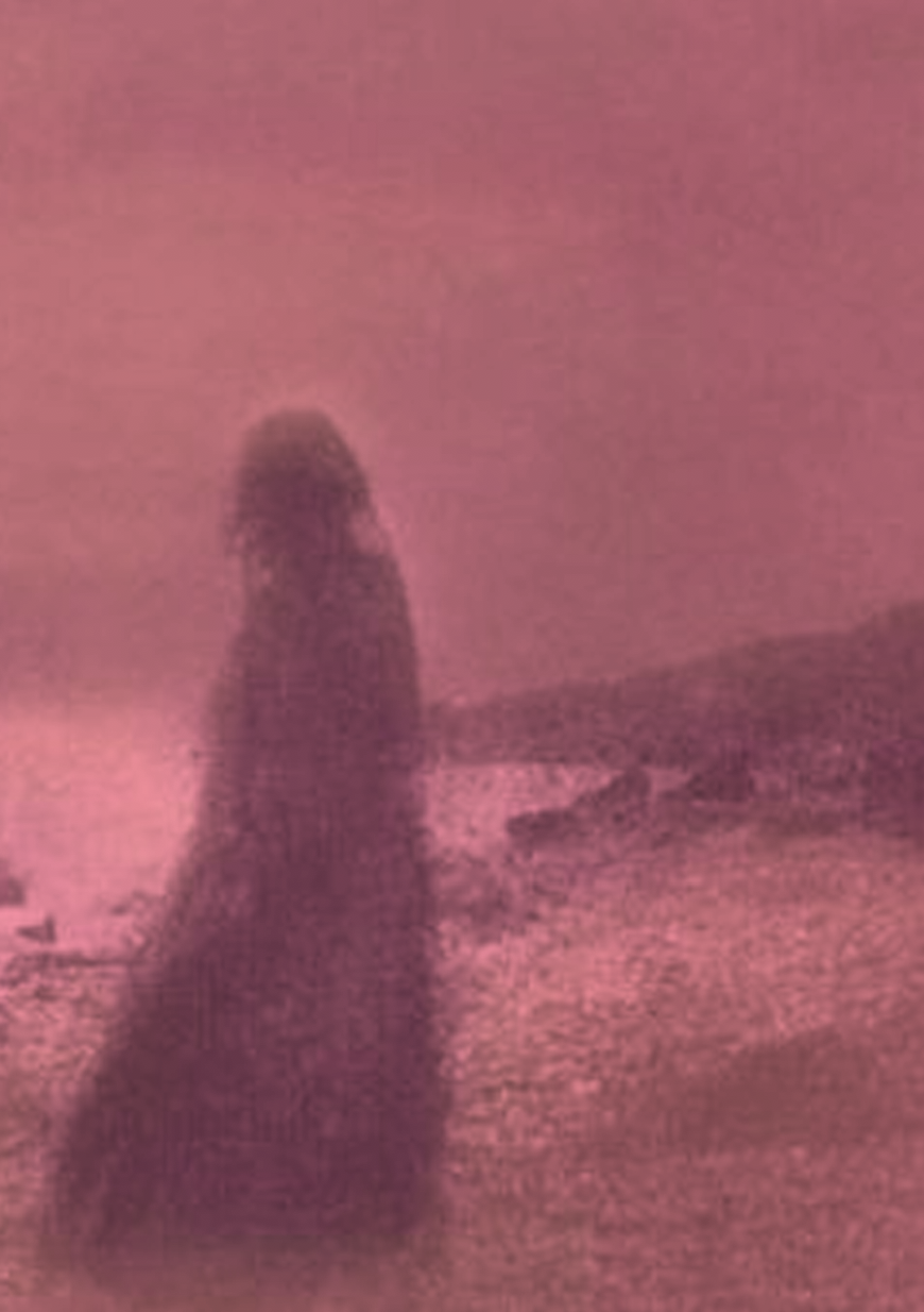
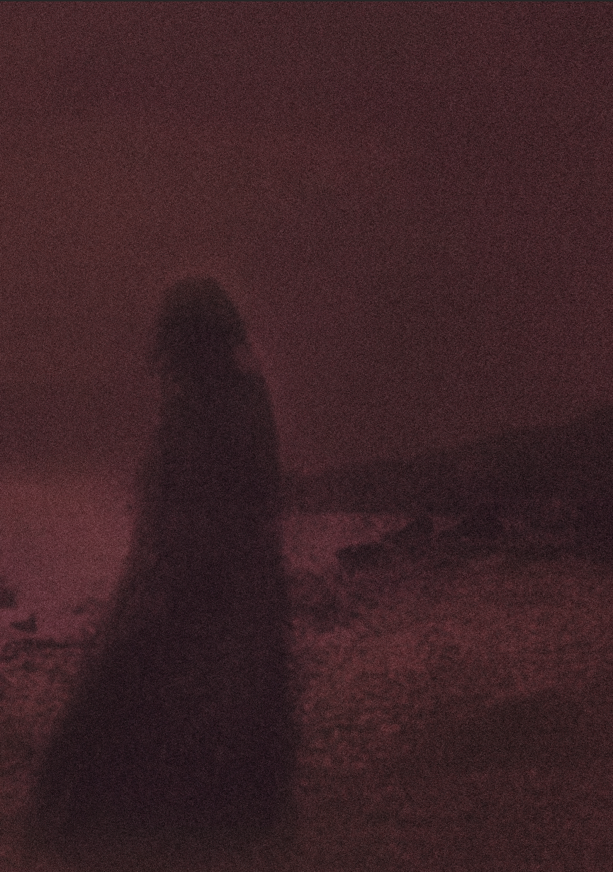
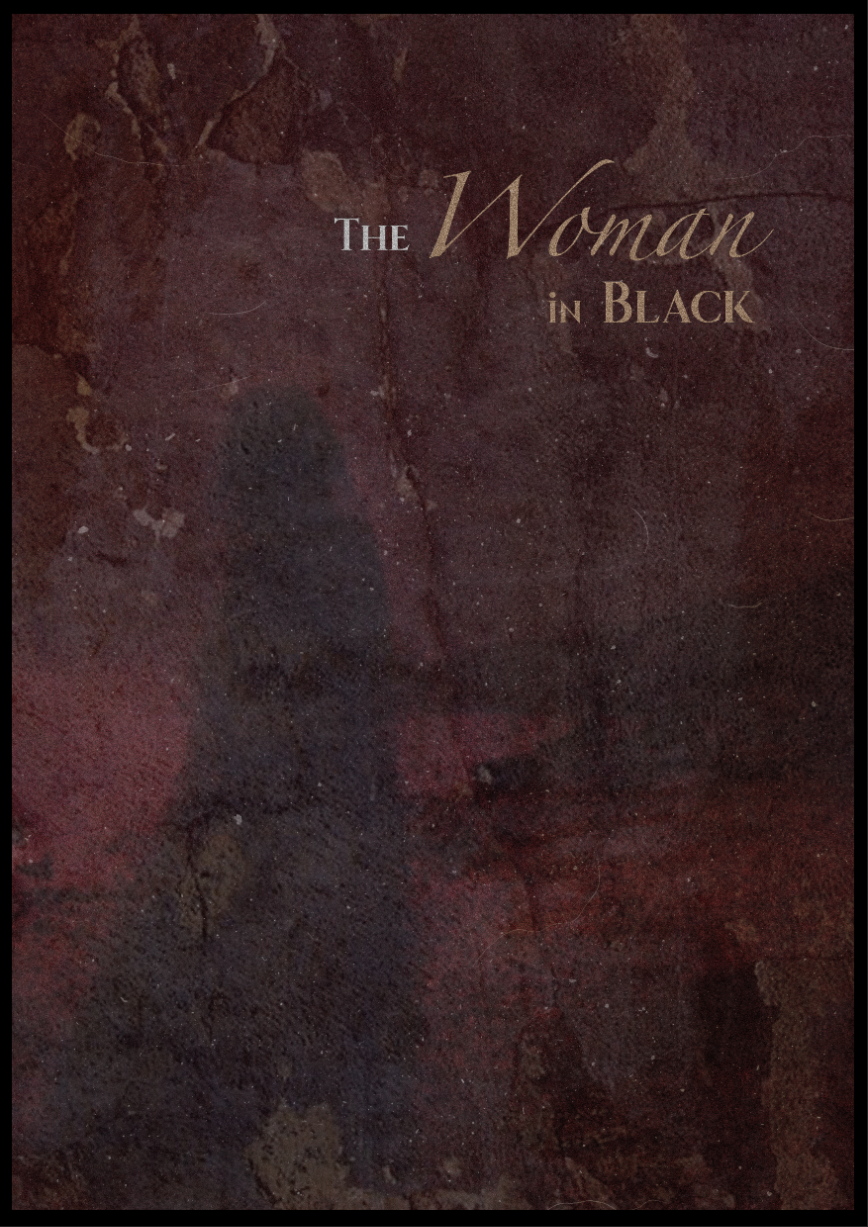
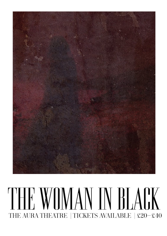
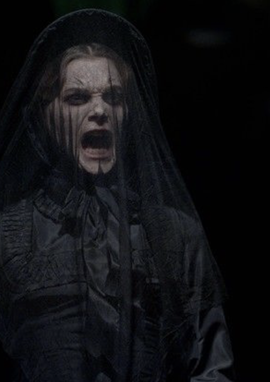
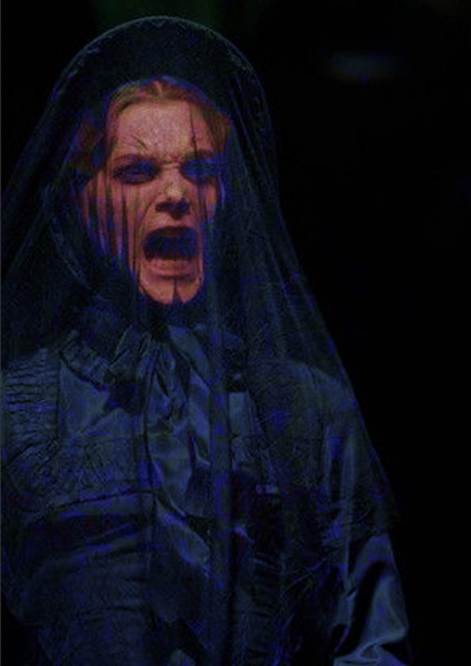
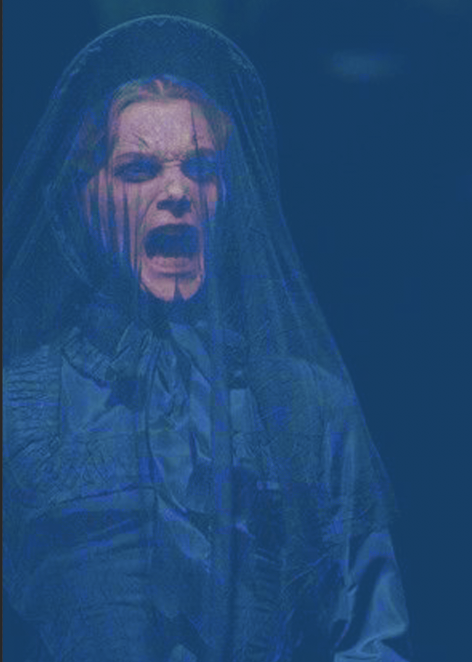
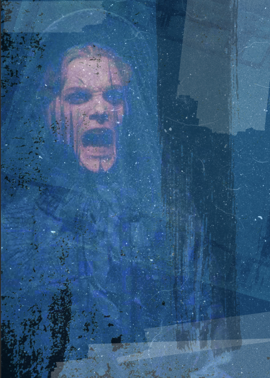
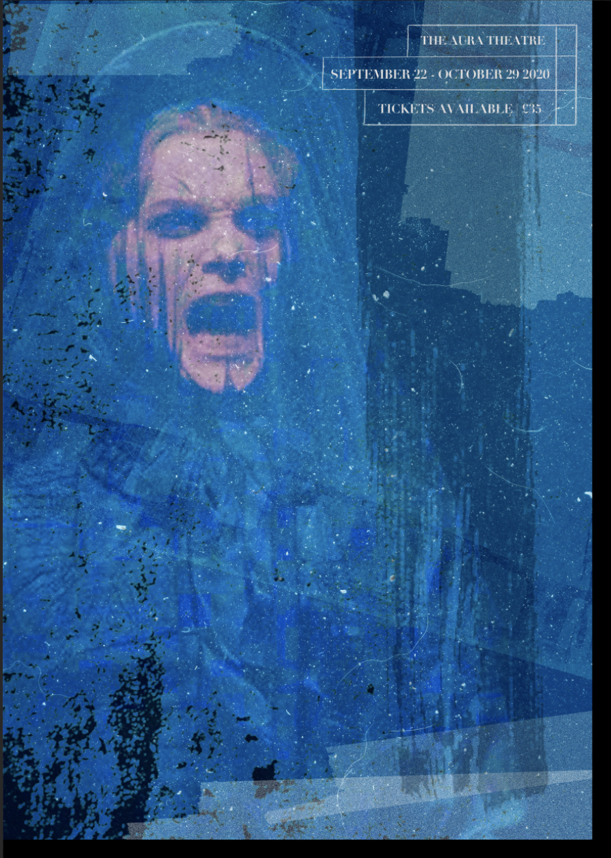
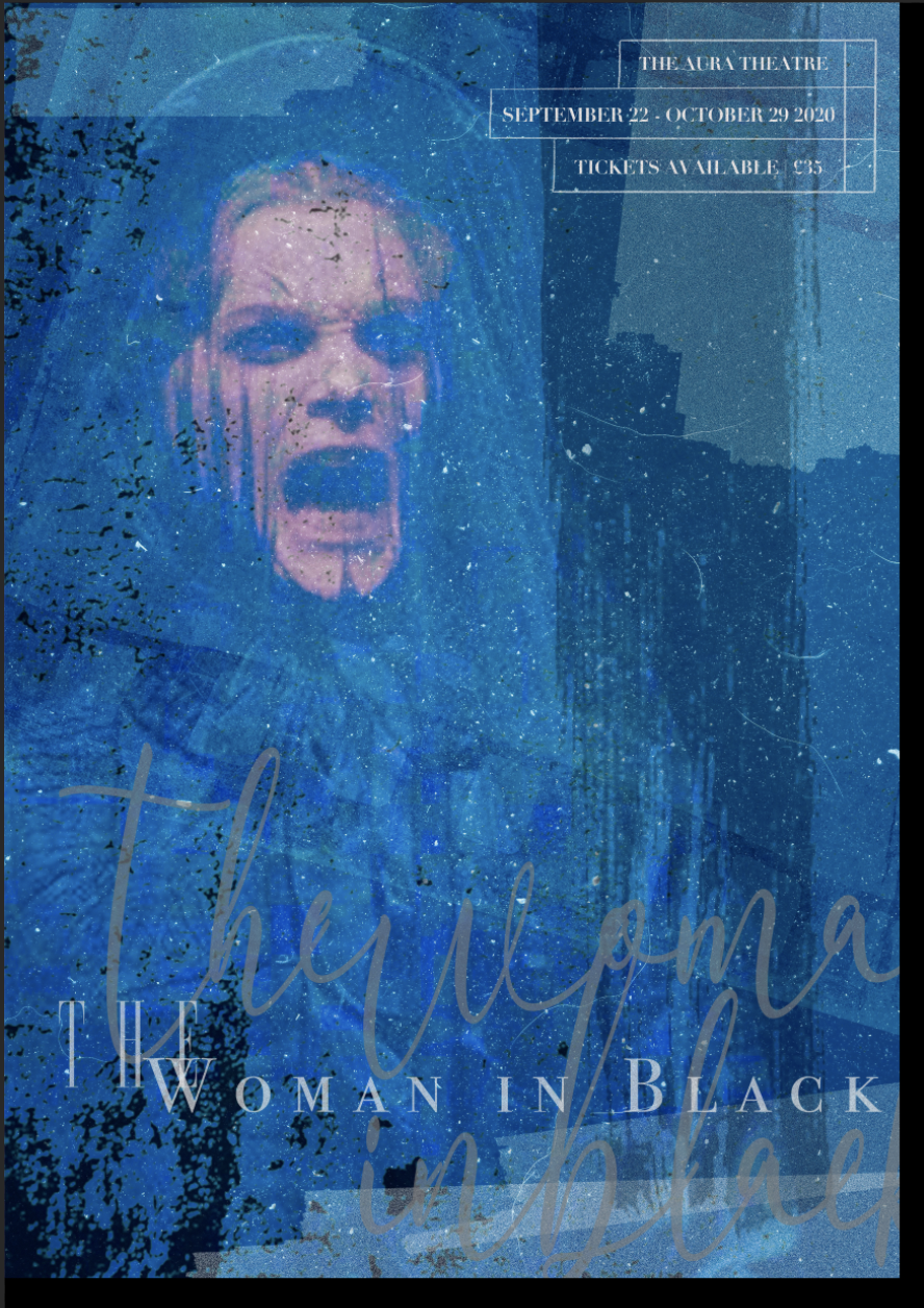
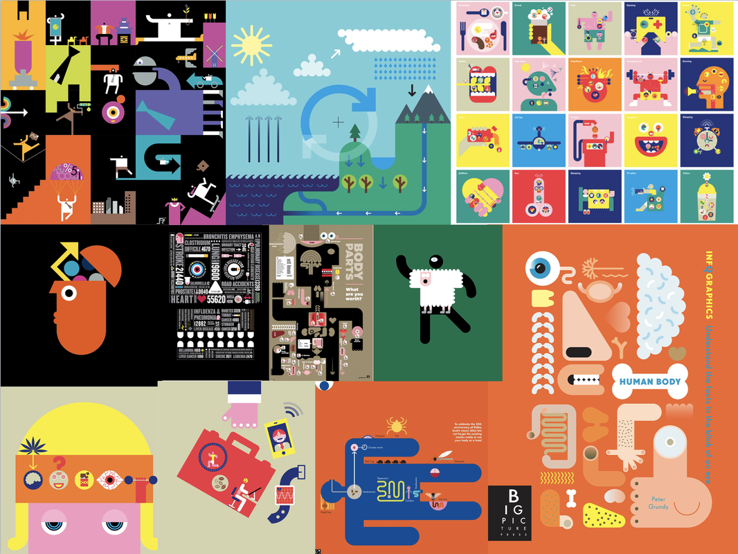
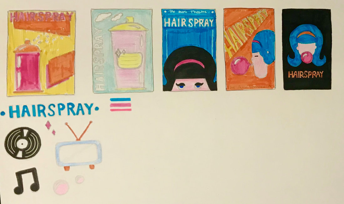
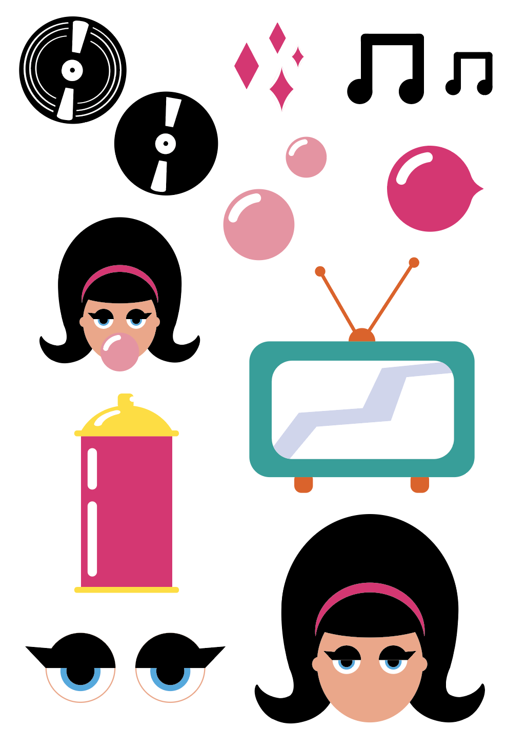
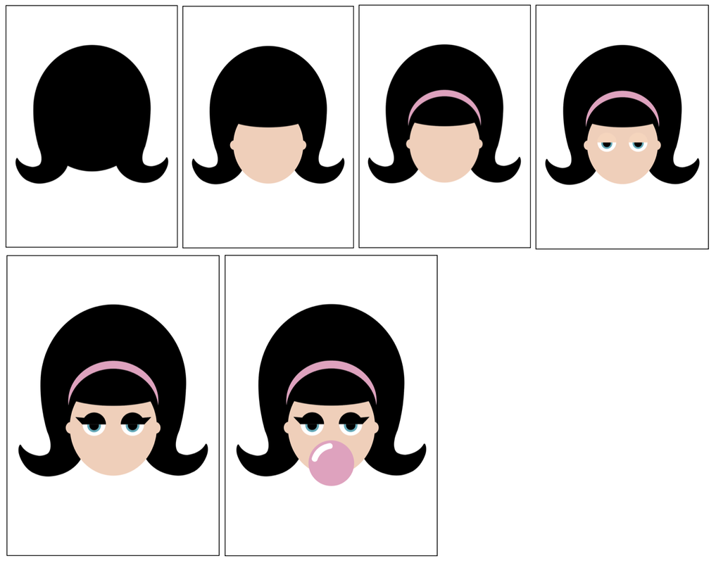
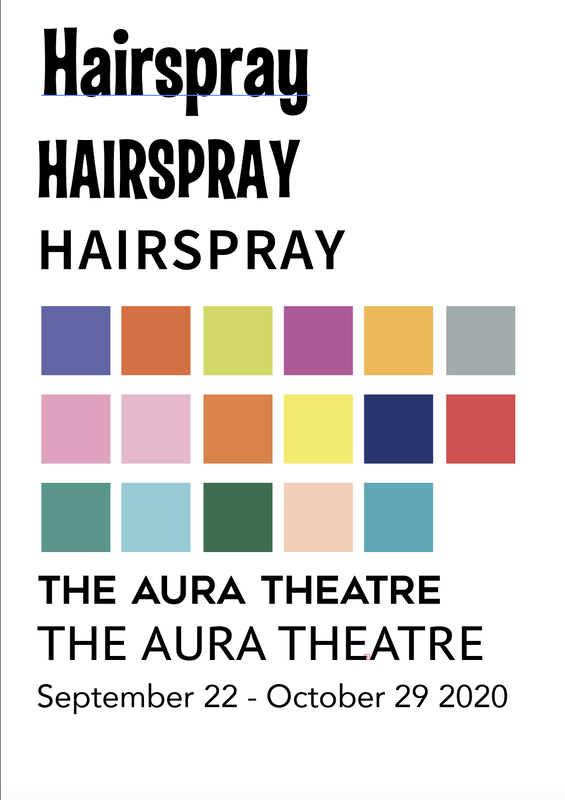
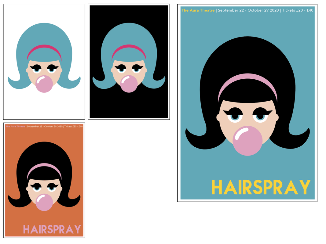
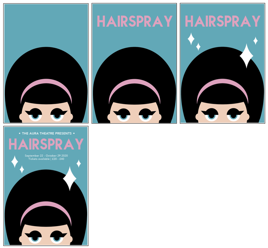
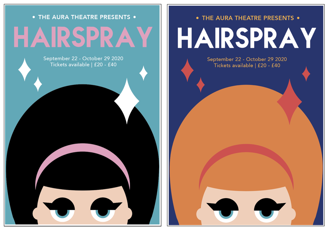
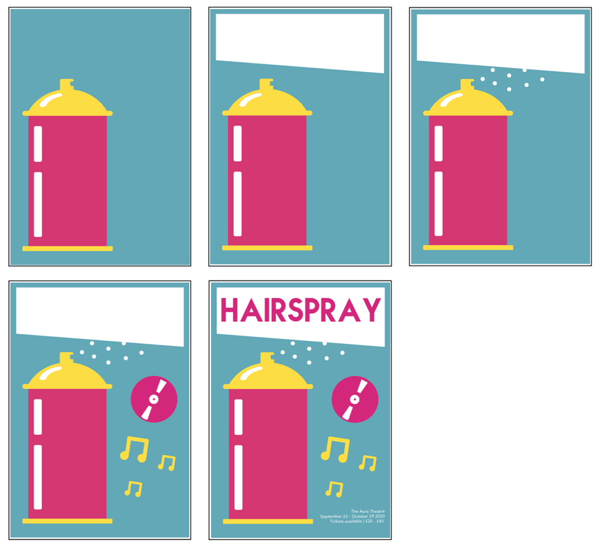
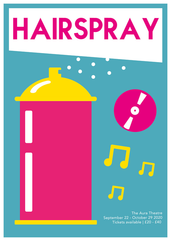
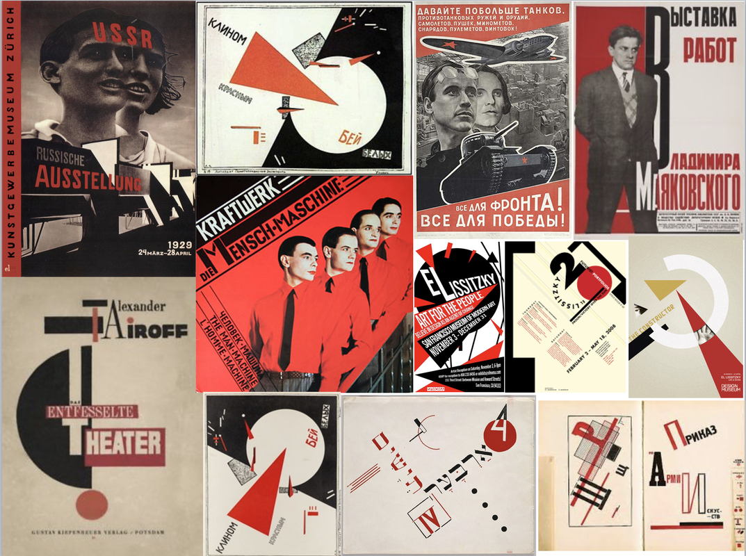
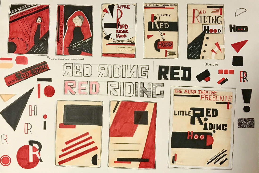
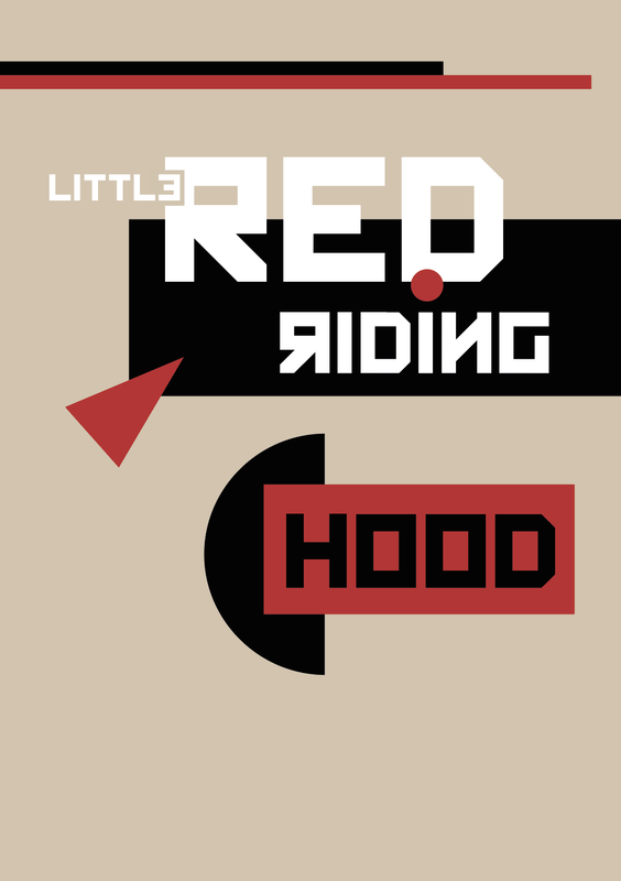
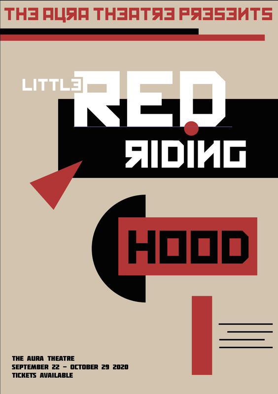
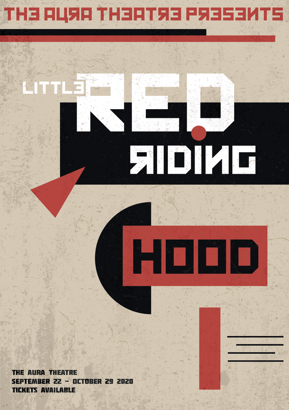
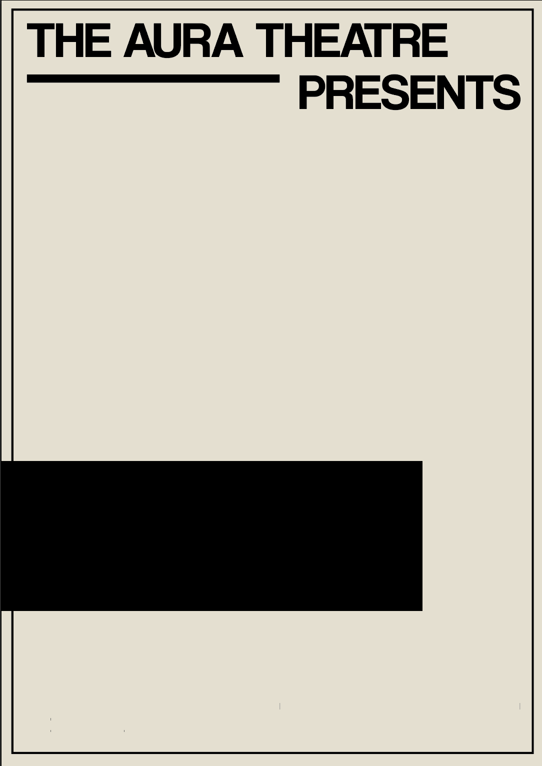
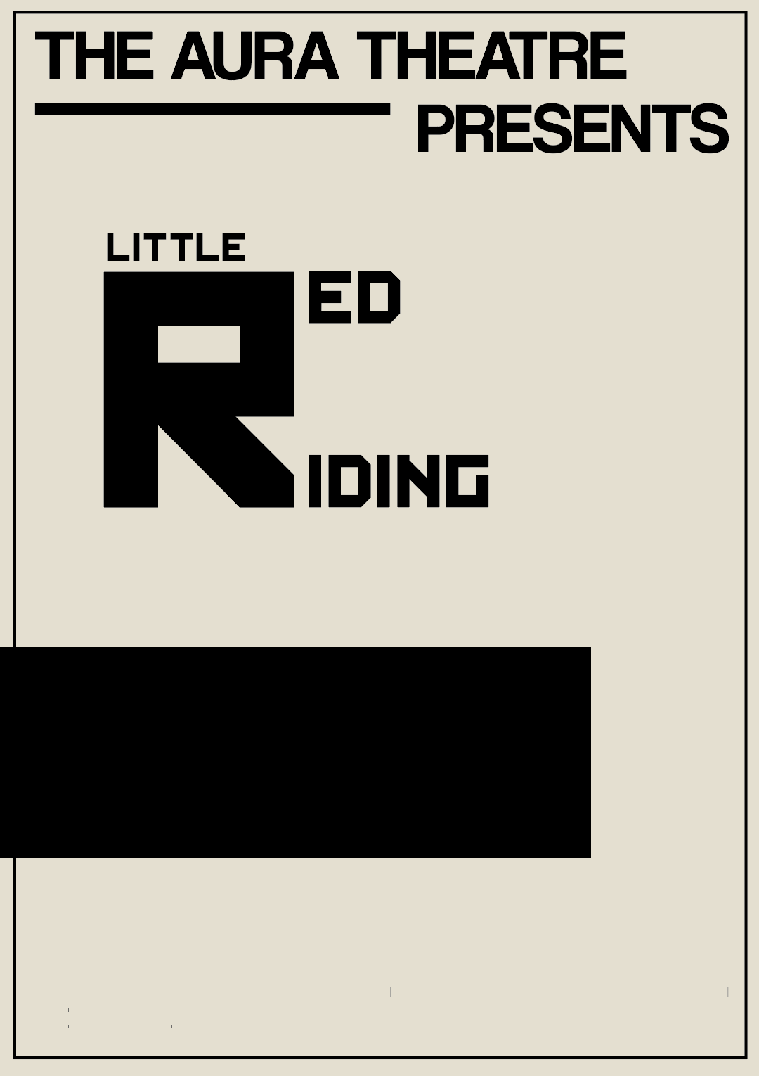
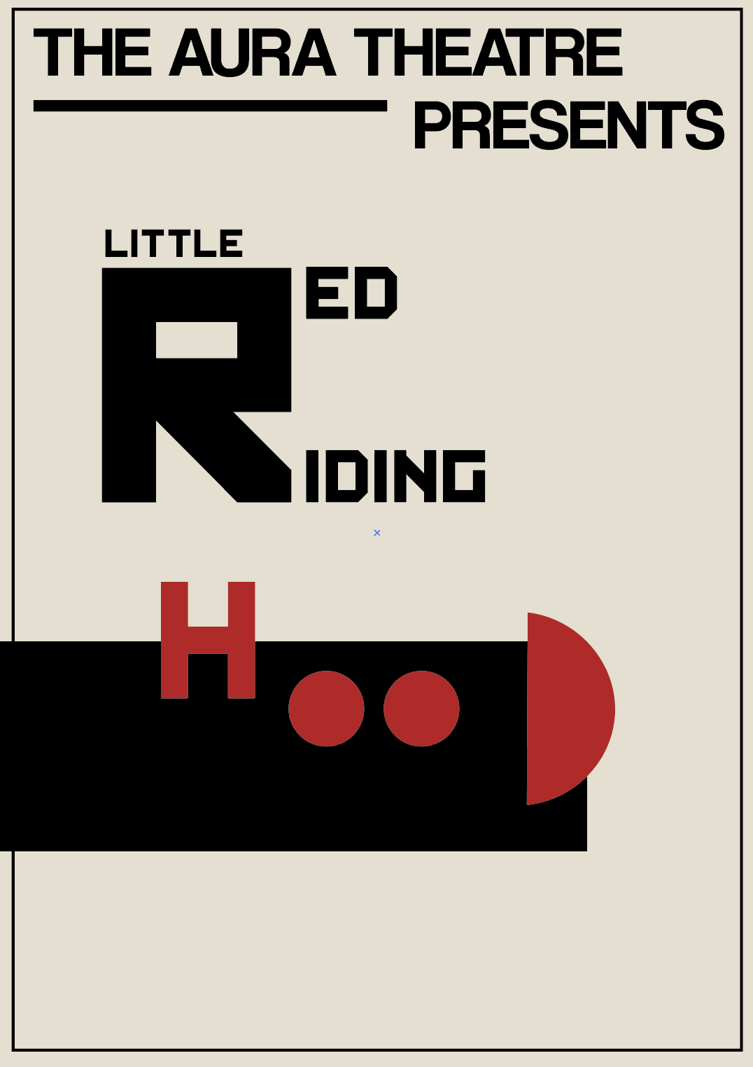
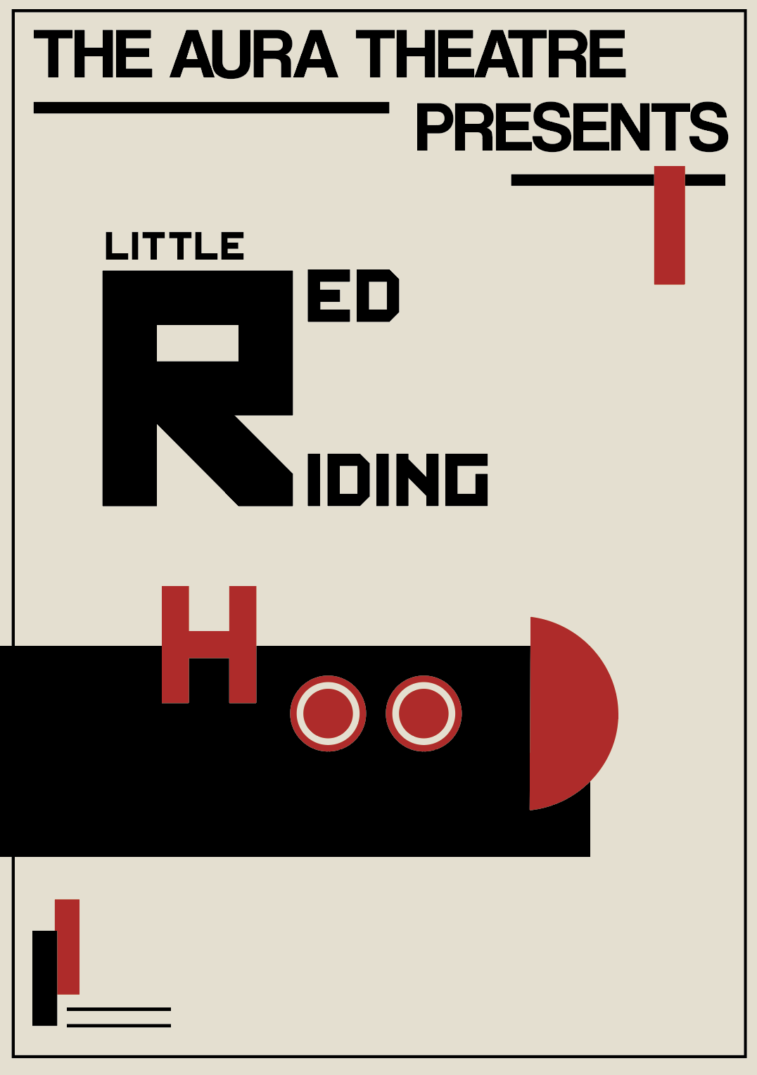
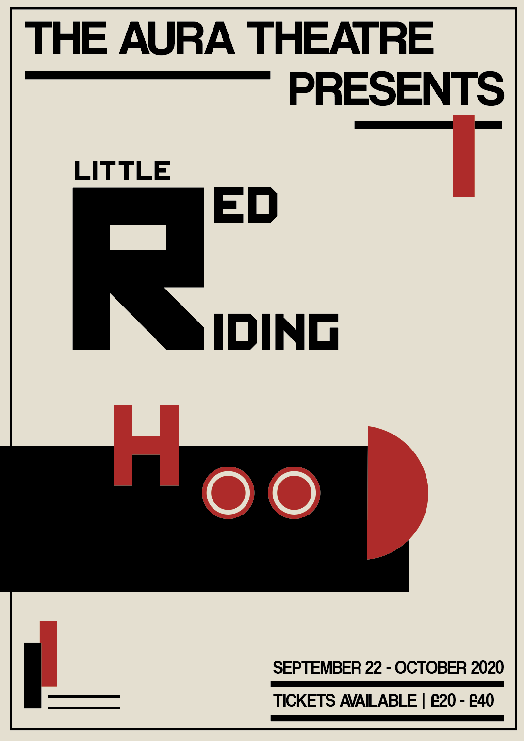
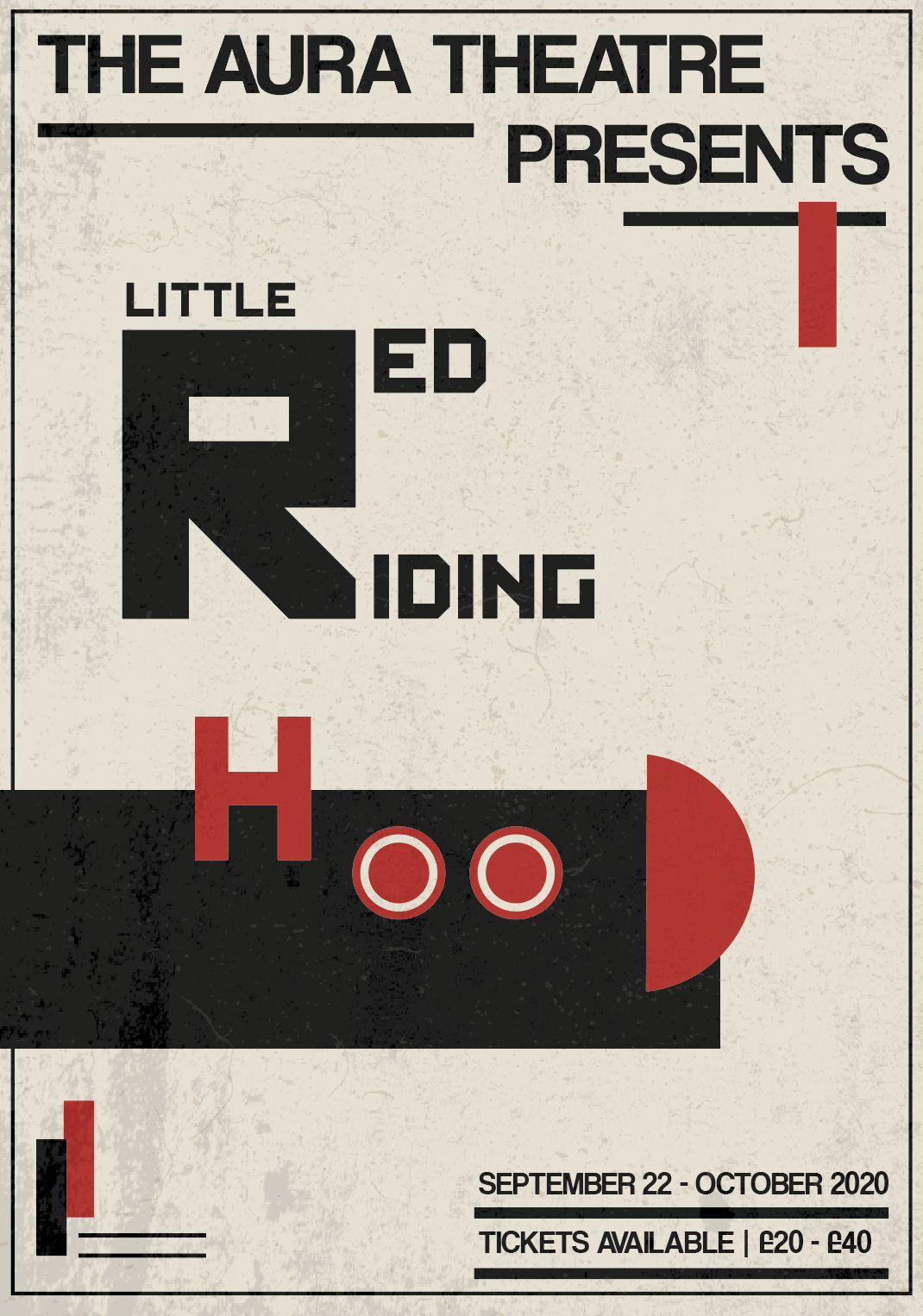
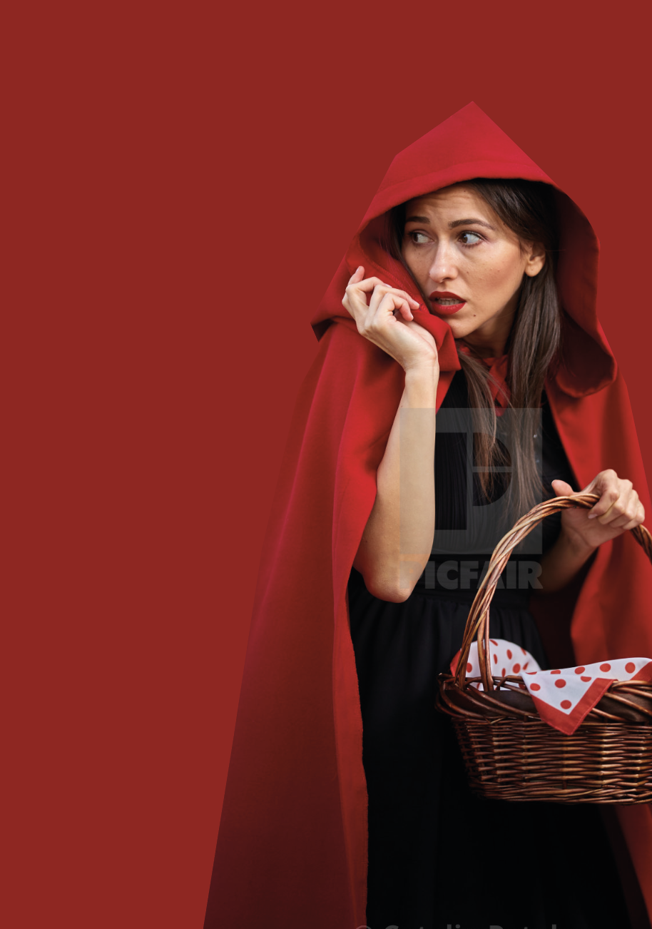
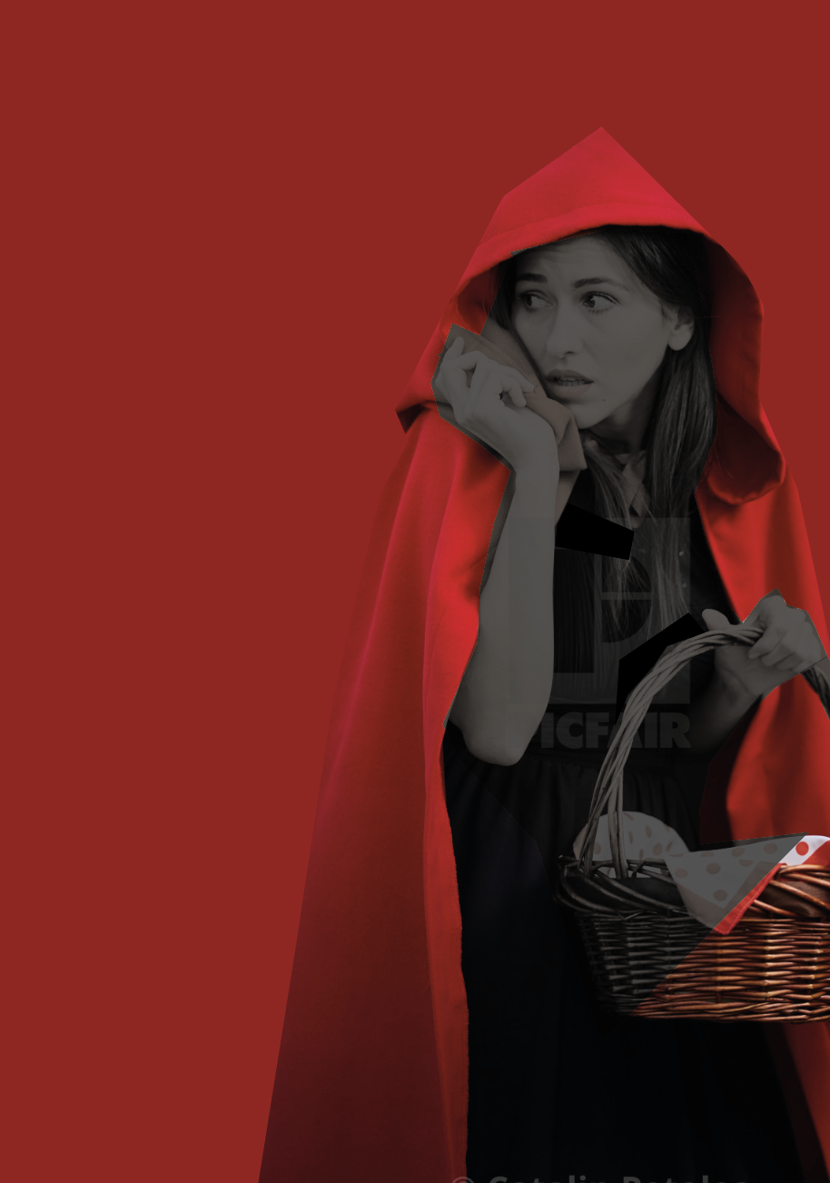
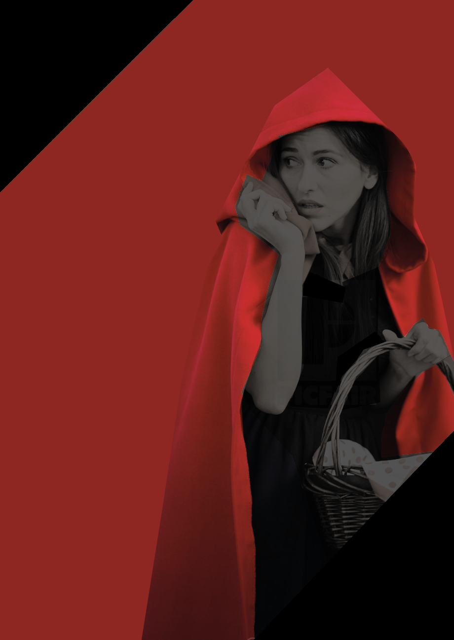
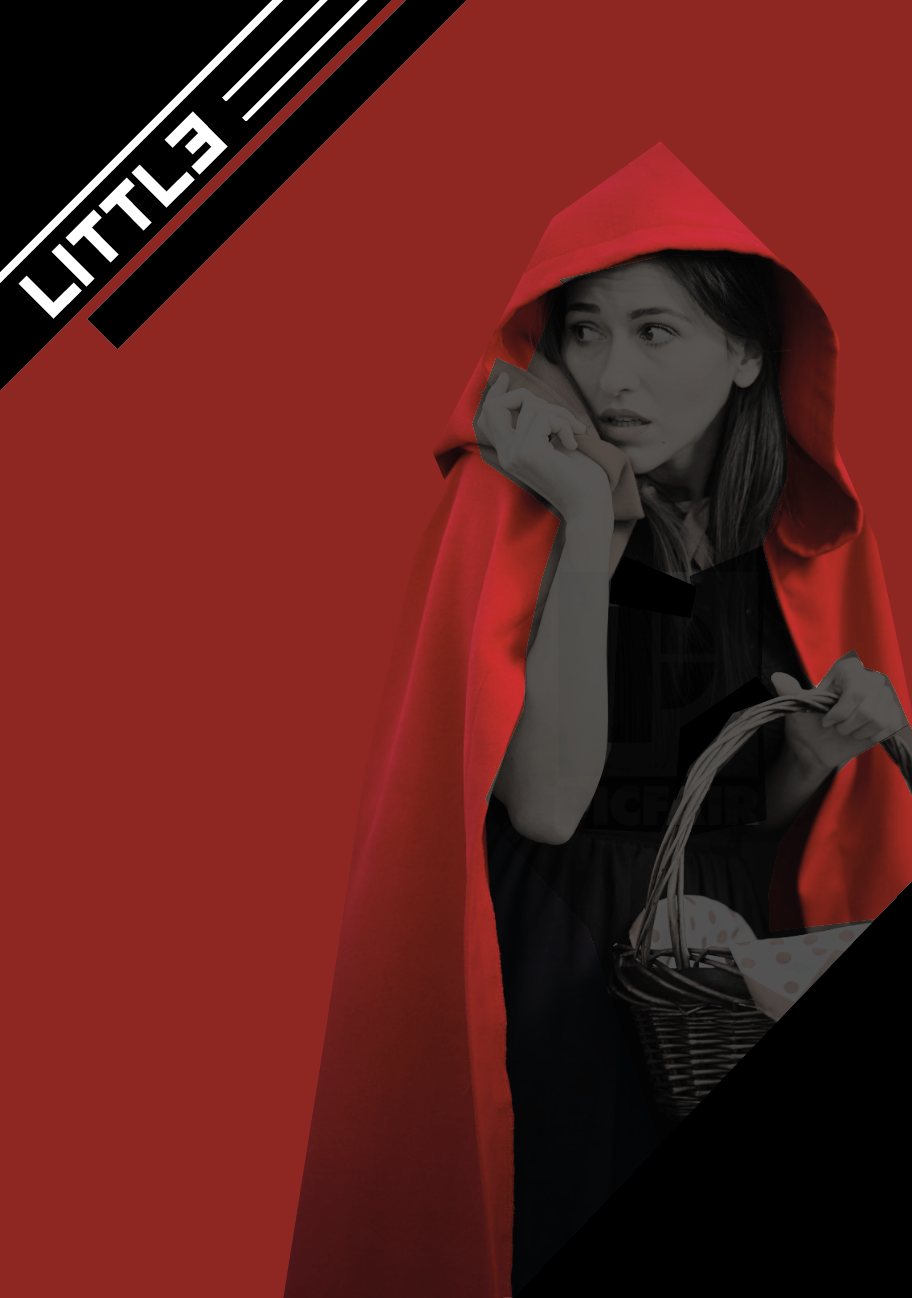
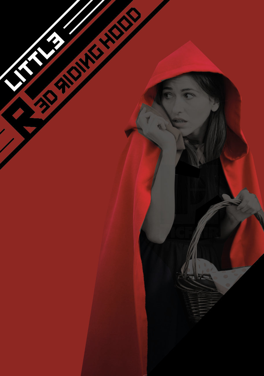
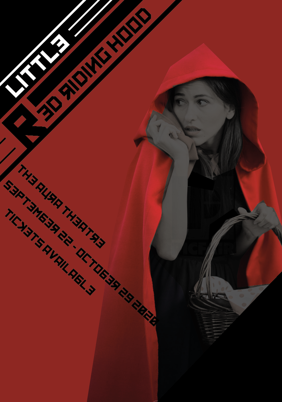
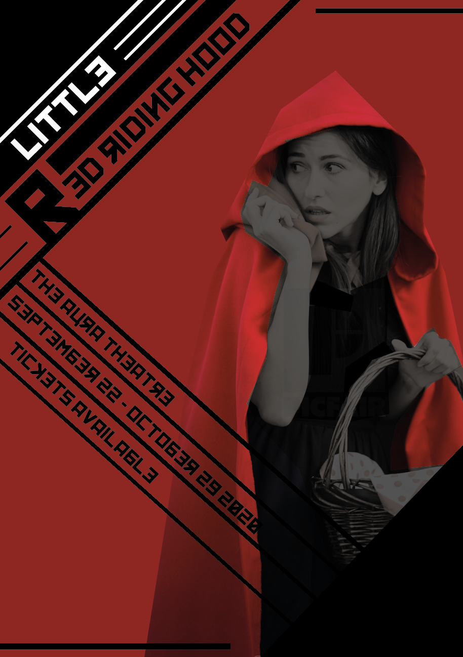
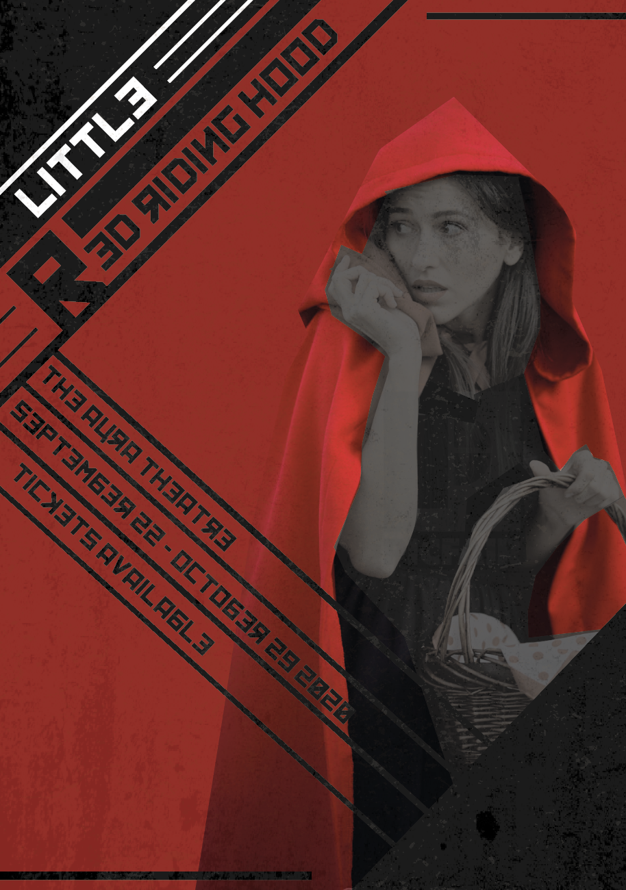
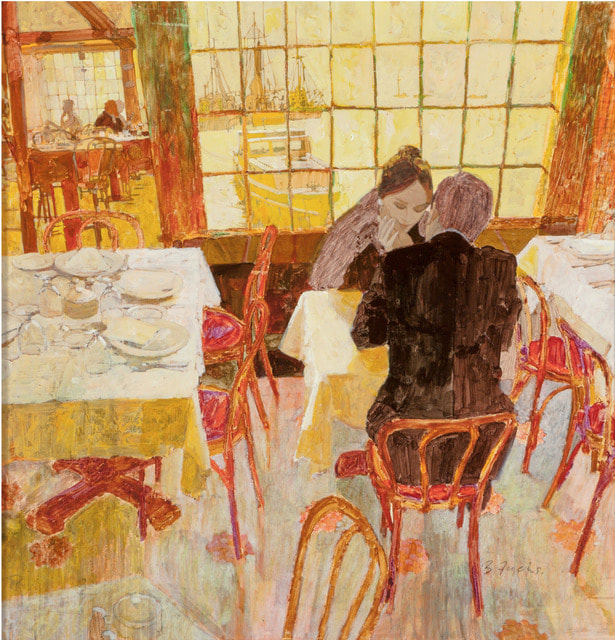
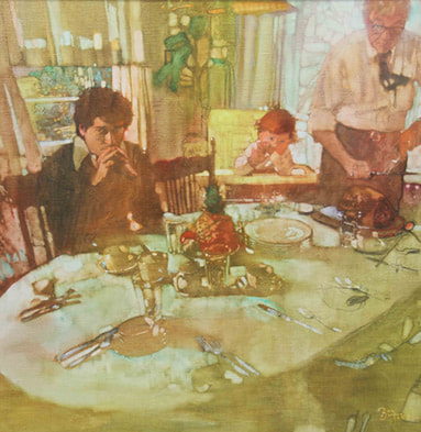
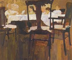
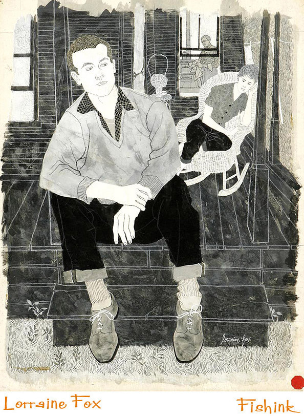
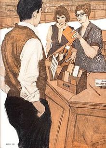
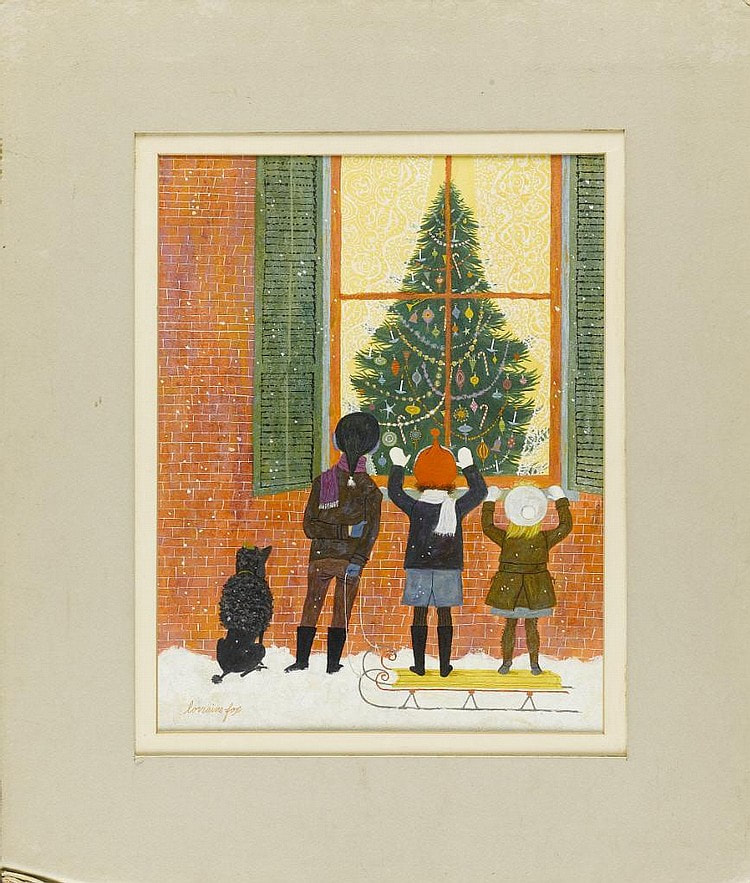
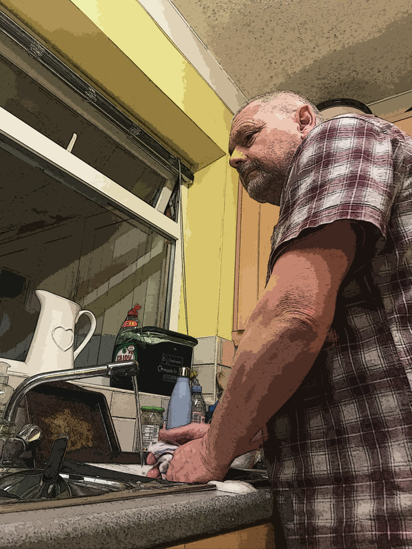
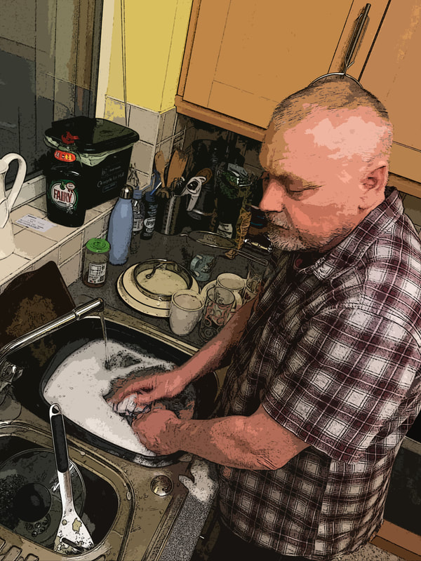
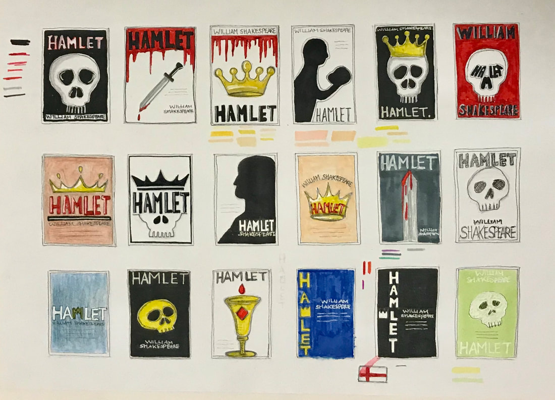
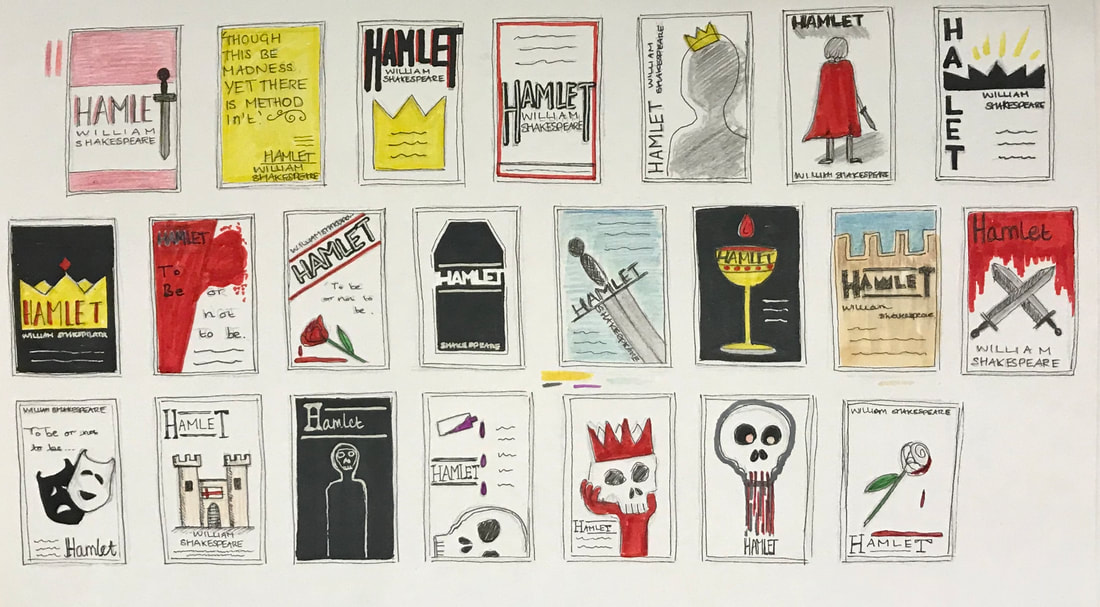
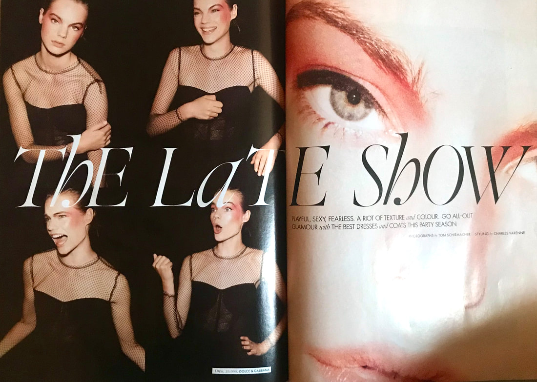
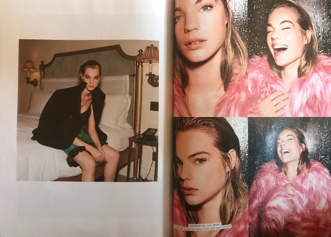
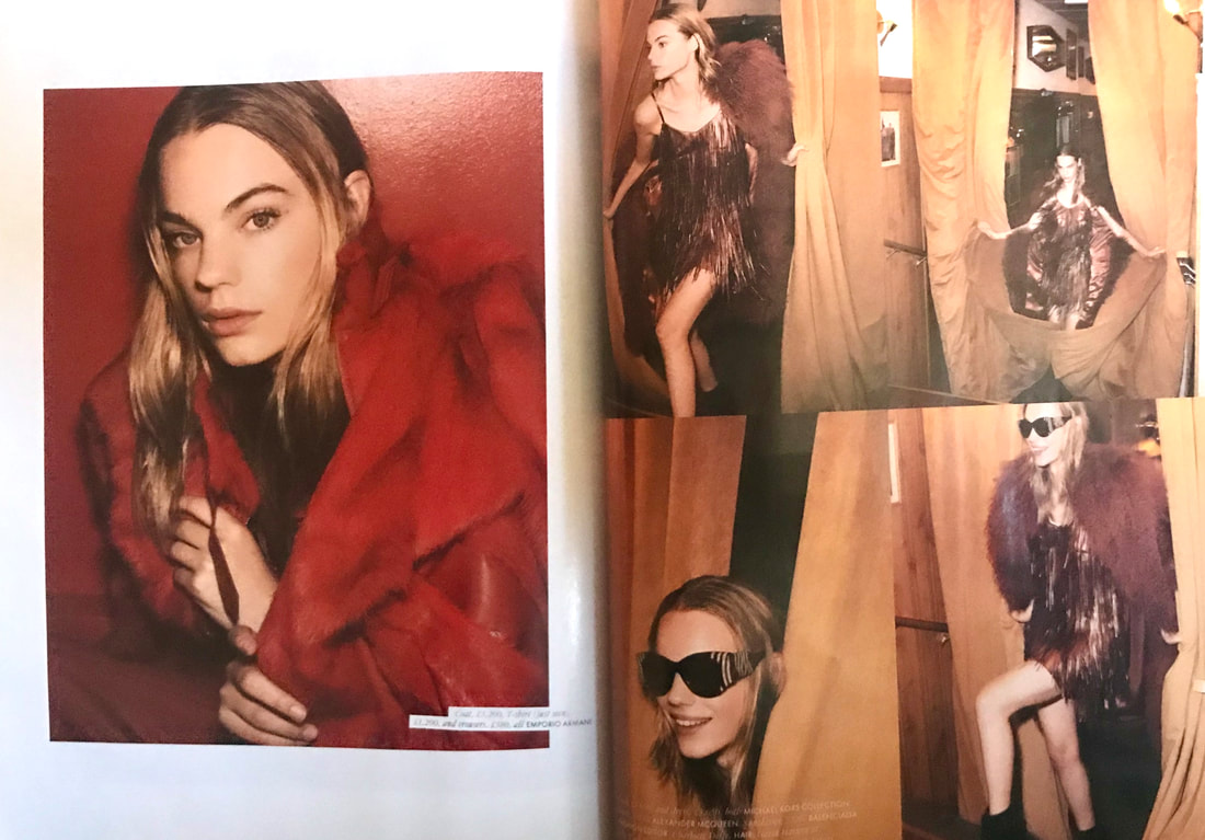
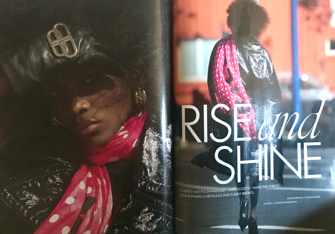
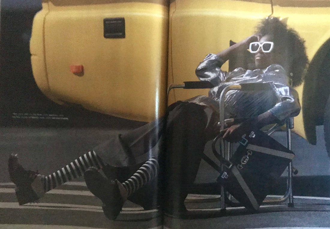
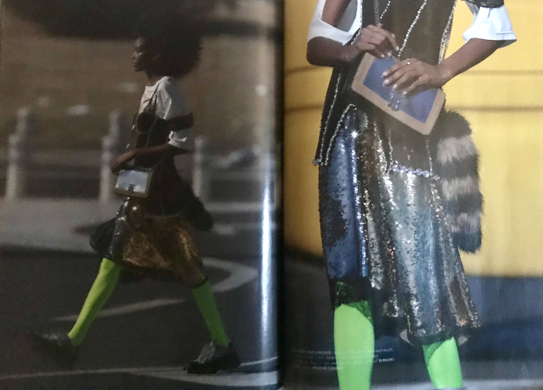
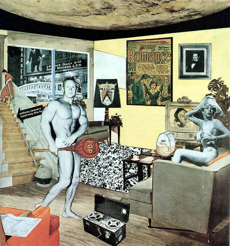
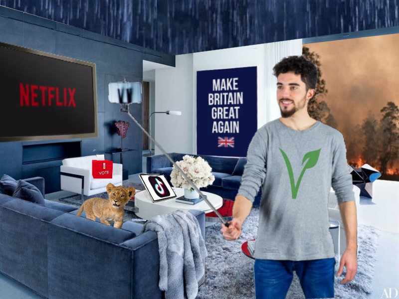
The first two weeks of this project revolved around exploring how colour and arrangement are a crucial part of visual communication, working using both analog and digital processes. Colour Theory To start the analog activities, we had to paint a colour wheel using only red, blue and yellow paint, showing the primary, secondary and tertiary colours. Next to this we had to create two sixteen step tonal scales, one using just black and white paint and the other using black and white along with one of secondary colours we mixed for the colour wheel, attempting to make each step tonally identical to the grey scale. 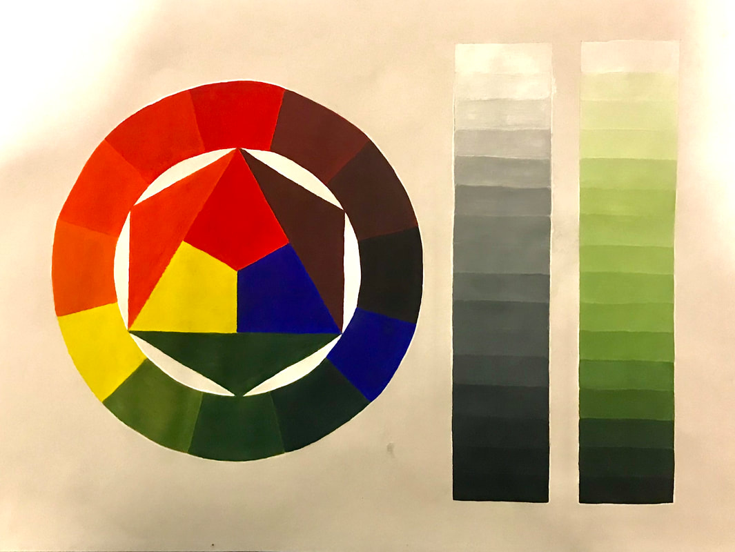 We then moved on to re-create the classic Bauhaus colour and personality exercise in order to explore the potential of colour communication. Using square grids we had to use the three primary colours along with black and white to mix colours we liked, making sure every square was different. We then had to use the same technique to create arrangements of coloured squares that communicated 'Mumbai, a rainforest, Blackpool, a misty morning, Autumn and a hospital ward. 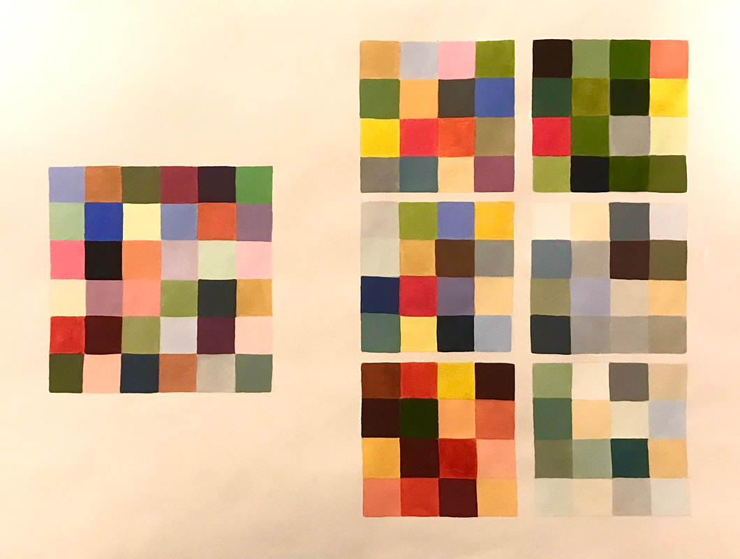 Designing with Type Our next task required us to use only letterforms to create six final digital typographic designs using given typefaces in combination with as many colours as we saw fit in order to answer a 'problem'. The point was to help us explore the infinite possibility of shape, arrangement, colour and contrast as tools to communicate.       Using Adobe Illustrator, the process of creating these type designs can be seen through the screen grabs below: Colour Materials and Abstract Collage Another analog activity required us to explore the possibilities of paint, coloured paper and glue to create arrangements and experiment creating pleasing compositions to set us up for our next lecture. 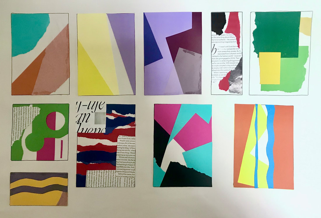 Composition This week we had to research and work in the style of three designers: Vaughan Oliver, Peter Grundy and El Lissitzky. The aim was to understand the key elements of their work; how they use composition, colour, type, imagery, and replicate their styles using Adobe InDesign, Illustrator and Photoshop. We had to produce A3 posters in the style of each of the designers for the theatre productions: Little Red Riding Hood, The Woman in Black and Hairspray. Vaughan Oliver/The Woman in Black Vaughan Oliver is best known for his work designing album covers for The Pixies, combining dark photography and experimental typography, and using digital and analog techniques. I collated a few of his works together to use as inspiration, all found on Google Images. For my thumbnail sketches, tried to play around a little with different poster layouts and placements for the typography as well as a few ideas of what kind of imagery I wanted to use to represent the theatre production. I chose to use this artist for 'The Woman in Black' due to it incorporating such dark imagery and texture, which I felt fit in well with the theme of horror. I then began experimenting with some ideas using Adobe Photoshop, playing around with different filters for the imagery, (the image I used is linked here) and combining different fonts to see which looked the most pleasing. I also added texture by overlaying some dust/scratches (linked here) to make it look for worn away and old as well as noise as it looked too clean. For this design I tried to combine a serifed font with a calligraphy font. Being new to this program, I similarly experimented with some more designs (image used linked here; texture linked here). Before created my final poster, I wanted to experiment a little with combining different typefaces so see what worked well together; I tried to make them look sort of grunge. However, I did find this quite difficult. 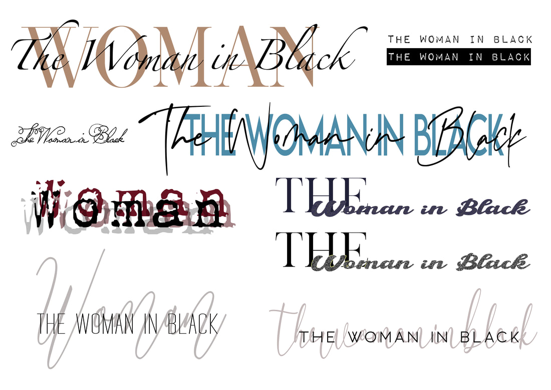 For my final poster, I used one of the images I used before, layering on different filters to make it look over exposed and grunge looking. I also added textures and noise to add to the worn away, old photo effect. I then added boxes to include the information about when and where the production is held, and then finally, I chose to use a calligraphy font in a muted colour behind two complimenting serif fonts of the title of the theatre production in order to make it pop more. Peter Grundy/Hairspray Peter Grundy is an illustrator and designer known for his work on infographics, highlighting the power of playful colour and basic shapes to communicate. I collated some images from Google to help inspire me. I then drew up a couple of thumbnails of ideas for my 'Hairspray poster'. Using Adobe Illustrator, I began by creating a few elements using vectors that I could use for my poster designs, by combining individual shapes to create images. I then experimented with some colour palettes taking inspiration from Grundy's work, as well as some simple sans serif fonts to communicate the information about the production clearly. Here I experimented with some other poster layouts. The first one I kept the type centred and added a few extra elements to create more interest. For the other design I chose to include some of the other vectors I created, focusing on using complimentary colours in order to make the poster stand out. El Lissitzky/Little Red Riding Hood I began my research by googling images of his work, collating images I found had appealing compositions that would inspire me in creating the poster. Lissitzky was most well known for his Russian modernism, constructivist designs, greatly influencing the Bauhaus movement. A master at mass communication, his limited colours and fonts created powerful dynamic geometric layouts. Looking at his work its clear he favoured a particular colour palette: red, black, white and sometimes some muted yellows, and thought that would work really well with the theatre production I chose to do in his style. When drawing up my initial thumbnail ideas, I tried to incorporate his dynamic use of layout using simple shapes, and tried to think about how to couple the shapes with the type. Some designs I also wanted to included some photographic imagery. I began using Adobe Illustrator to draw out the shapes and then added the type on top (the font was downloaded here). I didn't like the cleanliness and flatness due to it being done digitally; his actually work was hand printed, so I added some textures and noise to give it more of a printed effect. For this design I used a photographic image (found here), and using the same kind of colour palette and font I incorporate some simple line/geometric shapes. Final Posters I'm really happy with how my final posters turned out and think they reflect the artists techniques well. My abilities will improve the more I get used to using the software. 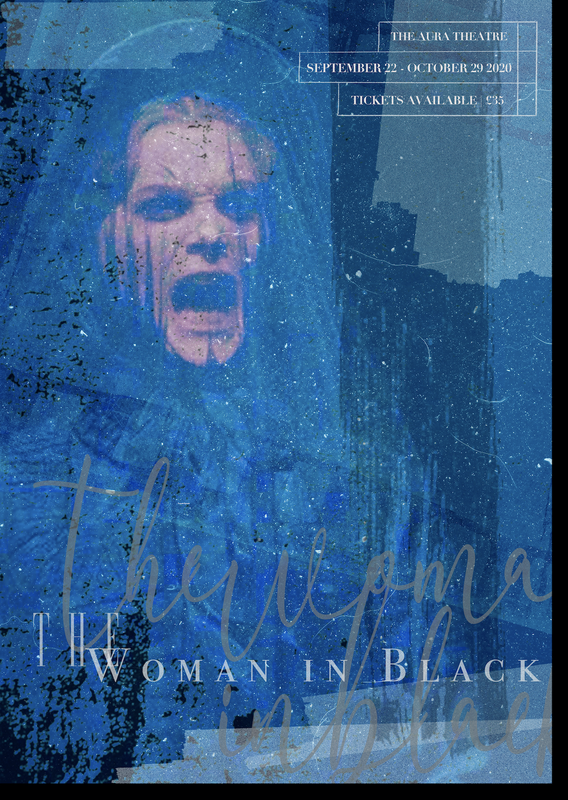 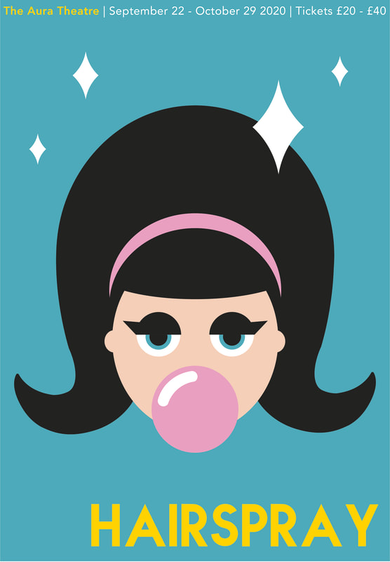 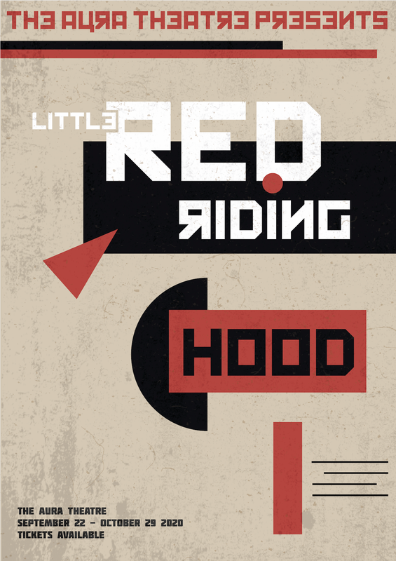 Bernie Fuchs Bernie Fuchs was an American illustrator who's created photography based paintings of mundane, everyday moments, creating visual interest through his use of colour and mark-making. He is known for creating unique paintings through his way of changing the point of view of the setting. Lorraine Fox Another notable American illustrator was Lorraine Fox, known for her nostalgic, emotive paintings giving the viewer a glimpse into the everyday world they don't normally notice. Much like Fuchs, she would use unique mark making and play with angles and viewpoints, all in a variety of styles. In response to these artists, I chose to take some photographs of everyday moments, trying to capture the ordinary but in a more visually pleasing/unique way. I did this by taking the images at slightly different angles, to make the compositions more dynamic and possibly help the viewer see these mundane moments in a different, more interesting way to how they would normally expect. In addition, I added a few filters using photoshop to make them more artistic and give them more texture like they are painted. Brief For this project we had to design 40 different thumbnail ideas for a portrait format theatre poster. We then had to take five of our ideas and and refine/develop them further. Finally we had to take the three best designs and work them up as more detailed client visuals on a slightly bigger scale. Research/Thumbnails I chose to design a poster for the theatre production 'Hamlet', a play about the ghost of the King of Denmark telling his son to avenge his murder by killing the new king, who is Hamlets uncle (research taken from here). Themes of the play revolve around madness, life and death and revenge, so many of my ideas feature elements such as skulls, swords, ghostly figures and blood. Developments I really liked the idea of using a crown shapes as part of the lettering so I explored this idea further when developing my poster thumbnails. I also looked at a few different typefaces; ones that had a more medieval look to them. I tried to think of different ways to layout the poster, trying some posters with the main title of the play at the top and others in the centre. 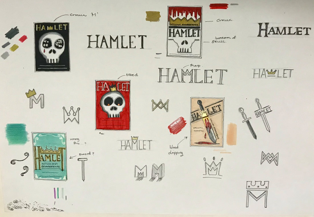 Final Piece These are the designs I was most pleased with and choose to work up in more detail. The first design I chose to make more ornamental/decorative, to represent the 'royal' theme of the play, using gold and blue and further developing the idea of added a crown onto of the type itself. The second design also played with the idea of using the crown onto of the text but in a different style. This design also incorporated the skull to represent the theme of death and the character, Yoricks, skull itself. I preferred the cleanness of this poster in contrast to the third design which features a sword dripping with blood. I liked the idea of incorporating the crown into the type as the letter 'M' and also making the layout a bit more dynamic by having the text on a slant rather than it all being uniformly straight and centred. Overall, I'm happy with the outcome of the project as I think my designs are all quite different from each other, allowing the client to have a good variation of ideas to choose from. It was a big challenge trying to come up with so many ideas as its something I'm not used to doing but I will continue to improve on this as the course progresses. 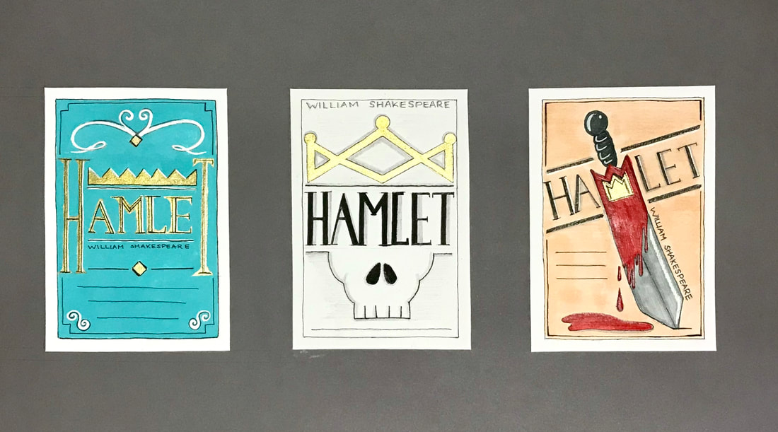 Fashion editorial storytelling refers to visual photographic stories used commercially and is considered to be a creative way of revealing the attitudes and tastes of the time, as well as woman self image. However, there are doubts as to whether it is to be considered a serious form of art or that it lacks in artistic integrity. After scanning through a few fashion publications, I chose to critique some fashion stories from the December 2019 issue of 'Elle' magazine. The first was called 'The Late Show' and illustrates the best dresses and coats for an audience interested in fashion for the party season. It depicts the models glamorously, using photographic imagery with playful poses, various candid shots and dark filters that make them look as if they were actually taken at a party. The typography is interesting as it contains a gentle mixture of serif fonts in addition to added curves and italics onto some of the letters. I think this could be said to represent the strength of the female but also the soft femininity of some of the elements of clothing advertised. Composition of the pages is kept slightly varied to give more interest, having some pages as single framed images and others more collage like to show a sequence of emotions and the movements of the models. Colours are also kept constant in every photo; outfits are complimented by the colours of the setting they are in. The entire piece just screams the vibe of having a good time. The second fashion story I wanted to critique is called 'Rise and Shine'; a fashion story featuring bold and colourful pieces for those who want to be noticed. The model is seen wearing a variety of interesting pieces; the photographic compositions are set in the streets to highlight the idea of standing out from the crowd. In addition the backgrounds are given slight pops of colour in contrast to the darker looking clothing, giving the images more interest. Poses are also mixed up, ranging from purposeful, typical type poses to more candid ones of the model walking through the street to give it a more real life feel, using natural light to capture the reflections of some of the shiny pieces. The typography is kept relatively simple, using a clean bold sans serif type face, leaving the real eye-catching parts to the photographic images themselves. Layout of images is also kept simple with constant use of covering the whole page and some double page spreads. The collage 'Just what is it that makes todays homes so different, so appealing?' was created by Richard Hamilton and is considered to be the first iconic piece of pop art. It was created in 1956 for the exhibition 'This is Tomorrow' held in London and represents the theme of consumerism, social culture and visions of the future. Hamilton incorporated categories into his collage such as man, food, history, TV and technology, some of which I tried to include in my own 2019 response. Beginning with an image of a modern living room, I digitally added elements such as a poster and ballot box to represent the current political affairs going on such as the current election, as well as an image of the Australia wildfires seen through the window. In addition, I wanted to represent the popularity of selfie taking during this time, choosing to also include a logo for veganism on the mans shirt, a movement really starting to become popular. For technology, I chose to incorporate the TV showing the logo for Netflix, as well as the newest iPad Pro by Apple displaying the logo for the Ticktock app, an application many people seem to be fans of. Finally, to represent TV/film, I wanted to include the character Simba from the newest release of The Lion King, which was hyped up a lot this year. |
AuthorHi, I'm Emma. I'm currently studying Graphic Design at the University of Cumbria. Modules
All
Archives
March 2020
|

 RSS Feed