
|
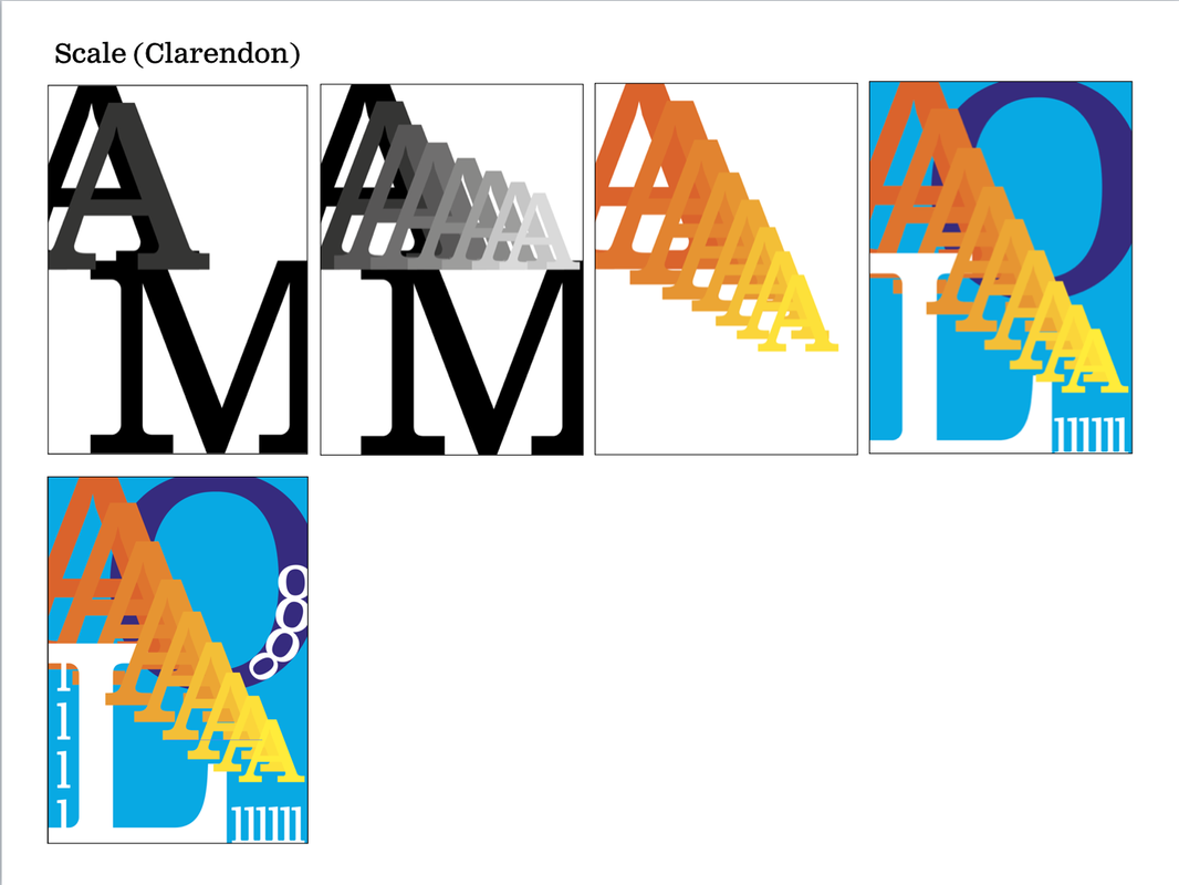
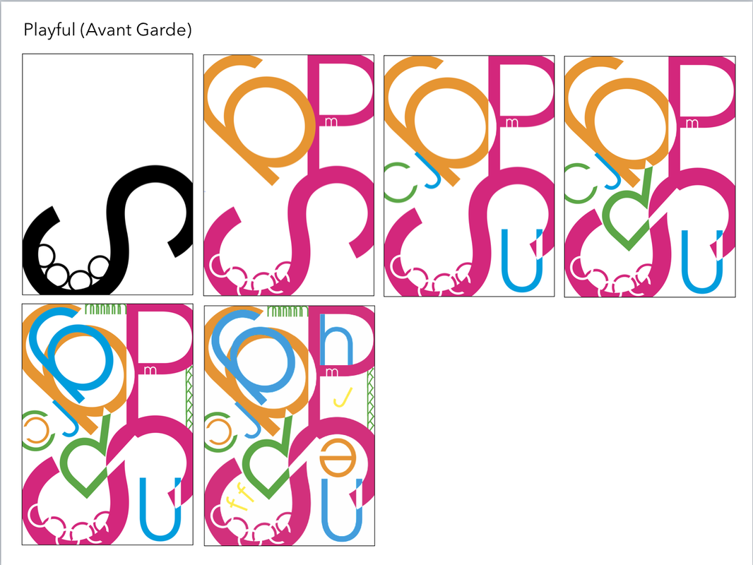
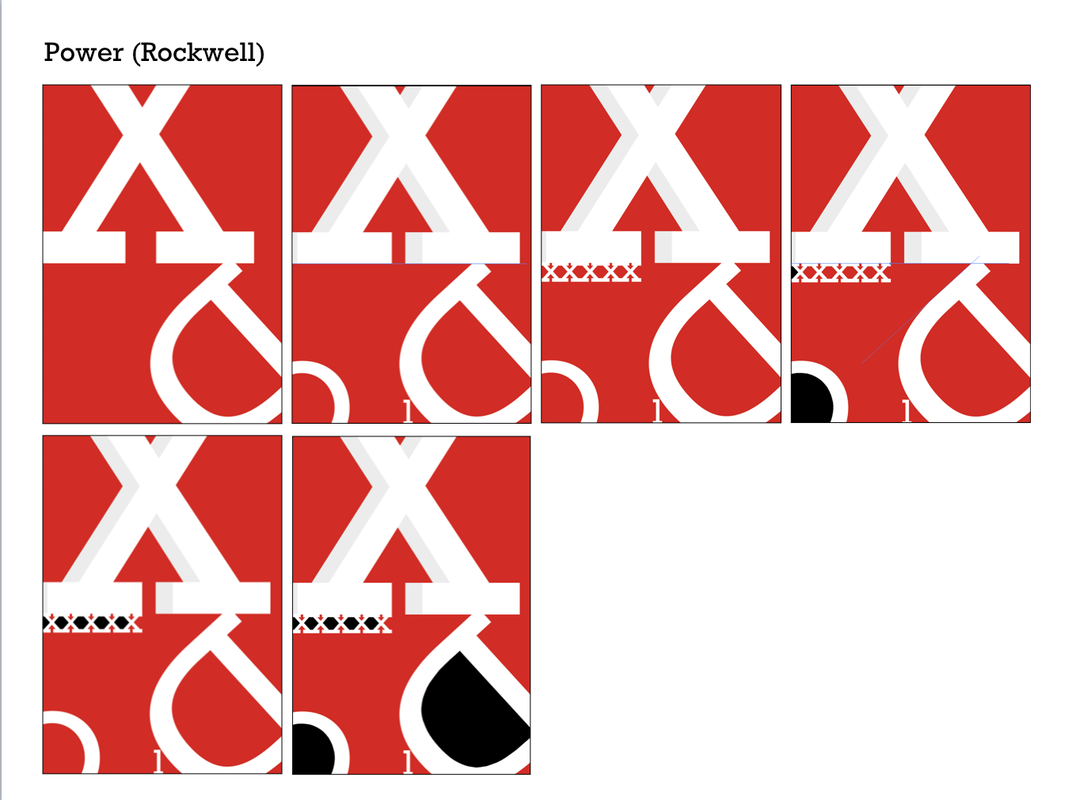
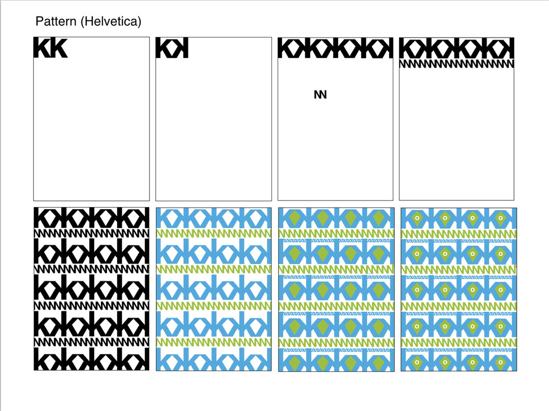
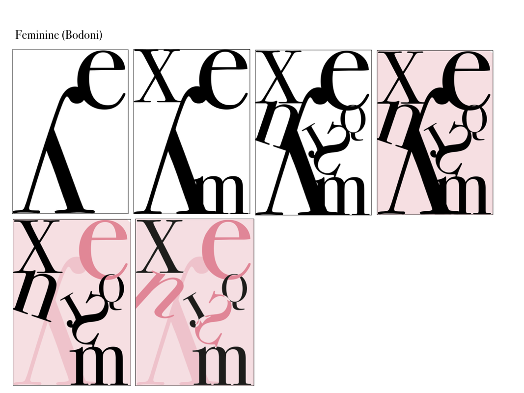
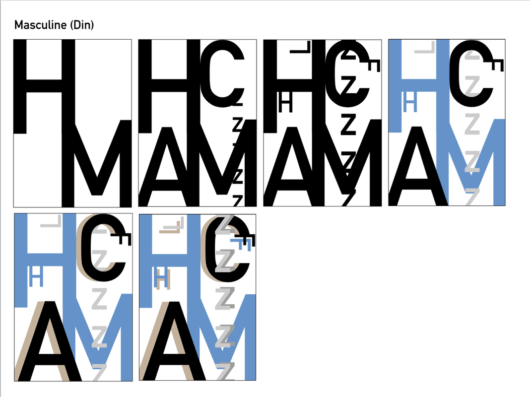
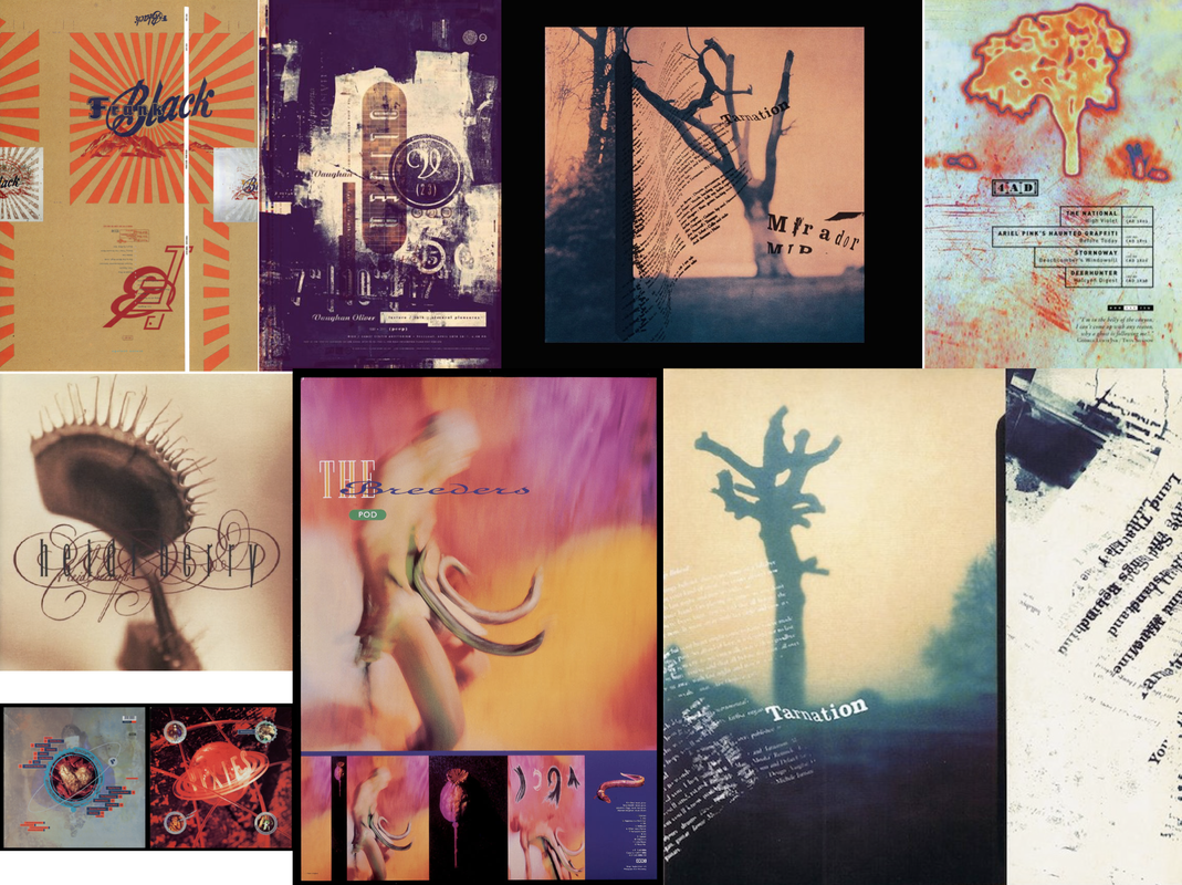
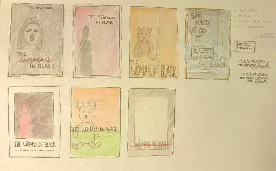
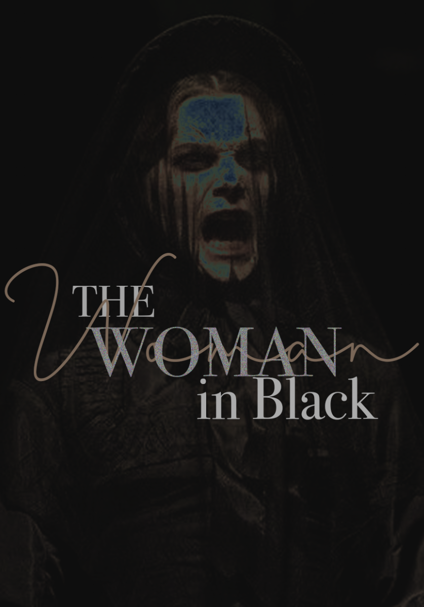
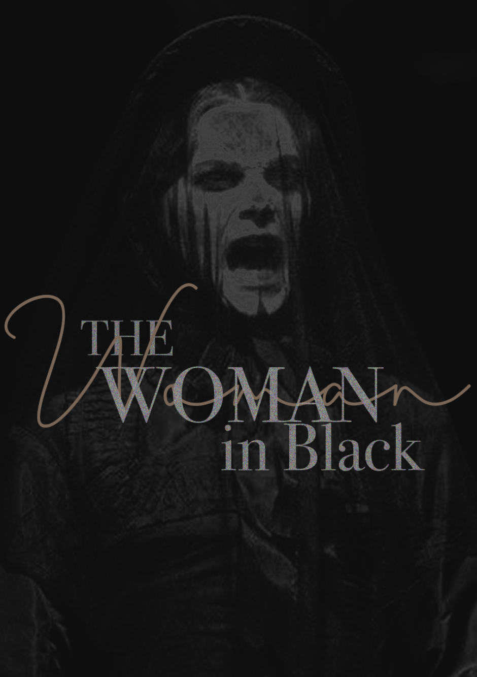
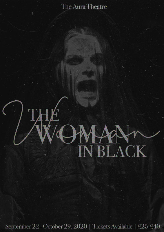
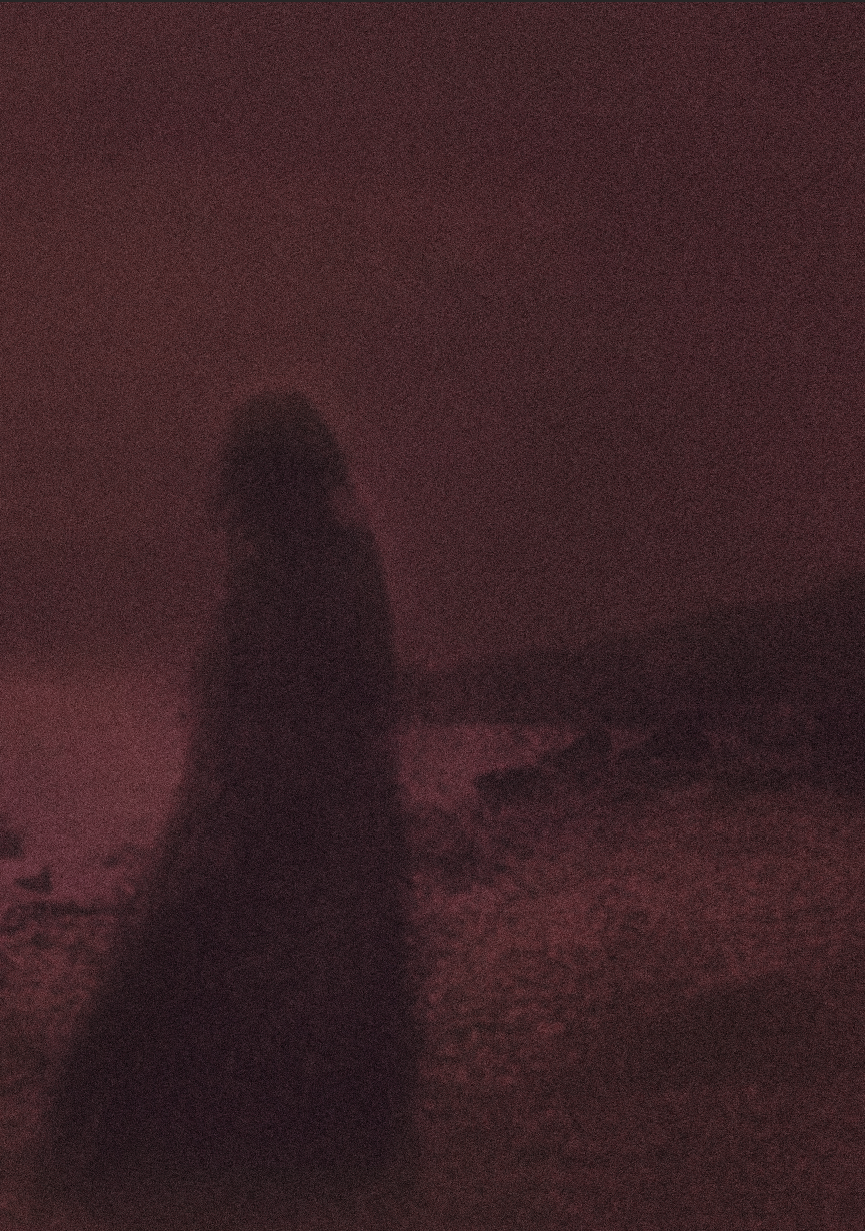
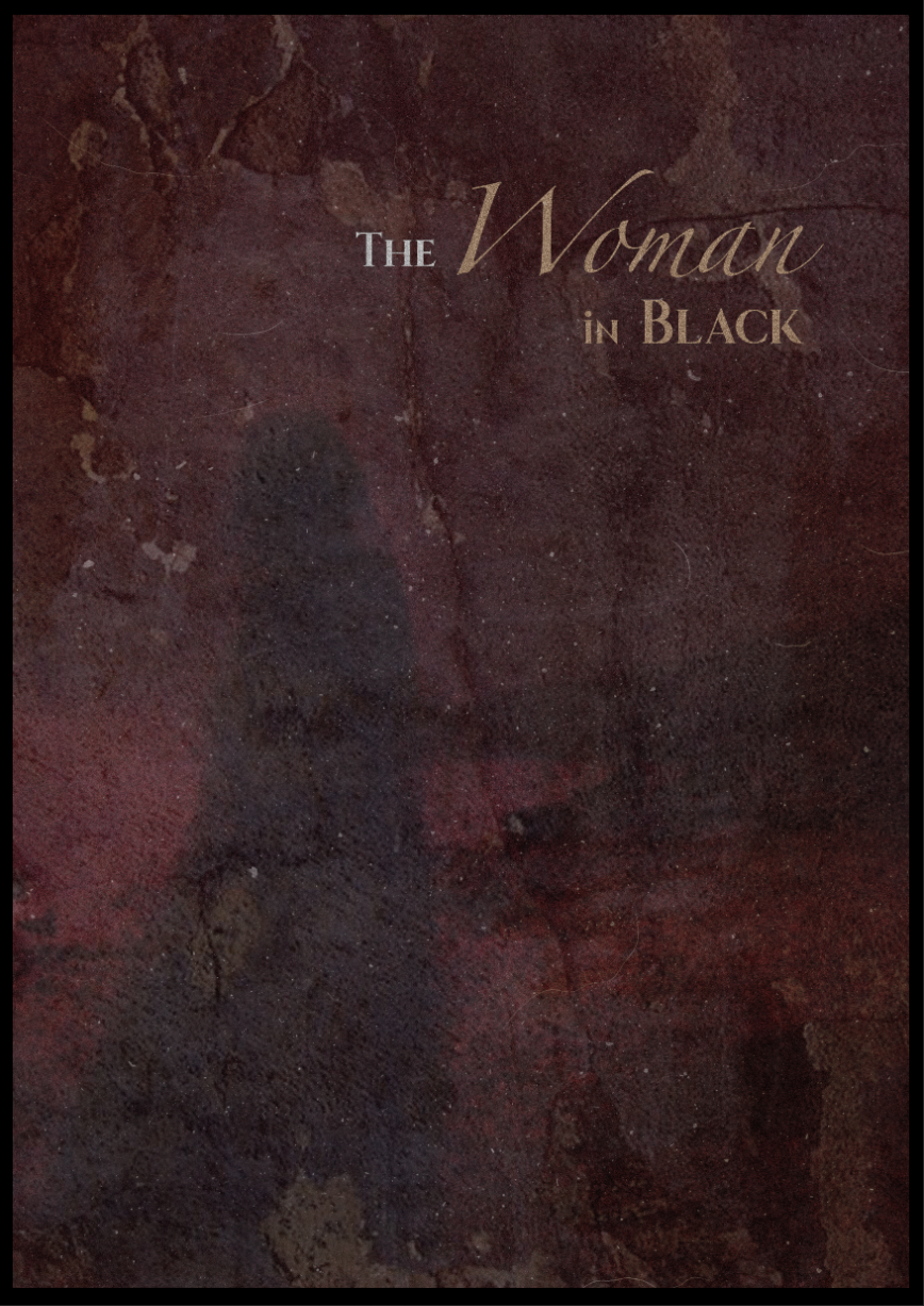
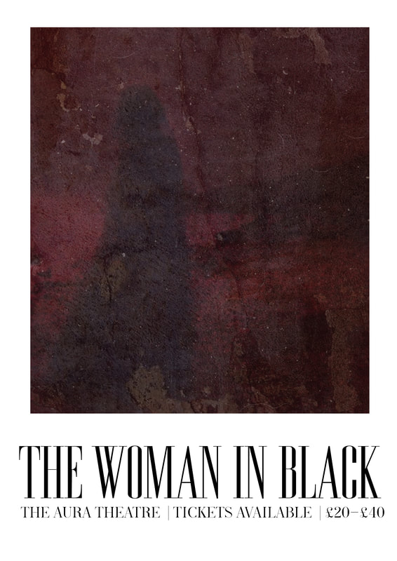
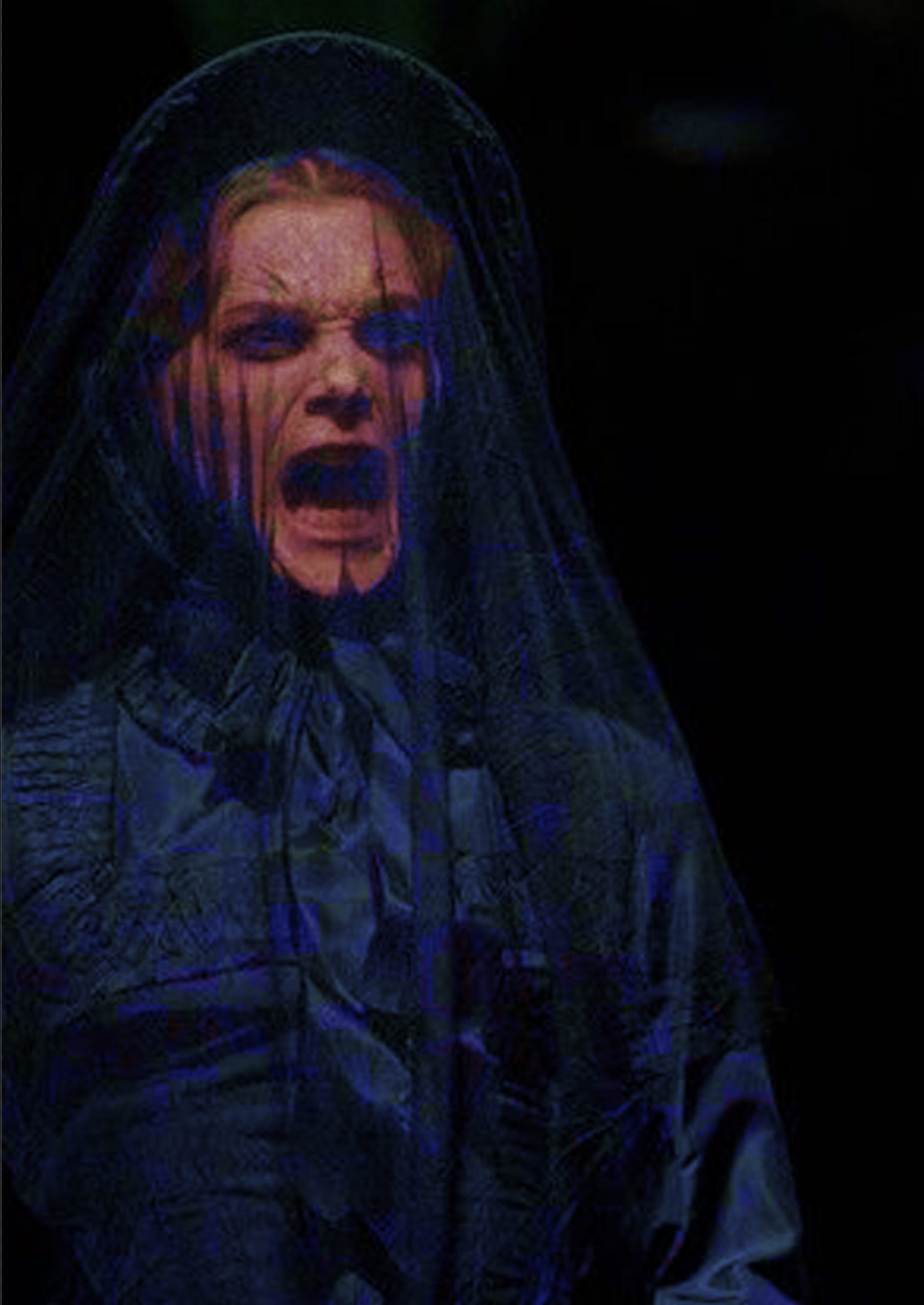
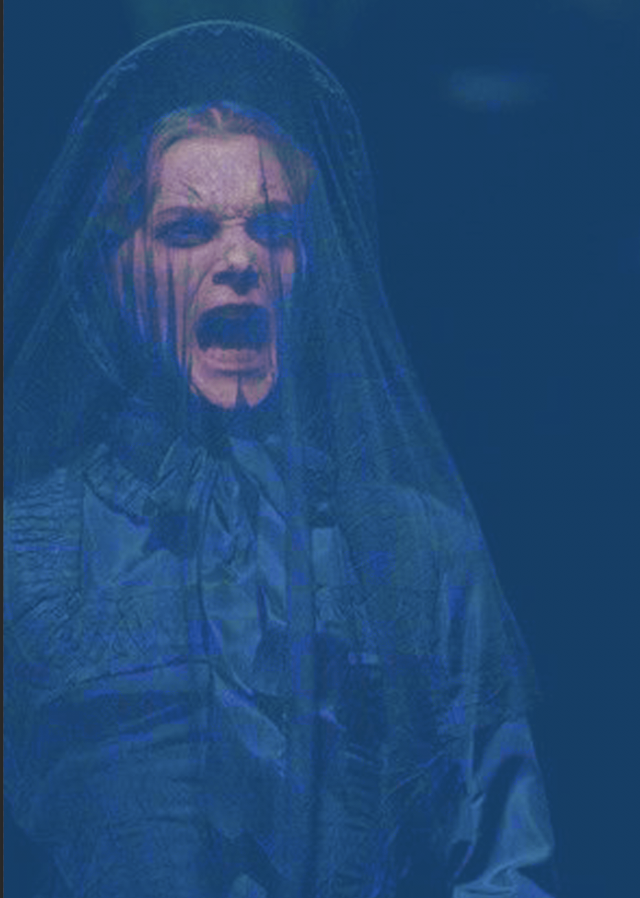
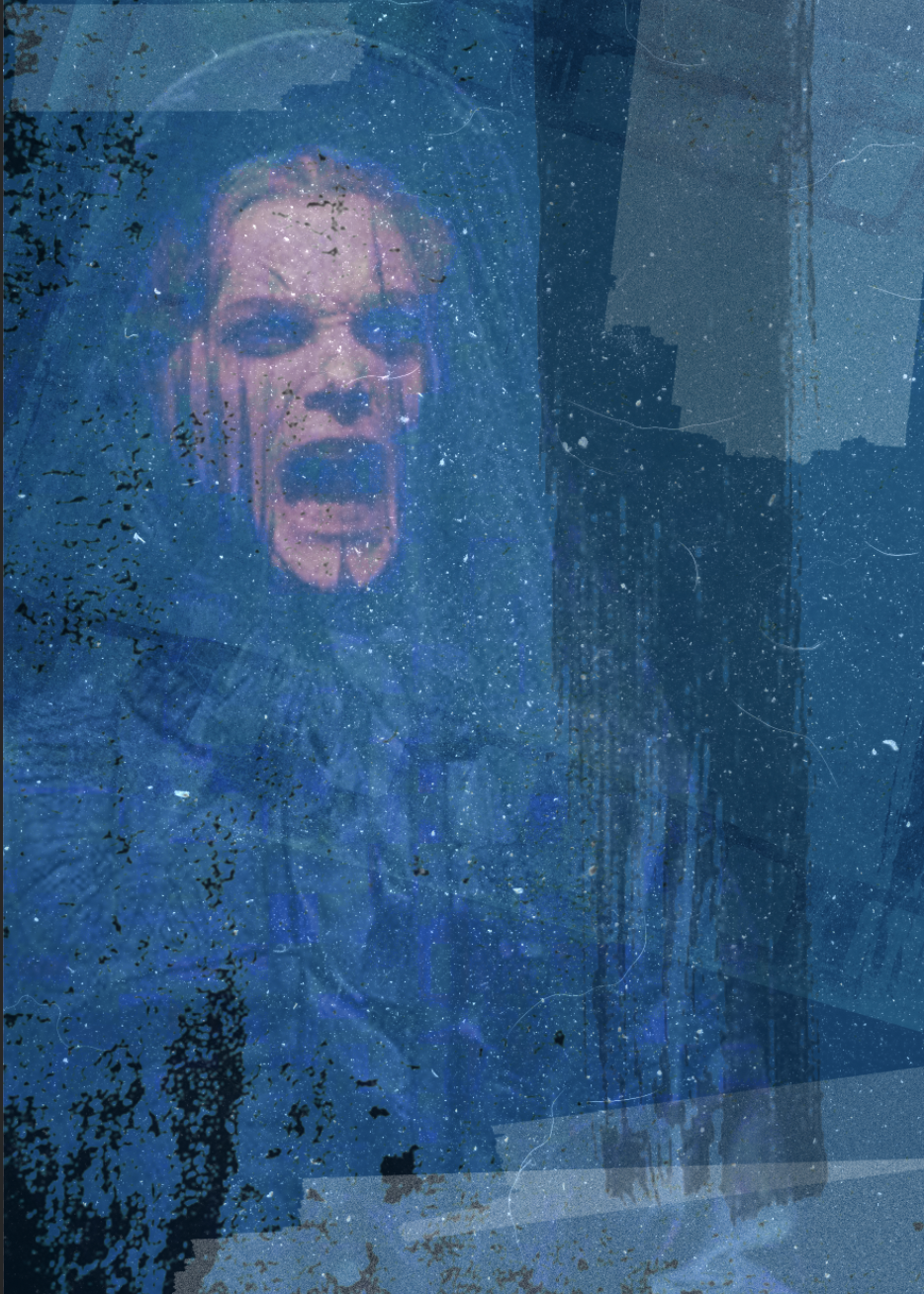
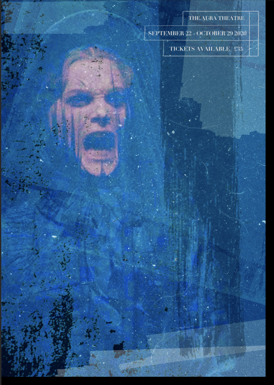
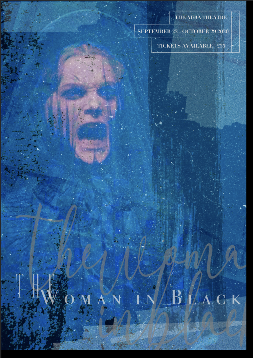
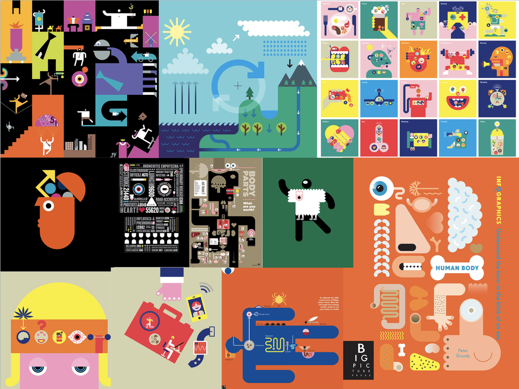
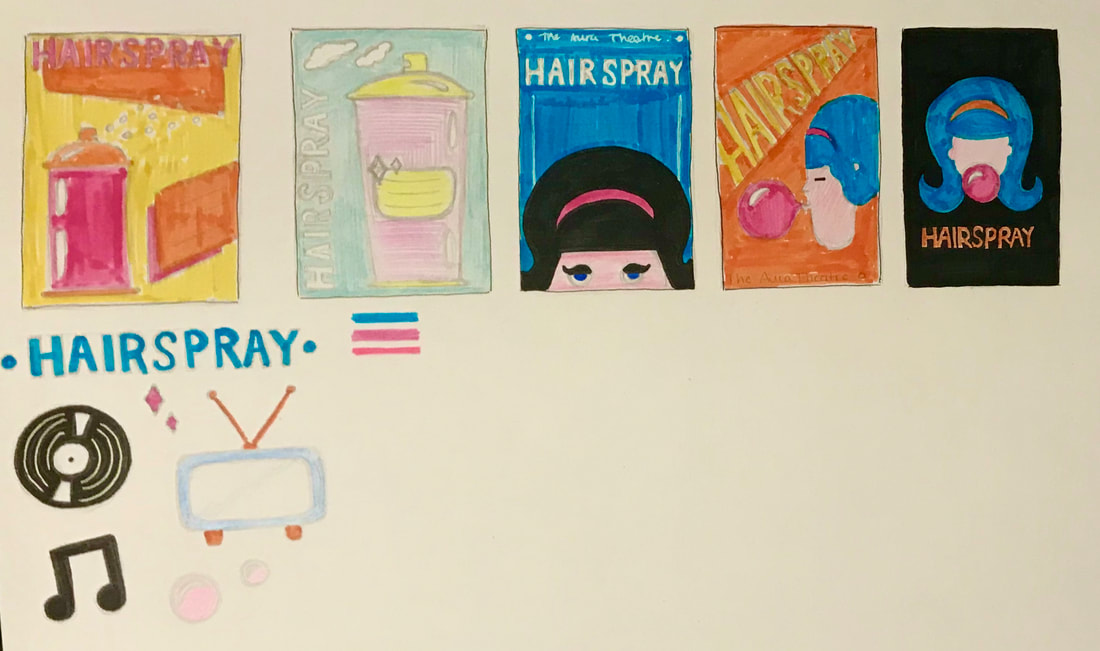
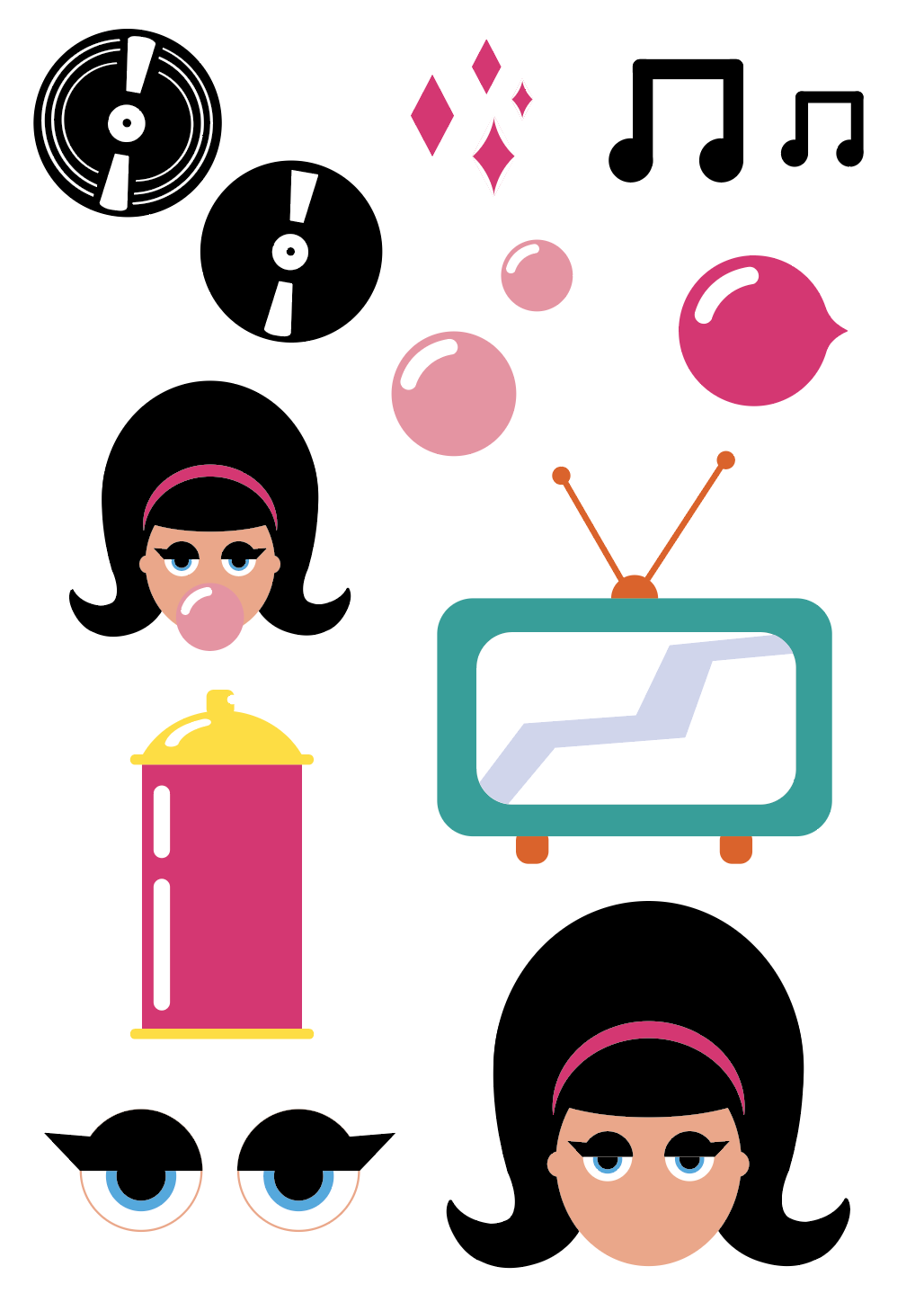
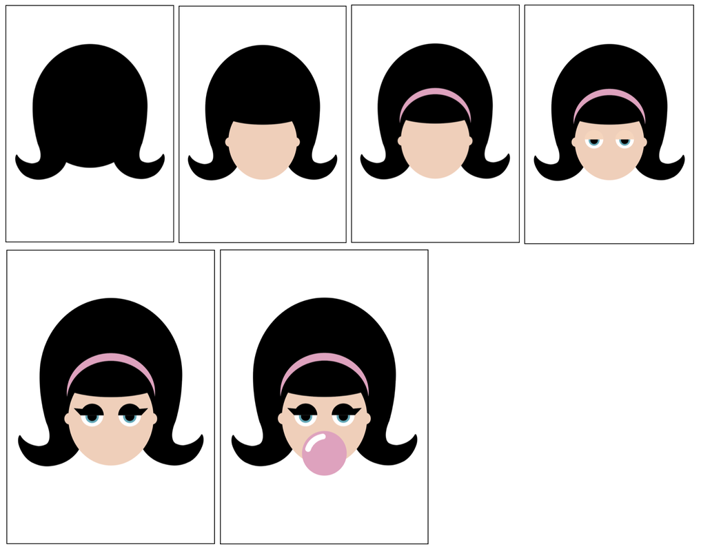
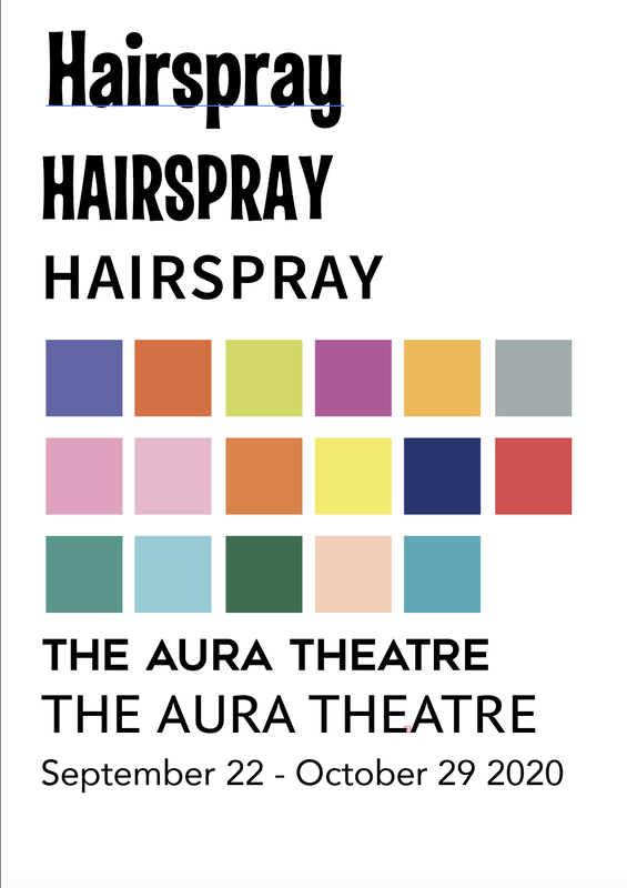
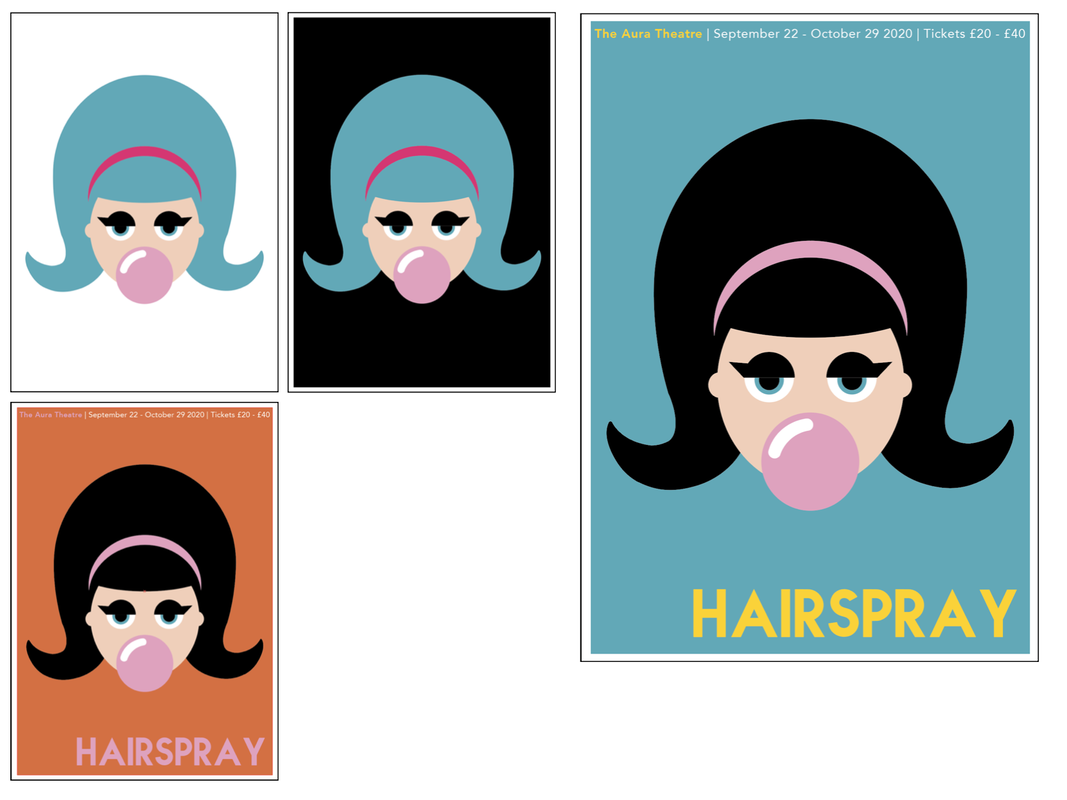
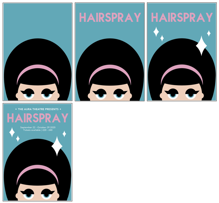
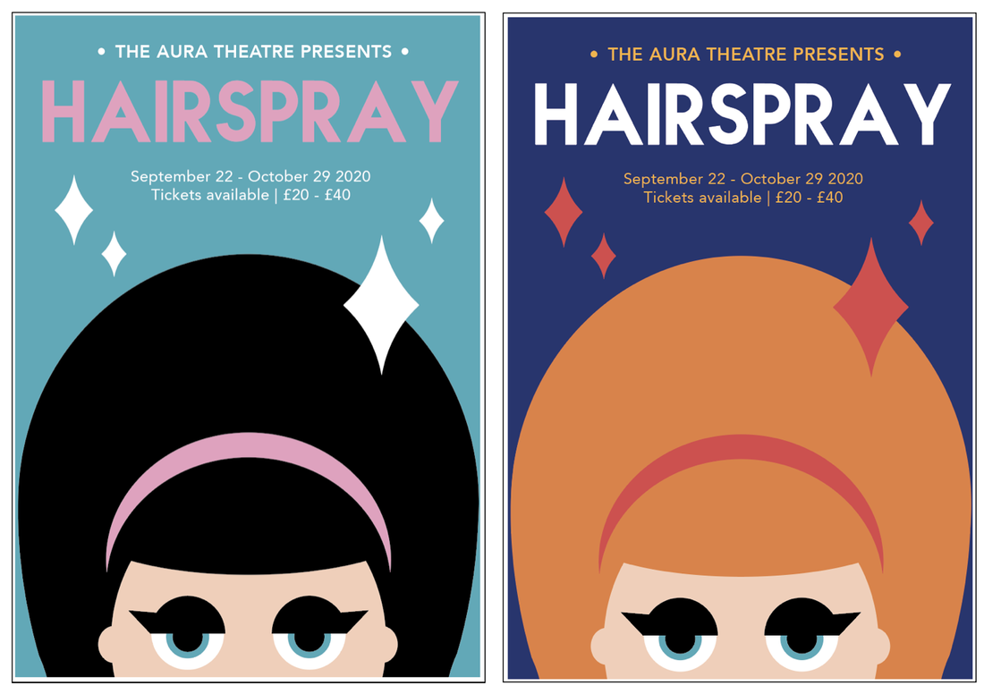
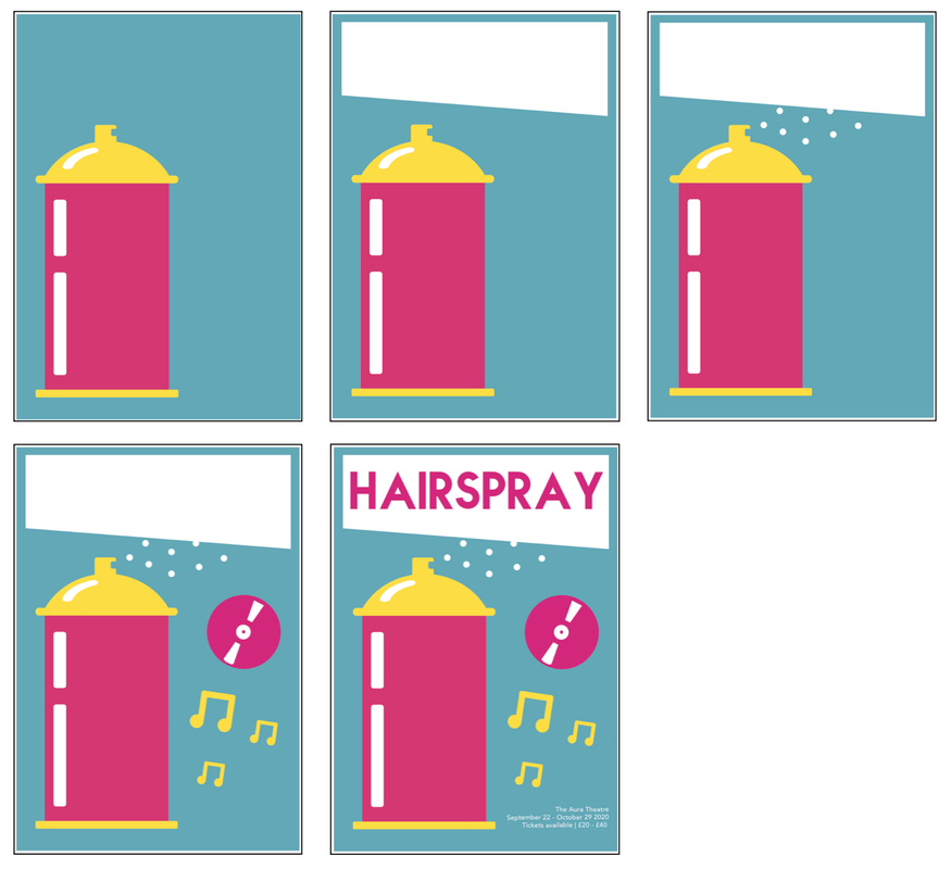
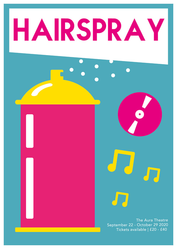
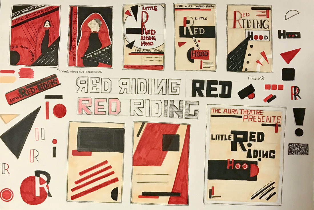
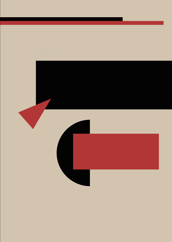
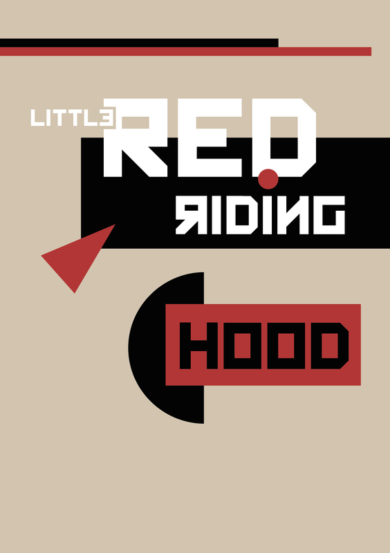
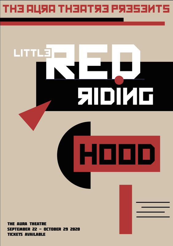
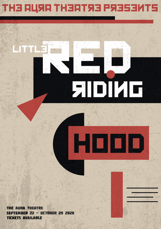
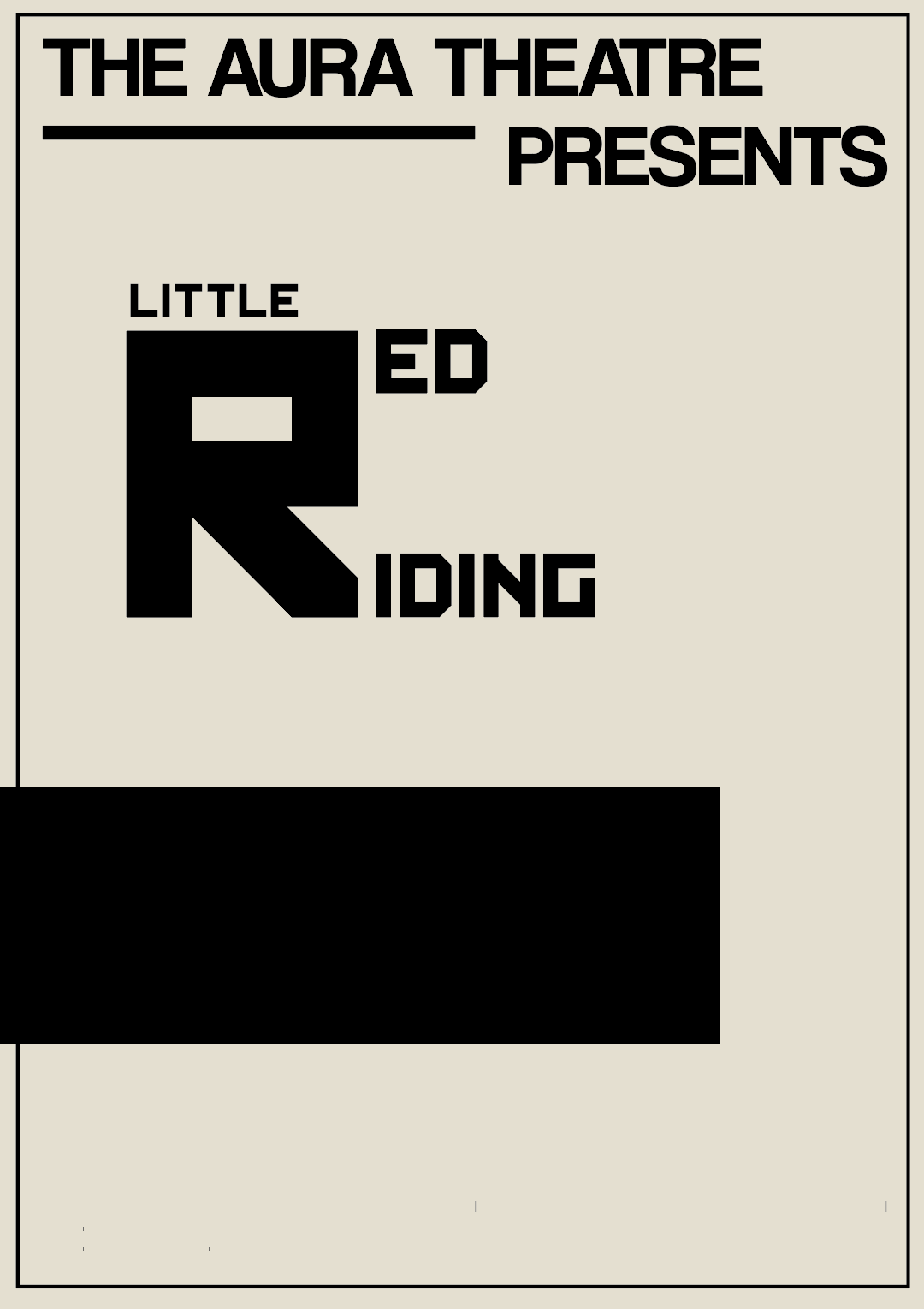
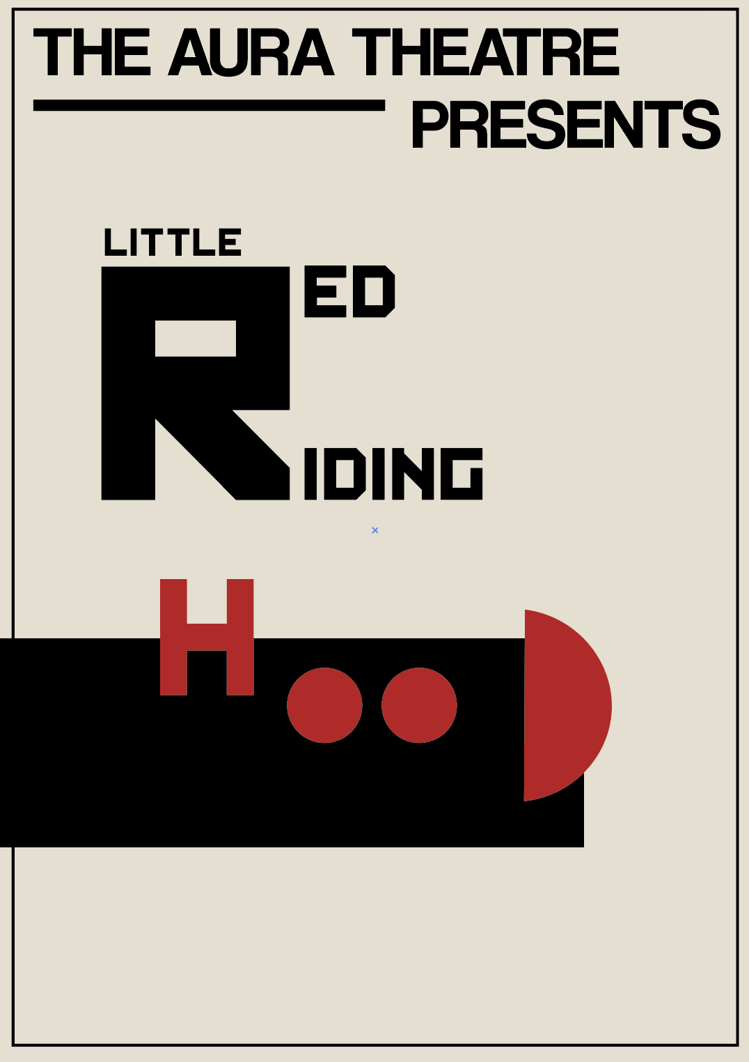
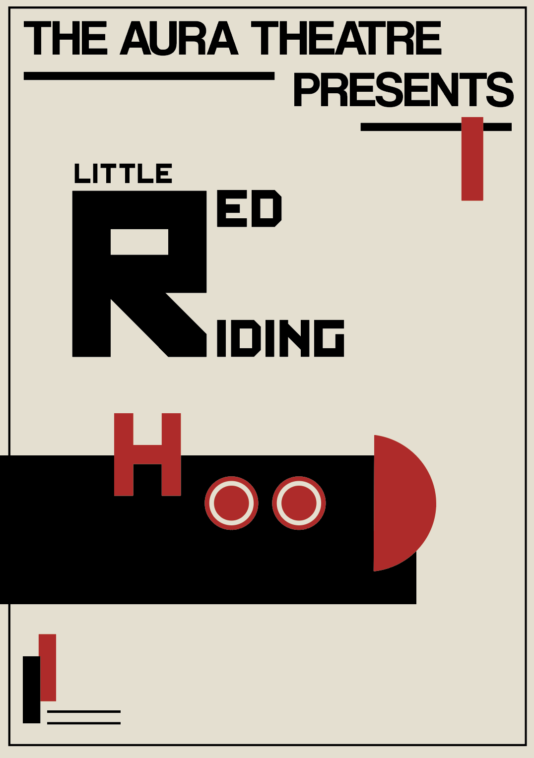
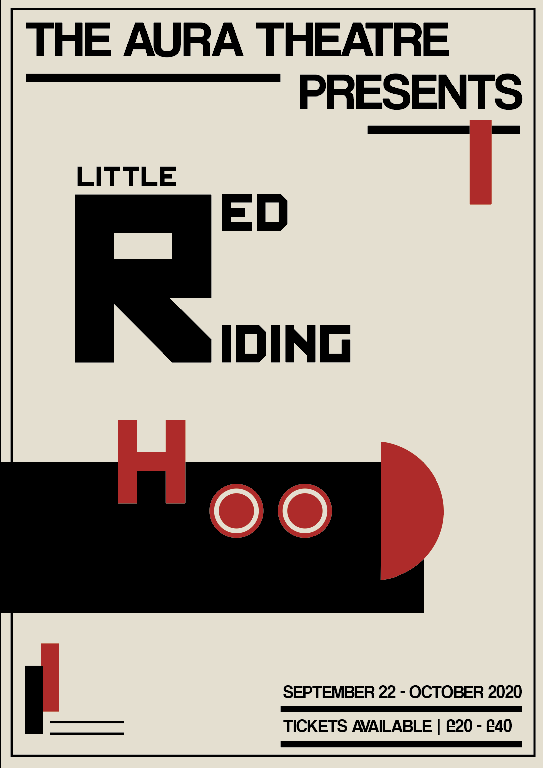
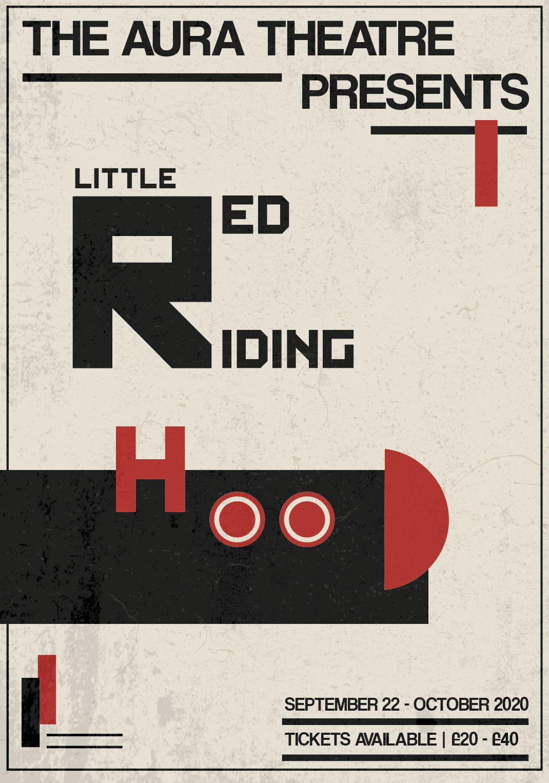
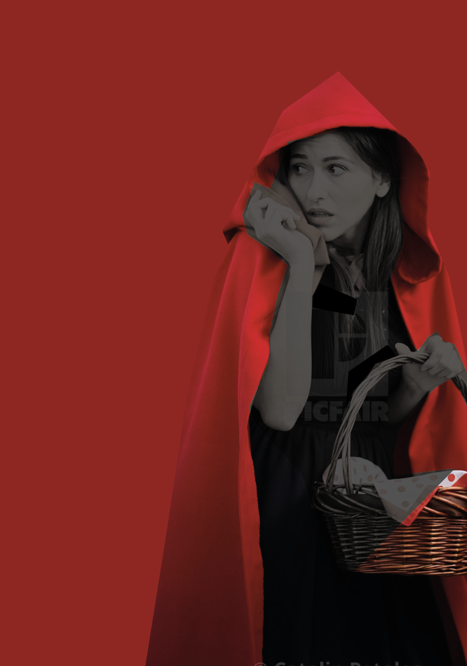
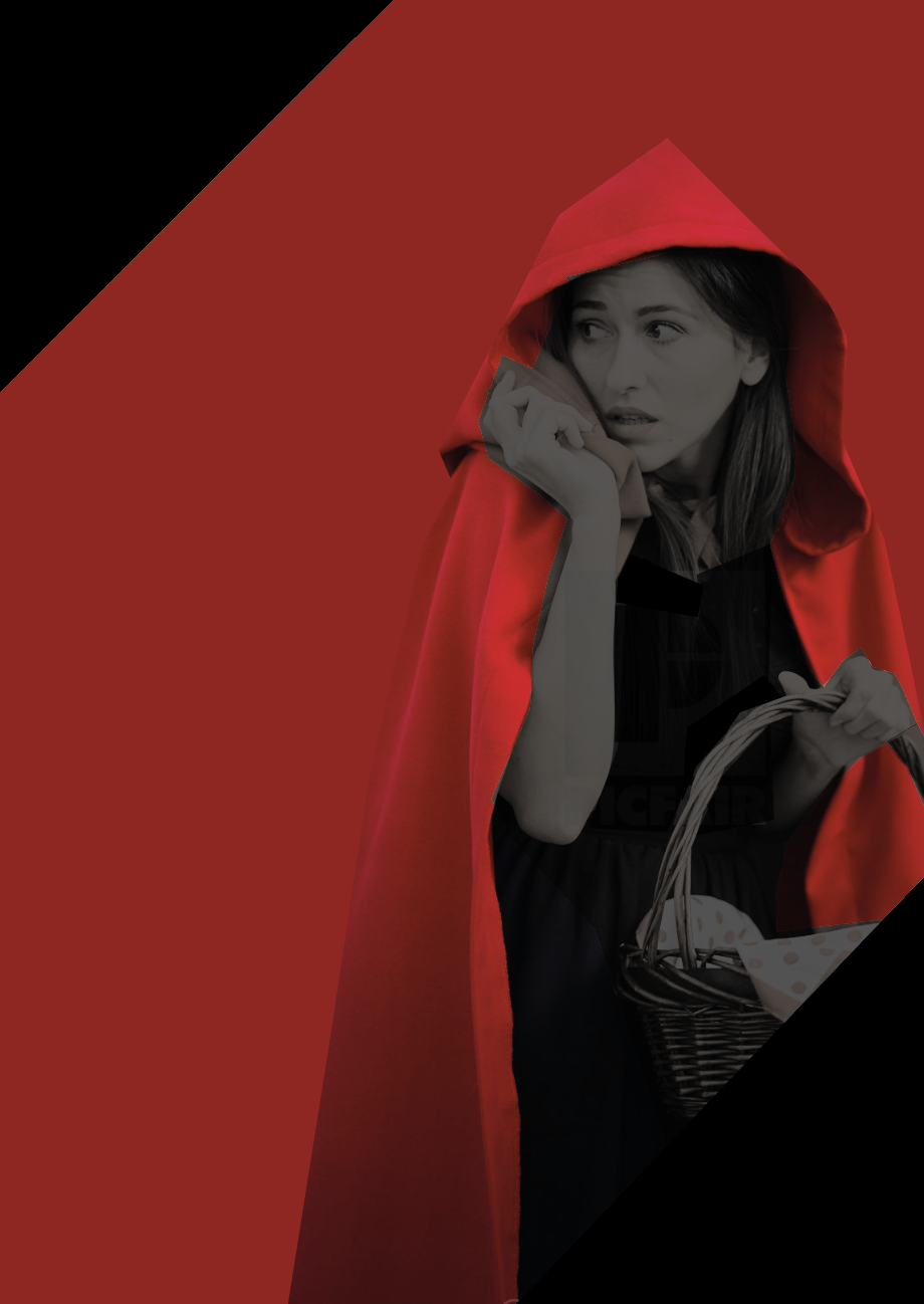
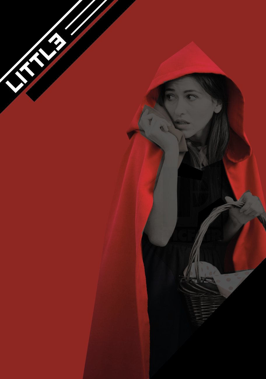
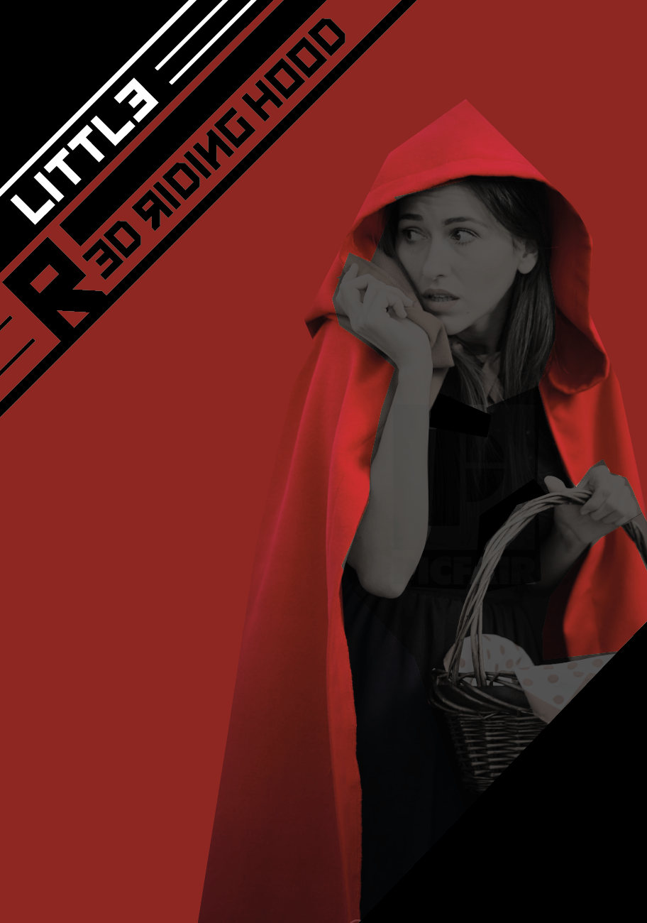
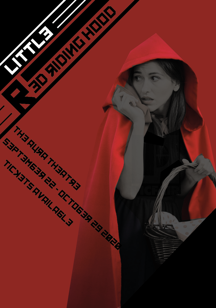
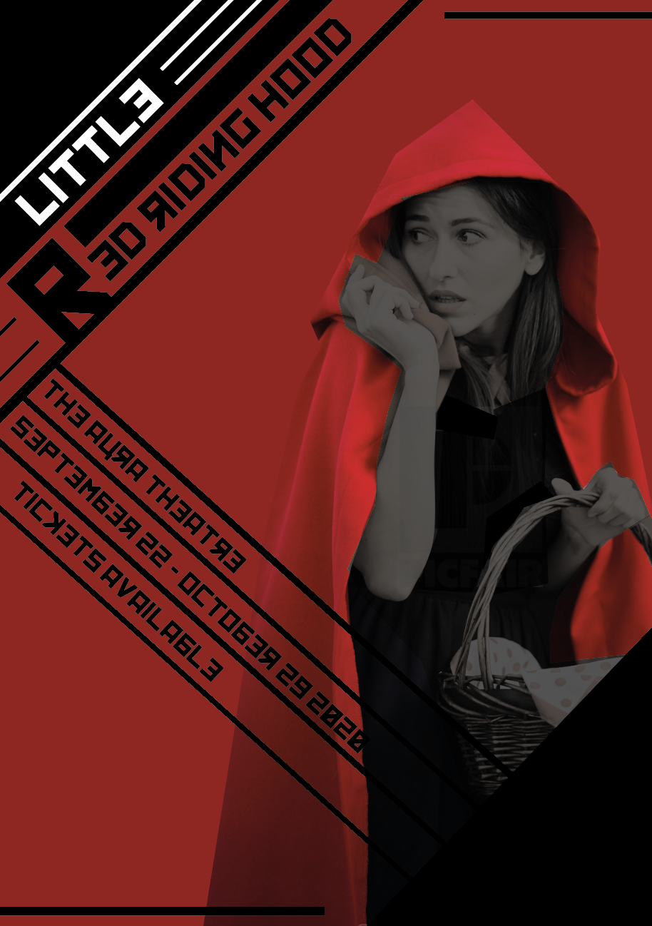
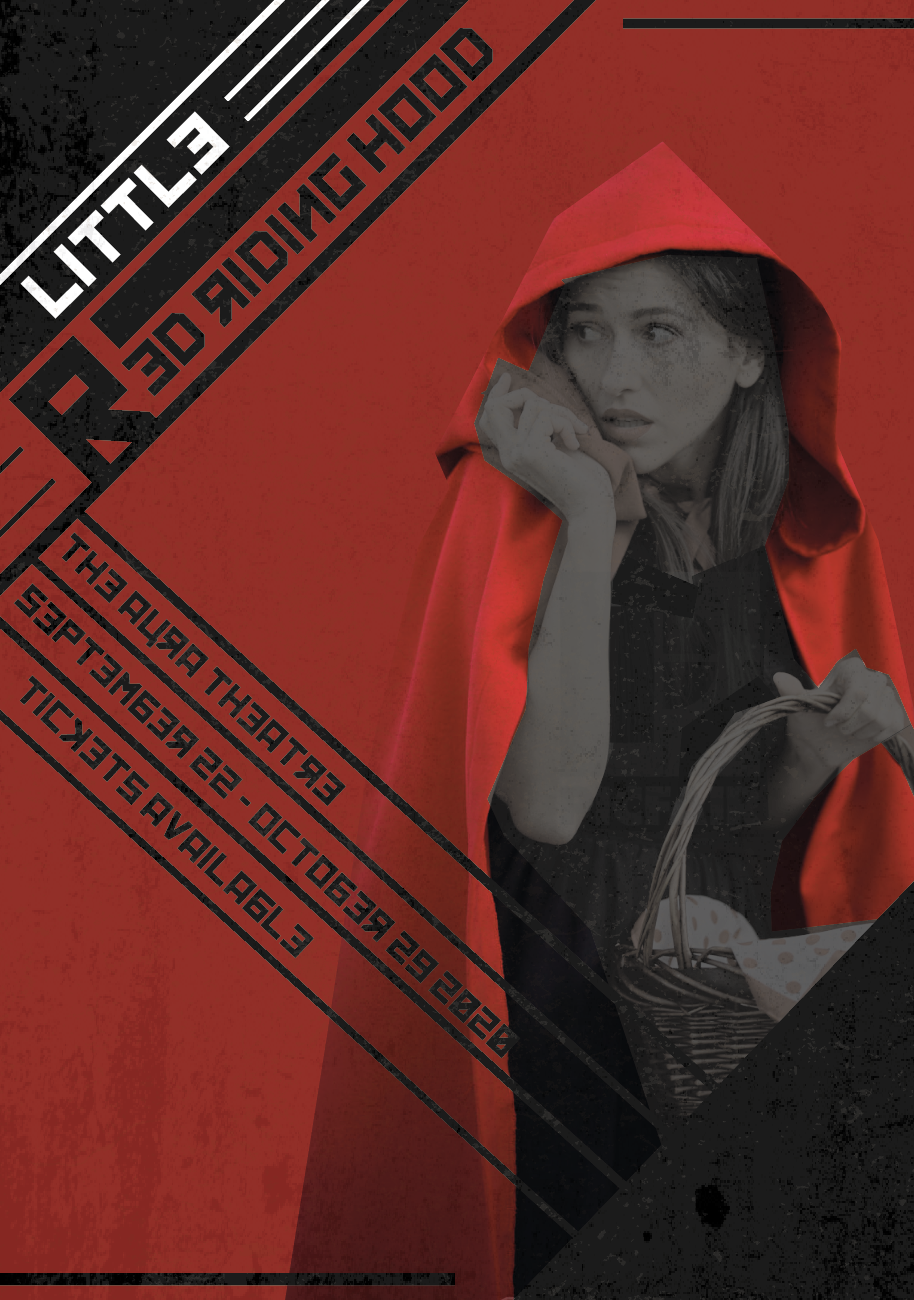
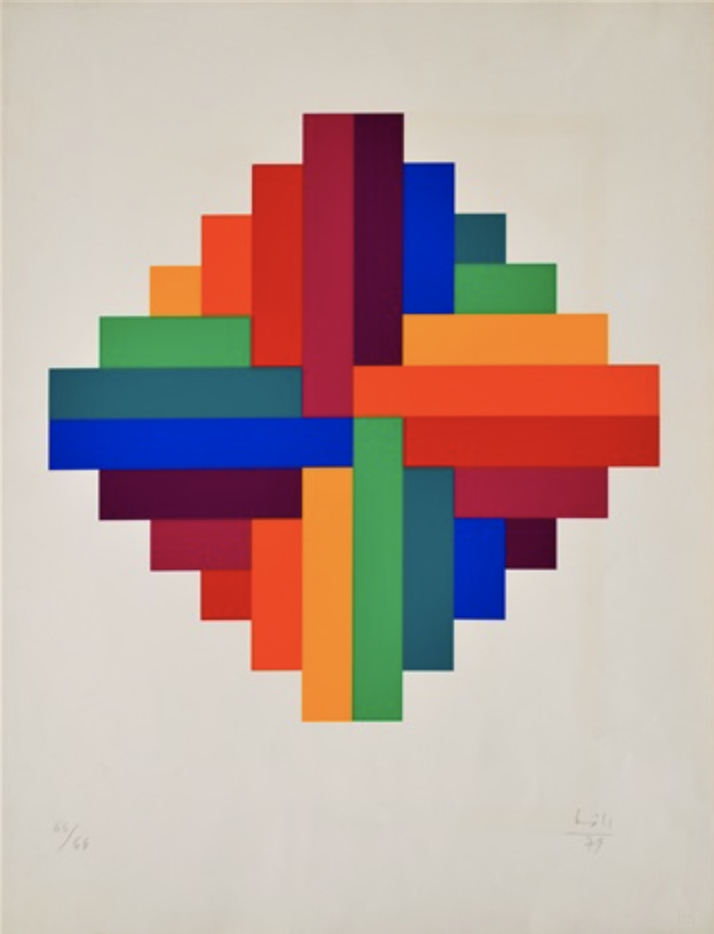
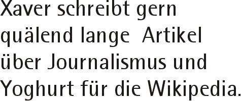
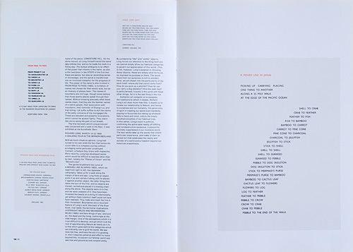
The first two weeks of this project revolved around exploring how colour and arrangement are a crucial part of visual communication, working using both analog and digital processes. Colour Theory To start the analog activities, we had to paint a colour wheel using only red, blue and yellow paint, showing the primary, secondary and tertiary colours. Next to this we had to create two sixteen step tonal scales, one using just black and white paint and the other using black and white along with one of secondary colours we mixed for the colour wheel, attempting to make each step tonally identical to the grey scale. 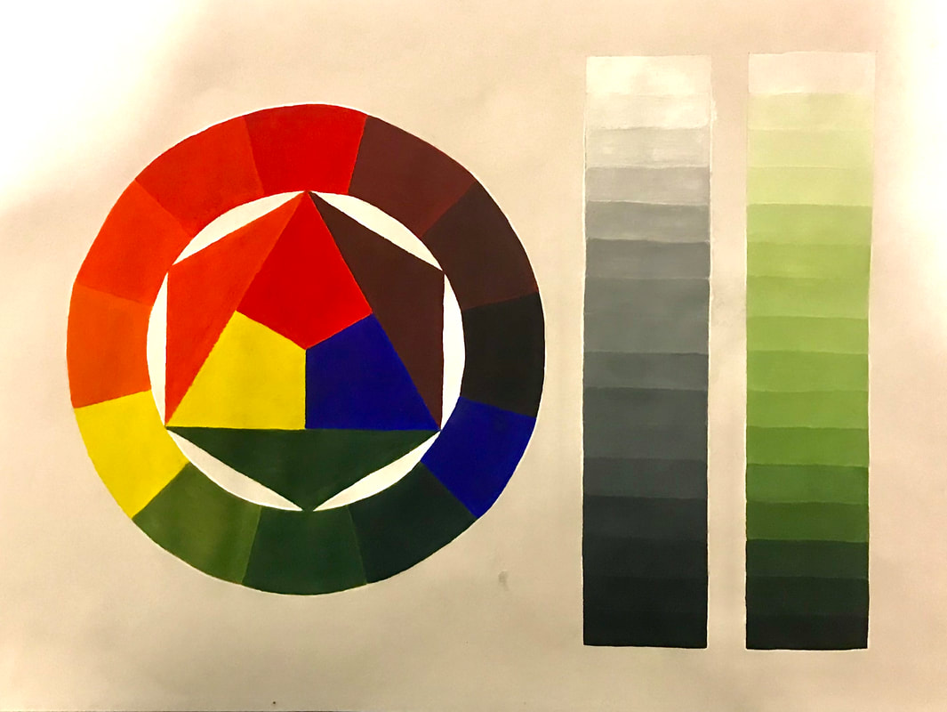 We then moved on to re-create the classic Bauhaus colour and personality exercise in order to explore the potential of colour communication. Using square grids we had to use the three primary colours along with black and white to mix colours we liked, making sure every square was different. We then had to use the same technique to create arrangements of coloured squares that communicated 'Mumbai, a rainforest, Blackpool, a misty morning, Autumn and a hospital ward. 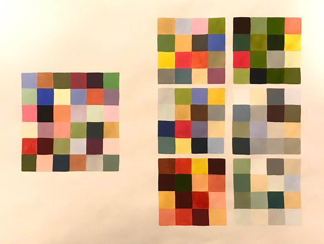 Designing with Type Our next task required us to use only letterforms to create six final digital typographic designs using given typefaces in combination with as many colours as we saw fit in order to answer a 'problem'. The point was to help us explore the infinite possibility of shape, arrangement, colour and contrast as tools to communicate.       Using Adobe Illustrator, the process of creating these type designs can be seen through the screen grabs below: Colour Materials and Abstract Collage Another analog activity required us to explore the possibilities of paint, coloured paper and glue to create arrangements and experiment creating pleasing compositions to set us up for our next lecture. 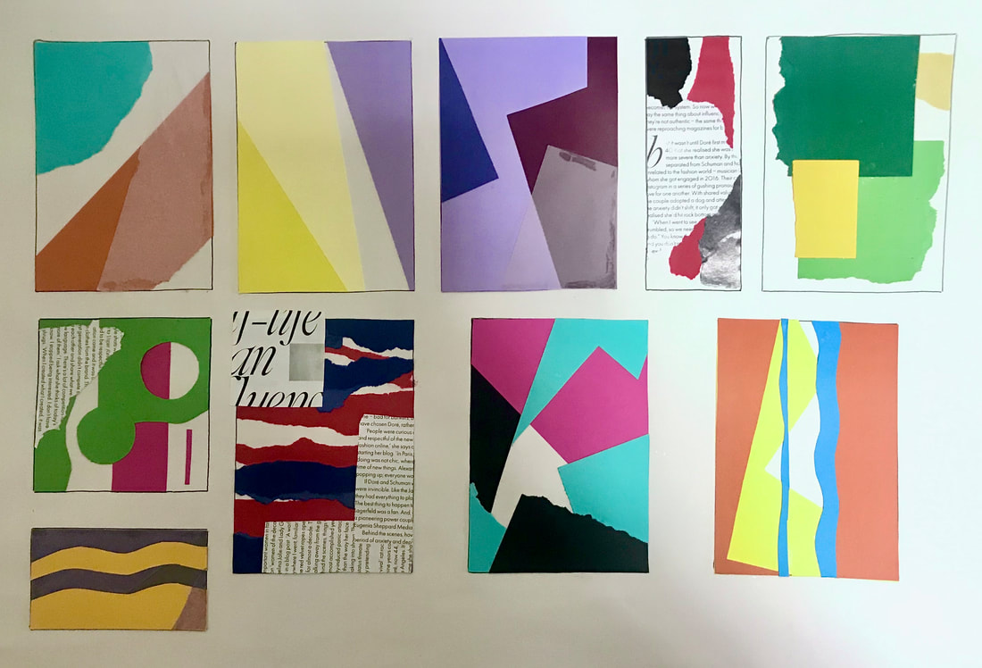 Composition This week we had to research and work in the style of three designers: Vaughan Oliver, Peter Grundy and El Lissitzky. The aim was to understand the key elements of their work; how they use composition, colour, type, imagery, and replicate their styles using Adobe InDesign, Illustrator and Photoshop. We had to produce A3 posters in the style of each of the designers for the theatre productions: Little Red Riding Hood, The Woman in Black and Hairspray. Vaughan Oliver/The Woman in Black Vaughan Oliver is best known for his work designing album covers for The Pixies, combining dark photography and experimental typography, and using digital and analog techniques. I collated a few of his works together to use as inspiration, all found on Google Images. For my thumbnail sketches, tried to play around a little with different poster layouts and placements for the typography as well as a few ideas of what kind of imagery I wanted to use to represent the theatre production. I chose to use this artist for 'The Woman in Black' due to it incorporating such dark imagery and texture, which I felt fit in well with the theme of horror. I then began experimenting with some ideas using Adobe Photoshop, playing around with different filters for the imagery, (the image I used is linked here) and combining different fonts to see which looked the most pleasing. I also added texture by overlaying some dust/scratches (linked here) to make it look for worn away and old as well as noise as it looked too clean. For this design I tried to combine a serifed font with a calligraphy font. Being new to this program, I similarly experimented with some more designs (image used linked here; texture linked here). Before created my final poster, I wanted to experiment a little with combining different typefaces so see what worked well together; I tried to make them look sort of grunge. However, I did find this quite difficult. 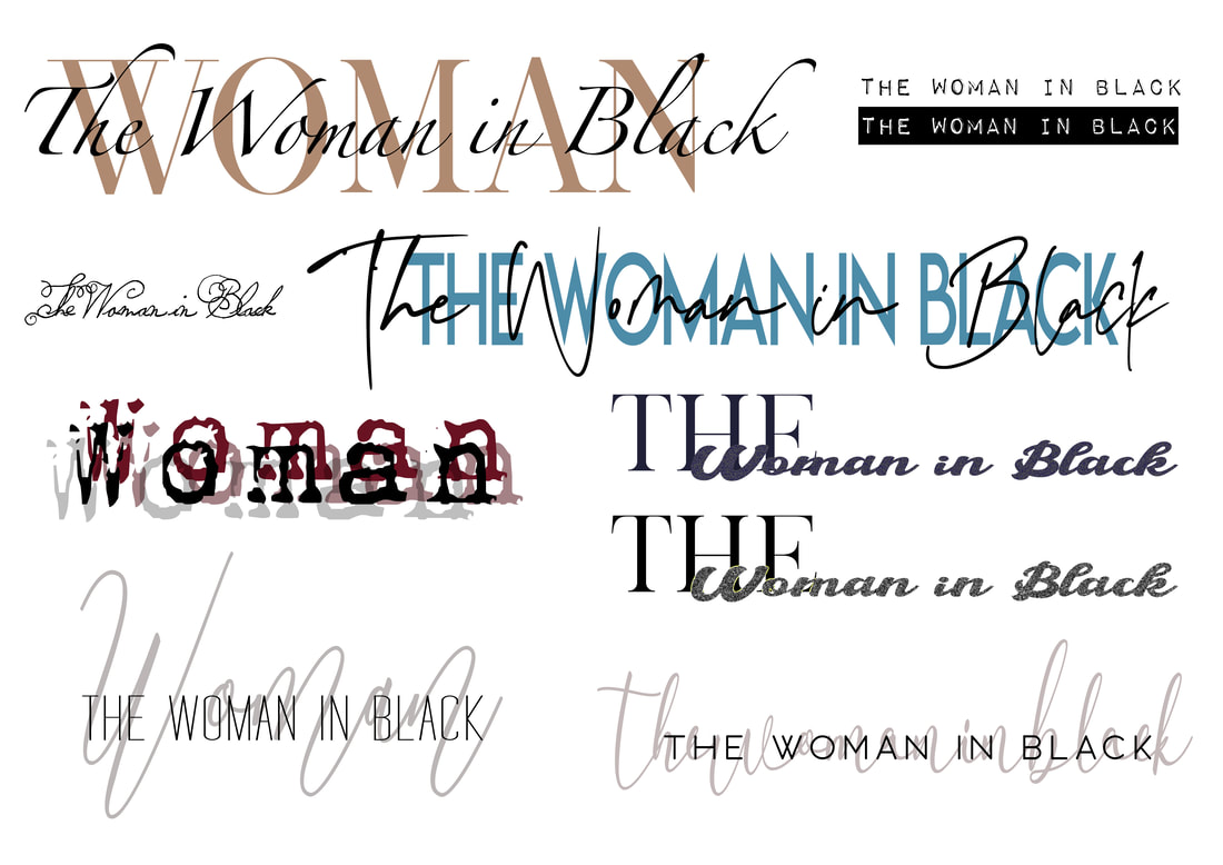 For my final poster, I used one of the images I used before, layering on different filters to make it look over exposed and grunge looking. I also added textures and noise to add to the worn away, old photo effect. I then added boxes to include the information about when and where the production is held, and then finally, I chose to use a calligraphy font in a muted colour behind two complimenting serif fonts of the title of the theatre production in order to make it pop more. Peter Grundy/Hairspray Peter Grundy is an illustrator and designer known for his work on infographics, highlighting the power of playful colour and basic shapes to communicate. I collated some images from Google to help inspire me. I then drew up a couple of thumbnails of ideas for my 'Hairspray poster'. Using Adobe Illustrator, I began by creating a few elements using vectors that I could use for my poster designs, by combining individual shapes to create images. I then experimented with some colour palettes taking inspiration from Grundy's work, as well as some simple sans serif fonts to communicate the information about the production clearly. Here I experimented with some other poster layouts. The first one I kept the type centred and added a few extra elements to create more interest. For the other design I chose to include some of the other vectors I created, focusing on using complimentary colours in order to make the poster stand out. El Lissitzky/Little Red Riding Hood I began my research by googling images of his work, collating images I found had appealing compositions that would inspire me in creating the poster. Lissitzky was most well known for his Russian modernism, constructivist designs, greatly influencing the Bauhaus movement. A master at mass communication, his limited colours and fonts created powerful dynamic geometric layouts. Looking at his work its clear he favoured a particular colour palette: red, black, white and sometimes some muted yellows, and thought that would work really well with the theatre production I chose to do in his style. When drawing up my initial thumbnail ideas, I tried to incorporate his dynamic use of layout using simple shapes, and tried to think about how to couple the shapes with the type. Some designs I also wanted to included some photographic imagery. I began using Adobe Illustrator to draw out the shapes and then added the type on top (the font was downloaded here). I didn't like the cleanliness and flatness due to it being done digitally; his actually work was hand printed, so I added some textures and noise to give it more of a printed effect. For this design I used a photographic image (found here), and using the same kind of colour palette and font I incorporate some simple line/geometric shapes. Final Posters I'm really happy with how my final posters turned out and think they reflect the artists techniques well. My abilities will improve the more I get used to using the software. 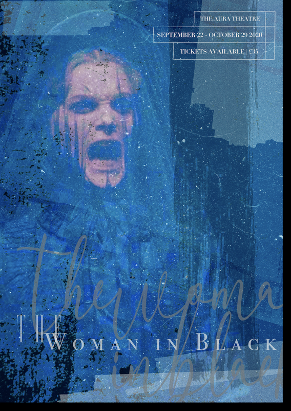 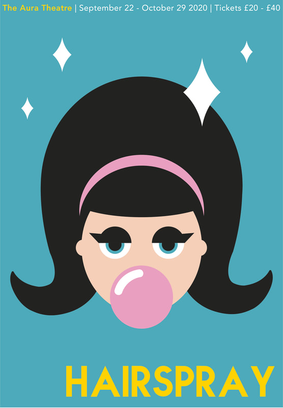 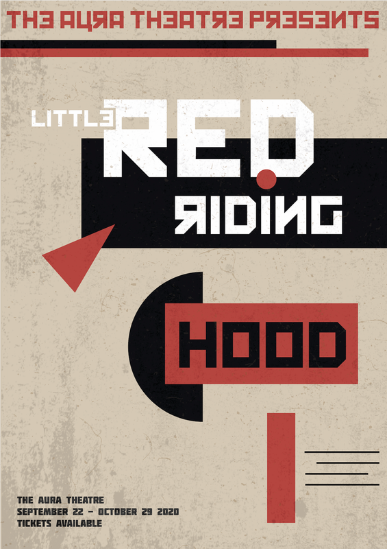
0 Comments
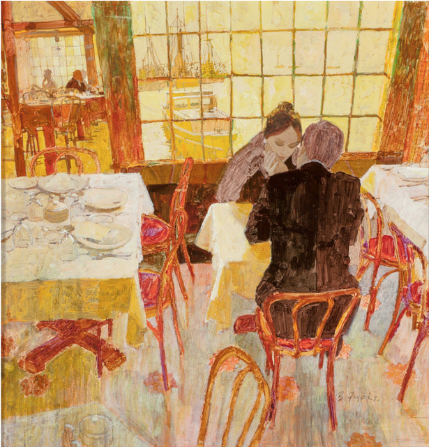
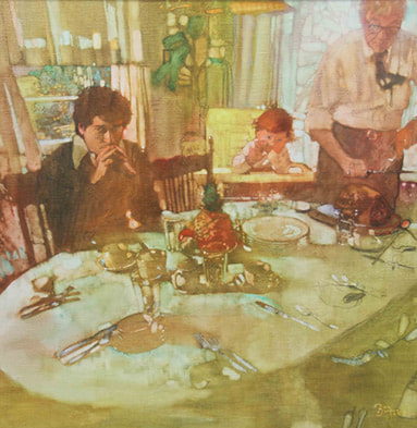
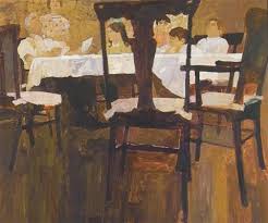
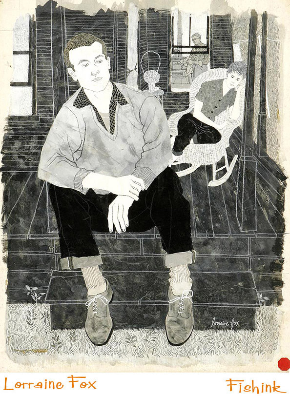
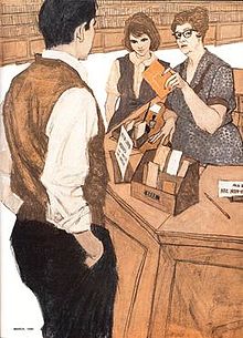
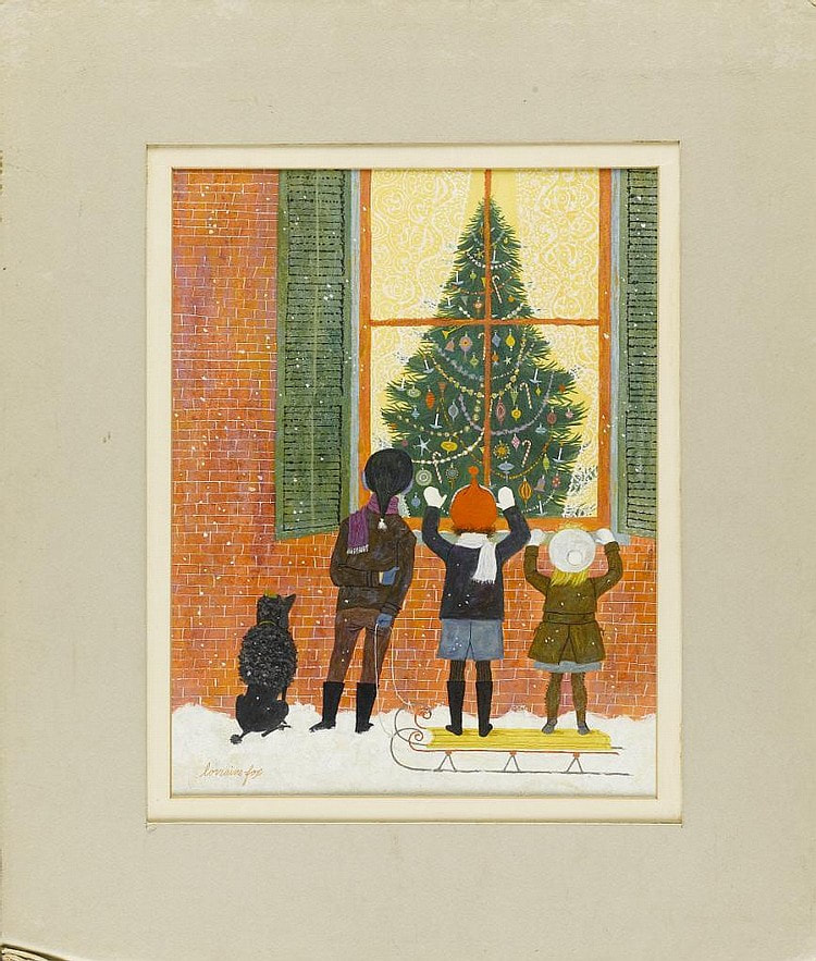
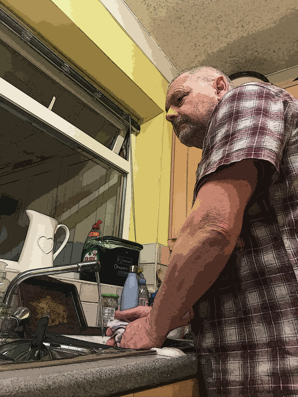
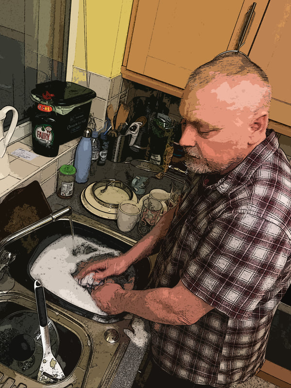
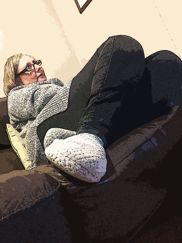
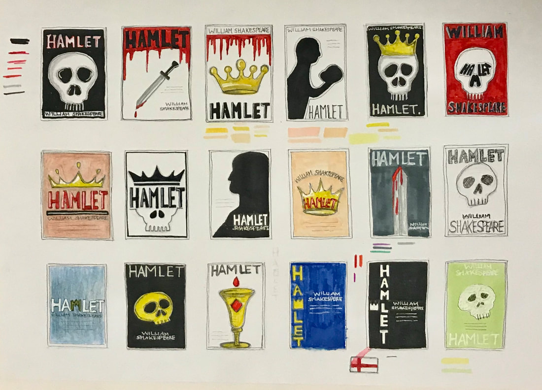
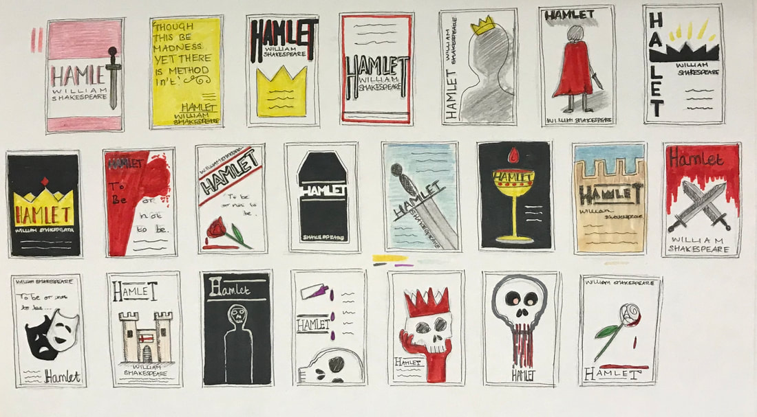
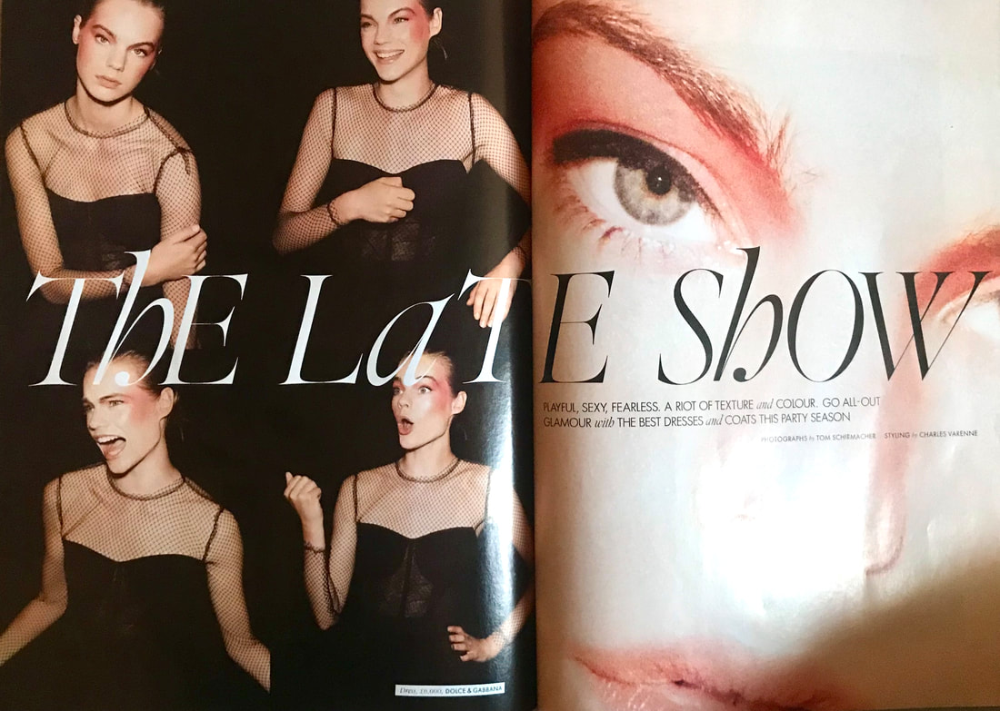
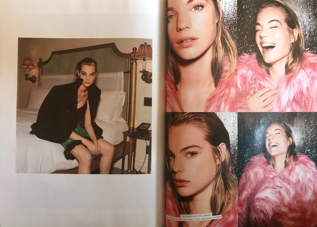
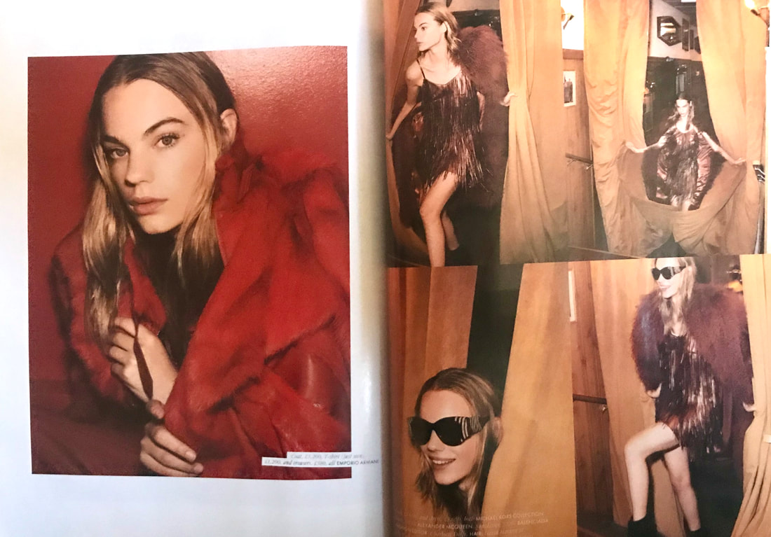
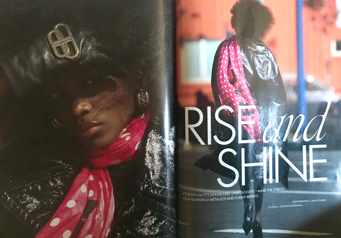
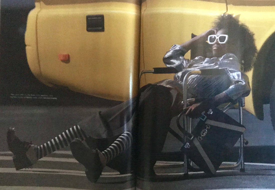
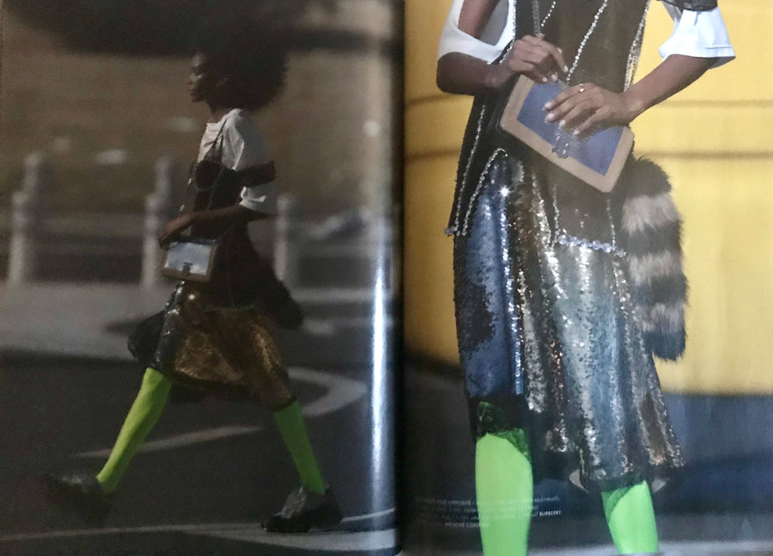
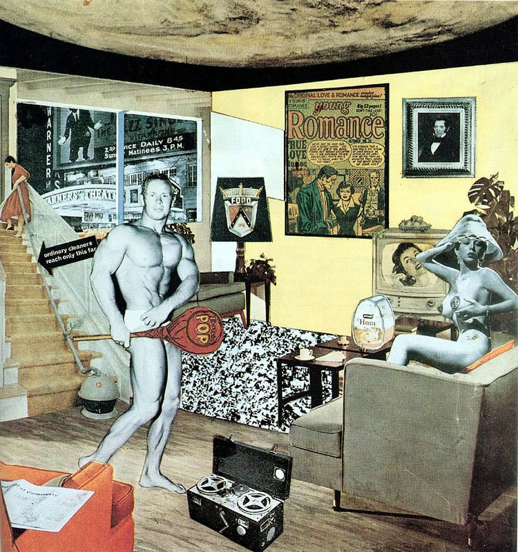
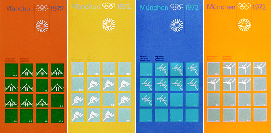
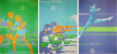
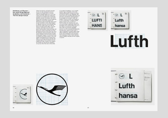
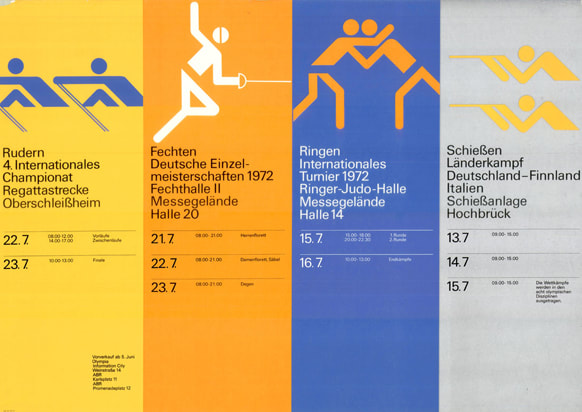
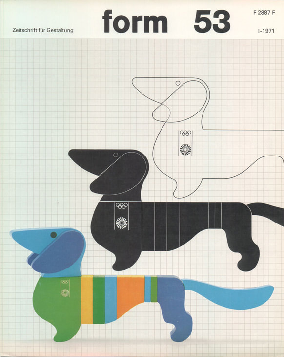
Bernie Fuchs Bernie Fuchs was an American illustrator who's created photography based paintings of mundane, everyday moments, creating visual interest through his use of colour and mark-making. He is known for creating unique paintings through his way of changing the point of view of the setting. Lorraine Fox Another notable American illustrator was Lorraine Fox, known for her nostalgic, emotive paintings giving the viewer a glimpse into the everyday world they don't normally notice. Much like Fuchs, she would use unique mark making and play with angles and viewpoints, all in a variety of styles. In response to these artists, I chose to take some photographs of everyday moments, trying to capture the ordinary but in a more visually pleasing/unique way. I did this by taking the images at slightly different angles, to make the compositions more dynamic and possibly help the viewer see these mundane moments in a different, more interesting way to how they would normally expect. In addition, I added a few filters using photoshop to make them more artistic and give them more texture like they are painted. Brief For this project we had to design 40 different thumbnail ideas for a portrait format theatre poster. We then had to take five of our ideas and and refine/develop them further. Finally we had to take the three best designs and work them up as more detailed client visuals on a slightly bigger scale. Research/Thumbnails I chose to design a poster for the theatre production 'Hamlet', a play about the ghost of the King of Denmark telling his son to avenge his murder by killing the new king, who is Hamlets uncle (research taken from here). Themes of the play revolve around madness, life and death and revenge, so many of my ideas feature elements such as skulls, swords, ghostly figures and blood. Developments I really liked the idea of using a crown shapes as part of the lettering so I explored this idea further when developing my poster thumbnails. I also looked at a few different typefaces; ones that had a more medieval look to them. I tried to think of different ways to layout the poster, trying some posters with the main title of the play at the top and others in the centre. 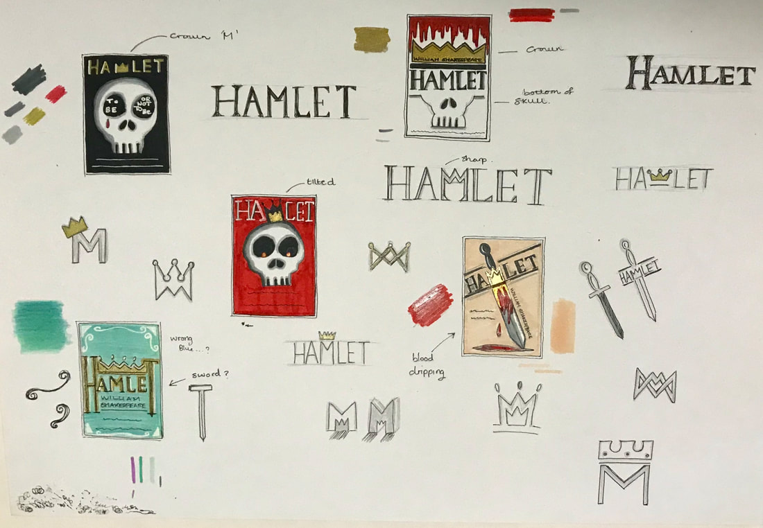 Final Piece These are the designs I was most pleased with and choose to work up in more detail. The first design I chose to make more ornamental/decorative, to represent the 'royal' theme of the play, using gold and blue and further developing the idea of added a crown onto of the type itself. The second design also played with the idea of using the crown onto of the text but in a different style. This design also incorporated the skull to represent the theme of death and the character, Yoricks, skull itself. I preferred the cleanness of this poster in contrast to the third design which features a sword dripping with blood. I liked the idea of incorporating the crown into the type as the letter 'M' and also making the layout a bit more dynamic by having the text on a slant rather than it all being uniformly straight and centred. Overall, I'm happy with the outcome of the project as I think my designs are all quite different from each other, allowing the client to have a good variation of ideas to choose from. It was a big challenge trying to come up with so many ideas as its something I'm not used to doing but I will continue to improve on this as the course progresses. 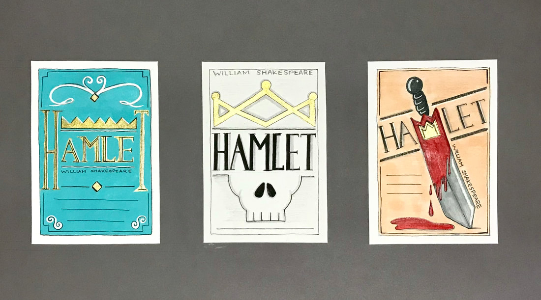 Fashion editorial storytelling refers to visual photographic stories used commercially and is considered to be a creative way of revealing the attitudes and tastes of the time, as well as woman self image. However, there are doubts as to whether it is to be considered a serious form of art or that it lacks in artistic integrity. After scanning through a few fashion publications, I chose to critique some fashion stories from the December 2019 issue of 'Elle' magazine. The first was called 'The Late Show' and illustrates the best dresses and coats for an audience interested in fashion for the party season. It depicts the models glamorously, using photographic imagery with playful poses, various candid shots and dark filters that make them look as if they were actually taken at a party. The typography is interesting as it contains a gentle mixture of serif fonts in addition to added curves and italics onto some of the letters. I think this could be said to represent the strength of the female but also the soft femininity of some of the elements of clothing advertised. Composition of the pages is kept slightly varied to give more interest, having some pages as single framed images and others more collage like to show a sequence of emotions and the movements of the models. Colours are also kept constant in every photo; outfits are complimented by the colours of the setting they are in. The entire piece just screams the vibe of having a good time. The second fashion story I wanted to critique is called 'Rise and Shine'; a fashion story featuring bold and colourful pieces for those who want to be noticed. The model is seen wearing a variety of interesting pieces; the photographic compositions are set in the streets to highlight the idea of standing out from the crowd. In addition the backgrounds are given slight pops of colour in contrast to the darker looking clothing, giving the images more interest. Poses are also mixed up, ranging from purposeful, typical type poses to more candid ones of the model walking through the street to give it a more real life feel, using natural light to capture the reflections of some of the shiny pieces. The typography is kept relatively simple, using a clean bold sans serif type face, leaving the real eye-catching parts to the photographic images themselves. Layout of images is also kept simple with constant use of covering the whole page and some double page spreads. The collage 'Just what is it that makes todays homes so different, so appealing?' was created by Richard Hamilton and is considered to be the first iconic piece of pop art. It was created in 1956 for the exhibition 'This is Tomorrow' held in London and represents the theme of consumerism, social culture and visions of the future. Hamilton incorporated categories into his collage such as man, food, history, TV and technology, some of which I tried to include in my own 2019 response. Beginning with an image of a modern living room, I digitally added elements such as a poster and ballot box to represent the current political affairs going on such as the current election, as well as an image of the Australia wildfires seen through the window. In addition, I wanted to represent the popularity of selfie taking during this time, choosing to also include a logo for veganism on the mans shirt, a movement really starting to become popular. For technology, I chose to incorporate the TV showing the logo for Netflix, as well as the newest iPad Pro by Apple displaying the logo for the Ticktock app, an application many people seem to be fans of. Finally, to represent TV/film, I wanted to include the character Simba from the newest release of The Lion King, which was hyped up a lot this year.  Developing Bauhaus Principles and Aims of the School Continuing the legacy of the Bauhaus, the Ulm School of Design was another radical design institution that has a huge effect on 20th century design. In 1946, various people attempted to revive the Bauhaus's ideas in Germany after the Second World War. The school was established in 1953 by Inge Scholl in memory of her siblings Hans and Sophie Scholl, who were executed by the Nazis in 1943 for being members of an anti-facist resistance group. Otl Aicher and Max Bill were also founders of the school. Bill was a Swiss artist, sculpture, architect, industrial, graphic and product designer and previous student of the Bauhaus before its closure, and was the Ulm School of Designs first head master until the late 1950s. Otl Aicher was a German graphic designer and typographer, particularly interested in corporate branding. Born in Ulm, Aicher was friends with the Scholl family, and was also strongly against the Nazi movement. After being arrested and forced to join the army, Aicher deserted and hid at the Scholl's family home. After the war, he attended the Academy of Fine Art Munich studying sculpture and then later married Inge Scholl, where alongside Max Bill, they established the Ulm School of Design. In 1969, Aicher designed the brand identity for the German airline Lufthansa, which the logo is still used today. Aichers interest in corporate branding resulted in him being commissioned to design the 1972 Olympic Games branding. It was requested that the design complement the architecture of the new stadium that had been built in Munich, basing his work on the 1964 Games iconography designs by Masaru Katsumie. He designed pictograms to visually interpret the sports in order for people to find their way around the stadium, using grid systems and bright colours. The colours were inspired by the Bavarian countryside and the Alps mountains of blue and white, in addition to green orange and silver, each allocated to different areas such as media and public functions. These colour themes were also used to colour coordinate staff through their uniforms relating to which department they worked in. The typeface 'Univers' was used for Aichers designs and twenty one sports posters were produced to advertise the games. A process called 'posterisation' was used in the graphics to separate the tones of the colours from the images; the first posters displayed were of the stadium. These designs later inspired the DOT pictograms that are seen indicating toilets and telephones all around the world. Aicher also designed the Munich Olympics logo, a spiral shaped garland representing the sun and the five Olympic Rings, as well as the famous dachshund mascot which had colours representing the Olympic Rings, designed to represent the resistance, tenacity and agility of all the athletes. In his later life, Aicher consulted for 'Bulthaup', a kitchen manufacturer, and created the 'Rotis' typeface family in 1988, before his death in 1991.  Product Design and the Domestic Sphere Any sort of formal qualifications were not required to become a student at the school, they looked for those with talent, drive and enthusiasm. Much like the Bauhaus, student studied a basic course first before moving to specialist areas that overlapped to create multi skilled designers rather than with specialist skills in one area. Topics were grouped together under general headings such as economics, politics and philosophy. The basic course consisted of studying through visual experiments (perception, symmetry), workshops (wood, metal, plastics, photography), presentation (drawing. writing) and methodology (logic, mathematics). Visiting lecturers also created an atmosphere of constant discussion, critique and ideas coming in from other areas, and permanent lecturers were also encourage to take on work outside of the school in order to bring in more funding. Max Bill resigned in 1957 due to conflict with the staff regarding the progression of the school, as he was failing to recognise the importance of building industrial links in order for designers to have an influence in rebuilding society after the war. Thomas Maldonado took over his role and wanted to move the school away from 'art' and more towards science and an objective design process. He developed the 'Ulm model', a view of design which involved the whole of society. Development groups were created where students could work with industry partners to develop and manufacture products that could make a difference in the world. The schools approach revolved around the design of a system rather than an individual object. Areas of focus included furniture systems, construction systems, electronic systems and communication systems. The electronic system revolved around creating products that could be multipurpose and fit into a modern, domestic environment. The school collaborated with the company 'Braun' alongside Dieter Rams, one of the most well known industrial designers, to develop new products with the students. Designs were geared more towards targeting the newer generation and their willingness to embrace new technology, which the older generations were still quite afraid of. As a result, consumerism grew. Innovations in Graphic Design The school also had a communications system area of development which involved designing marketing material, packaging, mapping etc.. The British designer and typography, Anthony Froshaug was among the teachers at the Ulm school of design associated with a more systematic approach to graphic design. Much of the work produced at the school was documented in a magazine which Froshaug designed, becoming quite influential to magazine design today due to his purest approach to type. In the 1960s, the school started emphasising more on theory again, which was opposed of strongly by Maldonado and Aicher. Collaborations with industry and maximising profits, and the philosophy of using art and design for social good and democracy caused clashes which unfortunately undermined the whole institution. Due to this funding was withdrawn, forcing the school to have to close in 1968.
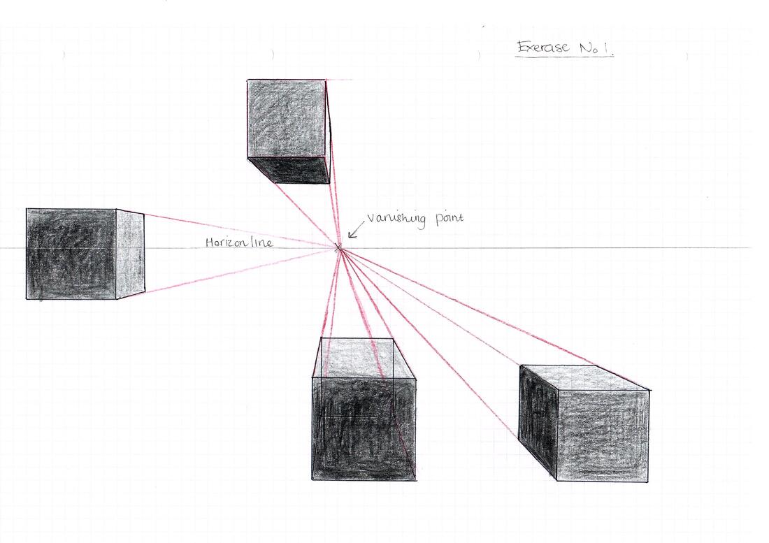
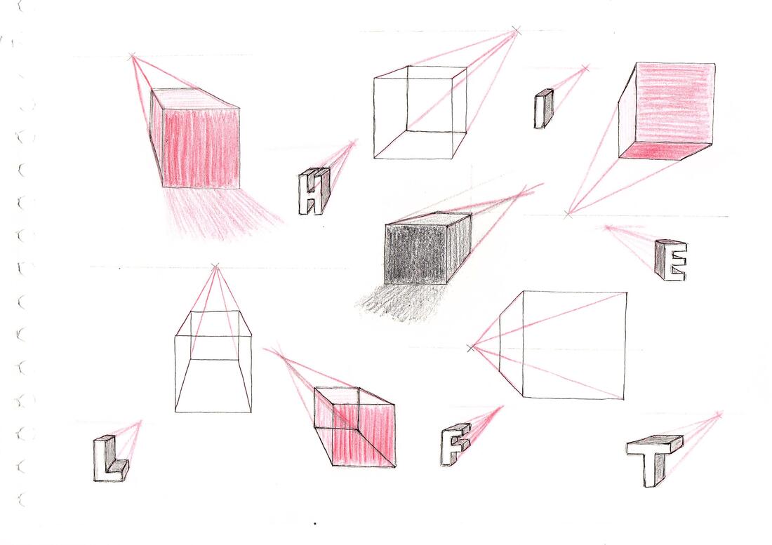
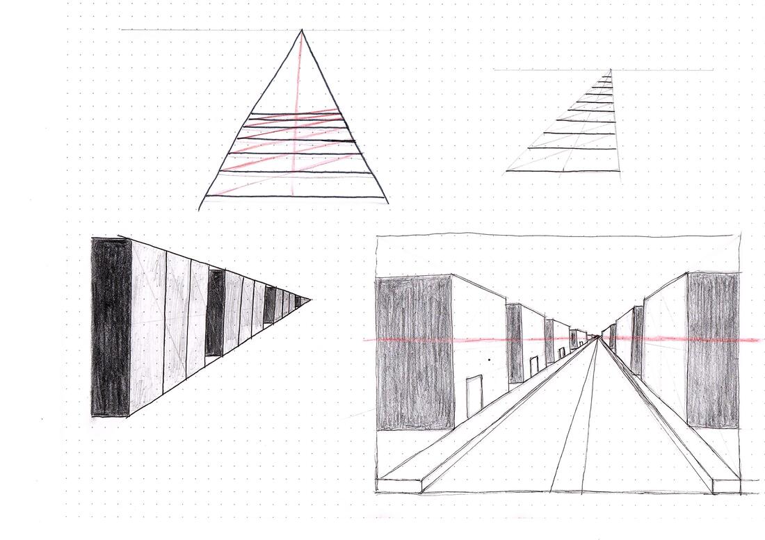
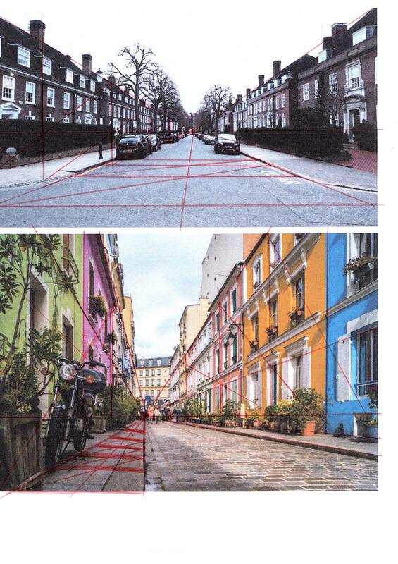
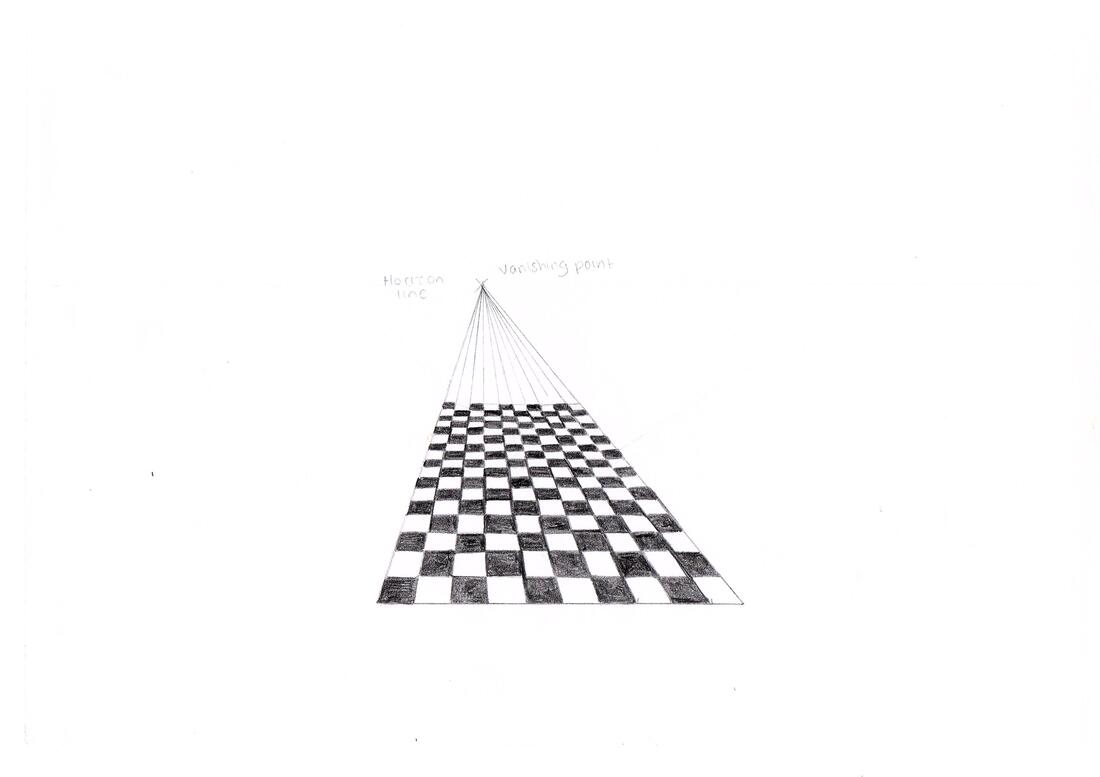
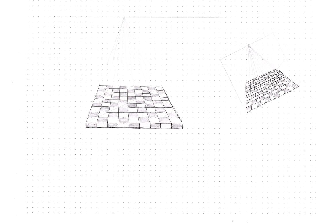
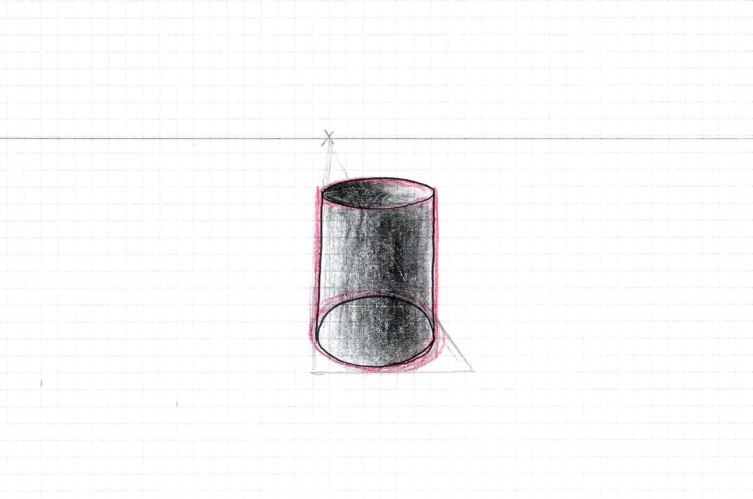
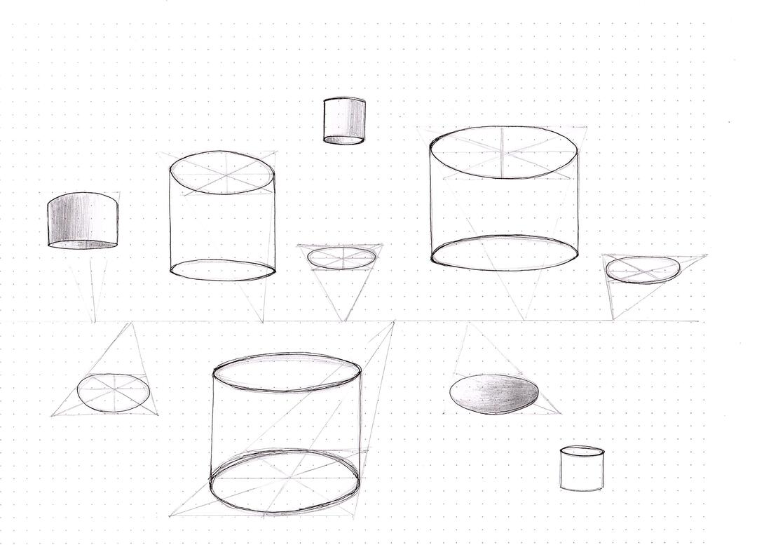
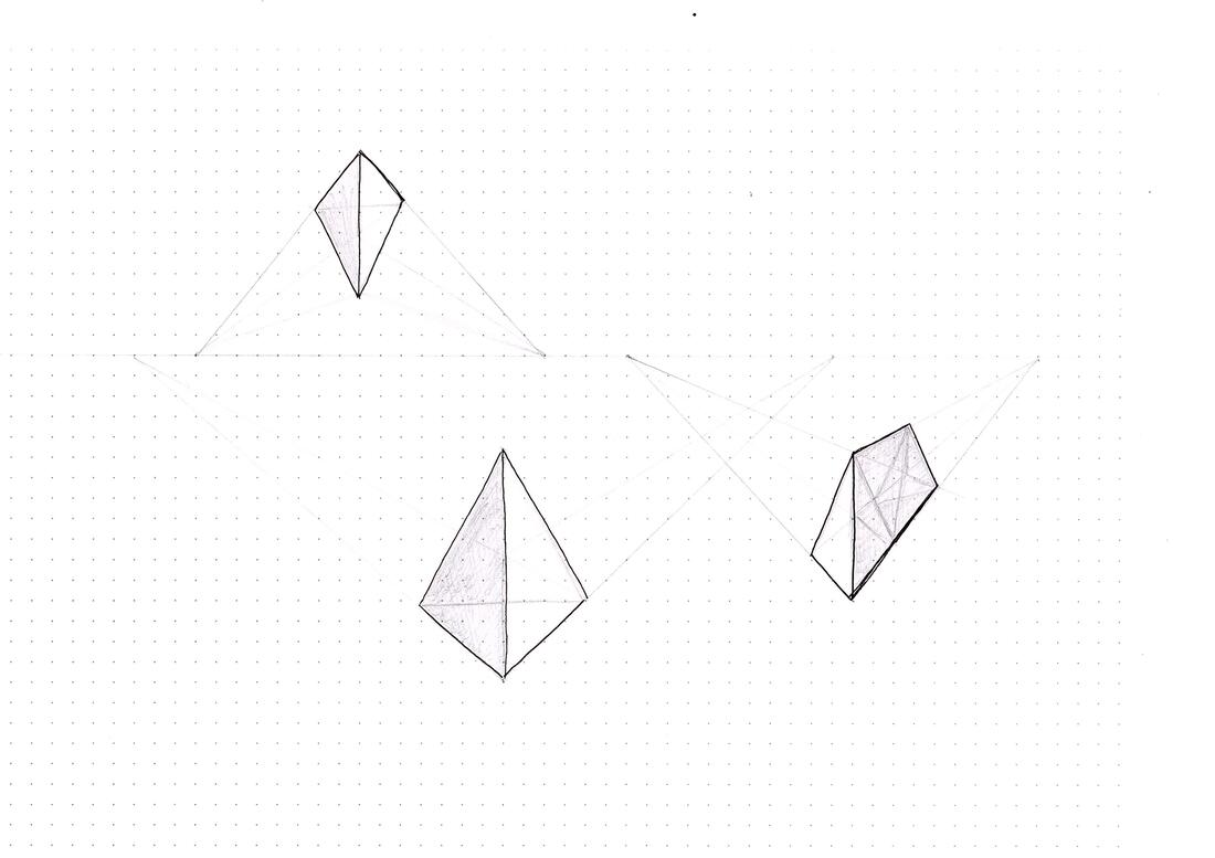
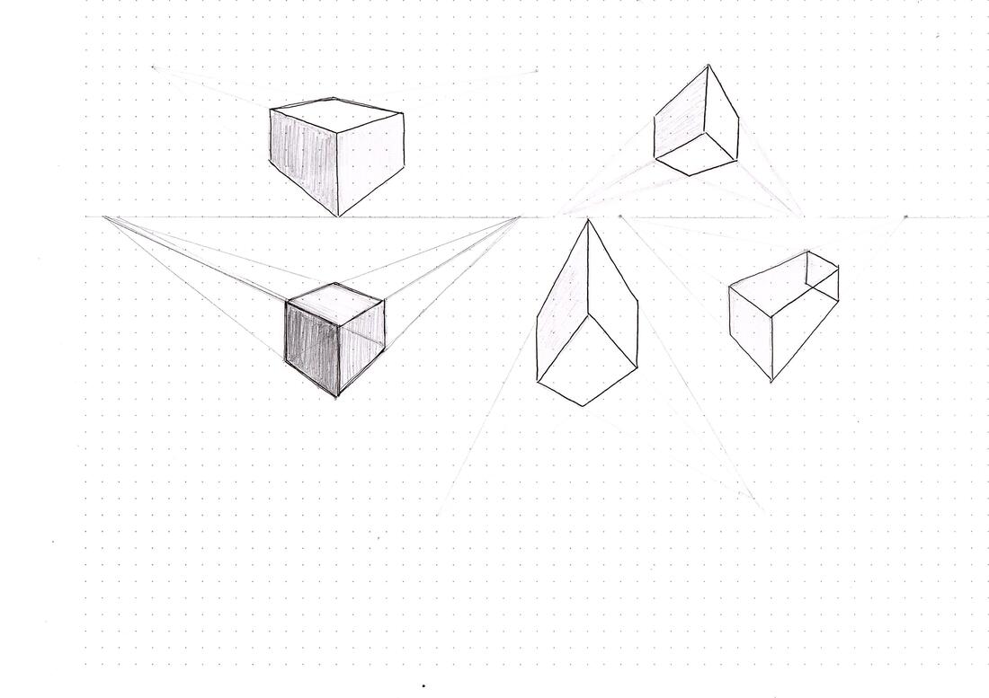
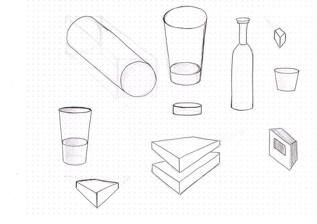
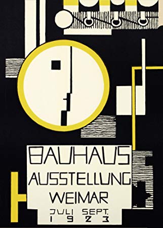
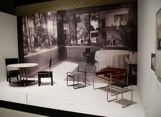
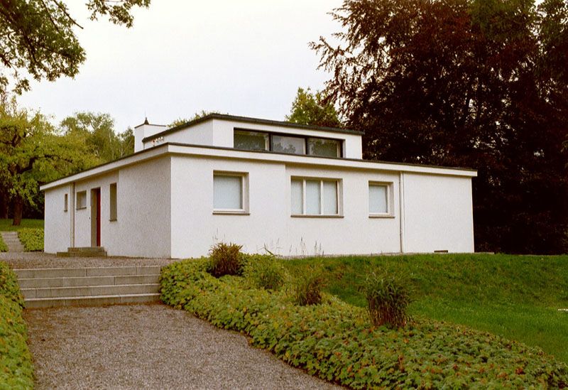
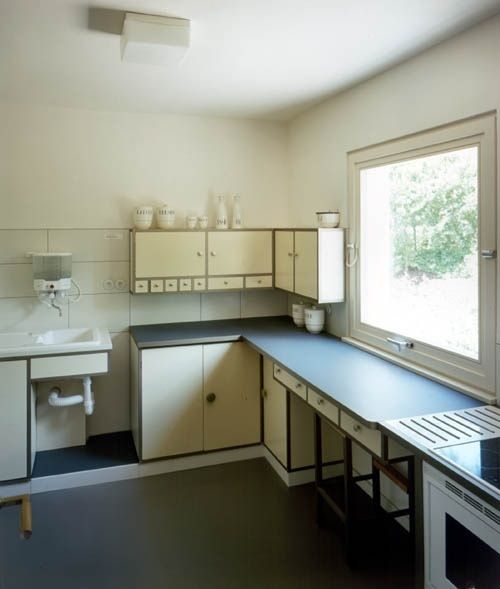
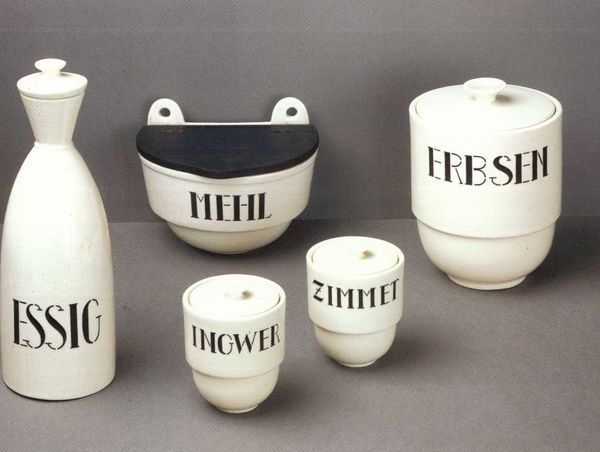
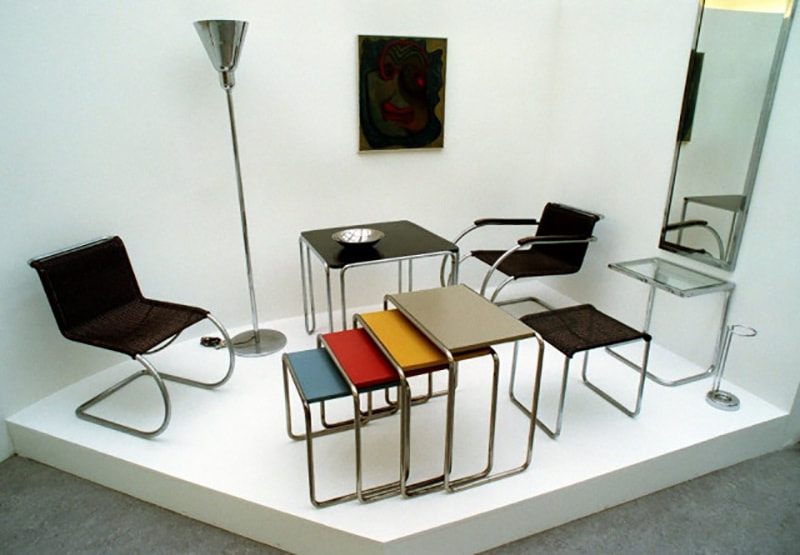
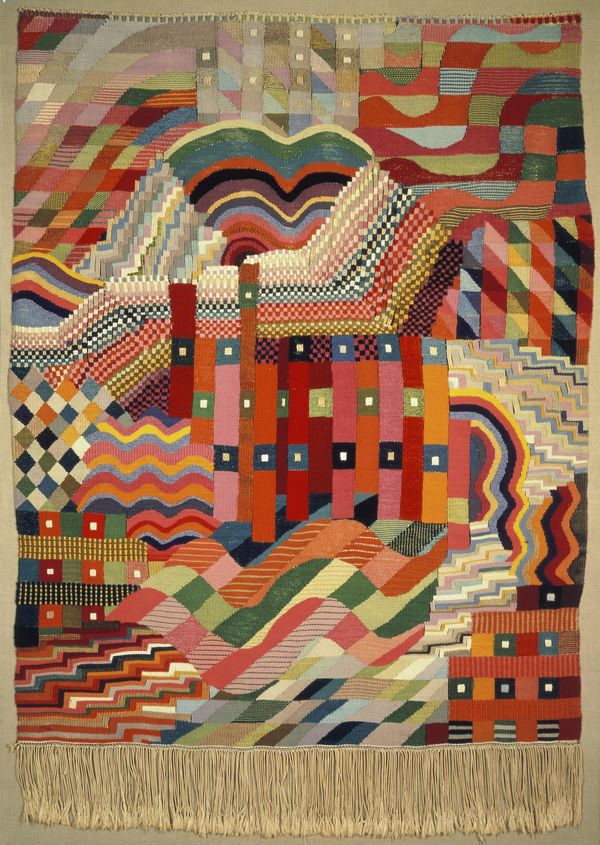
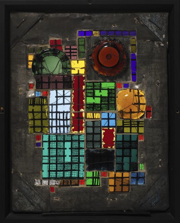
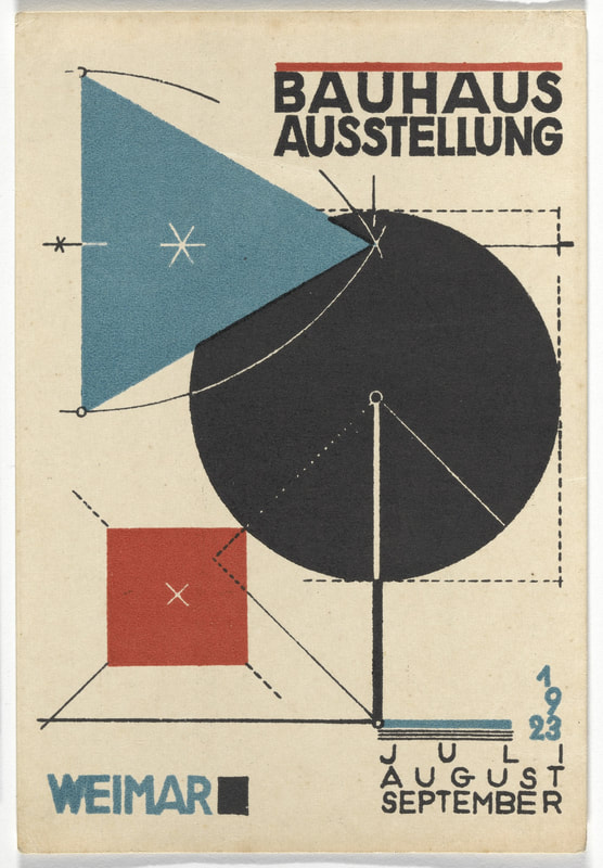
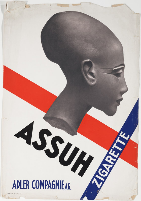
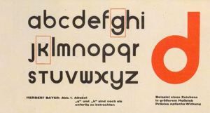
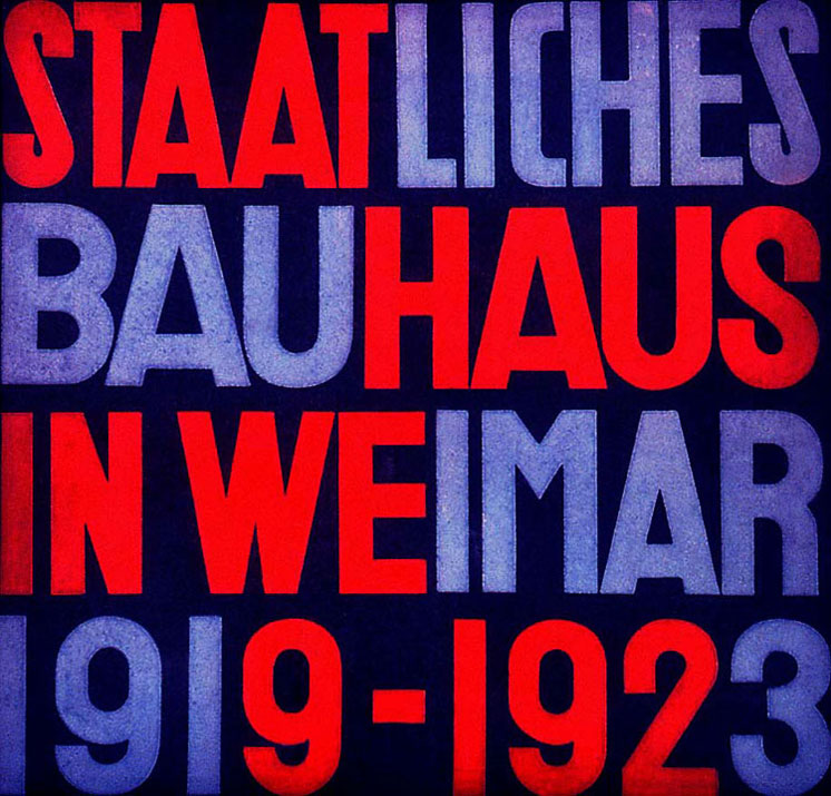
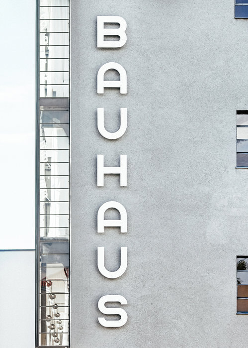
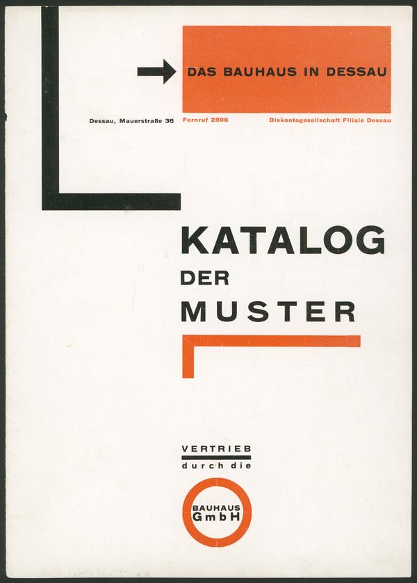
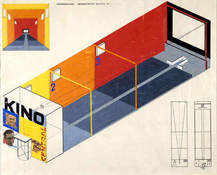
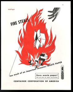
However, many of the innovations introduced by their approach to design is still relevant in teaching today, using methodical, analytical and reflective techniques in our own studies of the subject. These two weeks revolved around developing confidence in drawing and sketching. One Point Perspective Perspective drawings make an object appear solid using a linear illusion of depth, making objects look solid and three-dimensional. One point perspective uses a single vanishing point... Moving cubes and boxes around the horizon within the frame: Playing around with fences: Playing around with grids/chessboards: Playing around with ellipses/cylinders: Two/Three Point Perspective Thumbnail Visuals Warm Up Session  Aims and Philosophy of the School The Bauhaus was one of the most influential institutions into art and design history; the worlds greatest art school. Though it only existed for 14 years, it had a huge impact on art and design education and what is produced today. The school sought to train a new generation of designers with all round skills, starting with design basics followed by training in workshops, aiming to unite art and technology. The origins of the Bauhaus goes back to mid 19th century England, where the founder of the Arts and Crafts movement, William Morris, inspired to counteract the cultural damage caused by industrialisation. This eventually reached Germany, where they were inspired to create their own art school system and art and craft manufacturing. The goal was to close the division between someone who made things and the artist. People of any background, gender or nationality were welcome to be a student.  Key Figures Founded by the architect, Walter Gropius in 1919, the Weimar Academy of Arts and the Weimar School of Arts and Crafts was combined. Gropius wrote a manifesto as a basis for the concept of the Bauhaus, based on experimentation through craft to create a new visual vocabulary for industrial manufacturing; not just to create one off objects but rather people who could design for mass production. The first example of Bauhaus architecture was the 'Haus am Horn' which was part of the Bauhaus Exhibition in 1923. The building was designed by Georg Muche but many members of the school contributed various aspects to it, demonstrating ideas for modern living; a prototype of modern construction. It was considered to be a sort of testing ground for new materials, contraction methods and technologies, focusing more on functionality rather than ornamentation. The house was designed for a family without domestic staff, showing the schools political aspirations as they wanted people who were less fortunate to still have a nice place to live. It was the first building to feature a fitting kitchen, central heating, modern gas stove, washing machine, telephone system and Lino flooring. Everything inside was bespoke for the house.  In 1925, the school moved to Dessau due to political pressure causing cuts in funding, but this only resulted in motivating people more to produce work that was related to social change. A lot of resentment from the general population in Dessau was caused by the libertarian lifestyle of those associated with the Bauhaus, and as a result in 1927 Gropius resigned as director. A new director was appointed, Hannes Meyer, a Swiss architect, and previous professor of the school, who philosophy was more about meeting the needs of the people, rather than making things that were luxurious and beautiful. However, he was thought to be a threat due to his communist associations and was then deposed and replaced by the last leader of the Bauhaus, Ludwig Mies van Der Rohe. Mies van Der Rohe tried to detach any associated political involvement but despite his attempts the city council of Dessau passed a resolution to close the Bauhaus in 1932. The school was then moved again to Berlin in an abandoned telephone factory but financial backing had been severely cut, the building was raided and even some students were arrested and so it was decided that the Bauhaus was to be closed completely in 1933. Many of those who taught and studied at the school immigrated to avoid the political situation in Germany and so its ideas and ideals were spread across the world and other cultures. In 1937, Laszlo Moholy-Nagy founded the New Bauhaus in Chicago in an attempt to continue the educational philosophy. The Basic Course and the Workshops in the beginning, Gropius appointed some of the leading figures in the arts to be the 'masters', including Lyonel Feininger, Wassily Klanindsky, Paul Klee, and Oscar Schlemmer. The tutors developed a new programme based on a 'preliminary course' which involved studying composition, colour, materials, collage, life drawing etc, as well as more practical based training in various specialist workshops to which students were allocated to according to their strengths and potential. These were also complimented by some non-artistic subjects such as ballet, singing, and drama. Workshops included sculpture, ceramics, joinery, metal work, weaving, printing/advertising, graphic printshop, stagecraft, stained class, wall painting and photography. Most creations were made with the intention to be for mass production and taken to local factories and many design classics were produced that we still see today. The Output of the Visual Communication/ Typography Workshop There were various workshops devoted to graphic art, one of which was printing and advertising. The other workshop was the graphic printshop, which produced limited addition prints and portfolios by the Bauhaus masters. One of the masters, Herbert Bayer, dedicated himself to designing new types of lettering and modern typefaces combined with very simple graphic elements. Born April 5th 1900, the Austrian and American graphic designer began his studies as an apprentice under the architect Georg Schmidthammer and then later became a student of the Bauhaus studying wall painting under the Russian painter Vasily Kandinsky. After graduating form the school, Bayer was appointed head of the printing and advertising workshop where he taught students about the potential of letters and layouts of type as a form of communication. He was responsible for innovations such as the 'Universal alphabet', a typeface which he created, commissioned by Gropius, that consisted of only lowercase letters. The font was made up of a simplistic geometric san-serif, and it became the schools signature font. Bayer also emphasised to his students the importance of design having a dynamic sense of composition, using geometric elements, often combined with primary colours, in order to be suitable for mass production. Bayer designed many groundbreaking printed material and advertising graphics, containing elements such as type on its side, areas of white space, sense of alignment, abstract shapes, and photography combined with geometry, features that are so fundamental to how graphic designers work today. He also created designs for kiosks and small booths during the early 1920s, where he combined bold colours and typefaces with architecture and advertising techniques. Whilst working at the Bauhaus, Bayer married the photographer Irene Angela Hecht who he met at the first large Bauhaus exhibit in Weimar, and in 1928, he left the school in order to become art director of Dorland advertising agency and Vogue magazine. Bayer then left Germany in 1938 and during this time he created/directed various exhibitions such as the Deutscher Werkbund exhibition in Paris alongside Gropius and Laszlo Moholy-Nag. He then continued working as a commercial artist and graphic designer, designing the American propaganda exhibition Road to Victory in New York, consulting at the Aspen Cultural Centre and directing the design department of the Container Corporation of America until his death in 1985. The incredible objects originally created by the Bauhaus are seen everywhere in art and design today. The word 'bauhaus' is even used as a word to describe a certain kind of functional, modern style, illustrating the major impact the school has on design today all over the world, throughout architecture, product design and graphic design.
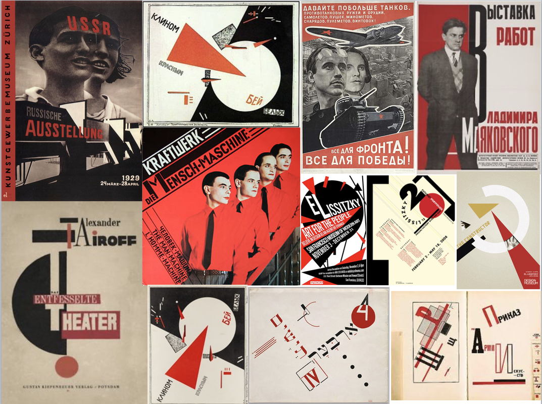
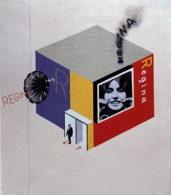
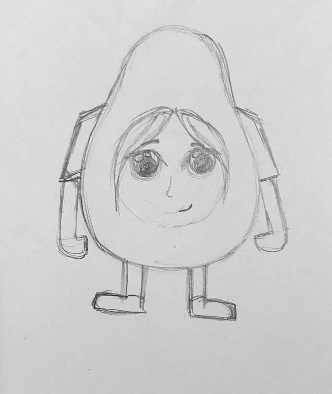
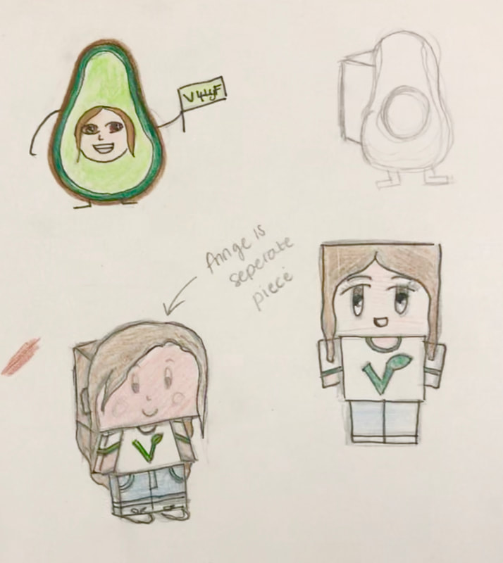
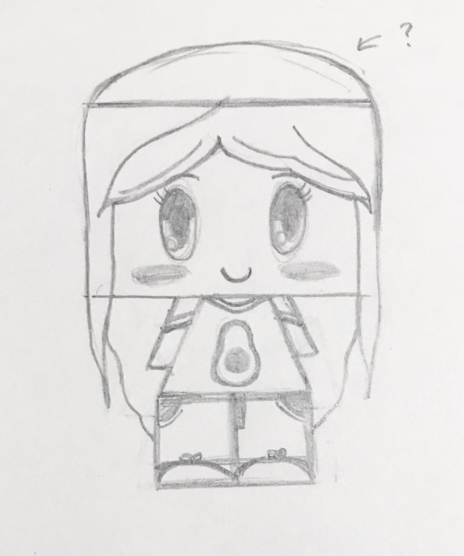
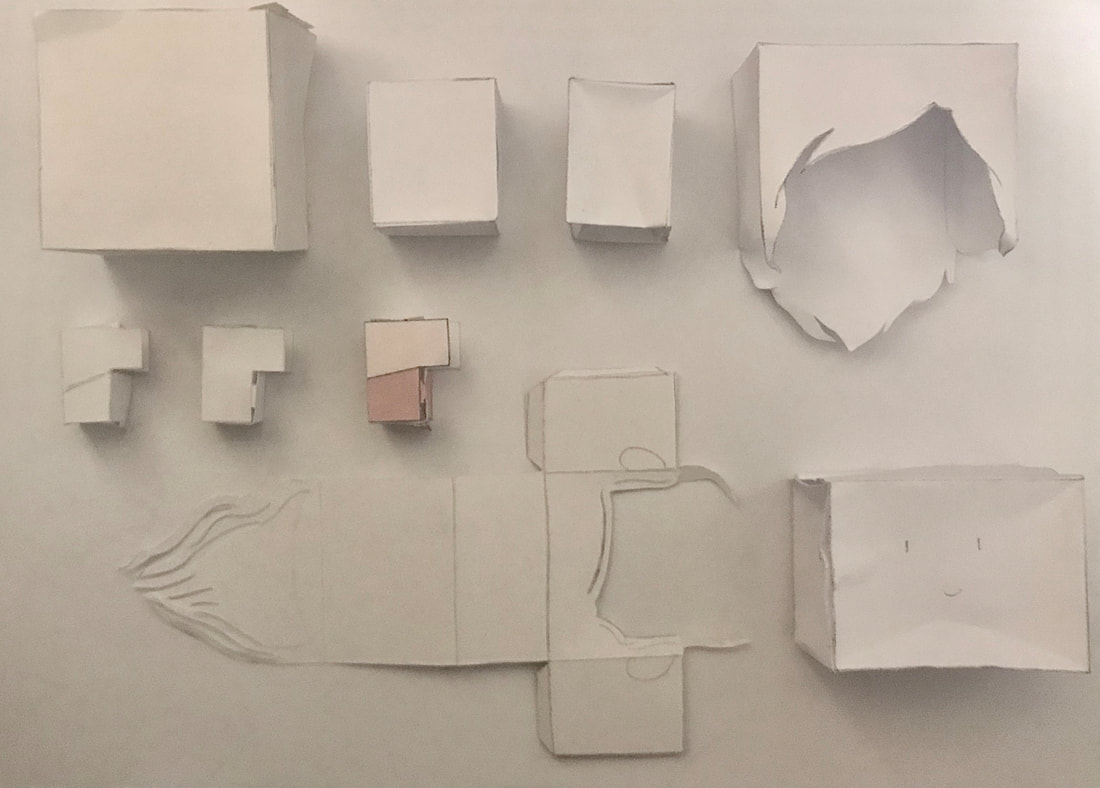
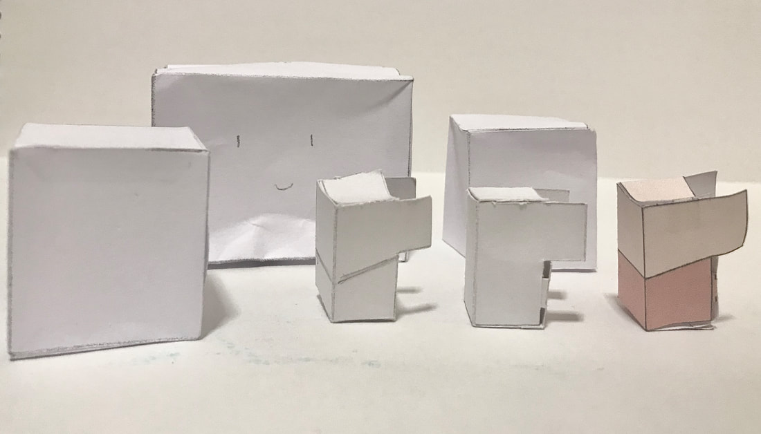
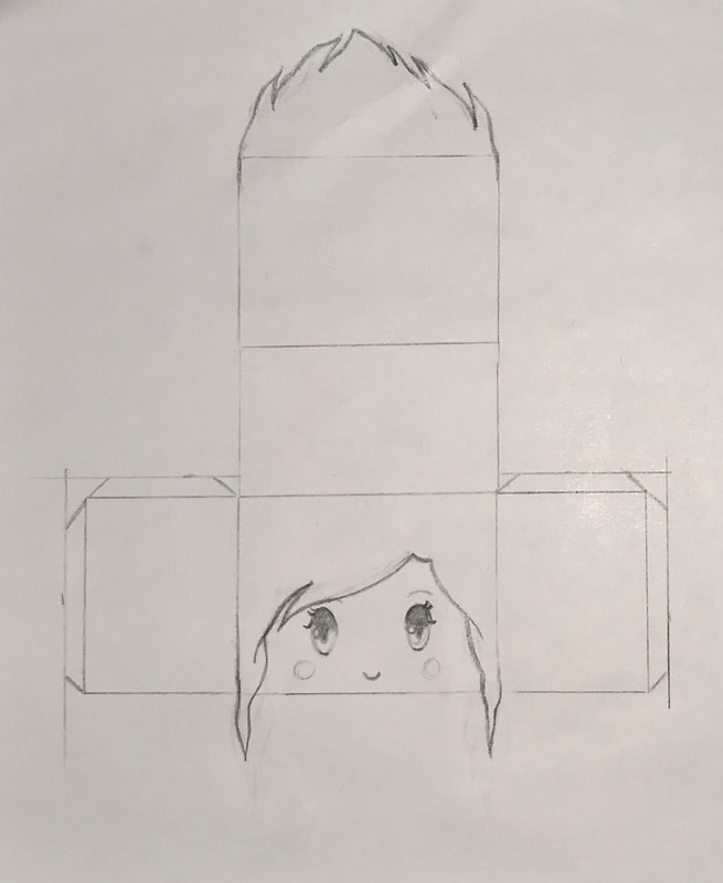
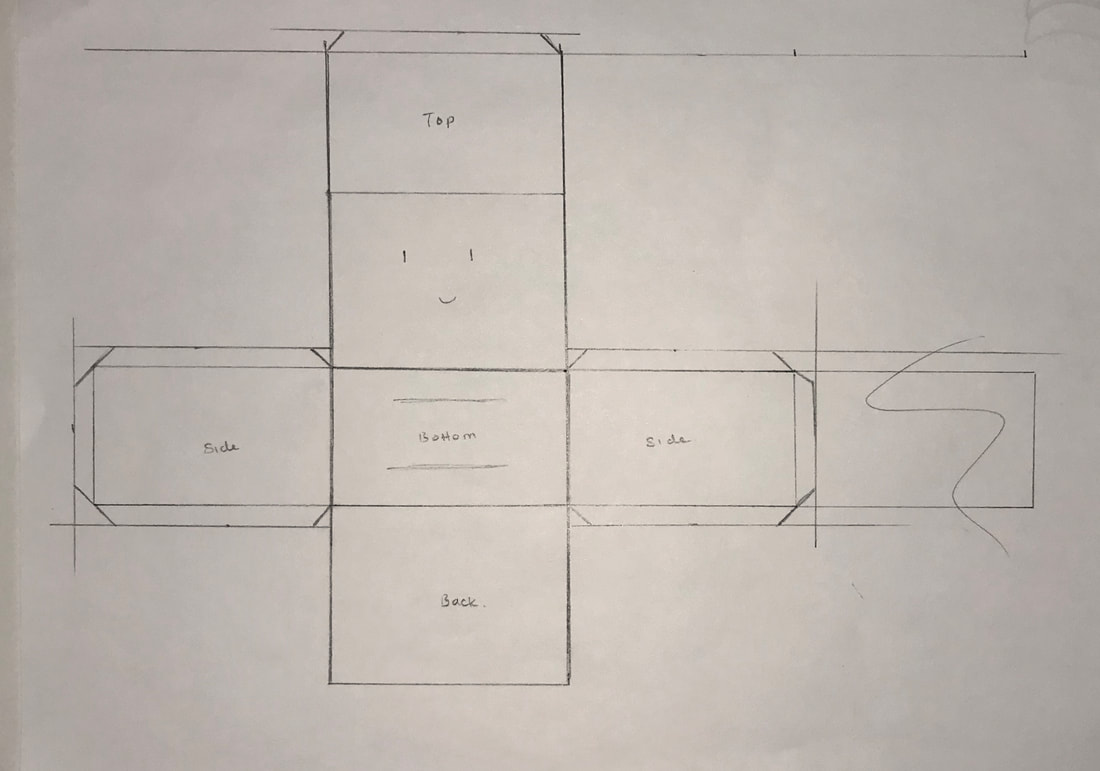
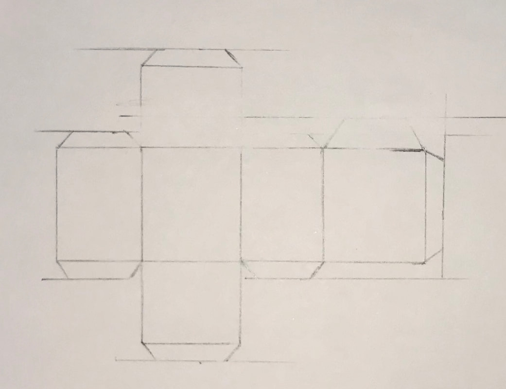
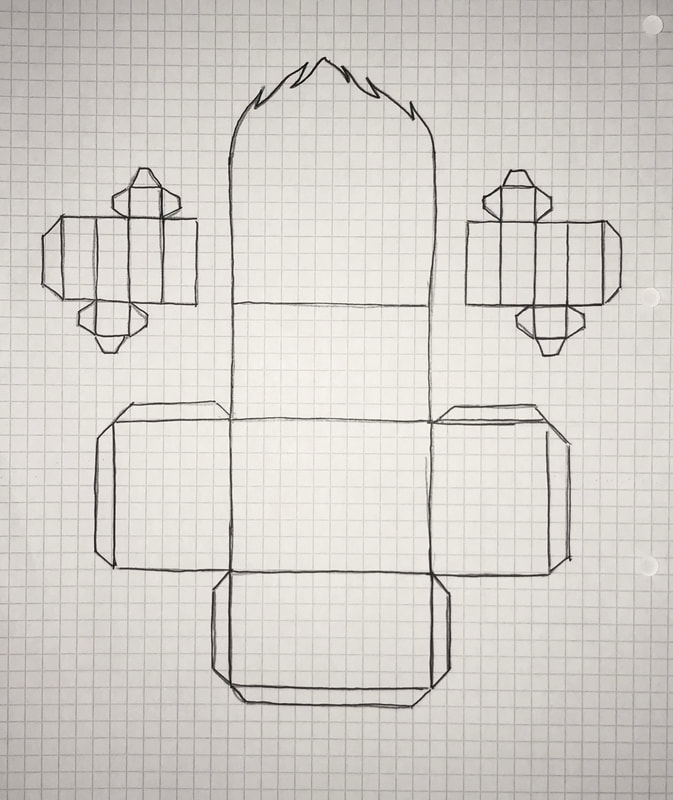
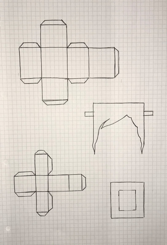
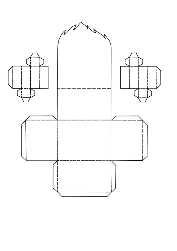
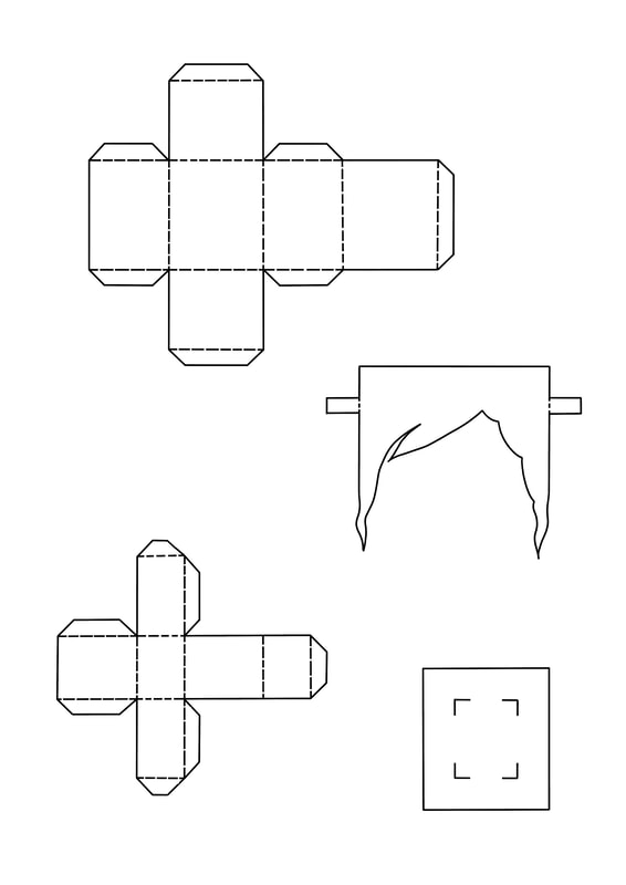
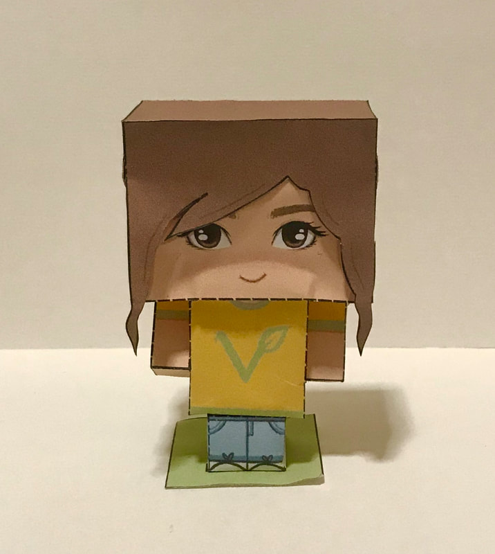
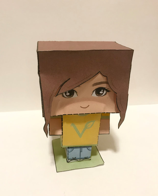
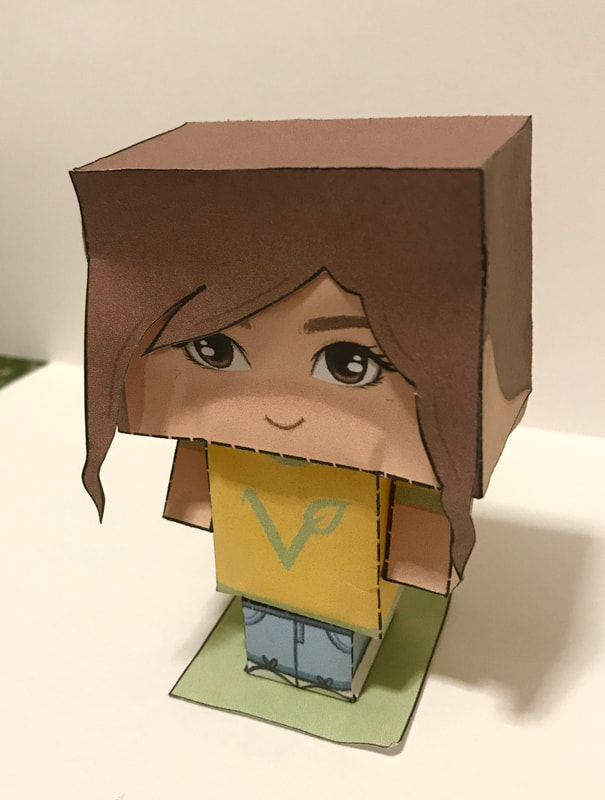
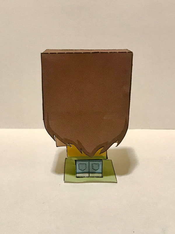
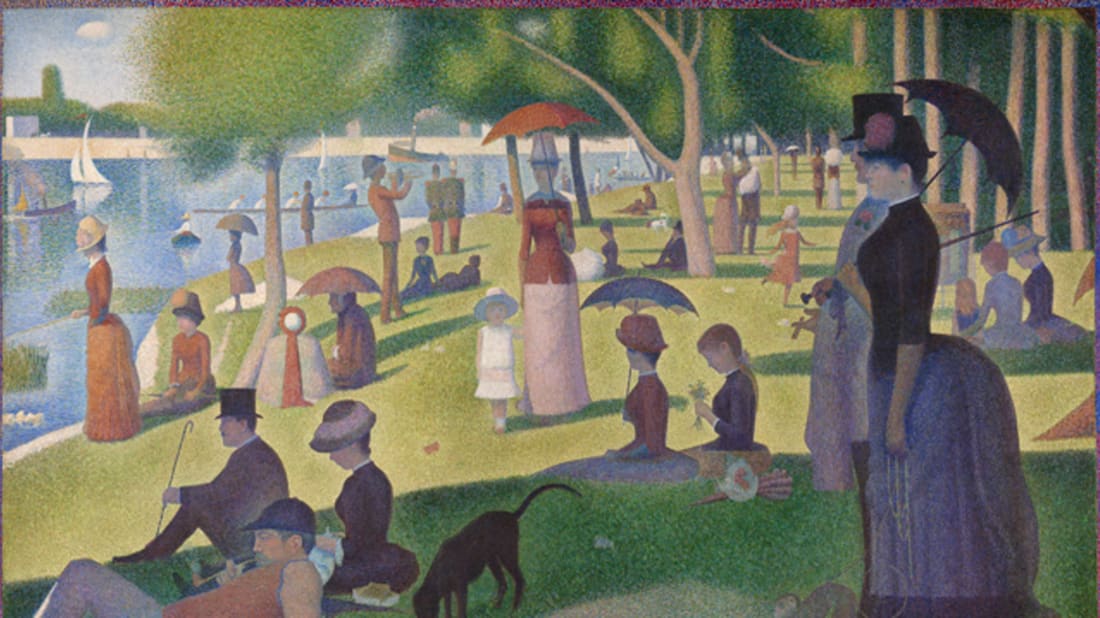
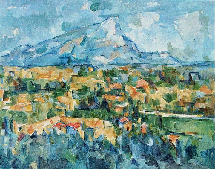
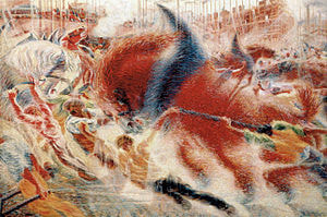
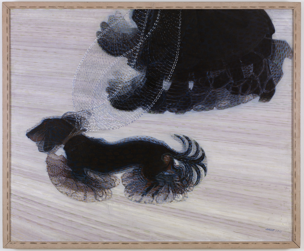
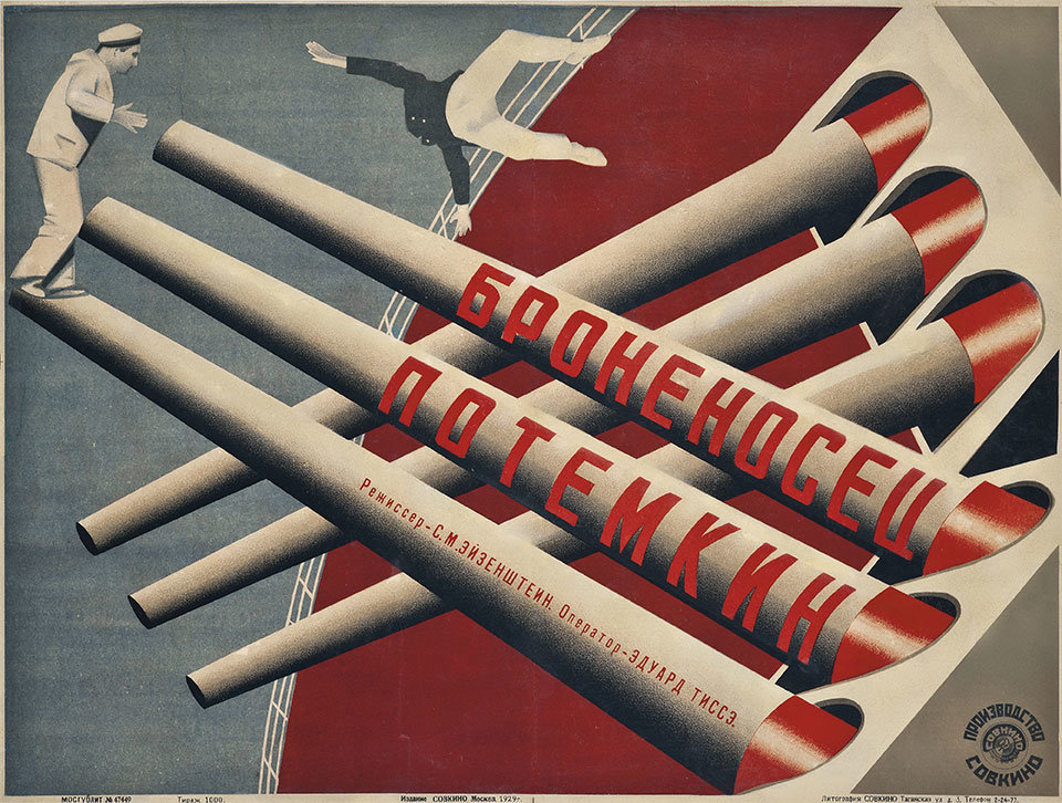
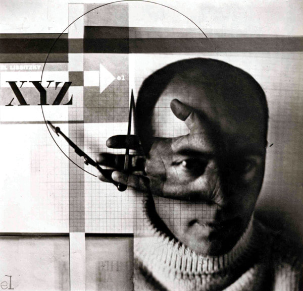
Brief For our second project we were asked to transform ourselves into an inventive 'designer' paper toy. We were required to present the made up 3D model of our character, in addition to the A4 net with associated typography, graphics, instructions and cutting lines. Our toy had to be in some way recognisable as ourselves, reflecting our own culture, background, interests, sense of humour and concerns. It could be rendered digitally or as traditional artwork. Research Paper toys are constructed by cutting, folding and glueing paper to form desired shapes. They originate from the art of origami (research from here). I began my research by looking at other designs for paper toys online, particularly at different ways to layout the nets to create the shapes/pieces. I wanted to be able to draw out the net myself from scratch rather than just using a template. Here are some of the ones I used for reference (links are in the captions): Development I first brainstormed some ideas of how I wanted my paper toy to represent me by doing a quick mind map of some of the things I associate with myself. For example, my interests include Harry Potter so one idea was to create myself wearing a Hogwarts robe, holding a wand or spell book. Another idea involved representing me being a vegan; wearing an avocado costume to add some humour, simply a typical outfit with the vegan symbol on the shirt, and extras such as holding vegetables to link to the stereotype of vegans only eating healthy. Here I also thought a little bit about the net itself with the idea of having an interchangeable face to show different emotions.  I then did a few quick sketches of some of the initial ideas. I decided to move away from the avocado costume idea as I wanted my paper toy to still have sharp edges and be cube-like similarity to how they are traditionally. So I focused on drawing visuals of myself wearing a typical outfit I would wear that still showed a part of my lifestyle with the design on the top. Here are some mock ups/experiments of some of the shapes I wanted to create. Inspired by one of the paper toys I linked above, I tried to make a net for the head and hair separately as I thought it made it look like it had more dimension. Next I started to draw out rough diagrams of the nets for the shapes that would make up my paper toy. thinking about where the tabs needed to be placed for gluing. I chose to create nets for the top, left arm and right arm, bottoms, head, a hair piece and a base. I then decided to draw the nets onto graph paper in order to keep them as accurate as possible. Using a light pad, I cut around the nets so that I could arrange them to fit on A4 paper before scanning them and drawing them out digitally on Procreate, making sure the lines were crisp and clean. After this, I constructed the mock up nets into their 3D models using a craft knife and ruler to cut out the nets, score the fold lines and glue the tabs together. 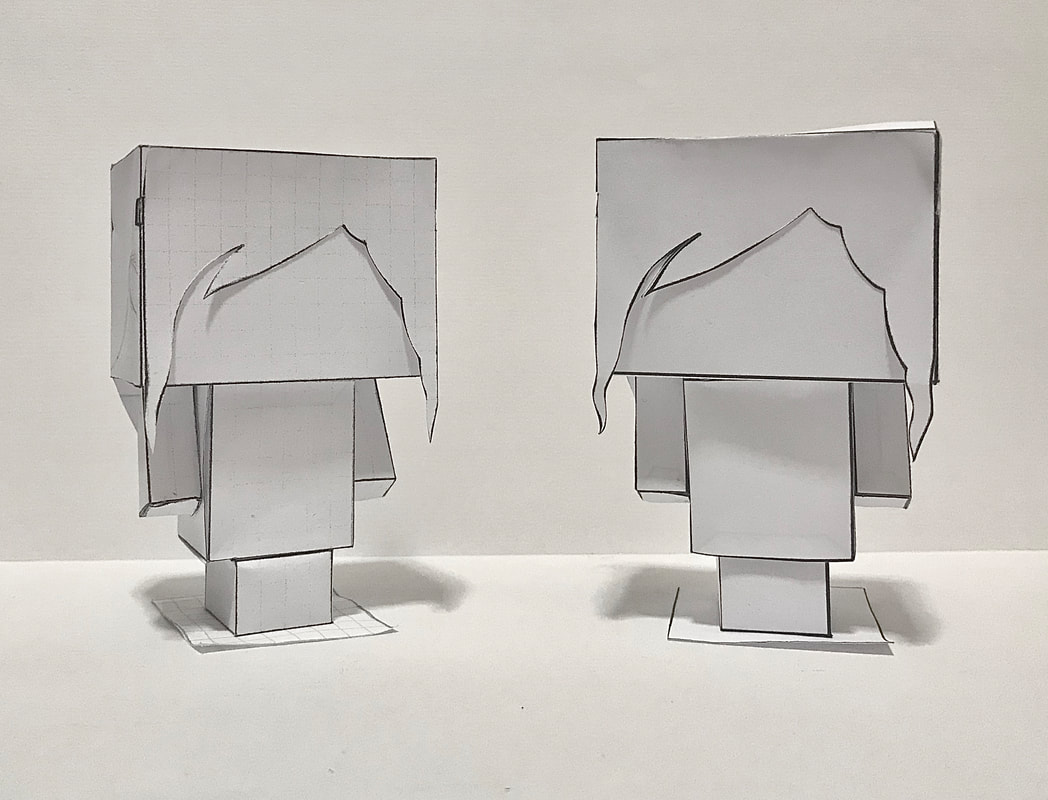 Final Piece Once I was happy with the nets, it was time to add colour. Using my preliminary sketches of designs as inspiration, I used Procreate to colour my paper toy. I wanted it to be realistic and true to my likeness, but in a cartoony style. I coloured the tabs black to make it clear they were the parts to add glue to and also made the lines that are scored and folded as dashes. I then designed the page to include instructions for construction as well as labels to each of the pieces to make it look more like a finished product. 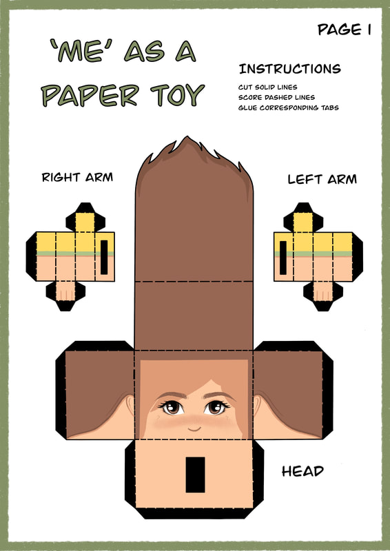 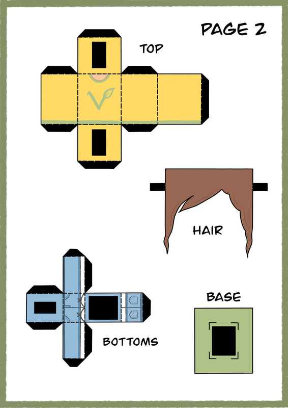 Overall, I am happy with my finished paper toy and I feel it fits the brief well as it represents me and my interests. The things I think I could improve on the most is that my research could have been more thorough, in addition to the amount of initial ideas being drawn up as thumbnails so that I had more designs to work from. However, I did experiment with the nets and shapes and how I could draw out the grids before committing to the final piece, showing development from start to finish. Below is the made up 3D model of my paper toy. Early Modernism/Cultural Determinism Modernism was a sustained period of innovation and expansion in the arts, starting roughly from the 1800s to the late 1970s. There are a few key themes: Modernism is told as a great meta-narrative. Going through the 20th century it is told by key figures such as artists critics, historians, and has a sense of hierarchy and order. It also signifies a conventional, patriarchal view of art and design history. Showing a a quest for originality through constant experimentation in literature, music, visual arts and architecture, it was a series of interlinking movements. Another key theme was determinism. From the 1870s innovation in science, technology, and industry and changing socio-political ideas was closely linked to the changes in art. The philosopher Karl Marx broke down society into the infrastructure (economic sphere of productive activity) and the super structure (social sphere). He argued that change happens at different speeds in each sphere and what happens in the infrastructure determines the superstructure. The Shock of the New and Crisis of Representation The old ways of portraying the world were no longer relevant. The idea of a static image of one perspective no longer made sense so new ways had to be thought up in order to depict the new interactions with industry and technology, time and space, changing social conditions and notions of peoples identity. It's now a more complex world.  20th Century Paris (Post-Impressionism) In 1889, Paris held the Exposition Universelle, a world's fair to showcase art and technology side by side. The Eiffel Tower was a big symbol of modernism and so served as the entrance into the fair. Impressionists were revolutionists, painted real everyday life, usually outdoors with a first person view. It was developed by artists such as Claude Monet who's work showed a greater understanding of light and colour in natural scenes by working quickly. Post-impressionism, however, describes the changes that came about after the Exposition. One of the major figures who developed the art movement was George Seurat, a French artist best known for introducing the painting techniques chromoluminarism and pointillism. His work differs from classic Impressionism as even though he is still painting what is real, his work was heavily pre-thought out in a studio before resulting in the final piece. Another important Post-Impressionist was the French artist Paul Cézanne, who's work is characterised by vivid colours and constructive painterly brushstrokes to create geometric forms. His work also featured creative perspectives; his paintings would often show the subject from different angles at the same time, which later became a major influence on Cubism. 20th Century Milan (Futurism) Futurism was a movement that originated in Italy which emphasised speed, technology, youth, and violence. A lot of Futurist art contains themes such as the car, airplane and the industrial city. Founded in Milan by the Italian poet Filippo Tommaso Marinetti, a manifesto was brought out where he was joined by painters such as Umberto Boccioni and Giacomo Balla. Futurists wanted you to be energised and motivated. Boccioni's painting 'The City Rises' is a good example of Futurism, symbolising manual labour through the rapid movements of the crowd scene. Similarly, Balla's painting 'Dynamism of a Dog on a Leash' shows the action in blurred frames depicting light, movement and speed. Modernism can be seen as a design for living. Structuralism implies we are formed and influenced by our surroundings; form follows function. 20th Century Moscow (Constructivism) Post Russian revolution saw the first flush of communism. Film makers, artists and designers were used as messengers of the state and to create its visual identity. The western idea of the artist was rejected; they would use their talent as artists to get messages out using words and images as agents of revolution to influence society. This became known as Constructivism; a belief that art should reflect the modern industrial world. Agitprop was designed to get people attention, motivate and get people to do stuff. Posters were created that were assertive, powerful in order to be used as mass communication. They featured dynamic geometric layouts but were restrained to limited colour options, fonts and usually made from recycled materials. They also featured heavy use of photography, using the power of image to grab peoples attention. The Stenberg Brothers were Soviet artists and graphic designers famous for their cinema posters which were nearly all of them were illustrated. They actually developed an overhead projector that allowed them to project images onto the posters and play with geometric forms, distort perspective, crop and montage elements and type. One of their most famous posters was for the silent film Battleship Potemkin. The piece has strong features of industry and modern warfare capturing the viewer with bold and powerful colours. Geometric elements seen through the use of diagonals as opposed to static verticals create a more dynamic perspective to the composition in addition to exaggerating scale. Another Russian artist associated with the Constructivist movement was El Lissitzky who is thought to have pioneered geometric collages of just photographs. The piece 'The Constructor' features himself with his hand over his face holding a compass. The highlighted eye gives the impression that he is symbolising the notion of the idea to production. It differs to the Stenberg Brothers work as it is has no colour, thought to make his face stand out more. The lines are are sharp, precise and distinct which represents the revolution of the machine. The type 'XYZ' symbolises the idea that it is the end of the last art movement; futurism is the future. It is overall a very powerful image. |
AuthorHi, I'm Emma. I'm currently studying Graphic Design at the University of Cumbria. Modules
All
Archives
March 2020
|


 RSS Feed