
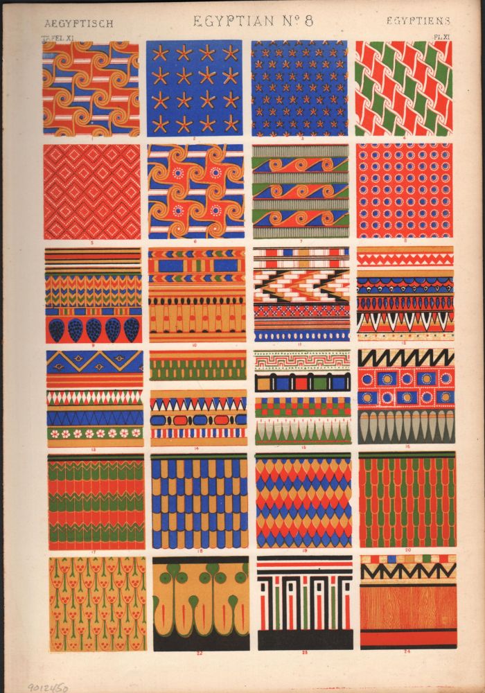
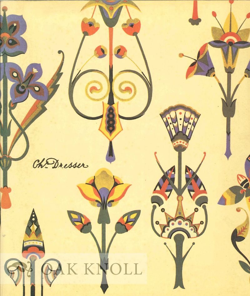
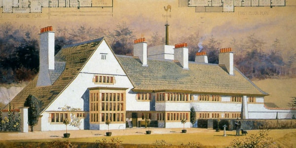
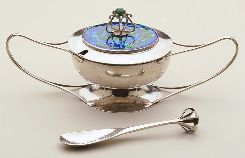
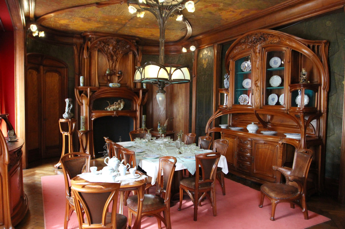
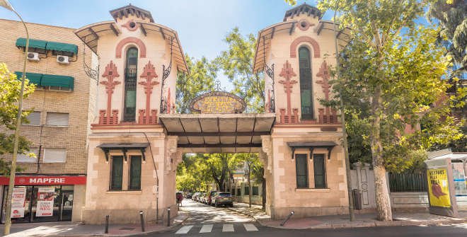
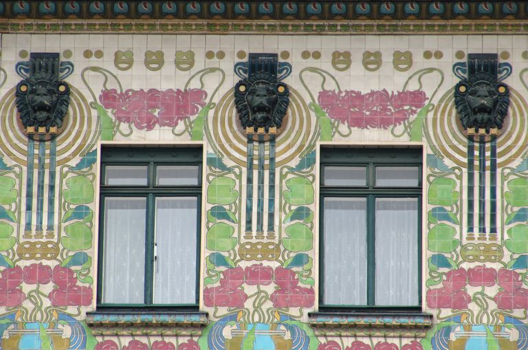
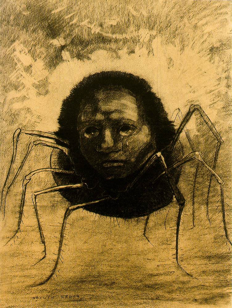
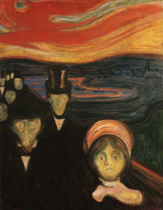
 The Late 19th Century During the late 19th century, if you wanted to become a painter or sculptor (and you could afford it), you could go to art school. You would spend most of your time studying the human form as making and designing things was considered to be more lower class. It was rare you would see a female as women were not allowed to attend art schools until much later on; they weren’t even allowed to paint the naked body and would be limited to studying sculptures instead. If you wanted to become an architect, you would learn it on the job much like an apprenticeship. Outside of this, there were those who also became interested in design alongside their main career. For example, Owen Jones was an architect considered to be one of the most influential design theorists of his time. He released the book ‘The Grammar of Ornament’, a design sourcebook containing ornamental designs from all over the world in order to help other aspiring designers take influence from others. Another inspiring artist was Dr. Christopher Dresser, a designer and design theorist who considered himself to be an ‘ornamentist’. He pioneered conventionalised ornament. The more something is stylised the more it is conventionalised. He is widely known to be the worlds first ‘industrial designer’; he understood how things were made but he would provide the designs to ceramic and furniture companies rather than making the himself. It is clear that he was claimed by the Aesthetic Movement, influenced by Japan after a trip to the country where he brought back things for inspiration, as well as being iconically known for his modern/minimal looking metal work  The Arts and Crafts Movement The Arts and Crafts Movement was an international trend in the decorative and fine arts marking the beginning of a shift in how it was thought things should be made. This was due to the damage the effect of industrialisation had on society. In 1884 a group of British architects created an organisation focused on the ideas of William Morris and the Arts and Crafts Movement in order to bring artists/designers together to discuss topics and learn things from each other. Later on, the Art Workers Guild formed the Arts and Crafts Exhibition Society in order to exhibit the decorative arts alongside the fine arts. It is interesting to note that the poster for this society contained an illustration of an artist and worker shaking hands, a symbol for setting aside class to come together as creatives. An example of a designer considered to use the Arts and Crafts style is C. F. A. Voysey, an English architect, furniture and textile designer, mainly known for building several country houses but who also designed wallpapers, fabrics and simple furnishings in his early career. Another well known contributor to the movement was C. R. Ashbee, a British architect and designer who founded the Guild of Handicraft to help teach traditional craft making skills. Art Nouveau The members of the Arts and Crafts movement were not particularly big fans of Art Nouveau because they believed it was not true to materials, taking hours to carve, having elements not necessary for the structure and designed purely for aesthetic reasons. However, it did originate in the UK. A big influence of Art Nouveau was nature and natural things. Artists were inspired by plant forms which they then flattened to create abstract and elegant creations. The style was interpreted differently by different countries; the French city of Nancy embraced it throughout the entire region covering buildings with extravagant floral and leaf motifs. Artists including Émile Gallé and Louis Majorelle co-founded the ‘Ecole de Nancy’, the leaders whose inspiration stemmed from plants and animals. The style was also interpreted different by designers in Madrid. The Colonia de la Prensa is a good example of architecture with beautiful modernist ceramics, wrought gates and statues.  It is clear there is not just one style of Art Nouveau; another influence was geometry, and asymmetrical compositions, thought to be pioneered by the Scottish architect Charles Rennie Mackintosh. His style was recognised through his use of black and white geometric patterns, characterised by strong but graceful abstract lines and shapes. He is largely know for designing the building that houses the Glasgow School of Art, one of the cities leading landmarks. The Viennese loved Mackintosh and invited him to exhibit at the eighth Secession exhibition, founded by artists such as Gustav Klimt and Josef Hoffman, who Mackintosh influenced significantly alongside a generation of other Viennese designers. Viennese Jugendstil, was hugely shaped by the architect Otto Wagner, whose buildings were usually symmetrically arranged, normally with floral ornamental exteriors using marble, glass, tiles and metal. Another designer involved largely in founding the Secession was the graphic designer Koloman Moser, who alongside Josef Hoffman established the Wiener Werkstätte, a company that brought together designers and artists from different specialities. Some good examples of the geometric style of Art Nouveau are shown in Hoffman's designs such as the 'Kubus Armchair’ with the use of squares and cubes, and graphic art with clean linear lines. The Symbolists As a young man, Moser was one of the many artists considered to be ‘Symbolists’, a movement that sought to use art to escape from reality and represent ideas and emotions, depicting an inner world. It was heavily influenced by the work of Edward Burne-Jones. A good example of a symbolist painting is 'The Crying Spider’ by Odilon Redon; a representation of his internal feelings and ghosts of his own mind through the image of a crying human face on a spiders body. Another good example is 'Anxiety’ by Edvard Munch, symbolising emotions of heartbreak and sorrow.
0 Comments
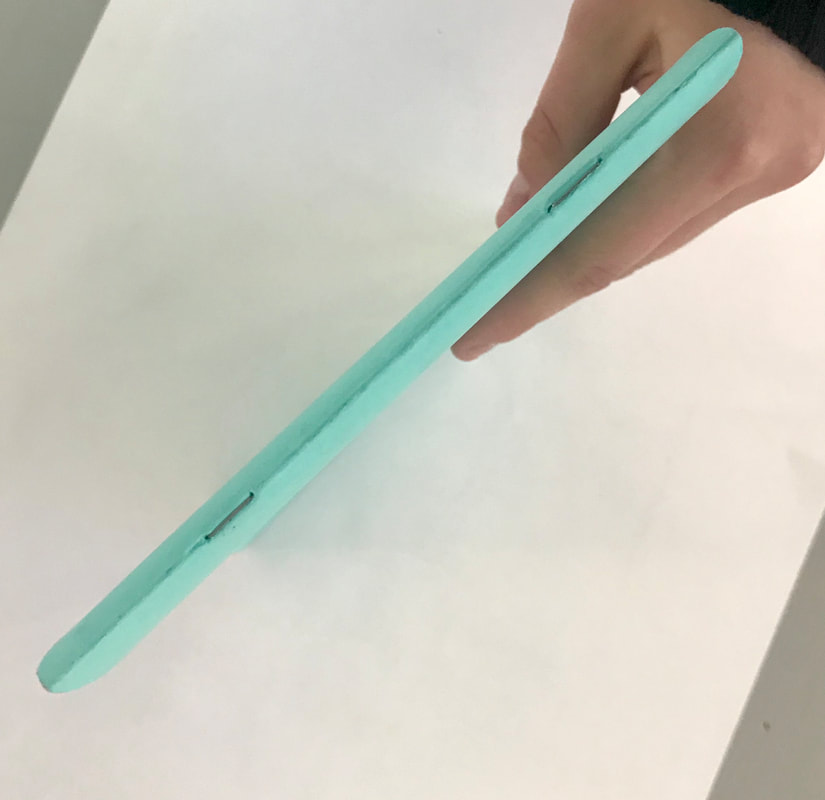
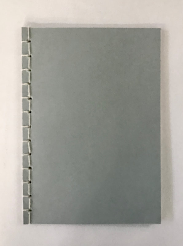
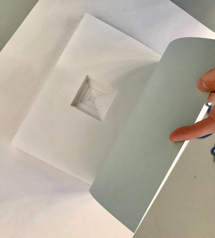
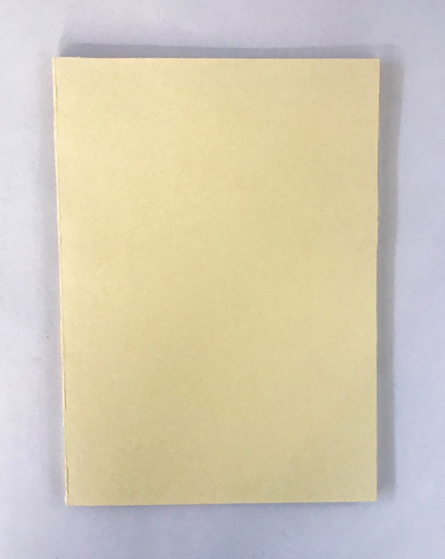
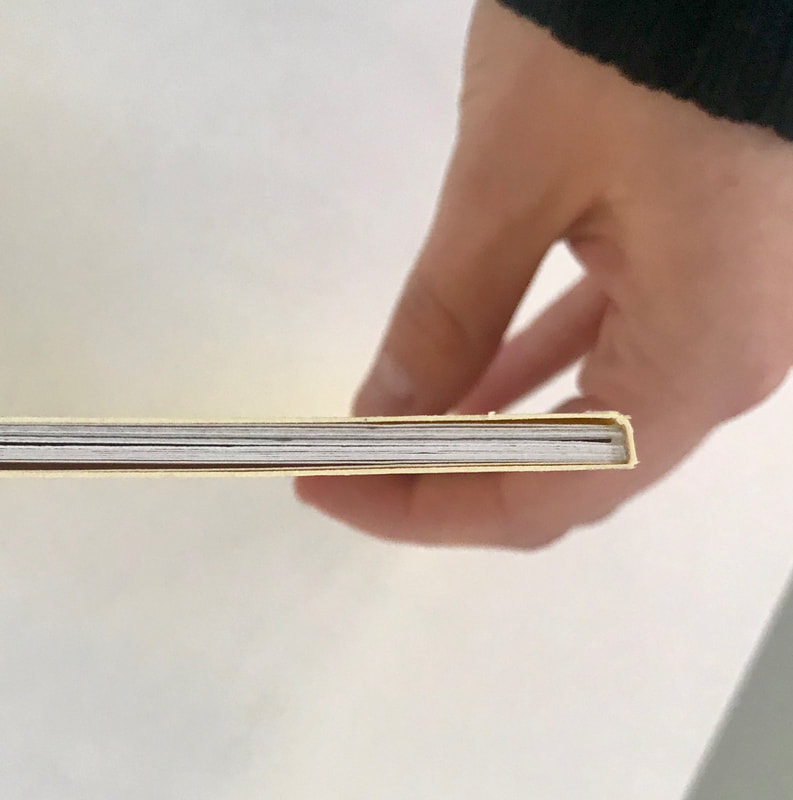
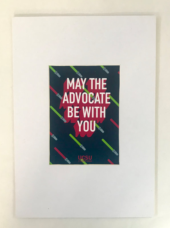
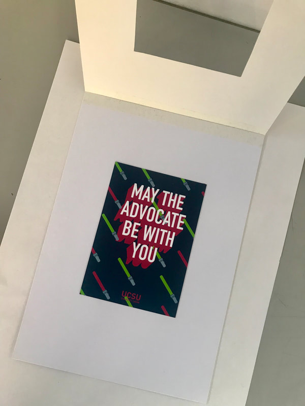
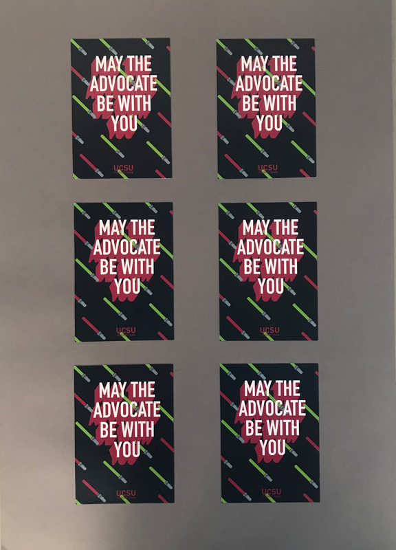
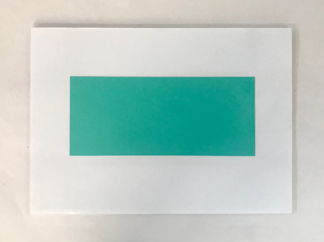
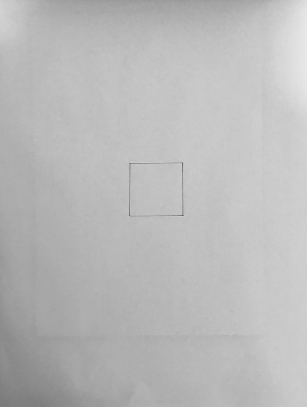
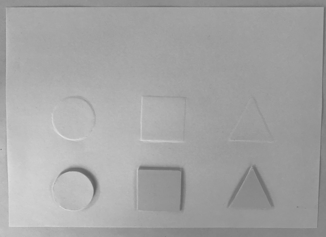
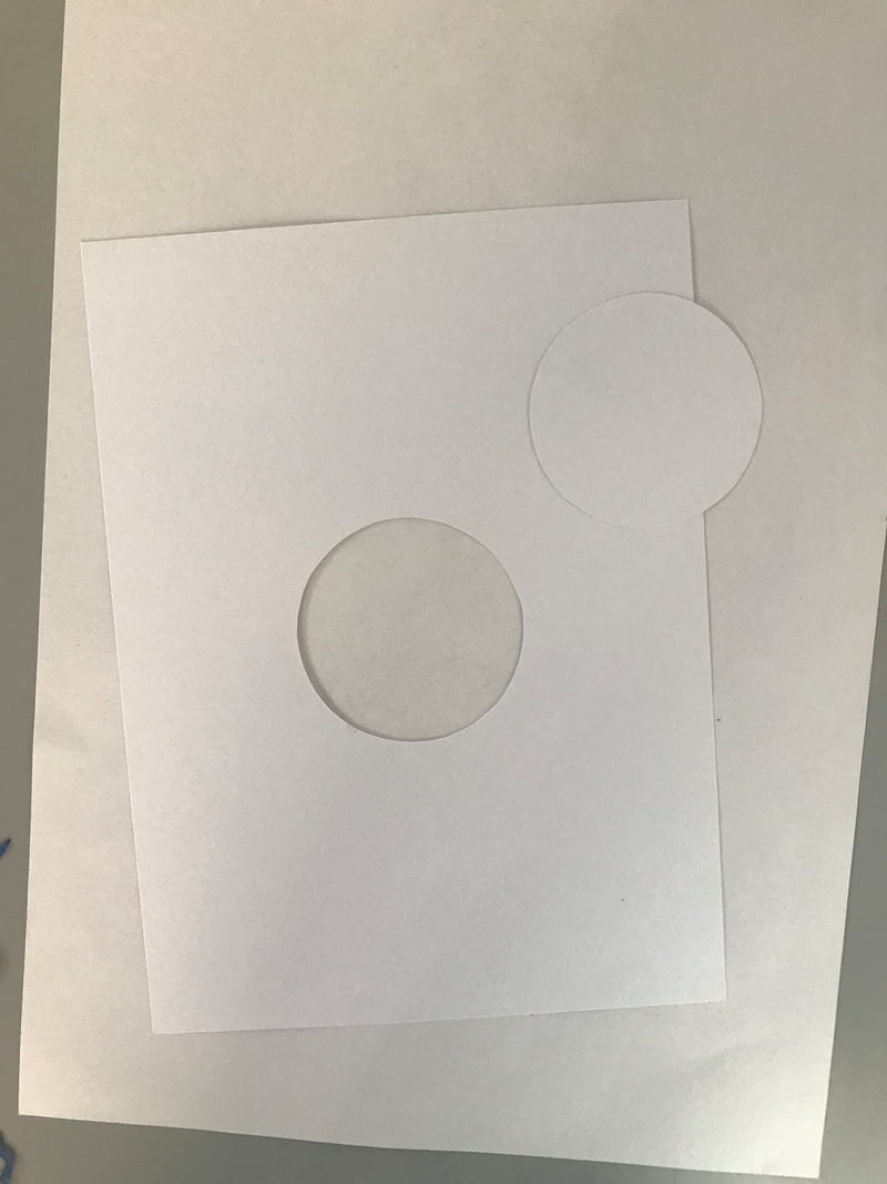
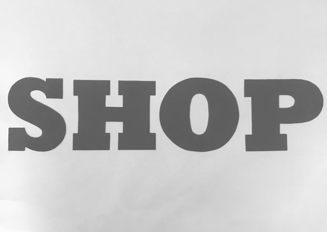
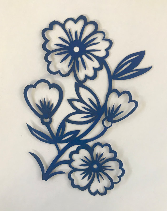
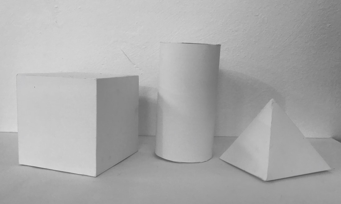
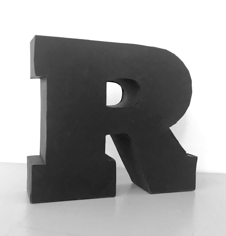
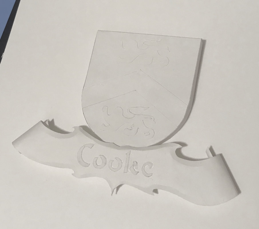
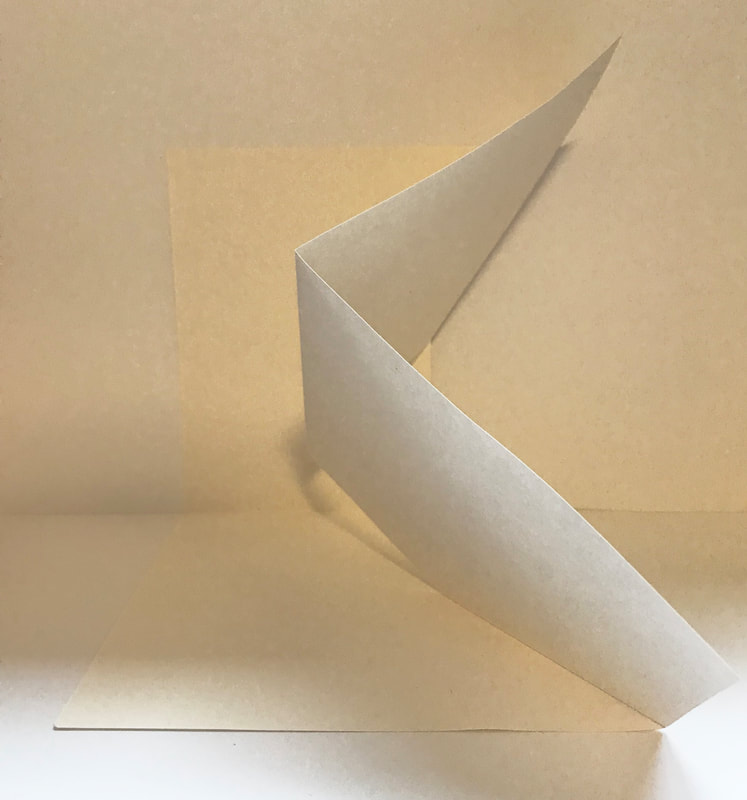
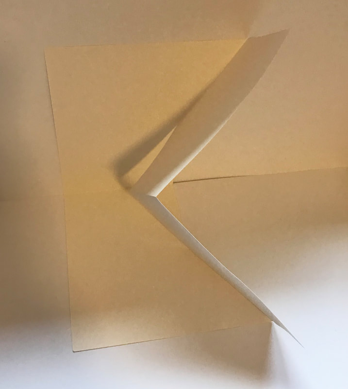
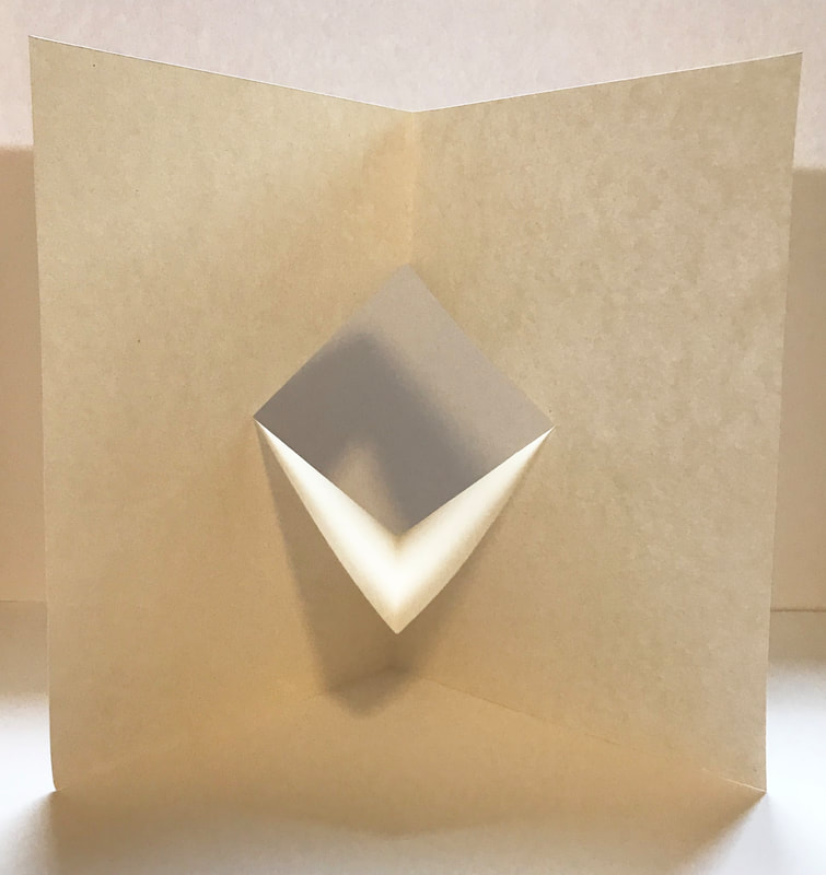
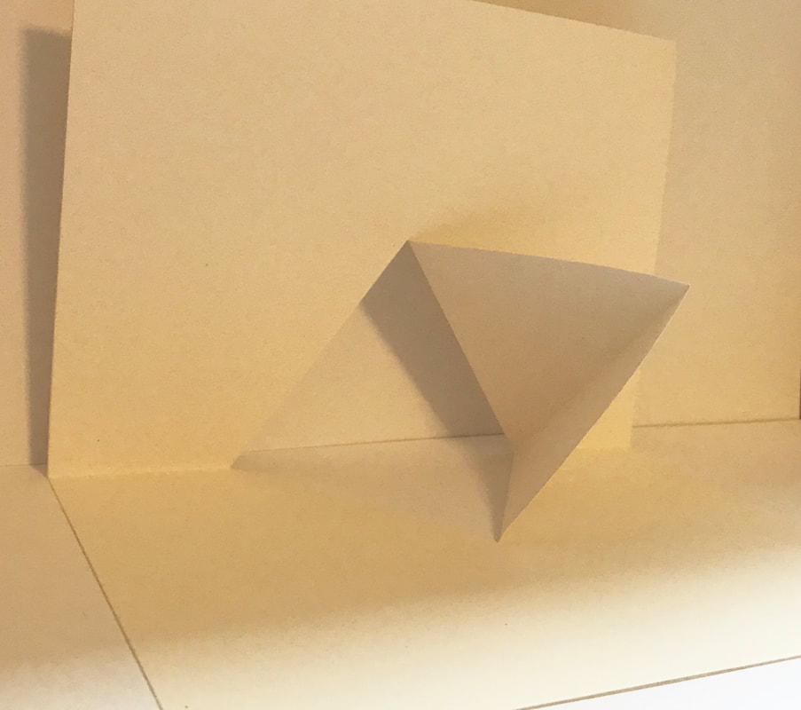
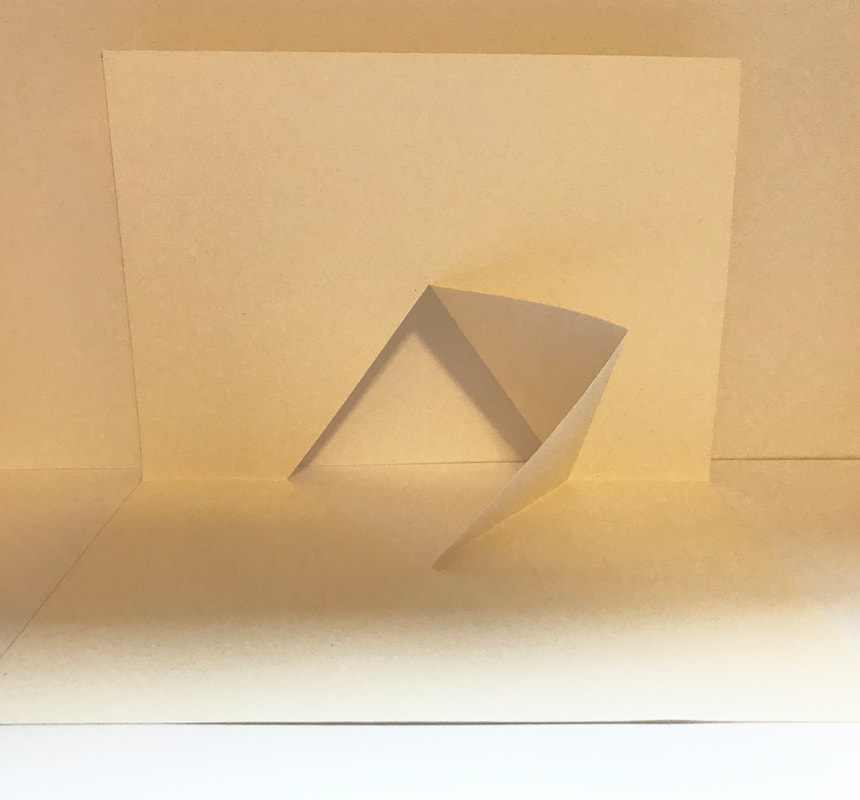
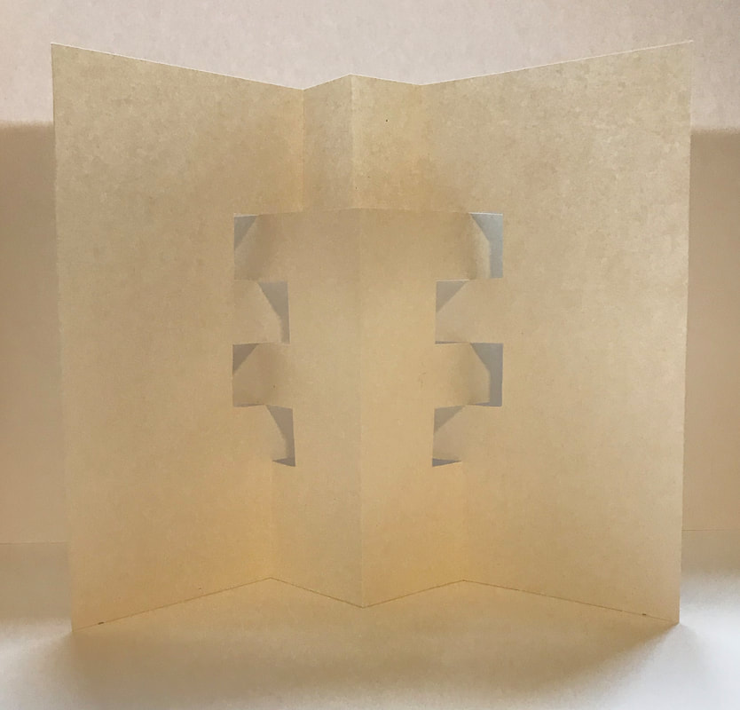
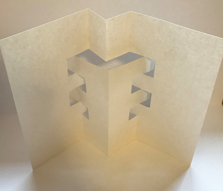
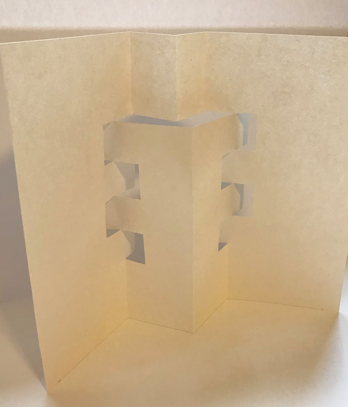
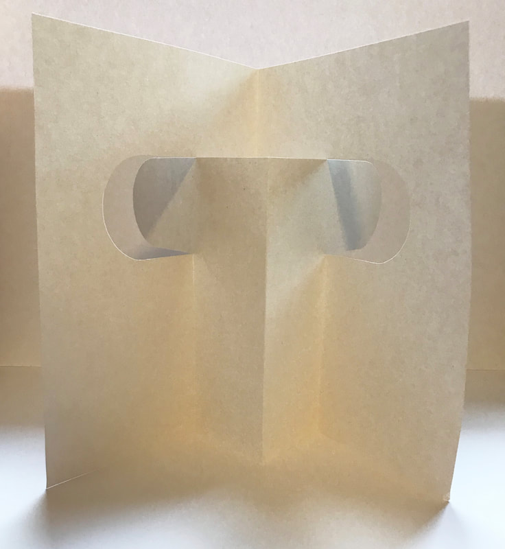
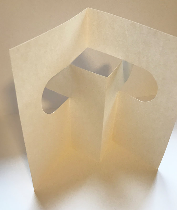
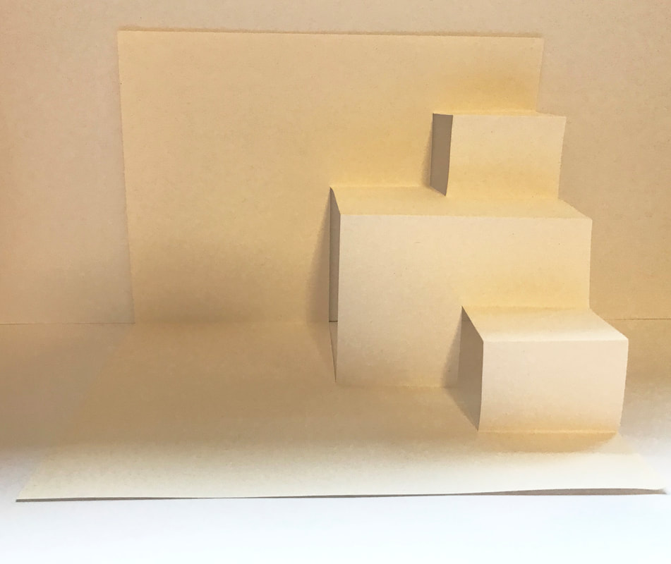
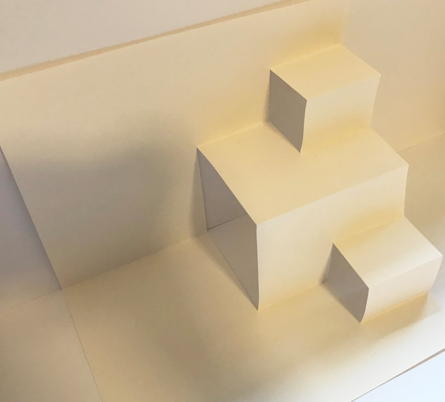
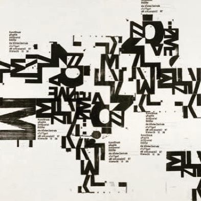
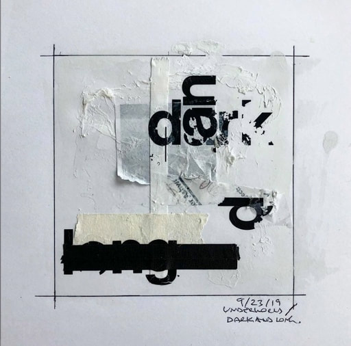
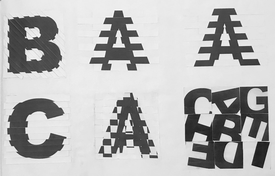
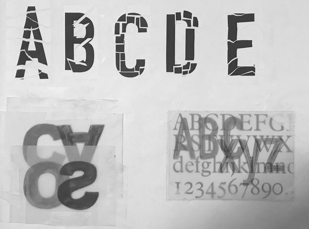
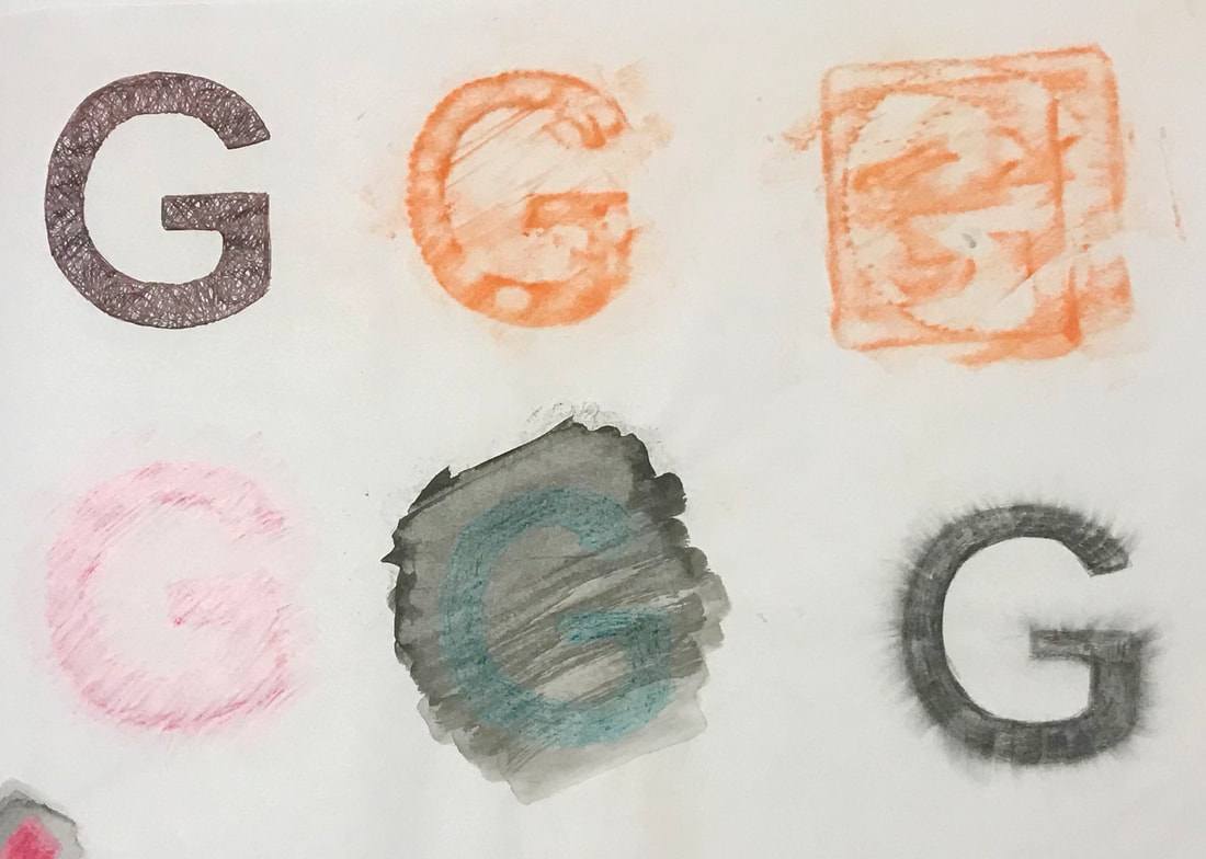
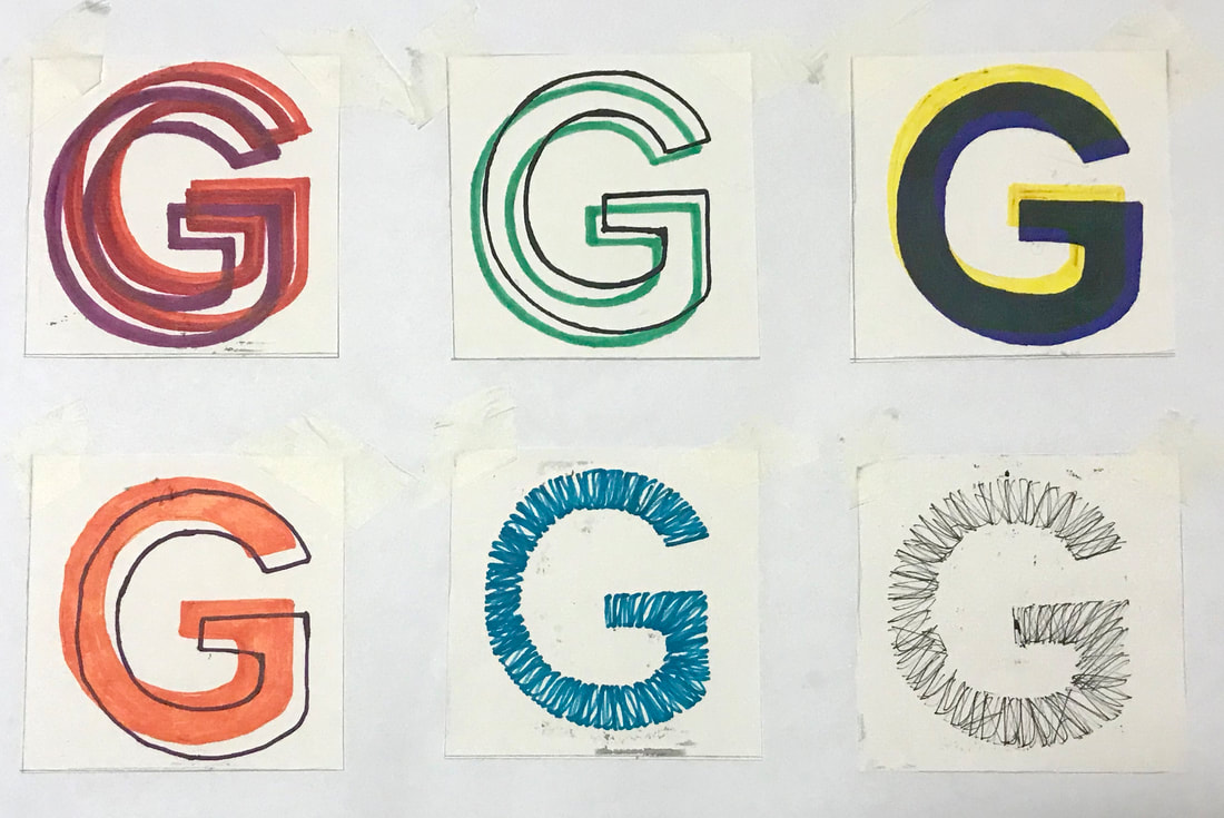
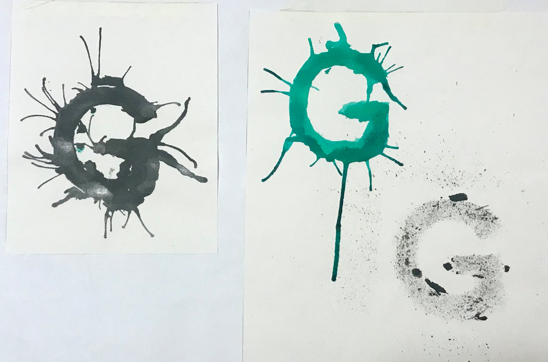
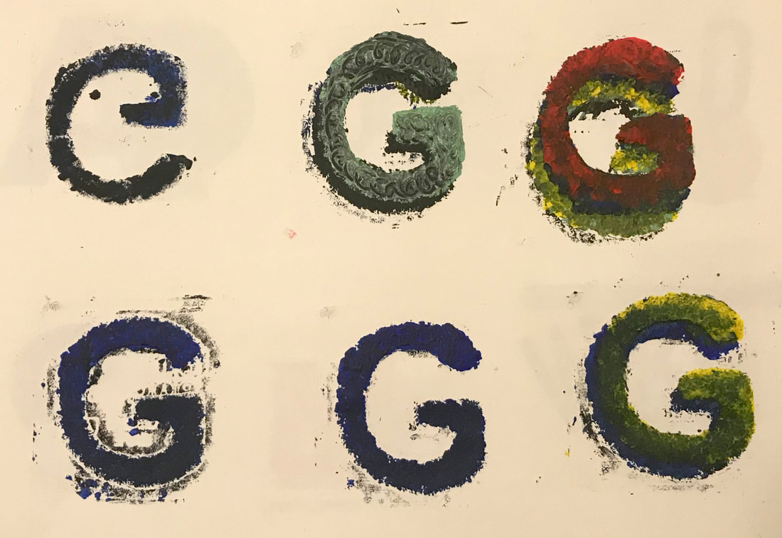
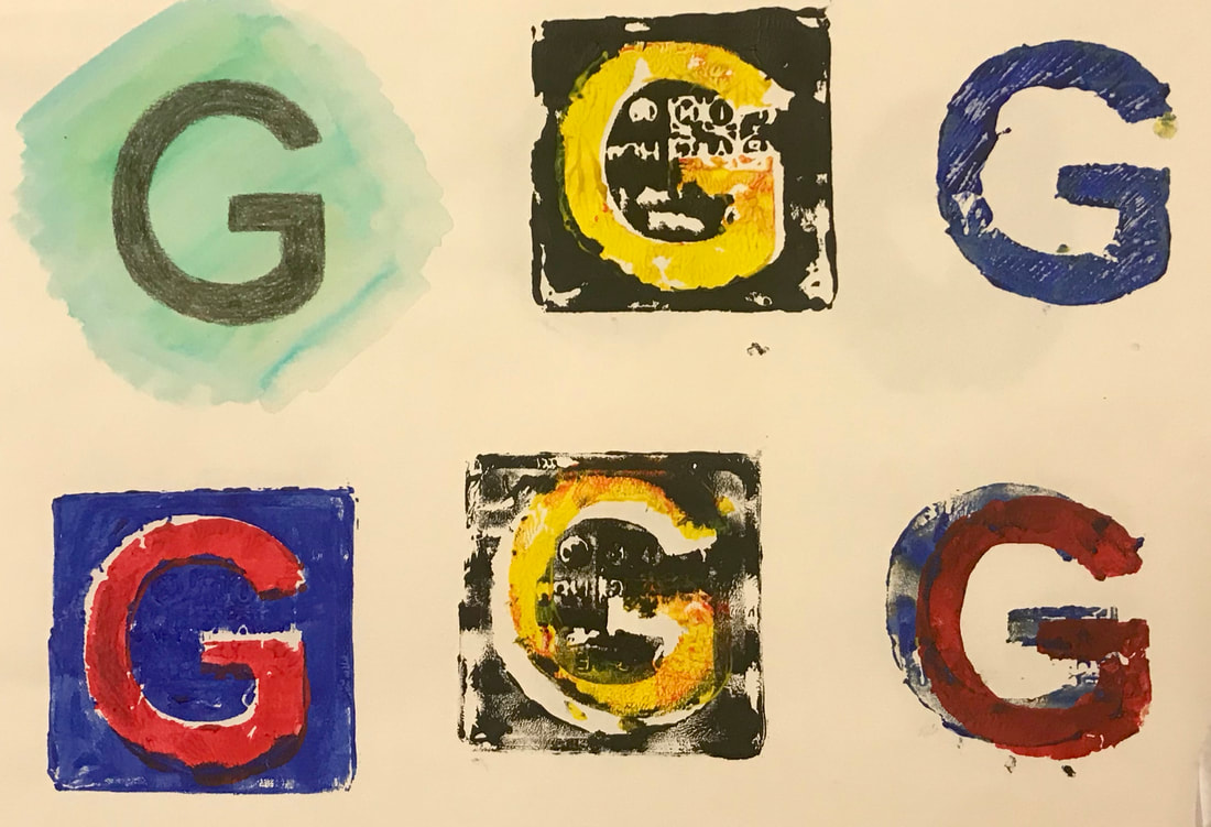
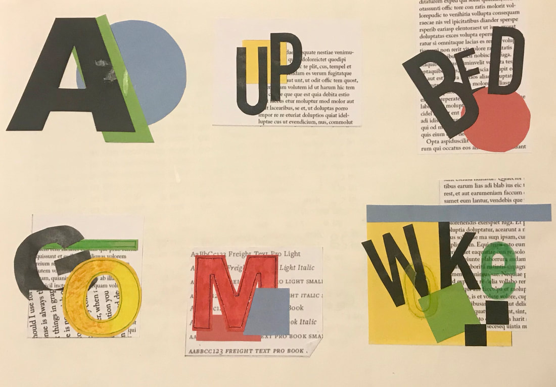
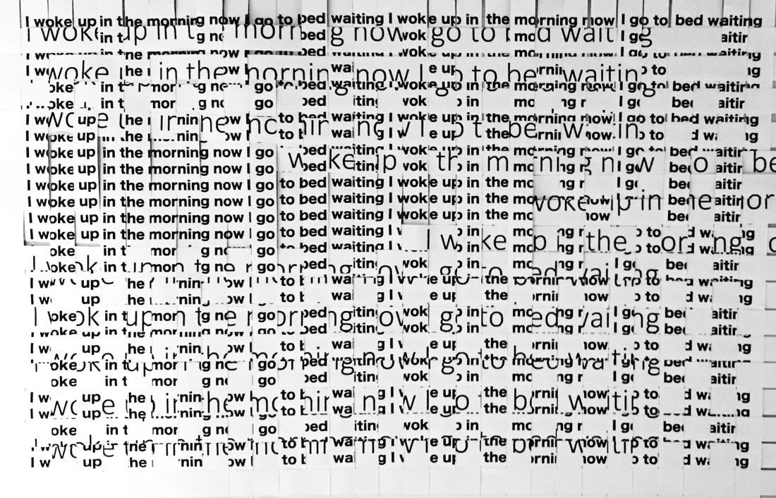
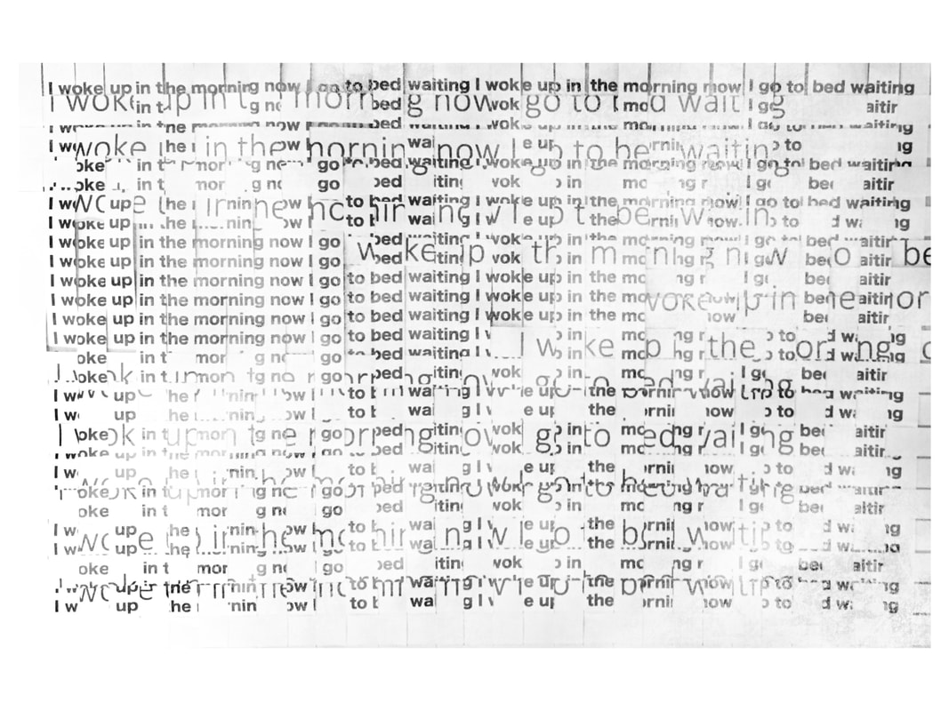
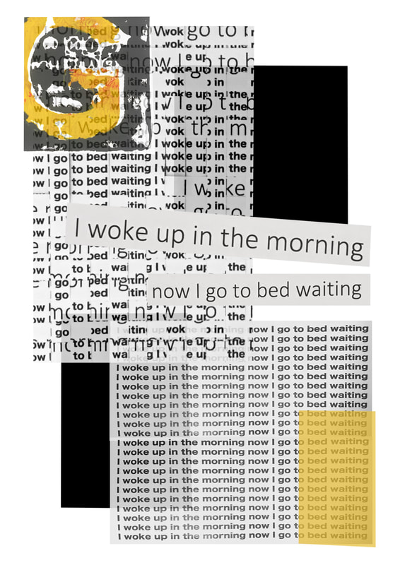
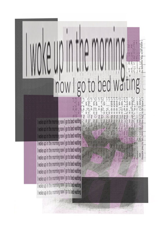
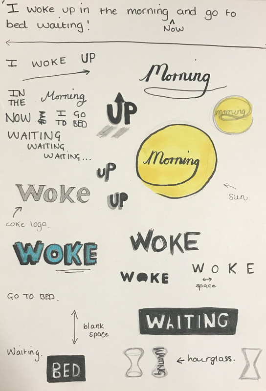
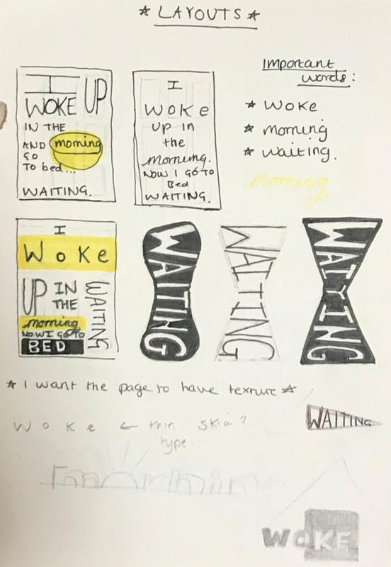
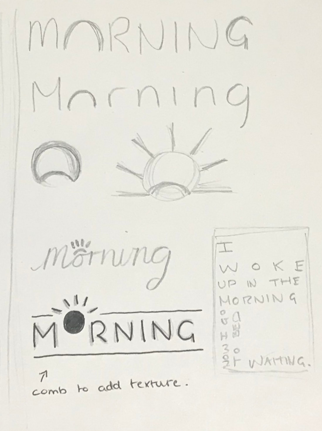
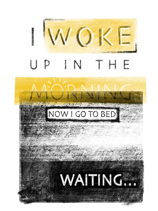
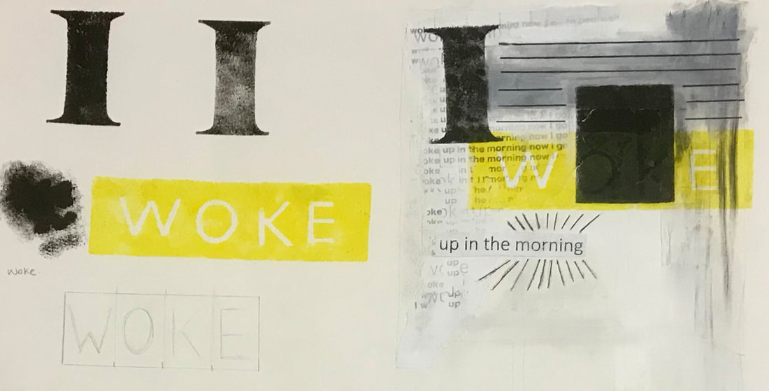
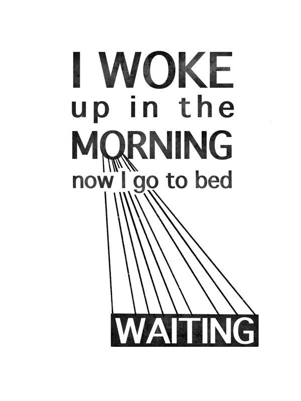
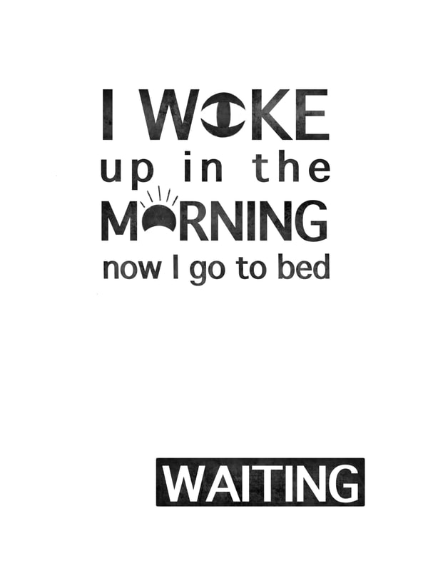
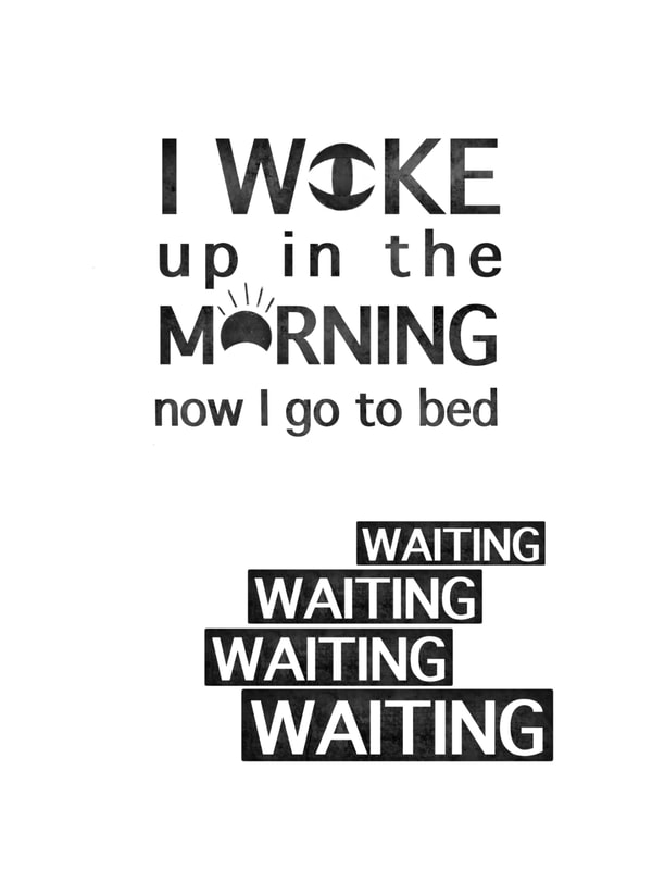
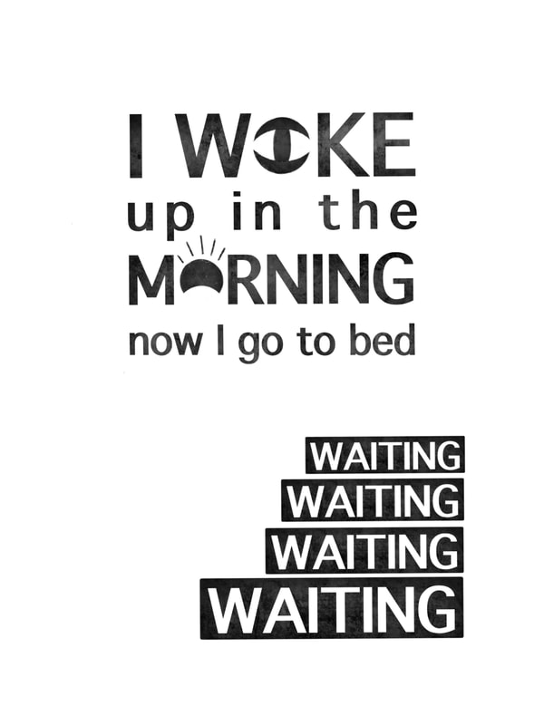
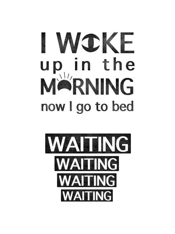
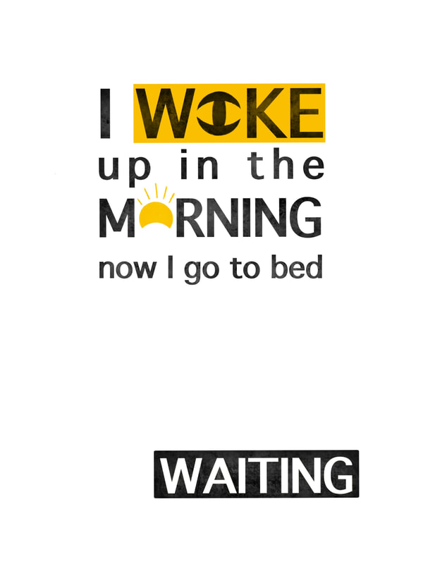
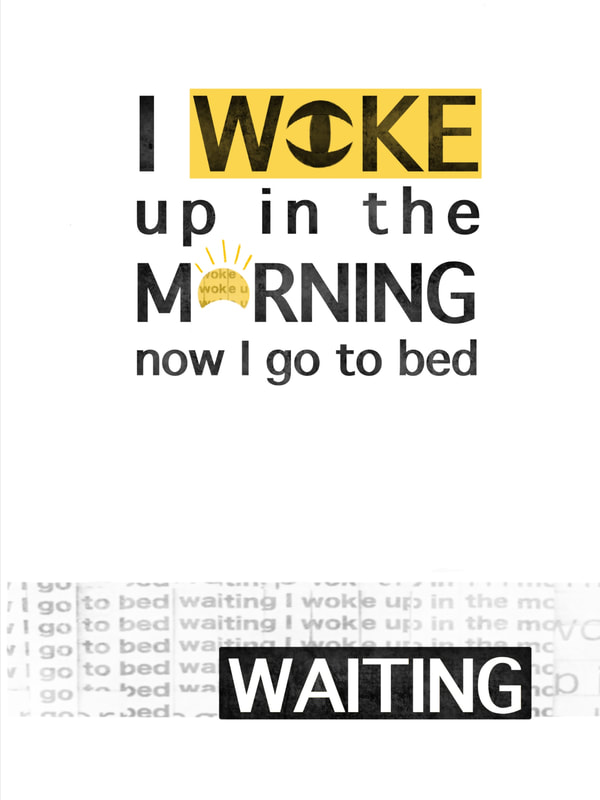
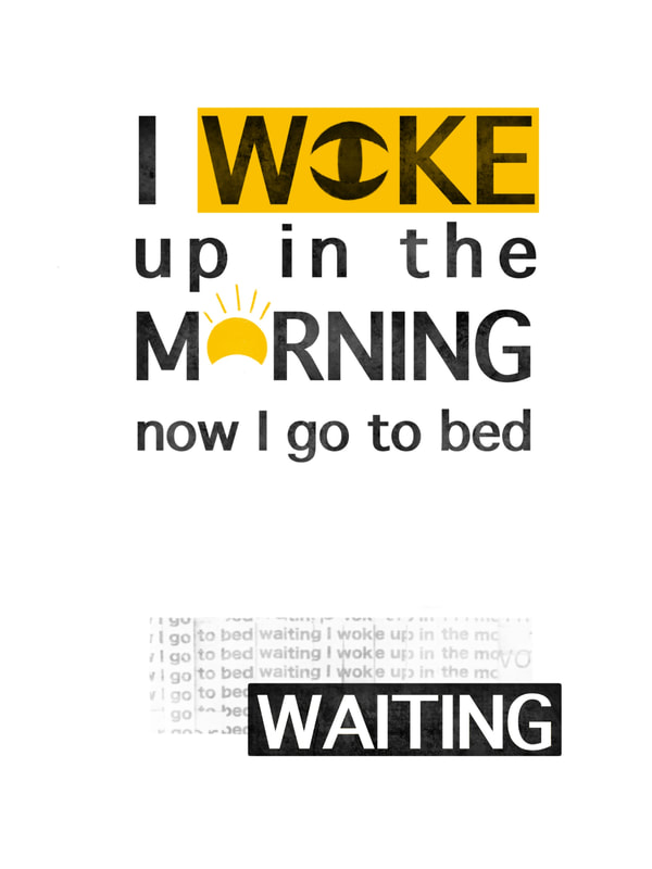
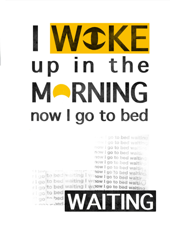
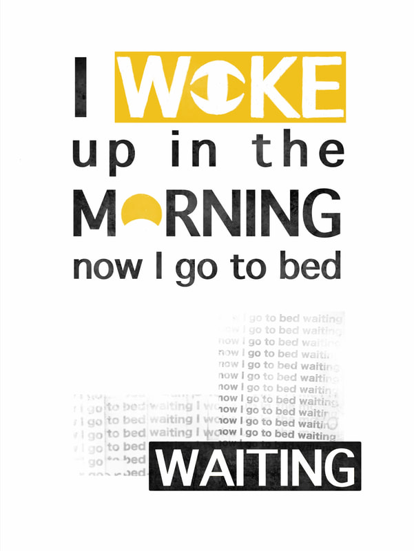
The first two weeks of this project revolved around us practicing, experimenting, planning and exploring. The aim was to get us to develop competence independently and learn from looking at the work of others; to engage with the world. We were given two weeks of old school projects to work through to showcase our problem solving, showing no glue or construction marks. Books Our first few tasks instructed us to make three books; saddle-stitched, stab-stitched and perfectly bound. Each of these included certain specific requirements such as size and decorative motives on the covers and inside the pages. Presentation The next tasks involved working on our presentation skills, mounting postcards, drawing out shapes pristinely and embossing. Each of these had to have specific size requirements and be centred correctly. Cutting We then moved on the cutting. Tasks included cutting out a circle perfectly with a 40mm radius, cutting out and mounting type in a specific size and font and creating our own decorative paper cut out using a craft knife. The Third Dimension These tasks involved making 3-D shapes of specific measurements, experimenting with surface patterns and creating our own paper sculptures using cutting and folding techniques. Paper Play Session This sessions aim was to encourage us to think about folding, cutting, light and shape by creating mini pop-ups and photograph them from a series of different angles. Anatomy of Type and Type Personality Workshop There are different features that make up letters. For this workshop we were tasked to render a sentence accurately on tracing paper, making sure to consider the anatomy of each character, 'thicks and thins', and the leading and kerning of each character/word. The Brief For our first two week project we worked as a team to create a book of experimental typography consisting of lines of text we were each given to work with to create our own individual pages. The final book is to be commercially printed and sold at the Lakes International Comic Arts Festival. A comic is most commonly described as being made up of a series of panels containing images used to express ideas. These are usually combined with text or other visual information (research from here). As graphic designers, our aim was to use type and typography to interpret and create an abstract response to the text we were given. The compositions had to be entirely typographic and created using analogue techniques and in addition to this, we were restricted to using only black and one other colour of our choosing. The aim of this project was experimentation and exploration, rather than design problem solving. Research To start me off on the right track I began with researching experimental typography to gain some inspiration. Experimental typography can include altering and manipulating the shapes of letters, playing with letter spacing (white/black space), font size, texture, and layout to create new unique designs (research from here and here). One of the graphic designers I looked into was the Swiss typography work of Wolfgang Weingart, who is known for breaking the rules of typesetting. I was particularly interested in his technique of distorting type by spacing out letters, curving lines, collaging and reorganising type to create new compositions. Furthermore, another designer I liked was Chris Ashworth, who similarly to Weingart, was inspired by Swiss design, known for using barcodes, horizontal lines and multiple transparent layers (research from here) Experimentation In order to get us started with experimenting ourselves, a workshop was held from which we were encouraged to explore different techniques and approaches. These involved taking typefaces of various sizes and styles; slicing letterforms into multiple parallel strips and sliding them against each other, mashing up two contrasting typefaces, interweaving two differing typefaces of the same letterform. Other techniques included cutting out a viewfinder to crop portions of letterforms and rearranging the squares, tearing to create an illusion of the letters disintegrating, and using tracing paper to overlap multiple layers of type. Below you can see these techniques in play through my own experimentation. I then continued to experiment further with different materials and mediums. In another workshop we were encouraged to create our own print block of a large letterform from a piece of polystyrene, and print with one/two colours, messing around with misalignment and overprint effects, using acrylic paint, crayon and coloured pens. In addition to this, I chose to distress some of the prints I made; blowing ink to create a dripping effect, sponging paint onto the stencil, overlaying wax crayon with ink and smudging charcoal. I then went on to experiment with collage techniques, trying to think about positive and negative space and the differing scales of the shapes. Development After all that experimentation it was time to start combining it with the line I was given for the comic to make my page. My line was: ‘I woke up in the morning now I go to bed waiting’. To begin, I decided to use one of the techniques by printing out two pages of the line repeated in differing fonts and sizes and interweaving them to create an abstract effect.I then decided to distress it further using an effect on Procreate to fade certain areas to make it look more worn away. I then decided to have a play on Procreate, using some of the collage techniques I learnt previously through the workshops to distort the text. I tried to think about the use of black and white space, adding small pops of colour to add more interest. The only thing I don’t like about these quick compositions is I felt it looked a little too busy, and because I did it digitally I wasn’t happy with the lack of texture that you would get if it was purely analogue. After this, I then went on to think more about the layout of the pages; how I wanted the lines to be lined up on the page and which words I wanted to put particular interest on. One idea involved setting up the page so the line ‘I woke up’ started off small and gradually got bigger to put emphasise on ‘up’. However, I decided against this as I thought that word wasn’t as important as some of the others. Another idea involved abstracting the word ‘waiting’ to look like an hourglass. In addition, I tried to think about way I could manipulate the text to create images representing the words, for example, taking away part of the ‘O’ in ‘woke’ to look like an eye and ‘morning’ to make it look like a rising sun. I also thought about how I could represent the meaning of the words through different typefaces, for example, thin, clean, spaced out letters for ‘woke’. Next I decided to play around a little more in Procreate to create a pleasing composition using some of my ideas. I was happy with the outcome but for further development I attempted to create an analogue version using the techniques from experimenting. I made stencils of some of the words and used a sponge to print the letters on the page, creating a more old-fashioned printed texture, and took the interwoven piece I did previously, adding rips and making it look faded into the background. However, I struggled with not making it look too overworked and as a result chose to go with a different approach. Here I experimented with different layouts: the first containing horizontal lines connecting the words as a way of representing rays of sun light. I also thought about repeating some of the words to add more emphasis. Once I was happy with the overall layout of the main text, I added some colour, keeping it towards the top of the page to link to the time of day, and also playing around with how I could add the interwoven text to the background to keep the page balanced. I also decided to try adding some of the faded text to the ‘O’ in ‘morning’, whilst still having the yellow shine through.  Final Piece Once I was happy with the layout of the design and had a good idea of what I wanted it to look like I began to cut out the letters in the font I chose to arrange on the page. I purposely printed out the letters to look sort of worn and faded in areas to give the impression it was cut from a newspaper. I then cut out stencils of the words 'woke’ and 'waiting’ to print them onto the page using black acrylic paint and a sponge to add texture. I also decided I wanted the text for 'woke’ to be in white to keep the pages lights and darks more balanced, and I chose to not use the eye shape; I preferred it just filled in white as it looked more open. After this I scanned my work onto the computer and used Photoshop to add a section of the interwoven text I created earlier to the bottom of the page and also faded over the sun shape in the word ‘morning’, making sure the entire piece lined up to the template we were provided. The finished piece is pictured below. 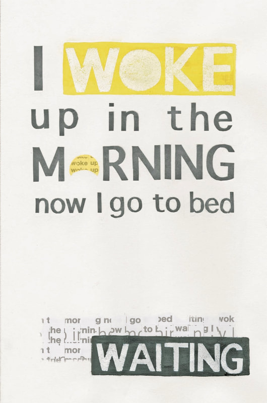 Overall, I am happy with the outcome of my piece and feel it fits the brief due to it being an entirely typographic way of interpreting the text. I experimented with a wide range of techniques and mediums and have shown good development in my work through exploring differing layouts and compositions, giving myself multiple designs to work from.
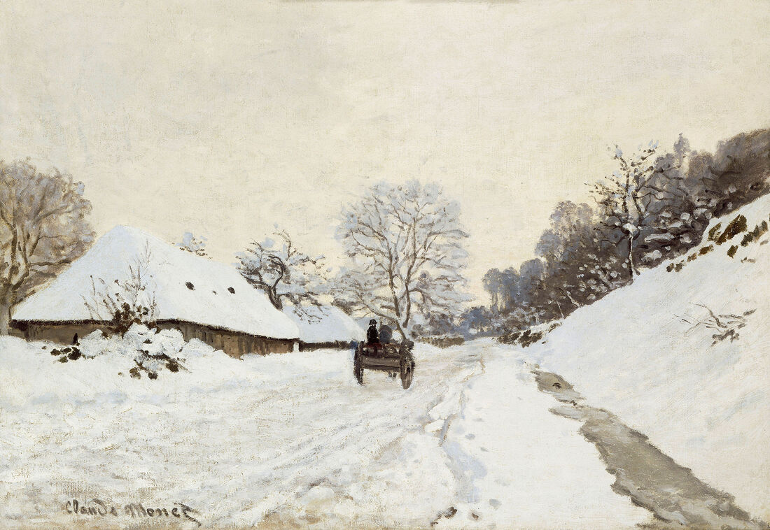
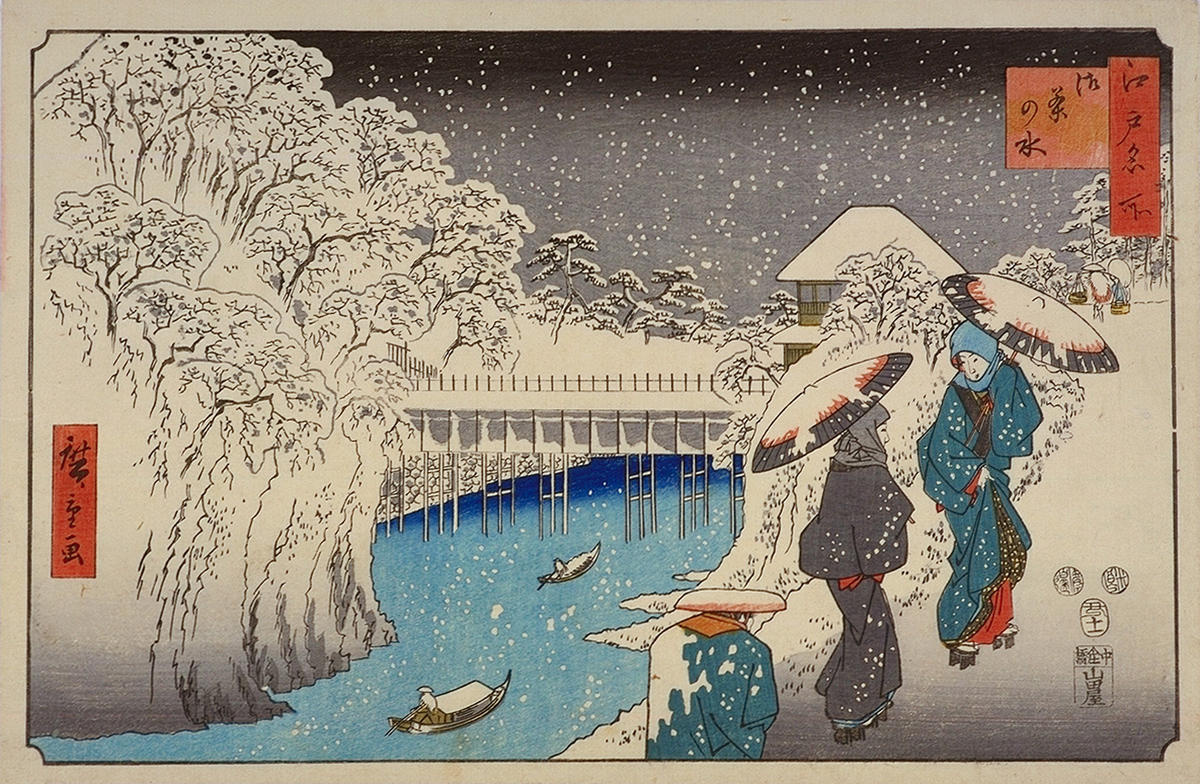
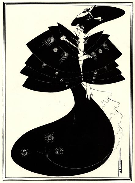
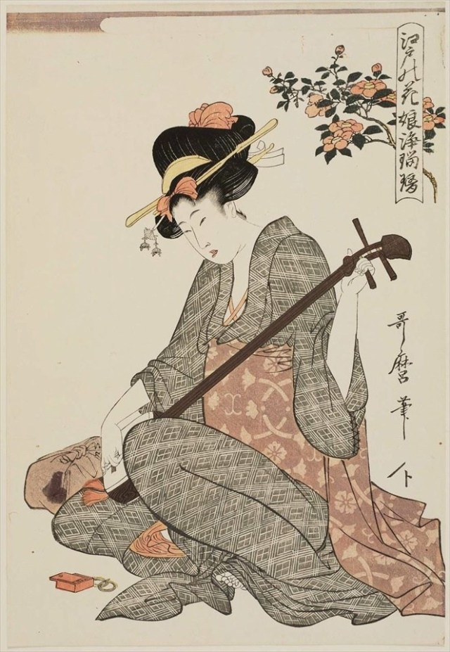
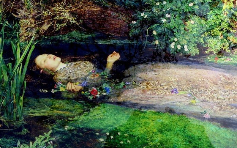
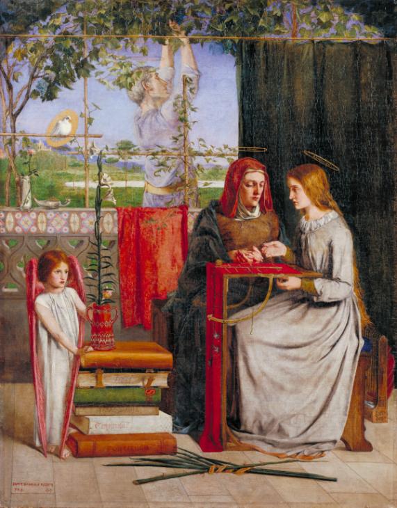
The only thing I’m not so happy with is that I think the piece needed more texture and less white space to look more experimental and more like a collage. In conclusion, although improvements could be made I am proud of what I’ve achieved and know I will have plenty of opportunities to improve my technical and design skills throughout the rest of the course.  This weeks lecture focused on the time period between the 1850s and 1900s; a time where art and design changed radically over a rather short span of time. The Gothic Revival Beginning in 1851, the 'Crystal Palace' built in Hyde Park housed the Great Exhibition where other countries were invited to showcase and exhibit their own achievements of art and industry alongside Britains own. The intention was to show our superiority, however this did not pan out as other countries showed much more advanced design. It was noticed that Britains taste was very over indulgent and 'bourgeois'. This later contrasted significantly due to the reemergence of gothic design. Augustus Pugin, who played a huge role in the early days of the Gothic Revival, believed that true Christian architecture better represented us and our country. Considered a romantic form of architecture, the Gothic approach focuses less on created a symmetrical building and more on making sure its flows and is practical to live in. By the 1960s, Gothic was considered the national style. However, the mass production required to produced these exquisite buildings required a lot of labour. In order to show the wealthy what was really going on behind the scenes, French artist Gustave Dore created a series of illustrations that show the harsh realities of mid-Victorian London.  Pre-Raphaelitism Founded in 1848, the Pre-Raphaelite Brotherhood was a secret society consisting of young artists, including William Holman Hunt, John Everett Millais, and Dante Gabriel Rossetti. They were opposed to the paintings promoted by the Royal Academy, particularly those of the Italian artist Raphael. They believed that art should be as true to real life as possible; not just to decorate but to educate. Pre-Raphaelite paintings are known to be extremely detailed but still imaginative, covering themes such as religion, literature and poetry. William Morris, who had a huge influence on Victorian art and architecture became interested by the Pre-Raphaelites due to his connections with Rossetti. He later commissioned Philip Webb to build him a house, ‘Red House’, and frustrated he couldn’t find any textiles to decorate his home that he liked he decided to design them himself. This led him and his friends to found Morris and Company, where they produced and sold things such as stained glass, wallpaper, textiles, and furniture.  Furthermore, a major supporter of the Pre-Raphaelite Brotherhood was the English leading art critic John Ruskin, who encouraged them to ‘go to nature’. He believed it was the artists duty to express nature to its truest form and was a particularly big fan of the work of Edward Burne-Jones. When visiting a gallery he came across the work of James Abbott McNeil Whistler, who believed paintings should be about nothing in particular; ‘art for arts sake’. Ruskin reviewed one of Whistlers paintings, writing 'I have never expected to hear a coxcomb ask two hundred guineas for flinging a pot of paint in the public's face. This was rather odd considering he had enjoyed the abstract work of J. M. W Turner in his youth. As result of this critique, Whistler sued Ruskin for libel, claiming that his review had damaged his reputation. Ultimately he won the case but his claim didn’t cover the court costs resulting in him becoming bankrupt. It was concluded that whilst a critic should still be allowed to freely review a piece of work, art should not have to teach you anything if it gives you pleasure. Subsequently, all of this initiated and became central to the Aesthetic movement. The Aesthetic Movement and the Cult of Japan In the mid-Victorian period, the western world went mad for Japan. Originally, Japan used to refuse to exchange with the west because they didn’t like what they had to offer, but they were eventually forced and we began trading cultural things for new technologies. As a result, Japonism, a passion for collecting Japanese art, came about, introducing us to a new style of art and design, such as wood block prints (ukiyo-e) and manga which hugely influenced European artists such as Vincent Van Gogh, Edgar Degas and Whistler. An example of a piece of art/design that shows Japanese influence is 'A Cart on the Snowy Road at Honfleur’ (1865) by French painter Claude Monet. Monet had a large collection of Japanese art and was particularly fond of wood-block prints. These can be seen to influence his own work through his use of asymmetry; the landscape has no central point unlike most artwork considered by the Academy. In addition to this, themes of winter and snow were common among the Japanese, such as Hiroshige’s 'Ochanomizu’. Monet was influenced by the use of white and colours such as purples, blues, greys and hints of warmer colours like yellow, giving the impression of bright light reflecting off the snow. Furthermore, another artist considered to be influenced in some way by Japan is the work of British artist Aubrey Beardsley. Known for his bold black and white illustrations, Beardsley was also strongly influenced by Japonisme wood-block prints. His piece 'The Black Cape’ (1894), is argued to be similar to Kitagawa Utamaro’s ‘'Flowers of Edo’ due to its use of black clean fine lines and contrasts of large black and white spaces. As well as the piece being a block print on Japanese vellum, the flowy lines and two-dimensional composition further show how Beardsley was influenced by Japanese art. These contrast with works such as from the Pre-Raphaelites as they showed no influence from Japan. Their focus was more on creating pieces with high realism and likeness of the subject, such as 'Ophelia' (1851-2) by Sir John Everett Millais and Dante Gabriel Rossetti’s 'The Girlhood of Mary Virgin' (1849), depicting insane detail and focus on natural forms. In conclusion, all of this massively shaped the Aesthetic Movement as it continued to grow and inspire art and architecture, focusing on producing art that was for its own sake rather than to express a greater meaning.
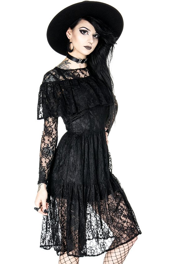
Our first lecture for the History and Practice module introduces us to the modernist timeline (1850-1980); exploring the developments of art and design in the present day, and how history effects cultural texts. The aim is explore ways of thinking and understanding of cultural works and inform creative practice. Cultural Texts Cultural texts are shaped and informed by the society and cultural norms surrounding those who create them. They give thought to things such as ideologies and morals, representing the world and its beliefs, class/status and fears. A piece of clothing is considered to be a cultural text and can say a lot about who you are as a person. When you get dressed in the morning you are consciously choosing clothing that shows how you want to be perceived by society, giving others an impression of your personality and social status. Clothing is considered to be a sign system as it conveys meaning; they have specific functions such as to disguise, show status and for personal expression. For example, there are various cultural connotations of the 'black dress; it could symbolise night-time, mourning, authority, and is associated with goth culture, but it is considered to be frowned upon if worn by a bride or new born baby.  Denim has a long, complex history that reflects different cultural contexts and trends. Today, denim is seen as the default mode of casual dress and can be interpreted differently depending on the cut, brand and how they are worn. Created in 1870 by the designer of the first pair of jeans, Levi Strauss, the denim jacket was designed for a similar function. Its original purpose was for it to be used as a utility garment for workers due to its heavy-duty material being ideal for tough manual labour.  In my own wardrobe is a LEE denim jacket. Founded by Henry David Lee in 1889, Salina, Kansas, the brand originally produced clothing brought about by the introduction of work jumpsuits and overalls, eventually becoming one of the leading manufacturers of work clothes in the US. Their focus later shifted from practicality and durability to following fashion trends and youth culture, adding flair through techniques like distressing and applying acid stone washes. The item was even banned in some schools due to its connotations with non conformity and rebellion, showings us how the design today is mainly worn more for expressing individual identity and style.
This shift in how the denim jacket has been perceived over time illustrates how clothes are signs that are open to individual interpretation, having a long history that reflects many cultures and trends throughout the years. |
AuthorHi, I'm Emma. I'm currently studying Graphic Design at the University of Cumbria. Modules
All
Archives
March 2020
|


 RSS Feed